Ensembles Lessons
Table of Contents
Verification
Probabilistic vs Deterministic
Forecasters are all familiar with how to verify a model forecast: compare the forecast to observations and compute the difference.
Verification of a probabilistic ensemble forecast differs from that for a deterministic single-model forecast. Now we want to compare the probability of a forecast to the observed frequency of that event. For example, over a long enough time and large enough area, when the ensemble predicts a 50% chance of rain exceeding 0.5 inches, then we hope to observe 0.5 inches or more of rain 50% of the time.
The easiest way to portray this is with the Reliability Diagram.
The Reliability Diagram
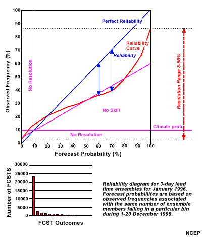
The reliability diagram plots the forecast probability versus the observed frequency. For a perfectly reliable ensemble, the two should match, yielding a straight line from the lower-left corner to upper-right corner, In other words, an event forecast with a 10% probability should occur 10% of the time, 20% probability should occur 20% of the time, and so on up to 100%. In this diagram, perfect reliability is shown as the blue line.
In practice, reliability diagrams are created for a fairly large region (for example, Northern Hemisphere north of 20 degrees latitude) for a period of a month or so.
The bar graph shows the number of forecasts for each probability level. The vast majority fall into the 0% probability range (the tall red bar on the left). Subsequent bars gradually diminish for increasing probabilities. This is to be expected as it should be relatively rare that 80, 90, or 100% of the ensemble members agree on a single bin of observations.
Interpreting the Reliability Diagram
In this diagram, the red line shows a hypothetical result for a reliability diagram. Most of the red line falls far below the blue line. What does that mean?
Suppose we look at the 70% forecast probability. From 70% on the bottom horizontal axis, we go up to the red line, then left, across to the vertical axis, which we intersect at about the 40% mark. An event predicted with 70% probability only occurred 40% of the time. We call this an over-forecast. Operationally, with this information, we would lower the ensemble probability in our forecast.
Notice that the red line intersects the left vertical axis at the 3% observed frequency mark. That means that when none of the ensemble members predicted the event, it still occurred 3% of the time. Similarly, note how the right end of the red line stops at a value of about 86% observed frequency. This means that there were times when all the ensemble members predicted an event that failed to occur.
Questions
Compare the two Reliability Diagrams for MSLP for October, 2012. Which ensemble appears more reliable? (Choose the best answer.)
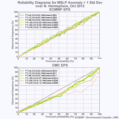
The correct answer is (a) ECMWF. Each Reliability Diagram shows separate lines for different forecast lead times. In the diagram for ECMWF, all the lines closely follow the diagonal from lower-left to upper right. This indicates a high degree of reliability. The Reliability diagram for the CMC ensemble tends to fall below the diagonal. Lead times longer than 5 days are worse than shorter times.
For the 2-day forecast from the CMC ensemble, how often does a forecast with 70% probability verify? (Choose the best answer.)

The correct answer is (b) 60% of the time. To find this answer, start at 70% Forecast probability on the horizontal axis. Go up to the 2-day forecast line (green), then left, across to the vertical axis, to the 60% Observed Frequency.
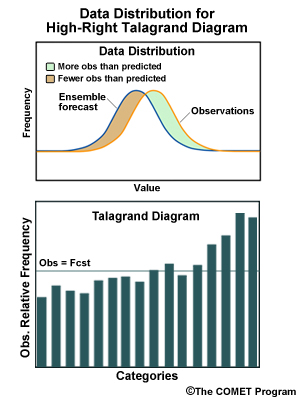
The Talagrand Diagram
The Talagrand diagram, also known as a rank histogram, provides a way to validate the spread of an EPS, typically over a month to a season. To understand a Talagrand, it is perhaps easiest to first show how one is "built".
Suppose you have a 72-hour ensemble forecast of 2-meter temperature for some specific location. There are 10 members in the ensemble. We then sort the temperature forecasts for the different members from lowest to highest, say from 40°F to 54°F. This leaves us with 11 bins. The boundaries of the bins are defined by the values of the ensemble members. The first bin has values less than the lowest value (40°F). The last bin has values greater than the highest value (54°F).
At the verification time, we compare the observation (or analysis) to the bins and add one increment to the appropriate bin. To build up the histogram, we repeat this exercise for every grid cell in the model domain. Then we repeat that process for every 72-hour forecast from every ensemble model run over a period of weeks.
So what does this tell us?
For an ideal ensemble, the same fraction of observation data falls in each bin and each bin contains 1/(n+1) of the data, where n is the number of ensemble members. With 10 ensemble members, each bin contains 1/11th (about 9%) of the data, and the Talagrand diagram or rank histogram is flat. This ideal, flat distribution is typically shown with a horizontal line spanning the graph. In these cases, the ensemble spread over time matches the spread in the observations.
Interpreting the Talagrand
But what if the rank histogram isn't flat?
The four panels below represent four hypothetical frequency distributions relative to forecast categories. Examples include diagrams for EPSs with spreads too large and too small, and with high and low biases.
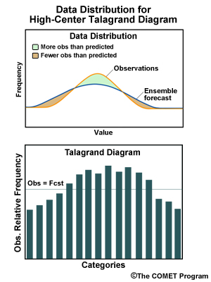
Ensemble spread too large. Lower than expected frequency for observations at the extremes, higher than expected in the middle range of forecasts.
Ensemble low bias. Lower than expected frequency for low observations, higher than expected frequency for high observations.
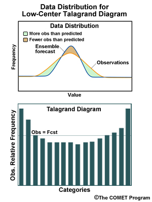
Ensemble spread too small. Higher than expected frequency for observations at the extremes, lower than expected in the middle range of forecasts.
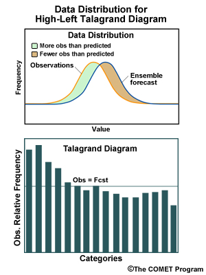
Ensemble high bias. Higher than expected frequency for low observations, lower than expected frequency for high observations.
Talagrand Caveats
There are, of course, several caveats when viewing Talagrand diagrams.
- If the period of observation for a Talagrand spans several different weather regimes, then regime-dependent biases may average out, leaving one overly optimistic about the ensemble spread.
- Observation error or imperfect sampling can create misleading frequency distributions. One may be left overly optimistic or pessimistic about the ensemble spread.
- If the period of observation for a Talagrand is too long, then we expect a flat Talagrand diagram, assuming there is no model bias. This merely indicates that the ensemble is matching climatology in the long range, which tells us nothing useful about forecast spread.
Question
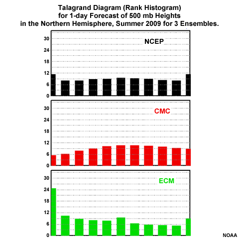
This graphic shows Talagrand diagrams for 24-hr ensemble forecasts from NCEP, CMC (Canada), and ECMWF (European Center) for the summer of 2009. How would you characterize each diagram? (Choose the best answer.)
The correct answers are:
NCEP: Ensemble spread too small. The histogram indicates that many observations fall above or below the range of ensemble forecasts.
CMC: Ensemble spread too large. The histogram indicates that relatively more observations fall in the center of the forecast range than near the highs and lows.
ECMWF: Ensemble high bias. The histogram indicates that many observations are at the low end of the forecasts. Therefore, forecast temperatures are too high.