Ensembles Lessons
Table of Contents
Ensemble Statistics
Normal Distribution
The real power of ensembles in weather forecasting is that they allow us to assign a probability to a forecast. To do that, we first need to be reasonably sure that the 20 or more members of the ensemble produce a range of forecasts that have a normal distribution.
What is a normal distribution?
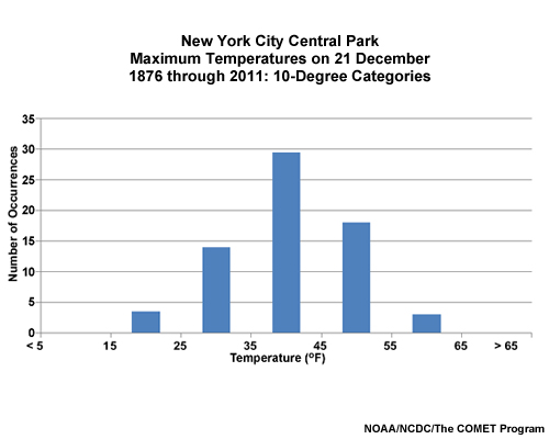
Let’s look at the high temperature for a given day, say the Winter Solstice on December 21, over a period of many years in Central Park, New York City. Here we have a histogram of observed frequencies for these data grouped in 10°F increments. In the plot, we see a peak around the middle of the temperature range with the count falling away symmetrically to either side.
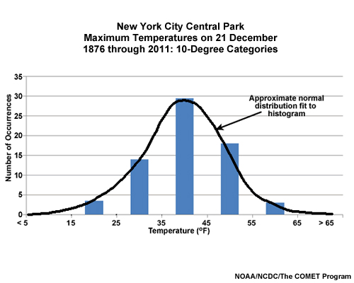
If we fit a curve to the histogram, we see a nice bell shape. This is approximately a normal distribution. The peak is near the center of the range of temperatures, and is neither too sharp nor too flat.
In contrast, a non-normal distribution may show a peak that's significantly off-center from the middle of the range, a peak that's too sharp or flat, or even multiple peaks!
Question
Which of the following plots shows a normal data distribution? (Choose the best answer.)
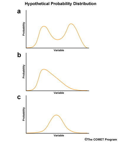
Feedback: The correct answer is (c).
Plot C shows a single peak with a nice bell shape. Plot B shows a single peak, but it is off-center in the distribution. Plot A shows more than one peak.
When we run an ensemble, we get 20 or more forecasts. As the forecast lead time increases, those forecasts will diverge. For temperature, we will see warmer and cooler temperatures for different ensemble members. If a histogram of the forecast temperatures resembles a bell-shaped curve, we have a normal distribution, and the statistics we compute will give us accurate probabilities.
Mean
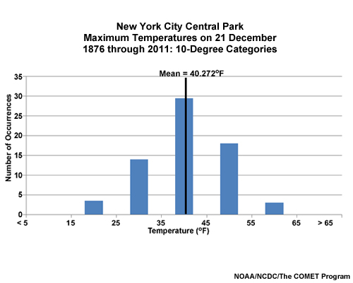
The mean is probably the most commonly examined attribute in all statistics. The arithmetic mean or average of a data sample is simply the sum of the values in a series divided by the total number of values in that series. In this graphic, we show the previous NYC temperature distribution with the average shown with a vertical line. As the distribution is close to normal, the mean is close to the center of the range.
Standard Deviation
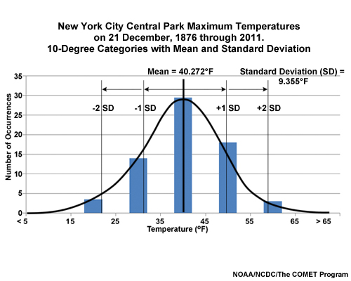
The standard deviation (SD) measures distance from the mean, as shown in this graphic. In a normal distribution, ±1 SDs around the mean encompasses about 2/3 (68%) of the values and ±2 SDs encompasses about 95% of the values. In a mean-and-spread plot, the spread is one SD.
Rank Statistics - Median
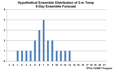
We can sort a data set from lowest to highest and develop rank statistics. In the following examples we will consider the histogram of a hypothetical forecast from a 21 member ensemble.
On the histogram, we can locate the value where one-half of the data are lower and one-half are higher. This defines the median of the data sample. Using the median better represents the middle of a distribution than the mean, because it removes the influence of extremely high and/or low outliers in the data sample.
Question
Suppose this graphic shows 21-member ensemble forecast of temperature for Baltimore, MD. Temperatures are in degrees Celsius. Of the following, which temperature is the median? (Choose the best answer.)
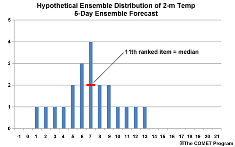
The correct answer is (c) 7°C. When ranked from low to high, the median is the middle value. For an ensemble of 21 members, counting from the left in the graphic, the 11th value is 7°C.
Rank Statistics - Percentiles
When we broke our cumulative distribution at the midpoint to determine the median, we also determined the 50th percentile. That is, 50% of the temperature readings fell at or below 7°C. We can extend this idea and determine other percentile rankings. Commonly used percentiles include the 10th, 25th, 50th (or median), 75th, 90th, and 99th. In terms of weather, the 99th percentile represents an extreme event.
Mode
The most frequently observed value or interval is called the mode of the data sample. In the case of the mode, no values other than those in the most frequently observed category affect the statistic. In the case of a tie, where more than one value has the same high frequency, each value is a mode.
Questions
In the 21-member ensemble temperature forecast for Baltimore MD shown again below, which temperature is the mode? (Choose the best answer.)
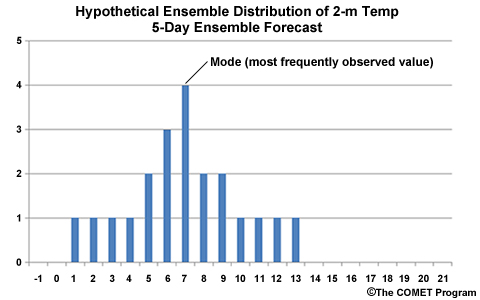
The correct answer is (c) 7°C. The mode is the category with the highest count, which is the four members at 7°C.
Suppose the same 21-member ensemble forecast at day 6 in Baltimore, MD has the temperature distribution in this graphic. In this plot, identify by letter, the mean, median, and mode.
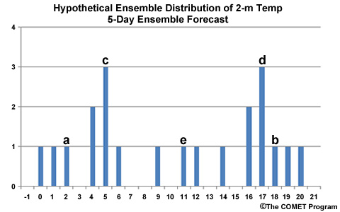
The correct answers are "e" for mean and median, and "c" and "d" for mode. Letter "a" is at the 3rd lowest ranked value and "b" is the 3rd highest ranked value, so both "a" and "b" are incorrect for all three cases. Letters "c" and "d" have the highest count in the distribution so both represent a mode of the distribution.