Ensembles Lessons
Table of Contents
Common Ensemble Products
Ensemble products reflect the breadth of data from all ensemble members. We typically show this breadth in one of two ways: (1) by showing a limited amount of data from each member (for example, spaghetti diagrams), or (2) by showing the results of a statistical analysis of all members (for example, mean and spread).
Mean and Spread
The most compact expression of the information in an ensemble forecast is the mean and standard deviation (or mean and spread) on forecast maps. While the graphic above is of 500-hPa geopotential height, many other meteorological variables lend themselves to this kind of display including, but not limited, to the following:
- Sea level pressure
- Air temperature
- Wind speed
- Geopotential height
- Specific or relative humidity
- Accumulated precipitation
- Stability parameters
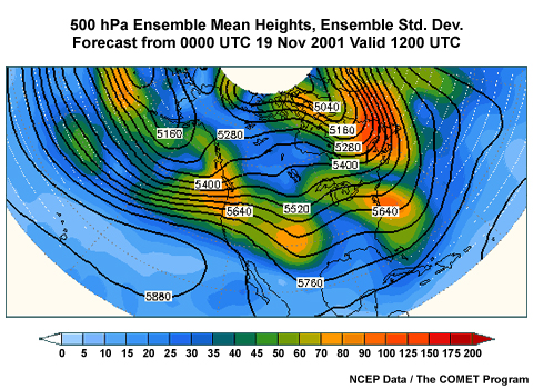
An example of how mean and spread convey compact information can be seen in this plot of 500 mb heights. Shading indicates the standard deviation, while contour values indicate the ensemble mean height, all in meters. Spread values are given by the color bar to the right.
Recall that the spread information on these maps assumes a normal or bell-shaped distribution for the ensemble data. Spread data for something like a bimodal distribution may not give meaningful results. The mean is not the most likely forecast outcome in these cases, so best forecast practice is to make adjustments based on the mode(s).
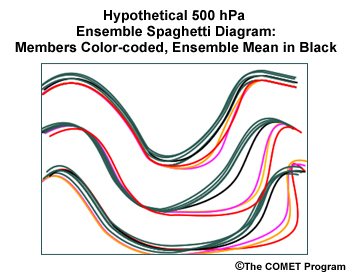
Spaghetti Diagrams
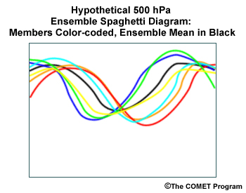
Spaghetti diagrams are maps of only one or two contour values for the variable of interest, but the forecaster can see all ensemble members for those contour values. How do we know which values give the most information? We can use the mean and spread diagrams to give us useful clues. Because we are interested in the probability of a forecast variable in regions in high uncertainty, it makes sense to examine spaghetti diagrams for contour values that cross the regions of maximum uncertainty!
Question
If you were forecasting for the eastern Unites States, which of the following would be the best contour for a spaghetti diagram? (Choose the best answer.)
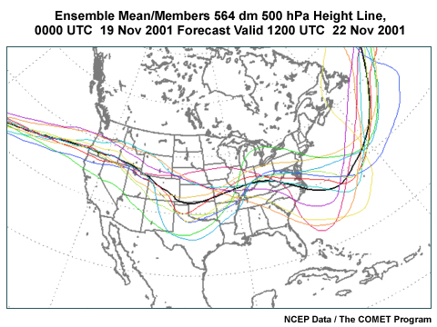
The correct answer is (c) 5640 m. This contour runs through areas with large spread located in the Midwest and East Coast. This is clearly seen in the large distances between the contours, and corresponds to the largest spread in the mean/spread diagram in these areas.
Interpretation of Mean/Spread
Mean and spread diagrams give more information than just an average forecast of weather. The location of maximum spread relative to the features in the mean can tell us why we have uncertainty.
Amplitude Uncertainty
Large spread near the middle of an ensemble mean feature means there is uncertainty in its amplitude.
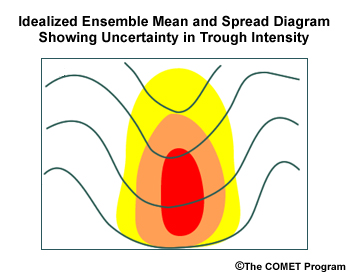
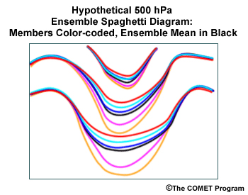
In this illustration, the shaded areas show that uncertainty is primarily in the center of the trough, as the accompanying spaghetti diagram illustrates. You should consider the existence of the trough likely, but have doubt that the mean has captured the probable intensity. If there were doubt about the feature's existence, the ensemble mean would likely show a small wave amplitude and heavy shading in that location, possibly indicating ensemble members with both ridges and troughs.
Location Uncertainty
Large spread up- and downstream of an ensemble mean feature indicates uncertainty in the location of the feature.
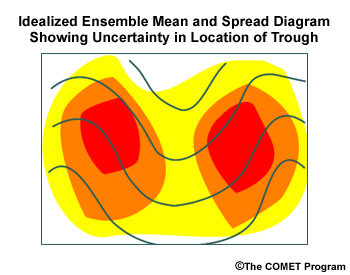
As shown in the illustration, if two areas of uncertainty flank a trough shown in the ensemble mean, it indicates that the ensemble forecasts diverge regarding timing and location of the trough. Once again, the existence of the feature is relatively certain. Note that in the spaghetti diagram, the biggest spread in the height contours is upstream and downstream from the ensemble mean forecast for the 500-hPa trough axis.
Clustering
Large asymmetric spread in relationship to an ensemble mean feature means a minority cluster of possible forecast solutions different from the ensemble mean.
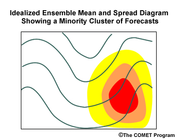
Such a situation is shown here, along with the corresponding spaghetti diagram. Note the cluster of forecasts (colored) with the deep short-wave trough downwind from the trough axis. This seems to be a feature unique to these ensemble members.
Combine Plots
As each of the above examples demonstrates, it is often useful to examine spaghetti diagrams to further understand mean and spread diagrams.
Probability of Exceedance
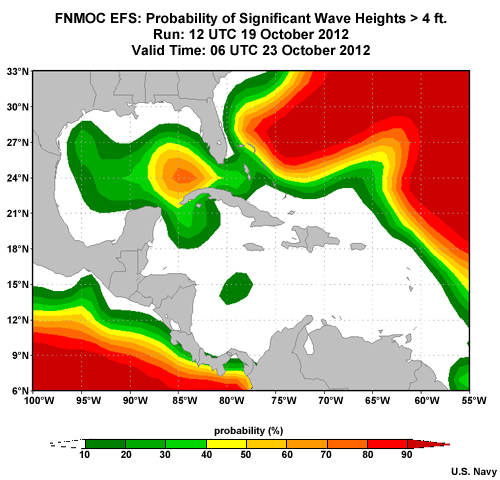
If you are interested in knowing whether wind will exceed ship limits, then a probability of exceedance plot will show a map of probabilities for a given limit at a given time. For example, this graphic shows the probability that significant wave height will exceed 4 feet for a 90-hour ensemble forecast. If the forecast for a given location is 75% and there are 20 ensemble members, then 15 of the 20 ensemble members show seas of 4 feet or greater at that time.
Probability of exceedance plots are typically used for sensible weather elements like temperature, precipitation, and wind speed. For marine applications, significant wave height is frequently viewed this way, as shown here.
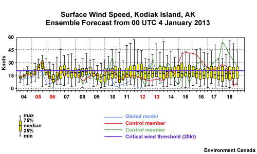
Box and Whiskers
Forecasters frequently use meteograms (or EPSgrams) to display weather elements for a single location, like an airport, over a forecast period. The box and whiskers diagram adds ensemble probabilities to the conventional meteogram. The whiskers show the full range of ensemble predictions. The box shows the range from the 25th to 75th percentile range. The horizontal black line inside the box shows the median of the data values. Here we see an example for a 15-day wind forecast for Kodiak Island, AK. The horizontal line spanning the diagram is the 20kt critical value from our ship routing case.