Produced by The COMET® Program
Section 1 Section 2 Section 3
introduction
The final section of the NAEFS webcast will look at NAEFS applications in two case examples. Then I’ll offer a summary of the full web cast.
Section 3 Outline
The final section of the NAEFS webcast will look at NAEFS applications in two case examples: a southern Plains case from August 2008 and a Northeast US case from February 2007. Then I’ll offer a summary of the full webcast.
Case Example 1: Heat Wave
The first example is a summer heat wave. The graphics are from NCEP’s Climate Prediction Center. Maximum temperatures and anomalies over the CONUS on 3 August are left to right in °F. A hot period in the south-central Plains of the CONUS peaked on 3 August, when temperatures exceeded 100°F over much of the central-to-southern Plains. These temperatures were greater than 10°F above normal. This case study will demonstrate use of NAEFS anomalies in the forecast.
The Big Picture
Here are observed 500-hPa heights over North America at 18 UTC on 3 August 2008, contoured at 60 meter intervals, which we’ll compare to the large-scale flow forecasts from NAEFS. We see a strong ridge in the central US bounded by troughs on both coasts, a pattern favorable for heat waves in the center of the country.
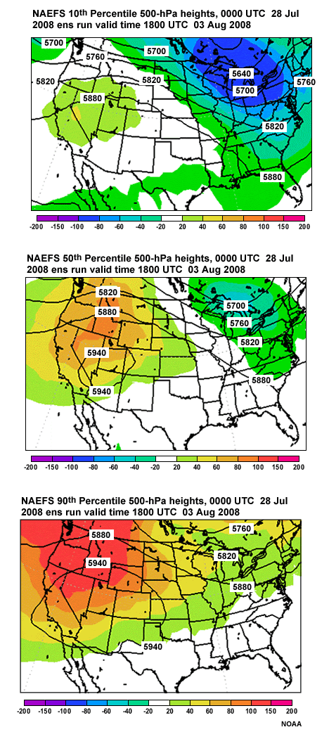
NAEFS: Day 7 500-hPa heights: %-iles
We’ll start seven days before 3 August 2008, the longest lead time for which WFOs are responsible.
At 7 days, we look at the large scale; for example, synoptic scale flow at 500-hPa, to obtain situational awareness of the potential for high-impact events in the medium range. We also want to visualize extremes for the flow regime.
These graphics of 10th (upper right), 50th (lower left), and 90th percentiles (lower right) contour the extreme and median flow patterns at 500-hPa, and shade the climate anomalies in meters. Answer the question on the next slide, based on these graphics.
Question 1
Question
Based on These Graphics of 500-hPA Heights Over the CONUS, which Statements below are
True?
(Choose the best answer.)
The correct answer is a) 500-hPa heights are near-to-above normal from Kansas to north Texas at all percentile levels.
At the 10th percentile, heights are near normal; at the 50th percentile, heights are up to 40m above normal; for the 90th percentile, heights are 20-60m above normal in the area from KS to TX.
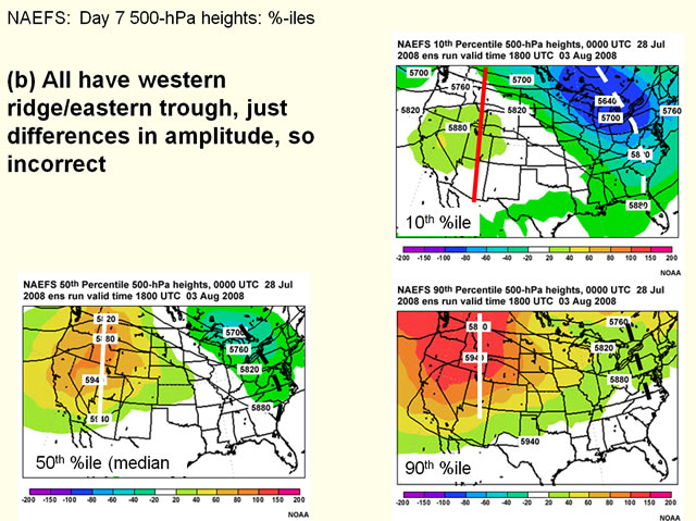
B is incorrect. All forecasts depict a western ridge and eastern trough, even though the amplitude varies.
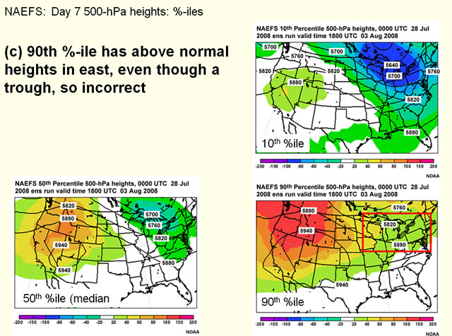
Regarding letter (c), the 90th percentile graphic, even with troughing near the Great Lakes region, has 500-hPa heights 20-40m *above* normal, so (c) is incorrect.
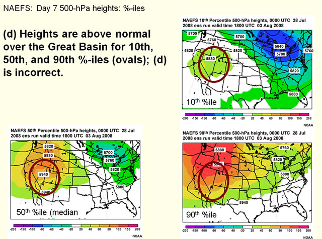
(d) is incorrect since over the Great Basin, even the 10th percentile has heights about 20 to 40m above normal.
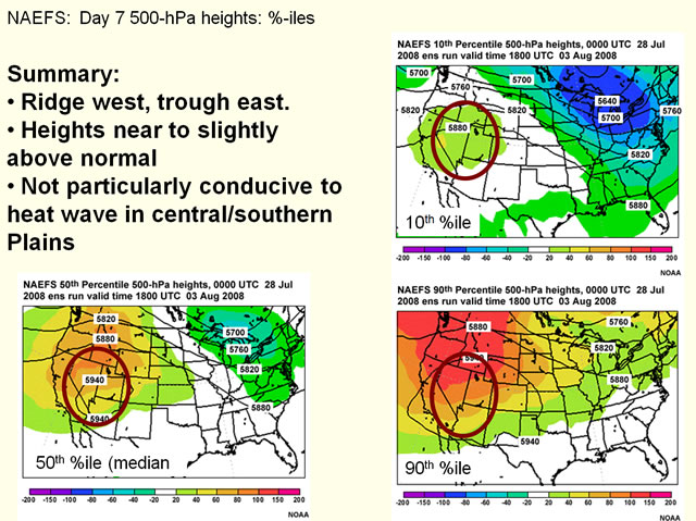
Great Plains heat waves usually involve a strong 500-hPa ridge over the highest temperatures. High heights indicate abnormal warmth from the surface to the mid-troposphere, with warm air aloft capping convection. With a western ridge, eastern trough, and 500-hPa heights only near to slightly above normal, the 28 July forecast isn’t favorable for unusually hot weather.
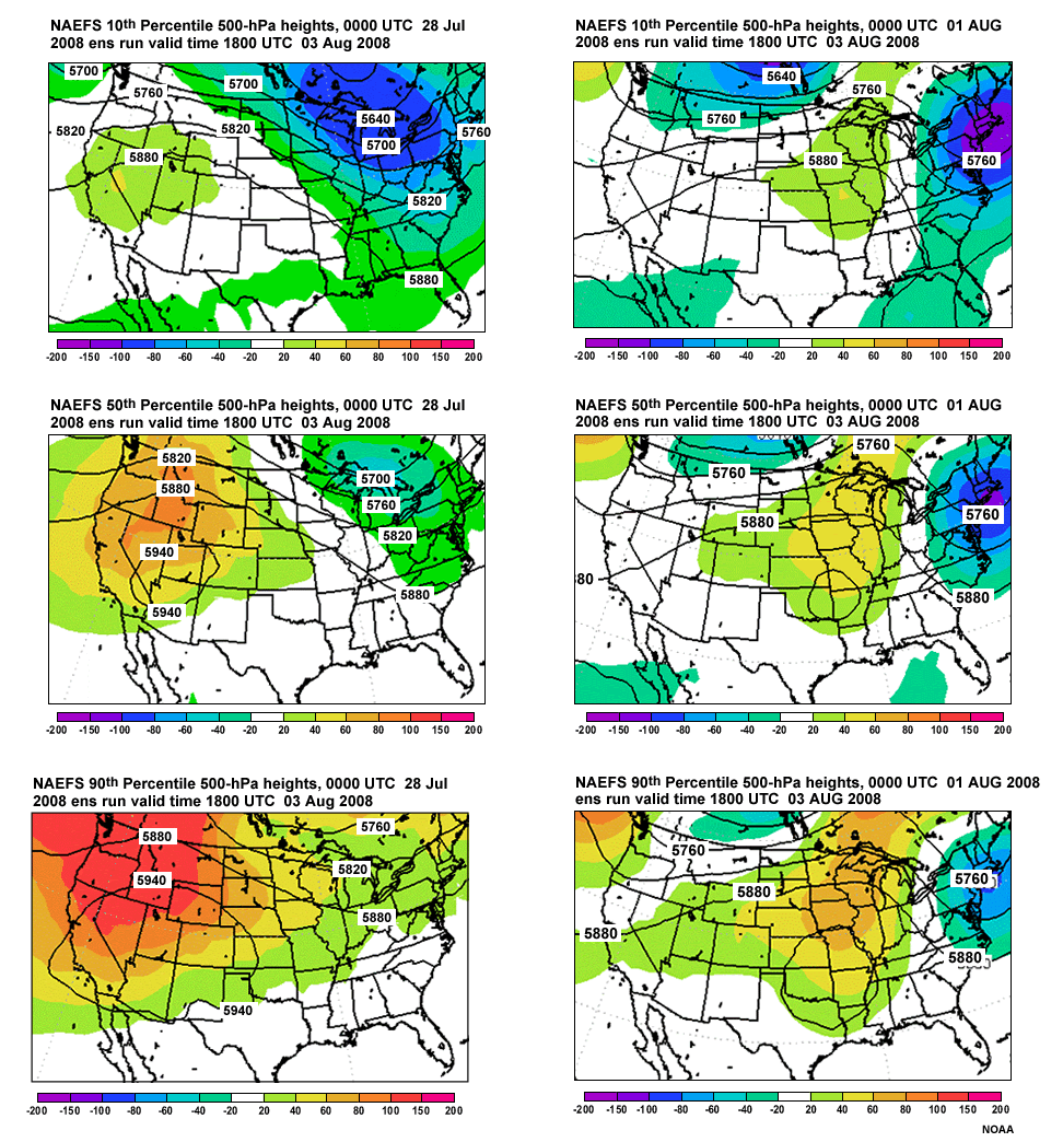
NAEFS: Day 3 500-hPa heights: %-iles
Now examine the 00 UTC 1 August run, with 10th, 50th, and 90th percentile graphics in the same locations. All forecasts are for 18 UTC 3 August 2008. Heights are contouring and coloring is the climate anomaly as indicated in the color bars.
Question 2
Question
Compared to the 00 UTC 28 July forecast for 500-hPa heights, what is different about
the 1 August forecast large-scale pattern?
(Choose all that apply.)
The correct answers are a) and c)
28 July forecasts for 18 UTC 3 August showed a western ridge/eastern US trough, with heights near normal over the Great Plains, while 1 August forecasts showed a ridge from the south-central Great Plains northeastward, so (a) is correct and (b) is incorrect.
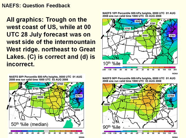
1 August forecasts show troughs over the west coast while on 28 July forecasts show the west coast just upstream of a ridge. So answer (c) is correct and answer (d) is incorrect. The eastward shift of ridge and trough was evident starting in 29 July forecasts.
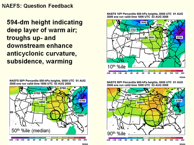
Note the closed 594-dm height contour in the median and 90th percentile over the south-central US, indicating deep warm air from 1000 to 500 hPa. Additionally, the up- and downstream troughs enhance anticyclonic curvature in the 500-hPa ridge, increasing large-scale subsidence and warming.
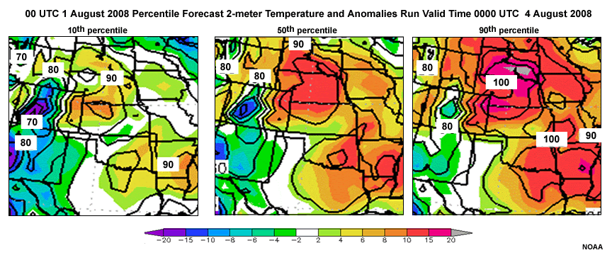
NAEFS: Day 3: 2-m Tmax %iles
Now, what do 2-m maximum temperature forecasts look like for the 6-hours ending 00 UTC 4 August?
From left to right, these are 1°x1° resolution graphics of the 10th, 50th, and 90th percentile forecasts for NAEFS 2-m maximum temperatures for the 6 hours ending 00 UTC 4 August 2008, in degrees F. Temperatures are contoured every 5 degrees, and anomalies are shaded as in the color bar below the graphics.
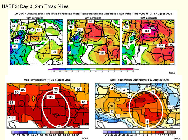
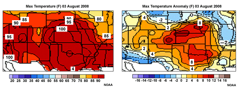
Now, we revisit observed CPC maximum temperature (left) and anomalies (right) for 3 August 2008. Recall that 100°F temperatures were common from KS to TX, with positive anomalies of 6-12°F.
Consider the forecasts versus observed 2-m temperatures and anomalies then continue to the question on the next slide.
Question 3
Question
Comparing Forecast versus Observed Anomalies and Temperatures, Which of the Following
are True?
(Choose all that apply.)
The correct answers are a) and c).
Of a) and b), a) is correct, since for a) anomalies are in the 2-10°F range, while for b) they are in the 6-15°F; verification was in the 6-12°F range.
Of c) and d), c) is correct, since d) had temperature forecasts mostly in the 90s, while c) has much of KS-TX exceeding 100°F.
More Verification/Forecast Comparison
The model temperature forecasts are too cool, but so is model climatology. Because the model analysis and not the station observations are used for bias correction, bias correction will not fix this kind of problem.
Model and observed temperatures respond similarly to the flow, however, so the forecast and observed anomalies are similar. As a result, a good deterministic forecast based on the NAEFS could use the most-likely, say median, anomaly forecast even if the temperatures are not well-forecast.
Example 1: Summary
In this case, we examined NAEFS in an August 2008 heat wave over the central to southern Plains.
For 500-hPa heights:
- At day 7 the heat wave wasn’t predicted in the NAEFS
- A pattern emerged later (central ridge, high heights) favoring well-above normal temperatures by day 3
Day 3 NAEFS 2-m temperature forecasts showed:
- Most of the area for the 10th, and all of the area for 50th and 90th %-ile was above normal
- While forecast temperatures were considerably lower than verification, the 50th or median percentile anomalies verified best.
Lessons applying generally:
- Know relationship between model climatology and station climatology. This will not be bias-corrected!
- Use the NAEFS anomalies rather than temperatures for station forecasts!
Case Example 2: Midwest/Northeastern US: February 2007 Storm
Our next example is from the cold season, and shows the advantage of adding the CMC ensemble to the NCEP ensemble in a winter weather case from February 2007. The bias-corrected files were unavailable for this case, unfortunately.
Snow (left) and Ice (right) 24-25 Feb 2007
Here are snow and ice plots for this storm, courtesy of the State College, PA WFO. On the left, we see 4-7” of snow fell in the DC area, part of an area of 4” or greater snows within the red contour. On the right, we see up to ¼” of glaze accumulated in parts of PA, WV, and MD.
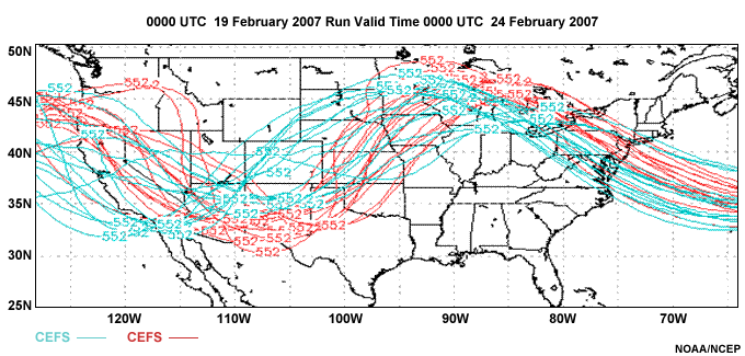
NAEFS run 00z19 Feb 2007 vt 00z 24 Feb 2007
Here are 6 day forecast spaghetti plots of 500-hPa 552-dm height contours from 00z 19 February 2007, valid 00z 24 February 2007. GEFS contours are red and CEFS contours blue. Combined, these represent NAEFS.
Question
Question
With Respect to CEFS, GEFS, and Combined (i.e. NAEFS) Forecasts, Which of the
Following are True?
(Choose all that apply.)
The correct answers are a) and c).
Let’s start upstream with the location of western US troughs at 500-hPa in the EFSs. Easternmost extent of GEFS members is the southern and central Plains, westernmost at the CA/AZ border. This extent is marked by a horizontal red double arrow. For CEFS members, the easternmost trough is found at the MO/KS border, westernmost off the south CA coast, marked with a blue double arrow. The NAEFS, combining both EFSs, has the same extent as the CEFS, considerably more spread out than the GEFS. So a) is correct and b) is incorrect.
Over the Great Lakes, extreme locations for the 500-hPa ridge in the GEFS and CEFS are marked with zigzag double arrows in red and blue, respectively. The CEFS extends farther east, to Lake Huron. Westernmost extent is over northern MN in the GEFS, but further west at the Dakotas/MN border in the CEFS. Therefore, answer c) is correct and d) is incorrect.
Let’s add verification. Verification was west of all GEFS members for the ridge and most GEFS members for the trough, but closer to the middle of the forecast distribution for the NAEFS.
Slower movement of the trough/ridge system indicated by some members of the CEFS implies the possibility of more low-level cold air getting locked in east of the Appalachians due to cold air damming.
How did this forecast evolve over the next 24 hours, and was it consistent with the last forecast?
NAEFS run 00z19 Feb 2007 vt 00z 25 Feb 2007
Here is the 996 hPa sea level pressure graphic at left and the 500-hPa 552-dm height graphic at right from the same run valid 00z 25 February 2007. At right, east- and west-most extent of CEFS ridgelines are marked with the blue zigzag double arrow, with highlighting of the eastmost and westmost members’ contours. The red GEFS ensemble forecasts are inside the CEFS envelope, as can be seen with the red zigzag double arrows and contour highlighting. The upstream CEFS troughs are located within the blue double arrow; the members at extreme locations highlighted. The GEFS trough axes are again mainly inside the CEFS forecast envelope. Verification of the 552-hPa contour (in dark green) for the ridge is near the middle of all NAEFS forecasts, though ridge curvature is sharper than most members; sharply curved ridges are difficult for NWP models to accurately predict. The upstream trough verification is within the NAEFS forecast envelope.
For the sea level diagram at left, GEFS contours are inside the CEFS, and CEFS forecast is more spread out. The verification for the 996-hPa contour is toward the middle of the NAEFS blue and red contour envelope, toward the west part of the GEFS contour envelope, and in the middle of the CEFS forecast envelope.
Note that the CEFS 500-hPa graphic shows *generally* tighter clustering of troughs near the verifying position than the GEFS, even though there are a few outliers beyond the westernmost GEFS members.
Example 2: Summary
To summarize, we used spaghetti plots of sea level pressure and 500-hPa heights for the NAEFS and its CEFS and GEFS components to examine longer-range, synoptic scale forecasts for a cold season winter weather events over the Midwest and Northeast. In the medium range, we saw the CEFS improve the solution in the NAEFS. This was because some members of the CEFS showed a farther west position for their upper air ridge axes, better-suggesting possible cold-air damming east of the Appalachians than the GEFS.
Even though the CEFS improved the ensemble forecast in this case, there are also times where the GEFS may improve the NAEFS over the CEFS.
Webcast Summary 1
Now let’s summarize the full webcast, ending with this section.
We defined an ensemble as a set of forecasts valid at the same time from different forecast models, different initial conditions, or both.
We stated the NAEFS is constructed from the U.S. Global Ensemble Forecast System (GEFS) and the Canadian Meteorological Center’s Ensemble Forecast System (CEFS). We showed the NAEFS performs better as an EFS because it has double the membership of either of the EFSs that comprise it, and it uses multiple models. This gives better ensemble mean forecasts, better relationships between ensemble spread and ensemble mean skill, and better probabilistic forecasts.
Webcast Summary 2
Now let’s summarize the full webcast, ending with this section.
We defined an ensemble as a set of forecasts valid at the same time from different forecast models, different initial conditions, or both.
We stated the NAEFS is constructed from the U.S. Global Ensemble Forecast System (GEFS) and the Canadian Meteorological Center’s Ensemble Forecast System (CEFS). We showed the NAEFS performs better as an EFS because it has double the membership of either of the EFSs that comprise it, and it uses multiple models. This gives better ensemble mean forecasts, better relationships between ensemble spread and ensemble mean skill, and better probabilistic forecasts.
Webcast Summary 3
Also in section 2, we discussed use and interpretation of these products. The 10th and 90th percentiles describe the distribution extremes; standard deviation or spread the amount of uncertainty; and mean, median, and mode the middle or most frequent forecast of the distribution. Anomalies for the 10th and 90th percentiles show the relationship of the full forecast distribution to climatology. We also showed where graphical products and raw and bias-corrected data files can be obtained.
Webcast Summary 4
Finally, in this third section, we showed two case examples. First, we examined forecasts of large scale flow and air temperature for a heat wave. Forecast upper-air patterns were conducive to a heat wave within six days of the event, but the model air temperatures were too low.
However, forecast anomalies from model climatology compared favorably to observed anomalies from station climatology. Thus, forecasters can apply NAEFS anomalies to station climatology in their forecasts.
From the cold season case, adding the CEFS to the GEFS improved the large-scale, medium-range forecast of significant winter weather event in the northeastern U.S. Snowfall looked more probable when the CEFS's members were added to the NAEFS, and a significant snowfall verified.
For More Information
For NAEFS on the web:
- At COMET, plesae see "Operational Models Encyclopedia" at the MetEd web site shown here:
https://www.meted.ucar.edu/training_module.php?id=1186 - At NCEP, NAEFS references are at links on the home page shown here:
https://www.emc.ncep.noaa.gov/gmb/ens/NAEFS/NAEFS-refs.html - Use the COMET NWP discussion forum to ask questions about or discuss the NAEFS. Join the
forum by going to the URL shown here:
https://www.meted.ucar.edu/nwp/newsgroups/index.htm
Thanks for your attention.
Next Steps
Congratulations!
You have completed Introduction to NAEFS: The North American Ensemble Forecast System.
Please remember to complete the quiz for this module. We would also like to invite you to take a moment to provide us with your comments and feedback by completing a brief user survey. The quiz and survey may both be accessed via the tabs along the top of the main window for this module.
For additional information on numerical weather prediction and other topics go to:
www.meted.ucar.edu
Note to NOAA/NWS users:
If you accessed this module through the NWS Learning Center, you must return to that system to
complete the quiz in order to receive credit for completion.