Produced by The COMET® Program
Section 1 Section 2 Section 3
The North American Ensemble Forecast System (NAEFS) and Its Products
The next section of the webcast discusses the products available from NAEFS.
Section 2 Outline
This section
- Lists bias-corrected products available from NAEFS
- Gives examples of NAEFS products on the web, including
- Maps of 2-m temperature products and anomalies
- EPS-grams for points in Canada, the US, and Mexico
- Ensemble mean and spread products
- Probability of exceedance products for critical sensible weather values
- Discusses caveats and cautions with regard to using NAEFS
New Bias-Corrected Products from NAEFS
GEFS and CEFS are separately bias-corrected with the most recent data given heaviest weight. Then, statistics for NAEFS are calculated. Bias-corrected statistics include:
- NAEFS ensemble mean, median and mode
- Standard deviation, 10th and 90th percentiles
- Anomalies for mean, median, mode, 10th, and 90th percentile.
Details on relevant calculations can be found in "Ensemble Forecasting Explained" or" Introduction to Ensemble Prediction" on the MetEd website.
While not the full probability distribution, these statistics give information about middle and extreme values for the NAEFS distribution, and its position relative to long-term model climatology.
Note: There will be a future webcast on bias correction of NWP data.
Bias-Corrected Data Available via FTP: NAEFS
This table lists bias-corrected variables available via FTP both for NAEFS statistics and individual ensemble members, including:
- Surface variables including zonal and meridional 10-m winds; sea level and surface pressures; and 6-hour maximum, minimum and instantaneous 2-m temperature and
- Upper level heights, wind components, and temperatures at 1000, 925, 850, 700, 500, 250, and 200 hPa.
NAEFS Bias-Corrected Products on the Web
North American Ensemble Forecast System Products Web Page:
https://www.emc.ncep.noaa.gov/gmb/ens/NAEFS/NAEFS-prods.html
This screen capture of the NCEP NAEFS, with its URL on top, has three links to graphical products. We’ll examine NCEP-generated NAEFS products first. Click in the red box if you want today’s products. Moving forward a slide …
NAEFS Products Web Page
We see a webpage linking to 10th, 50th, and 90th percentiles and climate anomalies for CEFS and GEFS 2-m temperature. Additional variables will become available soon. Note the 5th link in the topmost list for probabilistic quantitative precipitation forecast (PQPF) products for both ensemble systems. Again for today’s CEFS products, click in the red box.
Moving to the screen capture of the North American Region, CMC Bias-Corrected Ensemble Forecast webpage …
NAEFS Bias-Corrected 2-m Temperature Web Page
NAEFS Bias-Corrected 2-m Temperature Web Page:
https://www.emc.ncep.noaa.gov/gmb/yzhu/amap/camap_na.html
We find a table of links. Rows are ensemble forecasts from 00 UTC on the date in column 1, most recent first. Numbers to the right link to 10th, 50th, and 90th percentiles and anomalies for 2-m temperatures at indicated lead times. Let’s zoom into the run from 00 UTC 8 April 2008. Clicking the 120 hour forecast link (valid 00 UTC 13 April 2008).
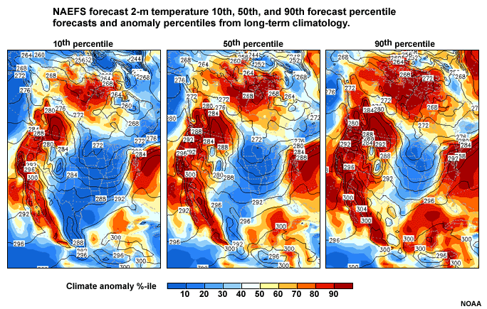
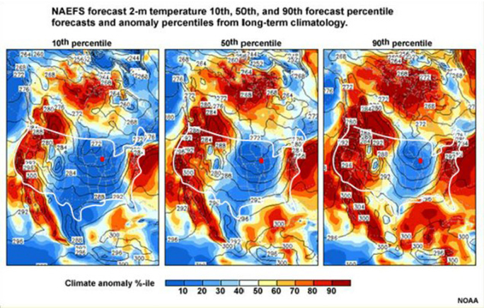
We see this graphic with 10th, 50th and 90th %-iles from left to right. I’ve outlined the continental US in white for ease of viewing. Contours represent forecast 2-m temperatures in Kelvins (K), with a 4 K contour interval. Note arrows pointing to labels for each panel’s 288 K contour.
Shading represents climate percentiles at 10% intervals, in Kelvins; values given by the color bar below the graphic. For example, forecasts in the middle (50th percentile) of the climate record fall where light blue shading transitions to light yellow. Half of the climate record falls above that level and half falls below.
Next, let’s look at a point of interest, say Chicago IL. Red dots represent Chicago’s approximate location. Now consider the question found on the next slide.
Questions
Question 1
Question 2
Question
What percentage of the ensemble distribution for 2-m temperature at
Chicago lies between 274.5K and 277K?
(Type your answer in the text box below.)
The answer is 80%.
The 10th percentile is at 274.5 and the 90th percentile is at 277 Kelvins, so 80% of the members lie between these two values! The 2.5 Kelvin range is 4.5 degrees Fahrenheit, which indicates pretty high certainty for a 5-day forecast of 2-m temperatures.
Now consider the climate percentiles for the 10th, 50th, and 90th forecast percentiles, and answer the next question.
Bias-Corrected Graphic Question
Question
What climate percentiles do the 10th, 50th, and 90th forecast
percentiles fall into?
(Select the best answer from the dropdown menu.)
Interestingly, the 10th, 50th and 90th percentiles of the forecast distribution all fall at or below the 10th climate percentile. Therefore, this forecast says there is a 90% probability that 2-m temperatures at 00 UTC 13 April 2008 will be in the coldest 10th of the climatology.
NAEFS Bias-Corrected Products on the Web
North American Ensemble Forecast System Products Web Page:
https://www.emc.ncep.noaa.gov/gmb/ens/NAEFS/NAEFS-prods.html
From the NCEP NAEFS page …there’s a link to the Meteorological Service of Canada (MSC) forecast graphics for NAEFS. If we click the link on the NAEFS/NCEP web page highlighted with a red rectangle …..
CMC NAEFS website
We get to CMC’s NAEFS website, with links to web pages for week two anomalies, “EPSgrams” for cities in Canada, Mexico, and U.S.A.., ensemble means and standard deviation charts, and probability of occurrence maps.
Clicking the EPSgrams link ….
EPS-grams Web page
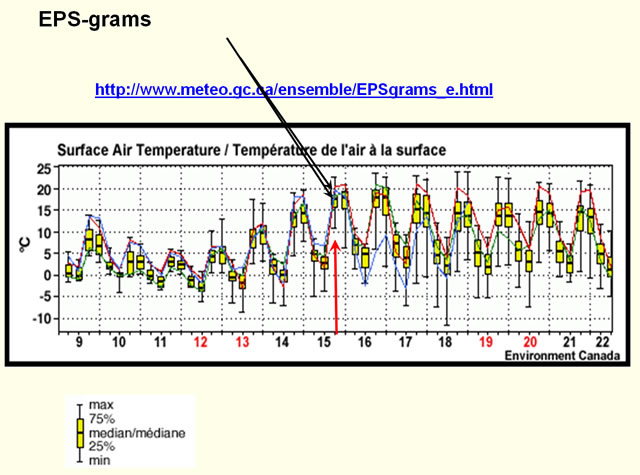
We find the EPSgrams webpage, URL shown. This annotated screen capture zoomed to the navigation part of the webpage shows pull down menus controlling what EPS-gram graphics are displayed below the navigation. Choices include Canada, Mexico, or the U.S.; NAEFS runs from the past 30 days chosen with the arrows left and right of the date, with a choice of 00 or 12 UTC runs; a choice of stations for each country (listed alphabetically and by station letters); and choice of three different graph types shown here. Choosing Denver CO, U.S.A., and the Temp-Precip-Wind-Cloud graph type, we get …
EPS-grams
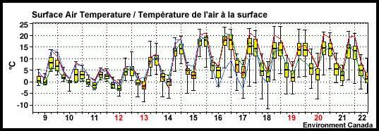
This graphic below the navigation on the webpage. The top panel shows the forecast for surface air temperature in °C, with the other three from top to bottom showing precipitation in mm, 10-m wind speed in km/h, and total cloud cover (in tenths), for the NAEFS ensemble run of 00 UTC 09 April 2008. While not shown, the second pull-down choice includes forecasts for 2-m RH, 500-hPa heights, 200-hPa wind speed, and mean sea level pressure; and the third shows the 1000-500 hPa thickness.
Each panel is a box and whiskers diagram. Each box and pair of whiskers are NAEFS forecasts starting at 6-hour lead time, then rightward at 6-hour intervals to 16 days, here 00 UTC 24 April 2008. The top and bottom of each yellow box represents the 75th and 25th percentiles of the forecast distribution at that forecast lead time, the horizontal line in each box gives the median, and the whiskers extending beyond the boxes are the highest and lowest forecast values. In addition to boxes and whiskers, blue, green, and red lines represent the operational Canadian GEM, GEFS control member, and CEFS control member forecasts, respectively.
To show use of box and whisker diagrams, we’ll examine surface air temperature, zoomed into on the next slide.
Questions on EPS-grams
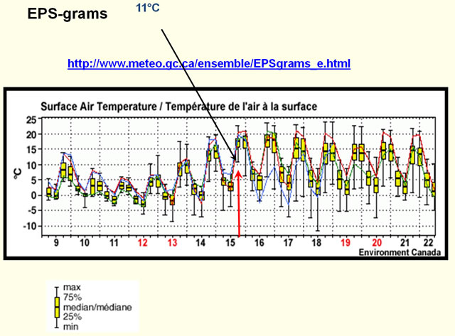
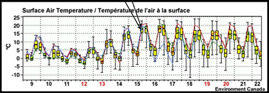
In box and whisker diagrams, each dashed vertical line from left to right marks 00 UTC of the date afterward on the x-axis, which I’ve highlighted with solid vertical lines for clarity. After 00 UTC on the graphic, the three boxes and whiskers are forecasts for 06, 12, and 18 UTC of that day. Arrows now point to these for the first forecast day. For 18 UTC 15 April 2008, we’d find the 00 UTC 15 April vertical line and move forward three box and whiskers. The new vertical bold arrow marks the spot.
Now that you’re oriented, advance to the next slide to answer a question about the diagram.
Advance to the next slide when ready.
Question 1
Question
Can you find the extreme high and low forecasts for Denver, CO for
18UTC 15th April 2008? The 25th and 70th percentile values? The median?
(Type your answer in the text boxes below.)
The extreme high forecast surface air temperature for 18 UTC 15 April 2008 for Denver, CO is about 23°C, the extreme low about 11°C, the 25th percentile about 15.5°C, the 75th percentile about 18°C, and the median or 50th percentile about 17.5°C.
EPSgrams for NAEFS Based on Ensemble and Deterministic
Forecasts:
https://weather.gc.ca/ensemble/naefs/EPSgrams_e.html
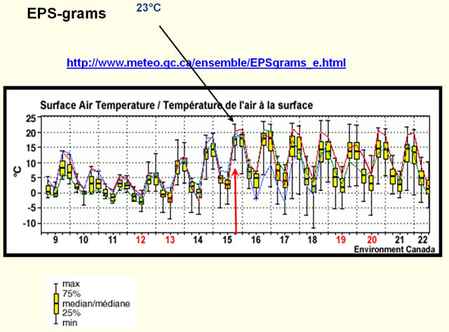


The extreme high forecast surface air temperature for 18 UTC 15 April 2008 for Denver, CO is about 23°C, the extreme low about 11°C, the 25th percentile about 15.5°C, the 75th percentile about 18°C, and the median or 50th percentile about 17.5°C.
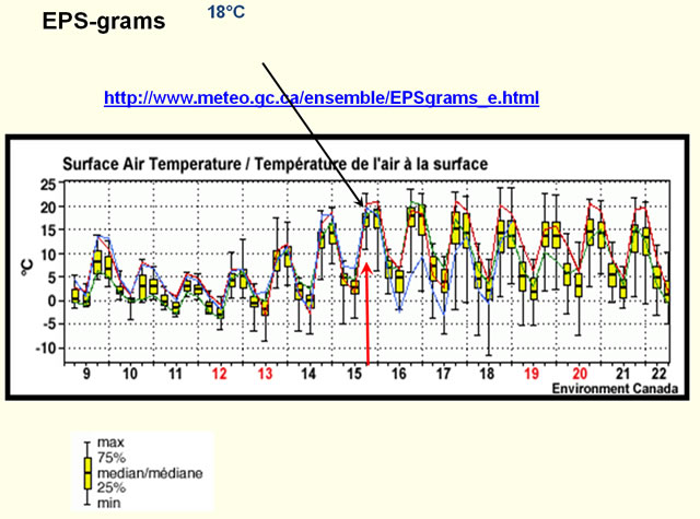
Now consider the 50th and 75th percentiles highlighted by the two remaining arrow and when ready, answer the question on the following slide.
Question 2
Question
What does the promiximity of the 75th and 50th percentiles indicate
about the distribution of forecasts?
(Type your answer in the text box below.)
EPSgrams for NAEFS Based on Ensemble and Deterministic
Forecasts:
https://weather.gc.ca/ensemble/naefs/EPSgrams_e.html
In this case, even though there is a 12°C forecast range at 18 UTC on 15 April 2008, about 11 members or ¼ of the forecasts have a surface air temperature within a half-degree of each other, at 17.5-18°C! With the median and 75th percentiles so close together, this indicates a cluster of forecasts in the 50th-75th percentile range In general, when the median is near one end of the box in a box and whisker diagram, forecasts are clustering around a small range of values between the median and that end of the box.
CMC NAEFS Website: Mean and Spread
tandard Deviation/Mean Charts for NAEFS
https://weather.gc.ca/ensemble/naefs/cartes_e.html
Going back to the CMC NAEFS website, if we click on the third link for mean and standard deviation charts.
We’ll find another webpage with selection menus for forecast issue or run date, starting hour of forecast cycle (00 or 12 UTC), forecast day (at 24 hour intervals after forecast issue date and time) and standard deviation and mean chart type, for variables including precipitation, surface wind speed, surface temperature, heights at 500-hPa, wind speed at 200-hPa, pressure at sea level, and thickness from 1000-500 hPa. Choosing surface temperature, 00 UTC 8 April 2008 forecast issue time and date, and forecast day of 13 April 2008, we obtain...
The 00 UTC 13 April NAEFS (both GEFS and CEFS) bias-adjusted surface air temperature standard deviation and mean forecast charts, with standard deviation in °C shaded per the color bar to the left, and mean contoured at 5°C intervals.
CMC NAEFS Website: Probability of Exceedance
Returning to the CMC NAEFS web page, click the last link, probability of exceedance of “several weather events”.
The linked page contains pull-down menus for temperature, wind, precipitation, and wind chill thresholds. You can choose the forecast issue date and time (00 or 12 UTC), forecast days to start and end with, and product type. Product types include probabilities of:
- Precipitation for any 24-hour period between start and end dates (at 00 or 12 UTC, depending on time chosen) exceeding
- 0.2, 2, 5, 10, and 25 mm
- Total precipitation between start and end dates exceeding
- 0.2, 2, 5, 10, 25, and 50 mm
- Surface wind speed in any 24 hour period from start to end date exceeding 15, 50, 90 km/hr
- Minimum temperature from start to end date below -5, -10, -15, and -30°C
- Maximum temperature from start to end date exceeding 0, 15, and 30°C
- Surface windchill from start to end date below -15, -30, -40, and -55°C
Probability of Exceedance Web page
Probability of Exceedance
NAEFS probability maps of weather events over time intervals:
https://weather.gc.ca/ensemble/naefs/produits_e.html
Here’s a graphical example from that page for the probability that surface temperature will be below 0°C for the 24-hour period ending 00 UTC 13 April 2008 (a 120-hour forecast from 00 UTC 8 April 2008). Probabilities are shaded at 10% intervals, with no shading less than 10% and saturated red at 100% probability of freezing temperatures.
NAEFS graphics convey information about forecast distributions in different ways. Forecasters should know the best tools for a given forecast problem. Keeping that in mind, answer the matching question on the following slide.
Question
Question
INSERT QUESTION TEXT HERE
The tool for best single (or deterministic) value for maximum temperature is the ensemble mean and standard deviation product. The mean removes unpredictable features through averaging, and the standard deviation assesses forecast uncertainty.
For risk of 90°F surface air temperature, a temperature probability of exceedance for the 90°F threshold is best, directly giving the percent of ensemble membership exceeding 90°F.
Need for a winter storm warning involves precipitation thresholds, so the QPF probability of exceedance map is useful.
Finally, minimum temperature range is best predicted by 10th, 50th, and 90th percentile map (using the 10th and 90th percentile panels). Standard deviation works well if the forecast distribution is bell-shaped; but this often isn’t the case.
Caveats and Cautions 1
NCEP public FTP site:
ftp://ftp.ncep.noaa.gov/pub/data/nccf/com/gens/prod
While NAEFS improves over GEFS because of increased model diversity and correction of ensemble mean bias, forecasters need to be aware of some caveats and cautions regarding NAEFS use:
- No NAEFS data beyond 10 of 20 GEFS unadjusted members are available in AWIPS.
However, you can get NAEFS data via FTP, through …
- The NCEP public FTP site at the URL shown here. Once here, you’ll see directories for the CEFS in cmce folders, GEFS in gefs folders, and NAEFS in naefs folders, by run date.
- Data is also available from the family of services FTP site.
Downloaded data can be used to create customized products for your local office.
Caveats and Cautions 2
Both data via FTP and graphics come in late because of the amount of time it takes to transfer CEFS files to NCEP and to compute bias correction and statistics. The following times are approximate.
For raw data on NCEP ftp server:
- Bias-corrected and anomaly data are available 7 hours after forecast run start time (e.g. 07 UTC for 00 UTC run)
- The downscaled National Digital Guidance Database files are available 8 hours or so after forecast run start time.
For the graphics on NCEP’s and Met. Service of Canada’s web pages
- 12 hours later on CMC and 8 hours later on NCEP web pages
Caveats and Cautions 3
NAEFS standard deviation and ensemble mean are best used for uncertainty and expected forecast value from about day 3 or so on. For days 1 to 3, use the NCEP Short-Range Ensemble Forecast (SREF) for uncertainty, and the operational GFS or SREF ensemble mean for expected value.
Because NAEFS has larger spread than GEFS or CEFS, it will GENERALLY give a better probabilistic forecast, but …GEFS or CEFS may perform better on any individual day. Now check your knowledge of the caveats and cautions regarding NAEFS by answering the question on the next slide.
Question
Question
Regarding NAEFS, which of the following statements are true?
(Choose the best answer.)
The correct answer is d) NAEFS can be downloaded locally to create customized products.
Such downloading allows the WFO the most flexibility in using NAEFS. a) is incorrect because data transfer takes at least 7 hours after the initial time of the run between the Canadian and US met centers. b) is incorrect because NAEFS with its coarser resolution is intended for medium rather than short-range forecasting. The SREF is better to use for uncertainty estimation for days 1-3. c) is incorrect
Section 2 Summary
Summary
To summarize this section, we stated that NAEFS bias-corrected products include
- Mean, median, mode
- Spread or standard deviation, 10th, 50th, and 90th percentiles
- Anomalies of each statistic other than spread from model climatology
Summary Continued
We showed some NAEFS products on NCEP and CMC web pages, including:
- The 10th, median, and 90th percentiles, which give the range of the forecast distribution from lowest and highest 10%, and the middle value;
- Box and whisker diagrams at a station, which give lowest, highest, 1st, 2nd or median, and 3rd quartiles of the forecast distribution;
- The standard deviation and ensemble mean plots, another way of showing the middle and range of the EFS distribution;
- Probability of exceedance plots, with the risk of exceeding certain precipitation, temperature, and wind speed thresholds over a user-chosen forecast period.
- We also pointed out that forecasters need to be thoughtful about which EFS tools are best for a given forecast problem.
- Finally, we stated that NAEFS will typically perform better than the GEFS and CEFS and better than deterministic forecasts after day 3.
You’ve now completed section two of the introduction to the NAEFS. For some more case examples, move on to section 3.