1.0 Using Satellite Tools for Surface Flooding
1.0 Using Satellite Tools for Surface Flooding » 1.1 Motivation
Flooding is one of the deadliest and costliest weather phenomena in the United States and around the world.
Question
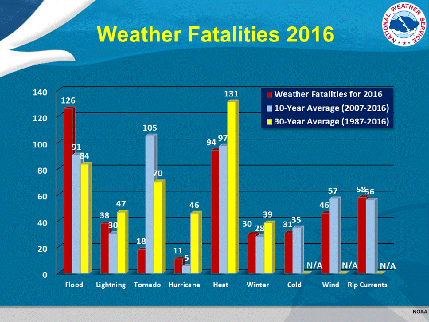
What do these bar graphs show regarding flood-related fatalities in the United States?
The correct answers are shown above.
Floods were the deadliest of the listed phenomena in 2016, and the second deadliest (behind heat waves) for the 30-year period of 1987-2016.
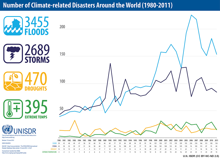
Worldwide the number of flood disasters increased more than threefold between 1980 and 2011, and the number of flood disasters outpaces storms, droughts, and extreme temperature.
Recent developments in satellite data provide real-time tools for flood detection and mapping using visible, infrared (IR), and composite high-resolution data. Satellite data are making it possible to provide detailed flood analyses and forecast tools in both developed and underdeveloped regions.
1.0 Using Satellite Tools for Surface Flooding » 1.2 Hurricane Harvey Flood Case
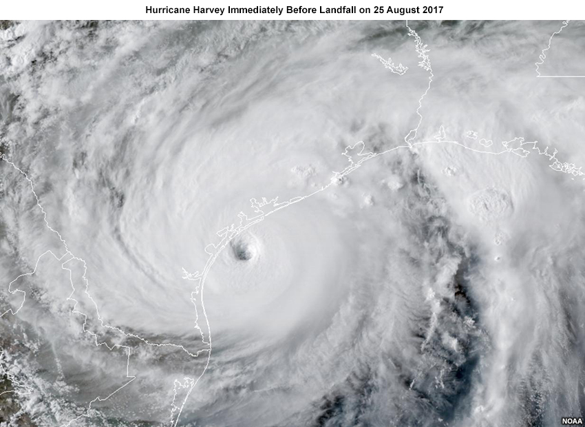
Hurricane Harvey made landfall along the Gulf Coast of Texas on 25 August 2017 in the early evening (local time). Excessive rainfall associated with Hurricane Harvey and its remnants triggered historic flooding along the Texas Gulf of Mexico Coast from 26 August through 1 September 2017.
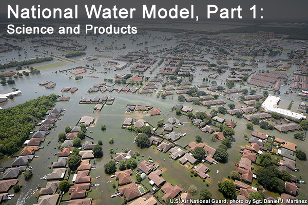
A recent COMET lesson, National Water Model, Part 1: Science and Products, reviews the Hurricane Harvey event. Unprecedented storm total rainfall exceeded 60 inches (1500 mm) in areas near Houston. Nine out of 19 stream gauges in Harris County, Texas, set new streamflow records.
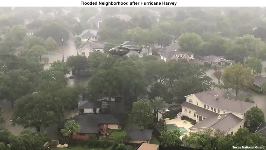
The floods caused > $125 billion in damages, killed 106 people in the United States, and forced the displacement of 40,000 people. There were hundreds of thousands of homes that suffered at least some flood damage along with over a half-million cars.
In this lesson we will look at satellite guidance of surface flooding generated during the Hurricane Harvey deluge.
1.0 Using Satellite Tools for Surface Flooding » 1.3 Satellite-based Flood Maps, Hurricane Harvey
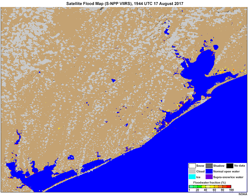
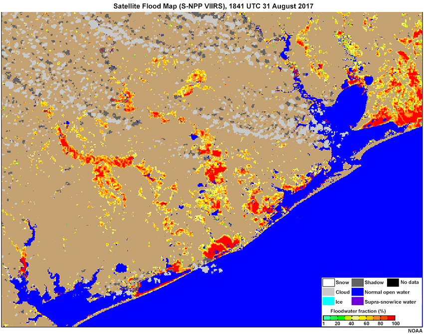
Use the slider below to view a satellite-derived flood map for the Gulf Coast of Texas before and after the extreme rainfall associated with Hurricane Harvey. The satellite data are from the Suomi National Polar-orbiting Partnership (S-NPP) Visible Infrared Imaging Radiometer Suite (VIIRS).
Question
Without knowing much about these maps, what can you see from this example?
The correct answers are a, b, d.
Areas of surface flooding resulting from the storm are highlighted with this satellite-derived flood map. The product does distinguish between permanent water bodies (seen in blue) and flooded surfaces, but clouds do obscure the surface. When used with overlays (such as stream gauge locations, rivers, roads, basin boundaries, reservoirs, urban areas, etc.) the products can have important diagnostic, forecasting, and decision-making uses.
1.0 Using Satellite Tools for Surface Flooding » 1.4 Satellite Data and Uses
Who are the users of these flood maps and why are these data important to them?
|
Users |
Roles during a flood |
Satellite data that are needed during a flood |
|
NWS/River Forecast Centers |
Flood forecasting, investigation and water management |
Near-real-time flood extent, river/lake ice cover, flood water surface level, flood water depth |
|
Federal Emergency Management Agency (FEMA) |
Flood mitigation, preparedness, response, recovery, education, and references |
Near-real-time flood maps |
|
US Army Corps of Engineers (USACE) |
Flood investigation, mitigation and water management |
Near-real-time flood maps |
|
WMO’s International Charter on Disaster |
Satellite data/products sharing with disaster management authorities in a country where flood occurs |
Near-real-time flood maps |
|
U.S. Agency for International Development (USAID) and U.S. Department of Agriculture (USDA) |
Flood mitigation and loss assessment |
Near-real-time flood maps |
|
Model developers and researchers |
Model validation etc. |
Flood extent datasets |
Table courtesy of NOAA
This table shows that the satellite flood maps are used for analyses, diagnostics, forecasting, and verification. The National Oceanic and Atmospheric Administration’s National Weather Service (NOAA/NWS) uses these data for real time forecasts and forecast updates, flood maps and flood extent. The Federal Emergency Management Agency (FEMA) and the U.S. Army Corps of Engineers (USACE) use satellite flood map guidance regularly. WMO’s Charter on Disasters shares these flood maps with disaster management authorities in the international community for flood emergency response. Other potential users include USAID and USDA for flood mitigation and loss assessment.
1.0 Using Satellite Tools for Surface Flooding » 1.5 Suggested Prerequisite Lessons
This lesson assumes familiarity with the basic products from the GOES-16 and S-NPP satellite platforms. The VIIRS instrument aboard S-NPP also flies aboard the Joint Polar Orbiting Satellite System (JPSS) spacecraft, including JPSS-1 (now NOAA-20). If you need a refresher on these products, you can refer to the following COMET lessons:
SatFC-J: The VIIRS Imager
https://www.meted.ucar.edu/training_module.php?id=1309
GOES-R Series Faculty Virtual Course: Advanced Baseline Imager
https://www.meted.ucar.edu/training_module.php?id=1325
GOES-R Series Faculty Virtual Course: Multispectral RGB Composites
https://www.meted.ucar.edu/training_module.php?id=1380
You can also review the full
Satellite Foundational Course for GOES-R (SatFC-G)
http://rammb.cira.colostate.edu/training/shymet/satfc-g_intro.asp
For details about S-NPP and JPSS data available with the Community Satellite Processing package (CSPP), see:
Operational Environmental Monitoring Applications using the Community Satellite Processing Package (CSPP)
https://www.meted.ucar.edu/training_module.php?id=1321
A recent COMET publication explores the use of imagery from S-NPP and JPSS VIIRS to monitor river ice and the flooding associated with ice jams.
JPSS River Ice and Flood Products
Finally, for a table of common acronyms, click acronyms in this lesson.
2.0 Satellite Data Used in Flood Maps
The following subsections will explore the satellite data that are used to produce the flood map. These data can be used on their own for examining surface flooding. The data include
- the False Color Red Green Blue (RGB) composite, or Day Land Cloud RGB
- the 0.86𝞵m near infrared (veggie) band, and
- the 1.6𝞵m near infrared (snow/ice) band.
2.0 Satellite Data Used in Flood Maps » 2.1 False Color RGB Composite
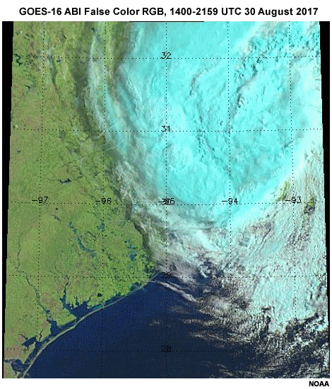
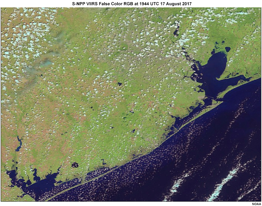
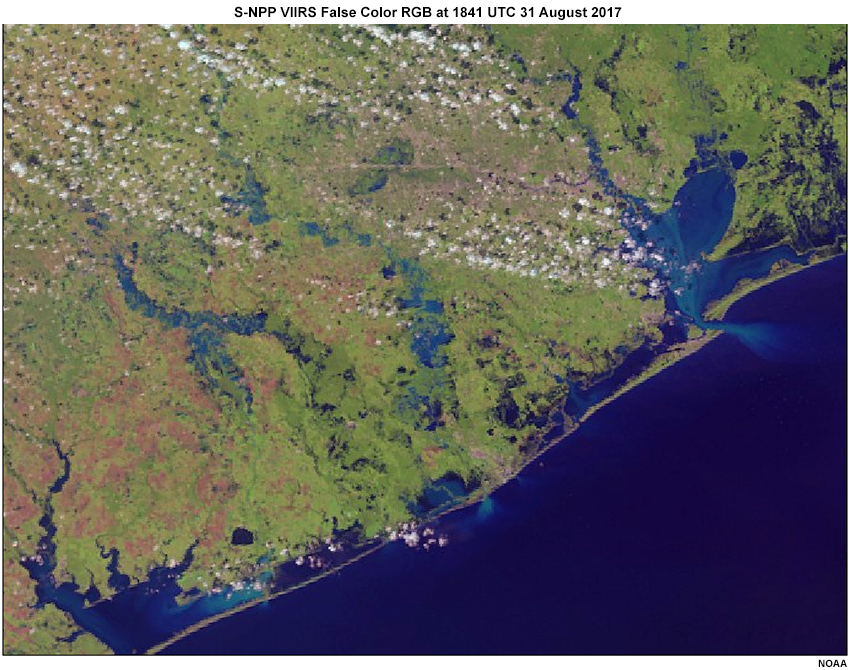
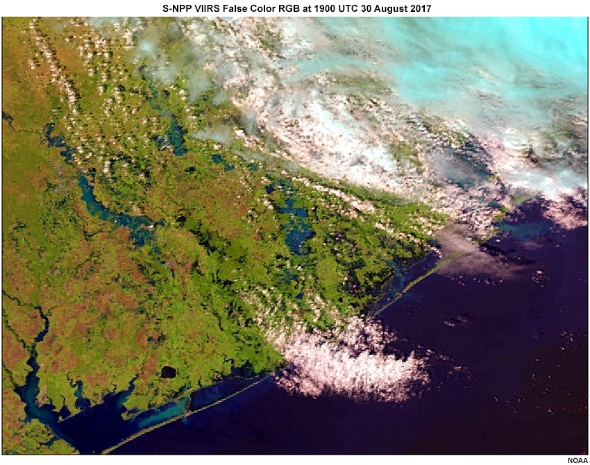
The false color RGB composite (or Day Land Cloud RGB) is useful for detecting and monitoring surface flooding. In this animation from 1400-2159 UTC on 30 August 2017 the dark blue shows surfaces that are mainly water, while unflooded land is green and brown and clouds appear white or light blue. You can see cloud shadows as well.
2.0 Satellite Data Used in Flood Maps » 2.1 False Color RGB Composite » 2.1.1 RGB False Color: Pre- and Post-Harvey
The following slider shows the false color RGB imagery of the upper Gulf Coast region of Texas before and after rainfall associated with the passage of Hurricane Harvey.
Question
Use the before and after comparison of the false color RGB composite image and the still of the false color RGB (with rivers and basins) after Harvey to answer true or false to each statement about the after-Harvey images.
The correct answers are shown above.
The false color RGB composite images show that there are swollen rivers, pooled water, and flooded landscapes following the storm. In this case there is even indication of sediment being washed into the bays and estuaries, as seen by the lighter blue shades. Floodwater depth is not depicted.
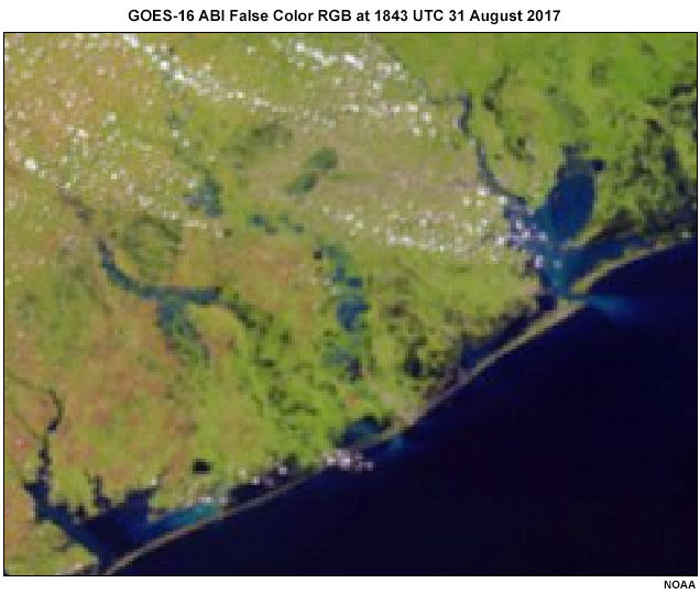
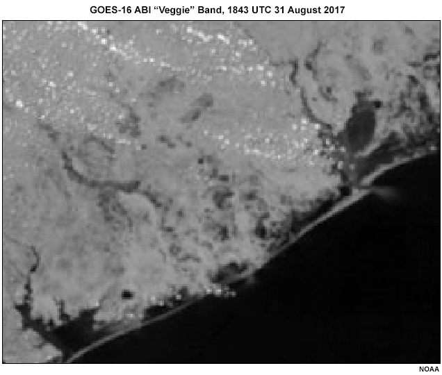
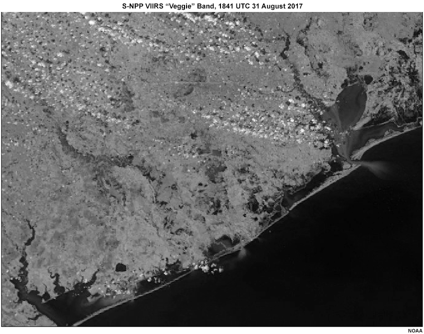
2.0 Satellite Data Used in Flood Maps » 2.1 False Color RGB Composite » 2.1.2 GOES-16 versus S-NPP
Use the tabs to compare the post-Harvey false color RGB images from GOES-16 ABI versus the S-NPP VIIRS.
Question
Which has finer spatial resolution of surface features?
The correct answer is a.
The S-NPP/VIIRS data has greater spatial resolution than GOES-16/ABI (375 m vs 1 km) and will therefore be better at detecting small scale flooding features when using a snapshot in time.
As the remnants of Hurricane Harvey moved away on 30 August 2017, satellite products that require cloud-free conditions during daytime hours were able to provide information about the rain-soaked surface. Use the tabs to see the S-NPP/VIIRS versus the GOES-16/ABI (somewhat larger area). Keep in mind that S-NPP VIIRS data is only available at one time during daylight hours in this location.
S-NPP VIIRS Snapshot
GOES-16 ABI Loop
Question
Complete the statements regarding GOES-16 ABI when compared with S-NPP VIIRS.
The correct answers are shown above.
GOES-16 offers much better temporal resolution, allowing it to sample during cloud-free periods and represent the time evolution of flooding more easily. The GOES-16 ABI is available every 5 minutes in the CONUS, and 15 minutes in the full disk, except every 30 seconds to 1 minute if mesoscale sectors are used over the area of interest. The S-NPP VIIRS is available only twice per day in mid latitudes.
2.0 Satellite Data Used in Flood Maps » 2.1 False Color RGB Composite » 2.1.3 Features Seen with the RGB False Color Composite
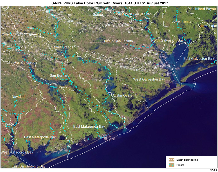
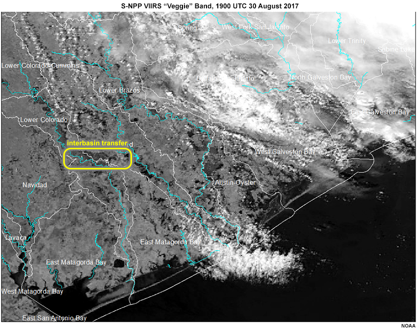
Question
In this S-NPP VIIRS false color RGB image with rivers and basin boundaries from 30 August 2017, there are areas of floodplain inundation and water flowing from one drainage basin to another (interbasin transfer).
Use the yellow pen to mark an area where interbasin transfer (water flowing from one basin to another) may be occurring. Use the purple pen to mark some areas where overbank flow or floodplain storage appears to be occurring.
There are several areas of interbasin transfer, where water from one basin is flowing into a neighboring basin. The most obvious on the image are shown in yellow. There are also a number of rivers that are experiencing overbank flow and flooding of the floodplain. The graphic shows some of these.
The following slider shows two False Color RGB composites one day apart.
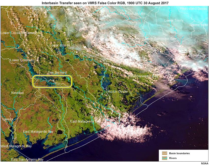
Note how the satellite shows the area of water across the basin boundary (yellow box) increases from 30 August to 31 August.
2.0 Satellite Data Used in Flood Maps » 2.1 False Color RGB Composite » 2.1.4 Local Short-term Forecast Concerns
Question

How can areas of water pooling behind barriers (orange oval) and interbasin transfer (yellow box) impact short range forecasts?
The correct answers are shown above.
Monitoring the pooling and movement of surface water during a major flood can have important impacts on real time forecasting. The orange oval on the map shows the Addicks and Barker flood control reservoirs following Hurricane Harvey. Numerous properties in and upstream of these reservoirs were flooded when the normally-dry reservoirs filled. Rapid reservoir releases and the risk of embankment failure on the downstream face of the reservoirs presented flooding risks to downstream areas along Buffalo Bayou for many days following the storm.
Interbasin transfer can have major consequences on both the river that is losing the volume, and the one that is gaining it.
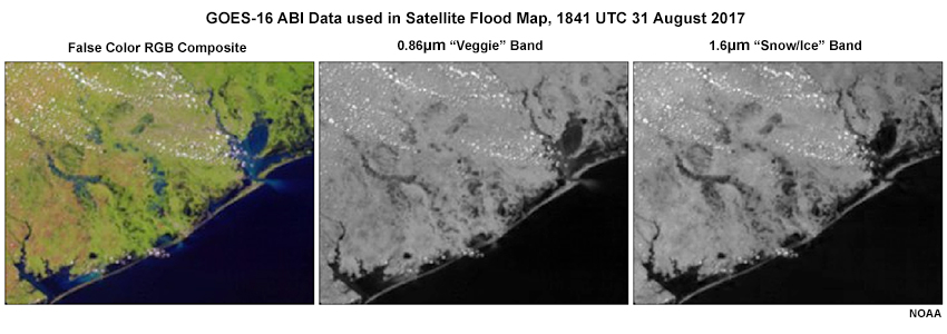
2.0 Satellite Data Used in Flood Maps » 2.2 Two Single Bands (“Veggie” and “Snow/ice”)
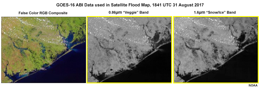
The two single bands used in the flood maps are highlighted in yellow. The 0.86𝜇m near-infrared band is particularly sensitive to reflected sunlight from green plants, and is thus referred to as the “veggie” band. It also has low reflectance for surface water which makes those areas appear dark.
The 1.6𝜇m near-infrared band is sometimes referred to as the “snow/ice” band because its low reflectance for snow allows discrimination between snow, ice, and clouds. It can also highlight surface water due to its lower reflectance for water versus unsaturated land.
2.0 Satellite Data Used in Flood Maps » 2.2 Two Single Bands (“Veggie” and “Snow/ice”) » 2.2.1 Compare Visible, Veggie, and Snow/Ice Bands
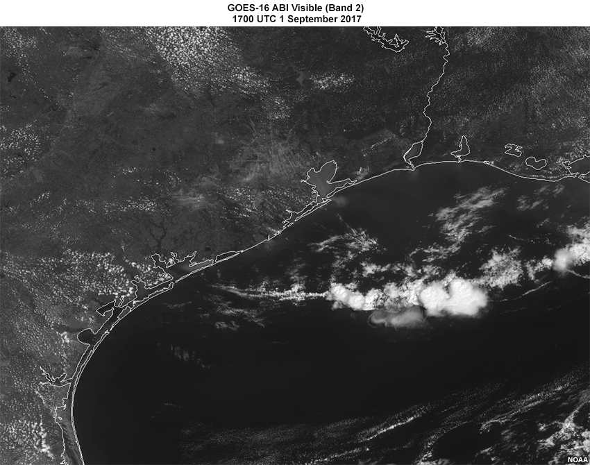
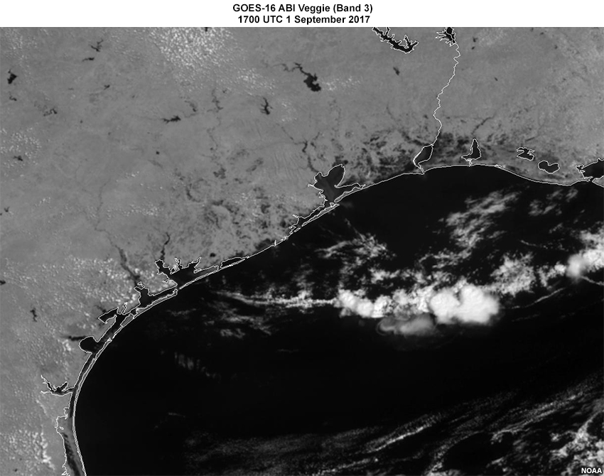
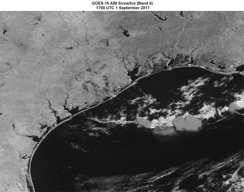
Use the tabs below to view the differences between the visible band, the veggie (0.86𝜇m) band, and the (1.6𝜇m) snow/ice band. All three images are from 1700 UTC on 1 September 2017 when there was a large amount of surface flooding present.
Visible
Veggie (0.86𝜇m)
Snow/Ice (1.6𝜇m)
Question
Using the comparison of the GOES-16 ABI visible, veggie, and snow/ice band images shown above, fill in these statements.
The correct answers are shown above.
The GOES-16 ABI 0.86𝜇m (veggie) and the 1.6𝜇m (snow/ice) show greater contrast between land and surface water than the visible. This makes these two near-IR bands useful for detection of surface flooding. The visible band is a little better at highlighting clouds over land areas than either the veggie or the snow/ice band. The visible, veggie, and snow/ice bands require clear skies and daylight to view the surface.
2.0 Satellite Data Used in Flood Maps » 2.2 Two Single Bands (“Veggie” and “Snow/ice”) » 2.2.2 Flood Features on the Veggie Band
Water has a much lower reflectance in the veggie and snow/ice bands which makes those bands useful for distinguishing water from dry land. But flooded areas often contain vegetation and suspended sediments. Thus, flood water is a little more reflective than pure water.
Question
Choose the correct letter to match the statement.
The correct answers are shown above.
Water with little or no vegetation or sediment appears nearly black in the veggie and snow/ice bands. Water with vegetation, mud, and sediment is also dark, but not as dark as pure water. In this image, non-flooded surfaces are a lighter gray.
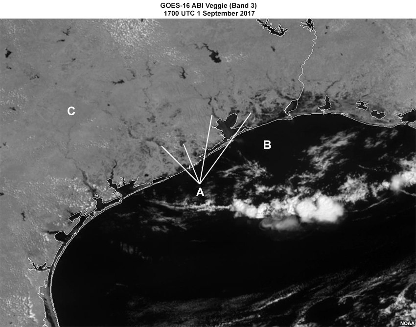
Question
Let’s look at one of the first GOES-16 veggie band images as the clouds moved away. On this regional-scale 1-km imagery the dark gray speckled areas typically show surface flooding.
Use the blue pen to mark the areas that appear to have a large amount of surface flooding.
In the image the darkest areas are surface water such as permanent lakes and reservoirs, and the Gulf of Mexico along with its bays. There are other dark areas that are not as black as the permanent water bodies. These show inundated areas that are normally not water, so there is a mix of water, vegetation, and mud or suspended sediments.
2.0 Satellite Data Used in Flood Maps » 2.2 Two Single Bands (“Veggie” and “Snow/ice”) » 2.2.3 GOES-16 Versus S-NPP
Use the tabs to compare the veggie band from GOES-16 ABI versus S-NPP VIIRS.
As we saw with the false color RGB imagery, S-NPP/JPSS VIIRS data have greater spatial resolution. But like the false color RGB, there is greater temporal resolution with GOES-16 ABI. Through direct broadcast capabilities and publicly available community software, S-NPP/JPSS data, including some flood map images, are available in near-real-time following the satellite overpass.
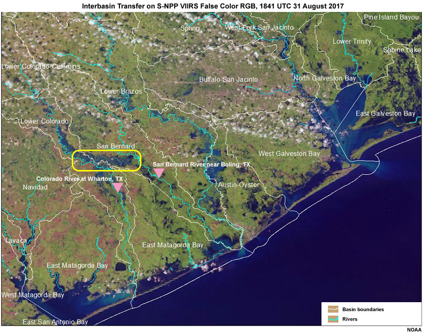
Use the tabs to examine the time change as seen by S-NPP versus GOES-16. We will focus on the interbasin transfer from the Colorado River to the San Bernard River that we looked at earlier.
S-NPP VIIRS 30 August 2017
GOES-16 ABI 1615-2030 UTC 30 August 2017
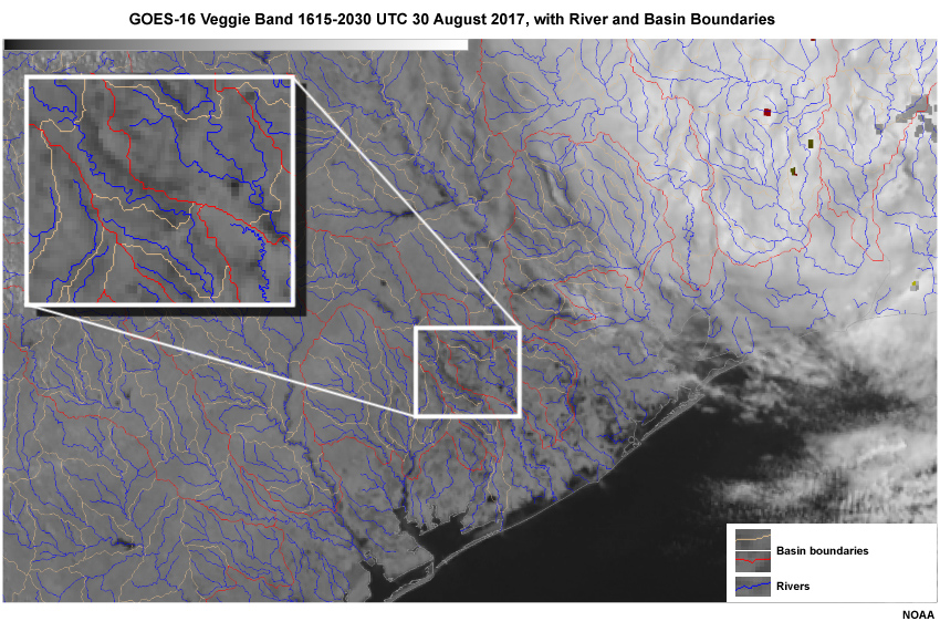
Question
Complete the following statements by selecting the best answer to fill in the blank.
GOES-16 provides more details about the time evolution of the advancing flood wave between the Colorado and San Bernard basins. This information is useful for both analyses and short-term forecasts. Although it is more of a snapshot in time, the greater spatial resolution of the S-NPP VIIRS data is useful in some situations for analyses and short-term forecasts. To further support these short-term forecast needs, the high-resolution S-NPP and other polar-orbiter data can be available very soon after the satellite overpass.
2.0 Satellite Data Used in Flood Maps » 2.2 Two Single Bands (“Veggie” and “Snow/ice”) » 2.2.4 Impact on Forecast Hydrographs
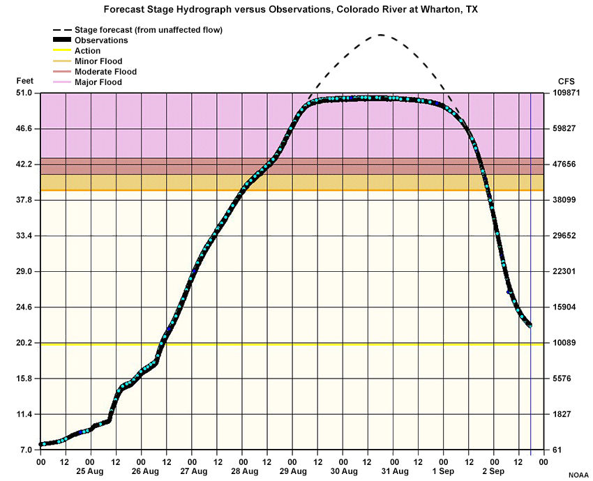
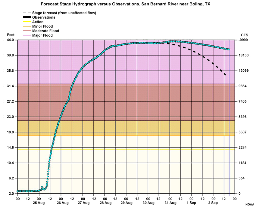
Use the tabs to look at hydrographs for the Colorado River at Wharton and the San Bernard River near Boling. The river gauge locations are marked by the pink icons on the map and are downstream from the area of interbasin transfer outlined in yellow.
River Gauge Points
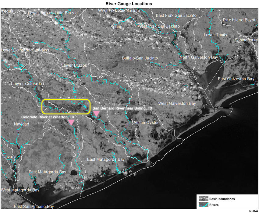
Colorado River at Wharton
San Bernard River near Boling
Question
Which of these rivers appears to be gaining volume from a neighboring basin?
The correct answer is b.
The Colorado River basin above Wharton, Texas, was losing volume to a neighboring basin and the impact can be seen in the flattening of the hydrograph compared to the forecast hydrograph (dashed) had the flow volume not been affected by overbank losses. The San Bernard River near Boling, Texas, received extra volume from the Colorado River basin, and its observed hydrograph showed more volume in the form of a slower recession than what was forecast. Detecting the transfer of volume from one basin to another is needed to improve the short range forecasts.
2.0 Satellite Data Used in Flood Maps » 2.2 Two Single Bands (“Veggie” and “Snow/ice”) » 2.2.5 Near IR Band Limitations
Study this GOES-16 animation of the 0.86𝞵m (band 3, the “veggie” band) on 30 August 2017. The rotating cloud shield on the right is the remnants of Hurricane Harvey. Are there clouds shadows that you can see on the surface?
Question
Can you see cloud shadows on the surface?
The correct answer is a.
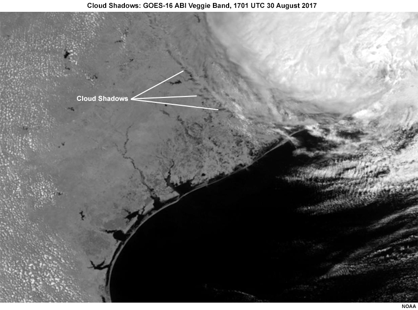
The edge of the cloud shield is casting shadows on the surface as shown. This image is near the middle of the solar day, so keep in mind that the shadows could be larger than the ones shown here.
Question
Do you think the cloud shadows might have an impact on detection of surface flooding?
The correct answer is c.
The cloud shadows appear darker (less surface reflectance) and thus appear similar to flooded surfaces. This can cause dry areas to be categorized as flooded.
Software within the data processing has been implemented to minimize the adverse effects of cloud shadows in both the veggie and snow/ice bands. A similar problem occurs with terrain shadows in areas with rugged terrain and that too has been minimized in the data processing.
3.0 Satellite Flood Maps
Now that we have reviewed the satellite data that are useful for distinguishing water from land, this section will look at the flood map that is derived using those satellite data.
3.0 Satellite Flood Maps » 3.1 GOES-16 Flood Map
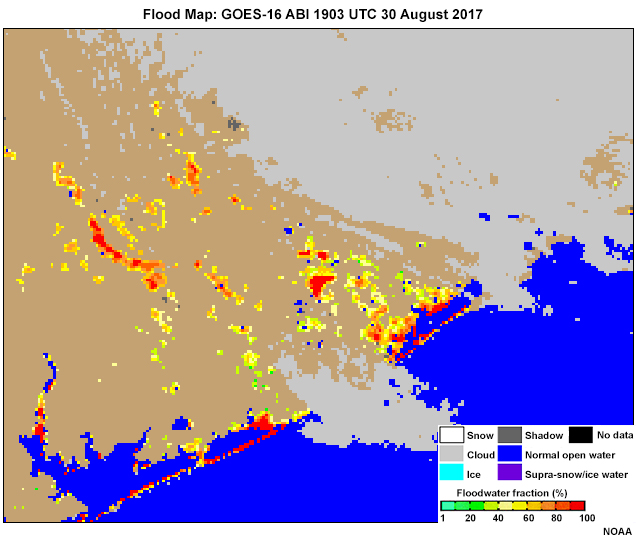
Using the two single bands and the RGB composite shown in the previous section, a flood water fraction is derived for each 1-km pixel of the GOES-16 ABI imagery, and each 375-m pixel of the S-NPP VIIRS imagery. Water fraction is the percent of open water in each pixel. The red and orange areas of this image based on GOES-16 show image pixels with between 60 and 100 percent of the surface coverage by water. Geographic information is used to identify permanent water bodies, seen in blue.
Question
Which of the following may be limitations in detection of surface flooding from GOES-16 ABI Flood Map?
The correct answers are a, c, d.
The flood maps derived using GOES-16 ABI data benefit from the high 5-minute temporal resolution in the continental U.S. The time resolution can be increased further to 30 seconds or 1 minute when a mesoscale sector or sectors are over the flood region. The 1-km spatial resolution, while very good, may not be fine enough to detect some local areas of flooding. In addition, the product requires cloud-free daylight conditions.
The following image slider allows you to compare a single GOES-16 ABI flood map with a flood map derived using a composite of GOES-16 ABI images.
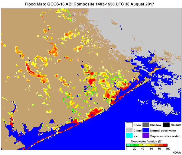
Question
How would using a GOES-16 ABI composite be beneficial for the flood map?
The correct answers are a, b, d.
The flood map composite imagery helps to minimize the impacts from cloud cover and cloud shadows (and maximize the percentage of clear sky coverage), and it derives maximum flood extent over a time range. For any pixel in a series of ABI flood maps, the map with the maximum flooding water fraction is selected as the final water fraction in the composited flood map.
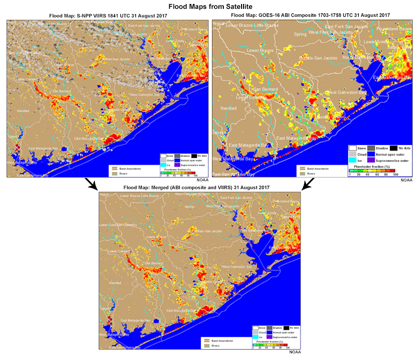
3.0 Satellite Flood Maps » 3.2 GOES-16 ABI, S-NPP VIIRS, and Merged
GOES-16 ABI Composite
S-NPP VIIRS
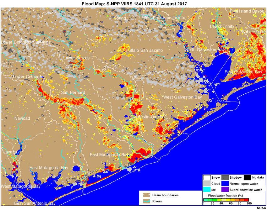
Merged (ABI Composite and VIIRS)
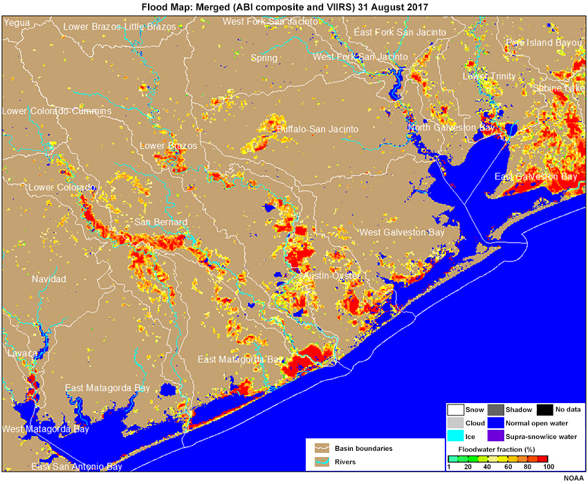
With these three tabs you can compare (1) the derived flood map from a composite GOES-16 ABI, (2) the sharper 375-m spatial resolution flood map derived from the S-NPP VIIRS, and (3) a “merged” product using both GOES-16 ABI and S-NPP VIIRS.
Question
After examining the flood map images (comparing GOES-16 ABI, S-NPP VIIRS, and the merged product), select the best choice for the following statements.
The correct answers are shown above.
The frequent updates of the GOES-16 ABI imagery will make it easier to take advantage of clear skies during daylight hours. The S-NPP VIIRS data have better spatial resolution and may offer more accurate depiction of the water fraction in the flood map and more useful guidance for small-scale features within the basin.
The merged product combines the greater spatial detail of the S-NPP VIIRS imagery with the clear sky period sampled by the more frequently updated GOES-16 ABI data.
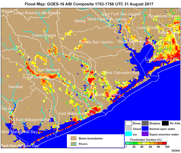
3.0 Satellite Flood Maps » 3.3 Features on the Flood Map
Recall this false color RGB and how it shows surface water, interbasin transfer (yellow box), and water pooling behind flood control reservoirs (orange oval).
Using the merged flood map with river lines and basin boundaries, can you identify some of the features and processes apparent on 31 August 2017?
Question
Highlight or outline flooding features on the 31 August 2017 flood map from the merged GOES-16 ABI and S-NPP VIIRS.
Use the purple pen highlight some areas of overbank floodwater from rivers and off-channel storage. Use the yellow pen to highlight an area of interbasin transfer. Use the orange pen to highlight areas where water may be pooling in flood control reservoirs.
The GOES-16 ABI and S-NPP VIIRS merged flood map shows numerous areas with flooding of normally dry locations. The Colorado, San Bernard, Brazos, and San Jacinto Rivers all show water in overbank areas.
Although interbasin transfer may be occurring in several places, the transfer from the Colorado River to the San Bernard River is especially noteworthy and affected forecast hydrographs for days after the rain had ended.
The two overflowing flood control reservoirs at the headwaters to Buffalo Bayou continue to be a serious concern in this flood map. Without local knowledge you may not have identified these areas as being different from other areas of ponded water. But for local officials and forecasters this is important information. Short term forecasts need to account for flooding along the boundaries of the reservoirs, and for the potential downstream risks as well.
4.0 Summary
This lesson showed that flood maps derived from satellite data are useful tools for flood events like Hurricane Harvey in August 2017.
The flood maps are derived using both GOES-16 ABI and S-NPP/JPSS VIIRS data including:
- Near-IR single bands
- 0.86𝞵m (veggie) band
- the 1.6𝞵m (snow/ice) band
- False Color RGB Composite
The GOES-16 ABI offers excellent temporal resolution (30 seconds to 15 minutes depending on the part of the hemisphere viewed and how mesoscale sectors are assigned) for its 1-km visible band data. The S-NPP/JPSS VIIRS offers better spatial resolution (375 m) but with far less update frequency. A merged product combines the greater spatial resolution of S-NPP/JPSS with the superior temporal resolution of GOES-16.
Specific surface features such as overbank flows and storage, field flooding, pooling water behind barriers, and interbasin transfer were identified with the Harvey-induced floods and other cases.
Data processing minimizes the adverse impacts of shadows from clouds or terrain. The flood map generation does require a cloud-free daylight period. This can reduce its utility during precipitating periods, but runoff, off-channel storage and movement, and overflowing reservoirs can persist for days after the clouds have cleared.
Thank you for completing this lesson. You can test your knowledge by completing the quiz; you can also leave us feedback via the lesson survey.
Contributors
COMET Sponsors
MetEd and the COMET® Program are a part of the University Corporation for Atmospheric Research's (UCAR's) Community Programs (UCP) and are sponsored by
- NOAA's National Weather Service (NWS)
with additional funding by: - Bureau of Meteorology of Australia (BoM)
- Bureau of Reclamation, United States Department of the Interior
- European Organisation for the Exploitation of Meteorological Satellites (EUMETSAT)
- Meteorological Service of Canada (MSC)
- NOAA's National Environmental Satellite, Data and Information Service (NESDIS)
- NOAA's National Geodetic Survey (NGS)
- National Science Foundation (NSF)
- Naval Meteorology and Oceanography Command (NMOC)
- U.S. Army Corps of Engineers (USACE)
To learn more about us, please visit the COMET website.
Project Contributors
Project Lead
- Matthew Kelsch — UCAR/COMET
Instructional Design
- Sarah Ross-Lazarov — UCAR/COMET
Primary Science Advisor
- Sanmei Li — George Mason University
Contributing Science Advisors
- James Gurka — NOAA, CICS-MD
- Kris Lander — NOAA/NWS West Gulf River Forecast Center
- Dan Lindsey — NOAA/NESDIS, CIRA-RAMMB
- Bill Sjoberg — JPSS Program Office
Program Oversight
- Amy Stevermer — UCAR/COMET
Graphics/Animations
- Steve Deyo — UCAR/COMET
Multimedia Authoring/Interface Design
- Gary Pacheco — UCAR/COMET
- Sylvia Quesada — UCAR/COMET
COMET Staff, June 2018
Director's Office
- Dr. Elizabeth Mulvihill Page, Director
- Tim Alberta, Assistant Director Operations and IT
- Paul Kucera, Assistant Director International Programs
Business Administration
- Lorrie Alberta, Administrator
- Auliya McCauley-Hartner, Administrative Assistant
- Tara Torres, Program Coordinator
IT Services
- Bob Bubon, Systems Administrator
- Joshua Hepp, Student Assistant
- Joey Rener, Software Engineer
- Malte Winkler, Software Engineer
Instructional Services
- Dr. Alan Bol, Scientist/Instructional Designer
- Sarah Ross-Lazarov, Instructional Designer
- Tsvetomir Ross-Lazarov, Instructional Designer
International Programs
- Rosario Alfaro Ocampo, Translator/Meteorologist
- David Russi, Translations Coordinator
- Martin Steinson, Project Manager
Production and Media Services
- Steve Deyo, Graphic and 3D Designer
- Dolores Kiessling, Software Engineer
- Gary Pacheco, Web Designer and Developer
- Sylvia Quesada, Production Assistant
Science Group
- Dr. William Bua, Meteorologist
- Patrick Dills, Meteorologist
- Bryan Guarente, Instructional Designer/Meteorologist
- Matthew Kelsch, Hydrometeorologist
- Erin Regan, Student Assistant
- Andrea Smith, Meteorologist
- Amy Stevermer, Meteorologist
- Vanessa Vincente, Meteorologist