Produced by The COMET® Program
Welcome
This module describes the main elements to consider when analyzing ocean swell to prepare a surf forecast. It also discusses some things you need to be aware of when using wave observations and wave model data.
Note that the content in this module is an excerpt from the previously published COMET module Rip Currents: Forecasting. While most references to rip currents have been removed from this module, some remain where they provide important applications to surf forecasting.
At the end of this module, you should be able to do the following:
- Describe wave data available from the NDBC website and its limitations
- Using a spectral density plot for a buoy:
- Determine the number of wave groups
- Determine the peak period
- List the parameters that are determined by a wave model
- Describe a polar wave spectrum plot
- Describe the information available in a NWW3 text bulletin
- Use a polar wave spectrum plot to determine the following:
- Direction and period of wind waves and swell groups
- Number of wave/swell groups
- Use a NWW3 text bulletin to determine the following:
- Direction, period, and significant wave height of wind waves and swell groups
- Number of wave/swell groups
- Using buoy observations and wave model products determine the height and period of swell likely to strike a given coastline
- Describe what is meant by wave masking and how it might affect a surf forecast along the coast
- Using buoy observations and wave model products determine whether a wave model initialized well
- Describe the conditions under which a wave model simulation might be in error, and what errors might subsequently result
Observations
National Data Buoy Center (NDBC)
https://www.ndbc.noaa.gov/
We’ll start by talking about the National Data Buoy Center (NDBC) standard hourly observation of wave height and period. However, this standard hourly report does not provide information on the entire wave spectrum. Both the hourly report and the detailed information on the entire wave spectrum help you assess the current and past ocean state. In addition, you can use buoy observations to determine if a wave model has initialized correctly.
Current Conditions
NDBC Current Conditions Table
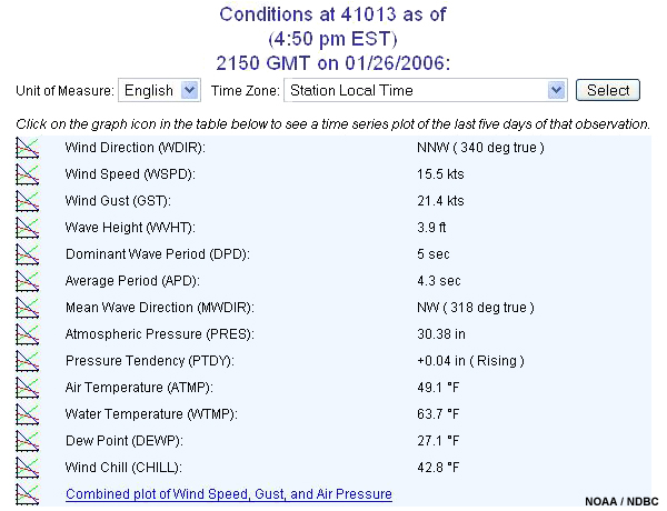
Buoy information is available both on AWIPS and on the Internet and can include data from a variety of sources other than NDBC buoys, such as those maintained by research institutions. If you look at a buoy report (like this one) on the NDBC Website, the first table on the page shows the current conditions. Note that this table gives wave height and dominant wave period. Mean wave direction is also included if the buoy has a direction sensor, but this is relatively uncommon.
The dominant wave period and mean wave direction given in the table are associated with the wave or swell possessing the maximum energy. However, the data in this table does not tell you how much of the energy is due to swell and how much is due to wind waves. Remember too that most buoys do not provide wave direction. Without wave direction information, you will not have any idea whether the dominant wave period relates to swell that will impact the beach of interest.
It is important to remember that there can be significant energy in both the wind wave and swell portion of the wave spectrum. Consider an example in which there is a wind wave of 10 ft at 6 s and a swell of 5 ft at 20 s. Most of the energy is wind wave; therefore, the buoy returns the dominant wave period of 6 s, and the information for the swell at 20 seconds is essentially "hidden" from you.
Detailed Wave Summary
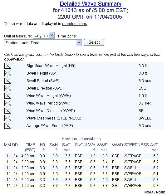
If you scroll down farther on an NDBC buoy report, you will come to the Detailed Wave Summary section. This summary breaks the observations into the swell and wind wave groups. In this example, all three components of height, period, and direction are provided. If direction isn’t listed, you will need to determine which waves are important from:
1. Your own knowledge about past and present wind events that are likely to have produced swell
2. A model analysis and forecast to examine the wave group movement
While this table provides more detail than the previous one, it can be misleading because it doesn’t provide information about the entire wave spectrum.
Wave Spectrum Plots
Because the Detailed Wave Summary only reports the dominant swell, it can "mask" other swell groups approaching the shore.
Analyzing the wave spectrum can help you accurately determine if wave or swell groups will impact your beach of interest. Another important use of this analysis is to check the initialization of numerical wave models. We’ll discuss this more in the next section.
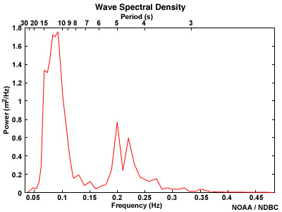
To examine the wave spectrum, the NDBC Website provides plots of wave energy (or power) versus frequency. Frequency is the inverse of the period. These products are called wave spectral density plots and are available on the Internet (but not on AWIPS). A link to the latest hourly plot can be found at the bottom of the Detailed Wave Summary section.
These spectral density plots show the peaks in wave power over the entire frequency range and make it easier to identify the total number of wave groups passing that location. To sort out which peaks are swell and which are wind waves, you will need to compare them with the wave period observations in the Detailed Wave Summary table. Note that the plot does not indicate the direction of propagation—you will need to look at model data or possibly scatterometry data to determine which, if any, of the wave groups will impact your beach.
For example, in this graphic, the wave spectrum density data show that there are two main wave groups, but we can't tell which, if either, would impact a particular beach. However, the wave model data indicate that swell from the southeast is impacting New Jersey and Long Island, while westerly winds are creating eastward-moving wind waves. In this case, the swell waves are the potential contributors to high surf along the New Jersey and Long Island beaches.
Wave Masking Example
- Toggle between times:
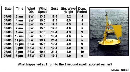
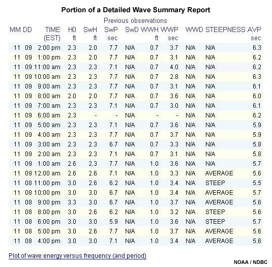
Let's look at an example of why forecasters should not rely solely on the dominant wave period reported by NDBC buoys.
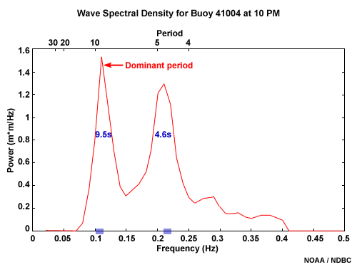
The data from this buoy shows a persistent wind from the southwest and little variation in wave height over 11 hours. However, the period changes from 9 s to 5 s at 11 PM. It appears that the 9 s wave group has passed by and no longer exists, or perhaps the slight wind change has caused a different wave group to develop. However, the buoy data is merely presenting the dominant period. It is important to remember that other wave groups with less energy may exist in the same location.
Let's look at the wave energy plots to see what happened to the 9 s wave group. Notice that at 10 PM, two distinct wave groups can be identified. The long-period wave group at 9.5 s has more energy than the 4.6 s wave group.
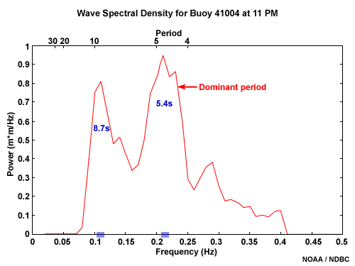
On the 11 PM plot, you can see that the two wave groups still exist, although the period of the second wave group has increased and now has more energy than the 9 s wave group. Therefore, the 5 s group has become the dominant wave group and is "masking" the 9 s group. However, it is important to realize that the 9 s wave group still exists.
Wave Model Data
Numerical wave models keep track of the location and propagation direction of newly generated waves and existing swell groups. They use this information, along with great circle tracks and wave physics (such as dispersion of wave energy), to forecast their movement. NOAA's WAVEWATCH III (NWW3) is the primary wave model used for ocean wave analysis in early 2006 when this module was published. The Great Lakes region uses the Great Lakes Coastal Forecasting System (GLCFS).
NOAA Wavewatch III
NWW3:
https://polar.ncep.noaa.gov/
COMET's Operational Models Encyclopedia
https://www.meted.ucar.edu/training_module.php?id=1186
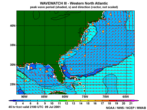
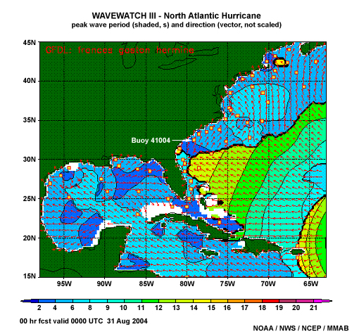
Example of a 2-D NWW3 plot of peak wave period and wave direction for the western North Atlantic
The NWW3 is a global model that produces a seven-day forecast four times a day. Wind fields used to drive the wave model come from the Global Forecast System (GFS) atmospheric model. In addition to the global domain, there are also several smaller domains that are run at a higher spatial resolution using the global output as boundary conditions (see the section titled "Regional Wave Models").
While NWW3 model data can be found on AWIPS, not all of the products (particularly the
spectral plots) and sub-domain data were available when this module was published. Some of
the data we are going to look at in this section are only available from the Operational
Products Website hosted by the NCEP Marine Modeling and Analysis Branch
http://polar.ncep.noaa.gov/mmab/oper.html
For information on various marine models, see COMET's Marine Model Matrix at
http://www.meted.ucar.edu/nwp/pcu2/marine_matrix/
NWW3 2-D Plots
Forecast parameters from the NWW3 include significant wave height, dominant (or peak) period, and GFS wind speed and direction. The output is displayed in 2-D plots, which can be useful to see how features behave spatially (e.g., tracking a swell front in the wave period field).
This is a loop of peak period for the western North Atlantic domain. Other graphical displays are available for wave heights and wind speeds. Notice that the southeast U.S. coast is affected by weak onshore swell at the beginning of the loop. Eventually, shorter-period wind waves moving toward the northeast develop along the East Coast, and the onshore swell seems to disappear.
The usefulness of 2-D plots is often limited by the fact that they can only display the direction and period of the dominant wave. Similar to wave masking in the buoy observations, the 2-D plots must be used with caution because other wave or swell groups that could lead to high surf are sometimes masked, as is the case in this loop.
NNW3 Spectral Plots
This information is available at:
https://polar.ncep.noaa.gov/waves/

Model spectral data provides the forecaster with information on individual wave groups, including their propagation direction and period. In addition, model output can be compared to buoy observations to determine how well the wave model initialized. We'll talk more about that use later.
Spectral plots of the wave energy and textual information on each wave group are provided by NWW3 at select locations. These output points are often collocated with NDBC observation points. The plots are available from any of the three interfaces (interactive, tabular, or text) on the NWW3 Website (https://polar.ncep.noaa.gov/waves/)
Interpreting Spectra
The gray rings on the NWW3 polar spectral plot correspond to frequency, which is inversely proportional to period. Consequently, the center green ring on the plot represents a frequency of 0.05 Hz or a wave period of 20 s, and the outermost ring represents a frequency of 0.25 Hz or a shorter-wave period of 4 s. Thus, the wave energy dispersed around the outer half of the plot is the higher-frequency (shorter-period) waves usually associated with locally generated wind waves. The wave energy in the inner half of the plot represents the lower-frequency (longer-period) swell waves.
Since wind typically varies in both speed and direction, the wave energy generated by local winds has a fairly large area of maximum energy that is spread over a range of frequencies and directions. In contrast, swell is characterized by wave energy that is typically focused around a narrow frequency range and a particular direction. The colors represent wave energy density, with dark blue indicating the absence of wave energy and light purple the local maximum. The figure shows that the wind wave group in the top right has the most energy, so its period would be the dominant period. To determine the actual height of the individual wave components, you would refer to the text bulletin output, which will be discussed later.
It is important to note that wave direction is shown on these plots in terms of moving away from the grid point, in other words toward the edge of the plot. This is the oceanographic convention, which is opposite the atmospheric wind direction convention.
Wave Masking
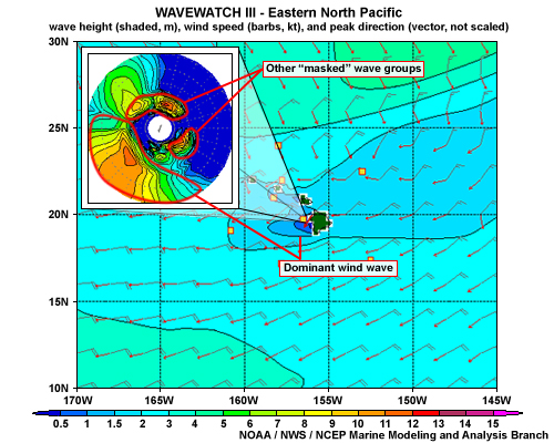
As shown in this example, wave masking is an issue in model data, just as it is in observations. The 2-D map indicates the dominant waves are moving to the southwest (red arrows), which would not affect high surf potential on the west coast of the island (depicted in green). However, looking at the spectral plot, you can see that it is the wind wave that is dominating the spectrum. The masked wave groups moving toward the southeast and northeast might affect the coast, depending on the orientation of the beaches.
Using Spectral Plots
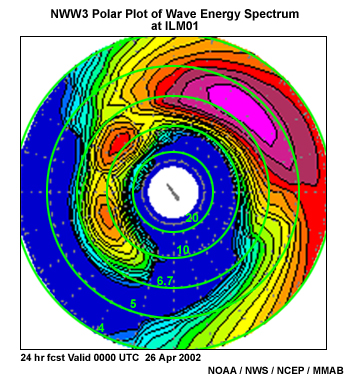
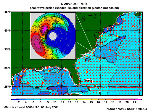
These graphics combine the NWW3 model predictions of peak wave period and direction for the Western North Atlantic (2-D plot) with the model spectral energy density (polar plot) for the output point at ILM01 that is just off the coast of Wilmington, N.C. Review these products and then answer the following True or False questions.
Question 1
This graphic is the NWW3 forecast for 0000 UTC on 8 July 2001. Examine the figure and determine if the following statement is True or False.
Click here to view a refresher on the interpretation of polar plots.
Question 1 of 2
Wind waves at ILM01 are presently moving from the northeast toward the southwest.
The correct answer is a) True
There are two groups of high wave energy. One is in the southwest part of the plot with the maximum centered near the 5 s (or 0.20 Hz) radius. The other is in the northwest quadrant of the plot, with the maximum centered near the 9 s (or 0.11 Hz) radius. The 5 s group has energy spread over approximately a 160-degree range of direction. Its low period and large direction range are typical of a wind wave field, and it is moving toward the southwest. The 9 s group is more focused and has slightly more energy. This indicates that it is swell that has traveled from a distant location. The wave energy that is northwest-northeast of the 9 s swell is a wave group that is probably young swell associated with southeast winds. Those winds have now turned northeasterly where they are presently generating the more energetic wind waves moving toward the southwest.
Question 2 of 2
Onshore swell has more energy than the wind waves at point ILM01.
The correct answer is a) True
This statement is True. This is a bit difficult to tell from the 2-D plot because the buoy is on the edge of the transition between the waves moving southwest and those moving northwest. However, it appears that the buoy is still in the area corresponding to waves moving toward the northwest, which would mean the swell waves are more dominant here. Comparing the color contours of wave energy density for the wind waves and the swell on the spectral plot, you can see that the swell group has one more contour in the center (the light purple area), which corresponds to more energy.
Question 2
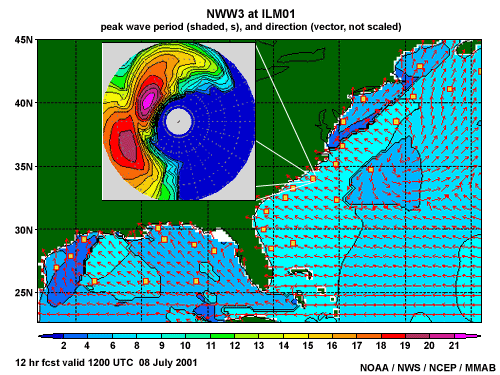
Compare the 12-hour forecast (valid 1200 UTC) with the earlier 00-hour forecast (valid 0000 UTC) and determine if the following statement is true or false.
Click here to view a refresher on the interpretation of polar plots.
Question
On 8 July, the 12-hour forecast valid at 1200 UTC is for onshore swell to persist and wind wave energy to decrease at point ILM01.
The correct answer is a) True
Again, comparing the color contours on the spectral plots, you can see that the forecast swell at 1200 UTC heading northwest has the same number of contours as earlier at 0000 UTC while the area corresponding to wind waves heading southwest no longer has the light purple contours. This indicates that the forecast wind energy decreased from 0000 UTC to 1200 UTC.
Question 3
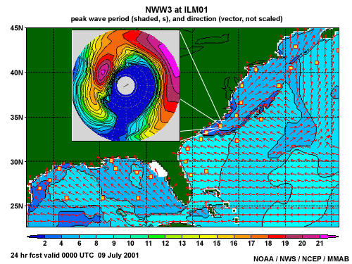
These graphics combine the NOAA WAVEWATCH III model predictions of peak wave period and direction for the Western North Atlantic (2-D plot) with the model spectral energy density (polar plot overlaid on the U.S. land area) from the output point ILM01 (see telescoping lines) that is just off the coast of Wilmington, N.C. The 00-, 12-, and 24-hour forecasts of these products from the 0000 UTC 8 July, 2001 model run are provided. Determine if the following statements are true or false for this model forecast.
Click here to view a refresher on the interpretation of polar plots.
Using Spectral Text
Spectral plots can be used to quickly identify the individual wave components over the life of the model run. However, you will need to examine the model text output to determine the wave height and exact wave period associated with the energy maxima seen on the spectral plots. Some forecasters just go directly to the text bulletin to find the wave groups of importance. Others first use the spectral plot to help identify where to look in the numerical output and to glance at trends for an individual point in the wave model.
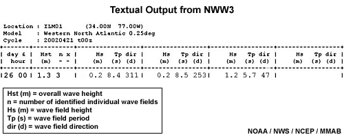
This spectral plot displays three main groups of waves. Looking at the corresponding text bulletin, you can see that two of these are swell groups of 8.4 s and 8.5 s moving toward the northwest (311 degrees) and west-southwest (253 degrees), respectively. The third wave group has a period of 5.7 s and is generating a variety of waves with general movement toward the northeast (47 degrees). Heights are expressed in meters.
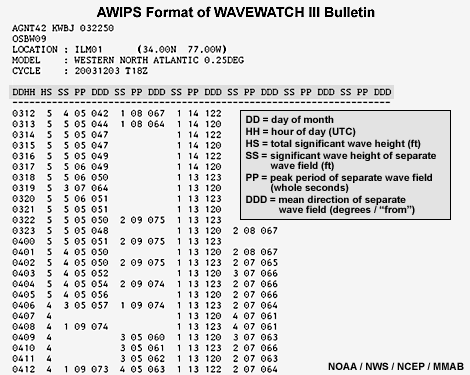
The text output from NWW3 is also available on AWIPS. The data format is slightly different but wave height, period, and direction are all provided. When displayed in AWIPS, the wave height is in feet and the wave direction is "from," analogous to the meteorological wind direction convention. This is important to note since the text output from the Web version of NWW3 uses the oceanography convention. Also, the column headings are slightly different in the AWIPS display; "SS" stands for wave height and "HS" stands for significant wave height based on all wave groups.
Model initialization
Wave models are quite useful, and they are improving. However, as with any model, the analysis and forcing parameters in the model can be in error and should always be checked with real observations when possible. Spectral analysis of wave observations allows the forecaster to know not only what wave groups presently exist, but whether the marine model was initialized well.
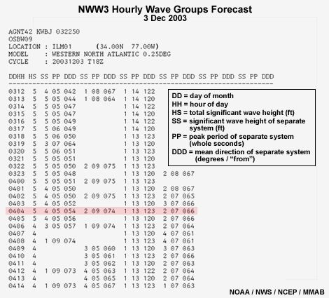
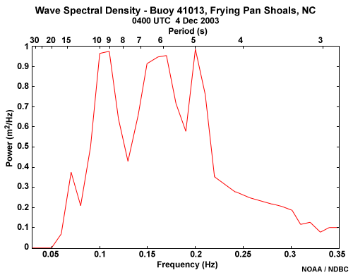
The text output from NWW3 provides an easy way for the forecaster to compare model predictions to wave observations. The wave groups in the model can be checked against the buoy’s wave spectral energy distribution. For example, comparing the data from the Frying Pan Shoals buoy and the text output from a model point collocated with the buoy, you can see that the four wave periods indicated in the observational data match closely with the NWW3 prediction of four wave groups.
Model Errors
If the NWP forecast for winds is incorrect, then the NWW3 wave forecasts will also be in error. Therefore, the first and most critical consideration to make when using any wave model is whether or not the winds used to force the wave model are correct. Most errors in wave models result from incorrect initial winds because wave growth and dispersion are determined by the actions of wind in the model.
Also, if the timing of wave generation or swell propagation is incorrect, the forecast of high surf will be in error. Since the longest period waves travel the fastest from the generation region, they are usually the first to arrive. Consequently, forerunner swell is very important to rip current forecasts.
Exercise
Look at the data and then choose the correct answer.
Question
The model results and buoy observations agree well.
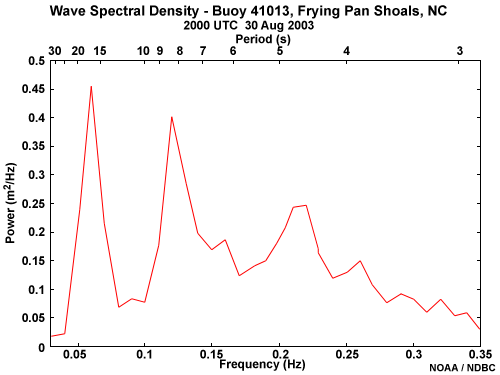
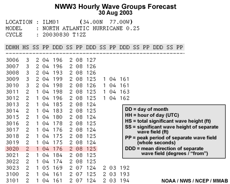
The correct answer is b) False
The observed wave spectrum indicated that three wave or swell groups were propagating by the buoy. The NWW3 output for that same time only showed the 8 and 4 s period wave groups and left out the 17 s period group. This other wave group could contribute to rip currents depending on its direction of propagation. Without model guidance for the wave direction, a forecaster would need to make some assumptions about the waves to try to determine their origin from a known storm that has recently occurred.
Model Limitations
In addition to model initialization errors, problems can also arise from poor dynamic predictions or from resolution limitations that do not capture smaller-scale events. For example, if the model winds used as forcing in the wave model unrealistically strengthen the wind field, then large errors in wave height prediction can occur. Or in the case of a small, intense tropical cyclone, the winds are often underestimated because the model resolution is too coarse to adequately represent such a strong mesoscale feature.
Another example is that of warm air advection occurring over relatively cooler waters leading to unrealistically high wind speeds predicted by the model and subsequent high wave-growth predictions. Because the stable layer near the water surface is not well-resolved by global-type models in these cases, higher wind speeds in the lower atmosphere are falsely mixed down to the surface level by the model, causing an overestimate of the actual surface winds. This can be a problem early in the warm season when increases in water temperature tend to lag behind seasonal air temperature fluctuations by about a month. These problems can also occur during periods of cool, deep ocean water upwelling.
Wave Masking 1
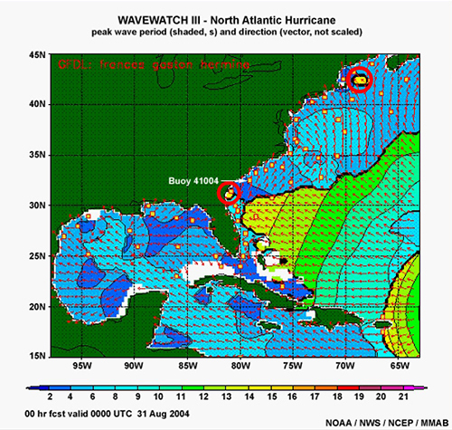
During the evening of 30 August 2004, you are tasked with issuing the Surf Zone Forecast for the Charleston, SC beaches (close to buoy 41004) valid for the next day. A main concern for this forecast is the swell expected from Hurricane Frances, which is presently located just north of the Lesser Antilles. In addition, there is a persistent southwesterly wind across Charleston’s adjacent Atlantic waters due to a synoptic high pressure area in the Western Atlantic.
Question 1
This graphic is the 2-D plot of peak wave period and direction for the NWW3 North Atlantic Hurricane wave model 00 hour forecast valid for 0000 UTC on 31 August 2004.
Question
Assume that the model initialized well. Using this 00-hr model forecast 2-D product, would you use a swell of 4 s and a direction from the SW when forecasting the surf at a beach near buoy 41004 for the valid time given in the product?
The correct answer is b) No
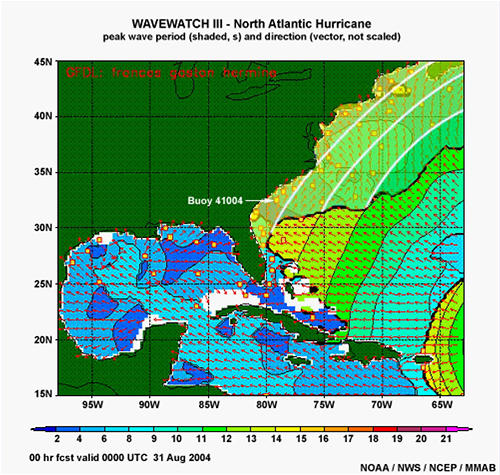
The 2-D plot does indicate 4 s waves from the southwest near the buoy, but the short period indicates that these are wind waves, not swell. Also, there is a hint in the plot that 14 s swell from the south-southeast might already be at the buoy, and that those long-period swells are being masked by the more energetic 4 s wind waves from the southwest. The clues are the small areas of yellow corresponding to 14 s swell near the Georgia coast and offshore of Massachusetts (circles) in addition to the more obvious random discontinuity line between the swell group and the low period waves that exist off the East Coast. If we were to draw the masked swell contours, it might look something like this modified graphic.
Question 2
To confirm whether wave masking is occurring, or to see if other model swell groups are passing by this point, let's look at the model's polar plot of wave energy spectrum for the buoy location.
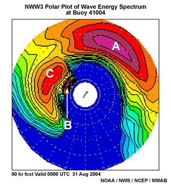
Question
Which statement most correctly describes the points labeled on the model's polar plot?
The correct answer is d) A is wind waves; C is swell from the southeast but not associated with the hurricane; B is swell from the hurricane.
Point A refers to the 5 s waves generated by the southwest winds. These are the most energetic waves in the spectrum, and consequently dominate the 2-D plot at buoy 41004, masking the other two wave groups indicated in the polar plot. Points B and C have the longer periods typical of swell. These cannot both be from the hurricane because long-period swell travels faster than short-period swell and over time, the range of periods within a swell group will become stratified with longer ahead of shorter. It would be logical to assume that the 20 s swell is associated with the hurricane, while the 10 s swell is from another source, probably the easterly trade winds typical here in the summer.
In summary, the 2-D plot hinted at wave masking hiding swell with periods around 14-15 s at the buoy, which is essentially confirmed by this polar spectral plot. In addition, this spectral plot indicates that the dominant wind waves are also masking a 10 s swell. In order to determine which swell period to use in a surf forecast (since both of them are in a direction that would likely impact Charleston beaches), the question now becomes, "Is the model right—has the swell from Hurricane Frances already reached buoy 41004?"
Question 3
The online NDBC Detailed Wave Summary (not shown here) for buoy 41004 reported a wind wave height of about 3 ft with a 4 s period and a swell of 2 ft at 10 s. Since the buoy does not have a direction sensor, one must use the NWW3 model products to determine the direction of movement of each of these groups. The polar spectral energy plot shows the wind wave moving toward the northeast and the 10 s swell moving toward the west-northwest. But what about the other swell group?
Let's look at the buoy spectral density graph to see how many wave groups are passing by this observation point.
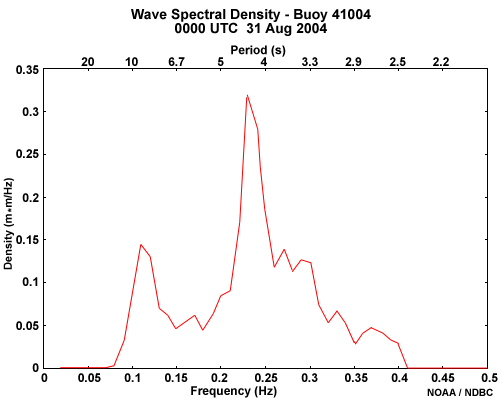
Question
Does the spectral graph show that the 14+ s swell from Hurricane Frances has reached buoy 41004?
The correct answer is b) No
Recall that you take the inverse of frequency to get period. The 0000 UTC spectral graph confirms that the 4 s wind waves are dominant and that the 10 s swell is the only other energetic wave group passing by this point. No long-period swell of 14 s (or higher) is presently being observed by the buoy.
Question 4
Question
Does the NWW3 NAH model seem to have initialized well compared to what Buoy 41004 observed at 0000 UTC?
The correct answer is b) No
Although the NWW3 NAH has captured the 4 s wind waves and the 10 s swell seen in the buoy spectral density graph, it has a third wave group at 14+ s that is not presently being observed by the buoy. In addition, this erroneous 14+ s swell group has more spectral power than the 10 s swell group. This allows the 14+ s swell to appear on the 2-D plot of peak period instead of the 10 s swell in areas where both are more dominant than the wind wave group.
The model may be in error for a couple of reasons. The first possibility is that the model has propagated the hurricane swell past this point too soon, and that the buoy will observe 14+ s swell at some later time. The second possibility is that the model winds associated with the hurricane were too strong and, therefore, generated swell with periods that are longer than what will actually be observed. Since the model seems to be accurately reflecting the 4 s and 10 s wave groups observed at the buoy, the first possibility is the most likely. Determining why the error is occurring in the model will help with how to adjust the swell characteristics for the Surf Zone Forecast product for the following day. To do that, you will probably need to re-examine the model wind forecast and compare it to some additional over-water wind observations (i.e., buoy, scatterometry) in order to see where the wave forcing was in error. Then, using a wave nomogram or your past experience, determine how fast and how strong the swell will likely be.
Summary
With respect to forecasting surf, it is important to identify the main swell contributing to the scheme. As a rule, the standard 2-D plots are helpful in showing the progression of swell fronts. However, the wave period fields can be harder to partition when there are several swell components present in addition to the wind wave field. Thus, when there are multiple wave groups, it is important to review the detailed information in the buoy observations, spectral polar plots, and model text bulletin output.
In this case, it is likely that the NAH was too fast with introducing 14+ s swell, which would have led to a high surf forecast that day when, in fact, there was no high surf reported in the Carolinas until 2 September, when the larger swell from Hurricane Frances finally did arrive.
Wave Masking 2
This next case is not specifically relevant to summer beach forecasts because of the season in which it occurs, but it provides more practice in using buoy and model data. This should be helpful in preparing Surf Zone Forecasts throughout the year.
Introduction
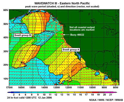
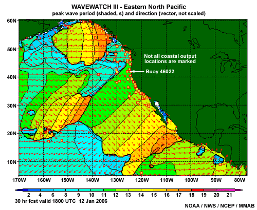
During the late afternoon of 11 January 2006, your shift duties include issuing the Surf Zone Forecast for the northern coast of California valid for the next day. Besides the large swell and high surf presently affecting the coast, you need to examine the potential for a new long-period swell generated by an Aleutian Low to move into your marine area the following day. For comparison to model forecasts, we will use observations from buoy 46022.
This graphic is the NWW3 Eastern North Pacific (ENP) 2-D plot of peak period and direction for the 24-hour forecast. The plot indicates two significant swell groups. The first swell group, labeled "A" in the plot, is an old swell group that was generated from the previous Aleutian storm several days earlier. The second swell group, labeled "B," is a relatively new swell that has been generated by the next storm in the area of a synoptic Aleutian Low.
The NWW3 forecast plot indicates that buoy 46022 will be experiencing a period of 11 s in 24 hours. However, it appears to be very close to the end of one swell train (A) and the beginning of the next (B). So let’s see what the buoy is observing now.
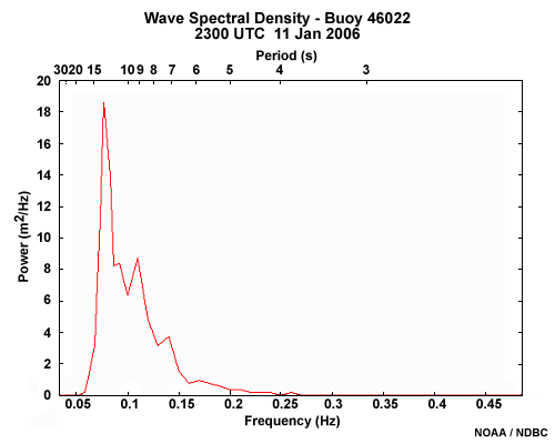
The 2300 UTC (3 PM PST) 11 January 2006 observations from the online NDBC Detailed Wave Summary (not shown) indicate the wind wave has a height of about 1 ft with a period of 4 s and the most energetic swell is 11 ft at 13 s. Remember that the NDBC Detailed Wave Summary section only lists the observed wind wave group and the swell group with the most energy. Therefore, one still needs to check the observed wave spectrum graph for other swell groups passing by this point.
Question 1
Question
From the spectral plot of buoy 46022 at 2300 UTC, is there any indication that swell group B has already arrived at the buoy and is being masked?
The correct answer is b) No
The spectral plot for the buoy shows that the 17 s group has not arrived at the buoy yet because the longest period swell in the spectrum graph is 13 s and is most likely associated with swell group A. However, the 17 s swell in the NWW3 2-D plot at the leading edge of group B is certainly being masked (along the rest of the swell front) by more energetic wind waves, as well as more energetic swell from the rear of swell group A (as indicated below in the 24-hour forecast).
Question 2
Another check of the model performance would be to look at the model bulletin output. This is the NWW3 ENP model run for 1200 UTC on 11 January 2006 (starting 11 hours prior to the buoy observations at 2300 UTC) at the point collocated with the buoy.
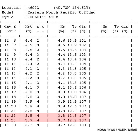
Question
Does the bulletin’s value of swell height (Hs) and period (Tp) compare well with the buoy data at 2300 UTC on 11 January 2006 which measured the wind wave height at about 1 ft, with a period of 4 s, and the most energetic swell at 11 ft at 13 s? (Remember, in this bulletin output from the NWW3 Web page; the wave height is in meters and the direction is "toward," not "from.")
The correct answer is a) Yes
The bulletin output for 2300 UTC is extremely close to the buoy observation for the dominant swell at this time. There is only a 1 ft and 1 s difference (11 ft vs. 3.7 m or 12.1 ft and 13 s vs. 12.2 s), which are fairly good given the magnitude of this swell.
So we can be reasonably confident that the model has a good handle on what is happening at buoy location 46022. The question then is when is the group B swell front going to arrive at the buoy?
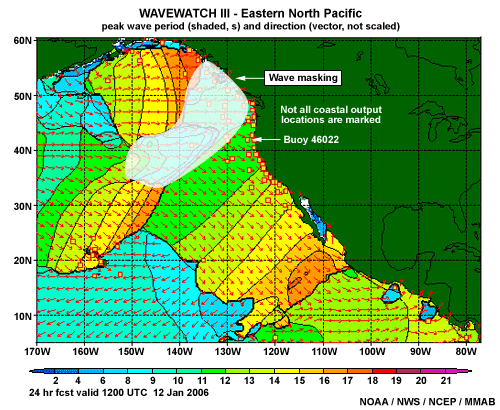
Masking
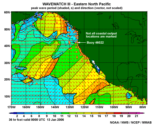
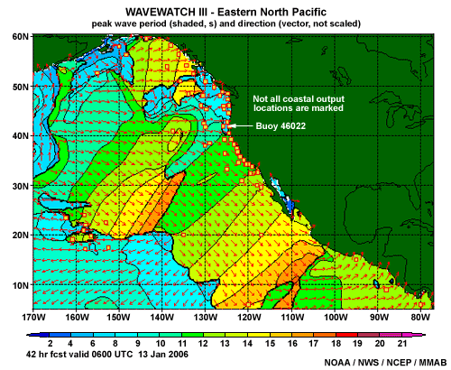
As you can see in the 30-, 36-, and 42-hour forecast plots of peak period, the 17 s swell previously displayed is now totally masked, and it is difficult to estimate when the swell front will reach the buoy. Extending the swell front to include at least a 17 s component, one can infer that the swell would arrive sometime around 0600 UTC on 13 January 2006. However, there is a large portion of swell front being masked due to the rear portion of swell group A having a larger wave energy in the same area.
The lesson here is that it is difficult to fine-tune your timing of the swell front if you only use the 2-D plots. Although these plots are useful for getting a quick overview of what is going on, the NWW3 text bulletin output will give you a much better feel for the model forecasts of height, period, and timing of the wave systems (assuming, of course, that the model has initialized well).
Question 3
Here is a portion of the NWW3 text bulletin output for a point collocated with buoy 46022 from the 11 January 2006 ENP model run.
Question 1 of 2
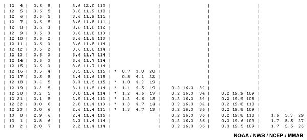
At what time does the swell at the leading edge of group B (>17 s)
show up in the ENP text bulletin output for this point?
(Type you answer in the text box below.)
The edge of swell group B appears at 2000 UTC on 12 January 2006 and is expected to have a height of 0.2 m, a period of 19.9 s, and will be heading toward 109 degrees (or from the west-northwest). The text bulletin also has two other long-period groups. It shows a swell heading toward 110 degrees at 3.6 m and 12 s at the start of the data shown and passing by this point at all times, but this period is too short to be associated with swell group B. The other group is expected to begin passing the point at 1900 UTC and it has a period of 16.3 s. However, it is predicted to be moving toward the north-northeast, so it also is unrelated to group B.
Notice that the highest period swell shown in the 2-D plots was 17 s in the 24-hr forecast (which was showing evidence of masking), but the bulletin indicates a swell of 19.9 s. This means that there was considerably more masking occurring than was evident in the 2-D plots.
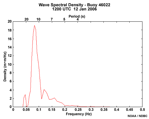
If you toggle to the Wave Spectral Density Plot for the buoy at 1200 UTC on 12 January 2006. You can see that the very long-period swell (about 20 s) has already arrived from the Aleutians. Thus the ENP was off in timing by at least 8 hours in this case.
Summary
This case illustrates that although the model output can capture the magnitude and period of events very well, it is important to look closely at the potential for timing issues. To get a better understanding of the timing, forecasters should be looking at upstream buoys if available. If the model has moved a swell front through a particular buoy location at a specific time, then the buoy should have observed its passage at that time. If the buoy does not show its passage, then it can be assumed that the model is too fast with the swell front’s progression or has developed swell that has a period that is too long. Likewise, if the wave model has not passed a swell front through at a specific buoy location and time, and the buoy shows that a passage had already occurred, then it is safe to assume that the model is either too slow or too weak. In either case, one needs to consider adjustments to the forecast.
With respect to surf zone forecasting, it is important to identify the swell with the largest energy in the spectrum whose direction of propagation could contribute to high surf development. As in the East Coast case, the wave period fields can be harder to partition when there is another, more dominant wave group present that is masking the swell that will contribute to high surf for a given location. Typically, this problem can be magnified along the West Coast, where there is a greater potential for numerous swell groups with long periods.
Summary
With regard to buoy observations:
The National Data Buoy Center (NDBC) provides standard hourly observations of wave height and period. Mean wave direction is also included if the buoy has a direction sensor, but this is relatively uncommon. These standard hourly reports do not provide information on the entire wave spectrum.
The NDBC Detailed Wave Summary breaks the observations into the swell and wind wave groups. Because it only reports the dominant swell, it can "mask" other swell groups approaching the shore.
NDBC Website provides wave spectral density plots, which show wave energy (or power) versus frequency. These plots show the peaks in wave power over the entire frequency range and make it easier to identify the total number of wave groups passing that location. Note that these plots do not indicate the direction of propagation.
With regard to wave model data:
Numerical wave models generate waves and keep track of the location and propagation direction of the newly generated waves and as well as existing swell groups.
The NWW3 is a global model that produces a seven-day forecast four times a day. Wind fields used to drive the wave model come from the Global Forecast System (GFS) atmospheric model.
Forecast parameters from the NWW3 include significant wave height, dominant (or peak) period, and GFS wind speed and direction. The output is displayed in 2-D plots. 2-D plots must be used with caution because other wave or swell groups are sometimes masked.
Model spectral data provides the forecaster with information on individual wave groups, including their propagation direction and period.
On NWW3 polar spectral plots, the wave energy dispersed around the outer half of the plot is the higher-frequency (shorter-period) waves usually associated with locally generated wind waves. The wave energy in the inner half of the plot represents the lower-frequency (longer-period) swell waves. Wind waves typically have more spread in direction and frequency than swell.
Examine the model text output to determine the wave height and period associated with the energy maxima seen on the spectral plots.
Spectral analysis of wave observations allows the forecaster to know how well the wave model initialized. The text output from NWW3 also provides a way to compare model predictions to wave observations. The wave groups in the model can be checked against the buoy’s wave spectral energy distribution.
If the NWP forecast for winds is incorrect, then the NWW3 wave forecasts will also be in error. Problems can also arise from poor dynamic predictions or from resolution limitations that do not capture smaller-scale events. For example:
- Warm air advection over relatively cool waters can lead the model to predict unrealistically high wind speeds and subsequent high wave-growth predictions.
- In the case of a small, intense tropical cyclone, the winds are often underestimated because the model resolution is too coarse to adequately represent such a strong mesoscale feature.
References
Davis, R.J. and C. H. Paxton, 2005: How the swells of Hurricane Isabel impacted southeast Florida, Bull. Amer. Met. Soc., 86(8), 1065-1068. [Available online at https://journals.ametsoc.org/bams/article/86/8/1065/58526/How-the-Swells-of-Hurricane-Isabel-Impacted]
National Weather Service, cited 2004: National Weather Service Instruction 10-310. [Available online at NWS Directives System homepage]
National Weather Service, cited 2004: National Weather Service Instruction 10-314. [Available online at NWS Directives System homepage]
National Weather Service, cited 2004: National Weather Service Instruction 10-320. [Available online at NWS Directives System homepage]
Contributors
COMET Sponsors
The COMET® Program is sponsored by NOAA National Weather Service (NWS), with additional funding by:
- Air Force Weather Agency (AFWA)
- Australian Bureau of Meteorology (BoM)
- Meteorological Service of Canada (MSC)
- National Environmental Education Foundation (NEEF)
- National Polar-orbiting Operational Environmental Satellite System (NPOESS)
- NOAA National Environmental Satellite, Data and Information Service (NESDIS)
- Naval Meteorology and Oceanography Command (NMOC)
Project Contributors
Principal Science Advisors
- Steven Pfaff — NWS Wilmington, NC
- Timothy Schott - NWS Marine and Coastal Weather Services Branch
Science Reviewers
- Rob Balfour — NWS San Diego, CA
- James Eberwine - NWS Mt. Holly, NJ
- Dave Guenther — NWS Marquette, MI
- Randy Lascody — NWS Melbourne, FL
- Sarah Prior — NWS Guam
- Spencer Rogers - North Carolina Sea Grant Program
- Andrew Shashy — NWS Jacksonville, FL
Project Lead/Project Scientist/Instructional Design
- Alan Bol — UCAR/COMET
Computer Graphics/Interface Design
- Steve Deyo — UCAR/COMET
- Heidi Godsil — UCAR/COMET
- Brannon McGill — UCAR/COMET
Multimedia Authoring
- Dan Riter — UCAR/COMET
- Carl Whitehurst— UCAR/COMET
Audio Editing/Production
- Seth Lamos — UCAR/COMET
Audio Narration
- Tia Marlier
COMET HTML Integration Team 2020
- Tim Alberta — Project Manager
- Dolores Kiessling — Project Lead
- Steve Deyo — Graphic Artist
- Gary Pacheco — Lead Web Developer
- David Russi — Translations
- Gretchen Throop Williams — Web Developer
- Tyler Winstead — Web Developer
COMET Staff, August 2008
Director
- Dr. Timothy Spangler
Deputy Director
- Dr. Joe Lamos
Business Manager/Supervisor of Administration
- Elizabeth Lessard
Administration
- Lorrie Alberta
- Michelle Harrison
- Hildy Kane
Graphics/Media Production
- Steve Deyo
- Seth Lamos
- Brannan McGill
Hardware/Software Support and Programming
- Tim Alberta (IT Manager)
- James Hamm
- Ken Kim
- Mark Mulholland
- Wade Pentz (Student)
- Dan Riter
- Carl Whitehurst
- Malte Winkler
Instructional Designers
- Dr. Patrick Parrish (Project Cluster Manager)
- Bruce Muller (Production Manager)
- Dr. Alan Bol
- Lon Goldstein
- Bryan Guarente
- Dr. Vickie Johnson
- Dwight Owens (Alphapure Design Studio)
- Marianne Weingroff
Meteorologists
- Dr. Greg Byrd (Project Cluster Manager)
- Wendy Schreiber-Abshire (Project Cluster Manager)
- Dr. William Bua
- Patrick Dills
- Dr. Stephen Jascourt
- Matthew Kelsch
- Dolores Kiessling
- Dr. Arlene Laing
- Dr. Elizabeth Mulvihill Page
- Warren Rodie
- Amy Stevermer
- Dr. Doug Wesley
Science Writer
- Jennifer Frazer
Spanish Translations
- David Russi
NOAA/National Weather Service - Forecast Decision Training Branch
- Anthony Mostek (Branch Chief)
- Dr. Richard Koehler (Hydrology Training Lead)
- Brian Motta (IFPS Training)
- Dr. Robert Rozumalski (SOO Science and Training Resource [SOO/STRC] Coordinator)
- Ross Van Til (Meteorologist)
- Shannon White (AWIPS Training)
Meteorological Service of Canada Visiting Meteorologists
- Phil Chadwick
- Jim Murtha