Introduction to Ensemble Prediction
Any forecaster working with numerical weather prediction (NWP) output quickly becomes aware of the differences between models. These are more pronounced for high-impact events, as we see in the runs from several models below.
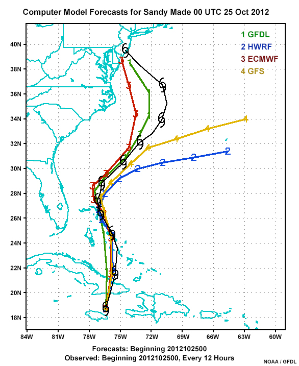
The forecast cyclone tracks are from four commonly used deterministic models. These models are run a single time from a single established set of initial conditions. The outcomes can vary, as in our example. Two models are predicting landfall while the other two show tracks going out to sea. Differences like this can occur for consecutive runs from a single deterministic model or from multiple deterministic models.
What causes the variability? Many factors are at play, notably differences in the models’ initial conditions, how they parameterize complex processes, their underlying physical approximations, their grid spacing, and the atmosphere’s inherent chaotic behavior over time.
While differences in model output may initially seem confusing and difficult to use in a forecasting process, they can be harnessed to help forecasters estimate uncertainty in predicted weather conditions and communicate that uncertainty to end users.
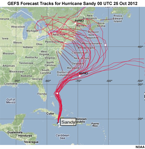
Improvements in modeling and computing time have enabled modelers to make slight changes to a model’s initial conditions, physics, parameterizations, or grid spacing, and run the model again to see the outcome. Doing this multiple times produces an ensemble of possible forecast outcomes, like those shown here from the Global Ensemble Forecast System (GEFS) for Hurricane Sandy. Note that some ensembles combine the results from several models, each of which is run multiple times with different conditions.
Ensemble Prediction System (EPS) output allows forecasters to use probabilistic forecast information, which better represents the state of the science, in their forecasts. Forecasters can also provide the probabilistic information and uncertainty estimates to a variety of customers, the majority of whom prefer it to single value deterministic information.
Typically, an EPS produces more data than can reasonably be integrated into most operational forecasting settings. Therefore, EPS products have been developed to summarize the data in different statistical forms, as shown in the two EPS products below.
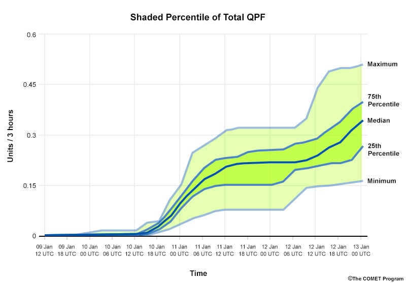
This sample point view product displays data using percentiles and color-shading so you can quickly view differences across time.
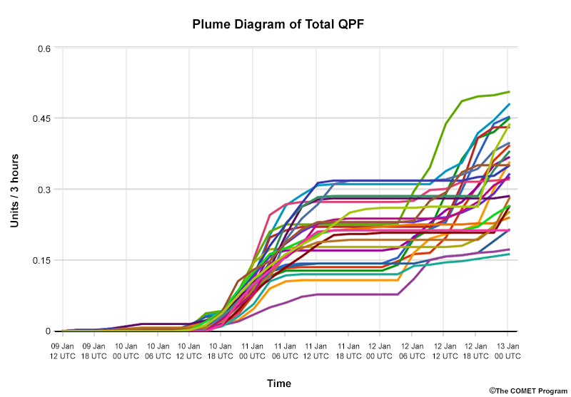
This sample point product displays the entire time series of EPS data so you can quickly view differences across time.
Ensemble output is mathematically complex so forecasters need to understand the underlying statistics in order to use it properly. The following section presents the basic concepts needed to interpret EPS products.
Understanding EPS Statistics
Understanding EPS Statistics » Probability Distribution Functions
EPS products use common statistics that represent the distribution of the different runs (“members”) that constitute the ensemble system. This allows forecasters to estimate the full range of model outcomes, the probability of certain thresholds being met or exceeded, and the most likely outcomes. We will review the most common statistical quantities used in EPS output calculations to help you better understand ensemble distributions.
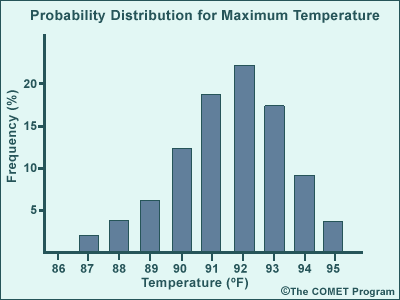
Histograms, which are grouped and ranked distributions of EPS data, are called probability distribution functions (PDFs). In a PDF, probability expresses how common a certain value is within the distribution, or its frequency. In the PDF below, the x-axis shows the maximum temperatures while the y-axis shows the frequency of those values in the ensemble.
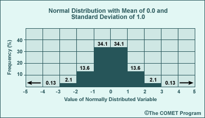
Many natural phenomena are randomly distributed, with the highest probabilities near the mean (average) value. These PDFs are called normal distributions.
The normal distribution is a theoretical, symmetrical PDF centred on the distribution's mean value. The distribution is fully described by two statistical parameters: the mean (average) and standard deviation (a measure of the spread of the data from the mean). The standard deviation, s, is the "sample standard deviation," which assumes the ensemble members are a sample of a larger unsampled population.
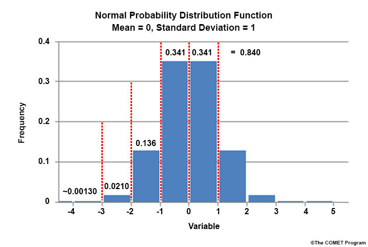
The histogram below shows a normal distribution with a mean of 0.0 and a standard deviation of 1.0. Each bar represents one standard deviation. The number above each bar is its percentage of the distribution. So one standard deviation in either direction from the mean encompasses approximately 34% of the distribution, while both encompass approximately 68% of the data. Wider distributions have larger standard deviation values. As with all PDFs, the probabilities must sum to 100%.
Understanding EPS Statistics » Cumulative Distribution Functions
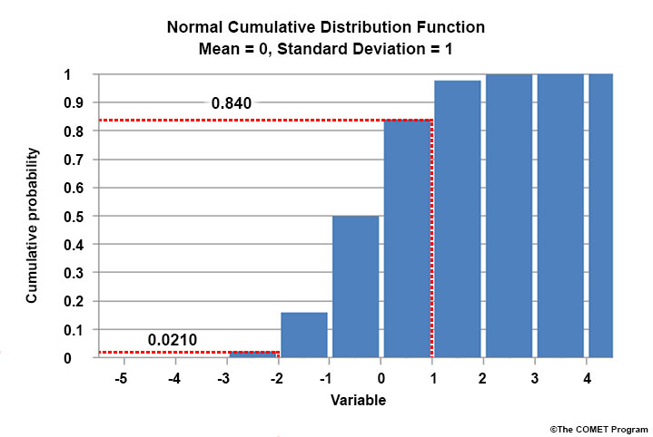
Another way to view the distribution is to rank it cumulatively. Cumulative Distribution Functions (CDFs) rank data by frequency just like PDFs. But the y-axis values are the cumulative probability of occurrence, or the proportion of data that falls at or below a specific value. You can think about CDFs as being the integral of PDFs.
In the CDF below, a value less than or equal to 1 has an ~84% chance of occurring. A value less than or equal to -2 only has a 2% chance of occurring. You obtain these numbers by adding up the frequencies from the PDF from lowest until the point of interest (here, the +1 standard deviation level).
CDF
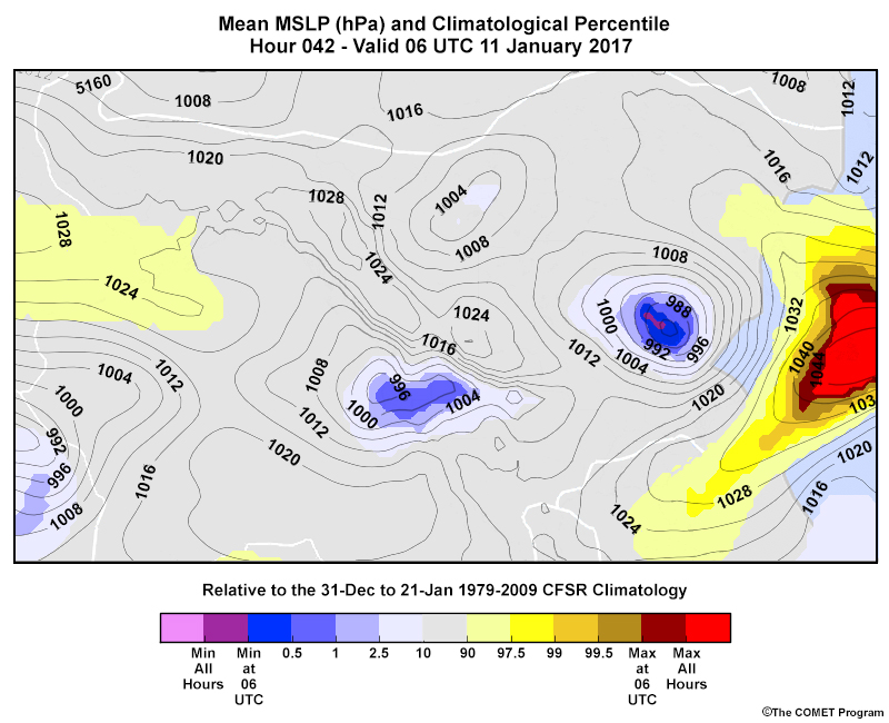
CDFs are useful for showing probabilities of accumulated quantities, such as total precipitation. They are used in EPS products like the Extreme Forecast Index and Shift of Tails; Probability of Exceedance; and Climatological Percentiles (shown below). These products are described in the EPS Products Reference Guide.
Understanding EPS Statistics » Median and Mode
Two other important statistical quantities are used in many EPS products: median and mode.
The median represents the middle value of the ordered dataset, with 50% of the distribution above and 50% below that value. In a normal distribution, the median value is the same as that of the mean.
The median value is commonly included on many EPS products, such as those shown in the tabs below. Remember that the median follows the middle of the frequencies of the distribution while the mean follows the middle of the values of the distribution.
Box and Whisker
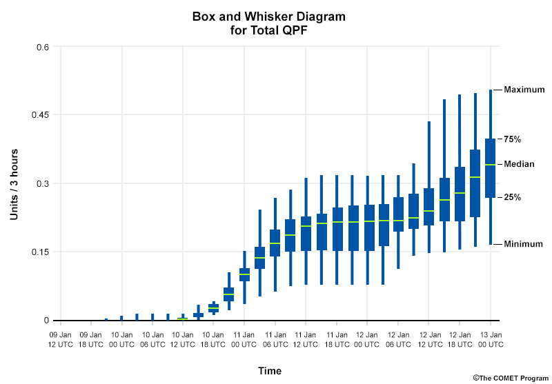
Box and Whisker plots display probabilistic information, such as the median, at specific locations over time.
Shaded Percentile
Shaded Percentile EPSGrams display probabilistic information, such as the median, about how specific weather variables change over time at a particular location.
The mode represents the distribution’s most frequent value. When there are two or more modes, the distribution is called “multimodal.” In ensembles, this is used to refer to two or more local maxima in the distribution. The distribution below could be considered bimodal since there are two peaks. Yet, by strict definition, there is only one mode, 23˚.
Another way to think about this is to consider how the data is clustered. In the distribution below, there are two forecast clusters: one from 15˚ to 20˚ with a peak at 17˚ and another from 21˚ through 26˚ with a peak at 23˚.
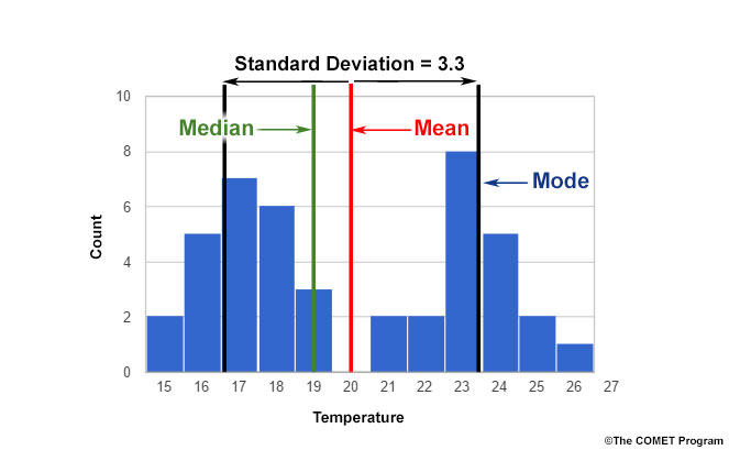
The mean, median, and mode are often used as proxies for the most likely outcome in EPS solution sets. This approach works fairly well for normally-distributed ensemble output. However, as distributions become less normal (as in our plot above), these quantities become less representative of the most likely outcome.
In the example, the mean does not represent any of the individual ensemble members since 20˚ never occurs in the distribution. Likewise, the median is unlikely to represent the most likely outcome because the most frequently occurring values are not in the middle of the distribution. In this case, the mode is slightly better since it captures one of the frequency peaks. But the other peak would go unnoticed if you only used the mode.
A standard normal-distribution method of calculating the standard deviation in similar situations often produces a large number that is larger than the standard deviation of either individual cluster would be if calculated separately.
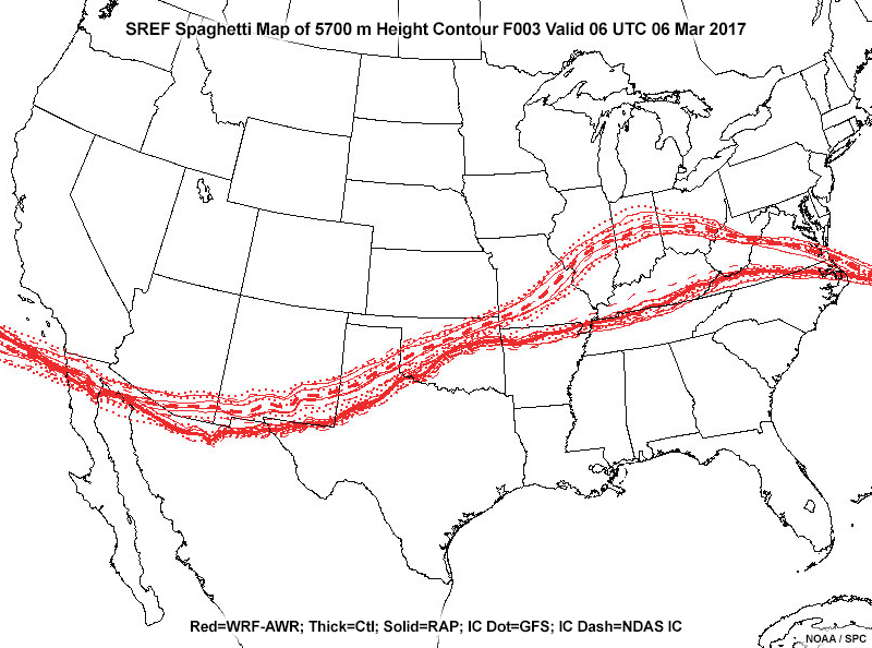
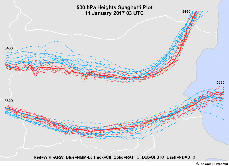
Ultimately, no single quantity directly expresses the most likely forecast from every distribution. Thus, it is critical to examine the underlying shape of an ensemble PDF or CDF before deciding on a most likely outcome or arriving at an overall uncertainty estimate. You can assess the overall shape of the distribution, including the presence of multiple modes, by examining products that plot all individual members, such as the spaghetti plot below.
It is also important to remember that ensemble PDFs and CDFs only represent the probabilities that occur in a single ensemble system. You could consider other possible solutions depending on your access to different models. But even if you looked at many of them, occasionally you’d find that the real atmospheric conditions occurred outside of the predicted values or within a gap in the distribution.
People often discuss forecast uncertainty when using EPS products. It’s important to remember that the uncertainty shown on a PDF or CDF is only the ensemble uncertainty. Your personal forecast confidence or uncertainty can and sometimes should be different based on your interpretation of atmospheric processes, the model’s performance, regime changes, local effects, and spatial and temporal scales that are smaller than the ensemble can resolve.
Using EPS Products in the Forecast Process
Supplementing deterministic forecast information with probabilistic information can improve your ability to estimate uncertainty in the existence, timing, and strength of weather features and impacts. Communicating probabilistic forecast information to end users, particularly as it relates to thresholds and likelihoods, can help them with cost-benefit analyses and safety decisions.
There are several general points to keep in mind when using EPS forecast information versus traditional deterministic information.
- Given the demands of running many ensemble members, most EPS systems run at about double the grid-spacing of their deterministic counterparts. They provide plenty of uncertainty information but may not capture small-scale phenomena as well as deterministic runs. Therefore, you should not immediately discount the outcome from a deterministic run even if it lies outside the EPS solution envelope, especially if topography or local effects may be at play.
- An EPS is only as good as the underlying model(s). If they cannot represent specific processes, such as individual convective cells, the EPS will not be able to represent them.
- In the medium to long range, avoid picking one member of the ensemble as the “member of the day” or throwing out members that seem unrealistic. This can be done more effectively for short-term forecasts (< 48 hours, preferably 24) by carefully assessing current observations, the quality of the model initialization, model performance, and your knowledge of local effects.
- For variables like QPF, the ensemble distribution is more likely to be non-normal due to topographic boundaries or other localized precipitation-generation processes. Therefore, they may not be as well represented by the ensemble mean as variables like temperature.
- When an EPS solution set has large spread, it is best not to communicate overly specific information or discount outlier solutions. You should encourage users to look for forecast updates. But when an EPS solution set consistently shows a small spread with a single mode, you can provide more detailed forecast information, including a most likely outcome.
- Finally, no forecast is truly useful unless it can be effectively communicated to and understood by users and the public. Ensemble prediction systems provide a great opportunity for the weather community to engage with end-users about thresholds and probabilities, providing the information that they need to conduct cost-loss analyses and make public safety decisions. You can learn more about forecast communication research and effective communication techniques in the Communicating Forecast Uncertainty lesson in the Forecast Uncertainty: EPS Products, Interpretation, and Communication Distance Learning Course.
Common EPS Products
Given the amount of data that ensembles produce, EPS products have been developed to summarize the data in different statistical forms. There are two broad types of EPS products based on their display.
Plan view products display data across the area of interest so you can quickly view differences across space
Point products display the entire time series of EPS data so you can quickly view differences across time
We will briefly describe the products in each group. You can learn more about them, including how to interpret them, in the EPS Products Reference Guide.
Common EPS Products » Plan View Products
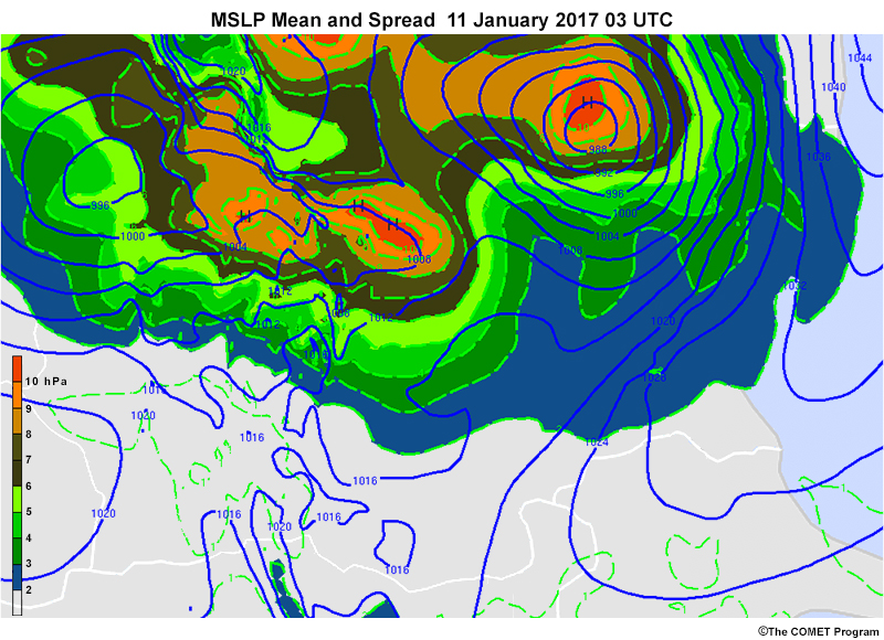
Common EPS Products » Plan View Products » Mean and Spread Maps
These maps plot the mean (average) value of a field as contours and colour-shade the spread (standard deviation), assuming a normal distribution.
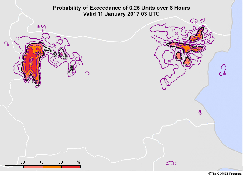
Common EPS Products » Plan View Products » Probability of Exceedance/Occurrence Maps
Forecasters are often interested in the probability of meeting or exceeding a critical threshold, especially if it applies to watches, warnings, and advisory criteria. Probability of exceedance/occurrence maps provide this information.
Common EPS Products » Plan View Products » Spaghetti Plots
These maps display all ensemble solutions spatially for one or more values of a variable, usually as contours.
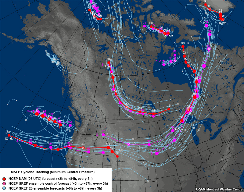
Common EPS Products » Plan View Products » Ensemble Trajectory Maps
These plots show forecast trajectories from all ensemble members for easily tracked phenomena, such as tropical and extratropical cyclone centres, vorticity centres, and individual thunderstorm cells.
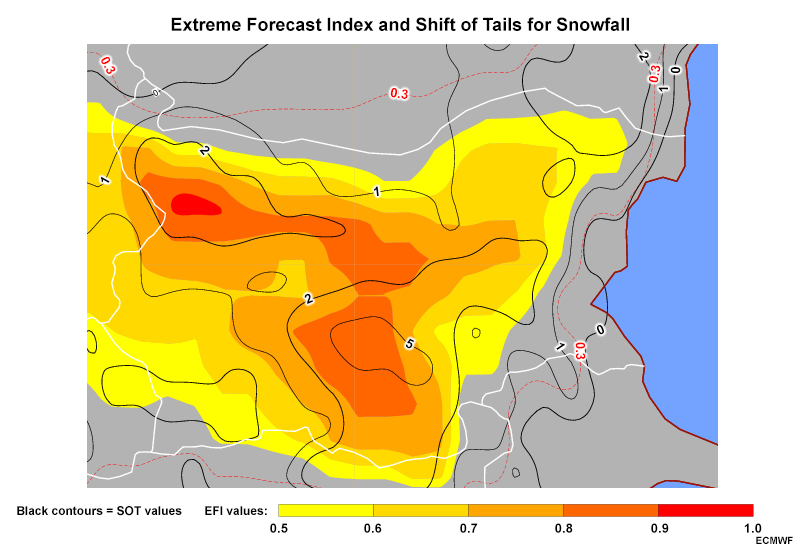
Common EPS Products » Plan View Products » Extreme Forecast Index and Shift of Tails Maps
These maps compare ensemble forecast CDFs to those from the model’s climate to help you anticipate anomalous or extreme weather conditions.
Common EPS Products » Plan View Products » Climatological Percentile Maps
Climatological percentiles are similar to EFI and SOT maps and show how unusual or extreme forecast conditions may be compared to a climatology.
Common EPS Products » Point Products
Common EPS Products » Point Products » Box and Whisker EPS Meteograms
These diagrams give a quick overview of an ensemble’s general distribution, including the median and various percentiles, over time at a given point.
Common EPS Products » Point Products » Shaded Percentile EPS Meteograms
These diagrams show the median and various percentile levels over time at a given point using colour shading and lines.
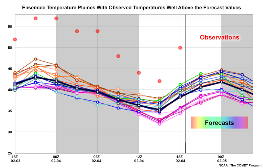
Common EPS Products » Point Products » Plume Diagrams
These diagrams show the values from all ensemble members for a given point over time, helping you find timing differences, clustering, and outliers.
Final Word
You have completed this brief introductory lesson, the first in the Forecast Uncertainty: EPS Products, Interpretation, and Communication Distance Learning course. The lesson gives you the foundational knowledge needed for the other components of the course, particularly the EPS Products Reference Guide and the Communicating Forecast Uncertainty lesson and its European case counterpart.
Please use the links to the left to take the lesson quiz and survey.
Contributors
COMET Sponsors
MetEd and the COMET® Program are a part of the University Corporation for Atmospheric Research's (UCAR's) Community Programs (UCP) and are sponsored by NOAA's National Weather Service (NWS), with additional funding by:
- Bureau of Meteorology of Australia (BoM)
- Bureau of Reclamation, United States Department of the Interior
- European Organisation for the Exploitation of Meteorological Satellites (EUMETSAT)
- Meteorological Service of Canada (MSC)
- NOAA's National Environmental Satellite, Data and Information Service (NESDIS)
- NOAA's National Geodetic Survey (NGS)
- Naval Meteorology and Oceanography Command (NMOC)
- U.S. Army Corps of Engineers (USACE)
To learn more about us, please visit the COMET website.
Project Contributors
Program Manager
- Bruce Muller — UCAR/COMET
Project Lead/Instructional
- Marianne Weingroff — UCAR/COMET
Primary Scientists
- Dr. Bill Bua — UCAR/COMET
- Bryan Guarente — UCAR/COMET
- Andrea Smith — UCAR/COMET
Graphics/Animations
- Steve Deyo — UCAR/COMET
- Sylvia Quesada — UCAR/COMET
- Marianne Weingroff — UCAR/COMET
Multimedia Authoring/Interface Design
- Gary Pacheco — UCAR/COMET
- Marianne Weingroff — UCAR/COMET
COMET Staff, March 2017
Director's Office
- Dr. Rich Jeffries, Director
- Dr. Greg Byrd, Deputy Director
Business Administration
- Dr. Elizabeth Mulvihill Page, Assistant Director of Operations and Administration
- Lorrie Alberta, Administrator
- Tara Torres, Program Coordinator
IT Services and Production Services
- Tim Alberta, Assistant Director of IT and Production
- Bob Bubon, Systems Administrator
- Steve Deyo, Graphic and 3D Designer
- Dolores Kiessling, Software Engineer
- Gary Pacheco, Web Designer and Developer
- Sylvia Quesada, Production Assistant
- Joey Rener, Software Engineer
- Malte Winkler, Software Engineer
International Program
- Paul Kucera, Project Manager
- Rosario Alfaro Ocampo, Translator/Meteorologist
- Bruce Muller, Project Manager
- David Russi, Spanish Translations
- Martin Steinson, Project Manager
Instructional Services
- Dr. Alan Bol, Scientist/Instructional Designer
- Lon Goldstein, Instructional Designer
- Bryan Guarente, Instructional Designer/Meteorologist
- Tsvetomir Ross-Lazarov, Instructional Designer
- Marianne Weingroff, Instructional Designer
Science Group
- Dr. William Bua, Meteorologist
- Patrick Dills, Meteorologist
- Lindsay Johnson, Student Assistant
- Matthew Kelsch, Hydrometeorologist
- Andrea Smith, Meteorologist
- Amy Stevermer, Meteorologist
- Vanessa Vincente, Meteorologist