EPS Products Reference Guide »
Plumes
Description
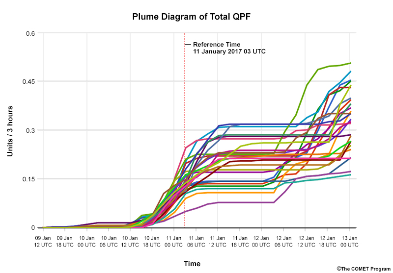
Plume diagrams display individual ensemble members and show how specific forecast variables change over time for a given location. They can either represent instantaneous values or cumulative values (as shown above). Often, the mean or median, control runs, or climatology traces are highlighted. From these plots, you can deduce information about the maximum and minimum forecast values, the most likely outcome, as well as the probability that specific values will occur.