EPS Products Reference Guide »
Plumes
Description
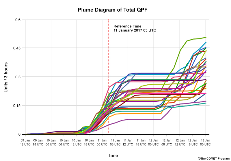
Plume diagrams display individual ensemble members and show how specific forecast variables change over time for a given location. They can either represent instantaneous values or cumulative values (as shown above). Often, the mean or median, control runs, or climatology traces are highlighted. From these plots, you can deduce information about the maximum and minimum forecast values, the most likely outcome, as well as the probability that specific values will occur.
Interpretation
Each line, or plume, represents a single member’s forecast values over time for the specified location. The median or mean value is often indicated by a bold line roughly centred among the group of plumes. Some plume diagrams are coloured by different variables, such as precipitation type. And some colour-code plumes above a certain threshold (for example, those above 0°C are red).
Plume diagrams can show outliers, the maximum and minimum values, and clustering. In the diagram below, the outlier is well outside the range of the main group of plumes but then merges with the others after several time steps. So it is best not to completely ignore outlier members despite their low probability of occurrence at a given time.
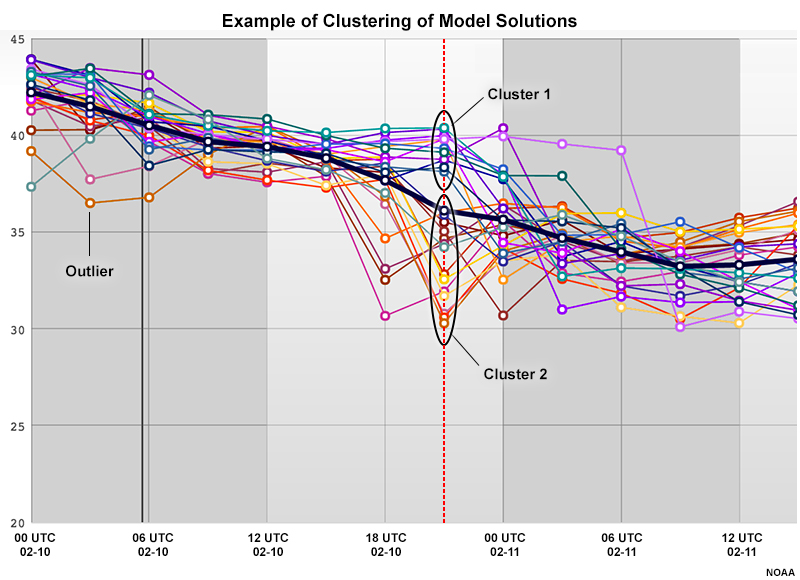
To determine whether the ensemble has clustering or is multimodal, look for areas where the members are divided into distinct subgroups with ample space between them or the other members. In our example, there is distinct spacing between clusters 1 and 2.
Clustering presents an excellent opportunity for you to add value to the forecast by using other products and observations to understand which cluster, if any, is the more likely solution.
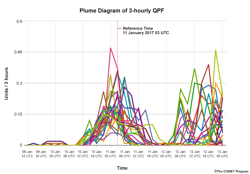
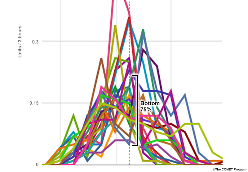
Below is the 3-hourly QPF plume, with the full distribution from the 14th time step shown in the foreground. The maximum and minimum precipitation values predicted by the ensemble are the highest and lowest values respectively.

To understand the probability of a threshold being met or exceeded, count the number of members that meet or exceed that threshold, then divide it by the number of members. In the diagram below, there is a 75% chance of <= .22 units / 3hrs of precipitation since 75% (18 of 24) of the ensemble members have values less than or equal to it.
This method of calculating probability can become difficult when the plumes are tightly spaced. That is why other diagrams are made for thresholding.
Strengths & Weaknesses:
Strengths:
Since you can see how all members are distributed, you can identify a normal distribution or clustering, which will improve your ability to forecast the most likely outcomes.
Plume diagrams also let you determine whether member disagreement is due to differences in the timing or magnitude of a weather system, or a combination of the two. For example, imagine two clusters of geopotential heights, one with a progressive trough to ridge, the other with a ridge to trough centred directly over the location, like the spaghetti plot below.
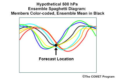
The ensemble would show good agreement with low spread above that location but poor agreement at locations to the east or west. If you looked at a box and whisker or shaded percentile EPSgram, you might see good agreement of heights over time for several time steps based on the median and range of solutions. However, that would be misleading. Of these plots, only plume diagrams show how the clusters happen to meet at one location while moving in opposite directions.
Since plume diagrams show the traces of individual members, you can compare plumes of different variables from the same ensemble to figure out their combined effect. For example, comparing plumes of precipitation and surface temperature can help you define precipitation type.
Knowing the model characteristics of individual members can help you determine if members with certain characteristics are causing clustering or outlier solutions.
Finally, plume diagrams show conditions at a specific point. This often yields more precision than estimating the value at a point from plan-view maps.
Weaknesses
While we can easily observe the shape of the distribution from a plume diagram, it is harder to estimate bulk statistical measures, like the probability of a certain value occurring at a location or the median value.
It can be hard to track the individual members through time. Our initial example has 24 members but other EPSs have over 50. Several products have an interactive viewer that highlights individual members when you hover over them but this not a common feature.
Like point products in general, the model forecast is likely interpolated, bilinearly or using the nearest land or sea gridpoint, to the specific location. Thus, the model is trying to represent horizontal and vertical scales that are not actually present, leading to some smoothing of forecast values.
Effective Use
Plume diagrams are useful for seeing the shape of the distribution and clustering at different time steps. They are best combined with other plots in the following ways.
- Use box and whisker or shaded percentiles to glean bulk statistics and decide whether to use or discard median and mean values at specific time steps.
- Use areal maps of probability, spaghetti maps, or trajectory maps to further assess member disagreement in the timing, magnitude, or position of a system or feature, and check on potential smoothing of surrounding values for your point forecast.
Keep the following points in mind when using plume diagrams.
- If you are concerned about severe or rare events, access additional information on model or reanalysis climate or observed climatology. At long lead times, the EPS median has a tendency to gravitate asymptotically toward the model climate.
- Occasionally, a deterministic run may show values outside the range of the EPS solution set. Since deterministic runs often have smaller grid spacing than EPSs, it can signal that small-scale features and/or topography are better resolved or that the EPS is not adequately sampling the processes or regime. This does not mean the EPS members or deterministic runs are better than the other. Rather, it suggests that you should carefully scrutinize the initialization and subsequent model runs.
Examples
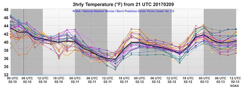
The questions on this and the following page are based solely on this 2m temperature (˚F) plume diagram from Vancouver, British Columbia, Canada. Each of the 24 members is a different colour, and the mean is shown in bold black.
Question 1 of 2
Based on this plume diagram, what is the most likely 2 m temperature for 06 UTC 12 February?
The correct answer is b.
Because we can see that the members are approximately normally distributed, the mean value is a reasonable approximation of the most likely outcome.
Question 2 of 2
At 06 UTC 10 February, what is the percent chance that the temperatures will be below 40˚F?
The correct answer is b.
Count the number of members with a forecast of lower than 40˚F (2). Divide by the number of ensemble members (24) to get an answer of ~8%.
Examples
The following questions are based on the same graphic as the previous page (2m temperature (˚F) plume diagram from Vancouver, British Columbia, Canada, each of the 24 members in a different colour, with the mean in bold black).
Question 1 of 2
Of these time steps, when does the model show the highest uncertainty in the temperature forecast?
The correct answer is d.
Of these time steps, the highest model uncertainty is at 00 UTC 12 February since the difference between the maximum and minimum values on the graph is largest at that time.
Remember that this is the model uncertainty in the forecast; your own confidence may not match. Since deterministic solutions sometimes lie outside of the ensemble solution set, your confidence in the ensemble can diverge from the ensemble uncertainty.
Question 2 of 2
At which of the following times would the mean calculation not necessarily represent the full distribution well?
The correct answers are a, c.
There are reasons not to trust the means at 06 UTC and 18 UTC 10 February. The first one (06 UTC 10 February) has significant outliers, which skew the mean toward that tail of the distribution. Better agreement among the members would make it easier to use the mean at that time. You could remove the outliers from the forecast and recalculate the mean value.
The second one (18 UTC 10 February) has clustering. If you were trying to decide which cluster to use, it would be best to pick the one closest to your understanding of the situation and use its mean in your forecast. Not surprisingly, the farther out in time you go from model initialization, the more difficult it is to determine if clustering is accurate. OR: … the less likely the cluster is to be accurate.
Links
- SPC SREF Plume Viewer: http://www.spc.noaa.gov/exper/sref/srefplumes/
- PSU E-Wall GEFS Plumes: http://cms.met.psu.edu/sref/ensembles/Plumes.html
- Plymouth State University Integrated Vapor Transport Plumes: http://vortex.plymouth.edu/~j_cordeira/ARPortal/Current/products.html#plume
- Center for Western Water and Weather Extremes Integrated Vapor Transport Plumes: http://cw3e.ucsd.edu/?page_id=491#PLUMES
- Environmental Modeling Center GEFS Plumes: http://www.emc.ncep.noaa.gov/mmb/cguastini/gefs/EMCGEFSplumes.html
- National Center Environmental Prediction Climate Forecast System Plumes: http://wxvu.net/spc/exper/sref/cfsplumes/index.php
- NCAR Weather Research and Forecasting (WRF) Model Plumes: https://ensemble.ucar.edu/dash.php