Print Version
Table of Contents
Subject Matter Expert
 Hello, I'm Ken Cook, the Scientific Operations Officer (SOO) at the
National Weather Service (NWS) Weather Forecast Office (WFO) in Wichita, Kansas. I've been at Wichita since
2005 and with the NWS since 1994. Before becoming SOO at Wichita, I was a lead forecaster at the Lacrosse,
Wisconsin WFO and a meteorologist at the Meteorological Development Laboratory in the Washington, DC area. I
hope you find this module enjoyable and useful in your work as an operational forecaster.
Hello, I'm Ken Cook, the Scientific Operations Officer (SOO) at the
National Weather Service (NWS) Weather Forecast Office (WFO) in Wichita, Kansas. I've been at Wichita since
2005 and with the NWS since 1994. Before becoming SOO at Wichita, I was a lead forecaster at the Lacrosse,
Wisconsin WFO and a meteorologist at the Meteorological Development Laboratory in the Washington, DC area. I
hope you find this module enjoyable and useful in your work as an operational forecaster.
Introduction
The content of this module will assist the forecaster with the third step of the forecast process; namely, determining plausible forecast outcomes forward in time. The module will highlight the role of probabilistic forecast tools to assess the degree of uncertainty in a forecast, as well as suggest an approach for evaluating past and present model performance.
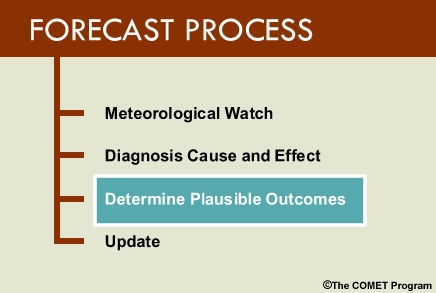
A plausible forecast outcome can be defined as the most likely forecast scenario. In order to determine a plausible outcome, we need to review several uncertainty products. Based on the uncertainty information and our conceptual model of the atmosphere, we can select the most probable outcome. Therefore, the main learning objectives are:
- Use 6 tools to determine the uncertainty of the forecast.
- Evaluate recent model performance history and its effects on NWP output to determine the plausible forecast outcomes.
The module is divided into two sections paralleling the learning objectives. A forecast simulation is included at the end of this module that will enable you to see and put into practice the ideas learned.
It is highly recommended that you complete the previous sections of the NWP course before attempting this module.
Determining the Uncertainty of the Forecast
Impact of Error Growth, Model Scales, and Model Inadequacy on Predictability
Forecasts contain uncertainty because various error sources lead to different forecasts that may be equally plausible. Several major error sources include:
- Initial condition errors resulting from observation error or insufficient observations (phenomena not
sampled sufficiently or at all), different assimilations of observations, etc. To learn more about data
assimilation, visit the module Understanding Assimilation Systems: How Models Create Their Initial Conditions -
version 2.
- Model error from insufficient resolution, dynamics/numerics, etc. To learn more about model error, visit
the module Impact of
Model Structure and Dynamics - version 2, Horizontal Resolution, Resolution of Features,
Features in Analysis and Features in Forecast.
- Model error due to physics parameterizations (radiative parameterization, convective parameterization, Planetary Boundary Layer, and other schemes). To learn more about model physics and parameterizations, visit the module, Influence of Model Physics on NWP Forecasts - version 2 and the parameterizations discussed there.
One of our duties as forecasters is to examine error sources and determine which forecasts are plausible and which are not. For example, if a satellite loop indicates a short wave is mislocated in a model's initial condition, that model's forecast for the shortwave will likely have larger errors. This leads to a less plausible forecast than a forecast from a model with initial conditions better matching the satellite loop. However, if two models match the satellite loop approximately equally, their forecasts of the evolution of this wave might be equally plausible.
Products to Determine the Uncertainty in a Forecast
Understanding that all models are imperfect, we need to determine our confidence that a NWP forecast can effectively deal with the forecast problems of the day. This will help us decide how likely the NWP solutions are and their plausiblity. The following is a list of some of the better tools for determining degree of confidence:
- Florida State University (FSU) Uncertainty Charts
- National Centers for Environmental Prediction (NCEP) Relative Measure of Predictability (RMOP)
- Ensembles which include some of the more widely used products such as:
- Spaghetti diagrams
- A poor man’s ensemble
- dProg/dt
- Plume diagrams
- Short Range Ensemble Forecast (SREF) probability plots
FSU Uncertainty Charts
FSU's Uncertainty Charts assess the level of uncertainty of the current Global Ensemble Forecast System (GEFS) forecast, compared to the average uncertainty of the GEFS for the given time of year. They also compare the degree of confidence in the current forecast to the past GEFS “climatology” of forecast confidence for a number of meteorological variables.
On this image, the black line is the 00 UTC 7 January 2007 standard deviation of the forecast by the GEFS out to 7 days, the blue line represents the climatological 45 day GEFS standard deviation, centered on 00 UTC 7 January. The yellow line is the 25 year observed standard deviation of 2 meter temperature for 7-14 January. Standard deviation in an ensemble measures confidence in the ensemble forecast. Thus, areas of red and green represent where the uncertainty from the GEFS 00 UTC 7 January 2007 forecast of 2 meter temperature exceeds/falls short of what it usually is during this time of year.
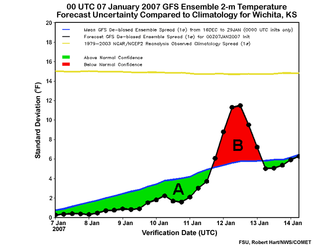
Notice the labeled areas A and B on the image.
Question
Think of how you might apply this information in the forecast process. Which area exhibits the greatest potential for significant improvement to the GEFS: (Choose the best answer.)
The correct answer is b).
The “red-zone” indicates low level of confidence in the forecast. That is where a meteorologist has the greatest opportunity to improve NWP predictions. This is also where large scale, high impact events lie within the forecast. The green zone indicates high confidence in the GEFS, suggesting it is unlikely the forecaster can improve the forecast.
Moreover, there will be cases where the red zone extends above the yellow line. This means the GEFS 2 meter temperature forecast uncertainty exceeds the climatological temperature variation for this date. In other words, the GEFS is extremely uncertain and a forecast of climatology should be considered.
The following links provide more information on the FSU Uncertainty Plots, including having stations added for your area of interest:
- Publication: http://ams.confex.com/ams/Annual2006/techprogram/paper_100178.htm
- Products: http://moe.met.fsu.edu/confidence/
- Add Stations: Contact Bob Hart at FSU by e-mail: rhart@met.fsu.edu
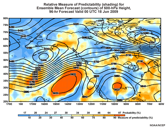
Relative Measure of Predictability (RMOP)
The NCEP RMOP is an objective way to describe the GEFS' ability to predict atmospheric flow based on its performance over the previous 30 days. NCEP RMOP displays the likelihood that a pattern will form over a region of the country. In the graphic below, the contours are GEFS ensemble mean 500-hPa heights. The warm and cool shadings are areas of high and low predictability, respectively. Along the bottom of the image is a color bar. The numbers below the color bar represent the percent of forecasts over the last 30 days with lower predictability than the current one. This is based on the number of ensemble members in the same climatological category1 as the ensemble mean. The assumption is that if more ensemble members are close to the ensemble mean, the atmospheric flow is more predictable. The numbers above the color bar represent the probability of occurrence based on verification over the last 30 days. The numbers above and below the color bar reflect the image colors on the map.
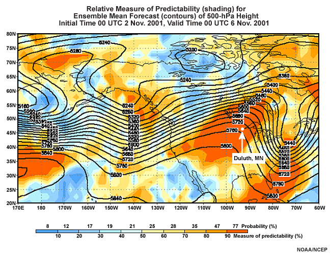
Let's look at Duluth, MN on the 96 hour forecast (above) made at 00 UTC 02 November 2001.
Question
If you were forecasting for Duluth (indicated by white dot and arrow on the graphic) on this day, how would this information impact your forecast decisions? (Choose the best answer.)
The correct answer is a).
This pattern is very predictable with a 90% measure of predictability and with a 77% chance of verifying. Any forecaster should strongly consider a forecast well above climatology, given the strong ridge of high pressure at 500 hPa. The RMOP is very effective in forecasting high impact events such as this. Often, high predictability is indicated for extreme events even when there is a high spread of values among the ensembles. Even members far from the ensemble mean may be indicating a rare event. If you see both high spread and high RMOP probabilities, it indicates large uncertainty in how extreme an event will be but agreement that the event will occur.
For more information please visit the following links that contain detailed explanations as well as the forecast images themselves:
- Detailed documentation: http://www.meted.ucar.edu/nwp/pcu3/cases/ens08apr02/rmop.htm and http://www.emc.ncep.noaa.gov/gmb/targobs/target/ens/relpred.html
- Forecast Images: http://www.emc.ncep.noaa.gov/gmb/yzhu/html/opr/relpred.html
1The long-term analysis climatology is divided into ten equally likely bins and the number of members falling into the bins is tallied. If forecasts were evenly distributed across climatology, we would expect ten percent to fall into each bin, and the forecasts would have no skill. Thus, numbers higher than 10 indicate a measure of skill in predicting deviations from the climatological distribution as shown in today's forecast. More information on RMOP can be found in the Tools section of the module Ensemble Forecasting Explained (in the navigation menu, choose Summarizing Data, then Products, then page 11).
Spaghetti Plots
Spaghetti plots help you view the individual members of the Ensemble Forecast System (EFS). They are available on AWIPS as well as online.
They are useful in examining:
- The overall spread of the ensemble members (i.e., the agreement or lack thereof, and the ability or inability to improve on NWP)
- The extremes within the members of the ensemble
- If there are any bimodal solutions (a case where the members cluster around 2 different solutions), or clusters of solutions
- The solution envelope. In general, the most likely solution is bounded by the outermost individual members.
To learn more about Spaghetti Plots visit Understanding the Role of Deterministics vs Probabilistic NWP Information
Poor Man's Ensemble
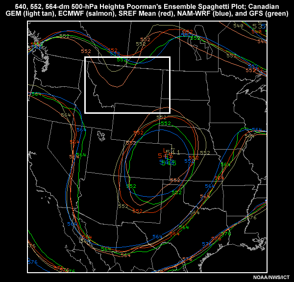
A poor man’s ensemble combines parameterizations and/or initial conditions from different modeling systems by overlaying their forecasts on a plan-view map. This is different from other ensemble systems that vary parameterizations and initial conditions in one model. Below is an image of a poor man's ensemble of the 500 mb height using the Canadian GEM (light tan), ECMWF (salmon), SREF Mean (red), NAM-WRF (blue), and GFS (green). Since this can be done easily on the AWIPS system1, a user could create short- and long-range poor man's ensembles for a variety of forecast fields. As with traditional ensembles, small spreads among the ensemble members correspond to high confidence and a small chance of improving the model forecast. Conversely, large spreads mean low confidence and a better chance of improving on the model. An ensemble constructed by combining different model systems often produces better ensemble mean statistics. The verification is also more likely to be captured in its range of forecast outcomes than in a single model system. This is a useful way to evaluate many models at once.
Question
Given this data, how would you forecast the weather in northeast Montana for the next 24 hours? (Choose the best answer.)
The correct answer is d).
There is a bimodal solution with the incoming disturbance with 2 of the 5 members suggesting that this disturbance will affect the forecast area. Since we are in the 24-hour forecast range, we recommend determining which model(s) are performing best now and weighting the forecast toward it or them.
1Customize the “Comparison Families” menu in the AWIPS volume browser; consult this web site for detailed instructions. Or, you can search for “Comparison Family” on the Local Applications Database .
dProg/dt
dProg/dt is defined as the change in the forecast over time for a given valid date. In other words, the forecaster can examine how the preceding forecasts for the same valid date have changed over time. This is utilized quite easily in AWIPS by selecting it from the D2D “Load Mode” control menu. Using dProg/dt enables the forecaster to ascertain the run to run consistency for a specific verification time period. It can also show consensus building or trending for your forecast problems of the day. That said, these trends can reverse, therefore, you must utilize dProg/dt carefully.
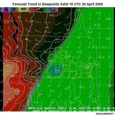
This loop illustrates the uses and pitfalls of dProg/dt. It shows a NAM-WRF boundary-layer dewpoint forecast. These temperatures range from the mid 60's in the east to the teens (F) to the west, with a strong gradient in between. The main forecast problem for this time period is convection. The area of possible convection is along the dewpoint gradient. Wind barbs are in blue, and the Wichita forecast area is highlighted in yellow.
The forecast valid date of interest is 18 UTC 26 April 2009. Examining this loop shows a gradient of dewpoints extending across central Kansas from southwest to northeast. This is associated with a cold front moving into the forecast area. The loop begins with a forecast made 42 hours ago and ends with the 00 hour forecast.
Notice that the gradient associated with the cold front trends further south so that by the 24 hour forecast, the front is further southeast into the forecast area. This has occurred in consecutive model runs.
Question
How would you use this dProg/dt information in your forecast process? (Choose the best answer.)
The correct answer is b).
Notice the front and gradient shift back to the northwest by the end of the loop and the 42 hour forecast was nearly as accurate as the 00 hour initialization. This case shows the pitfalls of extrapolating trends. Rather, the proper use of dProg/dt should be to visualize all of the runs as one ensemble and deduce the spread, envelope, and extremes of the forecasts for the same valid time.
Plume Diagrams
A plume diagram shows the ensemble forecast of an element, such as precipitation. Plume Diagrams can be used to identify:
- Overall spread of the ensemble members (i.e. the consistency or lack thereof, ability/inability to improve on NWP)
- Mean, maximum, and minimum for each precipitation type
- Total liquid precipitation for each ensemble member
- Any “clustering” of solutions of the individual members
- Precipitation beginning and ending time (duration inferred)
- Precipitation type based on color of trace
To learn more about using Plume diagrams visit Understanding the Role of Deterministics vs. Probabilistic NWP Information module in this Unit.
Finally, these and other plume diagrams are available online at the following locations:
- http://eyewall.met.psu.edu/mrefplumes/index.html
- http://www.spc.nssl.noaa.gov/exper/sref/plume/ (Firefox and Internet Explorer only)
SREF Probablility Plots
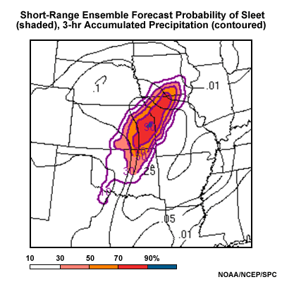
The SREF probability plots are used to examine the probability of reaching or exceeding a specific threshold of a particular meteorological field. This is an image of the probability of sleet. The purple contours represent the probability, the shading highlights higher probabilities, and the black lines represent the SREF mean Quantitative Precipitation Forecast (QPF).
Question
Given the forecast graphic above, what precipitation type would you forecast for eastern Kansas? (Choose the best answer.)
The correct answer is b).
Confidence should be rather high that sleet will be a problem in the eastern portion of Kansas.
Apply NWP Model Performance Assessments to the Forecast Problems of the Day
In the first section of this module, we learned about determining confidence in a plausible outcome. Now we are going to assess the recent performance of NWP in handling our problem of the day, using a forecast exercise from the day shift on 14 June 2009. A good way to accomplish this is by comparing previous model forecasts with their respective outcomes and through analysis of the initial conditions. Both will allow you to deduce the forecast uncertainty and develop a plausible forecast outcome by examining a few select meteorological fields.
Situation Briefing
You are making a 7 day forecast for the Wichita weather forecast office (WFO) in central and southeast Kansas. You are on the day shift. The forecast problems of the day are a possibility of convection for the first three days of the forecast, then a warm up during the middle of the period.
In the short term, NWP has not been doing very well with the location of the main quasi-stationary front which at 13 UTC 14 June 2009 traversed the forecast area from west to east. There are also many outflow boundaries that are more than likely sub-grid scale. Soils are saturated from evening and overnight rainfalls over the last several days.
Evaluate NWP Past Performance
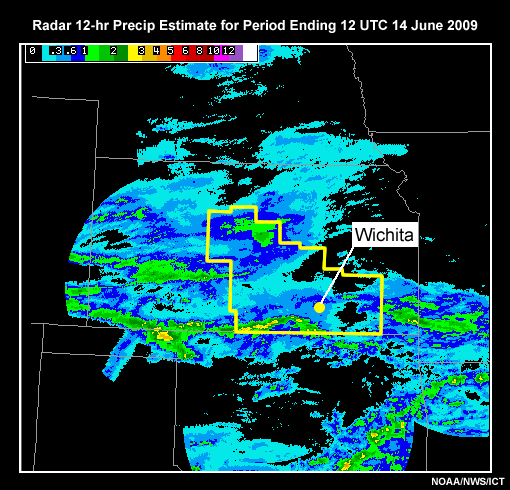
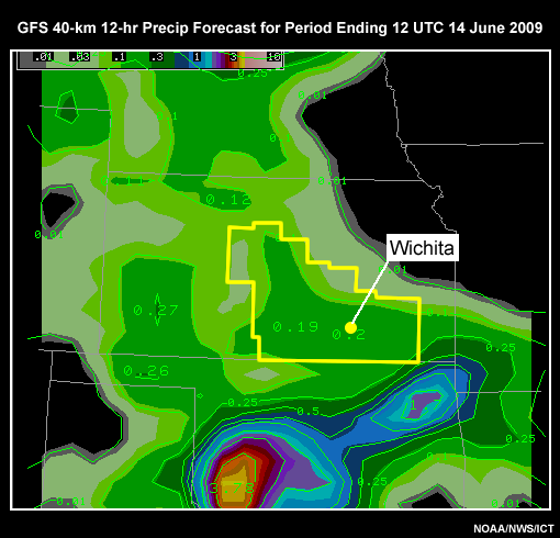
The first step is to compare previous model forecasts with their respective outcomes. Let's begin by comparing the following precipitation estimates by radar and forecasts by various models. The prediction of precipitation that fell from evening and overnight convection can be examined by viewing the following data loops. In addition, forecasters should make it common practice to review the previous Area Forecast Discussion (AFD).
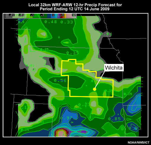
Click the tabs to compare the various model QPFs with the previous rainfall total. This is a 12 hour precipitation comparison for the period ending 12 UTC 14 June 2009.
Radar baseline (12 hr Storm Total Precipitation)
GFS 40
NAM-WRF-40km
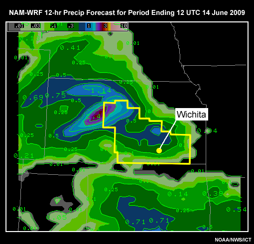
SREF
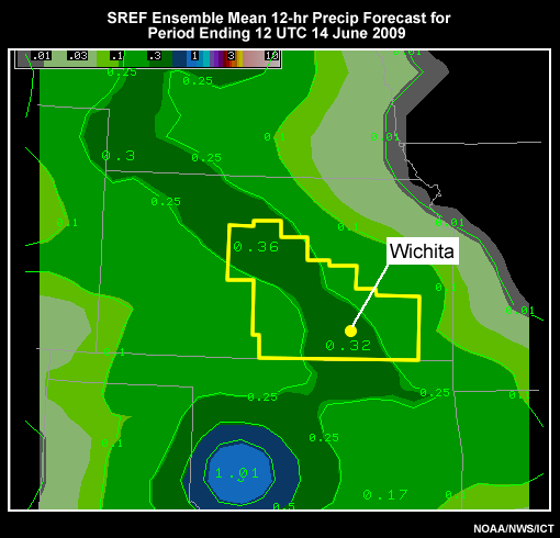
ICT-WRF-ARW 16km
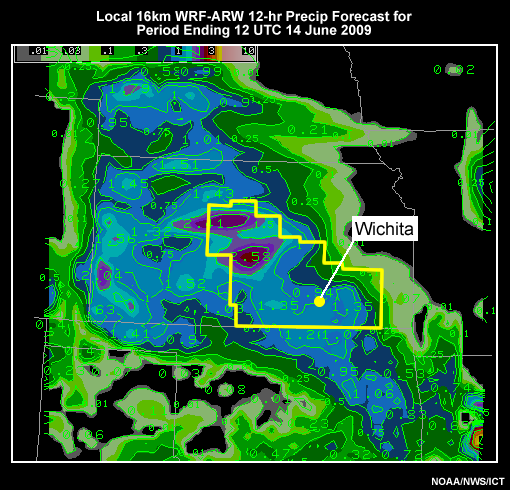
ICT-WRF-ARW 32km
Question
Which models have been performing best in the recent past? Put the models in the correct order of performance from best to worst by clicking a number in each drop-down box.
Of the five model QPFs, the local models were better than the NCEP models, and of the NCEP models, the NAM-WRF performed best. While all NWP forecasts have precipitation over the WFO during the previous 12 hour period ending at 12 UTC, they have been poor on location details. Therefore, we can say that confidence on the synoptic scale is high, but low on the mesoscale.
Evaluate Current NWP Performance
Our past performance assessment of NWP suggests that the local models have done a fair job on the previous forecast; the NAM-WRF was the best choice among the NCEP models. To evaluate the current performance we need to look at how the models are initialized and compare that to the current observations.
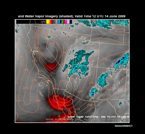
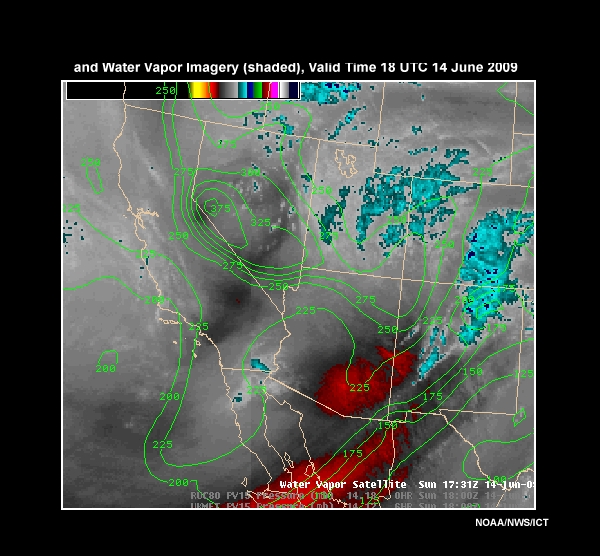
Let's examine a loop combining Potential Vorticity from the initial state of the models six hours ago and the currently observed Water Vapor (PV/WV). Remember, we are focusing on the convective aspect of the forecast (our first problem). The area we are looking at is the southwestern states where the images depict a group of disturbances. These will affect the Wichita, KS forecast area during the 00 UTC and 12 UTC period of 15 Jun 2009. The PV/WV loops are a comparison at 12 UTC and 18 UTC 14 June 2009.
GFS40 - 12 UTC
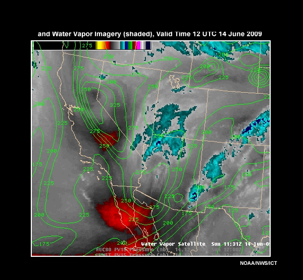
NAM-WRF80 - 12 UTC
GFS40 - 18 UTC
NAM-WRF80 - 18 UTC
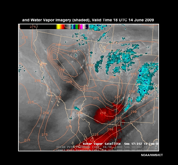
The contours are of pressure on the 1.5 PVU surface. Take some time to review the loops and see which model is doing better with the initializations.
Question 1
After reviewing the loops, which assessment below best describes the initialization. (Choose the best answer.)
The correct answer is b).
The NAM-WRF initial state handled the situation better and continues to do so. It shows the disturbance over southern Arizona as stronger, which is likely the case given the amount of darkening on the water vapor imagery (in fact, it may be stronger than the NAM-WRF). Yet, it does not resolve the secondary disturbance over southern California/southern Nevada well. Click the “continue” button below to view additional information now and answer a second question.
Question 2
Based on your assessment above, select the most appropriate adjustment. (Choose the best answer.)
The correct answer is c).
The secondary disturbance may be slower and farther south, so monitoring this possible trend is appropriate. This will enable us to make any necessary adjustments later on. Such monitoring is also warranted because the secondary disturbance may affect the downstream development of the primary disturbance.
Evaluate NWP Prediction
Thus far, we know:
- The local models as well as the NAM-WRF performed the best with the previous night's convection.
- The NAM-WRF has the best initial conditions thus far in the current day of your forecast.
We must now assess the predictive component of NWP.
Short-Range Forecast
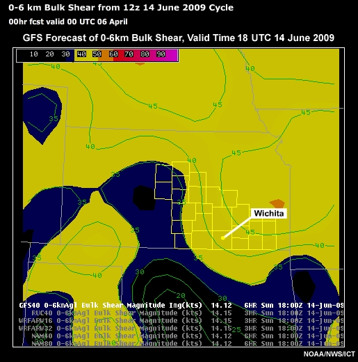
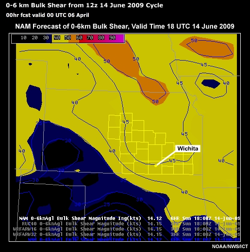
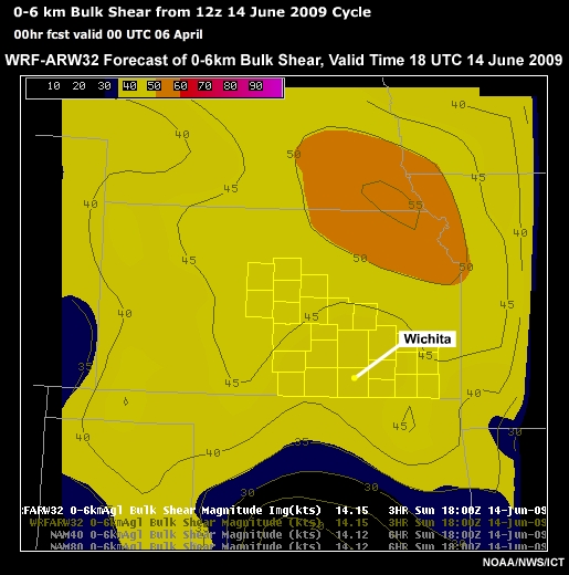
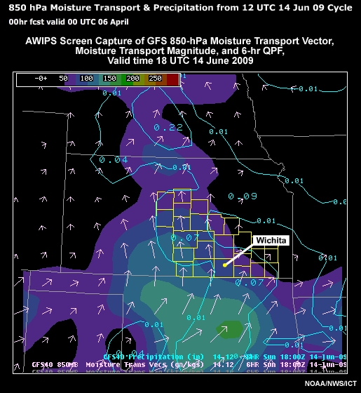
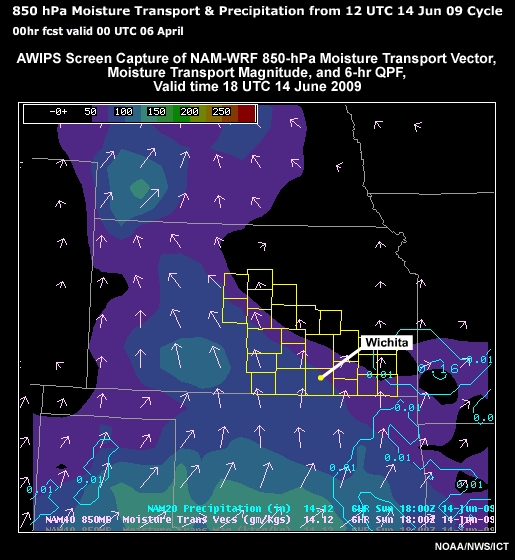
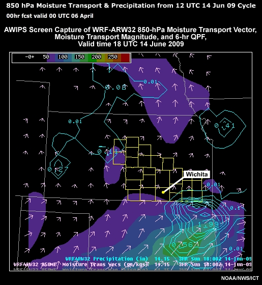
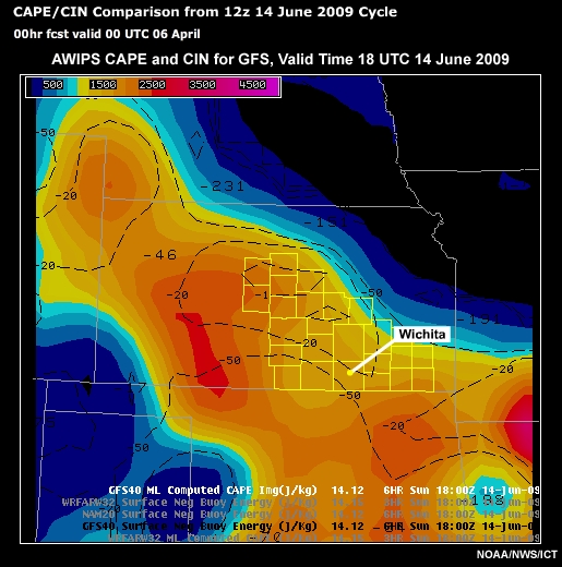
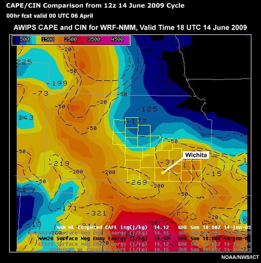
Let's examine a collection of data to determine a plausible forecast outcome. Remember that right now, we are assessing convection for the first 60 hours of the forecast. To do this, we have forecasts from different models: GFS, NAM-WRF, and a locally-run version of the WRF-NMM at 32-km resolution. Some precipitation data from the SREF is also provided. Graphics for the following variables are shown:
- 0-6 km bulk shear
- 850-hPa moisture transport and 6-hour accumulated precipitation
- Convective Available Potential Energy (CAPE) and Convective Inhibition (CIN)
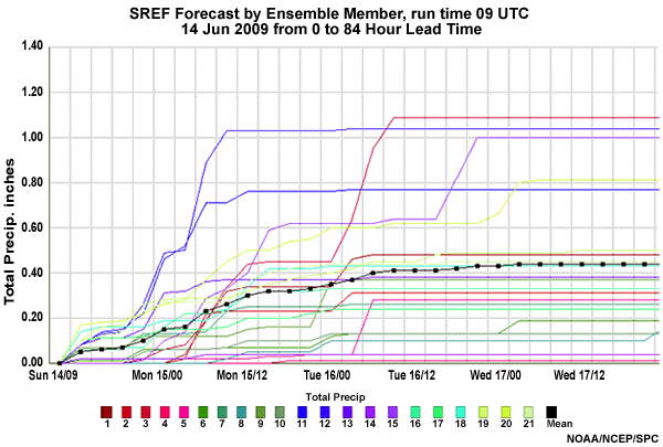
- Accumulated precipitation for each member of the SREF for both Wichita and Hutchinson, KS
The forecast analysis extends beyond these meteorological fields; however, we selected a few pertinent ones for this scenario.
The tabs allow you to examine the different fields (and in the case of the plume diagrams, the two different locations). You can show the different models by clicking on the radio buttons at the top of the graphics page. To step through the loops use the back and forward buttons above the images.
As you go through the images, please assess and develop a plausible forecast outcome for convection. The four questions after the data viewer relate to these images.
Data Viewer
0-6km Bulk Shear Model Comparisons
850 hPa Moisture Transport Model Comparisons
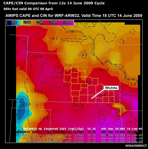
CAPE/CIN
Question 1
Given the information in the animated graphics, what do you think will be the nature of any convection in the Wichita KS WFO during days 2 and 3? (Choose the best answer.)
The correct answer is b), organized along areas of convergence.
We know that conditions will be favorable for convection, with moisture convergence, CAPE, and bulk shear. But we are missing information about the nature of the shear. Straight line shear will result in linear convection, while rotational and velocity shear will result in potential supercells. This also emphasizes the need for continuous metwatch for days 2 and 3. In examining the 0-6km bulk shear, we note that all models have significant shear, though the values and location vary from model to model. Note that the 32km WRF-ARW local area run, initialized with the GFS and using its lateral boundary conditions, looks very much like the GFS forecast. This is because the GFS at the lateral boundaries is constraining the WRF-ARW to some extent, even though it uses a different convection scheme.
Question 2
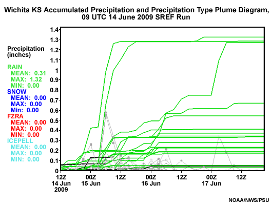
What time is convection expected to initiate during day 1 and day 2 at Hutchinson, KS? (Choose the best answer.)
The most correct answer is b), “15 to 18”, although c), “18 to 21‘, is also a good answer.
This is based on the initial times precipitation shows up in the plume diagrams for Hutchinson, KS.
Question 3
What time period is convection most likely during the next 3 days in the Wichita forecast area? (Choose the best answer.)
The correct answer is a), 00 UTC to 12 UTC.
Although convection will probably develop before 00 UTC both nights, remember the mesoscale remains uncertain. Since convective initiation (CI) is a mesoscale (at best) process, precipitation probabilities should be highest early in the 00 UTC to 12 UTC period.
From the moisture transport diagrams and the lack of change in the convective environment over the day 1-3 period, we can deduce that the front currently over the forecast area will remain in the vicinity. The plume diagrams indicate that convection will occur in the 00 UTC to 12 UTC time period through day 3, and that it will tend to initiate during the 15-18 UTC period. Reinforcing this forecast is the June climatology of the central Great Plains, which typically shows convection in the afternoon and early evening. With this in mind, consider the next question.
Question 4
In developing your plausible forecast outcome, what do you think best represents the solution to this forecast problem of the day? (Choose the best answer.)
The correct answer is c).
The front remains across the forecast area for the next three days. The plume diagrams show most members having precipitation on day 1, but a decreasing number each of the next two days. Moisture transport, CAPE, and CIN support the model convective forecast, suggesting several rounds of precipitation, and a high confidence forecast. Recalling the briefing, there likely will be outflow boundaries at sub-grid scale, so the mesoscale will be highly uncertain. This will affect afternoon storm initiation location and timing. Given the 0-6 km bulk shear, convection will be organized. Further assessment will be needed to determine specific convective mode(s) (not done here).
It is strongly encouraged for persons making a forecast in the 0-12 hour time frame to have a highly detailed and focused metwatch and short term forecast outcome in mind in these cases. Research from project Phoenix http://ams.confex.com/ams/22WAF18NWP/techprogram/paper_122657.htm, a model versus human forecaster study, suggests that forecasters with NO model information can outperform forecasters using NWP if they used high-end science practices and detailed analysis.
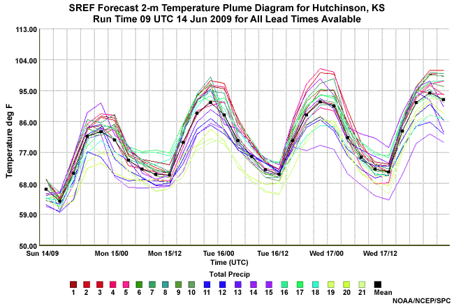
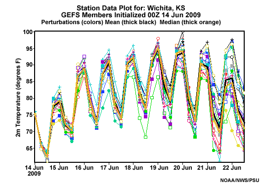
Medium-Range Forecast
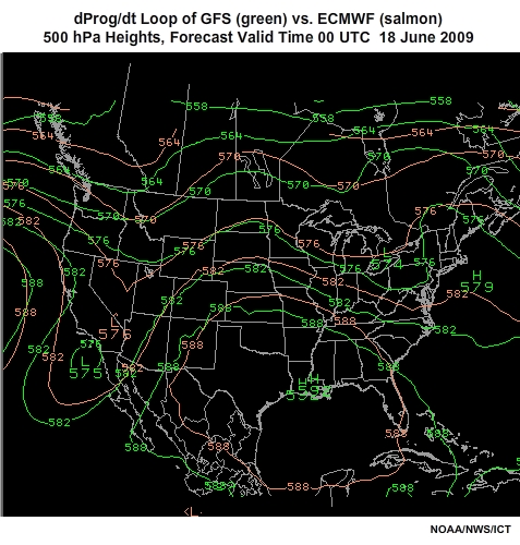
The last part of this case is to evaluate the second forecast problem of the day - the temperature warm-up in the latter half of the forecast (day 4 through 7). Please evaluate the images using the image viewer provided. Data includes the FSU Uncertainty graphic for 2-m temperature, the RMOP graphic at 96-hour lead time, the SREF 2-m temperature plume diagram for Hutchinson, KS, the GEFS 2-m temperature plume diagram for Wichita, KS, and an animation of dProg/dt for 500-hPa heights valid at 00 UTC 18 June 2009. When done evaluating the data, there are two questions to answer based on the graphics.
FSU Uncertainty
RMOP
T2m HUT
T2m ICT
Question 1
For this forecast, the forecast confidence is: (Choose the best answer.)
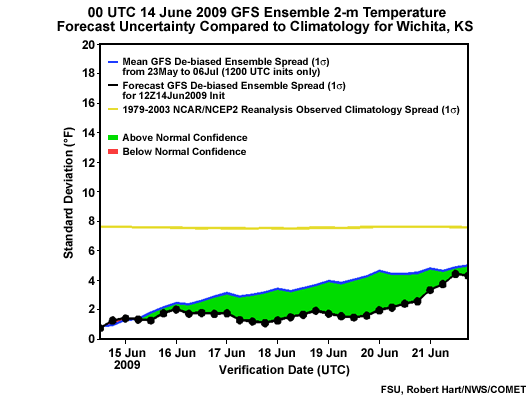
The correct answer is a).
The 2-m temperature FSU uncertainty chart for the ensemble forecast from 00 UTC 14 June 2009 relative to the 2005-2009 average, indicates lower than average uncertainty for the time of year. Thus, the forecast has higher than normal confidence. Also, the relative measure of predictability at 500-hPa, indicating potential weather patterns of influence, shows a deep-layer ridge over KS with a cutoff anticyclone to the south, a pattern conducive to above normal temperatures. The colors in the RMOP diagram indicate more certainty in KS than about 70% of the ensemble forecasts over the last 30 days. Thus there is above average predictability (warm shadings) for the medium-range, also supporting relatively high confidence.
Question 2
Should you be confident in forecasting highs and lows above climatology (lows - mid 60s; highs mid 80s)? (Choose the best answer.)
The correct answer is a), “Yes”.
dProg/dt was more consistent in the ECMWF than the GFS. Yet, both were sufficiently consistent to reinforce the GEFS forecast. Additionally, the plume diagram for 18 through 20 June indicates ensemble mean temperatures above 90°F, with all members at or above the mid-80s threshold. Thus confidence of a warm-up is pretty high. The range of the warm-up can be gleaned from the values in the ensemble plume diagram.
One important item to consider is the saturated soils from previous and expected day 1 through day 3 rainfall. Evapotranspiration in a moist environment would likely keep high temperatures down, but result in higher dewpoints. Depending on day 1 through 3 actual rainfall, this could affect maximum temperature. Convective forecasts may also be affected in the day 4 through 7 forecast period because of greater than expected CAPE values. Keep in mind that the GFS and ensembles do model the effect of evapotranspiration and soil moisture on the forecast, but are prone to errors in forecasting their impact on temperature and stability.
The final assessment for this case: Confidence is high that organized convection will occur over the forecast area in the short term (days 1-3). However, the mesoscale details of CI location and timing, and movement of resulting strong storms and heavy precipitation is highly uncertain. You will need to monitor and analyze the short-term environment using continuous metwatch techniques. Toward the days 4-7 period, there is high confidence in a warm-up for the area.
Some final comments: the keys to forecasting really start with your SOO, and his or her providing the tools necessary so that forecasters can do their jobs at the highest level. Forecasters need to know what to assess and how to assess it using operational forecast tools founded in sound science, to develop plausible forecast outcomes.
Summary
This module of Unit 3 focused on the steps for determining the plausible forecast outcomes. The first part of the module introduced tools that can be be used to ascertain the level of uncertainty in a particular forecast outcome. These tools included:
- Florida State University (FSU) Uncertainty Charts: FSU Uncertainty Charts assess the level of uncertainty
of the current Global Ensemble Forecast System (GEFS) forecast, compared to the average uncertainty of the
GEFS for the given time of year. They also compare the degree of confidence in the current forecast to the
past GEFS “climatology” of forecast confidence for a number of meteorological variables.
- They are useful for determining the degree of confidence in the forecast for days 1 through 7.
- National Centers for Environmental Prediction (NCEP) Relative Measure of Predictability (RMOP):The NCEP
RMOP is an objective way to describe the predictability of the atmospheric flow in the GEFS.
- This is useful for determining the degree of confidence that a particular flow pattern will set up over your area.
- Some widely used ensemble products include:
- Spaghetti diagrams:Spaghetti plots are very useful in examining the individual members of the ensemble
forecast system. They are available on AWIPS as well as online.
They are useful in examining:- The overall spread of the ensemble members (i.e. the consistency or lack thereof, ability/inability to improve on NWP)
- The extremes within the members of the ensemble
- If there are any bimodal solutions (a case where the members cluster around 2 or more common solutions)
- The range of possible forecast outcomes, also known as solution envelope. In general, the most likely solution lies within the outer bounds of the individual members.
- A poor man’s ensemble: An ensemble constructed by combining different model systems often
produces better ensemble mean statistics. Verification is also more likely to be captured in its
envelope than ensembles from a single model system.
- This is a useful method of evaluating many models at once.
- dProg/dt: shows how the preceding forecasts for the same valid date have changed over time.
- It is best used to visualize all of the runs as one ensemble and deduce the spread, range of possible forecast outcomes, and extremes of the forecasts for the same valid time.
- Plume diagrams: A plume diagram shows the ensemble forecast of an element, such as precipitation, at a
station.
- These are useful to show mean, maximum and spread of ensemble members, precipitation start and end times, etc.
- Short Range Ensemble Forecast (SREF) probability plots: are used to examine the probability of
reaching or exceeding a specific threshold for a particular meteorological field.
- Probability plots are useful in determining the need to issue warnings and advisories.
- Spaghetti diagrams:Spaghetti plots are very useful in examining the individual members of the ensemble
forecast system. They are available on AWIPS as well as online.
The second part of this module offered a method for determining plausible forecast outcomes based on past and present model performance.
First, we compared previous model forecasts with their respective outcomes. We accomplished this by comparing previous model forecasts with their respective outcomes.
Next, we analyzed the initial positions of weather features that were going to affect our forecast area, using observations appropriate for the analysis. The larger the initial error, the less likely the subsequent forecast will be plausible.
Third, we used probabilistic tools for different weather variables, to determine the level of confidence in likely forecast outcome(s) in the short and medium range. These include tools like RMOP, the FSU Uncertainty charts, plume diagrams, and dProg/dt.