Introduction
Operational weather forecasters often see single valued (deterministic) numerical weather prediction (NWP) forecasts go awry. This issue results from the approximations used in NWP models and the sensitive dependence on initial conditions (Lorenz, 1963).
Given these realities, forecast centers have developed Ensemble Forecast Systems (EFSs). These are probabilistic NWP systems run with multiple forecasts using slightly different initial conditions. EFS forecasts are typically generated from one model although some systems use multiple models. Because EFSs estimate probabilities for a range of forecast outcomes, they are used for situational awareness of potential high impact events, and to anticipate the need for impact-based decision support.
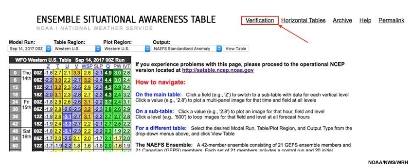
To provide useable information from EFS data, ensemble products or tools are created to summarize the data. The National Weather Service (NWS) Western Region Science and Technology Integration Division (WR-STID) maintains an Ensemble Situational Awareness Table (ESAT), which is used to assess forecast “extremeness” out to 10 days.
The ESAT uses data from the NCEP Global EFS (GEFS) and the North American EFS (NAEFS). The latter combines the GEFS and Canadian EFS (CEFS) into a multi-model global ensemble. For more information on Canada's Global Ensemble Prediction System and NCEP GEFS, see COMET’s Operational Models Encyclopedia.
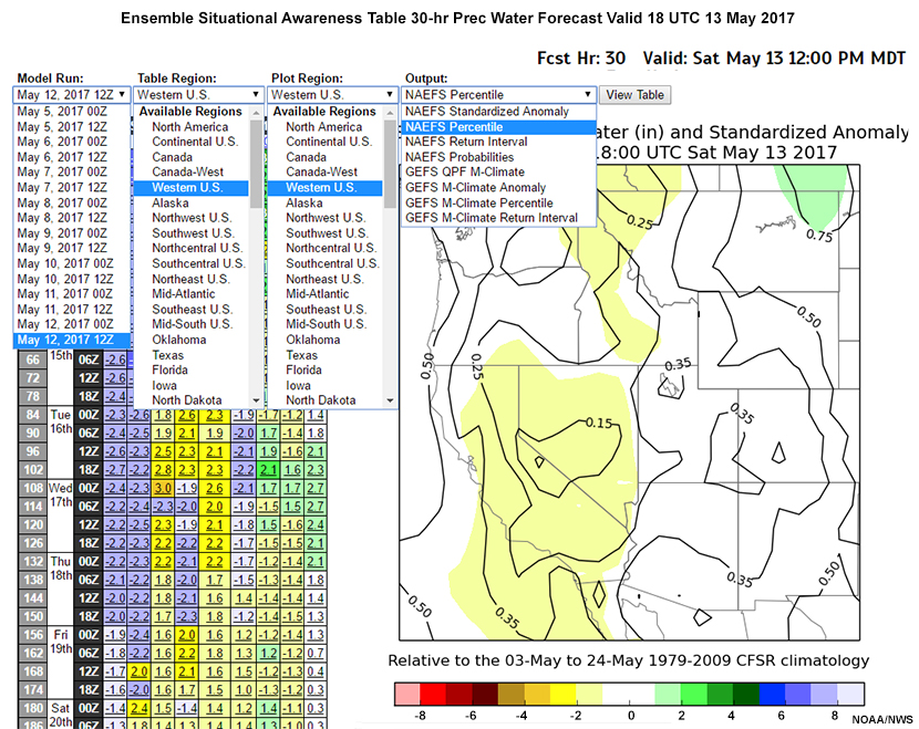
The graphic below shows a screenshot of the ESAT. Products and valid times are selected from the table on the left, and the corresponding data displayed on the right.
This lesson will use the ESAT and its products to present some ensemble tools, and the statistical methods used to develop them. We will examine data from a potential California atmospheric river event and a Northeast U.S. synoptic-scale storm system. Before continuing to the lesson, we strongly recommend that you review the basics of ensemble prediction by taking the lesson “Introduction to EPS Theory”.
After completing the lesson, you should be able to:
- Describe how ensemble tools support the assessment of extreme weather event forecasts
- Describe the ESAT, including data sources, forecast elements, and pressure levels
- Describe the ESAT products and the statistical methods needed to make effective use of ensemble tools, including:
- Probability in the context of using ensembles in the forecast process
- Reanalysis and R-Climate, reforecasting and M-Climate, and their use in predicting extreme events
- Verification of probabilistic forecast products
Measuring Forecast “Extremeness”
In the ESAT, any highly anomalous, top or bottom 10% percentile, and/or long return interval event is considered an extreme event. The ESAT compares EFS output to climatological data to assess the risk of extreme weather. To better understand this assessment, let’s first review climate products and probability distributions. Note reference to “forecast” in the lesson, means the ensemble mean forecast.
Measuring Forecast “Extremeness” » Reanalysis Climate (R-Climate)
For the ESAT, the Reanalysis (or R-Climate) analyses are from the National Centers for Environmental Prediction (NCEP) Climate Forecast System Reanalysis (CFS-R, Saha et al., 2010), at 6-hour intervals from January 1979 through December 2009. The forecast is compared to the CFS-R climatology to determine how it differs from the analyzed mean climate.
Measuring Forecast “Extremeness” » Reforecast Model Climate (M-Climate)
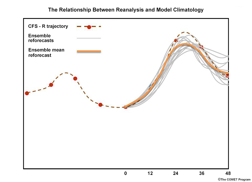
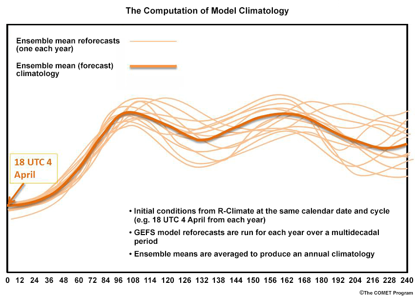
Model Climate (or M-Climate ) statistics (NOAA ESRL, 2017) are developed from daily 00, 06, 12, and 18 UTC 240-hour GEFS reforecasts, starting with CFS-R analyses from 1985 through 2012. GEFS initial condition perturbations are determined from the previous cycle’s 6-hour forecast. Each forecast is averaged over all 6-hourly forecast projections to determine the model (or M-) climate. M-Climate is then compared the current forecast to average forecasts made at that time of year (defined as the 21 days centered on the date and cycle of the run) and forecast projection. Below, we show a hypothetical reforecast started from CFS-R for an arbitrary variable, date and cycle, for the first eight forecast projections.
Averaging each of the 28 years of 0- to 240-hour reforecasts results in a mean climatology for each data and forecast cycle of the year. The schematic below show forecasts of some model variable, from 18 UTC 4 April of each year (thin orange lines), averaged to produce the forecast model climatology (bold orange line).
For R-Climate and M-Climate, a long enough time period is needed (usually at least 20 years) to obtain robust statistics.
Question
Which of the following statements is true? Choose the best answer.
The correct answer is d.
M-Climate is developed from a long series of reforecasts, so d is the correct answer and b is incorrect. R-Climate is developed from a reanalysis over a long period of time; in this case, the Climate Forecast System Reanalysis (CFS-R). Answer a is therefore incorrect. The reanalysis climate is not the best measurement of the model forecast climatology, so c is incorrect.
Measuring Forecast “Extremeness” » Probability and Cumulative Distribution Functions
To identify extreme events, ESAT tools compare NAEFS and GEFS forecasts with (probability distribution functions) and ( cumulative distribution functions) from R- and M-Climates. Put simply, a forecast value is compared to the likelihood of that value based on climatology (indicated by the probability distribution function), or the probability of a value up to and including that value occurring based on climatology (indicated by the cumulative distribution function). The probability distribution functions (PDFs) are typically used to determine the size of a forecast anomaly while cumulative distribution functions (CDFs) are used to determine the percentile (ranking) of a forecast.
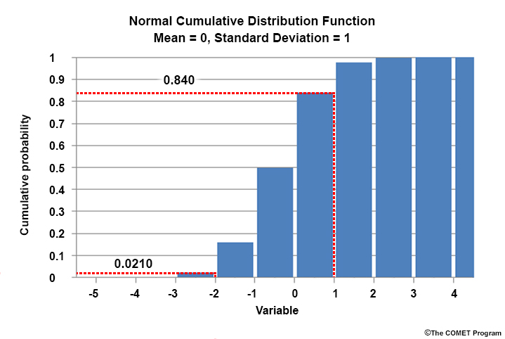
The bar graphic below shows a normalized histogram of a theoretical normal PDF, symmetric around the zero-valued mean. Each bar represents one standard deviation (SD) of the distribution, with the SD equal to 1. The number atop each bar is the percentage of the PDF each SD represents.
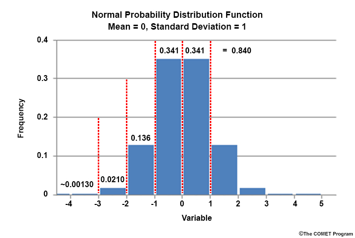
Even though not all meteorological variables are normally distributed, SD is useful to measure the size of a forecast departure from climatology. For example, a value of 1.0 is one SD above the mean. We see that an SD value exceeding 1.0 has a probability of only 0.16.
The next graphic is a histogram of the normal CDF, which shows the cumulative probability from the lowest value in the distribution to any value of interest. At +1.0 SDs, the CDF equals 0.84, the integrated probability from the low extreme to +1.0 SDs in the PDF.
Ensemble mean forecasts are compared to PDF and CDF climatologies from multidecadal reanalyses (R-Climate) and model reforecasts (M-Climate), to determine whether extreme values are being forecast. To learn more about PDFs and CDFs, see the COMET lesson, “Introduction to EPS Theory”.
Ensemble Situational Awareness Table
Ensemble Situational Awareness Table » Introduction
The Ensemble Situational Awareness Table (ESAT) was developed by the Science Services Division (SSD) of NWS Western Region (WR). The ESAT provides guidance for North America, Alaska, Canada, continental U.S. (CONUS), and CONUS subregions. Tools in the ESAT highlight potential extreme events by drawing attention to NAEFS and GEFS forecasts on the high or low ends of the R-Climate and M-Climate PDFs and CDFs. Additionally, the ESAT webpage links to ensemble tool verification and archived data, including data from historic cases of interest.
Which ensemble tools, GEFS or NAEFS, should you use in a given forecast situation? Consider the characteristics of each ensemble and the climatological comparison made.
- NAEFS
- Has 42 members (GEFS and CEFS), so has a better chance of including the actual outcome
- Is compared to a 31-year reanalysis climate
- Determines how extreme the forecast is relative to the estimated observations over 1979-2009 period.
- GEFS
- Has only 21 members (GEFS), and may miss actual outcomes that NAEFS might capture
- Is compared to a 28-year model climatology
- May remove some model bias through using model, rather than reanalysis, climatology
Note: If more ensemble membership is desired to cover more potential forecast outcomes, the NAEFS/R-Climate tools should be used. On the other hand, if model bias is considered more important, the GEFS should be used.
Ensemble Situational Awareness Table » Standardized Anomalies
The ESAT, with each table cell linked to ensemble-derived products, is shown below. Drop down menus can be expanded for Output (product), Table Region, Plot Region, and Model Run initial time. Forecast projections are at 6-hourly intervals from 0 to 240 hours.
On the right below is a plot of the NAEFS R-Climate 30-hour forecast of standardized anomaly (SA) for precipitable water (PW) from the 12 UTC 12 May 2017 NAEFS run, valid 18 UTC 13 May 2017. The number of SDs above or below the mean at each grid point is represented by shading. Contours show the value of the forecast projection. Almost all of Nevada and most of California has forecasts from 1 to 2 SDs below normal.
ESAT variables and forecast projections (left), forecast SA (right) as above.
The GEFS M-Climate standardized anomalies compare GEFS forecasts to M-climate at each time projection from 6 to 240 hours, using statistics over a 21-day period centered on the forecast projection time. Because the forecast below is valid at 12 UTC 6 May 2017, we use 12 UTC 25 April to 12 UTC 16 May.
Now consider the question below.
Question

GEFS M-Climate Anomaly ESAT on the left with the 120-hour forecast projection for SLP selected (red box). M-Climate Anomaly data plot on the right; shades showing size of the anomaly as in the color legend below. Inset is a normalized climatological M-forecast SLP PDF from 25 April to 16 May.
What are the ensemble mean and standardized anomaly (SA) at the location labeled with the “X”? Choose the best answer.
The correct answer is d.
“X” marks the approximate center of the forecast low. We’ve estimated the SLP at the “X” to be about 996-hPa. For the standardized anomalies, the “X” is in the middle of a large area of values ranging from -2 to -3. We’ve estimated the standardized anomaly to be about -2.9, almost three full SDs below the mean. This data point is well into the left tail of the M-Climate PDF, as can be seen in the inset added to the graphic below.
GEFS M-Climate Anomaly ESAT on the left with the 120-hour forecast projection for SLP selected (red box). M-Climate Anomaly data plot on the right; shades showing size of the anomaly as in the color legend below. Inset is a normalized climatological M-forecast SLP PDF from 25 April to 16 May with mean removed, and anomaly at the “X” marked.
Ensemble Situational Awareness Table » Standardized Anomalies » Advantages and Limitations
The following are advantages of standardized anomalies:
- The data provide a quick way to identify significant forecast weather events, using NAEFS R-Climate or GEFS M-Climate.
- Data from the NAEFS include 40 perturbed members and two controls from the GEFS and CEFS. More diverse forecast outcomes are thus possible.
- The GEFS SAs account for model climate, thus can reduce or eliminate any systematic model biases. This may compensate for only having 20 members plus a control run in the GEFS.
Standardized anomalies have the following limitations:
- Only the ensemble mean is shown; there is no explicit forecast confidence information.
- Considering significant events, forecasters should keep in mind that NAEFS and GEFS may understate the “extremeness” of the eventual outcome at longer lead times.
Ensemble Situational Awareness Table » Percentiles
As suggested earlier, probability distribution functions (PDFs) help identify extreme values. Cumulative distribution functions (CDFs) help to determine the probability that a variable will be less than or will exceed a value. Percentiles are especially useful for forecasts that are not normally distributed, like those for precipitable water (PW) or a quantitative precipitation forecast (QPF). The tool compares the GEFS to M-Climate, while the NAEFS is compared to R-Climate.
The next question asks you to interpret percentile data.
Question
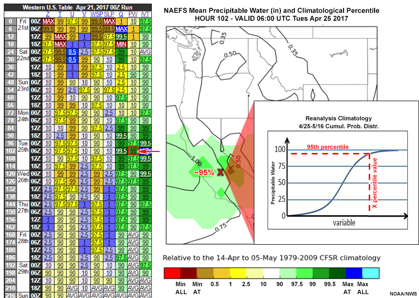
The plot shows 00 UTC 21 April 2017, 102-hour forecast of precipitable water (PW) and its percentiles, using R-Climate. Which of the following forecasts and percentiles are correct at the red “X”? Choose the best answer.
The correct answer is b.
The red “X” is at the 0.75” forecast PW contour, eliminating choices a and c. The light green color is between 90 and 97.5% in the color legend, close to the upper value, eliminating choice d. B is the best answer.
Ensemble Situational Awareness Table » Percentiles » Advantages and Limitations
The following are advantages of percentiles:
- Forecast “extremeness” doesn’t depend on some theoretical distribution, but rather the actual climatological CDF.
- NAEFS includes 20 perturbed members and one control each from the GEFS and CEFS, thus allowing a potentially better forecast.
Percentile plots have the following limitations:
- Data doesn’t explicitly give information on forecast confidence.
- The NAEFS and GEFS may underestimate the “extremeness” of the eventual forecast outcome at longer lead times.
Ensemble Situational Awareness Table » Return Interval
The Return Interval (RI) answers the question, “How likely is the forecast value to return, based on R-Climate or M-Climate?” For example, a return interval of five years means that in any one year, there is a 20% likelihood of the same or greater forecast (GEFS) or verification (NAEFS). A ten-year return interval corresponds to a 10% likelihood of the event within any given year.
As before, a three-week period is used, centered on the forecast projection. In the diagram, "outside CFSR climate" means that no reanalyses values met the extreme event criteria.
The return interval becomes less accurate as the forecast becomes more extreme and return interval lengthens. Forecasts outside the reanalysis climatology for time of day (00, 06, 12, and 18 UTC) or for all times of day are indicated as such.
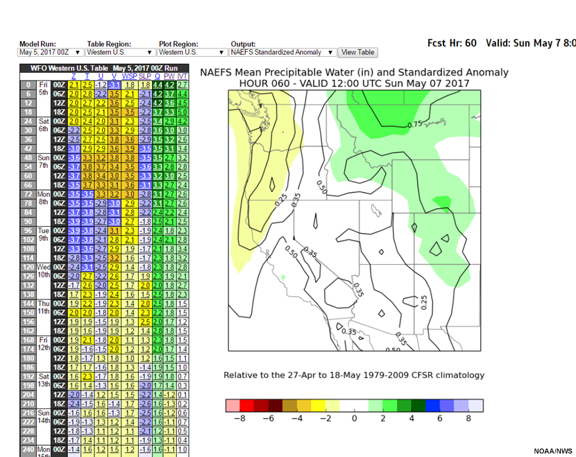
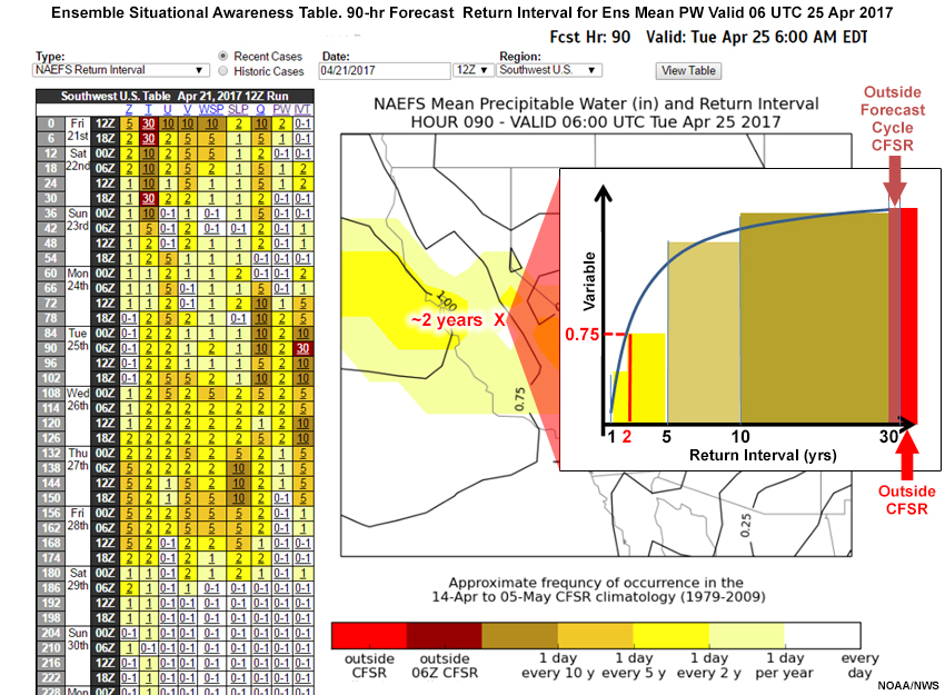
The graphic below shows the return interval for NAEFS forecast precipitable water from the example over the western U.S. We’ve added a hypothetical return interval curve, color coding areas under the curve to match the color legend at 1-, 2-, 5-, 10-, and 30-year return intervals. For the 06 UTC 25 April 2017 90-hour forecast of precipitable water of 0.75", the return interval is about every two years.
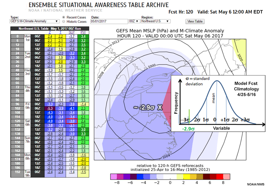
What would be the return interval of a 120-hour forecast of low pressure center of 996 hPa in the GEFS over the Mid-Atlantic? For this question, the return interval forecast is shown below. The return intervals are shaded, with contours representing forecast mean sea level pressure (MSLP) values. The red “X” pinpoints the low center.
Question
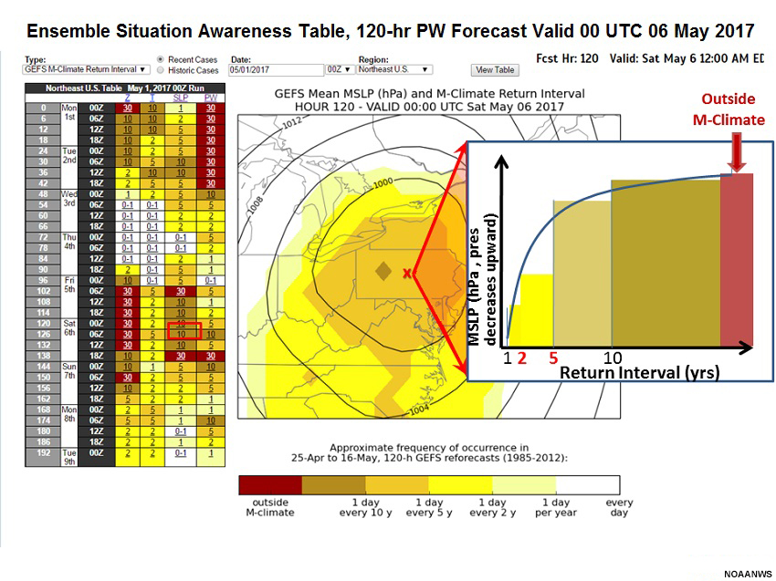
Examine the graphic and complete the following sentence. Select the best answer.
From the color legend, we see a return interval of about nine years. A return interval inset is annotated with the M-Climate and each range (1-2, 2-5, 5-10, 10-28, and outside the 28-year climatology) color coded as per the legend. You can see from the “once per 9 year” return interval that this event is relatively rare. As with R-Climate, however, keep in mind that the limited timeframe covered by the climatology would only account for three event occurrences.
Ensemble Situational Awareness Table » Return Interval » Advantages and Limitations
The following are advantages of using a return interval:
- The “extremeness” of the forecast is determined by the actual R-Climate distribution.
Return intervals have the following limitations:
- The data don’t explicitly provide information on forecast confidence.
- The sample size isn’t large enough to give good estimates of return periods beyond about two years.
- Long return intervals may have usefulness in the 30-year climatology context.
Ensemble Situational Awareness Table » Probabilities
The probability tool (only for NAEFS data) shows the fraction of ensemble membership with extreme maximum or minimum R-Climate values. Because the Southwest U.S. case had no climatological extremes, we will return to the Northeast U.S. low pressure center example.
The 120-hour forecast probability of extreme MSLP from the 00 UTC 1 May 2017 NAEFS forecast valid 00 UTC 6 May is shown below. The graphic helps us visualize the potential for a deep storm over Pennsylvania and Maryland, with an MSLP of close to 996 hPa for the forecast low pressure (white “x”). The likelihood of an extreme minimum MSLP value is 54%.
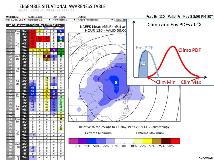
We’ve added an inset showing hypothetical climatological and NAEFS PDFs values for location “X” to facilitate interpretation. Maximum and minimum climatological values are annotated, and the portion of the NAEFS PDF below the minimum climatological value (a “record low”) is highlighted in blue.
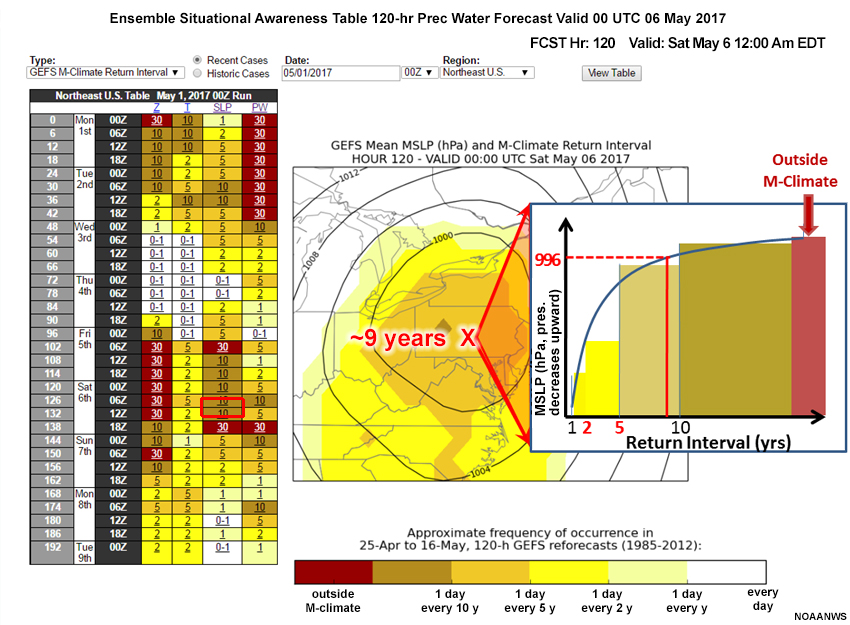
Ensemble Situational Awareness Table » GEFS QPF M-Climate
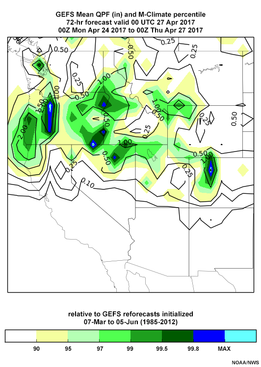
To forecasters, the deep low pressure area in the Northeast U.S. suggests extreme precipitation is possible. Comparing the forecast to reanalysis climatology would not account for model precipitation bias. A reforecast climatology from the same forecast model (M-Climate) takes into account those biases.
We’ve selected the GEFS QPF M-Climate output for the same GEFS run as above. The QPF table is broken down by forecast projection at 6-hour intervals (rows), and for 6-, 12-, 24-, 48-, and 72-hour accumulated precipitation (columns). We’ll choose the 120-hour forecast for 24-hour accumulated precipitation. The cell shows that 24-hour accumulated precipitation exceeds the highest reforecast (max) somewhere in the Northeastern U.S.
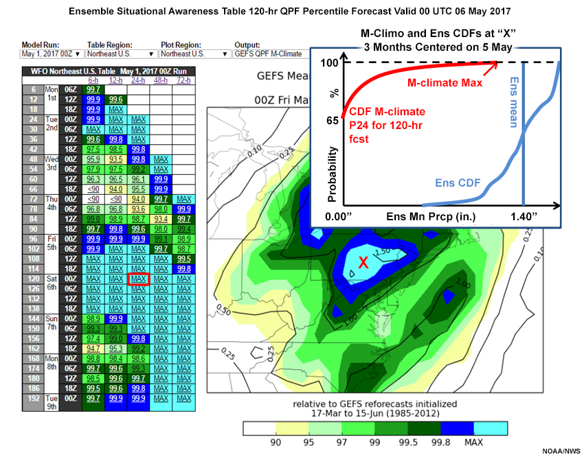
The forecast shows an extensive area of precipitation from the Carolinas north to eastern Canada. The area around the forecast low pressure center has the largest forecast in the reforecast record.
Ensemble Situational Awareness Table » Confidence in Forecasted Extreme Events
Confidence increases when a forecast is extreme, because such values require good agreement (i.e., low spread and high confidence) among ensemble members. The graphics below illustrate the relationship between extreme forecast values and forecast confidence.
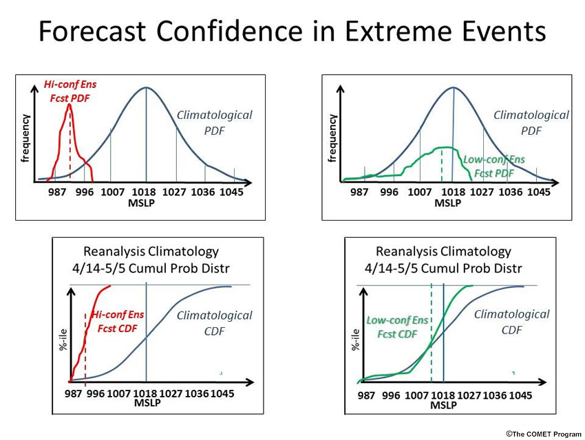
The upper and lower left panels represent high-confidence ensemble forecast PDFs and CDFs in red, compared to the climatological PDF and CDF for R-Climate in dark blue. The dashed red vertical line in the forecast PDF shows the forecast. Its value is about 991 hPa, about -2.5 SDs from the 1018-hPa climatological mean. The forecast's large distance from the climatological mean results from significant agreement among ensemble forecast members, indicated by the narrow forecast PDF. The entire ensemble forecast CDF is well below the climatological CDF.
The upper and lower right panels represent low-confidence forecast PDFs and CDFs (green) compared to the R-Climate PDF and CDF (blue). Even though there are a few ensemble forecast members with values even lower than the high-confidence extreme forecast, the forecast value is 1016 hPa, less than –0.5 SDs from the mean. Ensemble membership is spread over 4 climatological SDs. The corresponding CDF extends over a much larger extent than the high-confidence extreme forecast.
Ensemble Situational Awareness Table » Some ESAT Best Practices
While it is typically unlikely, there are situations for which the ESAT tools could lead you astray, and could be a false alarm or miss a high-impact event. The following pages outline some best practices for using ESAT.
Ensemble Situational Awareness Table » Some ESAT Best Practices » NAEFS or GEFS Forecast Errors
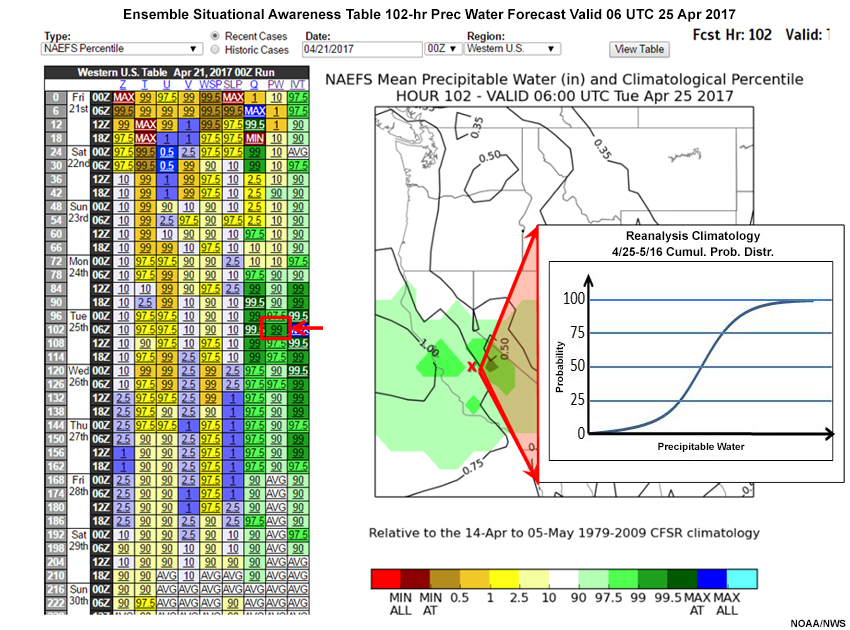
The Southwestern U.S. case from late April 2017 could be interpreted as a false alarm over the Sierra Nevada. The 102-hour precipitable water forecast from the NAEFS valid 06 UTC 25 April, is shown below.
Meanwhile, the 06 hour forecast at 00 UTC 25 April 2017 (an analysis proxy) is below:
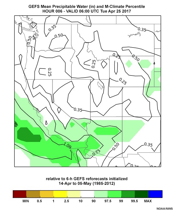
The 90-97.5% percentiles forecast in the Sierra Nevada, with precipitable water between 0.5” and 0.75”, verified as mostly less than 90% with precipitable water from 0.35” to 0.5”.
Ensemble Situational Awareness Table » Some ESAT Best Practices » Anomalies versus Impacts
Not all forecast anomalies produce serious weather impacts. The forecaster must consider the context in which anomalies occur. The corresponding GEFS 120-hour QPF forecast valid 06 UTC 25 April 2017 is shown below. Note there was little to no GEFS M-Climate QPF where there was high PW. At the approximate location of our red “X”, only about 0.1” of QPF occurs over the 72 hours.
Best practices require that the forecaster examine all relevant forecast variables before making a forecast. Extremely high PW anomalies will not result in heavy precipitation without vertical motion. Here, there was no significant mid-troposphere forcing, with broad west-northwest flow nearly parallel to the Sierra Nevada from 700 through 300 hPa (not shown).
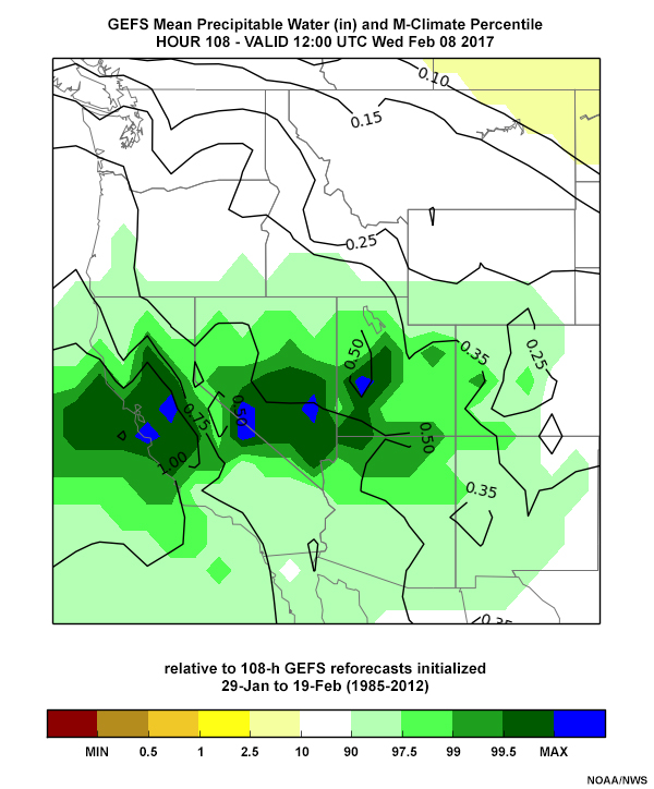
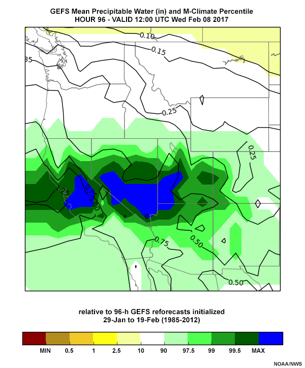
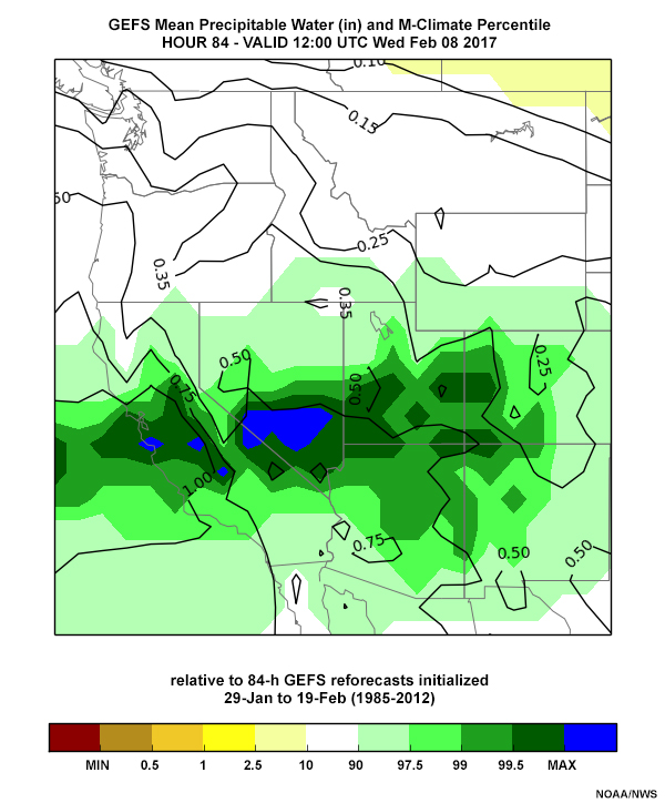
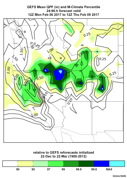
Forecasters will usually get confirmation from most of the forecast variables that a significant weather event is possible. For example, the Oroville Dam storm from 7-9 February 2017 was highlighted by the ESAT, with anomalies in several forecast variables.
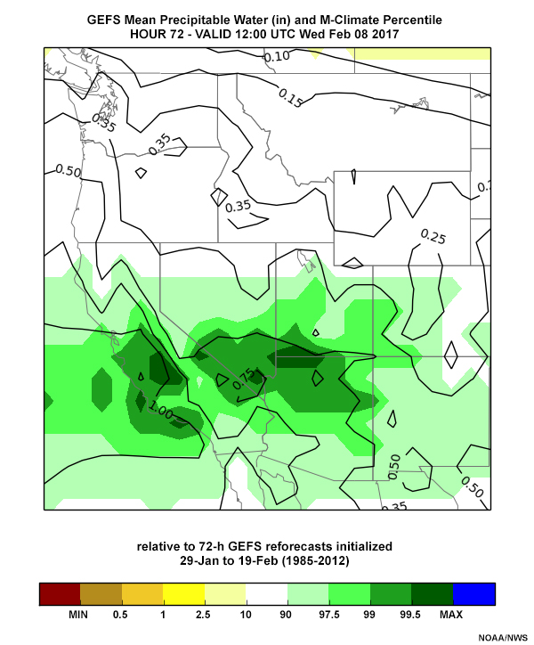
The GEFS precipitable water percentiles from 00 UTC 4 February 2017 through 12 UTC 5 February, all valid 12 UTC 8 February 2017, are shown in the tabs below. All of the forecasts' precipitable water percentiles are around the 99.5% range.
Precip Water: 00 UTC 4 Feb
Precip Water: 12 UTC 4 Feb
Precip Water: 00 UTC 5 Feb
Precip Water: 12 UTC 5 Feb
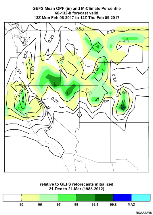
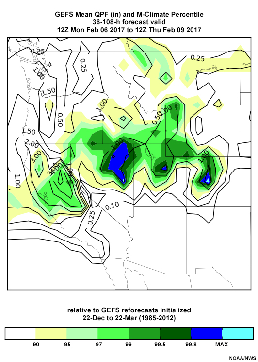
The quantitative precipitation forecasts (QPF) around 12 UTC 8 February (below) are similar, though the location of the maximum suggests small errors. Forecasts start at the 90-95th percentile and increase to the 99th percentile near the Oroville Dam region by the 12 UTC 5 February 2017 forecast. Forecast 72-hour QPFs increase from 2-3” to a small region of 5” amounts by the 12 UTC 5 February forecast. Mid-troposphere winds are forecast to be near-perpendicular to the topography during the period, at velocities as high as the 99th percentile in the mid-troposphere.
QPF: 00 UTC 4 Feb
QPF: 12 UTC 4 Feb
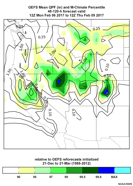
QPF: 00 UTC 5 Feb
QPF: 12 UTC 5 Feb
Verification
Verification is important to improve the tools in the ESAT. For confidence in the forecast of extreme events, we want to know:
- How do analyzed anomalies compare to forecast anomalies?
- How often are extreme events predicted but do not occur and how often do extreme events occur but are not predicted over recent periods?
- How reliable is the forecast probability of an event? Is a 60% forecast probability correct 60% of the time?
Verification » WRH NAEFS Verification Table
Clicking the Verification link at the top of the ESAT will bring you to the WRH NAEFS Verification Table, shown below with the standardized anomaly verification data displayed over 360 days. The forecaster can choose an ensemble tool and forecast parameter (850 or 700-hPa T or wind speed, PW, MSLP, or 500-hPa Z) over North America only. Verification statistics are accumulated for 30, 90, 180, and 360 days for anomalies, but only 180 days for the other tools.
Verification » WRH NAEFS Verification Table » Standardized Anomaly Verification
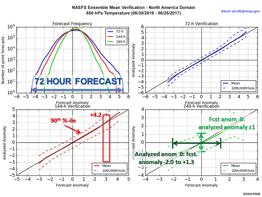
The standardized anomaly (SA) verification plot shown below has four panels, described as follows:
- Upper Left: A log-normal plot of the number of point forecasts over the domain for 72, 144, and 240-hour forecasts
- Upper Right: A plot of 72-hour (3-day) forecast versus analyzed anomalies, with the forecast in bold and 10th and 90th percentiles dashed
- Lower Left: Same as upper right, for 144-hour (6 day) forecasts
- Lower Right: Same as upper right, for 240-hour (10 day) forecasts
On the upper left, we can see that the PW data is not normally distributed, but rather has a long right tail, especially at 72 and 144 hours.
The other panels show excellent agreement between forecast and analysis anomalies up to +4.5 SDs for 72 hour forecasts, and about +2.5 SDs for 144- and 240-hour forecasts. The spread between the 10th and 90th percentiles is smaller for negative anomalies because PW has a lower bound of zero, but becomes large for high positive anomalies.
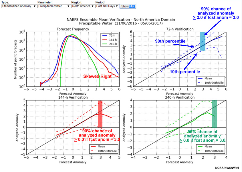
The boxes in the forecast versus analyzed anomaly plots represent the range of analyzed anomalies when the forecast was for a +3.0 anomaly. The 72-hour verification has anomalies greater than or equal to about +2.0.
Question
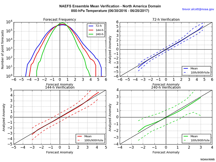
Refer to the graphic for Forecast versus Analyzed anomalies of 850-hPa temperature. Based on the graphic, which of the following are true for the 360 days ending 25 June 2017? Choose all that apply.
The correct answers are a, b, and c.
The upper left panel of the graphic shows the range of anomaly values by number of point forecasts. At 72 hours, the 850-hPa temperature anomalies range from -4.5 to +5.5. At 144 hours, the range is from -4.0 to +4.75. Finally at 240 hours, the range is from -3.0 to +4.0. So, a is correct.
The 144-hour verification shows that when the analyzed anomaly is +3.0, the 90th percentile dashed line is at about +4.2, so c is correct.
For the 240-hour verification on the lower right, the 10th to 90th percentile omit the top and bottom 10% of the analyzed and forecast distributions. Additionally, we note that when the analyzed anomaly is zero, the 10th to 90th percentile (horizontal axis) ranges from about -2.0 to +1.4. So d is incorrect.
The answers are annotated on the graphic below.
Verification » WRH NAEFS Verification Table » Extreme Forecast Verification
Below is the verification for the zero-percentile or extreme minimum MSLP from 1 November 2016 through 30 April 2017. The number of extreme minimum events per grid point is on the upper left, which can be compared to the total of 720 forecasts. Verification otherwise is by forecast projection. Forecast versus analyzed extreme minimum value frequencies is on the upper right. The lower left shows the percentage of 0% forecasts that were correct (fraction of bar in red) and incorrect (non-red fraction of bar). Finally, the lower right shows the percentage of analyzed 0% events forecasted correctly (red) and incorrectly (non-red).
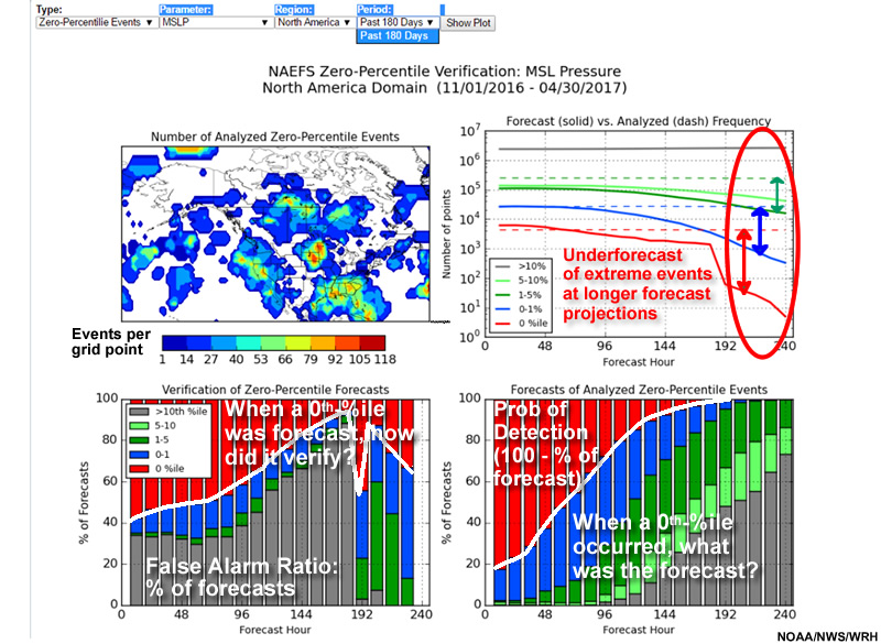
For example, extreme minimum 48-hour forecasts of MSLP shows little to no frequency bias (upper right, roughly equal dashed and solid red lines), have a false alarm rate of about 48% (lower left), and a probability of detection of about 61% (lower right, 100 minus percentage of forecast errors).
Extreme maximum verification is interpreted the same way. The following question asks about extreme maximum verification data.
Question
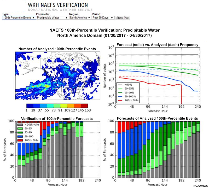
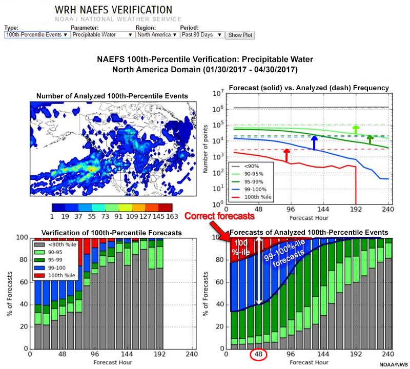
One-hundredth percentile verifications determine the skill in an EFS forecast of extreme maxima compared to R-Climate. In the graphic above, we show the 100th percentile verification graphic for precipitable water for the 90 days ending 30 April 2017. After reviewing the verification, determine which of the following statements are true. Choose all that apply.
The correct answers are a and d.
The annotated 100th percentile graphic below shows the answers. In the upper right graphic, the forecast frequencies are below the dashed analyzed frequency curves. The 100th percentile curves are in red. The lower right panel shows what the forecast was for 100th percentile events at from 0 to 240 hours, at 6-hour intervals. At 48 hours (white arrow), 99-100% events occur about 60% of the time when a 100% event is forecast, and extreme maximum forecasts verify only about 15% of the time. So, a and d are correct, while b and c are incorrect.
Verification » WRH NAEFS Verification Table » CDF and Probability Verification: The Reliability Diagram
The reliability diagram graphic below shows the number of points with extreme minimum (upper left) and maximum (upper right) forecasts by forecast probability for MSLP over 180 days ending 31 March 2017. This indicates how forecasts differentiate between events and non-events, and is called the sharpness. Because we are verifying extreme events, many more forecasts are at low rather than high probabilities. Each forecast projection is color-coded as indicated in the lower panel legends. Note that the y-axis is logarithmic.
The lower panels plot reliability of a forecast: the observed frequency of an event against the forecast probability of an event. Perfectly reliable forecasts have equal forecast and verification probabilities at all percentiles, and would be on the diagonal. Reliability is considered skillful at and above the dashed line, where reliability contributes positively to the Brier Skill Score (a verification tool for probabilistic forecasts). As with sharpness, each line shows a different forecast projection. The reliability plots end at the highest forecast probability for a forecast projection.
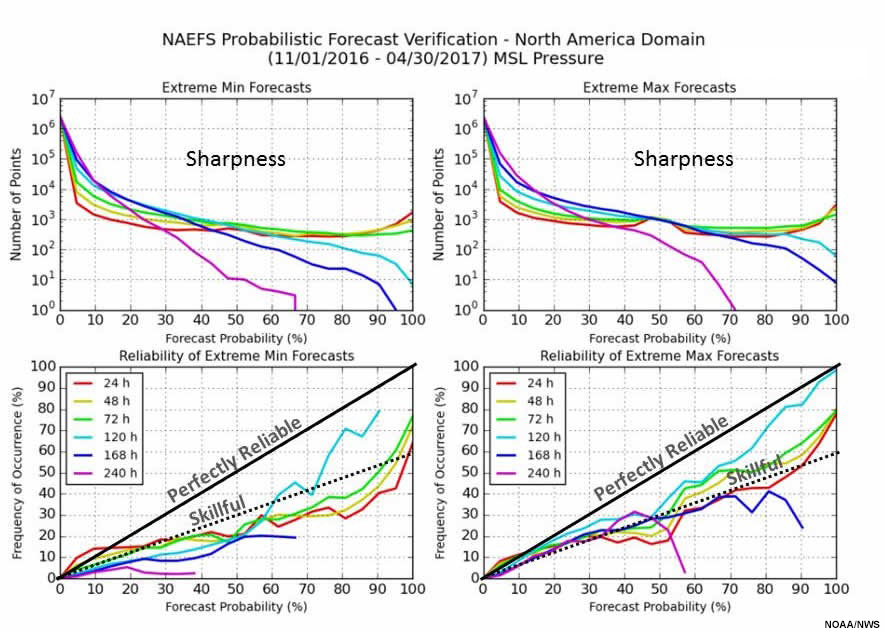
Question
In the previous graphic, we compared the frequency of forecasts from the NAEFS for each forecast projection to the frequency of observations. Given the data in the graphic, which of the following statements are true? Choose all that apply.
The correct answers are a and c.
For extreme low and high probabilities of MSLP, sharpness decreases with longer projections. Reliability is best at 72 hours, and worst at 240 hours. For almost all forecast projections and frequencies, extreme event probabilities are over-forecast. For example, at 120 hours (green line), a 100% forecast probability of an extreme maximum event verifies only 80% of the time. Therefore, a and c are correct, while b and d are incorrect.
Summary
This lesson provided foundational information about the ensemble tools used by the National Weather Service and introduced the Ensemble Situational Awareness Table (ESAT). In a second ensemble tools lesson, we will illustrate the operational use of these tools using a case study for a western U.S. heavy precipitation event.
We began by reviewing why we need ensemble forecast systems (EFS) and how EFS data is summarized using statistical methods. A web-based EFS tool has been introduced by the National Weather Service, Western Region called the Ensemble Situational Awareness Table (ESAT). The ESAT provides situational awareness through bringing attention to forecasts of anomalous weather events.
Next, we presented long-term reanalysis and model reforecast climatologies used in the ESAT to quantify the size of forecast anomalies in the North American Ensemble Forecast System (NAEFS, a combination of GEFS and CEFS) and the U.S. Global EFS (GEFS). The statistics used to describe these climatologies (mean, SD, and probability and cumulative probability distributions) were also discussed.
We then presented ensemble tools in the ESAT, derived from forecast NAEFS and GEFS values, including:
- Standardized anomalies (normalized by SD) from the climatological mean
- Percentile ranking (in the cumulative probability distribution)
- Return interval (estimated time between exceedance of critical forecast values)
- Probability (of lowest and highest percentile events)
- Probabilistic QPF using GEFS QPF climatology
We discussed the justification for using ensemble mean forecasts to measure the extremeness of an event. Extreme forecasts indicate agreement among the ensemble membership and an increased likelihood of an extreme event.
Finally, we presented available verification of the ensemble tools in the ESAT. These include:
- SA verification, for data at 72, 144, and 240-hour forecast projections
- Extreme maximum (100th percentile) and minimum (zeroth percentile) forecast verification at 12-hour intervals from 12 to 240-hour projections, and aggregated over the 240-hour forecast period and
- Reliability and sharpness diagrams at 24, 48, 72, 96, 120, 168, and 240-hour forecast projections.
You have reached the end of the lesson. Please complete the quiz and share your feedback with us via the user survey.
References
Lorenz, Edward N., 1963: Deterministic nonperiodic flow. J. Atmos. Sci., 20, 130—141. https://doi.org/10.1175/1520-0469(1963)020%3C0130:DNF%3E2.0.CO;2
Hamill, T.M. et al., 2013: NOAA's Second-Generation Global Medium-Range Ensemble Reforecast Dataset. Bull. Amer. Meteor. Soc., 94, 1553–1565, https://doi.org/10.1175/BAMS-D-12-00014.1
Toth, Z. et al., 2005: The North American Ensemble Forecast System (NAEFS). In Proceedings of the 1st THORPEX International Science Symposium, December 2004, Montreal, Canada.
Wilks, Daniel S., 2011: Statistical methods in the atmospheric sciences, 3d Ed., Academic Press, Oxford, 676 pp.
Contributors
COMET Sponsors
MetEd and the COMET® Program are a part of the University Corporation for Atmospheric Research's (UCAR's) Community Programs (UCP) and are sponsored by NOAA's National Weather Service (NWS), with additional funding by:
- Bureau of Meteorology of Australia (BoM)
- Bureau of Reclamation, United States Department of the Interior
- European Organisation for the Exploitation of Meteorological Satellites (EUMETSAT)
- Meteorological Service of Canada (MSC)
- NOAA's National Environmental Satellite, Data and Information Service (NESDIS)
- NOAA's National Geodetic Survey (NGS)
- National Science Foundation (NSF)
- Naval Meteorology and Oceanography Command (NMOC)
- U.S. Army Corps of Engineers (USACE)
To learn more about us, please visit the COMET website.
Project Contributors
Program Manager
- Amy Stevermer — UCAR/COMET
Project Lead
- Dr. William R. Bua — UCAR/COMET
Instructional Design
- Marianne Weingroff — UCAR/COMET
Science Advisors
- Dr. Jonathan Rutz — National Weather Service Western Region Headquarters
Graphics/Animations
- Steven Deyo — UCAR/COMET
- Sylvia Quesada — UCAR/COMET
Multimedia Authoring/Interface Design
- Gary Pacheco — UCAR/COMET
- Sylvia Quesada — UCAR/COMET
COMET Staff, September 2017
Director's Office
- Dr. Elizabeth Mulvihill Page, Director
- Tim Alberta, Assistant Director Operations and IT
- Paul Kucera, Assistant Director International Programs
Business Administration
- Lorrie Alberta, Administrator
- Tara Torres, Program Coordinator
IT Services
- Bob Bubon, Systems Administrator
- Joshua Hepp, Student Assistant
- Joey Rener, Software Engineer
- Malte Winkler, Software Engineer
Instructional Services
- Dr. Alan Bol, Scientist/Instructional Designer
- Tsvetomir Ross-Lazarov, Instructional Designer
International Programs
- Rosario Alfaro Ocampo, Translator/Meteorologist
- Bruce Muller, Project Manager
- David Russi, Translations Coordinator
- Martin Steinson, Project Manager
Production and Media Services
- Steve Deyo, Graphic and 3D Designer
- Dolores Kiessling, Software Engineer
- Gary Pacheco, Web Designer and Developer
- Sylvia Quesada, Production Assistant
Science Group
- Dr. William Bua, Meteorologist
- Patrick Dills, Meteorologist
- Bryan Guarente, Instructional Designer/Meteorologist
- Matthew Kelsch, Hydrometeorologist
- Erin Regan, Student Assistant
- Andrea Smith, Meteorologist
- Amy Stevermer, Meteorologist
- Vanessa Vincente, Meteorologist