Introduction
Do you find yourself short on time for everyday weather analysis and diagnosis? Were you once perplexed by the atmospheric conditions that were completely unpredicted by NWP or fellow forecasters? Have you wanted a one-stop-shop method to help you synthesize information from multiple levels on both the synoptic and mesoscales? If you answered yes to any of these questions, this lesson can assist you.
This lesson combines fundamental analysis and diagnosis concepts from COMET’s “Satellite Water Vapour Interpretation -- Short Course” into a coherent set of 3D mental models that will help forecasters understand and predict sensible weather. Honing and building upon these skills will help forecasters streamline their analysis and diagnosis process and will provide them more avenues to add human value to NWP forecasts.
Throughout the lesson water vapour analyses will be compared with surface observations to diagnose atmospheric processes and capture the forcings for the short-term weather. The objectives for this lesson are:
- Develop a three-dimensional, atmospheric mental model using surface and water vapour analyses.
- Diagnose differential vorticity advection based on the slope of vorticity tubes by comparing surface and water vapour analyses.
- Forecast sensible weather based on this diagnosis.
- Diagnose ana- and katafronts based on surface front and upper-level deformation zone overlap by comparing surface and water vapour analyses.
- Forecast sensible weather based on this diagnosis.
- Diagnose dry conveyor belt pulse deepening based on darkening water vapour imagery.
- Forecast sensible weather changes based on this diagnosis.
- Synthesize information from water vapour and surface analyses to write a forecast.
Completing and/or reviewing the Satellite Water Vapour Interpretation -- Short Course prerequisite modules covering deformation zone analysis and vorticity center identification using water vapour, inferring three dimensions from water vapour, and conveyor belts is HIGHLY recommended. A solid understanding of QG theory, frontogenetic/frontolytic circulations, and experience with hand surface-chart analysis are also suggested.
We’ll begin by testing your analysis skills.
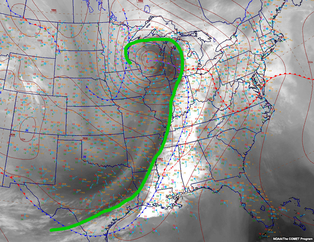
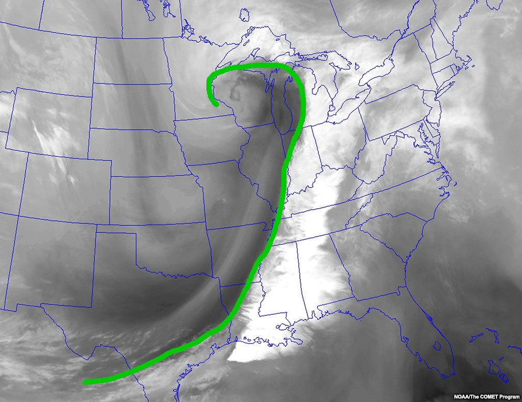
Hand Analysis
When you hand-analyse water vapour imagery and compare it to surface analyses, you can identify whether the weather is driven by surface or upper-level features.
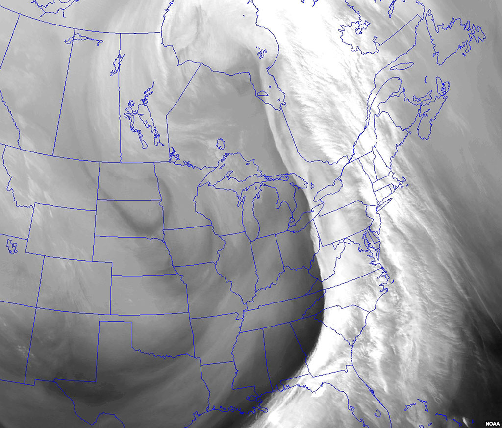
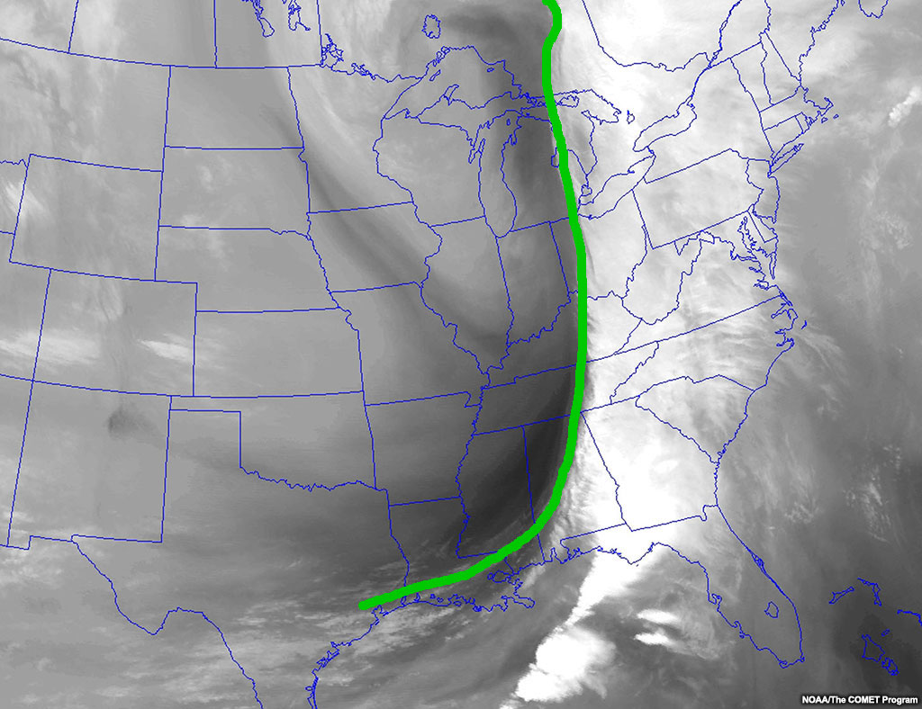
Watch the loop below to get a feel for the synoptic pattern, then you will analyze the last image of the loop in a later portion.
Water Vapour Imagery
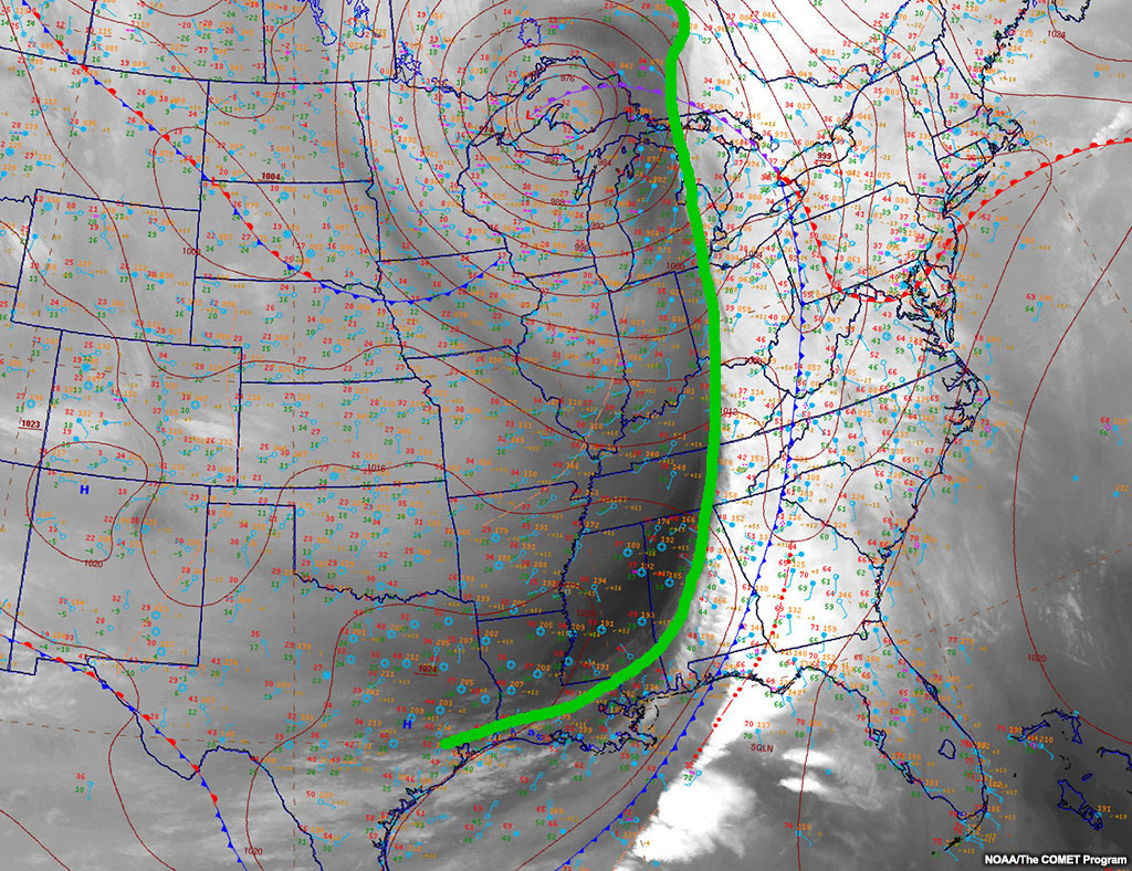
Analyse the following water vapour image. After you complete your analysis, press “done”, and your drawing will automatically be overlaid upon a US NWS surface chart. We will then compare the two analyses to diagnose active weather processes.
Question
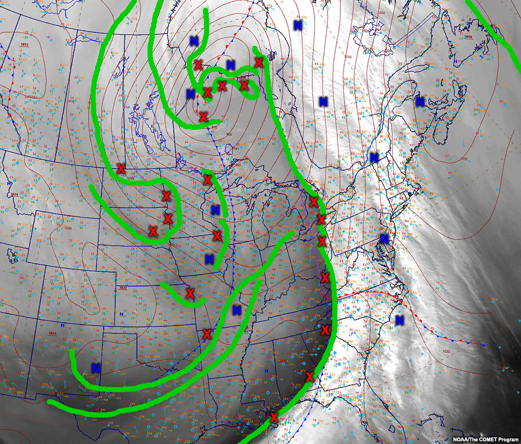
Analyse the deformation zones (green lines), vorticity maxima (red Xs), and vorticity minima (blue Ns).

Use green lines for deformation zones, red Xs for vorticity maxima, and blue Ns for vorticity minima.
| Tool: | Tool Size: | Color: |
|---|---|---|
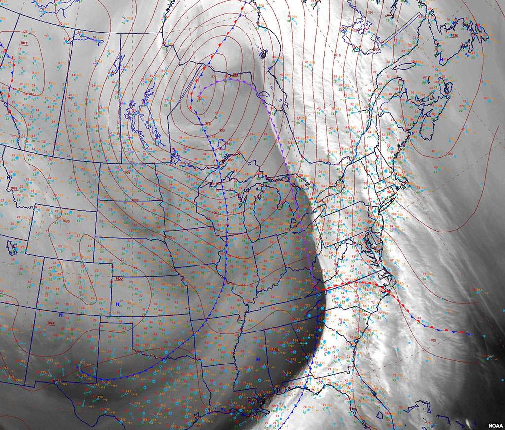
Below, your analysis is overlaid on a surface analysis. Use these images together to diagnose processes and improve your forecasts. Next, we’ll talk about the analyses together.
Forecasting from Comparisons
The key to this lesson is the alignment of the upper and mid-level water vapour and surface features. We will discuss the following features as they appear or are defined on water vapour and surface imagery:
- Slope of pressure centers/vorticity tubes with height
- Anafronts and katafronts
- Dry slot intrusions/upper-level fronts
- Dry conveyor belt pulses.
We’ll explore each of these diagnosable features and their forecast implications in the following sections.
Forecasting from Comparisons » Pressure Center/Vorticity Tube Slope
You can compare any surface pressure center location to the location of associated upper-level vorticity centers to define the slope of the vorticity tube. With surface lows,
- Expect development when the positive vorticity center is rearward from the surface low,
- And expect decay when the positive vorticity center is forward from the surface low.
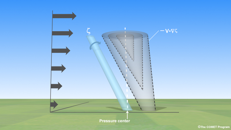
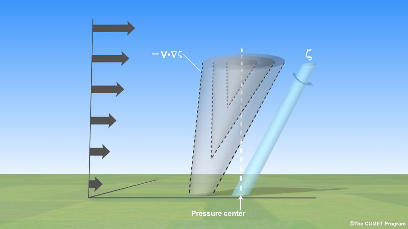
In this lesson, the convention for vorticity tube slope is to compare the vorticity center location to the surface pressure center location and its synoptic translation. If the surface pressure center is ahead of the vorticity center, that is considered a rearward-sloping vorticity tube, like in the following idealized cross-section.
You can predict the maintenance of the surface pressure center based on the slope of the vorticity tube. You will get information in this lesson about surface low maintenance, and this information applies equally to surface highs as well if you switch the sign of the vorticity center.
Forecasting from Comparisons » Pressure Center/Vorticity Tube Slope » Developing Surface Lows
Vorticity tube (blue cylinder) and its vorticity advection (dashed cones) pattern for an idealized rearward-sloping vorticity tube. The dashed white line indicates the maximized differential vorticity advection.
Rearward-sloping positive vorticity tubes, like the idealized one above, develop lows due to a high probability of positive differential vorticity advection and, to a lesser extent, by the implied thermal advections. The thermal advections can’t be directly assessed with this method.
- Differential positive vorticity advection develops surface lows.
In the following example, the southern low pressure center is connected to the trailing vort max indicated with the red X. The second tab shows that the tube has moved northeast: the surface low is still the southern of the two lows, the vort max is indicated by the red X, and the central pressure has lowered. Use the sliders to compare the surface pressure center and the upper-level vort max.
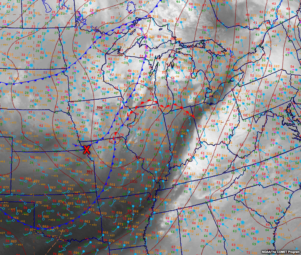

You can toggle between the two tabs to see how the surface low intensified (992mb to 986mb in 6 hours).
Since we can see development with this method, we must also be able to see decay. Hypothetically, how would you change the vorticity tube slope to cause surface low decay?
Forecasting from Comparisons » Pressure Center/Vorticity Tube Slope » Decaying Surface Lows
Vorticity tube (blue cylinder) and its vorticity advection (dashed cones) pattern for a forward-sloping vorticity tube. The dashed white line indicates the maximized differential vorticity advection.
Forward-sloping positive vorticity tubes, like the idealized one above, decay surface lows due to a high probability of differential negative vorticity advection and, to a lesser extent, by the implied thermal advections. The thermal advections can’t be directly assessed with this method.
- Differential negative vorticity advection decays lows
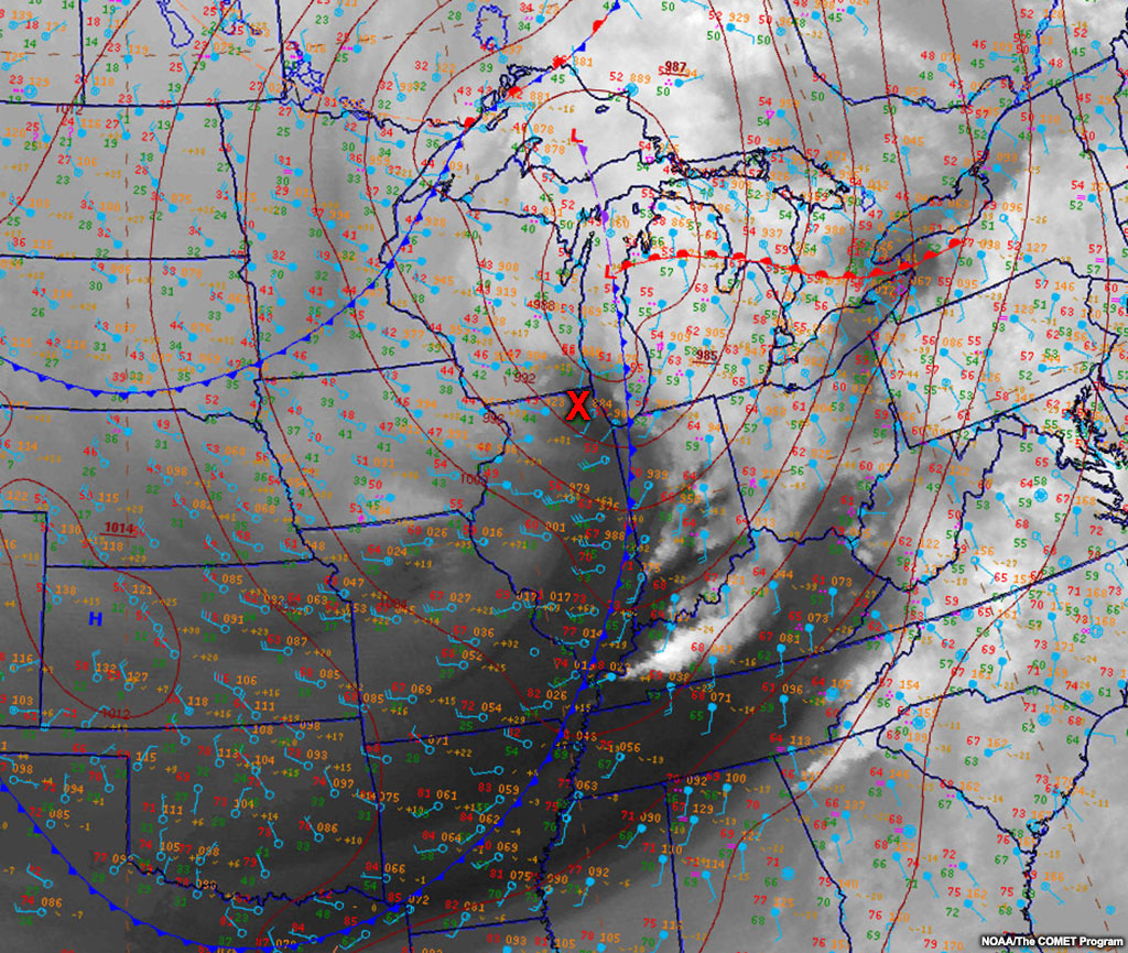
The surface low at the triple point (intersection of warm, cold, and occluded front) in the next example is linked to the leading vort max marked by a red X. The second tab shows that the vorticity tube has moved north and east: the surface low in question is still on the triple point and the positive vorticity center is marked with a red X.
Toggle between the two tabs to see how the low changes. The low decays from 1010 mb to 1012 mb over 6 hours.
Test your knowledge of sloping vorticity tubes in the next section.
Forecasting from Comparisons » Pressure Center/Vorticity Tube Slope » Exercise
Using the water vapour and surface observations below, define the slope of the vorticity tube by identifying the location of the upper-level vorticity center with respect to the surface low.
Question
Identify the locations of the upper-level vorticity center (X) and the surface pressure center (L). You can overlay the surface analysis with the checkbox found above the drawing area.
Based on your diagnosis of this system, how will it evolve over the next 12 hours?
Forecasting from Comparisons » Pressure Center/Vorticity Tube Slope » Surface Sensible Weather Implications
You can qualitatively diagnose and prognose the maintenance of surface lows with sloping vorticity tubes.
Here are some simple steps that you can use for forecasting sensible weather from this diagnosis.
Rearward-sloping Positive Vorticity Tube
With rearward-sloping positive vorticity tubes, you should expect all perturbations from the background state to intensify. Specific to the sensible weather variables, expect:
- Increasing wind speeds around the center of rotation.
- The fastest winds are usually within dry conveyor belt from momentum transfer to the surface.
- Increasing temperatures and dewpoint temperatures in the warm conveyor belt due to the increased wind speeds and thus, advections.
- Decreasing temperatures and dewpoint temperatures in the dry conveyor belt for the same reasons.
- Increasing cloud coverage and lowering the ceilings over time in the vicinity of the dewpoint advection along the warm conveyor belt.
- Decreasing static stability over time in the vicinity of the pressure drop causing more convective-like motions.
- Increasing inward perturbation of the surface winds toward the low.
Forward-sloping Positive Vorticity Tube
With a forward-sloping positive vorticity tube, you should expect all perturbations from the background state to weaken. Specific to the sensible weather variables, expect:
- Decreasing wind speeds around the center of rotation
- The fastest winds are usually in the dry conveyor belt from momentum transfer to the surface.
- Weakening warm advection and moistening advection in the warm conveyor belt due to the decreasing wind speeds.
- Weakening cold advection and drying advection in the dry conveyor belt for the same reasons.
- Decreasing the low-level cloud coverage and raising the ceilings near the weakening dewpoint advection along the warm conveyor belt.
- Increasing the static stability near the pressure rise causing less convective motions.
- Increasing the outward perturbation of the surface winds from the low.
Question
Using all the above information about vorticity tube slope and lows, complete the following sentences.
With a rearward-sloping positive vorticity tube, expect the system to develop until the vorticity tube disconnects from the surface low, the slope evolves from rearward-sloping to forward-sloping, or the vorticity center weakens.
With a forward-sloping positive vorticity tube, expect the system to decay until the vorticity tube disconnects from the surface low.
Forecasting from Comparisons » Pressure Center/Vorticity Tube Slope » Further Considerations
The focus of this section was on surface lows, but all of this information applies as well to surface highs when you replace the positive vorticity tube with a negative vorticity tube. Surface highs intensify when the negative vorticity tubes are rearward-sloping.
The comparison of the vorticity tube and the surface pressure center is an observational approximation. These sloping vorticity tubes are rarely linear as conceptualized and they continuously connect and disconnect with other vorticity tubes from higher or lower in the atmosphere to create vertical motions. This is similar to the way condensation funnels of satellite vortices attach to the main tornadic circulation on occasion, then detach later.
In some cases, the surface pressure centers are not associated with upper-level vorticity centers. The two can be fully decoupled, making the slope of the vorticity tube misleading. Think of monsoonal or thermal lows to understand the decoupled nature that can sometimes occur and how baroclinicity or thermal characteristics play a strong role in those instances.
In other cases, the surface pressure centers are not associated with upper-level vorticity centers due to topographic shearing. Topography can tear apart a vorticity tube leaving an upper-level vort max unassociated with a low-level pressure center. This is common in the taller mountains. Conversely, topography can be a magnifying factor for these tubes as well using potential vorticity arguments.
When the vorticity tube aligns vertically with the surface pressure center, you can still see development or decay. In those instances, it is the thermal characteristics/baroclinicity that dominate the maintenance.
This concludes the discussion of pressure centers and vorticity tube slope. We will now look more at specific features within pressure centers: anafronts and katafronts.
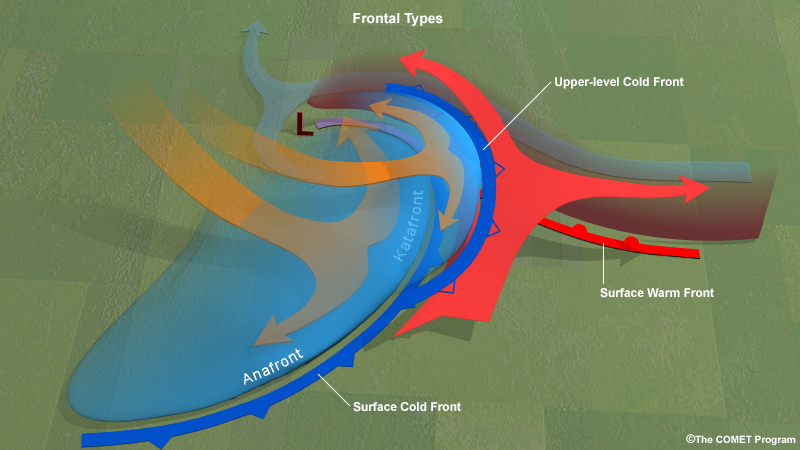
Forecasting from Comparisons » Frontal/Deformation Zone Overlap
As you saw in the hand-analysis exercise at the beginning of the lesson, the deformation zones aloft and the surface fronts are often not collocated. Their cross-over, or overlap, pattern can dictate the sensible weather.
You’ll look at two types of fronts: anafronts and katafronts. Over the length of a single surface front, both types can exist. These fronts exist on a spectrum where there may be singular frontal types, a mixture, or transitioning frontal types. The surface front can also align vertically with the upper-level deformation zone meaning the front is neither an ana- or katafront. Below you will find examples of each front.
Note that both frontal types can be seen with other satellite channels, but our focus is on the water vapour channel.
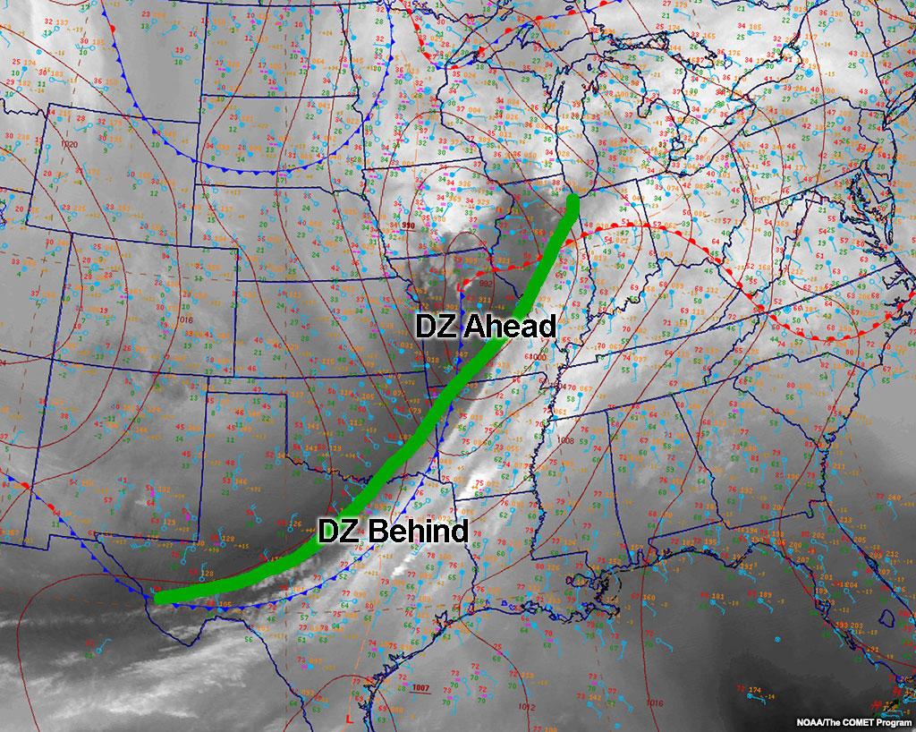
The example above with the deformation zone crossover is shown conceptually in three dimensions below.
You'll see this image further in the following sections.
Forecasting from Comparisons » Frontal/Deformation Zone Overlap » Anafront/Frontogenetic
Where the upper-level deformation zone lags behind the surface front, the front is called an anafront. The prefix “ana-” comes from Greek for “up”, “against”, or “back”. This makes sense since the warm air rises “up” along the front, “against” the flow of the front, and “back” behind the surface front.
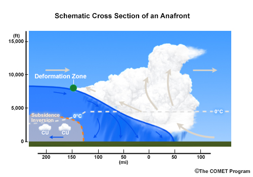
Cross-section of a left-to-right moving surface anafront. The green dot indicates the water vapour deformation zone which extends into and out of the screen.
The surface anafront is frontogenetic in the horizontal with a direct thermal frontal circulation (rising motion on the warm side and sinking motion on the cold side), which is actually vertically frontolytic due to diabatic processes. However, the amount of frontolysis is weak and spread thinly over a large area, making the front generally frontogenetic.
The tabs below show an anafront example from satellite images 9 hours apart. Use the sliders to compare the surface front and deformation zone locations.
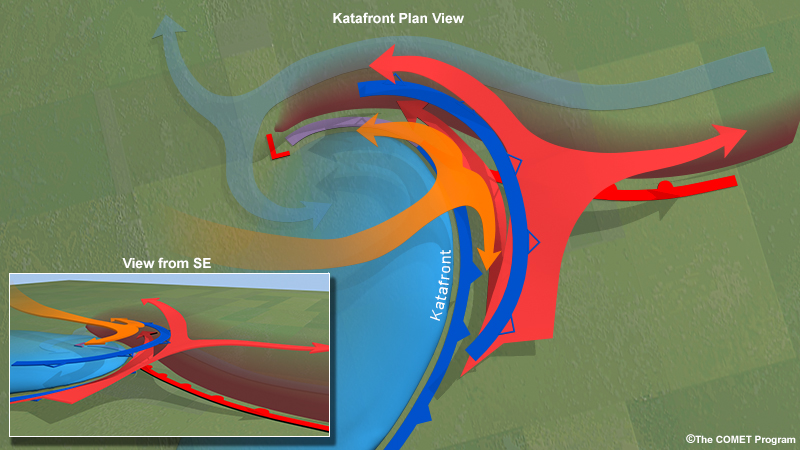
Forecasting from Comparisons » Frontal/Deformation Zone Overlap » Katafront/Frontolytic
Where the upper-level deformation zone races ahead of the surface front, the front is called a katafront. The prefix “kata-” comes from Greek for “down”, “downwards”, or “reversal,” which makes sense considering that air sinks aloft near katafronts.
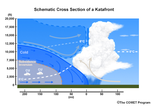
Cross-section of a left-to-right moving katafront. The blue dashed outline aloft indicates the overlapping deformation zone area and the leading edge is the upper-level cold front.
Katafronts are frontogenetic in the horizontal. There is a direct thermal frontal circulation with rising motion on the warm side and sinking motion on the cold side at low-levels. This circulation is vertically frontolytic due to diabatic processes. There is sinking motion aloft which plays a role in the overall frontogenesis and frontolysis. Yet, the story is more complicated.
When the upper-level deformation zone accelerates ahead of the surface front, yet remains close, the upper-level sinking motion caps off the low-level higher theta-w air, eventually bringing sinking motion lower on the warm side of the surface front causing an overall frontolysis.
If the surface front is trailing quite far behind and the air ahead of the front has a high theta-w value, you may see convection in the interim area due to potential instability (low theta-w air over high theta-w air). When the front separates this far from the deformation zone, the surface front can be overall frontogenetic.
The tabs below show satellite imagery of a katafront 6 hours apart. This example does not have convection along the surface front, so this would be considered a case where the front is overall frontolytic.
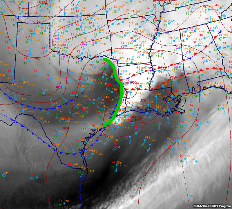
Forecasting from Comparisons » Frontal/Deformation Zone Overlap » Exercise
Question
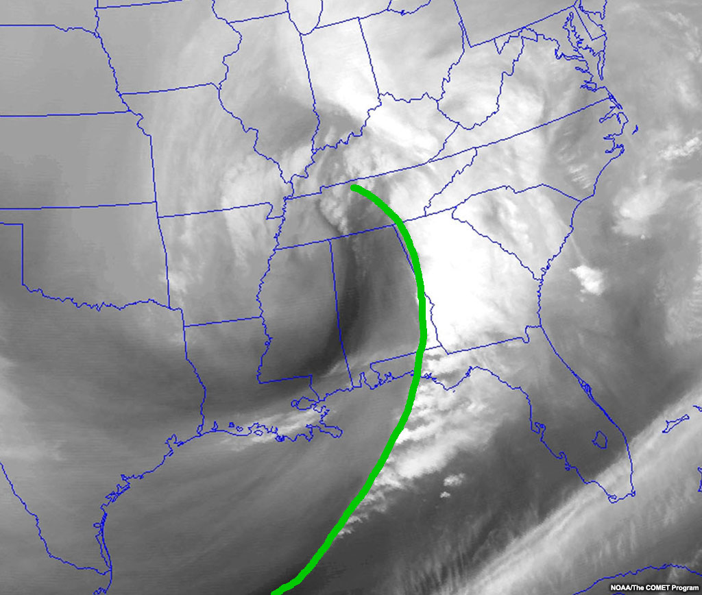
Based on the analysed image below, drag the frontal types to their appropriate location on the map.
Drag the anafront and katafront to their appropriate locations on the image.
The poleward portion of this cold front is a katafront, while the equatorward portion is an anafront. This is the general pattern for developed cyclones with both types of fronts.
The katafront is generated by the dry conveyor belt splitting in the vertical and creating an upper-level cold front at the location of the leading deformation zone.
On the equatorward end of the surface cold front, where it is an anafront, the winds at both the upper- and lower-levels tend to parallel the front and deformation zone.

Forecasting from Comparisons » Frontal/Deformation Zone Overlap » Surface Sensible Weather Implications
The anafront and katafront cross-sections tell the story of what sensible weather features you can predict once you know the frontal type. The trick is to catch the fronts as they’re developing or transitioning. Knowing that a front is going to transition from one type to the other, or that the upper-level features and surface fronts will link up in certain ways can help you predict both the future state of the atmosphere and how the front, and associated conditions will evolve (maintain, develop, or decay).
The table below is a summary of Sansom’s 1951 observational paper on ana- and katafronts in the United Kingdom (as summarized in Moore and Smith 1988). This table shows the differences and sensible weather conditions for each frontal type.
Summary of anafront and katafront characteristics |
||
Element |
Anafront |
Katafront |
Temperature |
Sudden, large drop with frontal passage |
Slight, gradual drop with frontal passage |
Dewpoint Temperature |
Sudden, moderate drop with frontal passage |
Moderate, sharp decrease with frontal passage |
Clouds |
Slow clearing with frontal passage |
Rapid clearing with frontal passage |
Precipitation |
Moderate-to-heavy rain with frontal passage with steady postfrontal rain |
Very light rain centered in a narrow band along front; possible convection ahead of front |
Wind |
Sharp veer, followed by decrease in speed behind front |
Gradual veer, with slight speed changes behind front |
Forecasting from Comparisons » Frontal/Deformation Zone Overlap » Further Considerations
The col location defines the frontal type and any transitioning. Poleward of the col is the katafront, and equatorward of the col is the anafront. You can monitor the position of the col to help evaluate frontal transition.
In the next section, we’ll investigate what could be considered upper-level, mesoscale fronts that may or may not extend to the surface: dry conveyor belt pulses.
Forecasting from Comparisons » Dry Conveyor Belt Pulses
Sometimes the surface analysis won’t show signs of things to come, yet when using water vapour imagery, you can predict some of these changes. Strong surface wind gusts are a prime example. An example is a cold front passing with consistent wind speeds, and then sudden strong wind gusts develop with only a minor increase of the surface pressure gradient observable beforehand. Often there is no way to forecast this from surface observations and NWP shows limited variation in wind speed.
We can conceptualize this forecast problem by visualizing a dry conveyor belt in the vertical. Below, multiple pulses exist in a dry conveyor belt, with the last one not yet reaching the ground. On a standard surface chart, the leading front is usually analysed, but you may find the second surface cold front is often unanalysed, as is the third front (upper-level), even after it reaches the ground. If the third pulse remains above the surface but close to the ground, it may be analysed as a pressure trough, but that is often missing as well.
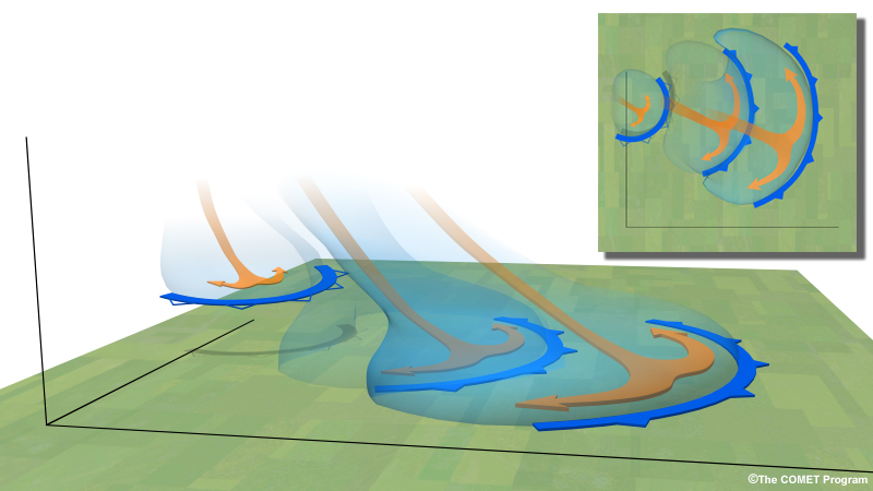
By overlaying a surface analysis on a water vapour image, we can see descending (darkening) dry conveyor belt pulses in water vapour imagery, and increasing surface winds. Note that these pulses must be descending with time, not simply a relatively dark part of the imagery. Note that the water vapour imagery cannot see to the surface, it can only see the descending dry air which is a strong indicator of momentum transfer to the surface and thus increased, perturbed winds.
Example
The greater the darkening, the more likely the pulse is to reach the ground. You can look for the strongest winds on the leading edge of the darkening. The further rearward from the initial cold front the pulse is, the less likely it is to reach the ground.
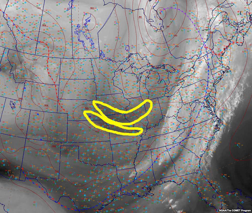
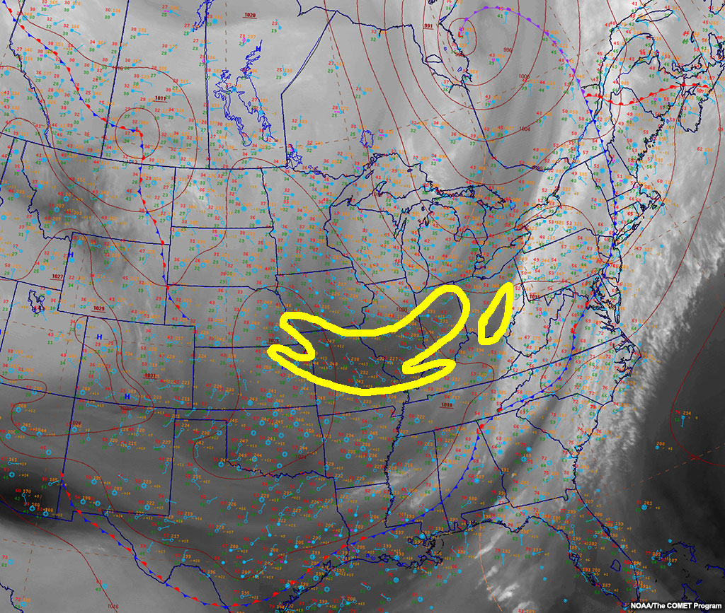
Forecasting from Comparisons » Dry Conveyor Belt Pulses » Exercise
Question
Where will the surface winds likely increase over the next 3 hours? Outline the area.
Use the pen to outline the area where the surface wind speeds should increase relatively.
| Tool: | Tool Size: | Color: |
|---|---|---|
Three hours later, the relative area where the darkening occurred (outlined in yellow below) shows increased wind speeds (0-5 kts initially, then 5-15 kts in the later frame). Drag between the two images below to watch the relative speeds increase in the outlined area.
Forecasting from Comparisons » Dry Conveyor Belt Pulses » Surface Sensible Weather Implications
Dry conveyor belt pulses cause clearing skies and increased winds due to the upper-to-lower-level momentum transfer. The steepest dry conveyor belts will create the strongest surface winds. You can assess the belt’s slope by using your three-dimensional understanding of the water vapour image - the greater the color contrast over a shorter distance, the steeper the slope of the belt.
With each pulse, the temperatures and dewpoint temperatures will decrease, but their gradients will become less noticeable with each subsequent pulse. Cloud cover and precipitation should be non-existent due to subsidence. The winds will show a slight directional perturbation based on the pulse shape. If the shape of the deformation zone is cyclonic, expect cyclonic perturbations in the surface wind field.
Forecasting from Comparisons » Dry Conveyor Belt Pulses » Further Considerations
In older or stronger systems, you can see as many as four different pulses making an impact on the surface observations. Typically, each subsequent pulse has a longer path to the surface or a weaker slope. Due to the weaker slope, each subsequent pulse will originate from a lower altitude. Due to the decreasing origination altitude of subsequent dry conveyor belt pulses, each pulse will transfer less angular momentum to the surface since they are coming from lower altitudes.
If you can forecast intensification of dry conveyor belt pulses, you can also forecast their weakening. When the water vapour imagery stops darkening or even lightens, you know the expected gradients will weaken.
We have made it through our list of features that can be detected by comparing surface observations and water vapour imagery. That leaves a couple limitations to discuss. Then it will be your turn to test your skills with a case.
Forecasting from Comparisons » Surface Features
One of the main limitations of water vapour imagery is that it cannot show the effects of surface features (e.g., some fronts, coast lines, or topography) until they affect the water vapour brightness temperature enough to make an impression. In some systems, the forcing comes from the surface features, not those aloft. You can minimize this limitation by always comparing to surface observations, adding in surface mesoscale or local scale factors that you could miss by using water vapour imagery alone.
A fine example is summertime convection with outflow boundaries. Outflow boundaries themselves are rarely, if ever, seen in water vapour imagery. The following example shows the evolution of convection from mesoscale to synoptic scale via water vapour imagery.
Example
This example shows that the upper-levels don’t always drive the weather pattern. The western convective cluster shown above originates from a surface boundary that isn’t analysed and isn’t visible in the water vapour imagery. Mesoscale and local scale boundaries and even topography may not show a reflection in water vapour imagery, but are extremely important to diagnose.
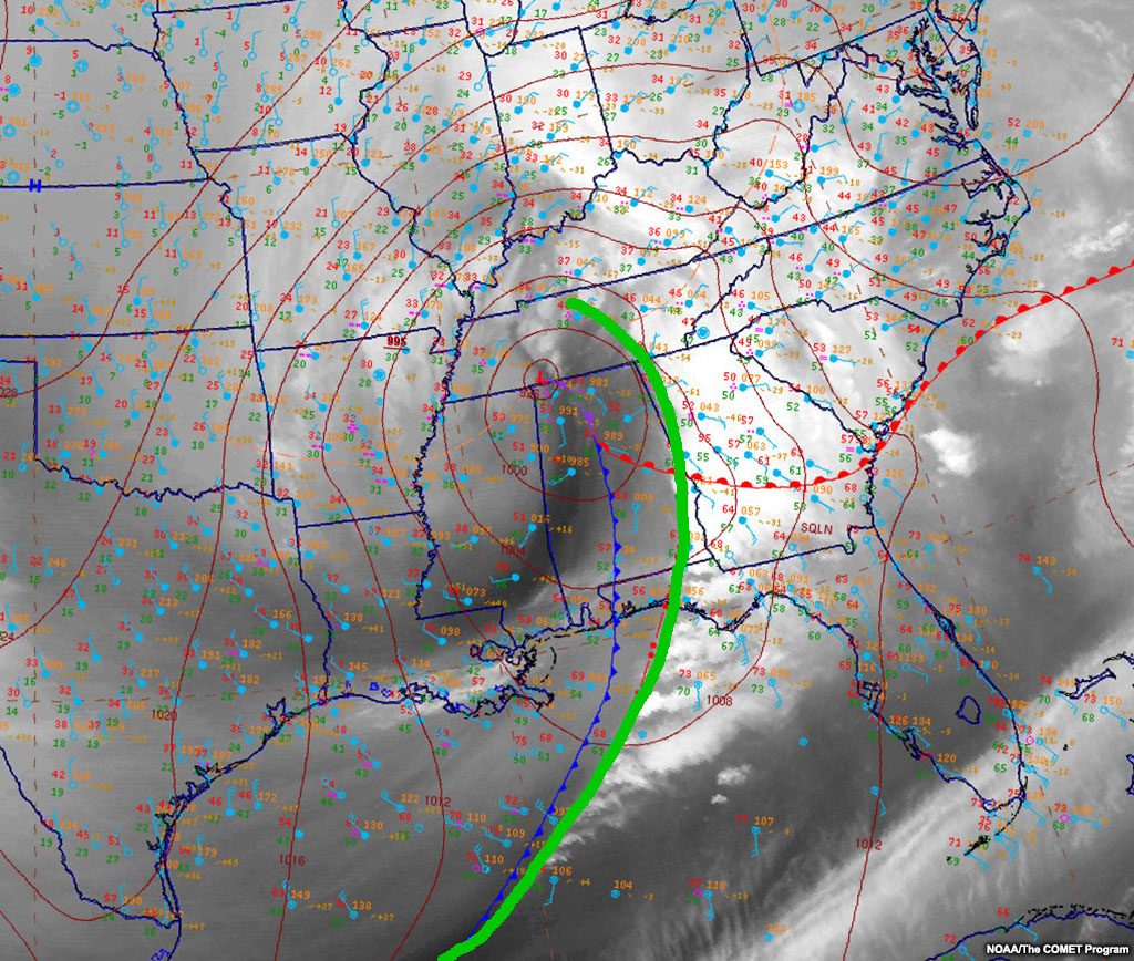
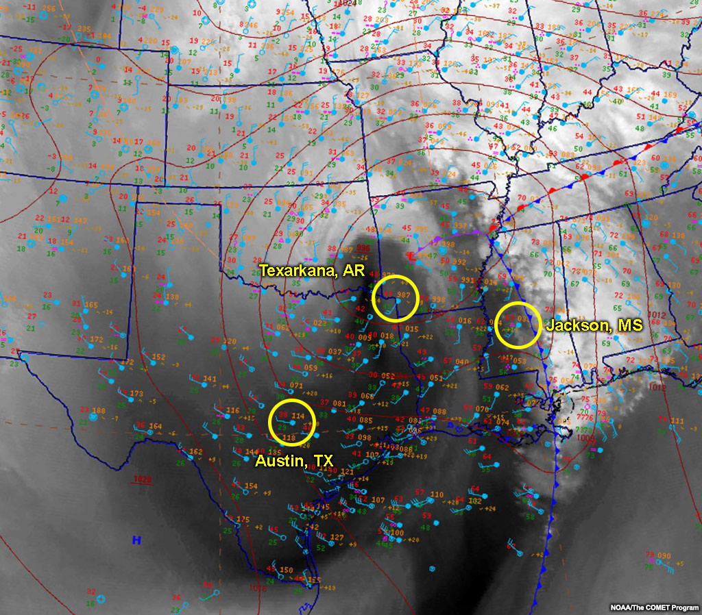
Culminating Exercise » Jackson, MS
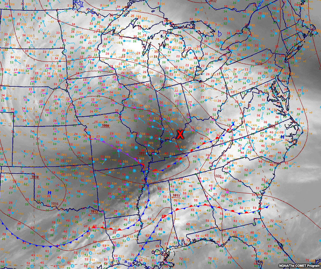
This final case exercise integrates analysis and diagnosis of vorticity tube slope, frontal type and conveyor belt pulses via comparing surface analyses and water vapour imagery. Test your knowledge by answering the questions for three locations. Start with an analysis for Jackson, Mississippi. The following loop is 6 hours long ending at the analysis time for the questions.
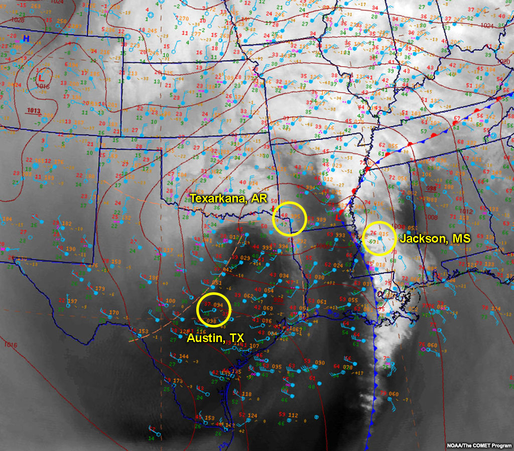

Below several questions will ask you about your analysis, diagnosis, and prognosis for the situation at the locations circled on the image: Jackson, MS (eastern circle), Texarkana, AR (central circle), and Austin, TX (western circle).
Question 1 of 2
Which situation(s) will affect the Jackson, MS station in the next 3 hours?
The correct answer is c.
This front is showing a deformation zone aloft behind the southern portion of the surface frontal boundary and it appears like it will expand farther north over time, since the col is migrating northward. So that means this portion of the front is transitioning to an anafront.
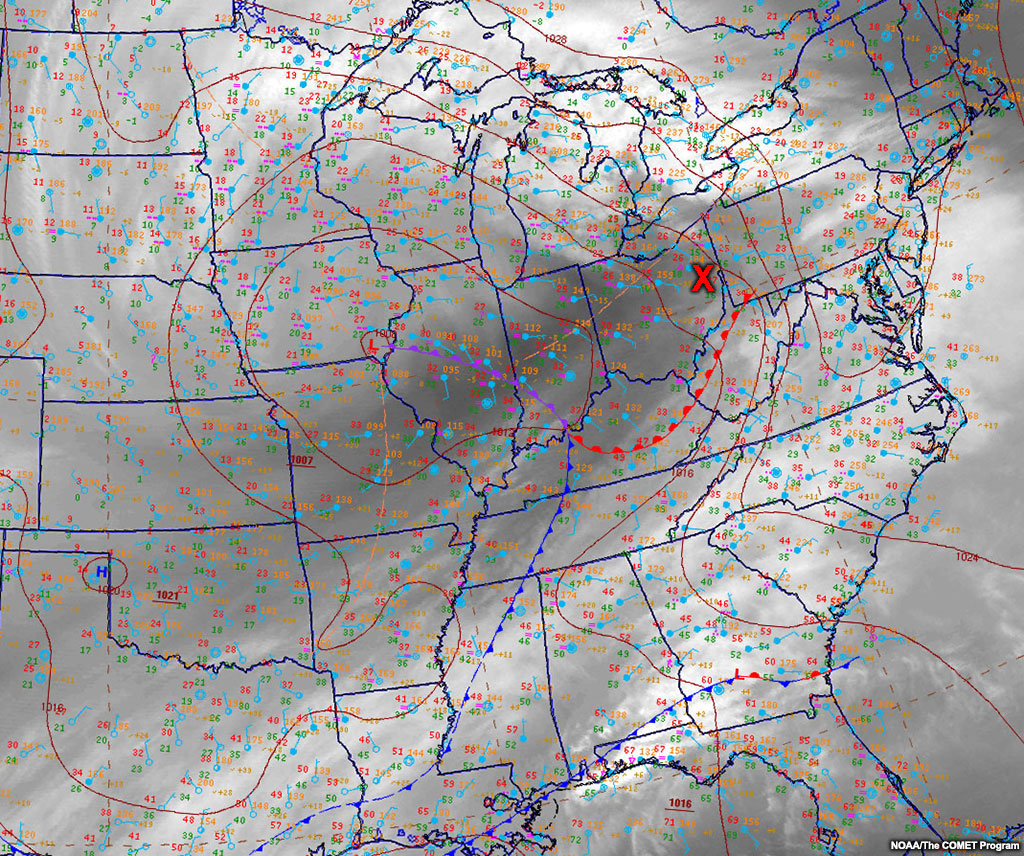
Culminating Exercise » Texarkana, AR
Continue with the final case exercise with an analysis for Texarkana, Arkansas. The following loop is 6 hours long ending at the analysis time for the questions.
Below several questions will ask you about your analysis, diagnosis, and prognosis for the situation at the locations circled on the image: Jackson, MS (eastern circle), Texarkana, AR (central circle), and Austin, TX (western circle).
Question 1 of 2
Which situation(s) will affect the Texarkana, AR station in the next 3 hours?
The correct answers are a, e.
In Texarkana, AR in the next 3 hours, the pressure center should develop and a dry conveyor belt pulse should drive toward the surface behind a mid-level moisture plume (seen in water vapour imagery).
Culminating Exercise » Austin TX
Continue with the final analysis for the case exercise for Austin, Texas. The following loop is 6 hours long ending at the analysis time for the questions.
Below several questions will ask you about your analysis, diagnosis, and prognosis for the situation at the locations circled on the image: Jackson, MS (eastern circle), Texarkana, AR (central circle), and Austin, TX (western circle).
Question 1 of 3
Which situation(s) is/are currently affecting the Austin, TX (western circle) observation?
The correct answer is e.
Over Austin, TX currently you see a dry conveyor belt pulse.
GOES-R WV Channels
The GOES-R era satellites will have three water vapour channels. The 6.2 µm channel sees mid-to-upper-level moisture just like it currently does while the two new channels (6.9 µm and 7.3µm) see lower into the mid-tropospheric moisture. These extra channels make it easier to analyse tilts, overlaps, and descending air, while letting you see deeper into the troposphere.

Summary
With your knowledge of atmospheric fluid dynamics, you can now use surface observations and water vapour imagery to diagnose and prognose the weather. The content in this lesson should increase your abilities to:
- Compare vorticity centers to surface pressure centers to assess the slope and perturb the system for the future state of the atmosphere,
- Analyse the overlap of surface fronts and deformation zones to predict cloud and precipitation states as well as frontogenesis and frontolysis,
- Observe mid-level darkening for dry conveyor belt pulses to predict changes in surface sensible weather even without a classical frontal passage,
- Build your three-dimensional atmosphere with a surface analysis to diagnose more synoptic processes.
You are likely to surprise yourself with how much you can diagnose and predict!
You have reached the end of the lesson. To receive your certificate, you must pass the lesson quiz and fill out the associated survey.
References
Browning, Keith A. "Conceptual models of precipitation systems." Weather and Forecasting 1.1 (1986): 23-41.
Moore, James T., and Kenneth F. Smith. "Diagnosis of anafronts and katafronts." Weather and forecasting 4.1 (1989): 61-72.
Sansom, H. W. "A study of cold fronts over the British Isles." Quarterly Journal of the Royal Meteorological Society 77.331 (1951): 96-120.
Santurette, Patrick, and Christo Georgiev. Weather analysis and forecasting: applying satellite water vapor imagery and potential vorticity analysis. Academic Press, 2005.
Contributors
COMET Sponsors
Special thanks go to Phil Chadwick (retired MSC forecaster) for his knowledge and vision to make this series a reality. Without his talents, artistic style, and passion for this subject, this series would not have come to fruition. Phil, your forecasting skills from just water vapour imagery are legendary, and your calm demeanor and desire to teach others has touched forecasters more than you know. Thank you for being the catalyst for this movement.
MetEd and the COMET® Program are a part of the University Corporation for Atmospheric Research's (UCAR's) Community Programs (UCP) and are sponsored by NOAA's National Weather Service (NWS), with additional funding by:
- Bureau of Meteorology of Australia (BoM)
- Bureau of Reclamation, United States Department of the Interior
- European Organisation for the Exploitation of Meteorological Satellites (EUMETSAT)
- Meteorological Service of Canada (MSC)
- NOAA's National Environmental Satellite, Data and Information Service (NESDIS)
- NOAA's National Geodetic Survey (NGS)
- Naval Meteorology and Oceanography Command (NMOC)
- U.S. Army Corps of Engineers (USACE)
To learn more about us, please visit the COMET website.
Project Contributors
Program Manager
- Wendy Schreiber-Abshire — UCAR/COMET
Project Lead, Project Scientist, and Instructional Design
- Bryan Guarente — UCAR/COMET
Graphics/Animations
- Steve Deyo — UCAR/COMET
Multimedia Authoring/Interface Design
- Gary Pacheco — UCAR/COMET
- Bryan Guarente — UCAR/COMET
COMET Staff, February 2016
Director's Office
- Dr. Rich Jeffries, Director
- Dr. Greg Byrd, Deputy Director
- Lili Francklyn, Business Development Specialist
Business Administration
- Dr. Elizabeth Mulvihill Page, Group Manager
- Lorrie Alberta, Administrator
- Hildy Kane, Administrative Assistant
IT Services
- Tim Alberta, Group Manager
- Bob Bubon, Systems Administrator
- Dolores Kiessling, Software Engineer
- Joey Rener, Student Assistant
- Malte Winkler, Software Engineer
Instructional and Media Services
- Bruce Muller, Group Manager
- Dr. Alan Bol, Scientist/Instructional Designer
- Steve Deyo, Graphic and 3D Designer
- Lon Goldstein, Instructional Designer
- Bryan Guarente, Meteorologist/Instructional Designer
- Vickie Johnson, Instructional Designer (Casual)
- Gary Pacheco, Web Designer and Developer
- Sylvia Quesada, Intern
- Sarah Ross-Lazarov, Instructional Designer (Casual)
- Tsvetomir Ross-Lazarov, Instructional Designer
- David Russi, Spanish Translations
- Andrea Smith, Meteorologist/Instructional Designer
- Marianne Weingroff, Instructional Designer
Science Group
- Wendy Schreiber-Abshire, Group Manager
- Dr. William Bua, Meteorologist
- Dr. Frank Bub, Oceanographer (Casual)
- Patrick Dills, Meteorologist
- Matthew Kelsch, Hydrometeorologist
- Dr. Elizabeth Mulvihill Page, Meteorologist
- Amy Stevermer, Meteorologist
- Vanessa Vincente, Visiting Meteorologist, CIRA/Colorado State University