Introduction
You've seen it happen before. A tough forecast at an inopportune time. News and social media have been in an uproar since the forecast went slightly wrong. Forecasters silently saw ensembles clustered in two distinct groups. It was hard to communicate the forecast uncertainty quickly and easily. With hindsight, one cluster was clearly missing something, but how were forecasters supposed to know during or before the event began?
Numerical Weather Prediction (NWP) models are the forecasting tool of choice for most forecasters, especially beyond 24 hours. Forecasters sometimes rely on NWP so heavily that it replaces much of the analysis and diagnosis process at times (Bosart 2003). -- "But the model output looks so realistic." -- This may be the case. Yet, it's possible to assess the NWP initialization before using it in your forecast. Using a poorly initialized model is like cooking with the wrong ingredients. The end result isn't pretty.
NWP assessment requires only a few minutes of your time when comparing it to synonymous real-time observations, and can make a difference in your final forecast products. This assessment can also help gauge confidence in certain models, runs, or ensemble members.
Based on the work of Santurette and Georgiev (2005), we'll compare water vapour imagery and certain NWP variables, which will help depict differences between observations and model performance.
Before going any further, think about how you have assessed NWP in the past:
- Why did you assess NWP output?
- What products did you compare/assess?
- What methods did you use for assessment?
- Did assessing NWP seem to work well for increasing forecast confidence?
- How much more confident were you that the forecast was going to verify after you assessed the NWP?
Many products are readily available for assessing forecast model output. We'll talk about comparing observations to those outputs and how we can adjust the NWP adequately for forecasting.
How to Assess NWP with WV
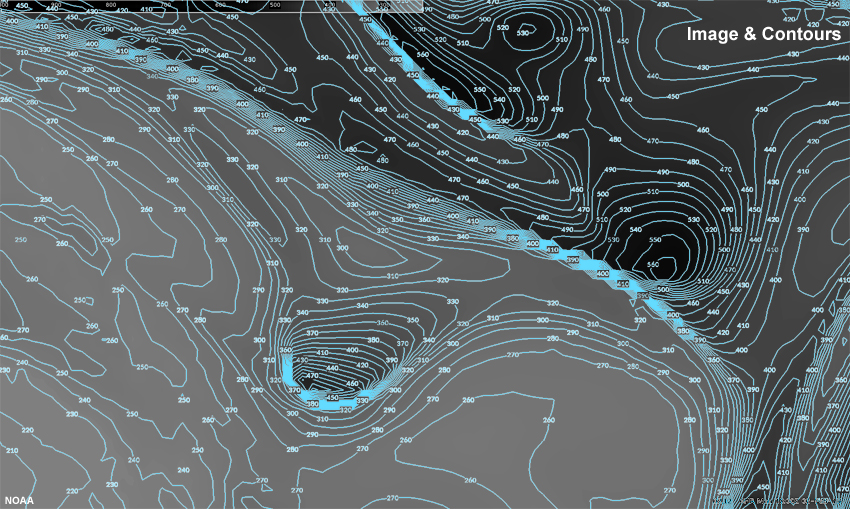
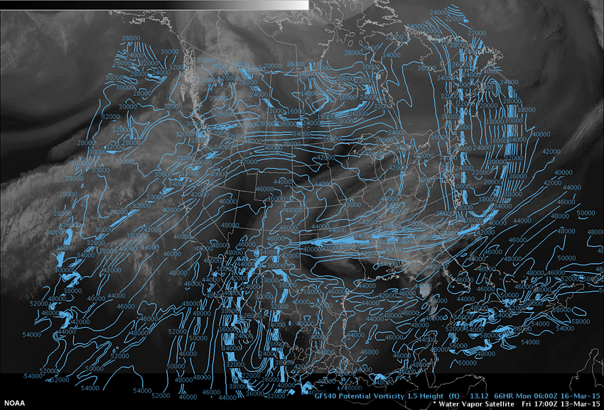
How does one go about assessing NWP? Ideally, we would want an NWP field that maps 1-to-1 against an observation set. This is easier than comparing multiple fields in a pieced-together fashion.
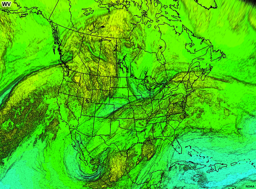
But what does a 1-to-1 comparison look like? Let's do an example with water vapour imagery. If you aren't seeing much contrast in the imagery, try to reduce the glare on your device, turn off lights shining on the screen, or increase the contrast on your device.
Question 1
Use the pen tool to contour this water vapour image. You do not have to contour all of the colors, just enough for you to get a handle on what it should look like.
| Tool: | Tool Size: | Color: |
|---|---|---|
Hopefully you captured some or many of the main features shown in this computer analysis of the image. Cool colors are higher brightness temperatures (lower heights). Warm colors are lower brightness temperatures (higher heights). The multi-colored contours show a true 1-to-1 relationship (they are just contours of the water vapour imagery itself). While this is likely more detailed than what you may do on a regular basis via hand analysis, assessing details of water vapour images to verify NWP in this manner is where we are headed and this lesson will give you practice comparing these images with other contoured NWP fields.
Below you will find another example showing a perfect 1-to-1 relationship where the contours and image are in direct relation to each other.

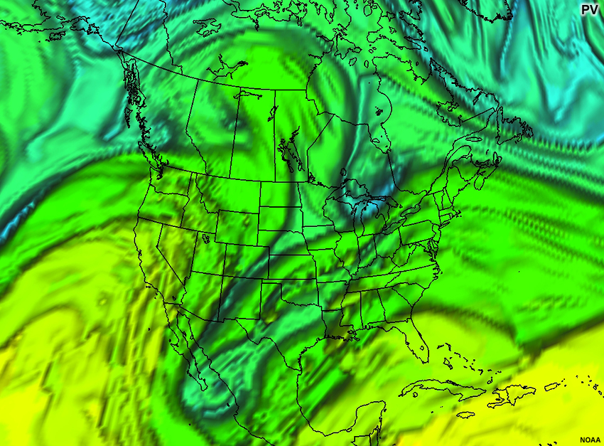
Of course, a completely 1-to-1 relationship between NWP output and satellite observations is almost never to be expected. In examples where the relationship isn't 1-to-1, there will be varying degrees of comparability. Sometimes the overall patterns will match, but the gradients will be tighter or looser than the water vapour gradients. Here is an image where the pattern matches well, but the gradients are too weak.
In the worst comparisons, contours of the appropriate NWP field will be perpendicular to the real-data gradient. Here, the contours of the NWP output are cutting dramatically across the water vapour contours in much of the image below.
In the following exercise, you'll identify which NWP field(s) are best for comparison to water vapour satellite imagery. You should look for the variable(s) that come closest to forming a 1-to-1 relationship with the water vapour contours. Yet, think before you click - consider what water vapour imagery is showing and what its best NWP proxy would be.
Question 2
When you've identified an NWP field you would like to overlay, do so by selecting both the surface and field from the radio buttons below. If you need to see the water vapour image only, you can toggle the overlay on/off by checking the "Toggle Overlay" button in the top left of the image. Upon mouseover of the overlaid image, a zoom tool can help you see more details.
After selecting what you feel is an appropriate image, click "Assess Comparison" below the image and answer the subsequent question.
After selecting what you feel is an appropriate image, click "Assess Comparison" below the image and answer the subsequent question.
Question
When you selected the overlay, what made you think this would be the best comparison to the WV image?
(Type your answer in the box, then click Continue.)
Follow-up Question
Does the overlay show similar patterns, shapes, and gradients as the water vapour imagery? (Choose the best answer.)
The general pattern of the isoheights matches in the Central U.S. and Canada. However, the correlation is limited. The large "cliffs" in the water vapour imagery (like in Oklahoma) are not shown in the height field well at this level. The inverse of the appropriate relationship is showing up in the Pacific Ocean where there are high heights in an area of low water vapour heights. Try to find a surface and field that correlate better with the varied topography of the water vapour surface.
Question
When you selected the overlay, what made you think this would be the best comparison to the WV image?
(Type your answer in the box, then click Continue.)
Follow-up Question
Does the overlay show similar patterns, shapes, and gradients as the water vapour imagery? (Choose the best answer.)
You may have been told to compare water vapour imagery to isotachs to assess jetstreaks, yet the match between the isotachs and the water vapour pattern are limited to only the areas where the jet is maximized and the water vapour imagery "sees". Even there though, it is hard to see a 1-to-1 relationship between the water vapour imagery and the 700mb isotachs as the shapes are vastly different and you are looking much lower in the atmosphere with this pressure surface. Because you are looking low in the atmosphere, you are also seeing effects from the mountains in the Western U.S. and Canada. Try to find a surface and field that correlate better with each other.
Question
When you selected the overlay, what made you think this would be the best comparison to the WV image?
(Type your answer in the box, then click Continue.)
Follow-up Question
Does the overlay show similar patterns, shapes, and gradients as the water vapour imagery? (Choose the best answer.)
The large scale patterns have some similarities to the WV imagery, yet the comparative locations are offset by a respectable amount. This is likely because the water vapour imagery doesn't see down to the 700mb level very often. Since this overlay seems to be too low, maybe higher in the atmosphere would work better. Give that a try.
Question
When you selected the overlay, what made you think this would be the best comparison to the WV image?
(Type your answer in the box, then click Continue.)
Follow-up Question
Does the overlay show similar patterns, shapes, and gradients as the water vapour imagery? (Choose the best answer.)
Omega seems, at first thought, to be a great field to match to the water vapour imagery. Where there is upward motion there should be clouds and more water vapour and where there is sinking motion one would expect drier air. But not all of the water vapour in the image is associated with vertical motions. Some of it is just quasi-horizontally advecting. Because of this, you should probably choose a different field. What kind of surface does the air really flow along? Maybe that would be a better way to find the surface and field you are looking for. Try again.
Question
When you selected the overlay, what made you think this would be the best comparison to the WV image?
(Type your answer in the box, then click Continue.)
Follow-up Question
Does the overlay show similar patterns, shapes, and gradients as the water vapour imagery? (Choose the best answer.)
The general pattern looks okay, but it only really does a good job where the water vapour image is "dry". That must mean we are too low with this surface since the "dry" areas are lower in the atmosphere. You might want to try to move up in the atmosphere to find a better surface to match the water vapour imagery. Try again.
Question
When you selected the overlay, what made you think this would be the best comparison to the WV image?
(Type your answer in the box, then click Continue.)
Follow-up Question
Does the overlay show similar patterns, shapes, and gradients as the water vapour imagery? (Choose the best answer.)
Theta-e does a better job of capturing the temperature and moisture relationship expected in a water vapour image, but doesn't really get the topography of the water vapour imagery. The matches seem to occur in the drier areas on the water vapour image and at the strongest gradients. Because it is matching well in the dry areas, which are low altitude in the water vapour sense, maybe you need to choose a higher surface to capture the variation better. Try again.
Question
When you selected the overlay, what made you think this would be the best comparison to the WV image?
(Type your answer in the box, then click Continue.)
Follow-up Question
Does the overlay show similar patterns, shapes, and gradients as the water vapour imagery? (Choose the best answer.)
Where there is correlation between these two images the correlation seems really good, but the correlation only occurs in very limited areas of the image. What pressure range does water vapour imagery typically see? Use that as a clue to find a different surface or field to try. Try again.
Question
When you selected the overlay, what made you think this would be the best comparison to the WV image?
(Type your answer in the box, then click Continue.)
Follow-up Question
Does the overlay show similar patterns, shapes, and gradients as the water vapour imagery? (Choose the best answer.)
It is quite hard to draw any correlation between these two images. 700mb is quite low to be looking for a match with the water vapour imagery. Water vapour imagery rarely shows info down to 700mb as it is weighted much closer to 400mb. Maybe try something higher to see what the correlation is up there. Try again.
Question
When you selected the overlay, what made you think this would be the best comparison to the WV image?
(Type your answer in the box, then click Continue.)
Follow-up Question
Does the overlay show similar patterns, shapes, and gradients as the water vapour imagery? (Choose the best answer.)
The general pattern of the isoheights match in the Central U.S. and Canada. However, the correlation is limited. The large "cliffs" in the water vapour imagery (like in Oklahoma) are not shown well in the height field, but they are better on this level than on the 700mb surface. The contours in California are perpendicular to the water vapour gradients, so this overlay is missing a bunch of the points. Try to think of a surface/field that would show a more dynamic topography. Try again.
Question
When you selected the overlay, what made you think this would be the best comparison to the WV image?
(Type your answer in the box, then click Continue.)
Follow-up Question
Does the overlay show similar patterns, shapes, and gradients as the water vapour imagery? (Choose the best answer.)
The correlations are best near the jet stream axis. However, other than that, the pattern doesn't clearly match the water vapour imagery. The winds do affect the pattern of the moisture, but the isotachs do not typically form the same gradients and shapes as the water vapour imagery. You would ideally want to find a surface and field that produces the same gradients of brightness temperature as the water vapour imagery. Try again remembering that the water vapour surface has highly variable topography.
Question
When you selected the overlay, what made you think this would be the best comparison to the WV image?
(Type your answer in the box, then click Continue.)
Follow-up Question
Does the overlay show similar patterns, shapes, and gradients as the water vapour imagery? (Choose the best answer.)
Wow! That feels really good where there are high RH values, but the areas where the RH is lower, the correlation is hard to see. The problem in those areas is likely that the 500mb surface is only part of the story when it comes to the water vapour brightness temperature. All levels of the middle- and upper-troposphere are contributing to the radiation signature of the water vapour channel. Is there a better way to encapsulate the vertical variation of the water vapour surface with a different surface? Try again.
Question
When you selected the overlay, what made you think this would be the best comparison to the WV image?
(Type your answer in the box, then click Continue.)
Follow-up Question
Does the overlay show similar patterns, shapes, and gradients as the water vapour imagery? (Choose the best answer.)
Omega seems, at first thought, to be a great field to match to the water vapour imagery. Where there is upward motion there should be clouds and more water vapour and where there is sinking motion one would expect drier air. But not all of the water vapour in the image is associated with vertical motions. Some of it is just quasi-horizontally advecting. Because of this, you should probably choose a different field. What kind of surface does the air really flow along? Maybe that would be a better way to find the surface and field you are looking for. Try again.
Question
When you selected the overlay, what made you think this would be the best comparison to the WV image?
(Type your answer in the box, then click Continue.)
Follow-up Question
Does the overlay show similar patterns, shapes, and gradients as the water vapour imagery? (Choose the best answer.)
The general pattern of the isentropes match in central Canada and the southwestern United States. However, the correlation is limited. The large "cliffs" in the water vapour imagery are not shown in the theta field possibly due to a lack of moisture in the theta calculation. Try to find a surface and field that correlate better with the extreme topography of the water vapour surface. Try again.
Question
When you selected the overlay, what made you think this would be the best comparison to the WV image?
(Type your answer in the box, then click Continue.)
Follow-up Question
Does the overlay show similar patterns, shapes, and gradients as the water vapour imagery? (Choose the best answer.)
Theta-e does a better job of capturing the temperature and moisture relationship expected in a water vapour image, but doesn't really get the topography of the water vapour imagery from the pressure surface perspective. There are areas in the western Canada where the more-than-subtleties are missed. Try a different surface or field to see what you can find that might match better.
Question
When you selected the overlay, what made you think this would be the best comparison to the WV image?
(Type your answer in the box, then click Continue.)
Follow-up Question
Does the overlay show similar patterns, shapes, and gradients as the water vapour imagery? (Choose the best answer.)
Parts of the image match really well, but other parts don't even have data to compare. This is likely because the 500mb surface doesn't vertically cut through the pertinent areas. However, the PV overlay does seem to offer some nice comparisons. We might want to try more examples of PV or get off of the 500mb surface. You likely need to select a surface or field that has more vertical variation to capture the variability in the water vapour surface. Try again.
Question
When you selected the overlay, what made you think this would be the best comparison to the WV image?
(Type your answer in the box, then click Continue.)
Follow-up Question
Does the overlay show similar patterns, shapes, and gradients as the water vapour imagery? (Choose the best answer.)
It is hard to make heads or tails of this comparison. Some areas look pretty good, but others have no correlation. This may work in some areas, but there might be better options out there to try. It seems like the best correlation is within the mid-latitudes. To the north and south of that line, the comparison drops off pretty rapidly. Try again choosing a surface and field that will try to capture the vertical variation in the water vapour surface.
Question
When you selected the overlay, what made you think this would be the best comparison to the WV image?
(Type your answer in the box, then click Continue.)
Follow-up Question
Does the overlay show similar patterns, shapes, and gradients as the water vapour imagery? (Choose the best answer.)
The general pattern of the isoheights match in the southern portion of the image. However, the correlation is limited. The large "cliffs" in the water vapour imagery are not shown in the height field. Think of a surface/field that would show a more dynamic height to its surface. Try to find a surface and field that correlate better with the extreme topography of the water vapour surface.
Question
When you selected the overlay, what made you think this would be the best comparison to the WV image?
(Type your answer in the box, then click Continue.)
Follow-up Question
Does the overlay show similar patterns, shapes, and gradients as the water vapour imagery? (Choose the best answer.)
You may have been told to compare water vapour imagery to isotachs to find the jetstreaks, which can be useful, but the match between the isotachs and the water vapour pattern and gradients are limited to only the areas where the jet is maximized. There is plenty more image to compare. Even in the jet, it is hard to see a 1-to-1 relationship between the water vapour imagery and the isotachs as the shapes are vastly different. Try to find a surface and field that correlate better with each other. Try again.
Question
When you selected the overlay, what made you think this would be the best comparison to the WV image?
(Type your answer in the box, then click Continue.)
Follow-up Question
Does the overlay show similar patterns, shapes, and gradients as the water vapour imagery? (Choose the best answer.)
That's a nice comparison. This comparison makes pretty good sense. The correlations are good where the water vapour image is "whiter" as those locations are "higher". Yet in the >90% humidity areas, you don't get any of the gradients. The other areas though where the water vapour imagery is darker don't seem to correlate well. This is because the water vapour image is showing an area that is lower than 300mb. There's probably a way with the NWP fields to match the varying topography of the water vapour imagery. Try another surface/field that might capture all of the vertical variation present in the water vapour imagery. Try again.
Question
When you selected the overlay, what made you think this would be the best comparison to the WV image?
(Type your answer in the box, then click Continue.)
Follow-up Question
Does the overlay show similar patterns, shapes, and gradients as the water vapour imagery? (Choose the best answer.)
There is very little to go on here. The large area of vertical motions associated with the frontal band off the West Coast of the U.S. has some shape correlation, but the entire cloud band isn't captured. Other areas in the imagery have limited or no correlation to the water vapour gradients and patterns. Try again looking for something that will emulate the water vapour variability.
Question
When you selected the overlay, what made you think this would be the best comparison to the WV image?
(Type your answer in the box, then click Continue.)
Follow-up Question
Does the overlay show similar patterns, shapes, and gradients as the water vapour imagery? (Choose the best answer.)
There is a relatively good match between the 300mb theta and the water vapour imagery around the jetstream and in the depression on the Ontario-Minnesota border. Yet, in those areas there is a slight offset making the correlation not the best possible solution. The comparison seems best where there aren't diabatic processes. Try again while trying to find a surface/field that matches even in those diabatic areas.
Question
When you selected the overlay, what made you think this would be the best comparison to the WV image?
(Type your answer in the box, then click Continue.)
Follow-up Question
Does the overlay show similar patterns, shapes, and gradients as the water vapour imagery? (Choose the best answer.)
There are limited areas that match the pattern of the water vapour imagery. Near the jetstream, the pattern looks pretty good, but when you pull away from that area, the comparisons are weak, with theta-e lines cutting across the water vapour gradients. You will need to find another surface/field that correlates better to the varying topography of the water vapour imagery. Try again.
Question
When you selected the overlay, what made you think this would be the best comparison to the WV image?
(Type your answer in the box, then click Continue.)
Follow-up Question
Does the overlay show similar patterns, shapes, and gradients as the water vapour imagery? (Choose the best answer.)
There are a lot of correlated shapes and patterns here where there is data present, but there is too much of the image where there is no data for this to reach any higher than 50% correlation. It seems like PV could capture some of the variability pretty well. You could try looking at PV on an isentropic surface or look at a PV surface with another field to see their correlation. Try again with one of those options to see what they look like.
Question
When you selected the overlay, what made you think this would be the best comparison to the WV image?
(Type your answer in the box, then click Continue.)
Follow-up Question
Does the overlay show similar patterns, shapes, and gradients as the water vapour imagery? (Choose the best answer.)
The comparison works well where there are strong gradients in the water vapour imagery only. Once you get away from those areas, the relationship breaks down. Sometimes high values of vorticity are low values of water vapour and other times the opposite is true. This doesn't seem to always have a direct relationship. Try again looking for a relationship that matches the varying topography of the water vapour imagery better.
Question
When you selected the overlay, what made you think this would be the best comparison to the WV image?
(Type your answer in the box, then click Continue.)
Follow-up Question
Does the overlay show similar patterns, shapes, and gradients as the water vapour imagery? (Choose the best answer.)
The height pattern follows the water vapour patterns in the eastern half of the image, but the gradients in a lot of locations on the southern portion of the contours cut across the water vapour gradients. This likely means that the isentropic surface is cutting through the water vapour below where there water vapour imagery can "see". Isentropic surfaces are often less variable in height than the water vapour imagery. There might be other surfaces or fields that capture the varying topography of the water vapour image better than this one. Try again.
Question
When you selected the overlay, what made you think this would be the best comparison to the WV image?
(Type your answer in the box, then click Continue.)
Follow-up Question
Does the overlay show similar patterns, shapes, and gradients as the water vapour imagery? (Choose the best answer.)
The isotachs on this surface are making peaks and valleys where the water vapour pattern is nearly flat. Not enough of the image is covered with data, and the patterns don't seem to match anything from the water vapour imagery. You will need to find a surface/field that captures the moisture patterns from the water vapour imagery. Try again.
Question
When you selected the overlay, what made you think this would be the best comparison to the WV image?
(Type your answer in the box, then click Continue.)
Follow-up Question
Does the overlay show similar patterns, shapes, and gradients as the water vapour imagery? (Choose the best answer.)
Although the patterns are similar to the water vapour imagery, they are misaligned by 100s of kilometers in many locations. Is this misalignment because of the vertical location of the 285K surface cutting through a tilted feature? You could probably try up an isentropic surface or two and see what that does, or maybe the issue is something different due to the tilting features. Try again.
Question
When you selected the overlay, what made you think this would be the best comparison to the WV image?
(Type your answer in the box, then click Continue.)
Follow-up Question
Does the overlay show similar patterns, shapes, and gradients as the water vapour imagery? (Choose the best answer.)
A lot of this image is missing data to compare to the water vapour imagery. So there is likely a better surface or field to use to find a good comparison. Try again.
Question
When you selected the overlay, what made you think this would be the best comparison to the WV image?
(Type your answer in the box, then click Continue.)
Follow-up Question
Does the overlay show similar patterns, shapes, and gradients as the water vapour imagery? (Choose the best answer.)
A poor comparison at best. This isentropic surface runs into the ground too soon leaving holes in the dataset, the vorticity at this level doesn't seem to capture any of the patterns well, and the gradients in the vorticity pattern aren't strong enough. You should try another surface or field to find a better comparison. Try again.
Question
When you selected the overlay, what made you think this would be the best comparison to the WV image?
(Type your answer in the box, then click Continue.)
Follow-up Question
Does the overlay show similar patterns, shapes, and gradients as the water vapour imagery? (Choose the best answer.)
The broad-scale patterns seem to show a general trough on the eastern portion of the image, and an old low in the southwestern U.S., but the gradients are misaligned and the maxima and minima are thus off center from where the water vapour imagery shows them. Try again.
Question
When you selected the overlay, what made you think this would be the best comparison to the WV image?
(Type your answer in the box, then click Continue.)
Follow-up Question
Does the overlay show similar patterns, shapes, and gradients as the water vapour imagery? (Choose the best answer.)
Lots of the isotachs cross the water vapour gradients at a severe angle. Isotachs lack substantial variability from moisture, so they likely won't work that well for matching to a radiative field based on moisture patterns. Try again.
Question
When you selected the overlay, what made you think this would be the best comparison to the WV image?
(Type your answer in the box, then click Continue.)
Follow-up Question
Does the overlay show similar patterns, shapes, and gradients as the water vapour imagery? (Choose the best answer.)
There are glimmers of hope with this overlay. The trough over the Ontario-Minnesota border is offset a little from the water vapour image, and the minimum in the water vapour doesn't have much to indicate its presence in the RH pattern. You could likely find a better comparison with another surface or field. Try again.
Question
When you selected the overlay, what made you think this would be the best comparison to the WV image?
(Type your answer in the box, then click Continue.)
Follow-up Question
Does the overlay show similar patterns, shapes, and gradients as the water vapour imagery? (Choose the best answer.)
The potential vorticity isn't present over most of the water vapour imagery, so the comparison can't be made well. The limited areas where the PV is displayed seem to show a relatively good match with the water vapour pattern. Maybe PV is a good field to try, but it doesn't seem to be working on this isentropic surface. Try again.
Question
When you selected the overlay, what made you think this would be the best comparison to the WV image?
(Type your answer in the box, then click Continue.)
Follow-up Question
Does the overlay show similar patterns, shapes, and gradients as the water vapour imagery? (Choose the best answer.)
A poor comparison. The only close comparison is over the Ontario-Minnesota border trough. And that isn't even captured all that well. You should try another surface or field to find a better comparison. Try again.
Question
When you selected the overlay, what made you think this would be the best comparison to the WV image?
(Type your answer in the box, then click Continue.)
Follow-up Question
Does the overlay show similar patterns, shapes, and gradients as the water vapour imagery? (Choose the best answer.)
The height pattern follows the water vapour patterns near the jetstream, but the gradients of the water vapour are poorly captured outside of that area. The strongest gradient in the central and eastern U.S. in the height field is offset by quite a bit from where it is in the water vapour imagery. Isentropic surfaces are often less variable in height than the water vapour imagery, although they are more varying than pressure coordinates. There might be other surfaces or fields that would work better than this one. Try again.
Question
When you selected the overlay, what made you think this would be the best comparison to the WV image?
(Type your answer in the box, then click Continue.)
Follow-up Question
Does the overlay show similar patterns, shapes, and gradients as the water vapour imagery? (Choose the best answer.)
Around the jet stream, this overlay looks like it has the patterns right. On closer inspection though, the fastest wind speeds are not comparable to the moisture patterns as they cut right across the patterns. Comparing isotachs to moisture patterns is likely not going to give you a good answer since the isotachs do not have any bearing from the moisture fields. It is likely best to try another surface or field. Try again.
Question
When you selected the overlay, what made you think this would be the best comparison to the WV image?
(Type your answer in the box, then click Continue.)
Follow-up Question
Does the overlay show similar patterns, shapes, and gradients as the water vapour imagery? (Choose the best answer.)
One of the only areas where the pattern of RH seems to match the water vapour is in the trough over Ontario/Minnesota. Even there though, the location is offset by a small, but not insignificant portion. Another location where the overlay matches the water vapour is over Newfoundland where the gradient matches pretty well going to the moist side, however, going toward the dry side, it doesn't seem the correlate well as it misses the valley just west of the water vapour "cliff". Try again.
Question
When you selected the overlay, what made you think this would be the best comparison to the WV image?
(Type your answer in the box, then click Continue.)
Follow-up Question
Does the overlay show similar patterns, shapes, and gradients as the water vapour imagery? (Choose the best answer.)
The potential vorticity isn't present over most of the water vapour imagery, so the comparison can't be that good. The limited areas where the PV is displayed seem to show an okay match with the water vapour pattern, especially over the southwestern U.S.. Maybe PV is a good field to try, but it doesn't seem to be working on an isentropic surface. Try again.
Question
When you selected the overlay, what made you think this would be the best comparison to the WV image?
(Type your answer in the box, then click Continue.)
Follow-up Question
Does the overlay show similar patterns, shapes, and gradients as the water vapour imagery? (Choose the best answer.)
This imagery holds some hope as there are multiple locations where the correlation is spot on like in the southwestern U.S. old low. But other locations on the image are really hard to make a useful comparison. Sometimes the vorticity maxima are darker colors in the water vapour imagery, but other times they are lighter colors for the same magnitude of vorticity. So there is definitely an issue with the gradients. Outside of the strong gradients in the vorticity pattern, the vorticity doesn't match to the water vapour gradients in a meaningful way. Try again.
Question
When you selected the overlay, what made you think this would be the best comparison to the WV image?
(Type your answer in the box, then click Continue.)
Follow-up Question
Does the overlay show similar patterns, shapes, and gradients as the water vapour imagery? (Choose the best answer.)
This is a pretty high-quality comparison. Not perfect, but perfect is unattainable when comparing NWP to water vapour imagery as the resolutions are different and the data "shouldn't match". Potential vorticity as a surface does a great job of matching the water vapour topography in general. However, this surface is a little low for comparing to the water vapour channel except in very cold environments. Stick with PV, and see what you can find. Try again.
Question
When you selected the overlay, what made you think this would be the best comparison to the WV image?
(Type your answer in the box, then click Continue.)
Follow-up Question
Does the overlay show similar patterns, shapes, and gradients as the water vapour imagery? (Choose the best answer.)
That gradient through the middle of the graphic matches well, until you look closer and see that it is just highlighting the jetstream gradients in the isotachs. The water vapour pattern doesn't match the contours of isotachs well really anywhere else aside from pointing out that gradient where the jetstream lives. Try to find another field that represents the moisture better since isotachs have no real obvious relationship with the moisture pattern. Try again.
Question
When you selected the overlay, what made you think this would be the best comparison to the WV image?
(Type your answer in the box, then click Continue.)
Follow-up Question
Does the overlay show similar patterns, shapes, and gradients as the water vapour imagery? (Choose the best answer.)
The southern portion of this graphic is horrendous to look at, and even worse at matching the water vapour imagery. Yet, the northern half of the image looks mostly good. So there is something about this surface that is working well, but maybe not perfectly. Try another PV surface and see what you can come up with. Try again.
Question
When you selected the overlay, what made you think this would be the best comparison to the WV image?
(Type your answer in the box, then click Continue.)
Follow-up Question
Does the overlay show similar patterns, shapes, and gradients as the water vapour imagery? (Choose the best answer.)
This is a pretty high-quality comparison. Not perfect, but perfect is unattainable when comparing NWP to water vapour imagery as the resolutions are different and the data "shouldn't match". Potential vorticity as a surface does a great job of matching the water vapour topography in general. However, this surface is a little low for comparing to the water vapour channel except in very cold environments, and the absolute vorticity is already included into the calculation for potential vorticity and just excludes some of the moisture and temperature parameters. It is better to include all of the parameters in the comparison. Stick with PV surfaces, and see what you can find. Try again.
Question
When you selected the overlay, what made you think this would be the best comparison to the WV image?
(Type your answer in the box, then click Continue.)
Follow-up Question
Does the overlay show similar patterns, shapes, and gradients as the water vapour imagery? (Choose the best answer.)
This is the best comparison. Where the heights are higher, the water vapour imagery has lighter colors. And where the heights are lower, the colors are darker. There are some lacking gradients in the large dark band in the southern half of the U.S., maybe you could do better than this sometimes. But most of the rest of the image is a good comparison.
Continue with the next question to check your understanding as to why this image may be slightly off of the water vapour imagery.
Follow-up Question 2
Through your exploration, you found that the geopotential heights on the 1.5 PVU surface mapped best to the water vapour imagery. There are still areas where the water vapour imagery has more detail or differently placed weather features than the NWP output. Why might that be the case?
What are some possible reasons for the mismatch between the 1.5 PVU surface and the water vapour imagery? Select all that apply.
The model used for all of the fields had a horizontal grid spacing of 12km, yet the water vapour imagery has a horizontal resolution of 4km. Because of this, there will likely be minor errors in the NWP comparisons.
PV doesn't include diabatic processes directly, and the models don't pick up well on all diabatic processes in the data assimilation process. Because of this, you should expect areas of diabatic processes in the water vapour imagery would be missed in the NWP output.
Because of software limitations, the contour interval in the PV heights won't be able to match the gradients/contouring in the water vapour imagery. This is only a minor problem.
Now that we have a pretty good feeling about using the 1.5 PVU surface (-1.5 PVU in the southern hemisphere), what do we do to compare these datasets? And how can we use this information to help us improve our forecasts? Move on to the next section to find out.
Question
When you selected the overlay, what made you think this would be the best comparison to the WV image?
(Type your answer in the box, then click Continue.)
Follow-up Question
Does the overlay show similar patterns, shapes, and gradients as the water vapour imagery? (Choose the best answer.)
Although some of the general pattern follows what is in the water vapour imagery, the contours definitely cross the water vapour gradients inappropriately. Try again.
Question
When you selected the overlay, what made you think this would be the best comparison to the WV image?
(Type your answer in the box, then click Continue.)
Follow-up Question
Does the overlay show similar patterns, shapes, and gradients as the water vapour imagery? (Choose the best answer.)
This looks pretty good in the northern half of the image, but in the southern half, this field gets really messy, likely because of all the diabatic processes included therein. It seems like this might be a good surface to look at since a bunch of the northern half of the image works well, but maybe potential temperature isn't the best field to try. Try again.
Question
When you selected the overlay, what made you think this would be the best comparison to the WV image?
(Type your answer in the box, then click Continue.)
Follow-up Question
Does the overlay show similar patterns, shapes, and gradients as the water vapour imagery? (Choose the best answer.)
This is a pretty high-quality comparison. Not perfect, but perfect is unattainable when comparing NWP to water vapour imagery as the resolutions are different and the data "shouldn't match". Potential vorticity as a surface does a great job of matching the water vapour topography in general. However, this surface is a little low for comparing to the water vapour channel except in very cold environments, and the absolute vorticity is already included into the calculation for potential vorticity and just excludes some of the moisture and temperature parameters. It is better to include all of the parameters in the comparison. Stick with PV surfaces, and see what you can find. Try again.
Question
When you selected the overlay, what made you think this would be the best comparison to the WV image?
(Type your answer in the box, then click Continue.)
Follow-up Question
Does the overlay show similar patterns, shapes, and gradients as the water vapour imagery? (Choose the best answer.)
This is a pretty high-quality comparison. Not perfect, but perfect is unattainable when comparing NWP to water vapour imagery as the resolutions are different and the data "shouldn't match". Potential vorticity as a surface does a great job of matching the water vapour topography in general. However, this surface is a little too high for comparing to the water vapour channel except in warm environments/seasons. Stick with PV, and see what you can find. Try again.
Question
When you selected the overlay, what made you think this would be the best comparison to the WV image?
(Type your answer in the box, then click Continue.)
Follow-up Question
Does the overlay show similar patterns, shapes, and gradients as the water vapour imagery? (Choose the best answer.)
There are lots of places where the isotachs are crossing the water vapour gradients perpendicularly, so there is limited to no correlation between these two images. Try again.
Question
When you selected the overlay, what made you think this would be the best comparison to the WV image?
(Type your answer in the box, then click Continue.)
Follow-up Question
Does the overlay show similar patterns, shapes, and gradients as the water vapour imagery? (Choose the best answer.)
This image looks pretty good in a lot of areas, but seems a little shifted even in those areas to where the pattern isn't perfect. We are likely too high using this 2.0PVU surface and could likely go down one or two PVU surfaces to find something that aligns better with the tilted features. Don't expect perfection in the 1-to-1 comparison, just try to get as close as you can. Try again.
Question
When you selected the overlay, what made you think this would be the best comparison to the WV image?
(Type your answer in the box, then click Continue.)
Follow-up Question
Does the overlay show similar patterns, shapes, and gradients as the water vapour imagery? (Choose the best answer.)
This looks pretty good. It is likely one of the good ones. However, the southern portions of this image don't map all that well to the water vapour gradients, especially the southwestern portions of the image and the warm conveyor belt north of that. Try again to find a surface and field that match really well.
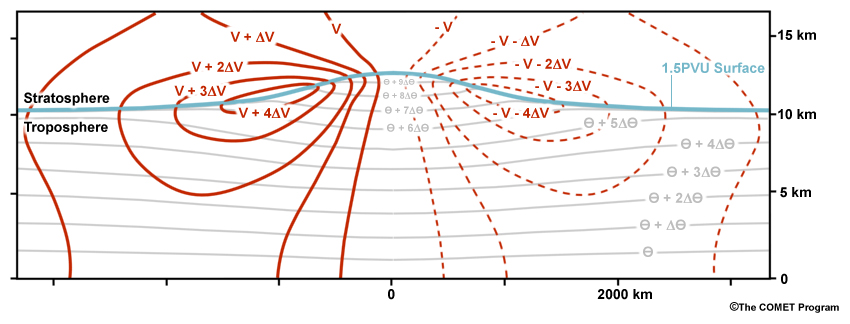
Making Comparisons
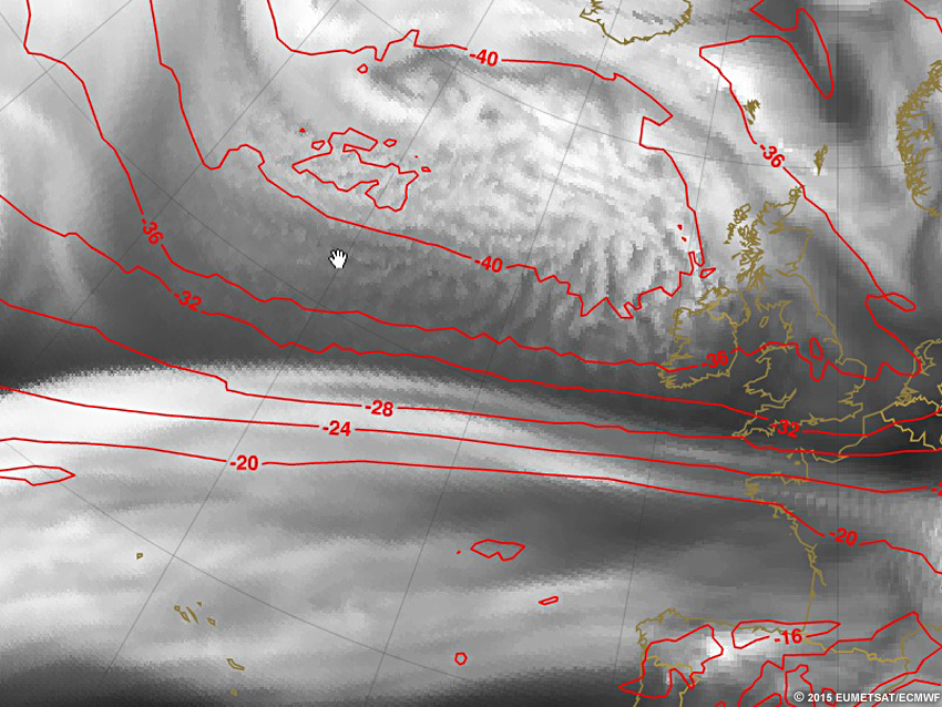
Comparing water vapour imagery and NWP output is best done by overlaying variables on top of a grayscale water vapour image as we did previously. Overlaying a vertical coordinate (pressure or geopotential height) of the 1.5 PVU (-1.5PVU for the Southern Hemisphere) surface will give you the best comparison. At times, the 2.0 PVU (-2.0PVU for Southern Hemisphere) surface will work equally well depending on your latitude. Typically, 1.5PVU is better in colder months and 2.0PVU is better for warmer months but this is also latitudinally-dependent.
The 1.5PVU surface works best in mid-latitudes, in and around the jet streams, and outside of anti-cyclones and old lows. This can be hard to understand without looking at more examples, like what follows.
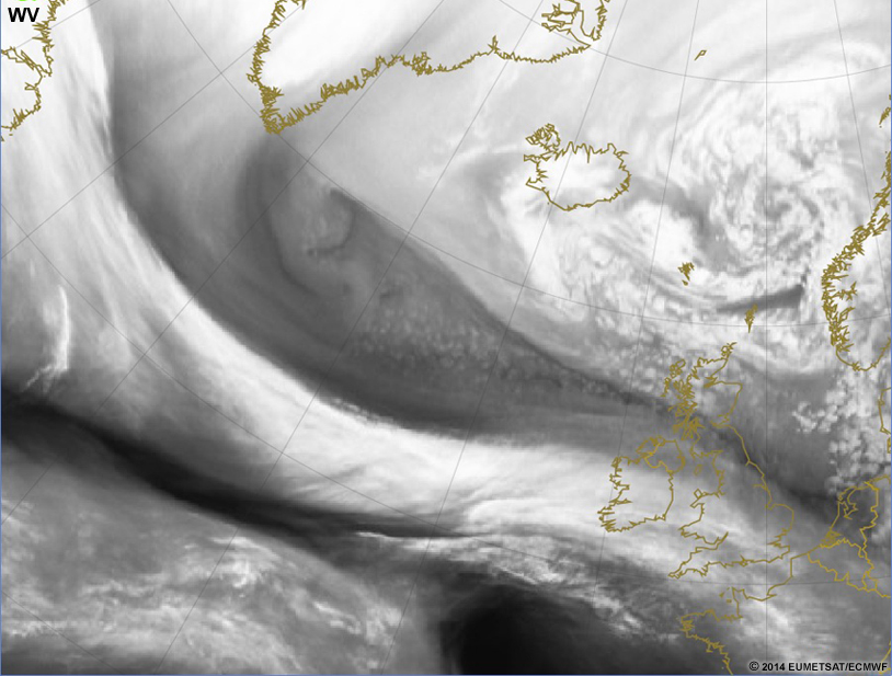
Let's use an example 1.5 PVU surface compared to a WV image.
Question 3
Contour the water vapour image. Use the natural gradients of the water vapour image as your contouring interval. When you are done, press the "Done" button to show the 1.5 PVU surface again as generated by the NWP.
| Tool: | Tool Size: | Color: |
|---|---|---|
The 1.5 PVU surface DOES NOT match what you drew. This isn't to say you made a mistake but to say that the PV surface rarely ever matches the WV image wholly. It is important to find all the areas where there are distinct mismatches between your contours and the NWP-output. There are three different types of mismatches that we need to discuss so you can justify any corrections you make to the NWP output. Read on to learn about the three types of mismatches.
The three types of mismatches between WV imagery and PV fields are temporal, location/spatial, and magnitudes/heights. To ensure the best comparison between the WV and PV fields make sure to:
- Compare the NWP initialization (f00 or t+0) with the same time in water vapour imagery. So for the 00Z model run, you should only compare that to the 00Z water vapour satellite imagery.
- If the times don't match, then an accurate representation of the other components will hinder your ability to accurately adjust the forecast NWP.
- Compare the locations of synoptic features.
- Sometimes toggling on and off the overlay can be useful to locate "jumping" features.
- Mesoscale or smaller diabatic processes are often not matched well between the NWP and the WV. This is to be expected. Only in the largest complexes of diabatic processes should you be comparing those features directly.
- Compare the magnitudes/heights of the major synoptic features.
- This can be hard to compare unless the contour interval of the PV surface is high enough to match the gradients of the water vapour imagery.
Examples of each follow:
When comparing WV and PV, it can be pretty obvious if you are comparing different times, but there are times when the pattern is so stagnant that you may not recognize the difference. Always make sure to compare the times on the images.
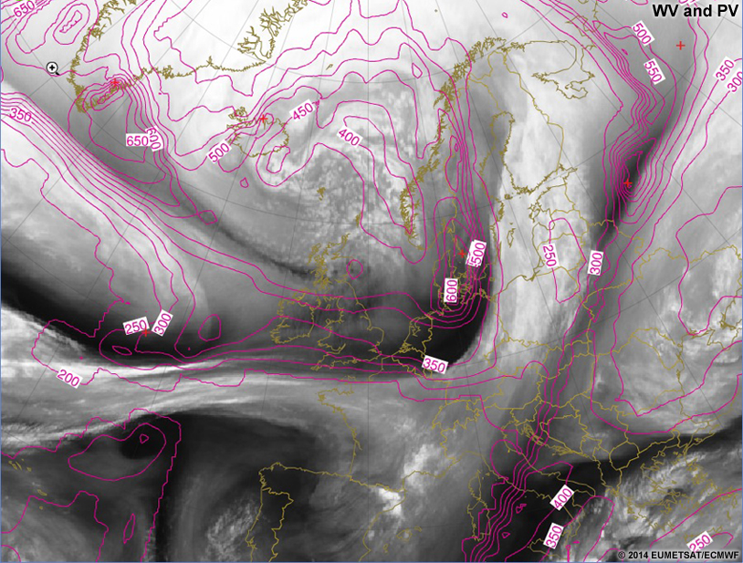
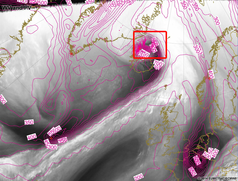
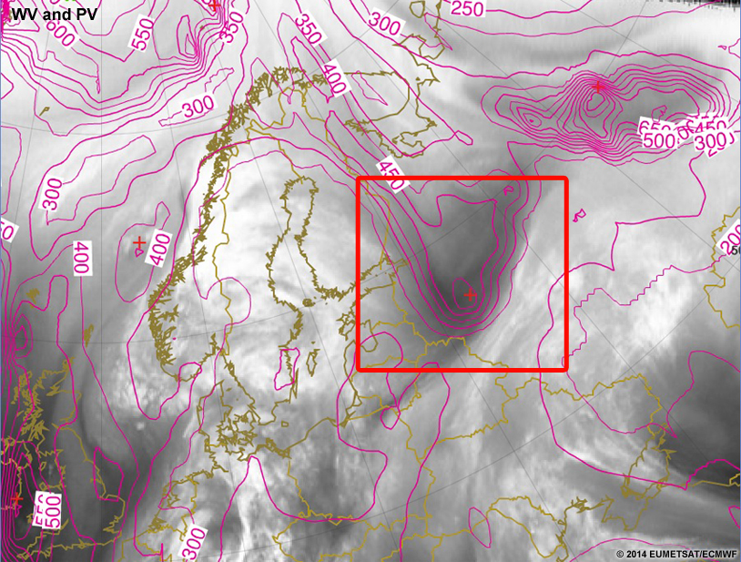
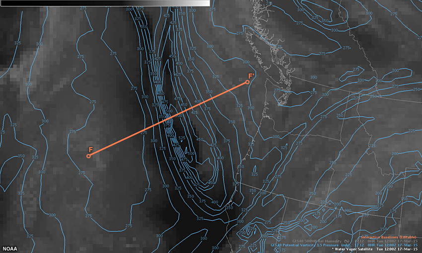
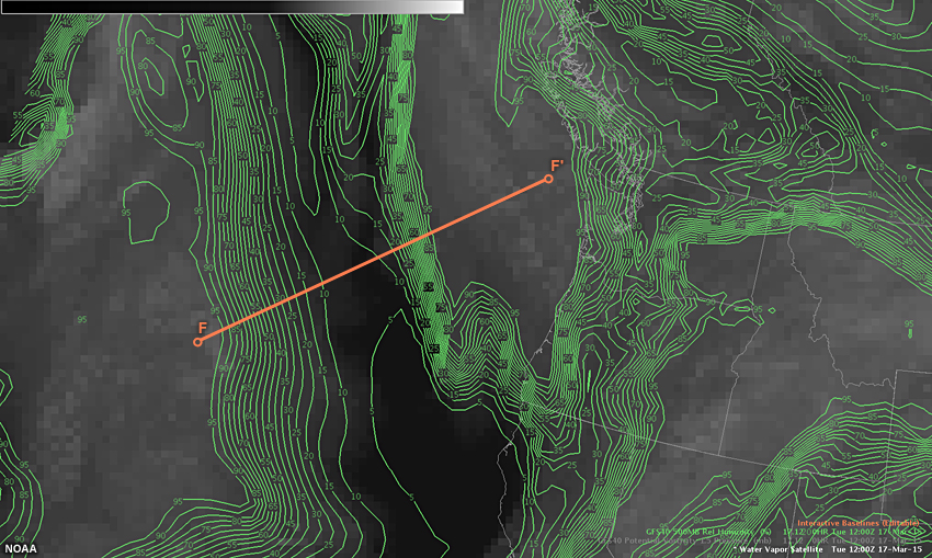
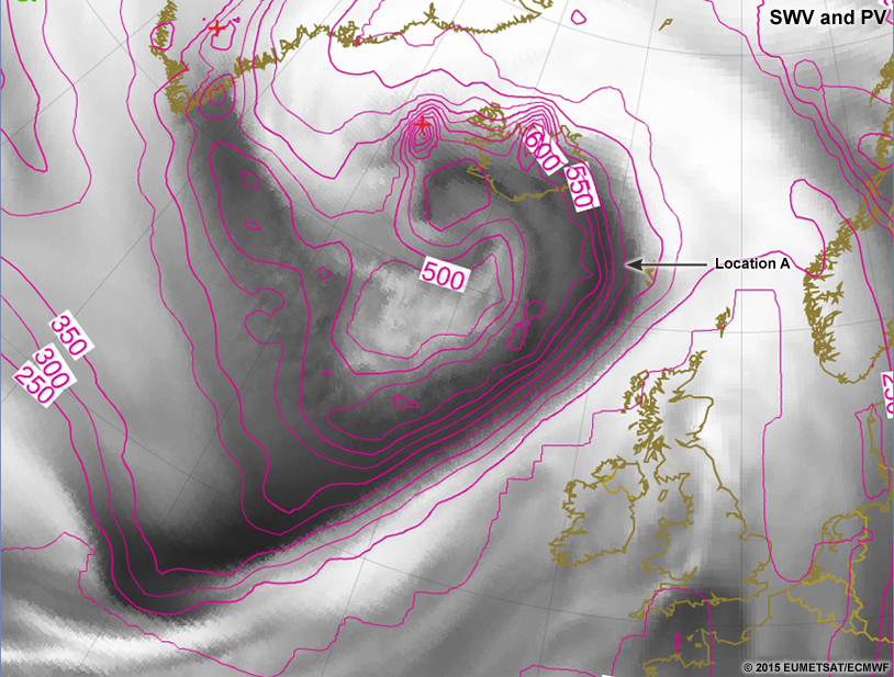
Diagnose location mismatches by comparing the water vapour imagery features to the locations in the PV field. If the features are offset, then you can assume a location mismatch like the one shown below:
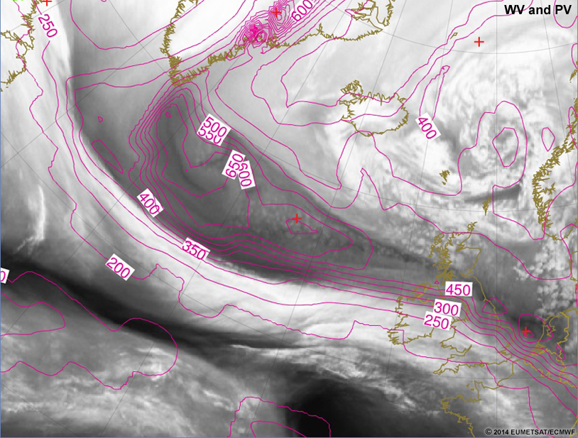
In the slider above, just northeast of the "350" label there is a localized northward inflection present in the 1.5PVU surface and it is west of the actual inflection point/vort max seen downstream in the water vapour image. The vorticity center in the PV field should be adjusted to the east as its magnitude is likely accurate compared to the surroundings.
Diagnose magnitude mismatches by comparing the water vapour imagery gray shading (excluding strong diabatic processes) with the PV contours. If the imagery has the same number of contours/gradients, then it has the same magnitude. An example of a magnitude mismatch is shown below:

In this slider, near the center of the image, there is a deep bull's-eye over Iceland in the 1.5PVU surface. This feature is not present in the water vapour image. Any future NWP features that develop from this bull's-eye will be inaccurate compared to reality. In the water vapour image, there is a small dip co-located with the 1.5PVU bull's-eye, but its magnitude is likely generated by topography or coastal frictional differences. It may even disappear over successive times in the NWP output.
Let's practice comparing water vapour imagery to NWP output. See if you can find the areas where the WV and NWP are mismatched. There are two good NWP fields to use, which creates a total of three comparisons:
- WV to 1.5 PVU Surface Height/Pressure (Dynamic Tropopause),
- WV to Synthetic Water Vapour Imagery, and
- 1.5 PVU Surface Height/Pressure to Synthetic Water Vapour Imagery.
We will step through each one of these in the following subsections.
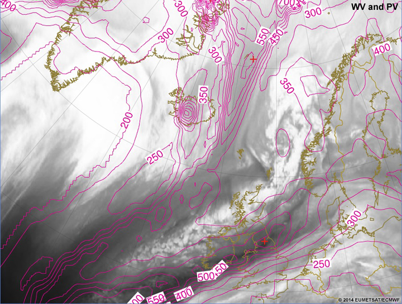
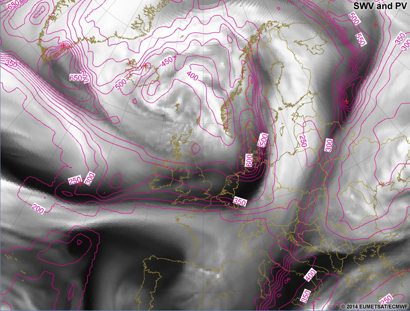
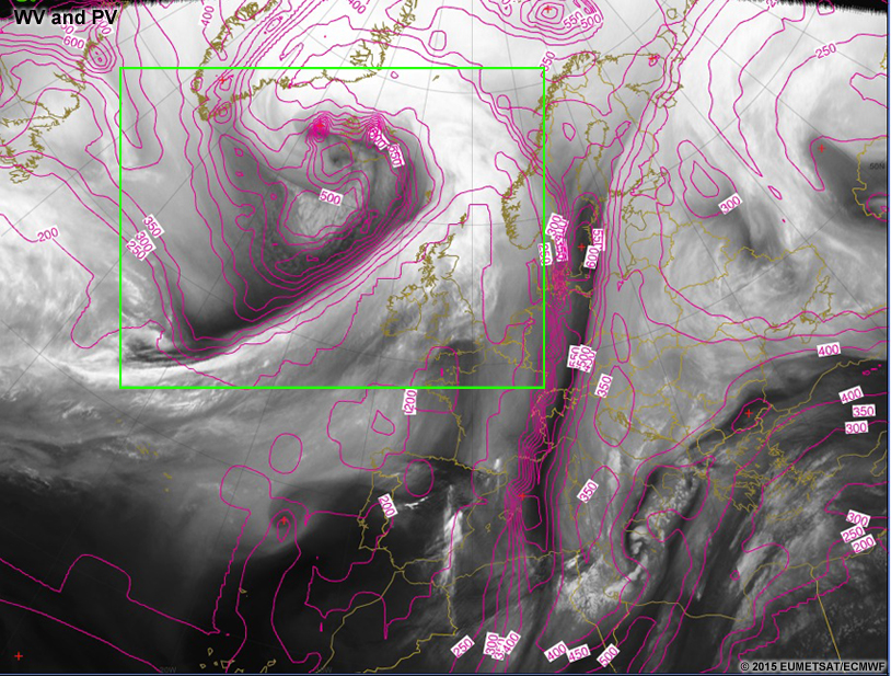
Making Comparisons » WV to 1.5PVU Surface (Dynamic Tropopause)
Comparing the water vapour imagery and 1.5PVU surface, you will be able to see the differences well between observations and model. Because the 1.5PVU surface and water vapour surface are so similar in vertical structure and height, we can make a nearly direct comparison. The images will likely NOT match in areas of diabatic processes or strong frictional forces, and work best in developing systems, not in old systems. Anticyclonic systems won't match between the WV and 1.5PVU surface as they have an inverse relationship.
In the following comparison of water vapour imagery and 1.5PVU heights, colors represent the height of the PV surface. Warmer colors are higher and cooler colors are lower. These images are three-dimensionalized and thus shadows are incorporated into them for easier representation of the three-dimensionality.
In the above comparison slider, the colors have been altered to best match each other on the whole. The comparison works best around the polar jet stream and in mid-latitudes. However, there are areas where the two images still do not match:
- areas of diabatic/frictional processes will appear "colder/higher" in the atmosphere in the WV imagery, (Alberta, Saskatchewan, and Montana are good examples)
- areas of anticyclonic flow will be the inverse relationship of each other, (off the California coast is one example) and
- areas where the NWP-output 1.5PVU field doesn't match the WV due to model errors. (over the Northern Great Lakes is an example)
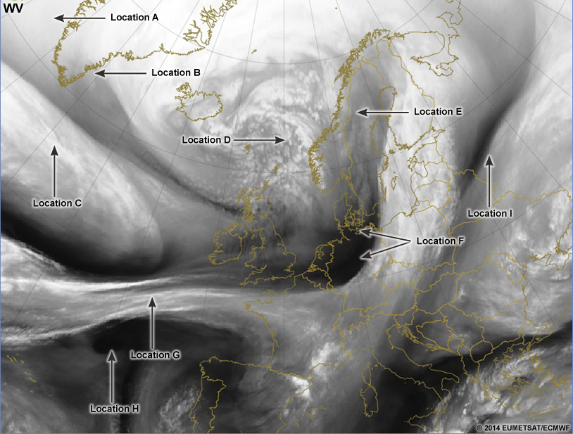
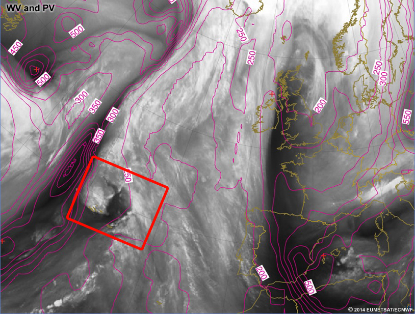
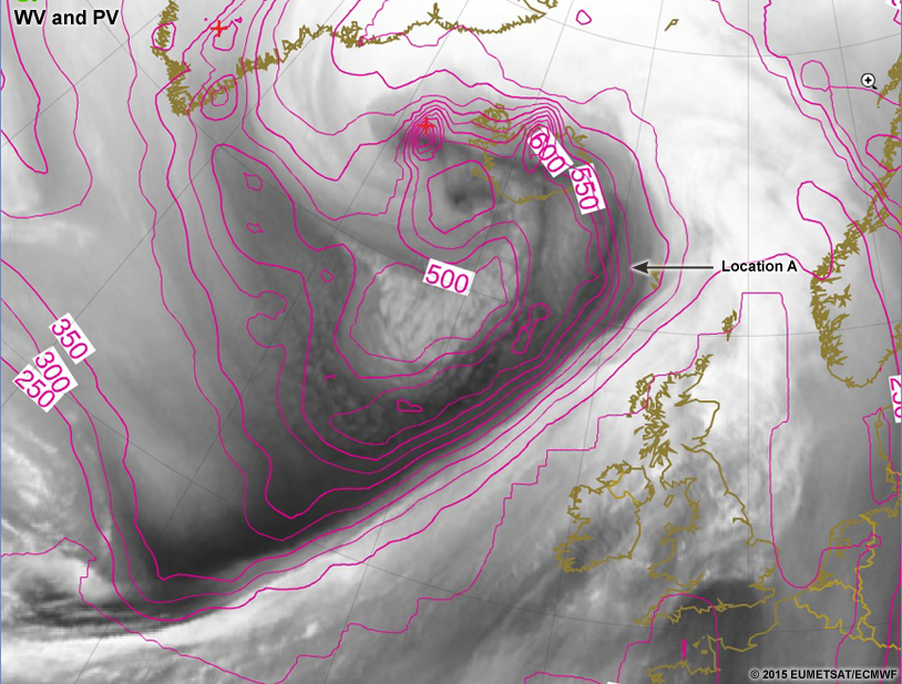
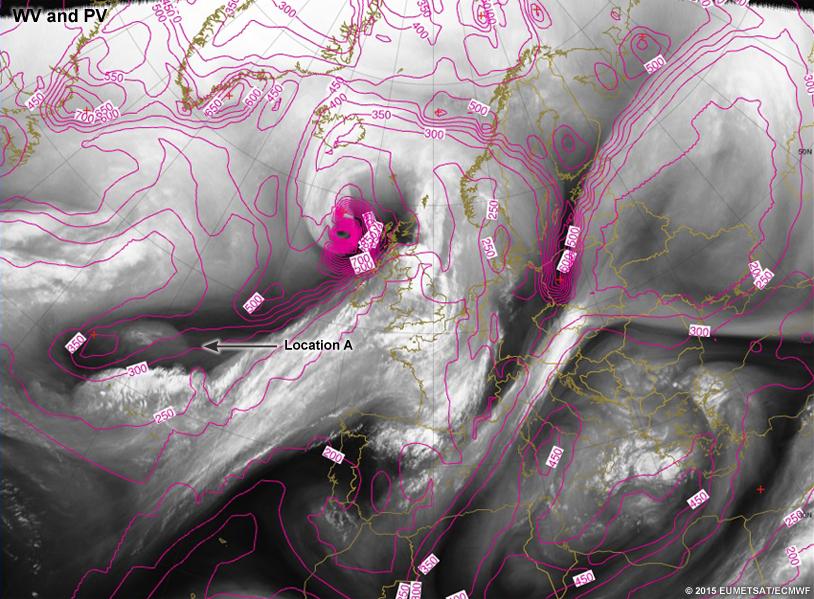
With the following image slider, we want to pinpoint the areas in the WV image where the PV field doesn't match because of NWP errors, and not due to diabatic/frictional processes or anticyclonic flow. In the comparison slider, look for location and magnitude mismatches, as there are no temporal differences. After this comparison, circle the mismatches in the next question.
Question 4
Compare the WV and PV imagery to determine where mismatches occurred between the observations and the forecast model. Circle the areas of mismatch between the two datasets.
Circle the areas of mismatch between the two datasets.
| Tool: | Tool Size: | Color: |
|---|---|---|
Areas of mismatch include:
- Location A: the dry area east of southern Greenland (magnitude [too large in PV, not extended far enough east]),
- Location B: the PV anomaly over Denmark (location [too far north compared to dry conveyor belt maximum]),
- Location C: the PV anomaly in western Russia (location [too far east in PV] and magnitude [too deep in PV]),
- Location D: the warm conveyor belt over Sweden and Finland (location [not tilting far enough east in PV] and magnitude [consistent field where water vapour field is changing]), and
- Location E: the jetstreak aimed toward the southern UK and Northern France (magnitude [dark area not represented well in PV]).
You will get more practice with this comparison in the future sections of this lesson. We will also dive into comparing WV to Synthetic Water Vapour Imagery in the next section.
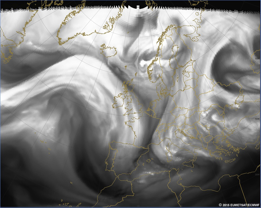
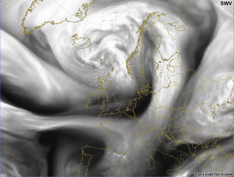
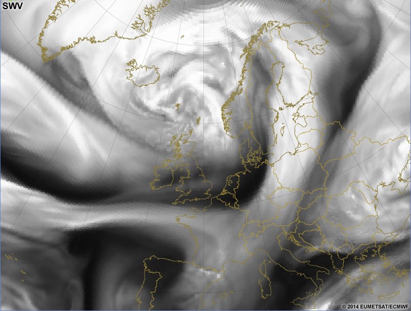
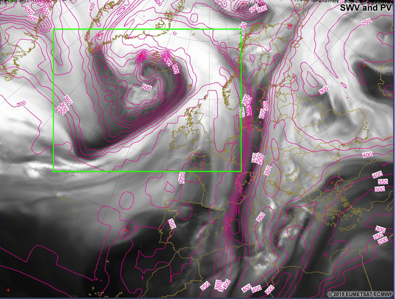
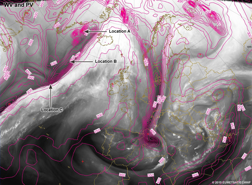
Making Comparisons » WV to Synthetic Water Vapour (SWV) Imagery
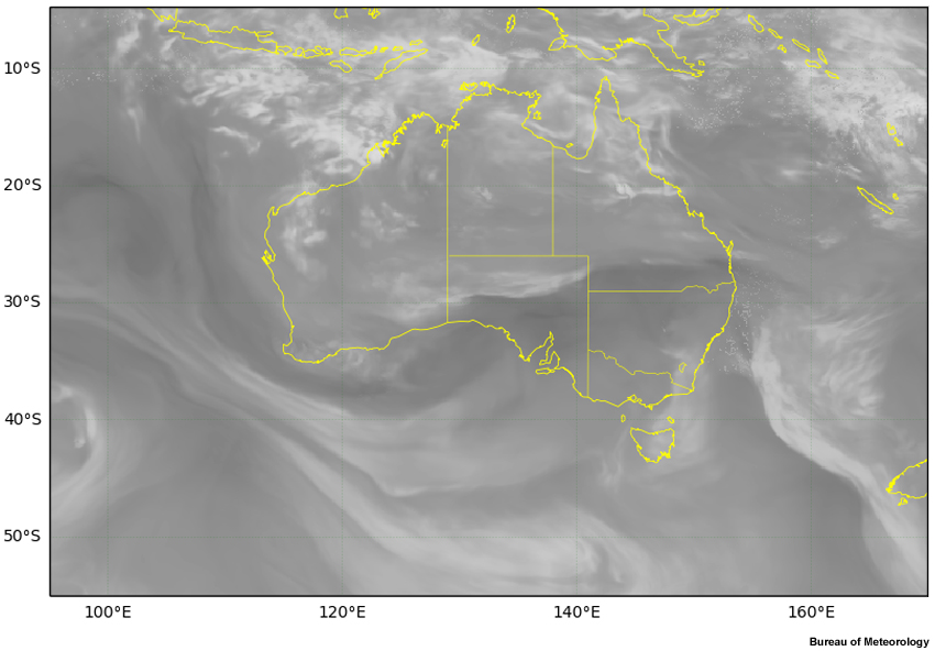
So far we have compared the WV imagery to the PV output. For most locations, we have another variable to consider: Synthetic, or Pseudo Water Vapour Imagery (abbreviated either SWV or PWV; herein SWV). Synthetic water vapour (SWV) imagery uses the modeled moisture distribution and temperature pattern to derive the brightness temperatures we expect to see from a water vapour image. These synthetic images are produced by running the model output through a separate two-dimensional radiative transfer model. Introducing this second model introduces more assumptions into the system. It is beneficial to know the model used to generate the SWV imagery as well as the assumptions that have gone into both models. At the time this lesson was published, easily accessible SWV imagery was available from the following sources:
- Views for Europe, Middle East, North Polar, South Africa, and Atlantic: EUMETrain
- Views of Australia, portions of the Indian and Pacific Ocean, South Polar, and Global: Bureau of Meteorology of Australia
In a perfect world, WV and SWV would be a direct match. Yet, this isn't possible, so you will be able to find mismatches right away by flipping between the images. One problem with this method is that you can't tell if the modeled errors are in the original forecast model or within the radiative transfer model used later. Thus, results of SWV and WV analysis can sometimes be inconclusive.
What is SWV imagery?
SWV is NOT output from the original model (for example, GEM Global). It is a post-processed variable that has often been run through a separate two-dimensional radiative transfer model which calculates the brightness temperature for each column in the model as if it were for a water vapour image. The radiative transfer model uses vertical profiles of temperature and relative humidity to calculate the apparent brightness temperature at the top of the column (Santurette and Georgiev -- Appendix B). The radiative transfer model has its own assumptions and parameterizations that may be different than those in the original forecast model, so you can and will see differences between the SWV and the PV.
What is the advantage to using SWV imagery?
The best reason for using SWV imagery is that is looks like the observational product to which forecasters are accustomed. Similar to the thinking behind generating simulated radar reflectivity from a model, SWV imagery helps you see what you are used to seeing in the observations. The comparison typically makes it easier to understand what features the model is generating.
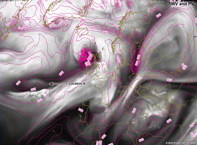
In the following image slider, compare the water vapour imagery and synthetic water vapour imagery. Look specifically for areas where the model and observations are mismatched. The mismatches can be spatially- or magnitude-based, so be sure to evaluate both. This is the same case used previously for the WV to PV comparison. You may note areas that are matches or mismatches in a way that is counter to what you noticed in the previous comparison. This is important information to obtain, and can aid in further diagnosis of the model errors.
One of the first things you may notice in the comparison is that the model grid spacing isn't as high as the pixel size in the water vapour imagery. This is quite common and can lead to size mismatches and location mismatches between the two datasets.
The image on the left is the water vapour image and the image on the right is the synthetic water vapour image.
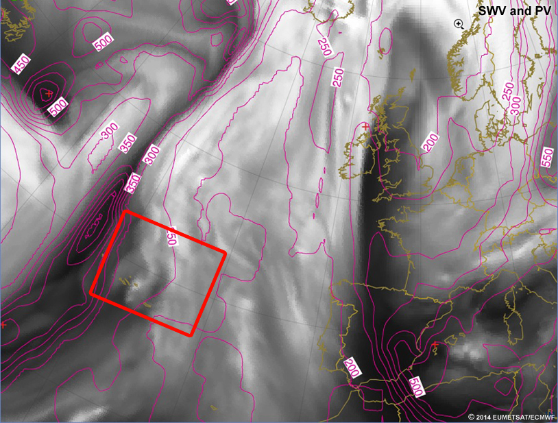
Question 5
Compare the WV and the SWV in the previous image slider for the following interaction. Circle the areas of mismatch between the WV and the SWV.
Circle the areas of mismatch between the WV and SWV.
| Tool: | Tool Size: | Color: |
|---|---|---|
Areas of mismatch include
- Location A: the dry area east of southern Greenland (magnitude [too dark in SWV]),
- Location B: the moist area south of the previous area (magnitude [too smoothed in the SWV]),
- Location C: the PV anomaly in western Russia (magnitude [too dark in SWV]),
- Location D: the warm, moist conveyor belt over Sweden and Finland (magnitude [too light] and location [extended too far west in SWV]),
- Location E: the jetstreak aimed toward the southern UK and Northern France (magnitude [not enough contrast in the SWV, and too consistent in tone across the moist side of the jet] and location [SWV doesn't extend the moisture far enough on the south side of the moisture plume]),
- Location F: and the expanse of the convective clouds associated with the vorticity maximum west of Norway/north of Scotland (magnitude [too broad an area of too higher of a moisture value]).
One place that matches relatively well that didn't match well in the WV/PV comparison is the dry conveyor belts over Germany. In the WV and SWV comparison, these match relatively well, and suggests that the original model moisture pattern is likely correct in that area, but that the potential vorticity pattern is not portrayed properly. Perhaps those dry conveyor belts are lower than the 1.5PVU surface or they are decaying in the PV field.
One can evaluate this further to see if the original model run contained the appropriate moisture pattern by creating cross sections of the original model relative humidity fields and matching them to moisture patterns in the WV. For greatest effect, evaluate those places that are nearest the important features.
Comparing WV and SWV imagery seems intuitive since the fields should look exactly the same. However, we should remain cautious when comparing the data, as the PV and SWV comparison remains to be seen.
It may seem counterintuitive to move on to the next step which is comparing the PV and SWV imagery to each other. In most cases, because the SWV comes from a different model, it is important to see if the models match each other. If you know that the PV and SWV come from the exact same model and assumptions, this next step can still be useful, but not as useful as when the model data are produced from differing models.
Making Comparisons » PV to SWV
PV is post-processed directly from model output. SWV is remodeled with a radiative transfer model in most cases (as of 2015). To compare PV to SWV, you need to know that the PV and SWV fields aren't going to match exactly if from differing models, but they should come quite close. Where they don't match doesn't indicate that there is a problem, but suggests you should flag that location for further investigation.
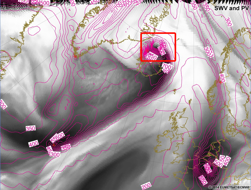
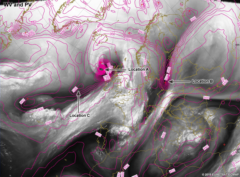
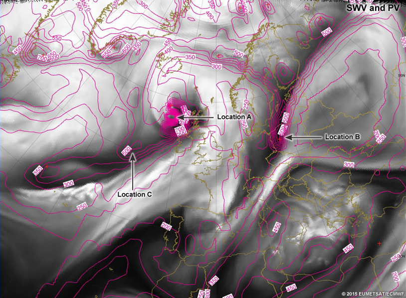
In the following image slider, compare the 1.5PVU heights and the synthetic water vapour imagery. Look specifically for areas where the model outputs are mismatched. The mismatches can be spatially- or magnitude-based, so be sure to evaluate both. This is the same case used previously for the WV to PV and WV to SWV comparisons. If there are mismatches here, you can gain a better understanding of the NWP errors by noting which of the two fields you are currently comparing matches best to the WV imagery. At the moment, you will only want to compare the PV and SWV.
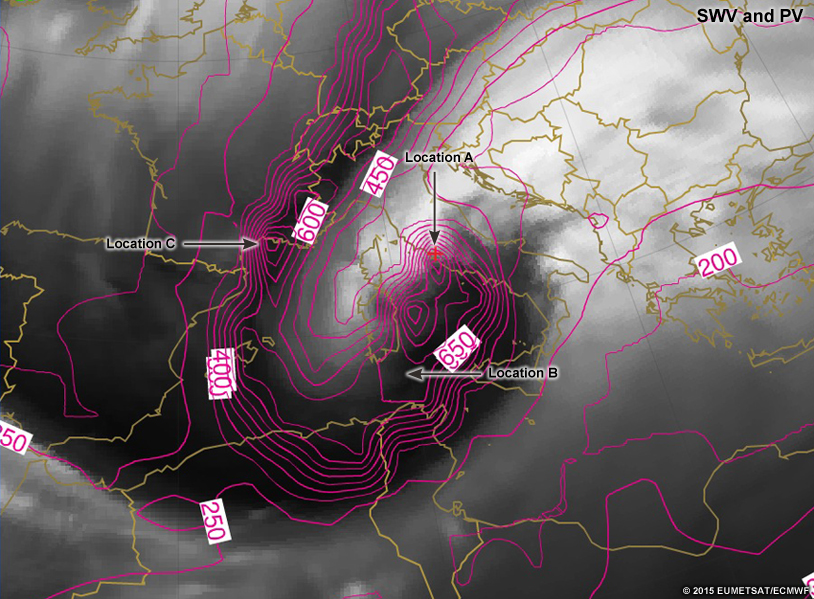
Question 6
Compare the PV and SWV imagery to determine where mismatches occurred between the forecast model and the radiative transfer model. Circle the areas of mismatch between the two modeled datasets.
Circle the areas of mismatch between the two modeled datasets.
| Tool: | Tool Size: | Color: |
|---|---|---|
There are plenty of places where these two images don't match up.
- Location A: There is a PV anomaly west of southern Greenland that doesn't show as well in magnitude in the SWV.
- Location B: The PV anomaly east of southern Greenland has the general shape correct but the details inside of the anomaly are not consistent between the two images.
- Location C: In the vorticity maximum north of Scotland/west of Norway, there are dark/dry areas that cross the lines of height/pressure. This is not consistent with what the atmosphere should be doing.
- Location D: In north-central Sweden, the PV anomaly is offset to the west from the location where the SWV shows a darker area.
- Location E: The Denmark PV anomaly and the dry conveyor belt over Germany should line up much better than they do.
- Location F: The jet aimed toward the southern UK and Northern France shows the opposite pattern in the PV to the SWV as you move west along the jet axis.
- Location G: The vorticity maximum off of Spain's most-northwest point doesn't match between the PV and SWV.
Comparing this information with WV can help you pinpoint areas where the forecast model is correct, but the radiative transfer model was wrong, so no adjustments need to be made to the forecast model.


When to Adjust?
When the PV and SWV match, but do NOT match the WV pattern, forecasters can add significant value to the NWP output. Although there may be larger differences between the WV/PV/SWV, we won't always have a good handle on what has caused the issues if the model data do not align with each other. It could be that the model has increased diabatic or frictional processes where the PV anomaly is, it could be stronger mixing down of stratospheric air in the observations, it could be a dynamical issue in the model, or it could be a combination of all of the above. And those are just the main possibilities.
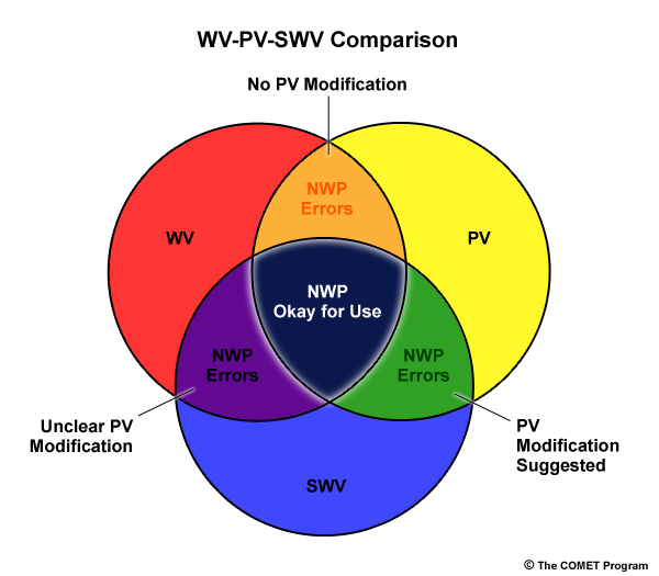
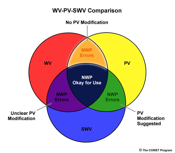
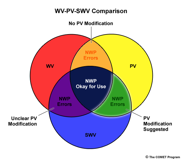
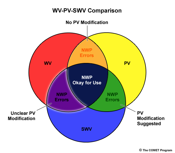
There will likely be areas where the WV, PV, and SWV will match and some where they will not. WV imagery should always serve as your guide to assessment, since it is the "truth" dataset. Here is the guide to determining how to adjust your forecasts appropriately and get the most added value. This diagram is derived from the works of Santurette and Georgiev (2005).

There are three NWP error situations. The three areas of NWP errors are where we've found WV = PV ≠ SWV (orange on the top of the Venn diagram), WV ≠ PV = SWV (green on the right side of the Venn diagram), and WV = SWV ≠ PV (purple on the left side of the Venn diagram). Each area has its own suggested solution, which will be examined in the following sections.
When to Adjust? » Areas Where WV = PV = SWV
In these areas in the WV imagery, you have assessed that the NWP matches the WV, so go ahead and use the NWP forecast without additional modification in that area. There may still be other areas in the imagery where the assessment is poor, so be careful not to overstep your bounds with where the NWP output is valid.
Below is an example of an area where the WV = PV = SWV. North of Iceland is a great comparison area. There are minor differences, but these are not likely to cause any major forecast problems as the most important features are diagnosed well by the model.
In the slider below, the left image is WV overlaid with the 1.5PVU Heights and the right image is SWV overlaid with the 1.5PVU Heights.
The previous example indicates an area where you can safely use the NWP for your forecasting purposes. This comparison falls into the center section of the Venn diagram (navy blue) as all three variables match well.
When to Adjust? » Areas Where WV = PV and PV ≠ SWV
In the indicated area, you can use WV and PV for forecasting. Ignore SWV. It is worth checking into these areas for possible vertical moisture differences that could still be present in the original forecast model output, as the model could be right for the wrong reasons.
In the slider below, the left image is WV overlaid with the 1.5PVU Heights and the right image is SWV overlaid with the 1.5PVU Heights.
The previous example indicates an area where we can safely use the NWP, but NOT the SWV imagery for forecasting purposes. This comparison falls into the top section of the Venn diagram (orange) as WV and PV match, but SWV doesn't match well. Something must be amiss with the SWV imagery, but in this case, because the SWV is derived from a different radiative transfer model, we can just ignore it.
The best way to test the model output is to take cross sections through moisture gradients near the PV anomalies and see if the humidity pattern matches the WV pattern. If the RH pattern shows a similar pattern of moisture in the 600mb to 300mb range, then there is something amiss in the radiative transfer model, and we should rely on the original NWP model. The following is only an example of the cross sections you might want to cut to understand the WV/PV/SWV relationship better.
WV and PV
WV and 500mb RH
Cross Section (PV and RH)
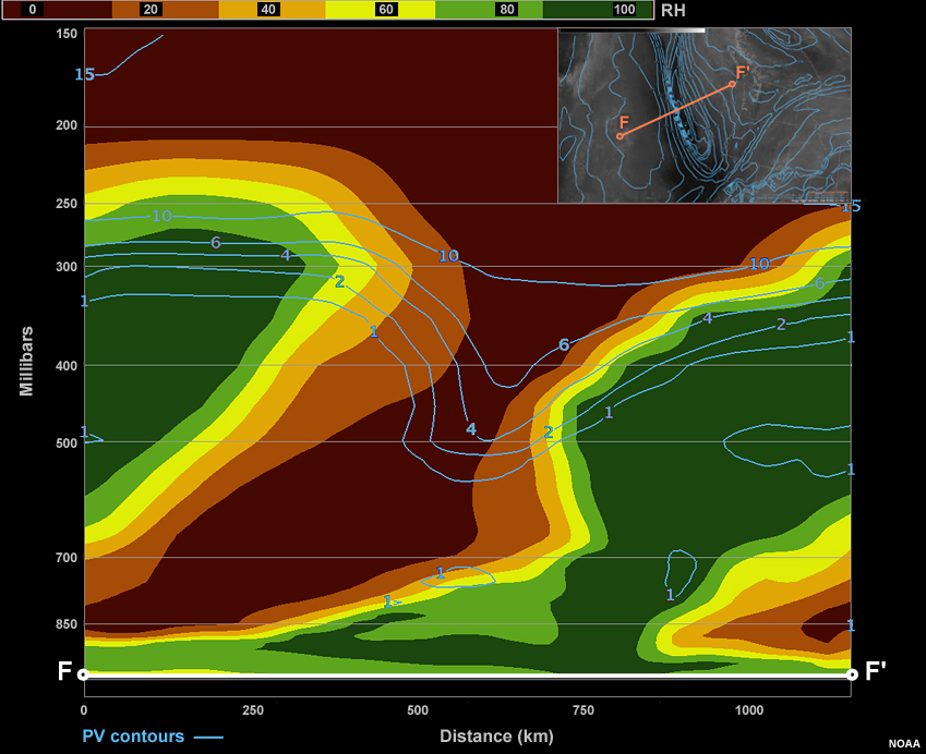
Here, the cross section shows a narrow vertical path of low RH. The water vapour imagery shows a similar situation where there is a thin "dark" area. The 500mb RH pattern shows a much wider gap that isn't coincident with the PV anomaly. If SWV imagery was available for this time, and we saw the SWV dry canyon was wider than in the WV and PV fields, we could have more confidence that it was the radiative transfer model causing the issue.
When to Adjust? » Areas Where WV ≠ PV and PV = SWV
In these comparisons, the model is in error and needs to be corrected to the WV image if we intend to use this model for forecasting.
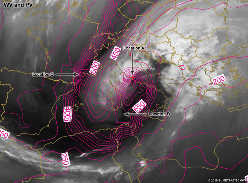
Let's look at an example. Use the vorticity center northwest of the Azores as your comparison point. Use the slider to note the differences between the WV/PV (left) and SWV/PV (right) images.
The previous example indicates an area where we cannot safely use the NWP for forecasting purposes. This comparison falls into the bottom right section of the Venn diagram (green), as PV and SWV match, but WV doesn't match either of the NWP fields.
Something must be amiss with the model outputs. Because of this we have two options: either adjust the NWP PV field, or check another model for comparison (if you have that flexibility). We will venture into the realm of PV adjustments after completing the other areas on the Venn diagram.
When to Adjust? » Areas Where WV = SWV ≠ PV
Assessment is most complex when maps match well between WV and SWV. The original NWP output is in error, but the SWV (often from a separate model) agrees with the WV. It means errors are present, but we can't tell their source. The PV field is in error and the SWV could be correct for the wrong reasons, but we can't tell which of these is true. So the best thing to do is to choose a different model. We cannot modify the PV field because it is in error to begin with, thus it shouldn't be trusted.
In the following example, look south of Iceland to find an area where the PV doesn't compare well to the other two fields (WV and SWV). There are differences between the WV and SWV imagery, but they are small compared to the difference between the PV and SWV and PV and WV. Examine these differences in detail using the slider below (WV/PV left; SWV/PV right).

This represents the lower left section (purple) of the Venn diagram. Thus, we can't have confidence in the original model output, but we also don't have a backup plan from this model.
In this case, PV modification is unclear, so we could try a different model run or a different model. If all else fails, we can use our understanding of fluid dynamics to make enhance the forecast based on the available observations and imagery.
How to Adjust PV Fields?
If the PV field clearly needs to be adjusted, how exactly does one perform that? Remember, we aren't saying this is necessary for all forecast shifts. Yet in high-impact events or challenging forecasts like multi-clustered ensemble data, it can be a way to succinctly add human value to a forecast.
Conceptually adjusting the PV field is easy in and of itself; however, once one modifies the PV field, there is also a need to modify all the dynamically-connected features (based on the Rossby radius of deformation -- greater influence for strong vorticity and lesser static stability [further reading on the Rossby radius of deformation here: https://www.meted.ucar.edu/nwp/pcu1/d_adjust/3_0.htm]).
So, if we move a PV anomaly while keeping its magnitude constant, we also need to conceptually move the associated pressure, wind, temperature, and moisture fields accordingly. If PV anomaly magnitude needs adjustment, the radius of influence of the anomaly changes, and thus the pressure, wind, temperature, and moisture fields must adjust accordingly.
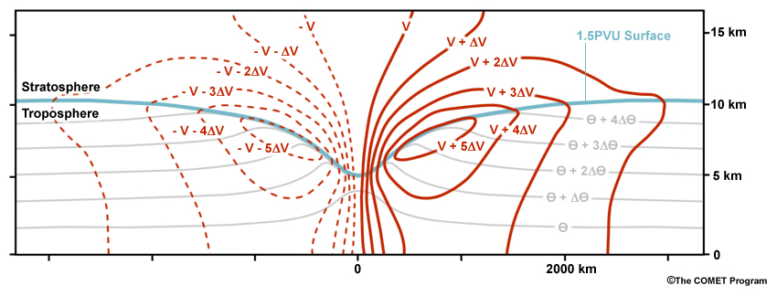
Positive PV anomaly and the dynamic tropopause as a cross-section. Gray lines are isentropes, the blue line is the dynamic tropopause, and red lines are cross-section perpendicular winds (solid into the page).
The above graphic represents a PV anomaly and its influence upon surrounding atmospheric variables. Red lines represent the static wind perturbations (i.e., excluding translational motion of the system), with solid lines being into the page. Gray lines represent potential temperature perturbations.
When adjusting to a stronger upper-level PV anomaly, the upper-level winds will be stronger, the lower-level winds will be slightly stronger, the advections greater, and the baroclinicity greater via the thermal wind relationship. Areal effects will be larger, and the surface pressure lower. The opposite is true for weaker PV anomalies.
Let's look at some more examples of PV anomaly perturbations and compare them to the anomaly above to understand the perturbations that each PV anomaly causes.
Stronger +PV Anomaly
Weaker +PV Anomaly
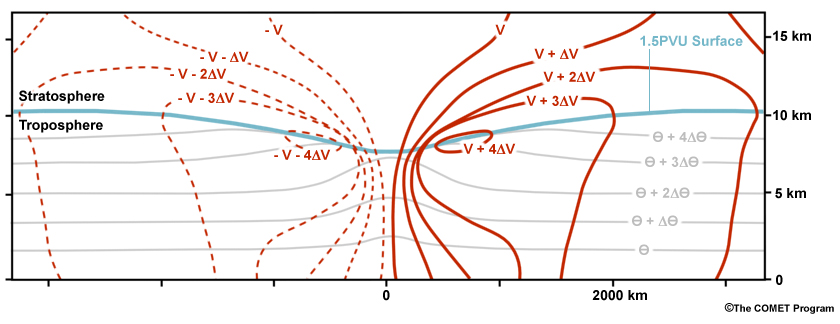
Weaker -PV Anomaly
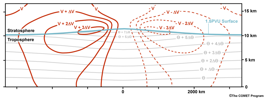
Stronger -PV Anomaly
When you determine what to adjust about the PV field, use the theoretical graphics as a basis for adjusting the other fields. For instance, for an anomaly that is weakly positive in PV but strongly positive in the WV imagery, adjusting the PV anomaly and its coincident variables to look more like the strong positive PV anomaly in WV is appropriate. Some examples for practice are provided in the following four sections.
Forecast Challenges
In the following challenge subsections, it will be your turn to assess the quality of the comparisons between water vapour imagery and NWP output. Remember to think back to the Venn diagram that shows when and when not to modify the NWP forecast. The first challenge helps step you through the process. Each successive challenge removes some of the steps so you can test your knowledge of the process.
Forecast Challenges » Challenge 1
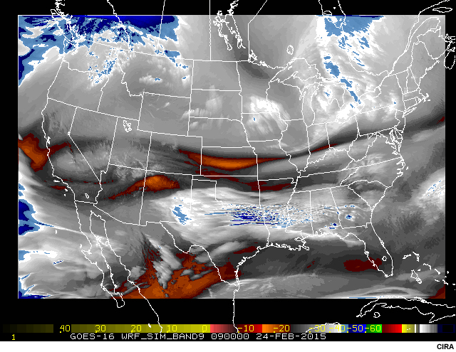
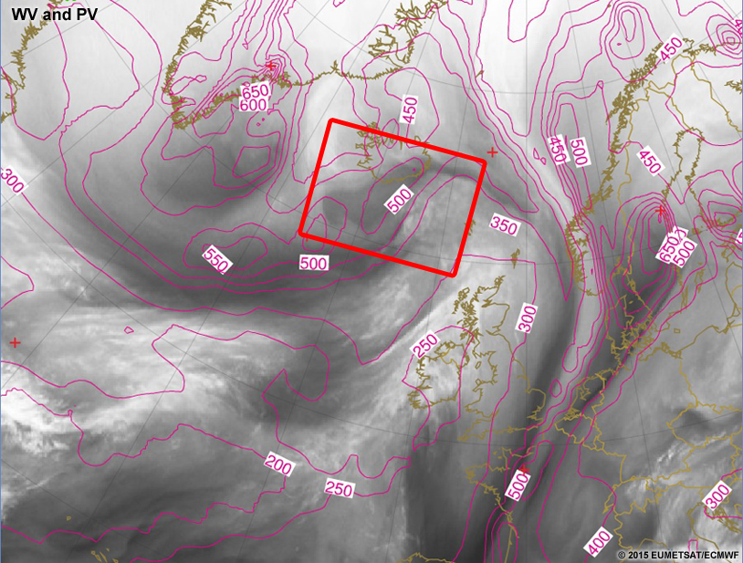
To help in understanding the synoptic setup, we are providing the large scale view of the situation. The area of interest is outlined within the slider.
After looking through the large-scale view, you can view zoomed images (below) to assess the comparisons within the box from above. You will be performing the same kinds of comparisons as before with WV/PV and SWV/PV images, but will take this through to completion of a forecast during the series of questions below the slider.


Question 8
For each location in the comparison above, drag the corresponding letter from below the Venn diagram onto the appropriate sector in the Venn diagram.
Drag each location to its appropriate comparison sector of the Venn diagram.
At Location A, PV = SWV, but neither truly matches the WV imagery.
At Location B, none of the images seem to compare well to each other.
At Location C, WV = PV, but PV doesn't match the SWV well.
At Location D, WV = PV, but PV doesn't match the SWV well.
If you had trouble with any of these comparisons, you can review the "Making Comparisons" section or you may need a refresher on thinking of the three-dimensionality of the water vapour channel. If so, you can find it here: Inferring Three Dimensions from Water Vapour Imagery.
Forecast Challenges » Challenge 2
Question 12
In the following location, how should the PV field be used?
The correct answer is b.
Because the PV and SWV fields do not match each other, and don't match the WV, it is best to either find another model that compares better or to ignore the model data in this location and use your own understanding of the atmosphere to enhance the forecast.
The vorticity maxima in the water vapour imagery aren't captured by the PV or the SWV field very well. If your forecast area is just downstream of these locations, you have a great opportunity to improve the forecast with added human value. This is only a single example of the advantage to assessing NWP with water vapour, but sometimes the examples are much larger or higher impact, and the payoffs can be significant.
Forecast Challenges » Challenge 3
Question 15
For each location on the images above, drag the corresponding letter on to the appropriate sector in the Venn diagram.
Drag each location to its appropriate comparison sector of the Venn diagram.
Location A: The WV and SWV match, but there is something dramatically wrong with the PV field. This means you have to move on to another model or simply enhance the forecast based on observations and your fluid dynamics knowledge.
Location B: The WV and SWV match, but the PV anomaly appears too deep. Again, the Venn diagram suggests moving to another model, or relying on the observations and your educated analysis, diagnosis, and prognosis.
Location C: None of the fields match very well. Could this be a case where the PV anomaly is so far shifted from the water vapour imagery that it is location B's PV anomaly? The deepest water vapour anomaly is at location C, but the deepest PV anomaly in the NWP is at location B. This likely requires a major PV modification even though the Venn diagram doesn't suggest that. Major modifications are very complex and often not suggested because of their effects on so many different forecast fields. If you have the means to make a major PV modification without much repercussion, you could make a huge value-added forecast. If your forecast system cannot support this, you can move to a different model, or forecast based on your own understanding.
Forecast Challenges » Challenge 4
Question 16
For each location, write what should be done including how you would adjust the forecast variables if necessary.
At location A, the WV = PV but not the SWV. In this case, the PV can be used as is. It looks to be a pretty good match for the water vapour imagery.
At location B, neither the PV nor the SWV matches the WV. The SWV comes close, but in this case, we would want to switch models or make a forecast based on observations alone. It looks like we could mentally increase the mid-level moisture, but there isn't much to say about this area from the near-surface perspective.
At location C, there seems to be a pretty good consensus on what is going on and thus no adjustments are really necessary. If anything, you could probably quickly and easily adjust the PV anomaly to be not as pinpoint deep. The depth seems appropriate, but the shape should likely be more of a valley. This adjustment would lead to a more uniform wind field in and around the circular PV anomaly.
Summary
Comparing NWP output against water vapour imagery can succinctly help one understand the usefulness of the NWP forecast. You can use the Venn diagram herein to help your through that process. It isn't uncommon for people to forget to evaluate the NWP output before using it for forecasting purposes. It isn't always cost-effective time-wise though in busy forecast shifts. However, assessing the NWP with real-time water vapour observations can be a simple way to make a big improvement in your forecasts over the NWP. This assessment can be especially helpful in high-impact, multi-modal ensemble forecast distributions. It can help you pinpoint the best model cluster to use based on the real-time observations.
If you have the data available, it is best to compare the 1.5PVU heights, synthetic water vapour imagery, and water vapour imagery. Comparing all three will help you figure out if there are errors in the original model or in the radiative transfer model (assuming they are different models). By doing this you can better handle how to adjust model data for your forecasts. Using the Venn diagram shown below, you can decide what changes need to be made to the PV fields.
If you would like more information about the Venn diagram and process for assessing NWP, consult the fantastic and exhaustive resource: "Weather Analysis and Forecasting: Applying Satellite Water Vapor Imagery and Potential Vorticity Analysis" by Santurette and Georgiev (2005).
Through four different exercises you had the chance to explore forecasting changes in small areas of a forecast model based on PV modification. If this was hard for you, understand that it just requires more practice to get better at it. It isn't an easy process at first, but becomes easier. Spend some time going through different forecast scenarios and comparing them to water vapour imagery to test your skills. Over time, they will only get better with practice.
You have reached the end of this lesson. We appreciate any comments you have about the lesson. You can pass comments along to us via the User Survey. There is also a quiz available to test your knowledge on this subject. You can find the quiz here: Quiz
References
Lance F. Bosart, 2003: Whither the Weather Analysis and Forecasting Process?. Wea. Forecasting, 18, 520–529.
Santurette, Patrick, and Christo G. Georgiev. 2005: Weather Analysis and Forecasting: Applying Satellite Water Vapor Imagery and Potential Vorticity Analysis. Amsterdam: Elsevier.
Contributors
COMET Sponsors
The COMET® Program is sponsored by NOAA's National Weather Service (NWS), with additional funding by:
- Bureau of Meteorology of Australia (BoM)
- Bureau of Reclamation, United States Department of the Interior
- European Organisation for the Exploitation of Meteorological Satellites (EUMETSAT)
- Meteorological Service of Canada (MSC)
- NOAA's National Environmental Satellite, Data and Information Service (NESDIS)
- NOAA's National Geodetic Survey (NGS)
- Naval Meteorology and Oceanography Command (NMOC)
- U.S. Army Corps of Engineers (USACE)
Project Contributors
Project/Program Manager/Coordinator
- Wendy Schreiber-Abshire — UCAR/COMET
Project Lead/Instructional Design
- Bryan Guarente — UCAR/COMET
Principal Science Advisors
- Mel Nordquist — NOAA/NWS Weather Forecast Office, Eureka, CA
- Nicolas Major — Environment Canada/Meteorological Service of Canada
Graphics/Animations
- Steve Deyo — UCAR/COMET
- Sylvia Quesada — UCAR/COMET
Multimedia Authoring/Interface Design
- Bryan Guarente — UCAR/COMET
- Gary Pacheco — UCAR/COMET
Review/User Testing
- Lis Cohen — UCAR/COMET
- Bruce Muller — UCAR/COMET
- Sylvia Quesada — UCAR/COMET
- Sarah Ross-Lazarov — UCAR/COMET
- Tsvetomir Ross-Lazarov — UCAR/COMET
- Andrea Smith — UCAR/COMET
- Brad Snyder — Environment Canada/Meteorological Service of Canada
COMET Staff, Winter 2014-2015
Director's Office
- Dr. Rich Jeffries, Director
- Dr. Greg Byrd, Deputy Director
- Lili Francklyn, Business Development Specialist
Business Administration
- Dr. Elizabeth Mulvihill Page, Group Manager
- Lorrie Alberta, Administrator
- Hildy Kane, Administrative Assistant
IT Services
- Tim Alberta, Group Manager
- Bob Bubon, Systems Administrator
- Dolores Kiessling, Software Engineer
- Joey Rener, Student Assistant
- Malte Winkler, Software Engineer
Instructional and Media Services
- Bruce Muller, Group Manager
- Dr. Alan Bol, Scientist/Instructional Designer
- Steve Deyo, Graphic and 3D Designer
- Lon Goldstein, Instructional Designer
- Bryan Guarente, Meteorologist/Instructional Designer
- Dr. Vickie Johnson, Instructional Designer (Casual)
- Gary Pacheco, Web Designer and Developer
- Sarah Ross-Lazarov, Instructional Designer (Casual)
- Tsvetomir Ross-Lazarov, Instructional Designer
- David Russi, Spanish Translations
- Andrea Smith, Meteorologist/Instructional Designer
- Marianne Weingroff, Instructional Designer
Science Group
- Wendy Schreiber-Abshire, Group Manager
- Dr. William Bua, Meteorologist
- Dr. Frank Bub, Oceanographer (Casual)
- Lis Cohen, Meteorologist (Casual)
- Patrick Dills, Meteorologist
- Matthew Kelsch, Hydrometeorologist
- Nicolas Major, Visiting Meteorologist, Meteorological Services of Canada
- Dr. Elizabeth Mulvihill Page, Meteorologist
- Amy Stevermer, Meteorologist
- Vanessa Vincente, Visiting Meteorologist, CIRA/Colorado State University