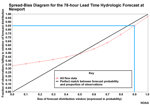
Underforecasting on the Spread-bias Diagram
Over on the right side, the spread-bias curve is closer to the diagonal showing greater forecast reliability. This point shows that 85% of observations fall in the lowest 90% of forecast ensemble members. This is a slight under-forecast. To be completely reliable the ensemble distribution would need to be a bit higher so that only 85% of ensemble members corresponded to 85% of observations.