Print Version
- 1.0 Introduction
- 2.0 IVP Case Study: OHRFC
- 3.0 EVS Case Study: MARFC
- Basin and Data Characteristics
- Verification Scores
- Examining Ensemble Means
- Ensemble Spread: Box Plots
- EVS Box Plots
- Headwater Box Plot: 6-Hour Lead
- Headwater Box Plot: 30-Hour Lead
- Headwater Box Plot, Low Flows, Hour 30
- Headwater Box Plot Questions
- Headwater Box Plot: 78 hour Lead
- Headwater Box Plot: 126 Hour Lead
- Headwater Box Plot Zoomed: 126 Hour Lead
- Downstream vs. Headwater: 30 Hour Lead
- Downstream vs. Headwater � 78 Hour Lead
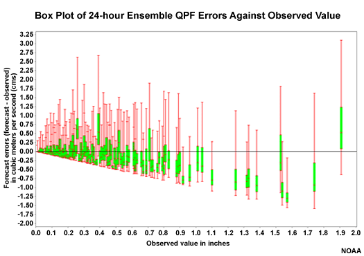
- QPF Box Plots
- Mean Continuous Ranked Probability Score (MCRPS)
- Mean Continuous Ranked Probability Skill Score (MCRPSS)
- Forecast Reliability: MCRPS
- Forecast Reliability: Spread-Bias Diagram
- Forecast Discrimination: ROC
- Confidence in Scores
- Review Questions
- 4.0 Verification Techniques Summary
1.0 Introduction/Module Goal
Welcome to the Techniques in Hydrologic Forecast Verification training module.
The main goal of this module is to demonstrate techniques for constructing hydrologic forecast verification efforts. The techniques will be demonstrated using NWS verification tools, but can be applied to other verification tools as well.
The NWS tools we will focus on are the Interactive Verification Program (IVP) and the Ensemble Verification System (EVS). This module represents the state of these tools as of 2010.
- Goal: Demonstrate hydrologic forecast verification techniques
- Using the Interactive Verification Program (IVP)
- Using the Ensemble Verification System (EVS)
Objectives
Objectives in this training include demonstrating these important steps in verification:
- Evaluate the important characteristics of the data set,
- Evaluate hydrologic forecast performance,
- Evaluate the impact of Quantitative Precipitation Forecast (QPF) input, and
- Identify and understand sources of error.

We will use a case study approach to explore the use of verification statistics and graphics that provide measures of data distribution as well as quantitative measures of forecast error, bias, correlation, confidence, skill, discrimination and reliability.
Recommended Prerequisite
This training complements the lessons that are presented in the module, Introduction to Verification of Hydrologic Forecasts. You should complete that module if you are not familiar with the scores and graphic displays associated with hydrologic forecast verification.
http://www.meted.ucar.edu/hydro/verification/intro/
You can use this summary table from that module as a quick refresher. It shows the numerical ranges and optimal values of statistical measures as well as the ideal plot for graphical measures.

http://www.meted.ucar.edu/hydro/verification/intro/VerifSummaryPage/
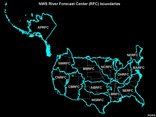
RFC Case Study Examples
As of 2010, all 13 River Forecast Centers (RFCs) in the U.S. National Weather Service (NWS) were developing case study examples of hydrologic forecast verification. The cases typically concern forecasts of basin-averaged precipitation and temperature and their impact on streamflow forecasts at specific forecast points.
Two RFC case study examples of verification are detailed in this module. One is from the Ohio RFC (OHRFC) and the other is from the Middle Atlantic RFC (MARFC).
IVP and EVS Case Studies
The OHRFC example verifies deterministic hydrologic forecasts using IVP. The MARFC example verifies probabilistic hydrologic forecasts using EVS. Both IVP and EVS are NWS programs used for verification at hydrologic forecast points.

Both case examples examine how the choice of whether or not to use Quantitative Precipitation Forecasts (QPF) as input for the hydrologic model impacts the hydrologic forecasts.
IVP: Deterministic Approach
Case study one, from the OHRFC, looks at the question: "How well do the river stage forecasts verify based on whether QPF is used as input?" The study also looks at the impact of lead time and the impact of modifications done to hydrologic forecast variables during the forecast process.
The IVP tool is used to examine verification of deterministic forecasts at point locations. The point locations are at the outlets for each of 18 river basins studied. The eighteen river basins used in the study are grouped, or aggregated, based on physical similarity as measured by hydrologic response time.
This case study looks at measures of forecast error, bias, correlation, and skill with respect to lead time. This case study will be detailed in section 2.
EVS: Probabilistic Approach
Case study two, from the MARFC, looks at the question: "How well do the ensemble streamflow forecasts verify based on whether or not ensemble QPF are used as input?" This study looks at how streamflow forecast performance is influenced by 1) lead time, 2) QPF, 3) climatology, and 4) location at either a headwater or a downstream point. It looks at characteristics of data distribution and spread, and verification measures such as error, bias, correlation, forecast discrimination, forecast reliability, skill, and confidence.
The EVS tool is used for the the verification of probabilistic flow forecasts at points. Two point locations in the Juniata River basin are studied. Williamsburg is an upstream headwater location. Newport is a downstream location. This case study will be detailed in section 3. Section 4 will summarize.
2.0 IVP Case Study: OHRFC
The Interactive Verification Program (IVP) is used by the Ohio RFC (OHRFC) to evaluate deterministic hydrologic forecast performance. The study covers the 25-month period from 01 August 2007 through 31 August 2009. The data presented in this case study will help us demonstrate how to use verification to answer important questions about hydrologic forecast performance. In this particular case it is used to evaluate the effect of QPF on that performance.
When evaluating how QPF affects hydrologic forecast performance, related questions arise. In this case study we will demonstrate how to answer these questions as we address the main question of QPF impact. These questions include: 1) Are the basin data aggregated in a meaningful way? Or in other words, do the basin groups really contain basins with similar characteristics? 2) How do the errors and biases differ depending on QPF input and forecast modifications? 3) How well-correlated are the hydrologic forecasts and observations? 4) How are QPF-influenced hydrologic forecasts impacted by lead time? 5) Are erroneous forecasts skillful? 6) What are the primary sources of error?

This study does not look at different thresholds of QPF amount. It only looks at the performance of the hydrologic forecast when QPF is used as input into the hydrologic models versus the hydrologic forecast without any QPF. QPF input is a mixture of both zero and non-zero amounts, but when QPF is not used it is the equivalent of zero QPF over all lead times.

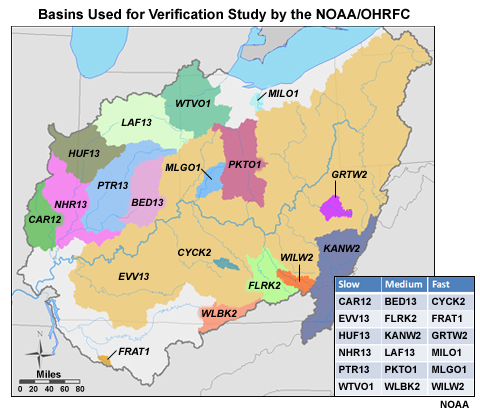
Basins Studied
The OHRFC used 18 basins in its area to perform the QPF study. The basins were aggregated into three groups of six—slow, medium, and fast—based on hydrologic response time.
In the table on this figure, the right column shows the fast-response basins. These tend to be the basins with smaller areal coverage and/or steeper slopes. The middle column has the medium-response basins. In the left column are the slow-response basins, which tend to have relatively large areal coverage. Grouping basins together, called aggregation of basins, based on similar physical characteristics is a common practice. It helps to increase the sample size for a certain type of basin. Larger sample size leads to greater confidence in the computed verification scores.
- Aggregation: grouping basins based on similar characteristics
- Increases sample size
- More confidence in verification scores
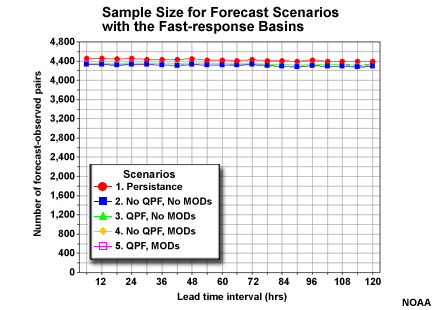
There were roughly 700-750 forecast-observation pairs for each individual basin and for each lead time interval. Shown here are the sample sizes within the fast-response group. The numbers for the medium- and slow-response groups are similar. When aggregated together, the sample size for the whole fast-response group is about 4,400. The sample sizes for the medium- and slow-response groups are almost identical.

Forecast Scenarios
Sources of error and uncertainty that influence hydrologic forecasts need to be considered carefully in order to isolate the impact of one input over another. In this case study we are looking at the impact of QPF in the hydrologic model. But QPF is not the only influence. RFC forecasters routinely perform modifications within the model during the forecast process, referred to as runtime modifications, hereafter referred to as MODS.
Using IVP we will look at the performance of stage height forecasts at basin outlet points for the following scenarios:
- The persistence forecast which simply means that current observed stage height is the forecast for the future.
- Forecasts without either QPF input or MODS
- Forecasts with QPF input but not MODS
- Forecasts without QPF input but with MODS
- Forecasts with both QPF input and MODS
Forecast Scenarios: QPF Input / Forecast Modification (MODs)
Forecast Scenarios |
QPF Input |
Forecast Modification (MODs) |
1 |
Persistence |
|
2 |
NO |
NO |
3 |
YES |
NO |
4 |
NO |
YES |
5 |
YES |
YES |
The QPF input typically consists of 6-hr QPF out to 24 hours. On occasion the QPF may extend to 36, 48 or 72 hours in anticipation of widespread significant precipitation. QPF forecasts beyond 24 hours account for about 10-15% of cases.
Basin Aggregation Assessment
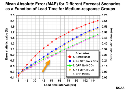
Next we will look at a few verification scores of individual basins within each group to ensure that these grouped basins do show similar characteristics. The scores we will examine are Mean Absolute Error (MAE), Mean Error (ME), and forecast correlation. These graphs and plots are for forecast scenario 4; hydrologic forecasts that include QPF and run time forecast modifications routinely performed by the forecasters.
You may want to keep the summary table from Introduction to Verification of Hydrologic Forecasts handy as a quick reminder of the optimal value and range of scores for each verification measure.
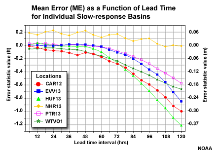
Slow-response Basin Aggregation
Here is a look at the MAE and ME of stage height with respect to lead time for each of the 6 individual basins in the slow-response group.

Question
Which basin appears to be an outlier when viewing the MAE scores with lead time? (Choose the best answer.)
The correct answer is C.
Question
Which basin appears to be an outlier when viewing the ME scores with lead time? (Choose the best answer.)
The correct answer is a.
Aggregation Outlier
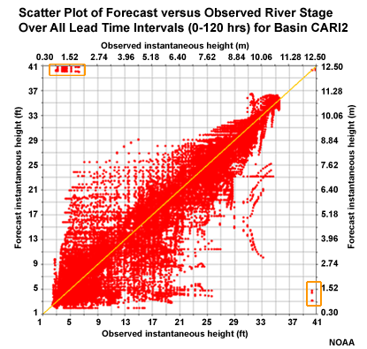
Let's look at why CAR12 may be an outlier from the MAE perspective. This scatter plot depicts correlation of forecasts and observations for the 5 lead days. We can see some outlier points in the upper left and lower right. These represent major errors either when the forecast was for a major event that did not occur, or a major event was observed but had not been forecasted. These erroneous forecast-observation pairs will impact the MAE and the correlation. However, the Mean Error graphic suggests that this basin is consistent with other basins in the group, and the MAE and correlation would be consistent if not for those few outliers.
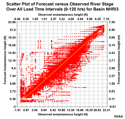
The NRRI3 station in the slow response group showed ME behavior that departed somewhat from the other basins in the group. Although the scatter plot of forecasts and observations for the 5 lead days shows some unsatisfactory correlation on the low end, there are no major outliers in the upper left or lower right corners. In fact the correlation looks reasonably good. Perhaps some of the behavior occurs due to some of the upstream controls affecting this basin. The MAE for this basin fits in well with the other basin in the group.
Medium-response Basin Aggregation
Next we will look at the MAE and ME of stage height with respect to lead time for each of the 6 individual basins in the medium-response group. No major outliers appear on the plots indicating that this is a reasonable group of basins.
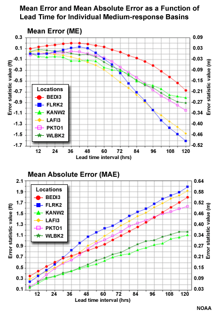
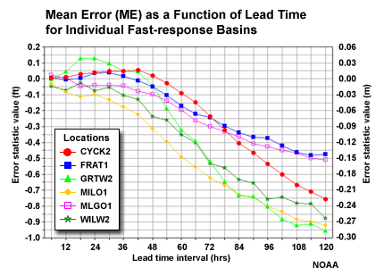
Fast-response Basin Aggregation
Finally, we examine MAE and ME of stage height with respect to lead time for each of the 6 individual basins in the fast-response group.
These basins appear to be well clustered, although there is a bit of an outlier tendency for the MAE shown with the GRTW2 basin. However, this basin is similar to the others in the group with respect to mean error and correlation. It's also a small headwater basin in the hilly portions of southeastern Ohio so it might be expected to behave a bit differently. Overall, using all six basins for aggregated verification scores is appropriate.

Compare Fast- and Slow-response Bias
Now that we have quickly assessed that the basins within each group make sense, we should ask if the separate groups make sense too. Compare the mean error tendency with lead time for the fast response and slow response groups.
Question
If we look at the magnitude of the negative mean error in the 48-72 hr lead times, is there a difference in the trend of the error? (Choose the best answer.)
The correct answer is c.
The fast-response basins are showing increasing negative mean error (underestimating stage height) for 48 to 60-hr lead time. The slow response basins show the increase in negative mean error mainly after the 60-hr lead time. The difference between aggregated groups supports the approach of aggregating the basins based on similar response-time characteristics.
Forecast Verification: Errors and Bias
After the determination is made that the data grouping�in this case the basin aggregation�is appropriate, the next step is to determine how the QPF impacts hydrologic forecasts of stage height. Recall from the opening page of this section that our verification technique is designed to foster understanding about the impact of QPF by allowing us to evaluate the following:
- Characteristics of errors and bias for different forecast scenarios
- Correlation between forecasts and observations
- Forecast skill for different forecast scenarios
- Impact of lead time on error, correlation, and skill
- Sources of forecast error
As mentioned earlier, the sample for each basin group is roughly 4,400. This number is consistent across all forecast scenarios and lead times as shown in this graphics of the fast-response basin group. The numbers are almost identical for the medium- and slow-response groups.
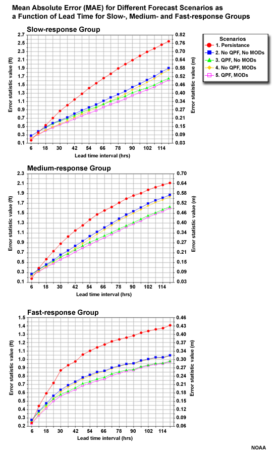
MAE for Forecast Scenarios
Let's begin by evaluating the overall performance of the different basin groups as measured by Mean Absolute Error (MAE). The different forecast scenarios are shown for each basin group.
The MAE shows increasing error with increasing lead time for all groups and scenarios. With the slow-response group, the increase in error is nearly linear. With the fast-response group, the increase in error is most rapid in the early lead time periods.
Question
For all three basin groups, which forecast scenario has the greatest error? (Choose the best answer.)
The correct answer is a.
Question
Which two forecasts have the lowest error? (Choose all that apply.)
The correct answers are c and e.
So when we look at all stage height forecast for all basins in each aggregation group, we see persistence is the worst forecast. But we also see that the two forecasts with QPF input are the best, as measured by MAE.
- Persistence is the worst forecast
- The two scenarios with QPF performed the best as measured by MAE
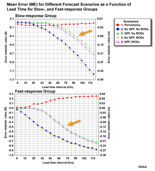
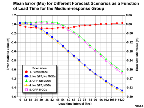
ME (bias) for Forecast Scenarios
Compare the ME for the different forecast scenarios of the fast-response and slow-response groups. There is an increasing negative ME, or under-forecast bias, with increasing lead time. But notice how the two scenarios with QPF perform much better than the two without.
Question
Why do you think that the persistence forecast would have the best mean error values with increasing lead time? (Choose the best answer.)
The correct answer is d.
The mean error is also the additive bias. It can have an ideal score of zero if there are equal amounts of errors in both the positive and negative direction. The MAE showed us that persistence has the largest absolute errors of the different forecast scenarios.

Correlation and Lead Time
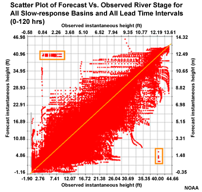
Let's look at how well the forecasts and observations of stage height are correlated. This scatter plot shows a large amount of scatter around the diagonal indicating less than ideal correlation between forecasts and observations.
This scatter plot contains all six basins and all leads times for the slow response basins in one plot. We can even see the outlier events from one basin that was discussed earlier.
Correlation Over All Lead Times
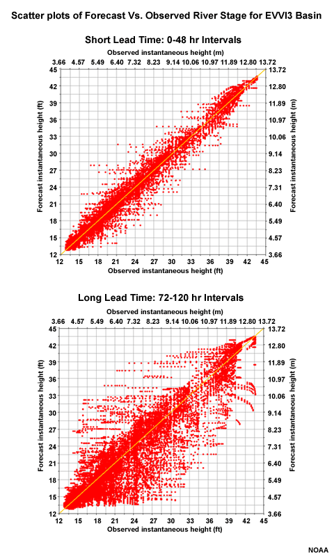
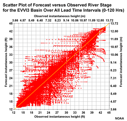
If we choose just one basin over all lead times, in this case EVVI3, we still see quite a bit of scatter around the diagonal, although not as much as when all basins are considered together.
In the previous section we noted that errors begin to increase most notably by the 48-hour lead for the fast-response basins and at forecast lead times longer than 60 hours for the slow-response basin. It would be informative to look at the scatter plot depiction of forecast correlation for short and long lead times.
Correlation: Short vs. Long Lead Time
Let's look at the scatter plot again for all forecast lead times at EVVI3.
Now let's look at two more scatter plots for this location, but one only includes forecast lead time <= 48 hours, and the second includes only lead time of >= 72 hours.
Question
Compared to the >= 72 hours lead time forecast, the <= 48 hours lead time forecasts show _____. (Choose all that apply.)
The correct answers are c and d.
With lead times of 48 hours or less, there is much better correlation between forecasts and observations. This is seen as less scatter about the diagonal in the scatter plots.
Correlation Plots
We can also see this in the correlation plots. Here, the correlation trend with lead time for the fast-response basin group (right side) shows a trend away from the perfect correlation coefficient of 1 as lead time increases. Also note that when compared to the slow-response basin group, the fast-response basins show less favorable correlation. The change to less favorable correlation also occurs more quickly with the fast- response group.

So there is a degradation of correlation between observations and forecasts with increasing lead time. As we saw with mean error and mean absolute error, this degradation in forecast quality occurs more rapidly with the fast-response basins than it does with the slow-response basins.
This is why it is important to produce different scatter plots (and different verification metrics) for various forecast time horizons. The performance of the forecasts will vary greatly with lead time. When pooling together all forecasts and observations from short to long forecast horizons, one might miss important information about forecast performance.
Forecast Skill and Lead Time
As shown earlier, errors start to increase notably, and correlation decreases when forecast lead times are greater than 60 hours. This occurs sooner in the small, fast response basins.
But is skill also decreasing with lead time? Remember that a forecast is skillful if it performs better than a reference forecast. The reference can be persistence, depicted by the red line. It can also be forecasts without QPF, depicted with the blue and yellow lines.
In the MAE plots note the separation between the lines for different forecast scenarios. Notice how the separation gets greater with longer lead times. The two scenarios with QPF in the hydro forecast, the pink and green lines in the graphic, have more slowly increasing errors with lead time. The separation in the lines shows that the two stage forecasts with QPF show increasing skill with lead time when compared to the two forecasts without QPF, or with the persistence forecast.
This indicates that although the QPF was mainly for 24 hours only, it is having a positive impact many hours later.
QPF Influence
An important consideration when examining sources of error and uncertainty is to look at the errors and uncertainty in the QPF itself. The COMET module on QPF Verification: Challenges and Tools, can provide some important information to consider as well as explanations of online QPF verification tools within the NWS.
NPVU
For QPF verification, the National Precipitation Verification Unit (NPVU) provides verification information for the RFC area. These graphics show two one-year periods covering the 2-year period from October 2007 through September 2009. This is offset by just a couple months from the OHRFC study. The NPVU and IVP data are not directly comparable. NPVU considers the entire RFC area, but the IVP study of stage forecasts looks at 18 test basins within the OHRFC's service area. Also, the OHRFC study looks at "no QPF" versus QPF input and does not stratify QPF impact by QPF magnitude as NPVU does. The NPVU data is still useful information in that it provides an idea about the range of errors associated with QPF for the OHRFC area. It also suggests that future work at the OHRFC may want to include categorizing QPF by amounts.

QPF Impact with IVP
We can also assess the influence of QPF on stage forecasts by comparing the verification results for the different scenarios. Let's go back to our MAE and ME plots. The QPF versus no QPF made a big difference in the errors and biases of the stage forecasts. The two forecasts with QPF had less error and smaller negative bias with increasing lead time. The QPF versus no QPF scenario overwhelmed any influence of whether there were or were not modifications made in the hydrologic model. Because QPF has a much stronger positive influence on the stage forecast, we expect the QPF errors to have a relatively strong negative influence as well. But a more robust verification study of the QPF amounts would need to be conducted to prove that.
Summary of OHRFC Case
This quick review of the hydrologic forecasts of stage height from the OHRFC is intended to provide guidance regarding techniques used to verify forecasts. The technique used here had several important steps.
- Look at basins within each response time group to make sure that basin aggregation makes sense.
- Evaluate measures of bias and error and how those vary with forecast scenarios, lead time, and basin response time.
- Examine correlation between observations and forecasts and how that varies with lead time.
- Evaluate forecast skill, in particular, the skill of forecasts with respect to QPF input and lead time.
- Assess whether QPF may be a significant source of forecast error.
The study appears to show that including QPF has a greater positive influence on the stage forecasts than the modifications to the forecasts that forecasters perform within the hydrologic model. Since QPF has the greatest positive impact on stage forecasts, that could mean that QPF errors have significant negative impact on hydrologic forecasts. However, more study would have to be done looking at, among other things, the impact of QPF for different QPF amounts.
Forecast quality as measured by error, bias, and correlation decreases as lead time increases. This decrease in forecast quality occurs more quickly with fast-response basins than with slow-response basins. However, the forecast quality degrades more slowly for forecasts that contain QPF input. In other words, when QPF input is used, the forecast show positive skill as lead time increases compared to forecasts with no QPF input.
As stated above, this study did not attempt to look at the impact of certain QPF amounts. In addition, we cannot conclude that the results would be the same in other regions with different precipitation regimes. But the point here was to demonstrate how verification can be structured to answer questions about hydrologic forecast performance and error sources.
Review Questions
Question 1
QPF input to the hydrologic model appears to have _____ runtime modifications. (Choose the best answer.)
The correct answer is c.
Question 2
Including 24-hour QPF has a positive impact on stage height forecast skill _____. (Choose all that apply.)
The correct answers are b and d.
Question 3
Basin aggregation based on physical characteristics of the basins is done to _____. (Choose the best answer.)
The correct answer is a.
Question 4
Errors in the stage height forecasts increase most quickly with increasing lead time for _____. (Choose the best answer.)
The correct answer is c.
Question 5
Correlation between forecasts and observations of stage height is best for _____. (Choose all that apply.)
The correct answers are a and d.
3.0 EVS Case Study: MARFC
This section describes the use of the Ensemble Verification System (EVS) by the Middle Atlantic River Forecast Center (MARFC) to evaluate ensemble hydrologic forecasts at two points on the Juniata River in Pennsylvania. The data presented in this case study will help us to demonstrate the use of verification to answer important questions about hydrologic forecast performance. Specifically, we will be answering the question, "How are ensemble river forecasts impacted by QPF?"
Several questions come up with respect to the main question. EVS can be used to explore the answers to these questions:
- Does a headwater point show different forecast performance than a downstream point?
- Is the ensemble spread sufficient?
- What are the characteristics of the QPF compared to those of the hydrologic forecasts?
- Is the forecast system skillful?
- What are the characteristics of forecast reliability and forecast discrimination?
- Is there notable difference in the forecast performance when QPF-based ensembles are used compared to climatologically-based QPF?
- What is the impact of lead time on the forecast performance?
- How confident are we with the verification results?
Basin and Data Characteristics
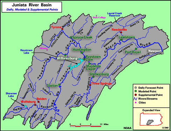
The Juniata River Basin is located in the south-central portion of the U.S. state of Pennsylvania. It contains some rather steep drainages in its headwaters tributaries. This case looks at two forecast points. Newport is close to the mouth of the Juniata River, just upstream of where it joins the larger Susquehanna River. There is a drainage area of 3,354 square miles, or 8,687 square kilometers, above Newport. Williamsburg is located on the Frankstown Branch of the Juniata and is representative of a headwater basin. There is a drainage area of 291 square miles, or 754 square kilometers, above Williamsburg.
The Data
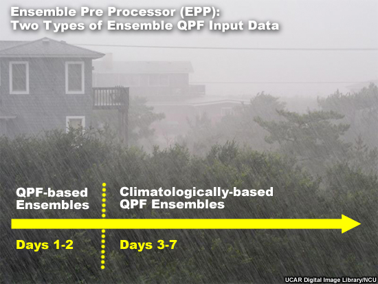
The period of time used for this study is 1 January 2006 through 31 July 2009. In addition to the ensemble hydrologic forecasts, the study also verified the QPF forecasts that are used to generate the hydrologic forecasts.The Ensemble Pre Processor (EPP) is used to generate two types of ensemble QPF input data that can then be verified with EVS. For the first 48 hours, Days 1-2, 6-hour QPF-based ensembles are used. Beyond Day 2, climatologically-based precipitation ensembles are used. Precipitation data that are independent of the EPP data are used in the verification. Twenty-four hour totals of gauge-based mean areal precipitation are used for verification of precipitation data, compared to six-hour instantaneous observations used to verify streamflow.
Sample Sizes
A non-exceedance probability value of 0.8 is used as one of the streamflow conditions. This is to provide a feel for how the forecast system performs for high flows, in this case the top 20% of flows, when compared to all flow measurements. In the module we will use a "top 20%" label to indicate where the high flow conditions are being examined.
In these sample size plots, notice that there are far fewer data points for the high flow threshold. If a higher non-exceedance probability were chosen there would not be enough data points for robust verification statistics
We see here that for the Williamsburg point, there are between 200 and 250 data points for the high flow threshold. The number is similar for Newport.

Verification Scores
We will demonstrate an approach that will explore several sets of scores and graphics. Initially we will get an overview of forecast performance by examining deterministic scores of error and correlation using the ensemble forecast means. This will be done for both the flow forecasts as well as the input QPF.

Data Distribution
We will examine data spread and distribution using box plots at the two forecast points, headwater and downstream. We will examine box plots for both the flow forecasts and the input QPF and how the data spread may change with lead time.
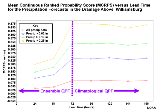
Mean Continuous Ranked Probability Score (MCRPS)
Because we are working with probabilistic forecasts, we will look at measures of probabilistic errors using the Mean Continuous Ranked Probability Score (MCRPS). In particular, we will look at the behavior of the MCRPS with lead time to understand the impact of ensemble QPF input.
MCRPSS (Skill Score)
For forecast skill we will examine the skill score form of the MCPRS, the MCRPS Skill Score (MCRPSS). Skill scores give us a measure of relative error.
Skill scores are important because it is possible for a forecast system to produce forecasts that are skillful even though they have error.

Conditional Forecast Verification
Next we will specifically look at conditional verification measures: forecast reliability, and forecast discrimination. For these we will examine the reliability component of the MCRPS, spread bias plots, and the Relative Operating Characteristic (ROC).


Confidence in Verification
Finally, we will examine confidence plots of the verification scores. The purpose of these products is to understand the sampling uncertainty. With the confidence information we can determine whether or not the verification scores are meaningful.

Examining Ensemble Means
Verification using ensemble means can provide a general look at the forecast performance. Remember, with ensemble means you are making a deterministic forecast out of ensemble forecasts. The range of solutions seen in the ensemble spread is removed.
But for a general impression of the forecast system over time, this may be a good first option.
We will look at the Root Mean Squared Error (RMSE), the Mean Error (ME) which is sometimes called the additive bias, and the Correlation Coefficient (CC).

RMSE at Headwater
The RMSE for the headwater point at Williamsburg shows that the error gets greater with lead time, with some leveling out after 84 hours.
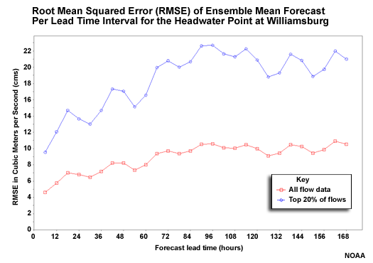
Question
How does the top 20% of flows (blue line) compare with all flows (red line)? (Choose the best answer.)
The correct answer is c.
RMSE of QPF Input
Here is the RMSE of the ensemble QPF input for the area represented by the Williamsburg point. There are four categories. The red line is all data, including forecasts of zero precipitation. The blue line is for days when the Mean Areal Precipitation (MAP) was observed to be greater than 0.02 inch, or 0.5 mm. The green line is for MAP greater than 0.10 inch (2.5 mm). And the yellow line is for MAP greater than 0.25 inch, or 6.4 mm. The 0.02, 0.10, and 0.25-inch thresholds correspond to the 63rd, 76th, and 86th percentiles respectively for this drainage.
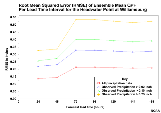
Question
What are some features of the relationship between the different thresholds? (Choose all that apply.)
The correct answers are a and c.
Question
Why would the errors increase most rapidly from 48 to 72 hours? (Choose the best answer.)
The correct answer is d.
The mean of the ensemble QPF shows greater error with the higher precipitation categories. It also shows that the error increases most rapidly from 48 to 72 hours. This is when the QPF-based ensembles are replaced with the climatologically-based QPF input.
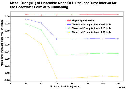
Mean Error (Bias) of QPF input
We might be curious about the nature of the greater errors in our precipitation forecasts. Here is the Mean Error (ME) of the QPF ensemble mean. ME is a measure of bias where a value of zero would indicate no bias.
When all data are taken together, there is a slight positive bias. But for increasingly large accumulation thresholds, the ME indicates a strong negative bias. So these verification scores suggest a slight overforecasting tendency for light precipitation and a strong underforecasting tendency for heavy precipitation.
Once again we see the transition from the QPF-based ensembles to the climatology-based ensembles. This is where the tendency for a rapid increase in negative bias of non-zero precipitation amounts is apparent.
Mean Error (Bias) of Flow Forecasts
Now if we look at the ME for the hydrologic flow forecasts, we see that the high flow events show a very strong negative bias, just like the precipitation input. Although we should expect greater magnitude ME for greater magnitude flows, this is useful information about the behavior of the forecast for important high-flow events. The increase in negative bias is especially noteworthy after the 48-hour lead time when the climatology-based precipitation is used as input.
The strong negative bias in the high flow forecasts is very similar to the negative bias in the precipitation forecasts for the large accumulation amounts. If the bias in the high flow forecast were much different than the precipitation forecasts, then we would have indication that the main error source was something other than the precipitation input.
Correlation of QPF Input
Here we can examine the correlation between the ensemble mean QPF and the observed precipitation. The ensemble QPF forecast correlation shows similar behavior as Root Mean Squared Error and Mean Error. Good correlation for all precipitation thresholds is seen in the first 48 hour. Then in the 48 to 72 hour period when climatologically-based QPF kicks in, there is almost no correlation (zero value) between the forecasts and observations. There is even a bit of a negative correlation for the high precipitation threshold. This should impact the flow forecasts in a similar way.

Correlation for Flow Forecasts
Here you can compare the forecast correlation for the headwater point, Williamsburg, and the downstream point, Newport. Remember that the blue plots show just the behavior with respect to correlation of the top 20% of flows. Remember that we want positive correlation, with 1.00 being a perfect correlation between forecasts and observations.

Question
What can you say about the top 20% of flows at these locations? (Choose all that apply.)
The correct answers are a and b.
Both the headwater and downstream points show decreasing correlation with lead time between the forecasts and observation. This occurs more rapidly with the headwater point from 0 through 84 hours, and especially in the 48-84 hour period. The correlation at all lead times is worse for the headwater point.
Ensemble Spread: Box Plots
Box plots are used to evaluate two important aspects of the relationship between the observations and forecasts: (1) whether there is appropriate distribution and spread in the ensemble forecasts, and (2) whether there is bias in the forecast.
The box plots are constructed so that the green represents 50% of the forecast members between the 0.75 and 0.25 exceedance thresholds. The red lines represent the highest and lowest 25% of forecast values including the extrema.
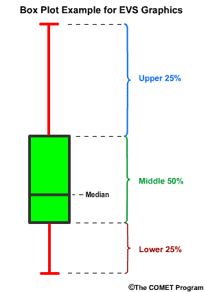
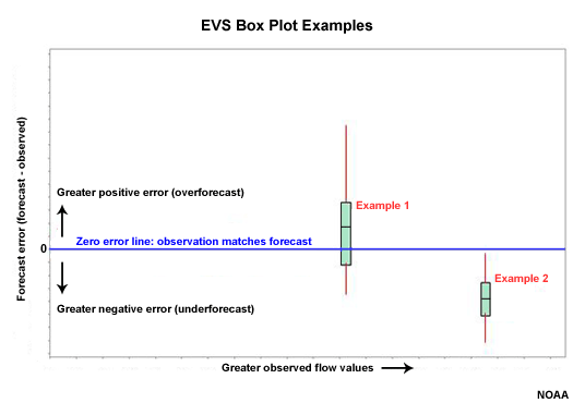
EVS Box Plots
In EVS the box plots can be plotted with the observed value, flow in this case, on the X axis and the forecast error (forecast minus observed) on the Y axis. The zero line on the Y axis is where the observation matches the forecast.
In box plot 1, the zero error line falls within the middle 50% of ensemble forecast values for observation 1, which should occur 50% of the time in a perfectly calibrated forecast system. The median value and the extreme are a little skewed in the direction of positive error, or overforecasting. But we cannot say there is an overforecasting problem with just one box plot.
In box plot 2, the ensemble forecast spread associated with observation 2 is completely below the zero error line. All of the ensemble members were too low indicating an underforecast. In other words, the observation was greater than any ensemble forecast member.
Remember that in a well-calibrated forecast system the green section of the box plot should intersect the zero line 50% of the time, and the upper and lower red lines should each intersect the zero line 25% of the time. The distribution, green and red sections, should never lie completely above or below the zero line.
We will look at box plots for forecast lead times of 6, 30, 78, and 126 hours.
Headwater Box Plot: 6-Hour Lead
Let's start with the headwater point at Williamsburg. At a 6-hour lead time there is very little spread in the ensemble forecasts. In fact, you can't really see the green part of the box plots that represent the middle 50% of ensemble members because those boxes are so small. As it turns out, many of the box plots do not intersect the zero line at all, indicating poor matching between forecasts and observations.
This is phase 1 when the QPF ensembles have not had an impact yet and flow forecasts are dominated by observed runoff.

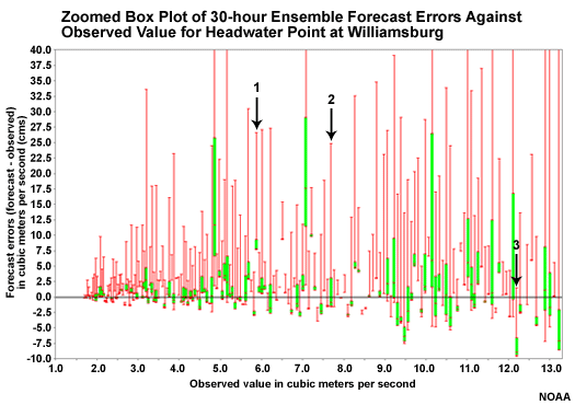
Headwater Box Plot: 30-Hour Lead
At a 30-hour lead time we have entered phase 2 when QPF input is increasing the range of possible flows in the forecasts. More of the box plots, especially the green segments, straddle the zero line than at 6 hours. This indicates more appropriate spread in the ensemble forecast members at a 30-hour lead time than at 6 hours.
Remember, that the zero line is where the forecast and observation match.
The exception is on the low end of observed flows, likely associated with light precipitation. The box plots left of the blue line on the plot represent the lowest 80% of observations and their corresponding ensemble forecasts in the dataset. We will zoom in on these to examine the box plots for the observed lower 80% of flows.
Headwater Box Plot, Low Flows, Hour 30
Here, looking at the zoomed area representing the lowest 80% of observed flows, the ensemble forecast distributions are mainly above the zero error line. This indicates that the ensemble spread has too many high values. In other words, the forecast system is tending toward an overforecasting bias.

Headwater Box Plot Questions
Question
What is the significance of the zero line on this plot? (Choose the best answer.)
The correct answer is c.
Question
Which box plot shows the middle 50% of the forecast distribution intersecting the zero line? (Choose the best answer.)
The correct answer is b.
Question
Which box plot shows that none of the ensemble members match the forecast? (Choose the best answer.)
The correct answer is a.
Question
Which box plot shows an overforecast bias? (Choose the best answer.)
The correct answer is a.
Question
What does box plot 3 tell us about how the observation matches the ensemble forecasts? (Choose the best answer.)
The correct answer is c.
Headwater Box Plot: 78 hour Lead
At a 78-hour lead time we have entered phase 3 when the climatologically based QPF is dominating. Compared to the 30-hour lead time, we see an increase in ensemble spread for the low end flow values and a decrease in ensemble spread for the upper 20% of observed values. In addition to the decrease in spread at the high end, we also see indications of an underforecasting bias. This underforecasting bias is seen by the tendency for box plots to be below or mostly below the zero line. This suggests that the hydrologic forecast ensemble spread does not adequately capture the high flow values at a 78-hour lead time when the climatologically-based QPF is a dominant influence.

Headwater Box Plot: 126 Hour Lead
Once we go out to a lead time forecast of 126 hours we are solidly in phase 3 where climatologically-based QPF input has a dominant influence. When climatological QPF dominates we see that the ensemble forecast members are indicating conditional bias�too high on the low end and too low on the high end. There is also tendency for underspread on the high end as seen by the small vertical extent of the boxes. But bias is the more obvious characteristic.
The upper 20% of flow observations are often not captured by any of the ensemble members as seen in the box plots located mostly or entirely below the zero error line. This indicates underforecasting.
At the same time the low end forecasts have a tendency to be skewed above the zero line, indicating an overforecasting bias there. However, the low end values are not as badly overforecast as they were at lead hour 30. Let's zoom in to the area left of the blue line. As with the zoomed in box plot we examined for lead hour 30, this zoomed in plot will allow closer examination of the ensemble forecasts associated with the lower 80% of observed flows.

Headwater Box Plot Zoomed: 126 Hour Lead
The 126-hour lead time shows more spread of the ensemble forecasts here in the lower 80% of values. You can still see the tendency to overforecast low values, especially with the very low values on the left side.

The main point to be taken from the box plots at the headwater location is that QPF input does result in more appropriate ensemble spread in the flow forecasts. QPF input is advantageous over climatologically-based QPF input in that the climatologically based input results in more tendency for low bias as well as underspread associated with the high flow events.
Downstream vs. Headwater: 30 Hour Lead
So now let's look at 30-hour lead time box plots for the downstream point at Newport and compare it to the 30-hour box plot for the upstream point at Williamsburg.
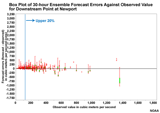
Question
How do the boxplots for downstream point (Newport) compare to those at the upstream point (Williamsburg) at 30 hours? (Choose the best answer.)
The correct answer is c.
Because it takes longer for QPF input to impact the downstream point, there is less spread in the hydrologic forecast ensembles there.
Downstream vs. Headwater � 78 Hour Lead
Now let's compare the 78-hour lead time box plots for the downstream point and the headwater point.
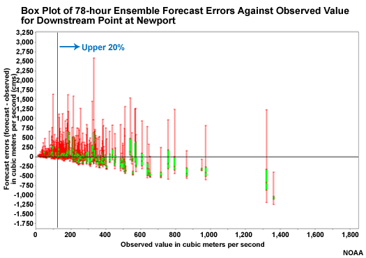
Question
Which point shows a more favorable distribution of forecast ensembles for the upper 20% of values? (Choose the best answer.)
The correct answer is b.
The underrepresentation of high flow values in the hydrologic ensembles occurs more quickly at the headwater point. The switch from QPF-based input to climatologically-based QPF input at 60 hours has an impact more quickly on the upstream point resulting in smaller spread and an underforecast bias. This will happen at the downstream point too, but not until later.
So the downstream point behaves similarly to the upstream point, but the timing is different. Both upstream and downstream had poor ensemble spread at 6 hours before QPF had an impact. By 30 hours the impact of QPF results in more spread in the hydrologic forecast ensembles and the observations are better captured by the ensemble forecast members. This is more obvious at the headwater point, which responds more quickly to QPF input. At longer lead times the impact of climatologically-generated QPF is dominant and we see an underspread of ensembles, with an overforecast bias at low values and an underforecast bias at high values. This occurs more quickly at the headwater point than at the downstream point.
QPF Box Plots
The box plots of the flow forecasts showed three phases. These are:
- Phase 1� Before QPF forecasts have much impact there is low spread in the ensemble flow forecasts
- Phase 2� When QPF has an impact there is greater spread in the hydrologic forecast ensemble members along with some overforecasting bias at low flows
- Phase 3� At longer lead times when climatologically generated QPF dominates there is more underspread and a conditional bias with overforecasting for the low flow values and underforecasting for the high flow values.
QPF Box Plots � 24 Hour Lead
If QPF input is having a strong influence on the hydrologic flow forecasts, we may expect to see a pattern of spread and bias in the QPF ensembles similar to those of the flow forecasts that we just examined. Here we can see the spread in QPF ensemble members often straddles the zero line, meaning the forecast ensemble included the actual value. For the high QPF values, there is a tendency for a low bias and for the spread, especially the middle 50% seen in the green segment, to be too low. This is similar to the forecast tendencies seen in the ensemble flow box plots at 30 and 78 hour lead times.
Climatologically-based QPF Box Plots
The climatologically-based QPF used as input after 48 hours, is much different. The ensemble spread is smaller and the spread often does not include the zero line for the medium and large values. This means that the climatologically-generated QPF rarely captures the true precipitation for moderate and heavy events.
The underforecast bias and the lack of ensemble spread in these climatologically-based QPF are consistent with the underforecast and lack of spread seen in the hydrologic forecast at long lead times for high flows.
There is also some overforecast of the low-end values, consistent with the overforecast bias seen in the long lead-time hydrologic forecasts.
This helps to confirm that QPF may be a big source of error in the hydrologic forecast process.

Mean Continuous Ranked Probability Score (MCRPS)
The mean continuous ranked probability score (MCRPS) is a measure of the "error" in probabilistic forecasts. Measuring error in probabilistic forecasts is really measuring how well calibrated the forecast system is. We want to measure how well forecast probabilities match observed frequencies of a given event. In other words, for every time a forecast was for a 60% chance of an event, was the event observed 60% of the time. That would be a perfectly calibrated forecast system. As with the error scores used with deterministic forecasts, low values indicate better matching between forecasts and observations.
The MCRPS for the probabilistic QPF with respect to lead time is shown here. The probabilistic QPF is the mean areal value for the 754 square kilometer basin area above Williamsburg.
The red line shows all forecasts including the zero QPF forecasts. The other lines show successively higher precipitation thresholds.
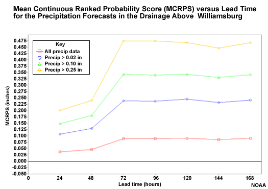
Question
Where does the MCRPS indicate worse QPF forecast performance (higher MCRPS values)? (Choose all that apply.)
The correct answers are a and d.
The highest threshold shows the least favorable scores. But remember that these are not measures of relative error. So we should expect the higher precipitation thresholds to have greater absolute errors and thus higher MCRPS scores. Perhaps the most important information in this plot is how the score trends with lead time. The performance of the probabilistic QPF gets worse at 72 hours when the climatologically-based QPF becomes more influential.
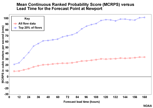
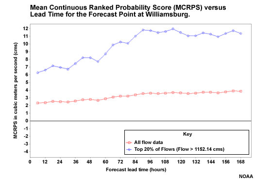
MCRPS of Flow Forecasts
So now we know that the probabilistic QPF performs better at lead times of 48 hours or less, and least favorably for long lead times of 72 hours and greater. Let's look at the hydrologic forecasts resulting from the QPF input. This plot is for all flows (red) and for the upper 20% of flows (blue) at the Williamsburg headwater point where the contributions from reservoir operations and tributary flows are minimal.
Note that the high flow forecasts have greater MCRPS values, especially after 72 hours when the climatologically- generated QPF has influence. So just like the QPF input, the forecast performance is better for lead times of 48 hours or less least favorable after 72 hours.
The MCRPS plot for Newport shows flows that are influenced more by reservoirs and tributary inputs, but it still shows worse scores with increasing lead time.
Mean Continuous Ranked Probability Skill Score (MCRPSS)
As with error scores, it is useful to look at the MCRPS in the form of a skill score: the mean continuous ranked probability skill score (MCRPSS).
Skill measures forecast performance relative to some reference, like climatology or persistence. A forecast can have skill even when there are forecast errors. In this case we will look at the forecast skill using the climatology as a reference.
Remember that a skill score value of zero indicates no skill over climatology in this case. Positive numbers indicate the forecast system does have skill over climatology.
Skill of Flow Forecasts
Here we see the skill scores for the downstream point at Newport.
Note the decrease in skill score with lead time when all flows are taken together (red) or just the high flows (blue). There is a leveling out in the 36-84 hour period that is more obvious in the high flows plot. This is showing the impact of QPF. The QPF has a positive impact on skill. At longer lead times the impact of the QPF decreases, and the skill scores fall to near zero, showing little skill over climatology.
Skill with Respect to Lead Time
We don't always expect the skill to be best at the initialization time. This is a function of how the data were recreated for this case. This graphic shows the skill of the operational forecast when compared with the climatology-based forecasts that were generated retrospectively with no forecaster modifications. High skill early on is mainly a result of the initialization. Then at about 36 hours we see the skill contribution from QPF, especially in the high flows graph.

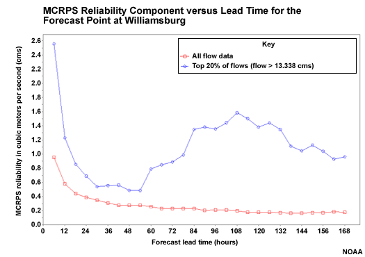
Forecast Reliability: MCRPS
A component of the MCRPS can be used to assess forecast reliability. The MCRPS can be decomposed into Reliability minus Resolution plus Uncertainty. So we can isolate and view the reliability component. Recall that forecast reliability looks at forecast performance conditioned on the forecast. So it helps us answer the question, "when the forecast is for X, what do the observations show?" Later we will look at forecast discrimination, which is conditioned on the observation and answers the question, "when the observation is X, what had the corresponding forecasts indicated?"
MCRPS = Reliability � Resolution + Uncertainty
Forecast Reliability: When forecast is for X, what do the observations show?
Forecast Discrimination: When the observation is X, what had the forecast called for?
Headwater Forecast Reliability
Smaller numbers are indicative of good forecast reliability. In these plots we see differences in the trends with respect to lead time when all magnitudes of flow forecasts are considered (red line) compared to when just the top 20% of flow forecasts are considered (blue line).
If we look at the headwater point, Williamsburg, when all flow forecasts are considered, we see that the worst reliability (highest value) is the first six hours. The best reliability (lower values) is the longer lead time period.
But when examining the top 20% of flows, we see a different trend. The best forecast reliability is in the 24-48 hour lead time when QPF has an influence. The reliability gets worse after that. This indicates that the big flow events, probably caused by big precipitation events, are not captured well when climatologically-derived QPF is used as input. So QPF input makes the hydrologic forecasts more reliable.
Downstream Forecast Reliability
The downstream point at Newport shows a similar trend for the high flow events. But at Newport the forecast reliability is best between 48 and 84 hours - later than at Williamsburg.

Question
Why would the best forecast reliability occur later at Newport than at Williamsburg? (Choose the best answer.)
The correct answer is b.
QPF input results in more reliable hydrologic forecasts. But the positive impact of QPF takes longer in the downstream point. So the best forecast reliability occurs later at the downstream point in Newport.
QPF Reliability
This graphic depicts the reliability of the precipitation forecasts. Forecast reliability is best in the 24-48 hour period before the climatologically-based QPF is used. It is also best when all amounts are considered. Reliability of precipitation forecasts decreases with the higher thresholds, especially when using the climatologically-based QPF.

Forecast Reliability: Spread-Bias Diagram
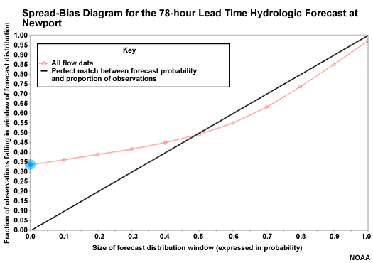
Another measure of forecast reliability uses the spread-bias diagram, sometimes called the cumulative Talagrand diagram.
The spread-bias diagram plots the proportion of observations that fall within a given segment of the ensemble forecast distribution. So for example, the 0.20 on the X axis represents the lowest 20% of forecasts. If there were 100 ensemble members, this would represent the lowest 20 of those members. The Y axis shows the proportion of observations that fall within or below that forecast segment, or window. If the forecast system were perfectly reliable, 20% of observations would fall in this window, and the point would be plotted on the diagonal. So the diagonal represents reliable forecasts.
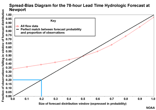
Overforecasting on the Spread-bias Diagram
In this case 40% of observations fall in the lowest 20% of the ensemble forecast distribution. This is over-forecasting, because too many observations are falling in the lower 20% of forecasts. That means that the ensemble forecast distribution would need to have lower members to capture the observations more reliably.
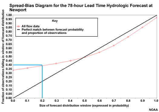
Observations Outside the Forecast Distribution
Over here we see a point that corresponds to the 0 on the X axis and 33% of observations on the Y axis. This means that 33% of observations occurred completely below the forecast distribution. So the forecast ensembles were so high that they missed 1/3 of the observations.
Underforecasting on the Spread-bias Diagram
Over on the right side, the spread-bias curve is closer to the diagonal showing greater forecast reliability. This point shows that 85% of observations fall in the lowest 90% of forecast ensemble members. This is a slight under-forecast. To be completely reliable the ensemble distribution would need to be a bit higher so that only 85% of ensemble members corresponded to 85% of observations.
Spread-bias Diagram: Lead Hour 6
Let's examine the spread bias plots for the downstream point at Newport. We will look at four different lead times, corresponding to the box plot lead times that we examined.
In the 6-hour lead time, we see a great example of what underspread forecast ensembles look like in the spread bias plot. The plotted point on the left axis indicates that 56% of the observations fall completely below the ensemble range. Thus, there is major overforecasting. These 56% of points would correspond to box plots that lie completely above the zero line.
The point on the right axis indicates that about 40% of the observations fall completely above the ensemble forecast range. This is underforecasting.
So if we do the math, we had 56% of the observations below the ensemble distribution, and 40% above the ensemble distribution. Adding 56 and 40 shows that 96 percent of observations did not fall within the ensemble distribution. That means only 4% did. Therefore, the ensemble forecast distribution is severely underspread. Recall, this is the time period where the box plots were very tiny indicating that lack of spread.

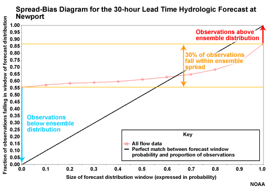
Spread-bias Diagram: Lead Hour 30
At a 30 hour lead time, QPF is starting to result in more spread in the hydrologic forecasts. But we still have significant underspread with overforecasting on the low end and underforecasting on the high end. Only about 30% of observations fall within the ensemble spread.
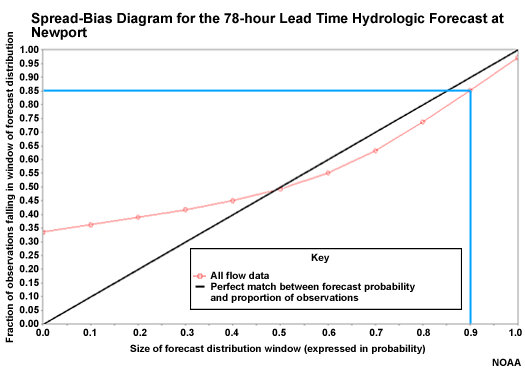
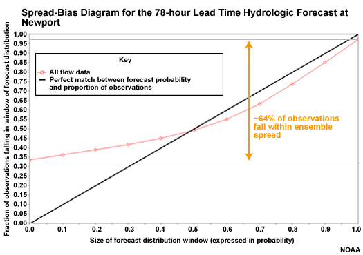
Spread-bias Diagram: Lead Hour 78
At 78 hours there is better spread with roughly 64% of observations within the ensemble spread. The curve is closer to the diagonal on the high end showing better forecast reliability. But there is still significant overforecasting on the low end.
Spread-bias Diagram: Lead Hour 126
At 126 hours the spread-bias plot shows better forecast reliability, although with overforecasting on the low end.
So overall, these spread-bias diagrams indicated increasing reliability with lead time. This may seem contrary to what we looked at with the reliability component of MCRPS. But remember that these spread-bias diagrams use all data and don't isolate the top 20%. The MCRPS reliability component showed us that forecast reliability decreases at longer lead times when considering the high QPF or the high flow forecasts.
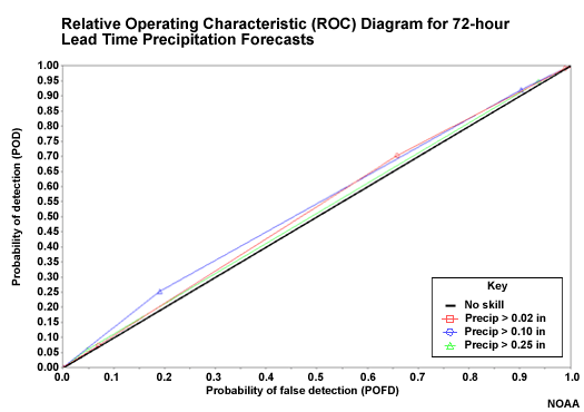
Forecast Discrimination: ROC
Forecast discrimination is a conditional verification measure like forecast reliability. But while reliability is conditioned on the forecast, forecast discrimination is conditioned on the observation. So forecast discrimination helps answer the question, "when the observations indicate X, what had the forecasts predicted?" The Relative Operating Characteristic, or ROC, is a common tool when looking at forecast discrimination for probabilistic forecasts.
ROC Curve for QPF
This plot of ROC curves is for the 24-hour probabilistic QPF for the three different QPF thresholds used. The upper left corner is ideal since this represents a Probability of Detection (POD) of 1.00 and a Probability of False Detection (POFD) of 0.00. In this case the curves all reach toward the upper left which indicates good forecast discrimination skill.
ROC Curve for Climatologically-based QPF
The ROC curves are also plotted for the climatologically-generated QPF. These fall very close to the diagonal. The diagonal represents no forecast discrimination skill.
If the curves had fallen below the diagonal, that would indicate negative forecast discrimination skill. In other words, if an observation indicates an event, the forecast had indicated a non-event.
So climatological input results in little or no forecast discrimination skill.
ROC Score: QPF
The ROC Score uses the area under the ROC curve in the following formula: ROC Score = (2*ROC Area) � 1. The ROC Score ranges from -1 to +1. Positive numbers show good forecast discrimination. Zero indicates no forecast discrimination. Negative scores indicate negative forecast discrimination. Thus +1 is optimal.
Here we see that there is good forecast discrimination through 48 hours. The ROC area drops to almost 0.00 when the climatologically-generated QPF is used.
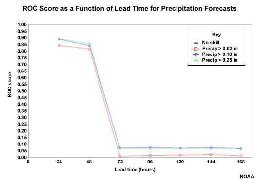
Question
Which precipitation threshold shows better forecast discrimination (greater ROC score)? (Choose the best answer.)
The correct answer is a.
The greater precipitation threshold is associated with better forecast discrimination. This is an opposite trend compared to forecast reliability, which was best for smaller amounts and long lead times. The same trend exists for the flow forecasts. Better forecast discrimination occurs with the high flow thresholds and the shorter lead times. The QPF input is likely a major factor in that trend.
ROC Scores: Flow Forecasts
If we look at the ROC score plots for the two points we are examining, we can get a feel for how forecast discrimination skill changes with lead time for the high flow threshold.
At the headwater point in Williamsburg, the forecast discrimination skill decreases with increasing lead time. The forecast discrimination skill seems to drop most rapidly between 60 and 72 hours. This is when the climatologically-generated QPF input, which has little or no discrimination skill, is beginning to have a big influence on the flow forecasts.
Look at the ROC score plot for the downstream point at Newport.

Question
How does the forecast discrimination skill for the downstream point at Newport compare with the upstream point? (Choose the best answer.)
The correct answer is d.
So the ability of the forecast system to discriminate between events and non-events decreases with lead time. The switch from QPF input to climatologically-generated QPF is a main factor in the evolution of forecast discrimination skill. The impact of climatologically-generated QPF occurs at later lead times for the downstream point.
Confidence in Scores
It may be important to know how much confidence to have in the verification scores that you are using. Here we show the confidence interval of the MCRPS scores from the Williamsburg point. Once again we show the trend with lead time for both "all data" together, and just the top 20% of flows.
Since the sample size is smaller for the top 20% of flows than it is for "all flows", there is a larger confidence interval for the high flows as seen with the taller box plots. What these plots tell us is that although the MCRPS may be computed as a value within the box, there is a range that the value can actually be. The smaller boxes for the "all data" set indicated we are more confident that the value is within a smaller possible range of values.

Here is the confidence interval plot for the MCRPS reliability component for the downstream point at Newport. As we showed earlier, there is greater forecast reliability (lower values) indicated in the 48-96 hour lead times for the top 20% of flows. The boxes are also a little more compact at those times, indicating greater confidence that the values fall within a relatively narrow range. Notice that the high flow confidence intervals are never as compact as those for all flows (red box plots).
Review Questions
Question
Verification using ensemble means should be used for _____. (Choose the best answer.)
The correct answer is a.
Question
Box plots can assist with showing which of the following? (Choose all that apply.)
The correct answers are b and c.
Question
Mean Continuous Ranked Probability Score (MCRPS) evaluates how well the forecast probabilities match the observed frequencies. (Choose the best answer.)
The correct answer is a.
Question
Forecast skill scores have which of the following characteristics? (Choose all that apply.)
The correct answers are a, c and d.
Question
Measures of forecast reliability show very similar trends for both the "all flows" and the "top 20% of flows". (Choose the best answer.)
The correct answer is b.
4.0 Verification Techniques Summary
Goal: Demonstrate hydrologic forecast verification techniques
- Using the Interactive Verification Program (IVP)
- Using the Ensemble Verification System (EVS)
This module's goal was to demonstrate how one might develop an approach for hydrologic forecast verification using available NWS software tools. To demonstrate the verification technique, this module focused on the question, "how does QPF input impact hydrologic forecasts?" The objectives were to demonstrate a verification process that includes:
- Evaluation of data characteristics important to verification
- Evaluation of hydrologic forecast performance
- Evaluation the impact of Quantitative Precipitation Forecast (QPF) input
- Identification of sources of error and uncertainty
Two case studies on verification of hydrologic forecast were examined. One was a look at deterministic stage height forecasts for selected basins at the Ohio River RFC. That study made use of the NWS Interactive Verification Program (IVP) tool. The second case looked at ensemble streamflow forecasts from the Middle Atlantic RFC and made use of the NWS Ensemble Verification System (EVS) tool.
Although the case studies involve different datasets, different types of forecasts, and different verification tools, we show here that the same basic technique can be applied to answer important questions about forecast performance.
It is important that the verification technique looks at different aspects of forecast performance, accounts for data characteristics that may impact the verification scores, and examines important subsets of the data.
Meaningful Verification
Meaningful verification cannot occur without first determining what you are trying to learn from verification and understanding the data set. In this demonstration we are trying to learn about the impact from QPF inputs. The two RFC case studies represented different types of data and forecasts, but in each case the verification technique involved for understanding the impact of QPF included:
- Understanding the data, especially the basin aggregation in the OHRFC case and the ensemble spreads in the MARFC case
- The impact of lead time
- The general hydrologic forecast performance in terms of error and bias
- A more detailed examination of hydrologic forecast performance as measured by error, bias, and correlation
- An examination of hydrologic forecast skill
- A look at conditional scores like forecast reliability and/or forecast discrimination
- A comparison of scores for important subsets of the data (such as high flow events or fast-response basins only)
There were scores and measures examined that were specific to each case. But this overall approach should work for almost any case.
Let's remember that the final outcome of meaningful forecast verification is to understand and quantify forecast performance, and to use the verification information to improve the forecast system. Improving a forecast system can be more effective and efficient if we understand the impact of model input, like QPF, how that impact manifests itself, where that impact is most obvious in the study area, and when that impact is most prominent within the forecast period.
Interpreting Results: OHRFC
For the OHRFC study, QPF clearly improved the stage height forecasts as measured by the mean absolute error for all lead times. But we hope the discussion of this case demonstrated that verification measures can provide much more useful information than just a simple measure of error. In this case we explored the trends with lead time of error, bias, correlation and skill. We looked at those parameters for different sets of basins defined by their response time characteristics. And we made some comparison between forecasts with QPF input and those without, including the relative impacts runtime modifications within the hydrologic model.
With those additional scores we learned that increasing negative bias with lead time was most likely the reason for increasing absolute errors and decreasing correlation with lead time. We also saw that QPF input appears to reduce but not eliminate these negative trends associated with longer lead times. In fact the QPF input appears to be more important than runtime modification for reducing bias in the longer lead times. This suggests that QPF input increases skill in the longer lead times. Finally, we observed through many of the statistics that a reduction in forecast performance with lead time occurs more quickly with fast-response basins than with slow response basins.
Without the variety of verification scores, we would not know that the negative trend in error and correlation with increasing lead time is due mainly to a negative bias. We also would not have confirmed that this impact is greater for the fast response basins. Furthermore, the scores suggest that the QPF input may be more important to hydrologic forecast performance than runtime modifications. With this information the users and developers of the hydrologic models are better equipped to account for limitations of the forecasts and subsequently improve the forecast system.
Interpreting Results: MARFC
The MARFC case also demonstrated that QPF improves hydrologic forecasts. In this case those are ensemble, or probabilistic flow forecasts. Once again it is important to examine a variety of verification scores and plots to understand the nature of the errors in forecast performance. In addition, it is important to evaluate characteristics of the data itself to gain useful perspective about what the verification scores might show. For example, box plots can provide useful information about whether there is appropriate distribution and spread in the ensemble forecasts of both the final flow forecast as well as the input QPF. Lack of spread and/or skewed distribution of forecast ensembles will impact the verification scores.
Although the case reviews error scores of ensemble means, that is just an overview of forecast performance with respect to lead time. The real important information explores the impact of switching from QPF-based ensembles to climatological QPF after 48 hours. The case also explore whether there are important difference between a headwater point and a downstream point. And finally, the case examines the difference in forecast performance between a high flows subset and all flows taken together. To get at some of the answers the case looks at measures of error, or how well calibrated the forecast system is. In addition, we reviewed measures of forecast skill, forecast reliability, forecast discrimination, and forecast confidence.
Without examining multiple verification measures, a user may have concluded that the high flow forecasts are simply more erroneous than the full data set. They are when using just measures of mean error and MCRPS. But more careful examination suggests that when compared to all flows, there is greater improvement in the high flows subset as seen in forecast skill, reliability, and discrimination. There is a very significant difference in many of the scores when switching from QPF-based ensembles to climatologically-based QPF. When we examined box plot of the QPF input, it was seen that the climatologically-based QPF suffered from lack of spread and a conditional bias (too low on big events and too high on light events). The impact from that is seen in many of the scores. Finally, the impact of QPF and then climatological QPF occur more quickly at the headwater point than at the downstream point.
So with all of this information, the user can learn more than just how quickly the forecast performance degrade with lead time as measured by simple errors statistics of the ensemble mean. Here we showed how one can obtain details of the types of errors, when and why forecast performance changes most rapidly, how different forecast points react relative to each other, and how a high flow subset may show different trends than all flows taken together. With that information important adjustments and improvements to the forecasts are possible.
Summary and Resources
To summarize, these two cases on verification of hydrologic forecasts provide an example of the techniques that may be used in verification studies.
http://www.meted.ucar.edu/hydro/verification/intro/
Let's recall from the Introduction to Verification of Hydrologic Forecasts that there are three main reasons that forecast verification is performed. One, to monitor forecast quality, which is to say, measure the agreement between forecasts and observations. Two, to improve forecast quality by learning the strengths and weaknesses of the forecast system, and three, to be able to compare one forecast system with another.
These cases demonstrated the use of verification as a way to monitor forecast quality for both deterministic and probabilistic forecasts. The cases also demonstrated using verification for the other two main reasons. We looked at how the forecasts and the data characteristics may need to change in order to improve the agreement between observations and forecasts. We also examined the impact of different input data and forecast scenarios and compared the different results.
This module showed the verification technique for one main question, how does QPF impact the hydrologic forecasts? But the verification techniques used can be applied to other questions about forecast quality and utility. The important take away message is to have an objective and a question in mind when beginning a verification effort. Then be prepared to look at multiple measures to understand the strengths and weaknesses of your forecast system, and how that system can be improved.
Congratulations! You have completed the Techniques in Hydrologic Forecast Verification module. Please remember to complete the quiz. We would also like to invite you to take a moment to provide us with your comments and feedback by completing user survey.
NOAA/NWS users please note: If you accessed this module through the NWS Learning Center, you must return to that system to complete the quiz in order to receive credit for completion.