Forecast Reliability: Spread-Bias Diagram
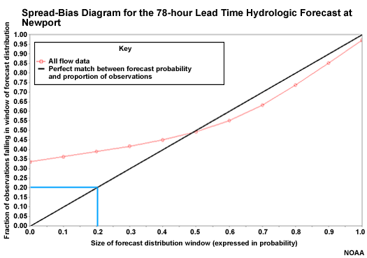
Another measure of forecast reliability uses the spread-bias diagram, sometimes called the cumulative Talagrand diagram.
The spread-bias diagram plots the proportion of observations that fall within a given segment of the ensemble forecast distribution. So for example, the 0.20 on the X axis represents the lowest 20% of forecasts. If there were 100 ensemble members, this would represent the lowest 20 of those members. The Y axis shows the proportion of observations that fall within or below that forecast segment, or window. If the forecast system were perfectly reliable, 20% of observations would fall in this window, and the point would be plotted on the diagonal. So the diagonal represents reliable forecasts.