Aggregation Outlier
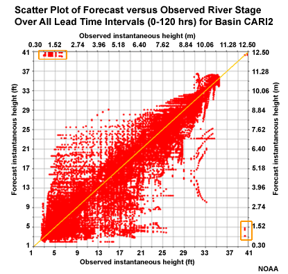
Let's look at why CAR12 may be an outlier from the MAE perspective. This scatter plot depicts correlation of forecasts and observations for the 5 lead days. We can see some outlier points in the upper left and lower right. These represent major errors either when the forecast was for a major event that did not occur, or a major event was observed but had not been forecasted. These erroneous forecast-observation pairs will impact the MAE and the correlation. However, the Mean Error graphic suggests that this basin is consistent with other basins in the group, and the MAE and correlation would be consistent if not for those few outliers.
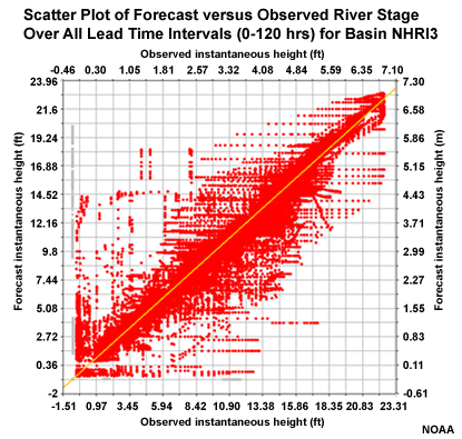
The NRRI3 station in the slow response group showed ME behavior that departed somewhat from the other basins in the group. Although the scatter plot of forecasts and observations for the 5 lead days shows some unsatisfactory correlation on the low end, there are no major outliers in the upper left or lower right corners. In fact the correlation looks reasonably good. Perhaps some of the behavior occurs due to some of the upstream controls affecting this basin. The MAE for this basin fits in well with the other basin in the group.