Produced by The COMET® Program
Introduction
Verification of hydrologic forecasts provides valuable information for both the forecasters and the users of the forecasts.

This information can be used by both of these groups to help with evaluating, improving, and using the forecast products.

Hydrologic forecast verification can apply to a variety of hydrologic concerns such as snowmelt runoff, water supply, and all categories of stream flows, including floods and low flows.
Verification Topics
- Distribution Properties
- Forecast Confidence
- Correlation
- Categorical Forecasts
- Accuracy (Error Statistics)
- Forecast Skill
- Conditional Verification
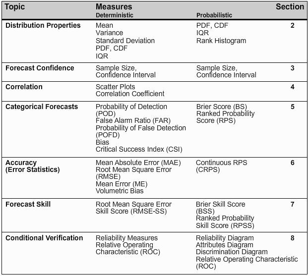
This module will review and explain the statistical measures and graphic displays associated with seven topics in hydrologic verification. These topics were defined by the National Weather Service (NWS) Verification Systems Requirements team and are covered in sections 2 through 8 of this module.
This section reviews the reasons to verify forecasts and introduces important concepts and terminology. We will examine the following questions:
- Why do we verify hydrologic forecasts?
- Why can't one number tell the whole story?
- What is a "good" forecast?
- What types of hydrologic forecasts are verified?
- What are the commonly used verification measures?
- What are the seven verification topics used by the NWS Verification Systems Requirements Team?
Why Verify?
Evaluation and Verification
There are three general motivations for evaluating hydrologic forecasts. One, to understand and quantify the accuracy and skill of the forecast. Two, to understand how well the information is being communicated to the users of the forecasts. And three, to evaluate the utility of the forecast in the context of the impact facing a specific user.
This module will focus on the first of these three motivations: understanding and quantifying forecast accuracy and skill. This is commonly referred to as forecast verification.
There are three primary reasons to perform forecast verification. One, to monitor forecast quality, which is to say measure the agreement between forecasts and observations. Two, to improve forecast quality by learning the strengths and weaknesses of the forecast system, and three, to be able to compare one forecast system with another.
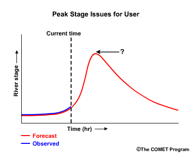
Whether a forecast is “good” can mean different things to different users and in different situations. A user of river forecasts might wonder, "Will the peak stage be exactly what the peak stage forecast calls for?
If the forecast is wrong, will the stage be higher or lower?
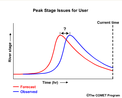
Do the forecasts usually capture the peak timing? If not is the observed peak early or late?
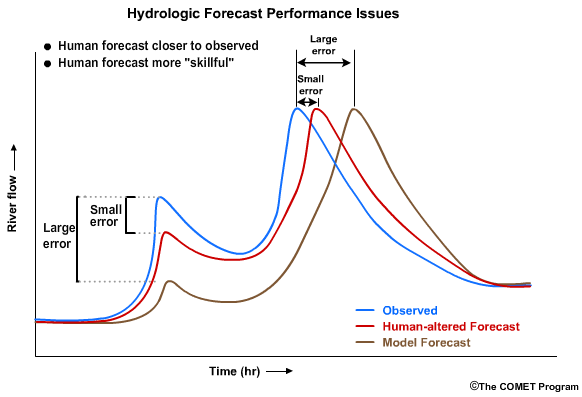
A forecaster, on the other hand, may want to know additional information such as, “Is the skill in our forecasts good even if the accuracy is less than perfect?” Or, in other words, “Am I doing better than some reference, such as the unadjusted model output?” In this hypothetical example, the difference in the first peak between the observed and the human-altered forecast is smaller than the differences between the observed peak and the model output.
This shows skill when compared to the model forecast. In the second peak, the human-adjusted forecast is also closer in timing to the observations than model forecast. Again, the human-adjusted forecast shows skill over the model forecast.
A forecaster can improve upon forecasts using verification, especially if consistent errors are identified.
Verification Purposes:
- Monitoring quality
- Reducing error
- Comparing forecast systems
So we can see how a forecaster can use forecast verification for the purposes of monitoring quality, reducing forecast error, and comparing forecast systems.
No 1-number Solution

Policy makers often want verification metrics to be represented with one number. (1) If you were to describe a house to someone, would it be sufficient to offer only the price as a description? Of course not.

Although the price is important , one would also want information such as age, number of rooms, size, condition, location...
and a photograph!
Likewise, in hydrologic verification, it is not enough to use only a measure of accuracy, like root mean squared error, to verify a hydrologic forecast. That's important, but so are measures of bias, data distribution, confidence, correlation, skill, discrimination, and reliability.
This module will hopefully convince you that good verification typically requires a look at several numbers and/or figures depending on the type of forecast issued and the information that is needed.
What is 'Good'?
What Is a "Good" Forecast?
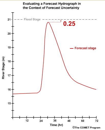
Let's go back to the simple question of how "good" is a forecast? Let's say the current forecast indicates that 24 hours from now the river will begin to experience a rapid 6-hour rise of 5 meters to a peak stage of 20.75 meters which is 0.25 meters below flood stage.
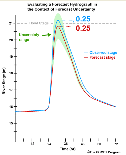
Now let's say the river rose with exactly the timing that was forecast, but the peak stage was 21.25 meters instead of 20.75 meters. That means that it peaked at 0.25 meters above flood stage instead of 0.25 meters below.Was that a good forecast? Of course, the answer depends on who is asking and in which context the forecast is being used. To a forecaster who has knowledge that high stage measurements on this river have a significant uncertainty range, this would likely be considered a good forecast.
To an emergency manager however, the river went over flood stage although it had not been forecast to do so.
Given the serious consequences of not preparing for flooding, this may be considered a bad forecast.
On the other hand, let's say the emergency manager knew through verification statistics that the peak stage forecasts are sometimes off by more than a half meter. Combined with the knowledge that there is high uncertainty for these high-stage forecasts, the emergency officials may decide that being within 0.25 meters of flood stage is close enough to warrant emergency preparation.
Forecast Types
Additional Resources:
See Ensemble Streamflow Prediction module for more information about
ensemble forecasts.
Types of Hydrologic Forecasts to Verify
Forecast types:
- Deterministic
- Single value
- Probabilistic
- Multiple values
We consider two types of forecasts, deterministic and probabilistic. Deterministic forecasts are single-value predictions with no information about uncertainty in that single value. Probabilistic forecasts consist of multiple values or probabilities describing the range of possible outcomes.
How a forecast is verified depends on which type of forecast it is. We will go through a simple example of the differences here, but you are encouraged to review online material about probabilistic forecasts.
Additional Resources:
See Ensemble Streamflow Prediction module for more information about
ensemble forecasts.
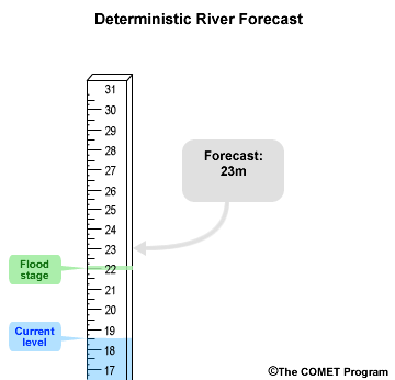
An example of a deterministic forecast for peak river stage might look something like, "the river will crest at a stage of 23 meters.” There is a single value, 23 meters, and there are two possible outcomes: 1) it will crest at 23 meters or 2) it won’t crest at 23 meters.
If an important threshold such as flood stage is forecast to be exceeded, the deterministic forecast does not provide a measure of uncertainty. In this case, a flood is forecast with implied certainty because the forecast stage of 23 meters is above the flood stage of 22 meters.
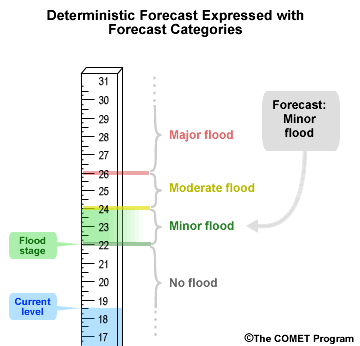
Both deterministic and probabilistic forecasts can be expressed as categorical forecasts. In other words, we can divide up the range of possible values into distinct categories.
In this example we have four categories: no flood, minor flood, moderate flood, and major flood. Using our example of a deterministic stage forecast of 23 meters, we can see our categorical forecast is for a minor flood because 23 meters falls within the minor flood category.
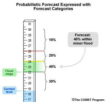
Probabilistic forecasts are associated with a probability. In this example, that would be the probability for stage values. If we express a hypothetical probabilistic forecast with the same forecast categories we just used for the deterministic forecast, we may get something like this where there is a 40% chance of the forecast stage being in the minor flood category. That means there is a 60% chance that the observed stage will be outside the minor flood category, either above or below.
The probabilistic forecast for a minor flood provides a measure of uncertainty. The deterministic forecast implied a minor flood with certainty.
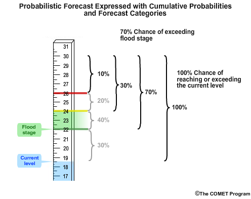
Now let’s introduce the concept of cumulative probabilities that is used in the next section. In this case, there is a 10% chance of exceeding 26 meters. There is a 30% chance of exceeding 24 meters, which is just the sum of probabilities in the highest two stage categories. Likewise there is a 70% chance of exceeding the flood stage of 22 meters, because it is the sum of probabilities in the top three categories. Finally there is a 100% chance of reaching or exceeding the current level of 18.5 meters.
A probabilistic forecast does not need to be associated with categories. There can be probabilities associated with specific stage values.
Verification Measures
Verification Topics/Measures
There is a wide variety of verification measures used. We have grouped these based on the forecast attribute that the user needs.
The NWS Verification Systems Requirements Team came up with a list of seven topics within hydrologic verification. This table shows the topics and associated verification measures. Those topics are distribution properties, confidence, correlation, categorical statistics, accuracy, skill, and conditional performance.
Sections 2.0 through 8.0 of this module will detail each of the seven topics in the table.
Additional Resources:
National
Precipitation Verification Unit (NPVU) Help Guide to Understanding Verification Graphics
Distribution Properties
This section covers the distribution properties of forecasts and observations. This is one of seven important topics to consider when verifying hydrologic forecasts.
Distribution properties provide information about observed and forecast values such as: numerical range, extrema, and typical values. By examining distribution properties, we get information about the spread of values across a range of possible values.
Measures of Distribution Properties:
| Deterministic | Probabilistic |
|---|---|
| Mean | |
| Variance | |
| Standard Deviation | |
| Probability Density Function (PDF) and Cumulative Distribution Function (CDF) | Probability Density Function (PDF) and Cumulative Distribution Function (CDF) |
| Interquartile Range (IQR) | Interquartile Range (IQR) |
| Rank Histogram |
The selection of measures may depend on whether it is deterministic or probabilistic forecasts that are being verified. For probabilistic forecast verification in particular, the Probability Density Function, Cumulative Distribution Function, Interquartile Range, and the Rank Histogram are especially relevant.
Mean/Variance
Mean, Variance, Standard Deviation
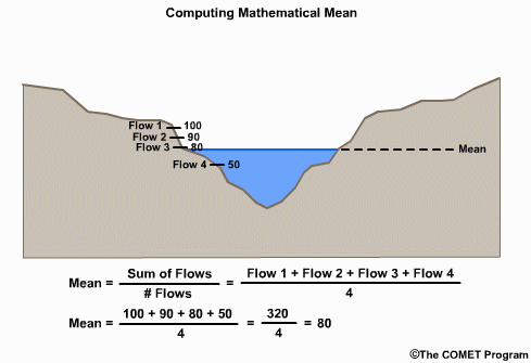
For deterministic forecast verification, common measures for assessing the spread and distribution of values include the mean, the variance, and the standard deviation. The mean is the sum of the values divided by the number of values. This value is used to compute variance and standard deviation.
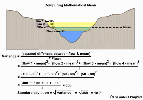
Variance is a measure of the spread of values around the mean. It is calculated as the average squared difference of the value from the mean. It is also called the deviation from the mean. If the values are all very close to the mean, then the variance is small.
The standard deviation is the square root of the variance, and is often used to quantify how typical or atypical the specific value is. When using standard deviations, about 67% of values should fall within one standard deviation of the mean, and about 95% should fall within 2 standard deviations of the mean, assuming a normal distribution. So if a value is 2 standard deviations from the mean, it is an atypical value, one that occurs 5% or less of the time.
Of course, hydrologic variables typically do not exhibit normal distributions. However, the mean and variance can still offer a good summary of the data.
Question
1. Compared to a river with very consistent flows, a river with large fluctuations in
flow from year to year would have a _____ variance even though the mean flow _____.
Choose the best answer.
The correct answer is a)
PDF/CDF
Probability Density Function (PDF) and Cumulative Distribution Function (CDF)
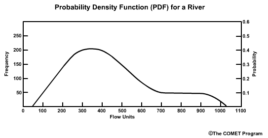
The Probability Density Function (PDF) and the Cumulative Distribution Function (CDF) display the probability functions of some continuous variable. In the context of forecasts, they may display the distribution of forecast values.
We will start our discussion of PDF and CDF using normal distributions. Then we will go into the more realistic skewed distributions that we typically see with hydrologic variables.
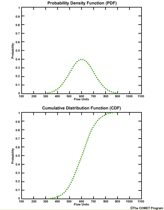
In both plots the x axis is graduated in units of the data itself, in this case flow units such as cubic meters per second or cubic feet per second. The y axis is the probability from 0 (meaning no chance) to 1.0 (meaning 100% chance).
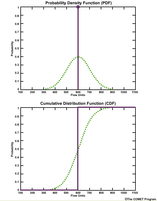
Let’s start with a simple case of a deterministic forecast that calls for a flow of 600 flow units. On the PDF plot there is one point with a probability of 1.0 at the value of 600 units. The plot is a single vertical line. On the CDF plot there is one line with a probability of 0.0 for all flow values less than 600 units, and then the cumulative probability becomes 1.0 at values of 600 units or greater.
PDF and CDF plots:
- Can be constructed from either probabilistic forecasts, or multiple single-value, deterministic forecasts
- For multiple forecasts they represent the distribution of those forecasts
But the PDF and CDF plots are typically used for more than one forecast value. That’s why these curves show a spread of values as the probability changes. These plots can be constructed from either probabilistic forecasts, or multiple single-value, deterministic forecasts. When using multiple forecasts, the PDF and CDF plots represent the distribution of those forecasts.
Later we will see how we can use a CDF for multiple forecasts or for probabilistic forecasts and compare this to a single-value observation. That will be the basis for a metric called the Ranked Probability Score.
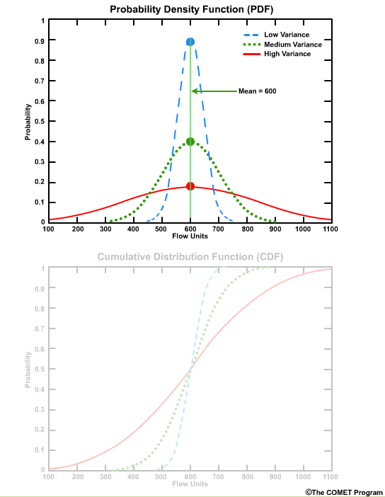
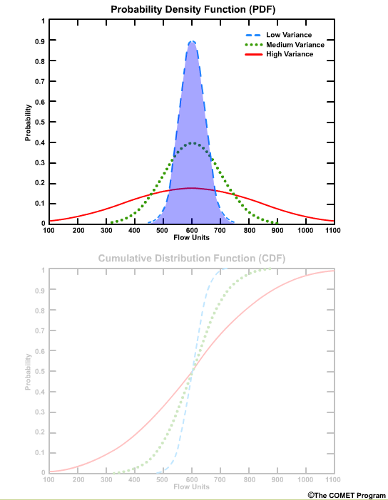
The PDF highlights which values have the highest frequency of occurrence. For these curves those values are near 600 units.
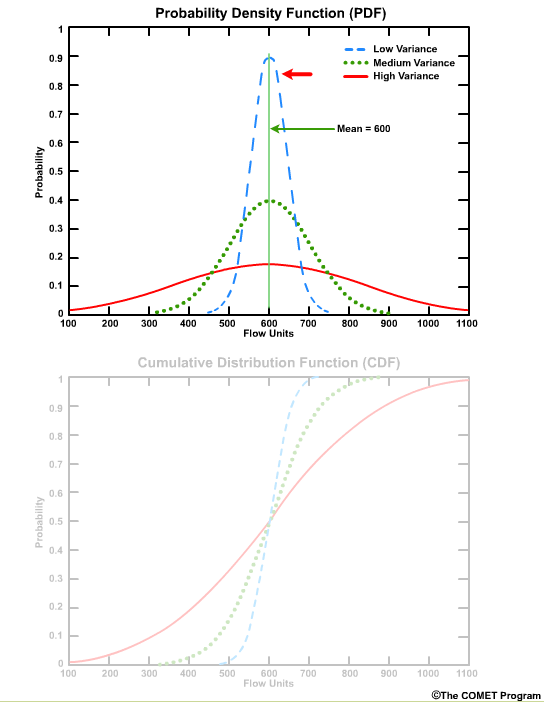
The PDF also shows how the values are distributed around the mean. A sharp, narrow peak would indicate a small standard deviation, or highly confident forecasts.
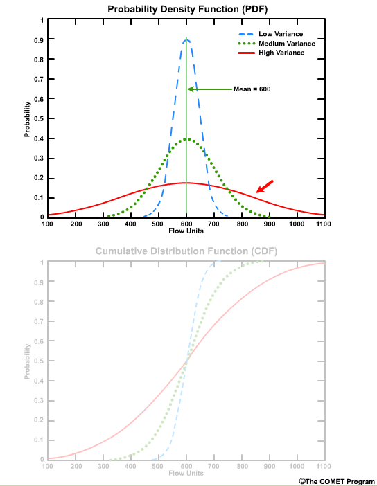
A broad low peak would indicate a larger standard deviation, or greater forecast uncertainty in the stream flow.
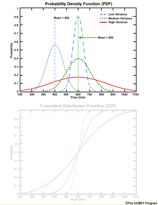
If the peak occurs at a different place on the x axis that would indicate a different mean value.
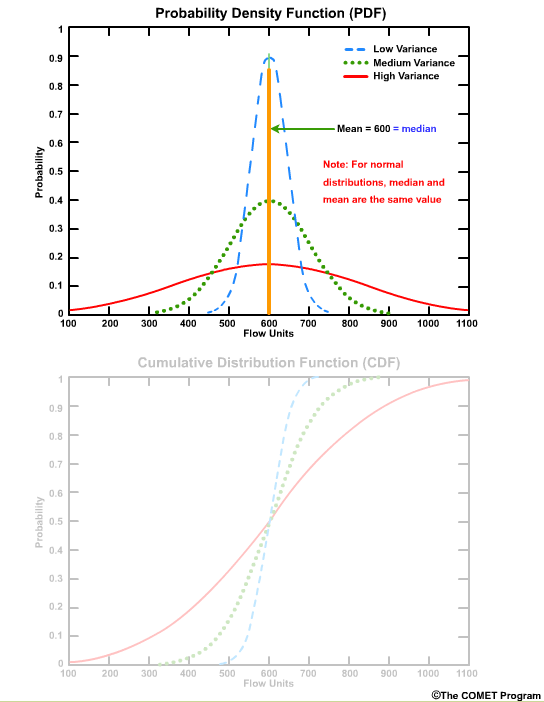
Because these are normal distributions, the median and the mean are the same value.
The area under the PDF curve integrates to 1.0. This is an important characteristic in that the entire spectrum of data is represented by the shape of the curve.
The corresponding CDF plot shows the cumulative probability for a given flow threshold.
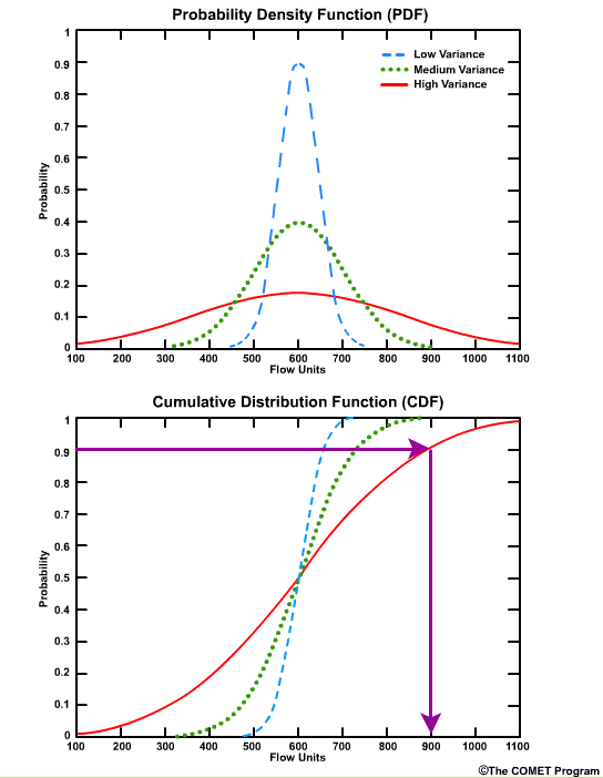
For example, for the high variance graph, there is a 90% probability that we will see a flow value of 900 flow units or less. This can also be seen as a probability of non exceedance. In other words, there is a 90% probability of not exceeding 900 flow units.
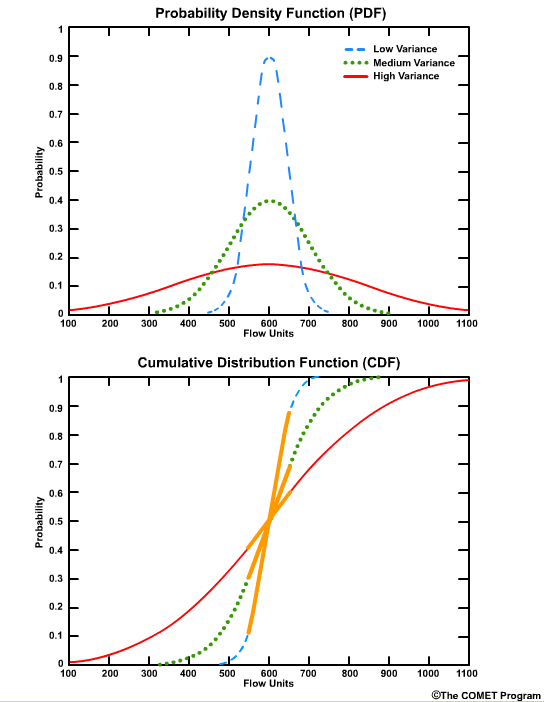
The greatest positive slope corresponds to the value that occurs most frequently, which is centered on 600 units for these curves.
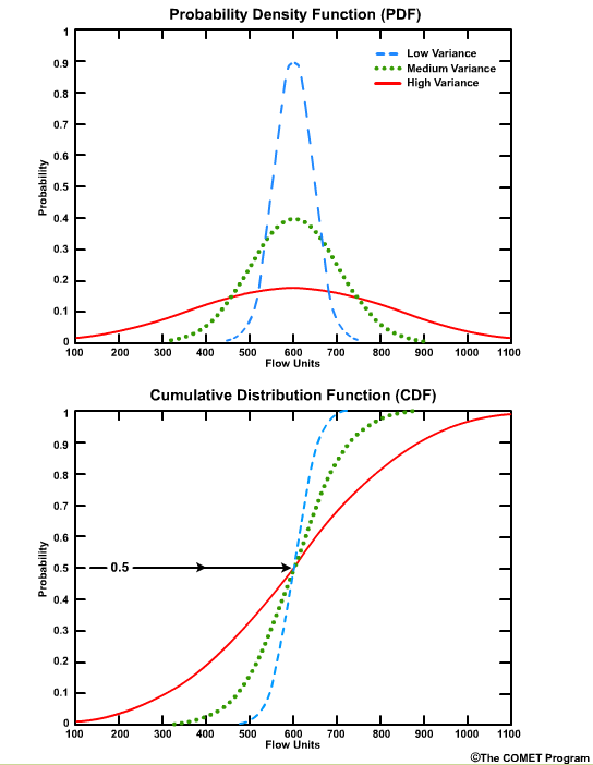
The median value corresponds to the cumulative probability value of 0.5 on the CDF, because by definition the median is the point where half of the values are higher and half are lower.
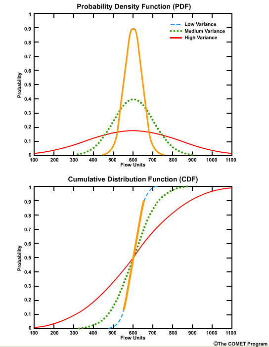
CDF curves for datasets with small variances cover a smaller range of values on the x axis and are seen as faster-rising curves.

Larger variances are depicted with less steeply sloped curves and cover a larger range of values on the x axis.
Real PDF/CDF
Of course, real world CDF and PDF plots aren't that simple because hydrologic variables, like river flow, are not characterized by normal distributions. A PDF of real flow data is likely to have more spread toward the high end.
Note that sometimes the Y-axis on the PDF is expressed as frequency. This is just the probability multiplied by the sample size.
The median and mean values are not equal to each other when we have a skewed distribution. Remember the median is the point at which half of the flow values are higher and half are lower. Because this river flow record is skewed to the higher end flows, the median of 350 flow units is on the low end of the possible range which runs from roughly 50 to 1050 flow units. As we see in skewed distributions, the mean flow, which is about 440 flow units in this example, is different from the median flow value. In this case the mean value is greater than the median, which is the typical case for many river flow datasets. And as with the median, there are greater differences between the mean flow and high flows than there is between the mean flow and extreme low flows.
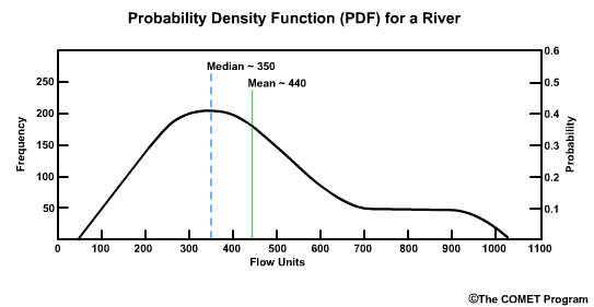
Because the median is less affected by the skewed spread of flow values, it is often considered more representative of the dataset than the mean value.
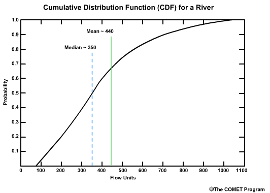
The shape of CDF plot that corresponds with this PDF indicates the skewing toward higher flows. There is a greater slope on the left side of the plot where you have the greatest frequency of flow values. On the right side, the graph flattens out for the less frequent high flow values. Note the mean and median values are plotted here too.

Viewing the PDF and CDF together we can see the relationship. The high frequency of occurrence on the PDF corresponds to the steep slope in the CDF curve. The long tail on the right side of the PDF curve is seen as a flattening of the CDF slope.
Question 1 of 3
Refer to the PDF plot above to answer this question.
Of the following flow values, which has the highest probability?
Choose the best answer.
The correct answer is b)
Question 2 of 3
Refer to the PDF plot above to answer this question.
The highest probability flow on the PDF always corresponds to _____
on the CDF.
Choose the best answer.
The correct answer is d) the steepest slope
Peaks on the PDF curve correspond with rapid increases in probability (steep slope) on the CDF curve. Although on this plot it seems the correct answer can be “b”, that is not true for all datasets. In highly skewed datasets, the median may be more obviously displaced from the peak probability. Only “d” is the correct answer for all datasets.
Question 3 of 3
Refer to the PDF plot above to answer this question.
Look at the CDF curve, about what percentage of flow values have
occurred below the median value?
Choose the best answer.
The correct answer is c) 50
The median is by definition a value for which half the values in the dataset are higher and half are lower. It is considered more representative of the dataset than the mean value.
IQR
Interquartile Range (IQR)
- Standard deviation not appropriate for skewed distributions
- Use Interquartile Range (IQR)
Because hydrologic variables rarely exhibit normal distributions, using measures of variance and standard deviation can be misleading. The interquartile range, or IQR, can be used to depict data with skewed distributions.
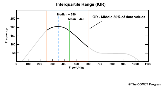
Here the value of 250 flow units is the first quartile, Q1, or the 25th percentile. To the left is the lower 25% of data values. In other words, if there were 100 values, this would be the 25 data points with the lowest values. The value of 600 flow units is the third quartile, Q3, or the 75th percentile. To the right is the upper 25% of values in the distribution.
The IQR represents the middle 50% of values between Q1 and Q3, in other words, between 250 and 600 flow units. The IQR is expressed as the difference between the first and third quartiles: IQR = Q3 - Q1. In this example the IQR is 600 minus 250, which equals 350.
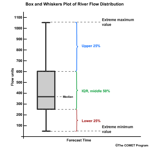
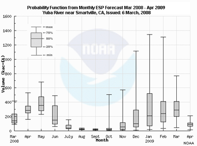
The distributions associated with the IQR are typically displayed as a box and whiskers plot. The y axis is the data value and the x axis is typically the forecast time. The "box" represents the interquartile range, with the median shown by the horizontal line. The whiskers represent the 25% of values on the high and low end outside the IQR. The extrema of the whiskers represent the maximum and minimum values. Because in our river example the values tend to be skewed to the high end, notice that the high-end whisker is longer.
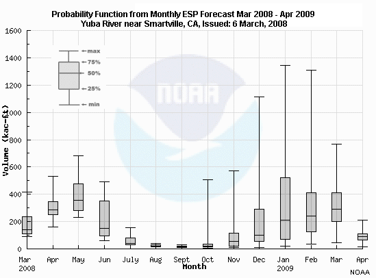
Here is a box and whiskers plot of snowmelt volume (in thousands of acre-feet) on the Yuba River near Smartville, CA.
Question 1 of 2
What are the general tendencies for data distribution?
Choose the best answer.
The correct answers are c) and d)
Question 2 of 2
What can we say about the data representing the forecast snowmelt volume
(in thousands of acre-feet) in June 2008?
Choose the best answer.
The correct answers are a) and c)
Rank Histogram
Additional Resources:
See Ensemble Streamflow Prediction module for more information about
ensemble forecasts.
- Probabilistic forecasts often involve ensemble forecasts, e.g. Ensemble Streamflow Prediction
- Ensemble spread – The range of possibilities in an ensemble forecast
- What is an appropriate ensemble spread?
- Use a rank histogram
For probabilistic forecasts, we are often dealing with ensemble forecasts; for example, the forecasts produced by the Ensemble Streamflow Prediction system.
The range of forecast values in an ensemble forecast is referred to as an ensemble spread.
What is an appropriate ensemble spread? To help answer this question we use a rank histogram, sometimes called a Talagrand Diagram.
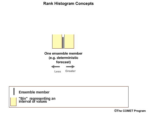
In the simplest case, we have one ensemble member which is associated with two forecast bins, one greater than and one less than the forecast value. This is a deterministic forecast.
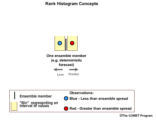
Now let's assume we have two forecast-observation pairs. In a perfectly calibrated ensemble system, one observation would fall in the high bin, and one in the low bin.
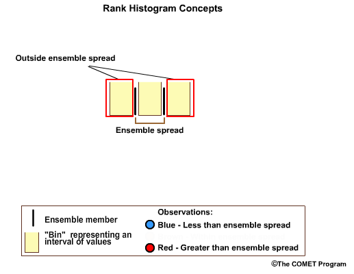
If we had two ensemble members, we would have three forecast bins. Two out of three forecast bins will fall outside of the ensemble spread. The middle bin covers the range between the two ensemble members.
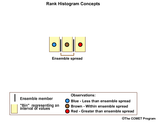
Now let's assume we have three observations. In a perfectly calibrated ensemble system, one observation would fall in the high bin; one would fall in the middle bin, and one in the low bin. The one in the middle bin is within the ensemble spread.
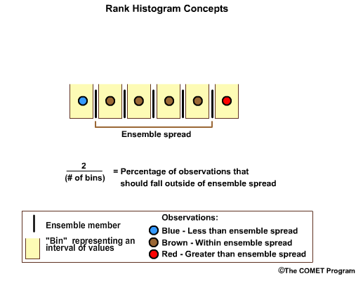
If there were five ensemble members, and therefore six forecast bins, two out of the six forecast bins will fall outside of the ensemble spread. This time let's assume we have six observations. We want one observation in the high bin, one in each of the four middle bins, and one in the low bin. The four in the middle bins are within the ensemble spread.
For any well-calibrated ensemble forecast the percentage of observations that should fall outside the ensemble spread is two divided by the number of bins.
Question
So if you had 39 ensemble members, associated with 40 forecast bins, what percentage
of observations should fall outside the ensemble spread in a well-calibrated system?
Choose the best answer.
The correct answer is a) 5%
In a well calibrated system each bin will have the same number of occurrences. So the percentage that falls outside the ensemble spread will be 2 divided by the number of bins, which is 40, and that comes out to 0.05, or 5%.
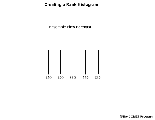
In reality, there is typically more than one observation in each forecast bin. Let's consider a 5-member ensemble forecast for flow.For this example, we’ll use flow unit forecasts that are in whole numbers. The ensemble members are: 210, 200, 330, 150, and 260 units.
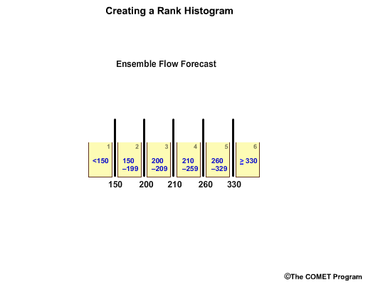
To make a rank histogram, we first order the ensemble members, in this case, from lowest to highest which gives us 6 bins that represent ranges for less than 150, 150 – 199, 200 – 209, 210 – 259, 260 – 329, and greater than or equal to 330.
Note how the bins have unequal value ranges. For example, bin 3 only ranges from 200-209, while bin 5 spans a much larger range from 260-329.
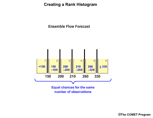
But each bin has equal chances for the same number of observations in a well-calibrated forecast system. So, there is equal chance of a flow value in the 200-209 range as there is in the 260-329 range.
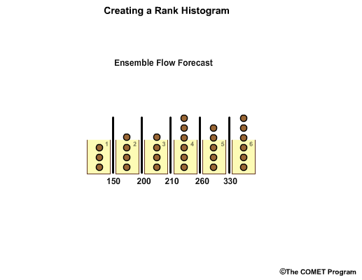
Observations are placed in the appropriate bin.
In this case we have varying number of observations in each.
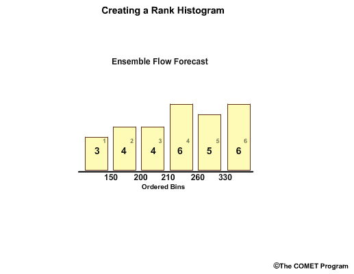
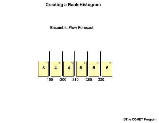
So now we have a bar graph plot showing the frequency of observations per forecast bin. For example, in bin 1, flows less than 150, the bar graph shows us that there have been three observations that fall within this range.
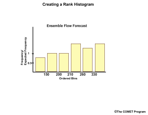
Next, we create a y axis to represent frequency of observations. We now have a rank histogram, also referred to by some as the Talagrand diagram.
Often the y axis is expressed as frequency divided by expected frequency.
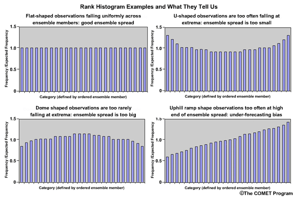
So how should a rank histogram be interpreted? The rank histogram provides information about the distribution of observations associated with the ensemble forecasts. Let's look at some idealized rank histograms.
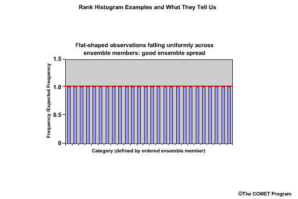
The perfect distribution of observations in ensemble forecasts would show the same frequency for each bin. And, if the y axis is expressed as frequency over expected frequency, the bar graphs would each be at a value of 1.0.
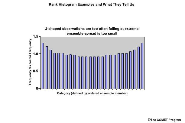
If the rank histogram appears to have a "U" shape, this indicates too many observations falling at the extremes. The ensemble spread is too small and needs to be larger.
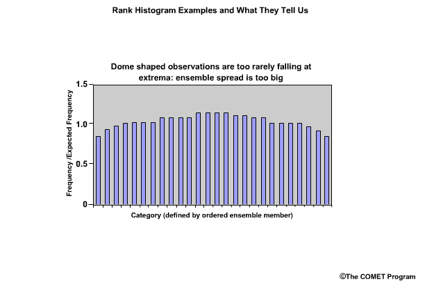
Conversely, what if the rank histogram exhibited an inverted U shape, or dome shape? This would indicate that not enough observations are falling at the extremes. The ensemble spread is too large and should be smaller.
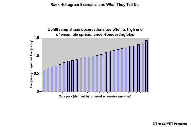
If the rank histogram shows greater frequencies toward the right end and takes on an uphill ramp shape, this indicates that observations are too often in the high end of the ensemble spread, and there is under-forecasting.
Conversely, if the rank histogram shows greater frequencies toward the left end and takes on a downhill ramp or "L" shape, this would indicate that observations are too often in the low end of the ensemble, and there is over-forecasting.
An important caveat with rank histograms is that they require a large number of forecast – observation pairs. Rank histograms created with fewer pairs than there are ensemble members are essentially useless.
Review Question
Question
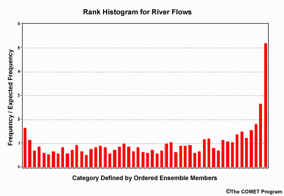
How would you interpret this rank histogram in terms of how appropriate the ensemble
spread is and what it tells you about the forecasts?
Choose all that apply.
The correct answers are a) and c)
The "U" shape tells us that the ensemble spread is too small because there is a higher frequency of observations falling at the extrema. This is especially notable at the high end which tells us that there tends to be more observations of high flows than the ensemble forecasts are suggesting, thus there is underforecasting.
Confidence
This section covers the measures of forecast confidence. This is one of the seven important attributes to consider when verifying hydrologic forecasts.
Confidence statistics provide a measure of the certainty that the forecast value will fall within the expected range of values. The degree of confidence is related to the number of samples in the dataset.
Measures of Forecast Confidence:
| Deterministic | Probabilistic |
|---|---|
| Sample Size | Sample Size |
| Confidence Interval | Confidence Interval |
The measures described in this section apply to either deterministic or probabilistic forecast verification.
Sample Size
- Number of forecast-observation pairs to be used
- Minimum number of samples required for confidence
- The larger the sample size, the more likely that the full range of possibilities is represented
Sample size refers to the number of forecast-observation pairs used in a particular verification method calculation. The word sample is important. It suggests a larger set of data is being represented by the subset (or sample) used for particular calculations. There is a minimum number of samples in a dataset required to ensure a certain confidence in the forecasts. The larger the sample size, the more likely it is that the data will represent the full range of possibilities.
For example, if there is a forecast of a major flood event, there is typically a greater amount of uncertainty because major flood events are generally not sampled very often. A small sample size often leads to greater uncertainty in the verification statistics and consequently lower confidence in the forecast.
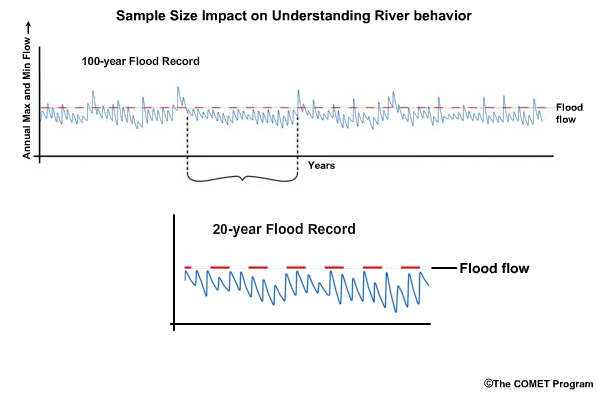
If there is 100 years of stable flow record, there is a reasonable chance that the behavior of the river is understood. Uncertainty goes down and forecast confidence increases. Conversely, if there is only 20 years of flow record, there is less chance than in the 100-year record that the range of possible flows has been sampled. Under-sampling the range of possibilities leads to greater uncertainty in the forecasts.
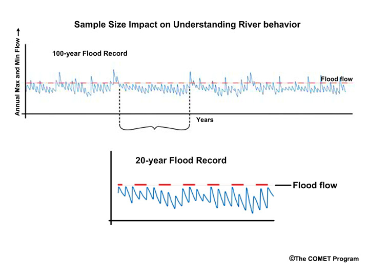
Question
Consider this 20-year period from our longer record. Why do you think the subset of
data may present problems when trying to understand the river behavior?
Choose all that apply.
The correct answers are c) and d)
The river did not experience any flood flows. It also didn't experience any extreme low flows. Therefore this 20-year period is not representative of the river behavior we see in the longer record.
Confidence Interval
- Confidence Interval: range of values that includes the true value
- Confidence Level: prescribed probability with the confidence interval
- These help with expressing forecast uncertainty
The confidence interval allows us to express a forecast as the range of values that includes the observation, or true value, with a prescribed probability. The prescribed probability is known as the confidence level. In this way, there is an expression of uncertainty.
So a forecast may read, “there is a 95% chance that the snowmelt peak flow will be 800-1000 cubic meters per second (cms).”
The confidence interval is the range of values, 800-1000, and the confidence level is 95%.
Question
The river stage forecast says there is a 95% chance that the peak stage will be
between 16 and 20 meters.
The confidence interval is _____, and the confidence level is _____.
Choose the best answer.
The correct answer is a) 16-20 m | 95%
Trade Off
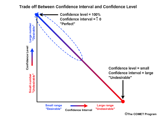
There is a trade off between confidence level and confidence interval. The desirable forecast would have a confidence level of 100% and a confidence interval of ±0. This means that you are absolutely confident that one exact value will occur.
An undesirable forecast would be one that is associated with a low confidence level and a large confidence interval. This would suggest that there is very low confidence in a forecast despite the forecast having a large range of values that can verify as correct. In other words, it's like saying that you are 10% confident that the snowmelt peak flow will be between 100 and 1000 cms.
We want forecasts to have high confidence levels and small confidence intervals. This will typically come with the greater experience that requires a large sample size.
Question
Let's go back to our forecast of a 95% chance for a peak stage of 16-20 meters. Let's
say we want our confidence level to be 99%. Ideally, what should happen to our confidence interval of 16-20 meters?
Choose the best answer.
The correct answer is c) The range would decrease.
CI for Statistics
Confidence Interval for Statistics
- Confidence measures for the statistics
- 95% chance that the mean error is between 15 and 18 cubic meters per second
- Small sample size >> greater uncertainty
- Greater uncertainty >> less confidence
In addition to the confidence interval of the forecasts, there are also confidence intervals for the statistics. The statistical confidence interval expresses the probability that the statistical estimate falls within the specified limits. Such measures may read something like this, “There is a 95% chance that the mean error for the flow forecasts is between 15 and 18 cms.”
A small sample of forecast-observation pairs may not adequately represent the full range of possible conditions simply due to random chance. Uncertainty for verification statistics is larger for small sample sizes. Greater uncertainty in verification is associated with less confidence in the forecast.
Correlation
This section covers the correlation measures and how they relate to hydrologic forecast verification. Correlation is another one of the seven important verification topics to consider when verifying hydrologic forecasts.
Correlation provides a measure about the degree that two variables, in our case, forecasts and observations, are related.
Measures of Correlation:
| Deterministic | Probabilistic |
|---|---|
| Scatter Plots | |
| Correlation Coefficient |
This section applies to deterministic forecast verification only.
Meaning
Meaning of Correlation
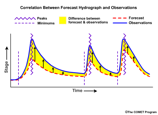
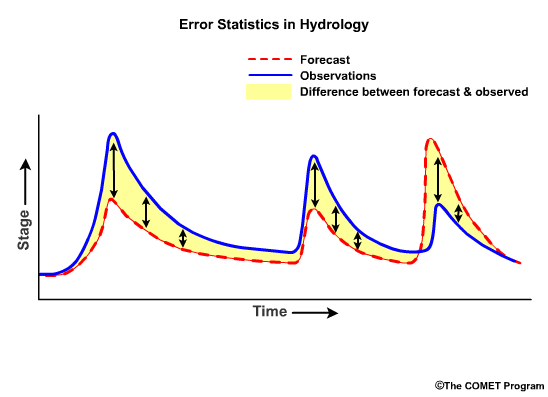
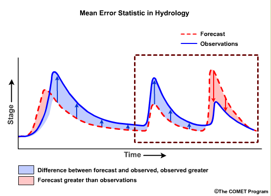
Correlation is a measure of how well patterns and trends in the forecasts match the observations. Well correlated forecasts may be accurate. However, a forecast may correlate well with observations but still be inaccurate. For example, in this hydrograph time series, the peaks and troughs show similar trends in both forecasts and observations, but the observed magnitudes of flows are different from the forecasts. The forecasts are consistently too low. In this case, the forecast and observations are well correlated but the forecasts contain consistent errors.
Scatter Plots
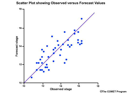
Scatter plots are a fast way to view the relationship between two variables. In forecasting, the two variables are typically the forecast and observed values. There are several types of scatter plots. The most common presents the forecast values on the y axis and the observed values on the x axis. The closer the points line up along the positively-tilted diagonal line, the greater the positive correlation is between observed and forecast values.
Correlation Coefficient
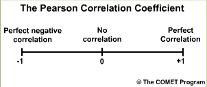
The Pearson Correlation Coefficient measures the strength of the linear relationship between the forecasts and the observations. In other words, when the forecast values go up do the observations go up? When the forecast values show a peak, do the observations show a peak?
The values range from -1 to +1. A value of 1.0 indicates perfect correlation. A value of 0.0 indicates no correlation; meaning that there is no statisitical relationship between the forecasts and the observations. A value of -1.0 indicates perfect negative correlation; meaning that if the forecasts are for high flows the observation are always low flows.
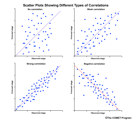
The correlation coefficient gives us a numerical measure of correlation. The scatterplots provide a graphical representation of correlation. Let's look at how scatter plots of observed versus forecast flows would appear for different correlation coefficient values.
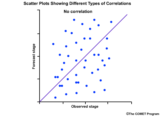
This scatter plot shows no relationship between the forecast and observed values, and the correlation coefficient is 0.0.
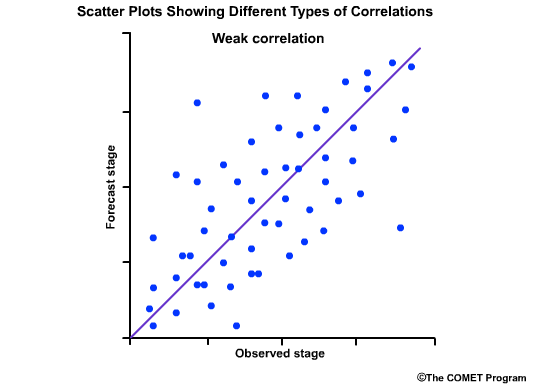
This one shows a weak positive correlation. That is, there is a positively-sloped diagonal line that can be drawn through the scatter plot, although there is still a large amount of scatter around that line. The correlation coefficient is a small positive number.
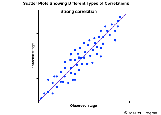
This next scatter plot shows the points lining up close to the positively-sloped diagonal line. This is indicative of good correlation between forecasts and observations, and thus the correlation coefficient is a positive number close to 1.0.
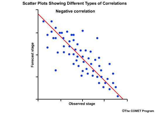
The final scatter plot shows points lining up along the negatively tilted diagonal line. This indicated a negative correlation between forecasts and observations and it would be represented by a correlation coefficient approaching minus1.0.
Review Questions
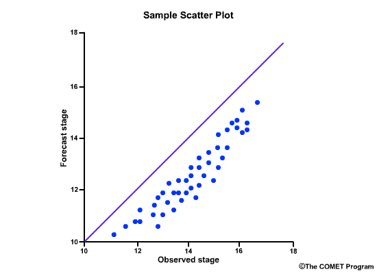
Consider this scatter plot of observed stage versus forecast stage.
Question 1 of 2
What does it tell you about the correlation?
Choose the best answer.
The correct answer is b)
Question 2 of 2
What does it tell us about the error?
Choose the best answer.
The correct answer is d)
Categorical Forecasts
This section covers the verification of categorical forecasts. Categorical forecast verification statistics make up one of seven important topics to consider when verifying hydrologic forecasts.
Correlation provides a measure about the degree that two variables, in our case, forecasts and observations, are related.
Measures of Categorical Forecasts:
| Deterministic | Probabilistic |
|---|---|
| Probability of Detection (POD) | |
| False Alarm Ratio (FAR) | |
| Probability of False Detection (POFD) | |
| Bias | |
| Critical Success Index (CSI) | |
| Brier Score (BS) | |
| Ranked Probability Score (RPS) |
Categorical forecast verification methodologies can be applied to either deterministic or probabilistic forecasts. Some scores are used specifically with deterministic forecast verification, and others are used with probabilistic forecasts.
Deterministic/Probabilistic
We will look at both deterministic and probabilistic examples for a location where the flood stage is equal to 22 meters.
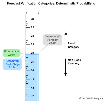
Let's say the deterministic peak stage forecast was for 22.1 meters, or 0.1 meters above flood stage.
If the corresponding observed peak stage was only 21.9 meters, then there was no flood observed because we are 0.1 meters below flood stage. In this case the forecast would go in the flood category and the observation would go in the non-flood category.
Although the deterministic forecast was very close to the observed stage value, using the categorical threshold of greater than or equal to flood stage, the forecast would count as a false alarm.
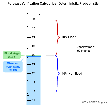
Now let's consider a probabilistic forecast for the same situation. Our probabilistic forecast was for a 40% chance of less than the flood stage of 22 meters, and a 60% chance of being in the flood category of greater than or equal to 22 meters.
Just like in deterministic forecast verification, we want to compare these probabilistic forecasts with observations. But a single observation doesn't come in a range of probabilities. Either the event happened or it didn't. Therefore, we use probabilities of 100% to represent the observed occurrence or 0% to represent the observed non-occurrence. So in our case, if flood stage of 22 meters had been reached or exceeded, then the observation would have been a 100% chance of a flood. But our observed peak stage of 21.9 meters stopped just short of flood stage, and thus the observation is for a 0% chance of flooding. Instead of a complete false alarm as we saw with the deterministic example, the probabilistic forecast had a 40% chance of being below flood stage, which is what was observed.
Contingency Test

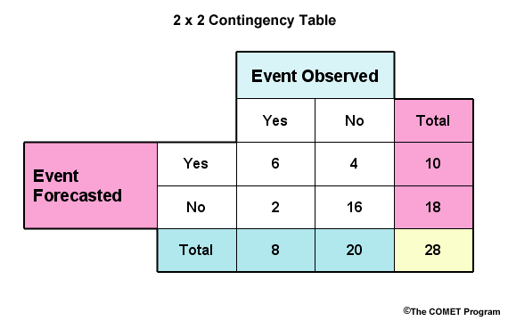
Contingency tables are used to describe the distribution of forecasts and observations in terms of their frequencies for the different categories. For verification with two categories, the 2X2 contingency table is commonly defined. It is for a yes/no configuration; for example; flood/no flood.
For this simple yes/no table, the rows represent forecast categories and the columns represent categories for observations. In a flood/no flood categorization, "Yes" represents "flood", either observed and/or forecast. "No" represents "no flood" either observed and/or forecast. The "a" bin indicates the number of observed floods that were correctly forecast to be floods, or hits. The "b" bin indicates the number of observed non-floods that had been incorrectly forecast to be floods, or false alarms. The "c" bin indicates the number of observed floods that were forecast to be non-floods, or misses. The "d" bin indicates the observed non-floods that were correctly forecast to be non-floods, or correct negatives. "a+c" and "b+d" are the total observed floods and non-floods respectively. "a+b" and "c+d" are the total forecasted floods and non-floods respectively.
Cont. Table Scores
- Probability of Detection (POD)
- Hit rate
- Proportion of observed floods that were forecast to be floods
- POD = a/(a+c)
- 0 (worst) to 1 (perfect)
- False Alarm Ratio (FAR)
- Proportion of forecasted floods that were not observed to be floods
- FAR = b/(a+b)
- 0 (perfect) to 1(worst)
Two common scores are the Probability of Detection, POD, and the False Alarm Ratio, FAR.
The POD, or hit rate, in the case of flood/no flood, is the proportion of observed floods that were forecast to be floods. From the 2X2 contingency table, the POD is calculated as a/(a+c). The POD can range from a worse case of 0 to a perfect score of 1, or 100%.
The FAR in our case is the proportion of forecasted floods that were not observed to be floods. It is calculated as b/(a+b). A perfect score is 0 and the worst possible score is 1.
- Critical Success Index (CSI)
- Proportion of correctly forecast floods over all floods, either forecast or observed.
- CSI = a/(a+b+c)
- 0 (worst) to 1 (perfect)
- Probability of False Detection (POFD)
- Probability that given a flood did not occur, it was forecast to occur
- POFD = b/(b+d)
- 0 (perfect) to 1 (worst)
- POFD sometimes called False Alarm Rate which is NOT the same as False Alarm Ratio
- Bias
- Ratio of all forecast floods over all observed floods
- Bias = (a+b)/(a+c)
- 0 (low bias) to 1 (perfect score) to infinity (high bias)
Other scores that are commonly computed are the Critical Success Index, CSI, the Probability of False Detection, POFD, and the bias.
The CSI is sometimes referred to as the Threat Score. In the two-category case of flood versus no-flood, it is the proportion of correctly forecast floods over all floods either observed or forecast. It is a way to focus on forecast performance for rare events, without the statistical score being dominated by the correctly forecast negative events. For example, it may be useful when verifying major floods.
From the contingency table, this is expressed as a/(a+b+c). The value can range from a worst case of 0 to a perfect score of 1.
The POFD is the proportion of observed non-floods that had been forecast to be floods. This is given by b/(b+d). The values can range from a perfect score of 0 to a worst case of 1. This is sometimes called the False Alarm Rate and should not be confused with the False Alarm Ratio.
The bias, in our case, is the total number of forecast floods over the total observed floods, or (a+b)/(a+c). The values can range from zero to infinity. A score of 1 is the perfect score. This indicates no bias. In other words, the number of observed floods is the same as the number of forecast floods. Values <1 indicate a low bias, meaning there were more observations than there were forecasts of floods. Values >1 indicate a high bias, meaning floods were forecast more often than they were observed.
| Score | Table | Formula | Criteria | Description |
|---|---|---|---|---|
| Probability of Detection (hit rate) | POD | POD = a/(a+c) | 0 (worst) to 1 (perfect) | Proportion of observed floods that were forecast to be floods |
| False Alarm Ratio | FAR | FAR = b/(a+b) | 0 (perfect) to 1(worst) | Proportion of forecast floods that were not observed to be floods |
| Critical Success Index | CSI | CSI = a/(a+b+c) | 0 (worst) to 1 (perfect) | Proportion of correctly forecast floods over all floods, either forecast or observed |
| Probability of False Detection (false alarm rate) | POFD | POFD = b/(b+d) | 0 (perfect) to 1 (worst) | Proportion of observed non-floods that were forecast to be floods |
| Bias | Bias = (a+b)/(a+c) | 0 (low bias) to 1 (perfect score) to infinity (high bias) | Ratio of all forecast floods over all observed floods |
So consider our contingency table for flood, "yes", versus non-flood, "no".
What are the following values?
Choose the best answer for each.
3X3 Cont. Table
3X3 Contingency Table
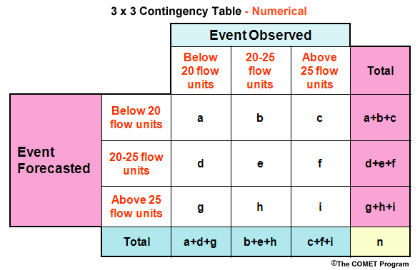
In hydrology there is often a need to define more than two categories. For example, we may wish to have three flow categories. These could be, one, flows below 20 flow units, two an interval of flow from 20 to 25 flow units, and three flows above 25 flow units. With three categories we have a 3X3 contingency table. Instead of the columns and rows being labeled yes/no, we have the numerical values for the different categories. The rows still represent the forecast categories and the columns represent the categories for observations.
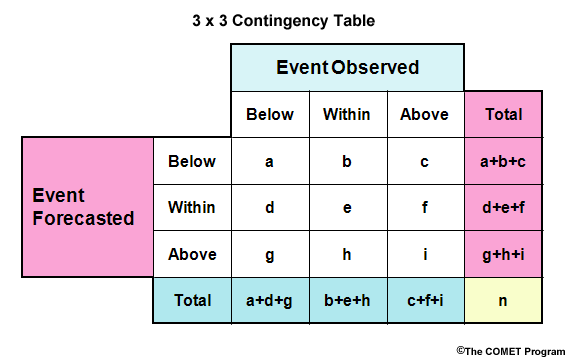
The three categories in the table could be expressed in different ways. For example, we could use qualitative thresholds of below, within, and above to represent the numerical thresholds.
In the case of perfect forecasts, observations exactly match the forecasts, all forecast-observation pairs would fall along the diagonal defined by the letters a, e, and i.
What about traditional scores like POD and FAR? First, we need to choose which category we are verifiying. Let's assume we are verifying a flow for the "Within" category. Then, PODwithin = e/(b+e+h). FARwithin = (d+f)/(d+e+f).
- Use 3 x 3 contingency table for over and underforecasting rates.
- Overforecasting rate for "within" category = h/(b+e+h)
Question 1 of 2
Refer to the above image to answer this question.
What would the POD be for a flow that is greater than the high flow
threshold (PODabove)?
Choose the best answer for each.
The correct answer is d) i/(c+f+i)
We can also compute the over- and underforecast rates. Once again, let's use the "Within" category for this example. So we want to know, what proportion of observations in our "Within" category were forecast to be in the "Above" category (an overforecast) and what proportion were forecast to be in the "Below" category (an underforecast)?
- The Overforecast Rate = h/(b+e+h).
Question 2 of 2
Refer to the above image to answer this question.
What would the underforecast rate be for observed flows in the "Within"
category?
Choose the best answer for each.
The correct answer is b) b/(b+e+h)
BS vs. RPS
Brier Score versus Ranked Probability Score
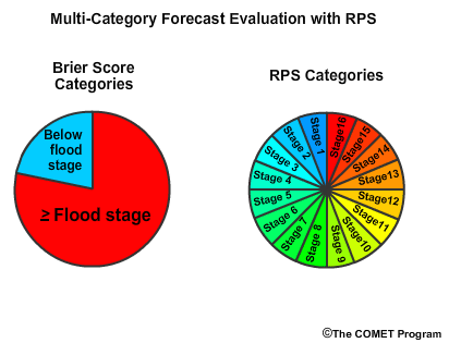
Now let’s turn to verification of probabilistic categorical forecasts. There are two scores that will be covered in the next two sections, the Brier Score (BS), and the Ranked Probability Score (RPS).
The Brier Score is used when the probabilistic forecasts are binned into two categories. The RPS is used for verification with more than 2 categories. These two scores are based the same mathematical formulation for comparing the observed and forecast probabilities. But before we get into the detail, let’s first describe why a forecaster would choose one or the other.
The Brier Score is very useful when the consequences are asymmetric. So for example, when the two categories are flood and no flood, the difference between the categories is very important and the Brier Score is a useful verification measure.
The RPS is useful when the consequences are symmetric. In other words, the value of a specific category is not as important as the summary measure for all categories. So the RPS is a useful verification tool for verifying a forecast with numerous flow categories where you are not particularly concerned about one specific category of flow.
Brier Score
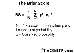
The Brier Score can be used for answering the question, "what is the magnitude of the probability forecast errors?" As stated previously, it is particularly useful when the difference between the two categories is important. It is based on the average of the squared differences between the forecast probabilities, f, and observed probabilities, o, for all of the forecast-observation pairs.
Remember, the observed probability is 0.0 if the event did not occur, and 1.0 if it did occur. Like other error statistics, a BS of 0.0 is best, for this indicates no difference between the observed and forecast probability. A BS of 1.0 is the worst possible value. The Brier Score for probabilistic forecasts is analogous to the Mean Square Error for deterministic forecasts.
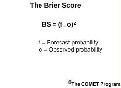
For simplicity we will use a 1-forecast example, which means N in the equation is one. This simplifies the equation for demonstration purposes.
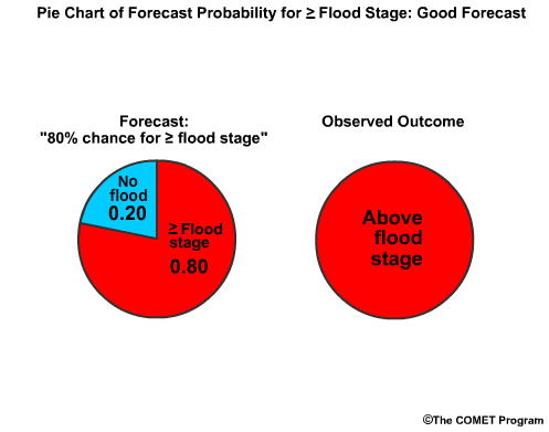
Let's say there is an 80%, chance for reaching or exceeding flood stage in the forecast, or a 0.80 probability. Flood stage is reached, which means the observed "probability" is 1.0. The BS is the forecast probability minus observed probability squared, or (0.80-1.0) squared, which is -0.20 squared, or 0.04. This number is very close to 0.0, which is good.
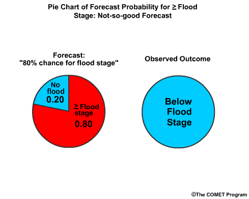
On the other hand, what if flood stage was not observed and we had predicted an 80% chance for reaching or exceeding flood stage? The observed probability is 0.0. Now we have 0.80-0.00 squared, or 0.64. That score is much closer to 1.0, showing it is not nearly as accurate.
RPS
Ranked Probability Score
To understand the Ranked Probability Score (RPS) we should recall the Cumulative Distribution Function (CDF) described in section 2. The RPS measures the difference between the probabilistic forecasts and the corresponding observation by looking at the difference between the forecast and observed CDFs. This will be illustrated shortly when we describe the RPS plot. But first, let’s describe the RPS formulation.
The RPS is very similar in formulation to the Brier Score but the RPS may be used for verification with multiple categories, represented by bins. Here, each bin represents a stage category. A forecast probability is associated with each bin. So the RPS answers the question, "How well did the probabilistic forecasts predict the frequency with which observations would fall into certain bins?"
If the bins cover the entire range of forecasts, the RPS is analogous to an error statistic of a deterministic forecast. So, if stage category one through stage category 16 represent all possible forecast probabilities, then the RPS answers the question, “How far off from the observed value was my probabilistic forecast?”
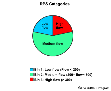
So let's start with a simple 3-category, or 3-bin example. We will assume three flow threshold bins for low, medium, and high flows. In this case, there is a greater chance for the medium flow level. So, our three bins are, low flow which is less than 200 flow units, medium flow, which is greater than or equal to 200 but less than or equal to 300, and high flow, which is greater than 300.
Recall that the Brier Score is the average of the squared probability differences over all forecast-observation pairs for a 2-bin system. This simplified equation assumes one forecast run.
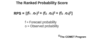
The RPS may also be derived from the sum of the squared differences between the forecast probabilities, f, and observed probabilities, o, but for numerous categories. Again for simplicity, we assume one forecast run for a 3-bin system, indicated by the subscripts 1, 2, and 3.
For more detail on the RPS formulation for multiple forecast and numerous bins see the additional resources.
Computing the RPS

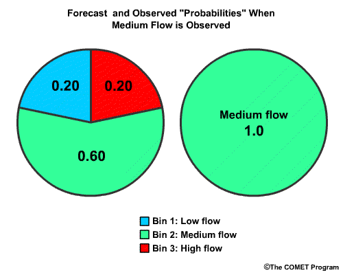
Now we will use a numerical example of the RPS for our 3-bin verification. We will assume that the probabilistic forecast indicates that the chance for each of these bins, expressed as probability from 0.0 to 1.0 is 0.20 for low flow, 0.60 for medium flow, and 0.20 for high flow.
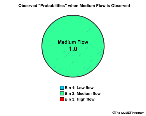
Now let's say the medium flow category actually occurred. In probabilistic terms this means that the "chance" for observing the medium flow bin is 1.0 and the other two bins are 0.0.
To compute the RPS for the forecast, we will use the cumulative probabilities, sometimes called the probabilities of non-exceedance. Cumulative probabilities were defined back in section 2 of this module.
Cumulative probability values for RPS computation
| Forecast Cumulative Probability | Observed Cumulative Probability | |
|---|---|---|
| Bin 1: low flow | ||
| Bin 2: medium flow | ||
| Bin 3: high flow |
To begin, we will have the forecast probability in the "low flow" bin, of 0.20. Since this is the first bin, the bin probability equals the cumulative probability.
Next we have the forecast probability of 0.60 for the "medium flow" bin. The cumulative probability includes the sum of the “low flow” and "medium flow" bins, or 0.20 plus 0.60. This cumulative probability value is 0.80.
Next we have the cumulative probability of "high flow". This is 1.0, because it is the sum of all the forecast bin probabilities. As you can see, for the last bin the cumulative probability is always equal to 1.
Now that we have the forecast cumulative probabilities for each bin, let's get the observed cumulative probabilities. The observed probability of "low flow" is 0.0, because medium flow was observed.
The observed probability for "medium flow" is 1.0, because medium flow has been observed, but not exceeded. The cumulative probability is also 1.0.
The observed probability of high flow is 0.0 since only medium flow was observed, but the cumulative probability of high flow is 1.0 because once the cumulative probability reaches 1.0, which it did with the medium flow bin, it stays there.
Cumulative probability values for RPS computation
| Forecast Cumulative Probability | Observed Cumulative Probability | |
|---|---|---|
| Bin 1: low flow | 0.20 | 0.00 |
| Bin 2: medium flow | 0.80 | 1.00 |
| Bin 3: high flow | 1.00 | 1.00 |
So now that we have the table filled in we can compute the RPS value using the equation.
Σ[(0.20-0.00)2 + (0.80-1.00)2 +(1.00-1.00)2] = Σ [0.04 + 0.04 +0.00] = 0.08
The RPS equation for our 3-bin example gives us (0.20 minus 0.00) squared, plus (0.80 minus 1.00) squared, plus (1.00 minus 1.00) squared. This gives 0.04 plus 0.04 plus 0.00 for an RPS value of 0.08. This value is close to the perfect RPS score of 0.0, which means there was little error in the probability forecasts.
Cumulative probability values for RPS computation
| RPS Computation for Climatological vs. Observation Probability of Non Exceedance | ||
|---|---|---|
| Forecast Cumulative Probability | Observed Cumulative Probability | |
| Bin 1: low flow | 0.20 | 0.00 |
| Bin 2: medium flow | 0.80 | 1.00 |
| Bin 3: high flow | 1.00 | 1.00 |
Question
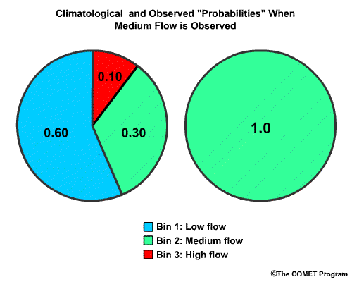
Using the same approach, and the information for the climatological flow
probabilities with medium flows observed, what would the RPS score be for
climatology.
Choose the best answer.
The correct answer is c) Σ [(0.60-0.00)2+(0.90-1.00)2+(1.00-1.00)2] = 0.37
For climatology the cumulative probabilities for the low flow, medium flow, and high flow bins are 0.60, 0.90 and 1.00 respectively. Observed cumulative probabilities for the low flow, medium flow, and high flow bins are 0.00, 1.00, and 1.00 respectively. So the equation is (0.60 minus 0.00) squared, plus (0.90 minus 1.00) squared, plus (1.00 minus 1.00) squared, which is 0.36 plus 0.01 plus 0.00 which gives us and RPS of 0.37. Because this is further from the perfect score of 0.00 than the RPS we calculated for the forecast, the climatological guidance is less accurate than the forecast.
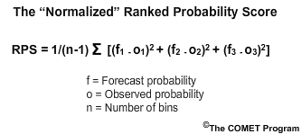
Although the best RPS score is 0.00, the worst score is dependent on the number of bins used. Often the RPS score is normalized by dividing by the number of bins minus 1. This formulation is sometimes called the “normalized RPS.”
The continuous RPS, section 6, is another formulation that allows the score to be independent of the number of forecast bins used.
RPS Display
RPS computation for forecast vs observation
| Forecast Probability | Observed Probability | |
|---|---|---|
| Bin 1: low flow | 0.20 | 0.00 |
| Bin 2: medium flow | 0.80 | 1.00 |
| Bin 3: high flow | 1.00 | 1.00 |
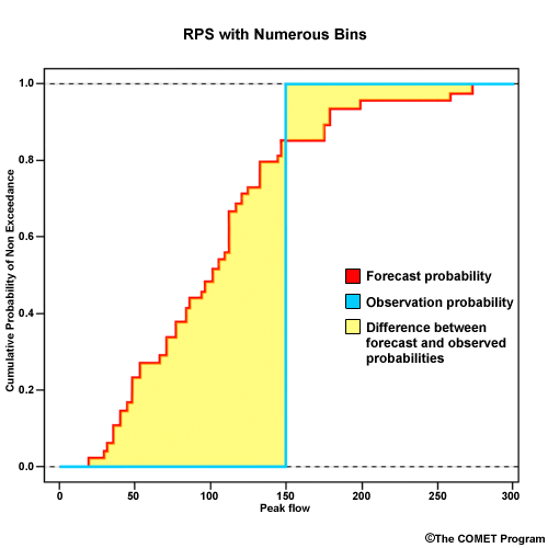
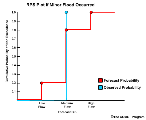
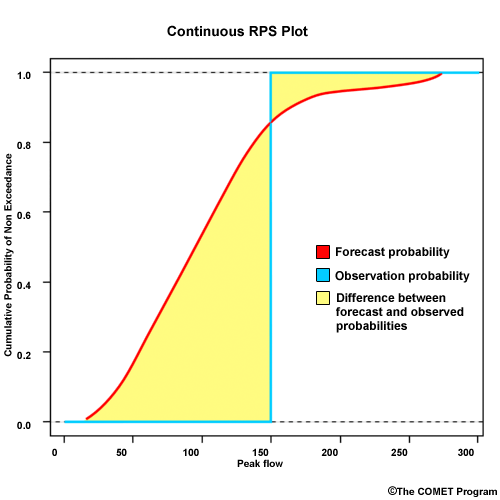
To plot the RPS, we have the cumulative probability on the y axis and bin threshold values on the x axis Let's go back to our example forecast. We defined 3 bins for low flow, medium flow, and high flow. If we plot the cumulative probability for bin 1, which is 0.20; bin 2, which is 0.80; bin 3, which is 1.00, then we get this plot for the forecast. Since a medium flow value was observed, the observed cumulative probability goes to 1.00 at the medium flow bin and stays there.
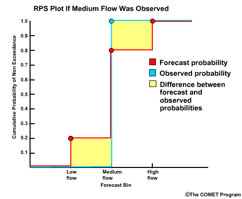
So, the RPS display simply shows us the difference between the forecast CDF and the observed CDF. The RPS is defined as the area between these two curves. For this forecast the area is rather small which reflects the good RPS value of 0.08.
Question 1 of 2
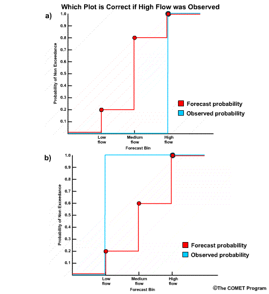
What if a high flow value had been observed for the same forecast? What would the RPS
plot look like?
Choose the best answer.
The correct answer is a) Plot a)
The forecast plot is the same, but the observation plot goes from 0.0 to 1.0 at bin 3, the high flow bin.
Question 2 of 2
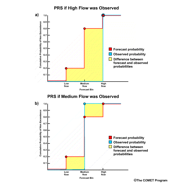
Using the RPS plot with an observation of high flow, note the shaded area which
represents the difference between forecast and observed probabilities. The
numerical RPS value is 0.68. Compare this with the earlier plot when medium
flows occurred for the same forecast and the RPS was 0.08. What do the shaded
areas tell us?
Choose the best answer.
The correct answer is a) There is more forecast error with the high flow scenario.
Accuracy
This section covers the verification of forecast accuracy. Accuracy is one of the seven important verification topics to consider when verifying hydrologic forecasts.
The accuracy is defined as how well observed and forecast values are matched. The accuracy statistics are really measures of forecast error and therefore we could call them error statistics. Except for the bias statistic, we prefer values close to 0.0 for these statistics, indicating that forecast error is minimized. Because bias is a proportion, a value close to 1.0 indicates minimal error between forecasts and observations.
Measures of Accuracy (Error Statistics):
| Deterministic | Probabilistic |
|---|---|
| Mean Absolute Error (MAE) | |
| Root Mean Square Error (RMSE) | |
| Mean Error (ME) | |
| Volumetric Bias | |
| Continuous RPS (CRPS) |
The continuous ranked probability score is an error statistic used for verification of probabilistic forecasts. A value of 0.0 indicates a perfect forecast—no error. All other scores in this section are suited to verification of deterministic forecasts.
CRPS
Continuous Ranked Probability Score (CRPS)
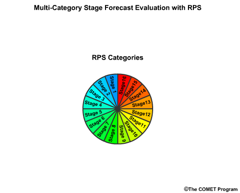
The Ranked Probability Score (RPS) was described in the categorical forecast verification section. Often the RPS plot will represent many more bins than our 3-bin example from that discussion. Here is an RPS plot with numerous bins that each represent a peak flow interval.
When we have a very large number of forecast bins, each bin represents a very small interval of flow values. In this situation, the probability errors between forecasts and observations may be summed over an integral. The result is a continuous RPS like this.
This becomes like many other error statistics where a difference between the observed and forecast probabilities of zero is ideal, as this would suggest zero error.
Error Stats
- Two common error statistics:
- Mean Absolute Error (MAE)
- Root Mean Square Error (RMSE)
When verifying deterministic forecasts, two commonly used error statistics to measure quantitative accuracy are the Mean Absolute Error (MAE) and the Root Mean Square Error (RMSE).
They are both based on the magnitude of difference between forecasts and observations. They don't account for whether those differences are positive—forecast is larger than the observation—or negative—forecast is smaller than the observation.
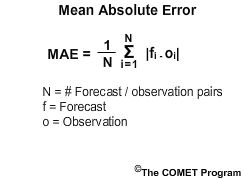
MAE is the mean of the absolute differences between the observations and forecasts. RMSE is the square root of the mean of the squared differences between the observations and forecasts. In both cases a value of 0.00 indicates a perfect match between observations and forecasts. Values increase from zero with larger errors and theoretically can go to infinity.
RMSE is more sensitive to large differences between observations and forecasts than MAE. Therefore MAE may be more appropriate for trying to verify low flow numbers because the magnitude of forecast error is generally much smaller for low flow forecasts. Large errors, more common for high flow forecasts, will dominate the RMSE error statistic.
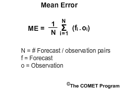
Another error statistic is the Mean Error (ME). Mean Error is the mean of the arithmetic differences between the observations and forecasts.
Unlike MAE and RMSE, the ME indicates whether the forecasts tend to be higher or lower than the observations, so you can have negative numbers. Positive values denote a tendency for overforecasting (forecasts tend to be higher than observations) and negative values denote a tendency for underforecasting.
- Mean Error = zero (errors cancel out)
- Mean Absolute Error > zero
- Root Mean Square Error >> zero
Although like other error statistics a value of 0.00 is best, this can be misleading. If a set of forecasts has large errors that are equally distributed higher and lower than the mean, the Mean Error is zero because the errors cancel each other out. Therefore, an ME equal to zero does not necessarily indicate a perfect forecast. The RMSE and MAE values in that case would have non-zero values indicating an imperfect forecast. It is important to use the ME statistic with other measures when verifying forecasts.
Bias
There are several statistics that are called "bias." Because the Mean Error will show the direction in which observations and forecasts differ, there are some sources that refer to it as the additive bias. The categorical bias score described in section 5 is a frequency bias because it is derived from bins based on forecast categories.
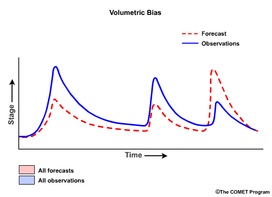
Another commonly used bias statistic in hydrology is the Volumetric Bias which is the ratio of the sum of the forecast values to the sum of the observed values as expressed in the following formula:
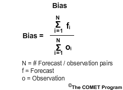
This ratio can range from 0 to infinity, with the value of 1.0 indicating no bias. A value greater than 1.0 denotes overforecasting (forecasts were greater than the observations), and a value less than 1.0 indicates underforecasting.
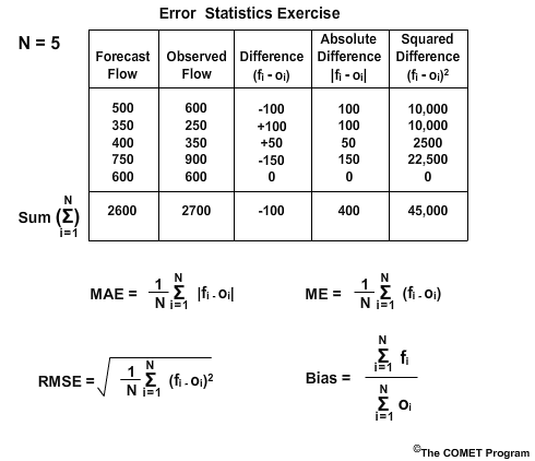
Exercise
Here is a table with 5 forecasts of river flow and the corresponding observed flow. The table also shows the difference as the forecast minus the observed, the absolute difference, and the squared difference. The last row shows the sum of each column.
Below this are the formulations for each of the four error statistics: Mean Absolute Error, Root Mean Square Error, Mean Error, and Bias. Because there are five forecast values, N equals 5.
Use this information and a calculator to answer the following questions.
Forecast Skill
This section covers measures of forecast skill and how they relate to hydrologic forecast verification. Skill is one of the seven important verification topics to consider when verifying hydrologic forecasts.
Unlike error statistics, skill statistics provide a measure of forecast performance relative to some reference forecast. Some common reference forecasts used are climatology, persistence, and model guidance. So we may be answering a question such as, "although our RMSE and bias were not very good, how much improvement did we show over climatology?"
Skill statistics are especially useful since they take into account whether the forecast performance was better because the events were easier to predict, in which case both forecast and reference perform better and the skill score is not higher. Skill statistics will detect the increase of performance due to the “smarts” of the forecasting system compared to the reference forecasts.
Measures of Forecast Skill:
| Deterministic | Probabilistic |
|---|---|
| Root Mean Square Error Skill Score (RMSE-SS) | |
| Brier Skill Score (BSS) | |
| Ranked Probability Skill Score (RPSS) |
Skill scores can be associated with either deterministic or probabilistic forecasts.
Formulation
Skill Score Formulation
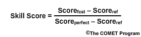
Skill scores take the form: score of the forecast minus the score of the reference, divided by the perfect score minus the score of the reference.
- Root Mean Square Error Skill Score (RMSE-SS)
- Brier Skill Score (BSS)
- Ranked Probability Skill Score (RPSS)
We are going to look at the skill scores associated with the Root Mean Square Error, the Brier Skill Score, and the Ranked Probability Score. These are the Root Mean Square Error Skill Score, RMSE-SS, the Brier Skill Score, BSS, and the Ranked Probability Skill Score, RPSS.
- Scoreperfect = 0
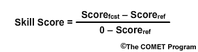
The RMSE, BS, and RPS each have a numerical value of 0 for the perfect forecast. So the equation would look like this. Keep in mind that other accuracy measures do not necessarily have a perfect value of zero, so the equation won’t necessarily simplify like this.
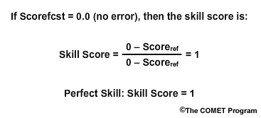
If the actual forecast shows no errors—meaning it's perfect—then the skill score equation looks like this, with the numerator identical to the denominator. So a perfect skill score has a value of 1.

If the forecast score and the reference score are the same, then the numerator becomes zero and thus the skill score is zero. In this case there is no skill because the forecast performance is no different from the reference performance.
- No Skill in forecast compared to reference: Skill Score = 0
- Positive Skill (forecast improved over reference): Skill Score > 0 and <1
- Negative Skill (forecast is less desirable than reference): Skill Score > 0
Positive skill is indicated by skill scores between 0 and 1. This means the forecast performed better than the reference. A negative skill is indicated when the skill score goes below zero. This occurs in situations when the forecast performed more poorly than the reference.
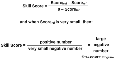
In situations where the reference forecast is nearly equal to the perfect forecast, large negative skill scores are possible even if the forecast wasn’t much worse than the reference forecast. Mathematically this results from a very small number in the denominator.
RMSE Skill Score
- Measure skill of official river flow forecast
- Reference: climatology of river flow
- Is the official forecast) better than climatology? How much better?
Let's consider a situation where we want to use Root Mean Square Error to know the skill of an official river flow forecast. The reference forecast is flow climatology. In other words, we will answer the question, "Is the official forecast showing improved guidance over climatology, and how much improvement is there?"
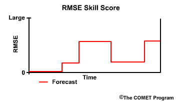
Recall that the RMSE provides information about the error in terms of differences between observed and forecast hydrographs. This simple RMSE plot shows the error can vary from zero error to a relatively large error with time.
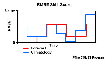
We can overlay the RMSE for climatology as well. When the RMSE from the forecast is lower than the RMSE from climatology, it indicates that the forecast performed better than climatology because it had less error than climatology.
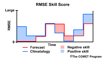
Thus the forecast has positive skill when compared to climatology. When the forecast RMSE is greater than that of climatology, the forecast has negative skill. So now we will see how a corresponding plot of the RMSE Skill Score, or RMSE-SS, will look.
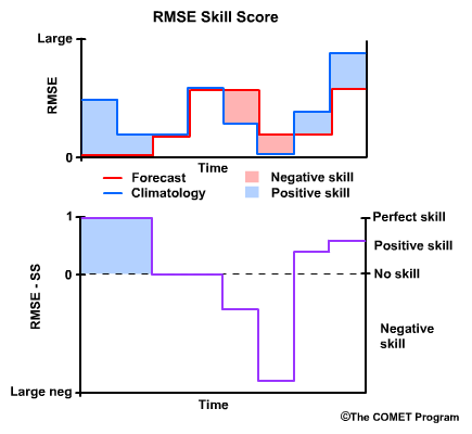
Recall that when the when the forecast is perfect, or RMSE for the forecast equals zero, then the RMSE Skill Score is 1, a perfect skill score.
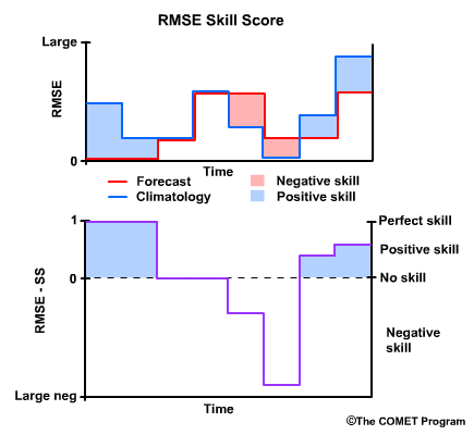
When the RMSEs for the forecast and climatology are equal, there is no skill, and the RMSE Skill Score is 0. This is true regardless of what the RMSE is, because the skill score is only measuring how the forecasts improve upon our reference, climatology.
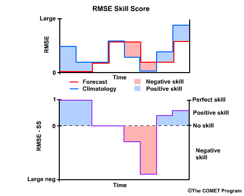
Where climatology results in a lower RMSE than the forecast, and thus the forecast performed less favorably than climatology, we have negative skill. In cases where the reference, in our case climatology, has an excellent RMSE of near zero, the RMSE Skill Score can become a large negative number even if the RMSE for the forecast is relatively low.
Finally, note that there can be positive RMSE Skill Scores even with relatively high RMSE values for the forecast. The main point of the skill score is to measure how well the forecast is performing compared to the climatological reference.
BSS and RPSS
Brier Skill Score and Ranked Probability Skill Score (BSS and RPSS)
- Reference forecast = climatology
- Do the forecasts provide better guidance than climatology?
Now let's look at computing skill associated with the Brier Score and the Ranked Probability Score. In these examples we will use climatology as the reference. So now the question is, "Does the forecast provide better guidance than climatology?"
Let's bring back the Brier Score example from section 5. In that example we had a 0.80 probability for a flood and the flood occurred. The Brier Score is 0.04.
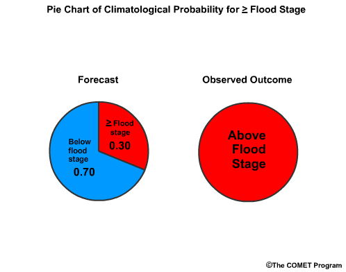
If climatology suggested that the probability for a flood is 0.30, then the Brier Score would be 0.49.
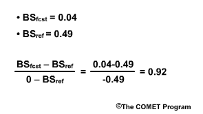
The Brier Skill Score (BSS) is BSfcst minus BSref divided by 0 minus BSref. That would be 0.04 - 0.49 divided by -0.49. This computes to +0.92. A Brier Skill Score of +0.92 means that the forecast is a 92% improvement over the climatological guidance.
Review Question
- RPSS similar to BSS
- Climatology is reference forecast
The Ranked Probability Skill Score (RPSS) is computed the same way as the BSS. Using climatology as the reference, refer to this equation to answer these questions.
Question 1 of 3
If the RPSS is less than 0, what would that say about the forecast skill?
Choose all that apply.
The correct answer is a) and d).
Question 2 of 3
If the RPSS is less than 1 but greater than 0, what does that say about the
forecast?
Choose all that apply.
The correct answer is b) and c).
Question 3 of 3
In the categorical forecasts section, we computed the RPS for a forecast when a
minor flood occurred to be 0.08. The RPS for climatology when the minor food was
observed is 0.37. What is the RPSS when climatology is the reference?
Choose the best answer.
The correct answer is d) 0.78
The RPSS is (0.08 minus 0.37) divided by (0 minus 0.37) which is -0.29/-0.37, which is 0.78. This suggests a 78% improvement over climatology in the forecast.
Conditional Measures
This section covers conditional forecast verification measures. Conditional forecast verification is one of seven important verification topics to consider when verifying hydrologic forecasts.
Conditional verification measures provide information about the performance of forecasts, or forecast probabilities, given a certain event or condition.
Measures of Conditional Verification:
| Deterministic | Probabilistic |
|---|---|
| Reliability Measures | Reliability Diagram Attributes Diagram Discrimination Diagram |
| Relative Operating Characteristic (ROC) | Relative Operating Characteristic (ROC) |
There are discrimination and reliability measures used in verifying either deterministic or probabilistic forecasts.
Reliability/Discrimination
- Conditional forecast verification
- Relative to the forecasts
- Relative to the observations
- Reliability measures:
- Given the forecast, what were the corresponding observations?
- Discrimination measures:
- Given the observations, what had the forecasts predicted
Conditional forecast verification can be relative to either the forecasts or the observations. Both approaches should be considered to better understand the different aspects of the forecast performance.
Reliability examines the statistics that are conditioned on the forecast. In other words, given forecasts for a particular event, what were the corresponding observations?
Discrimination examines the statistics that are conditioned on the observations. In other words, given the observations of a particular event, what did the corresponding forecasts predict? There are two measures of discrimination that we will discuss in the followings sections: (1) the Relative Operating Characteristic (ROC) which measures forecast resolution, and (2) the discrimination diagram.
Example
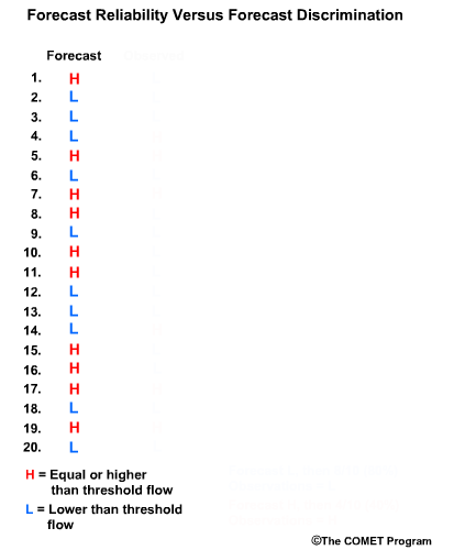
Let’s consider twenty forecasts for river flow. This could be twenty deterministic forecasts or an ensemble forecast with twenty ensemble members. For simplicity we will use two classifications for the forecasts and observations. The first classification is for flow lower than a set threshold, and we will refer these events with an “L” as shown in blue. The second classification is for flow equal to or higher than a set threshold, and we will refer to these with an “H” as shown in red.
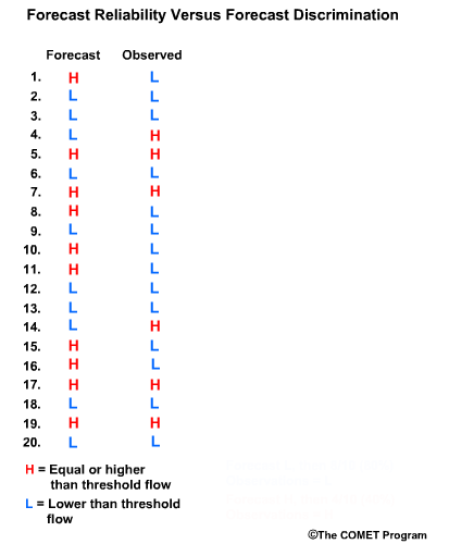
Now let’s list the twenty corresponding observations for these forecasts. Again we use L and H to show the observed flow. There are two ways to compare these forecasts and observations. One is a forecast-based verification, and the second is an observation-based verification.
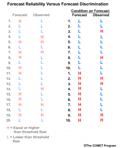
For the forecast-based verification, we split the forecasts into two groups. Group 1 is all of the “L” forecasts with their corresponding observations. Group 2 is all of the “H” forecasts with their corresponding observations. Now there are two important questions we can address.
Question 1, given a forecast of L, what did the corresponding observations show? Here we see that 8/10, or 80% of the observations matched with a value of L. This indicates a reliable forecast system for flow L.
Question 2, given the forecast of H, what did the corresponding observations show? This time we see that only 4/10, or 40% of observations matched the forecasts with an H value. This indicates that for flow H, the forecast system is not as reliable.
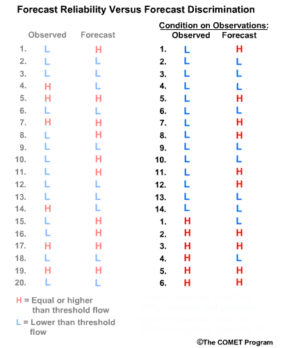
Next we will consider observation-based verification. Again we divide the data into two groups, L and H flows, but this time based on the observations. So group 1 is all observations of L and their corresponding forecasts. Group 2 is observations of H in their corresponding forecasts. Now we can ask these two questions.
Question 1, given observations of flow L, what had the forecasts predicted? We can see that 8/14, or 57%, of the forecasts matched the observations. So the forecast system was just a little better than 50-50 at discriminating low flow conditions.
Question 2, given observations of flow H, what had the forecasts predicted? In this case 4/6, or 67%, of forecasts matched the observations.
| Reliability | |
|---|---|
| Given a forecast of | Corresponding observations that correctly matched |
| L | 80% |
| H | 40% |
| Discrimination | |
|---|---|
| Given a observation of | Corresponding forecasts that correctly predicted outcome |
| L | 57% |
| H | 67% |
So what does this mean? In this case the forecast system was reliable for flow L. In other words, if the forecast was for flow L, there was an 80% chance the observation would be flow L. However, the forecast system didn’t discriminate flow L as well. If the observation was for flow L, there was only a 57% chance that the corresponding forecast had predicted L.
For flow H, the forecast system was much less reliable than for the L forecasts. Only 40% of forecasts for flow H resulted in observations of H. However, the forecast system was pretty good at discriminating flow H. If the observation was for flow H, then there is a 2/3 chance that the corresponding forecast had predicted H.
This was a simple example with just two categories. In reality, there can be many categories in the continuum from lowest possible flows to the highest possible flows. Conditional forecast verification becomes more complicated, but the meaning of forecast reliability and forecast discrimination is the same as for the simple 2-category system.
Reliability Measures
- Reliability is the alignment between forecast probability and frequency of observations
- Reliability describes the conditional bias of each forecast subgroup
Reliability is the alignment between the forecast probability and the frequency of observations. Once a condition is applied, meaning the data has been divided into subgroups, some of the verification measures we have discussed so far can be applied to describe reliability. For example, reliability describes the conditional bias for each forecast subgroup.
The reliability and attributes diagrams are used with probabilistic forecast verification.
Reliability Diagram
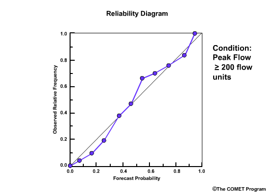
The Reliability Diagram plots the observed frequency of the observations as a function of the forecast probabilities. So it helps us see how well the forecast probabilities predicted the observed frequency of an event. In other words, if an event was forecast 30% of the time, what percentage of the time was it actually observed? Or, in probabilistic terms, for all the forecasts with a 30% chance that an event would occur, how many times did the event actually occur? Ideally, if we take all forecasts that called for a 30% probability of an event, then that event should have been observed for 30% of those forecasts.
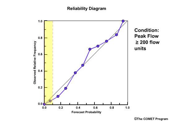
The forecast probabilities, given on the X axis, are divided into bins. For this example, we will use 11 bins to represent the probabilities, P, of P=0.0, 0.0<P≤0.1, 0.1<P≤0.2, 0.2<P≤0.3, 0.3<P≤0.4, all the way up to 0.9<P≤1.0.
It is important to note that reliability diagrams depend on an event definition, in our case the event is peak flow ≥200 flow units. Therefore the information gained by a reliability diagram is relevant only for that event.
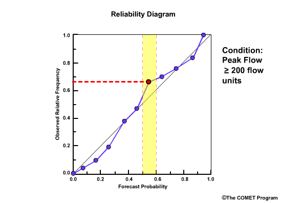
So what does a point on the reliability diagram and its position relative to the diagonal tell us? This point indicates that for all forecasts that called for a 0.5-0.6 probability of greater than or equal to 200 flow units, it was actually observed 0.66, or 66%, of the time.
- Points on the diagonal: reliable forecasts
- Points above diagonal: underforecasting
- Points below diagonal: overforecasting
Points that lie directly on the diagonal line are indicative of perfectly reliable forecasts. In these cases, the forecast probabilities are exactly equal to the observed frequencies. Points that lie above the diagonal line are indicative of underforecasting. This means that the observed frequency of the events is greater than the forecast probability. Points below the line are indicative of overforecasting.
Sharpness
Reliability and Sharpness
Issues of sample size sometimes have an impact on the utility of the reliability diagram.
A histogram is sometimes given to show the frequency of forecasts in each probability bin. This provides an indication of the number of samples used to compute the reliability statistic, and it also describes the sharpness of the forecasts.
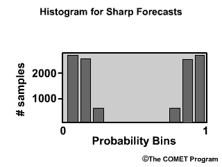
Sharp forecasts:
- Differ from climatology or the mean
- Tendency to predict probabilities near 0.0 or 1.0
- Are accurate if they are also reliable
Forecasts are sharp if they are often much different from the climatology or mean values, and have a tendency to predict probabilities around 0 and 1. Sharp forecasts are accurate if they are also reliable so that they correspond well to the observations.
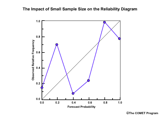
If the sample size is too small, the reliability diagram may show an erratic plot around the diagonal. The user cannot interpret the statistical results because of this sampling uncertainty.
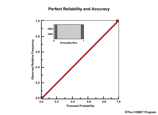
Perfect forecast verification using reliability would show one point in the upper right, one point in the lower left, and the histogram would have all samples at probabilities of 0 and 1. This would indicate that the forecasts always called for either a 0 or a 100% probability, and they always matched the observations.
Attributes Diagram
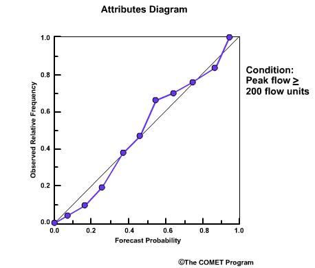
Now we will take our reliability diagram for the flow event, "peak flow greater than or equal to 200 flow units” and add some features.
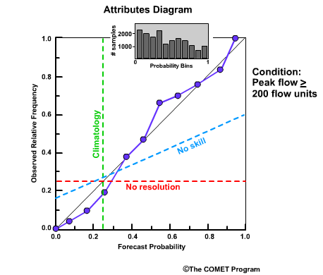
If we add our histogram and overlay additional information that allows us to compare the plotted data relative to climatology, resolution, and skill, we have an Attributes Diagram. Let's say climatology suggests a 0.25 probability for this event. The "no resolution" line is parallel to the x axis and typically based on the observed sample climatology. What does it mean? It means that if the forecast system always forecasts for climatological values, then it is unable to resolve between events and non-events. Any time the curve connecting the plotted points becomes horizontal it indicates that the particular observed value occurs with every forecast probability.
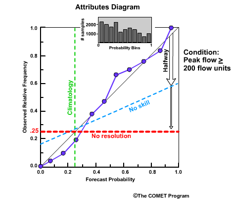
The no skill line is defined to be half way between the no resolution line and the diagonal line.
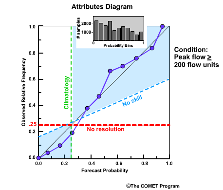
The shaded area on the Attributes Diagram is where forecasts have skill.
Discrimination
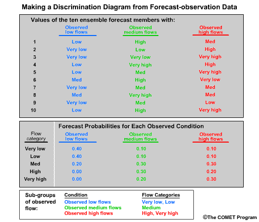
Forecast discrimination is the ability of the forecast to discriminate between events, given an observed outcome.
For this example we will assume five flow categories, very low, low, medium, high and very high. Since the forecast discrimination is based on the observations, let’s sort the observations into three subgroups. These are, one, “Observed low flows” which includes any observation of the very low flow and low flow categories; two, “Observed medium flows” which is defined as the medium flow category; and, three, “Observed high flows”, which is defined as the high and very high flow categories.
For this example we will assume ensemble forecasts with 10 members. So column 2 shows what each of the 10 ensemble members predicted when the observations showed the “Observed low flows” subgroup. Column 3 shows each ensemble member prediction when the “Observed medium flows” subgroup was observed. And column 4 shows the ensemble predictions when the “Observed high flows” subgroup was observed.
In the lower table we have the forecast frequency of our 5 flow categories for each observed subgroup. So, for example, in column 2, the “Observed low flows” subgroup four out of ten ensemble members were very low and another four were low flow. Thus, the probabilistic forecast for each of the flow categories very low and low is 0.40. The medium flow category has a 0.20 probability because it was only forecast by 2 out of 10 ensemble members. And there were no forecasts for the high or very high flow categories when low flows were observed.
Now we do the same for column 3, “Observed medium flows” and column 4, “Observed high flows”.
This information can now be used to construct a discrimination diagram.
Discrimination Diagram
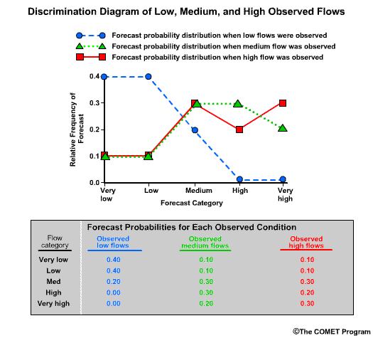
So now we can use the information from the table showing forecast flow probabilities conditioned on observed flow subgroups and construct a discrimination diagram.
On the discrimination diagram, the x axis shows the five flow categories of “very low” through “very high.” The y axis shows the relative frequency of the forecast.
First let’s consider the blue dashed line which corresponds to the information in column 2. This shows that when low flows were observed, there was a 0.4 frequency of forecast categories very low or low and only a 0.2 probability for medium flow. The frequency of forecasts for flow categories high and very high drops to 0.0. If you recall the Probability Density Function (PDF) from section 2, the blue dashed line is the PDF of the forecast when low flows were observed.
The green dotted line, which corresponds to the data in column 3, is the PDF for the forecast when medium flows were observed. This shows relatively lower probabilities of forecast categories very low and low compared to forecast categories medium through very high.
The red solid line, which corresponds to the data in column 4, is the PDF for the forecast when high flows were observed.
Note that the green dotted line is quite similar to the red solid line. This means that the forecast probabilities when medium flows were observed were similar to the probabilities when high flows were observed. In other words, the forecast system is not very good at discriminating between medium and high flows. The forecast system shows some good discrimination capability for low flows. We can say this because if we examine the blue dashed curve, there were higher probabilities for the lower flow categories of very low and low, and the PDF shows some separation from the other two curves. This means that forecasts were different for times when low flows were observed than the times when medium or high flows were observed.
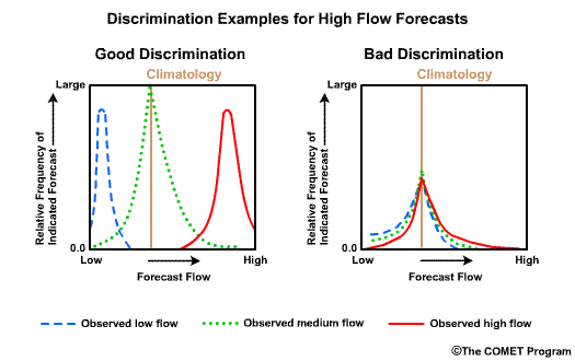
Ideally, the three observed subgroup distributions would be well-separated distributions, or PDFs. On the left side we can see that each forecast PDF for each observed flow subgroup is separate from the other two. This shows good forecast discrimination. In other words, the forecasts for each observed condition was unique. And, in this idealized case the observation subgroups match the forecasts. For example, the PDF when high flows are observed occurs on the right end of the x axis which represents the forecasts of high flows.
By contrast, the PDF plots for the poorly discriminated forecast system show little or no difference between the distributions and are often centered on the climatological probability.
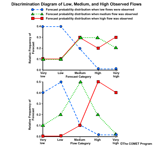
Let’s go back to our discrimination diagram and assume it represents forecasts with a four-month lead time on the peak snowmelt runoff. Now let’s bring up a discrimination diagram for the same location and variables, but this lower one represents forecasts with a one-month lead time.
Question
What can you say about the one-month lead time forecasts compared to the four-month
lead time forecasts?
Choose all that apply.
The correct answers are a) and d)
The one-month lead time forecasts show better discrimination as seen in the well separated PDFs for low, medium , and high flow subgroups. This is better than the four-month lead time forecasts that show little discrimination between the medium and high flow subgroups. This means that given the observations, the one-month lead time forecast showed good discrimination for all subgroups.
ROC
Relative Operating Characteristic
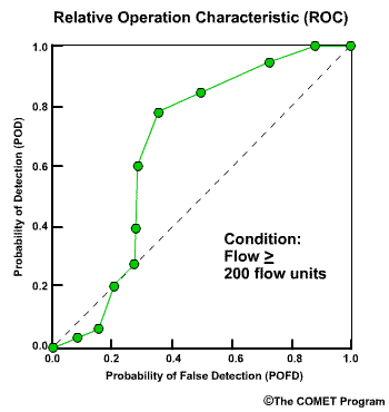
- Measures ability to discriminate between events and non events
- Measures forecast resolution
- Conditioned on observations
- If observed peak flows ≥ 200 flow units
- Then how did forecast probabilities predict, yes or no, that there would be ≥ 200?
The Relative Operating Characteristic, or ROC, measures the ability of a forecast system to discriminate between events and non events for a given condition. In this case we will use the condition, flow greater than or equal to 200 flow units. The ROC measures forecast resolution, which is related to event discrimination.
The ROC is conditioned on the observations. So the ROC in our example can help answer the question, "if the observations showed that the peak flows reached or exceeded 200 flow units, then how did the corresponding forecast probabilities predict, yes or no, that 200 would be reached or exceeded?"
Before we get into the numerical detail, let’s give an example of how users might use the ROC information.
Let’s consider two users of river flow forecasts. User 1 is responsible for facilities that are very sensitive to whether or not flood stage will be reached. A 0.20 probability for greater than or equal to flood stage is enough to warrant preparations for an evacuation.
User 2 has a business that is not nearly as sensitive to whether or not the river is at flood stage. He does not prepare for flooding unless there is a 0.80 probability for greater than or equal to flood stage.
It might be useful for these users to know if the forecast system has any skill at resolving between 0.20 and 0.80 probabilities. The ROC can help with measuring this forecast resolution.
ROC Interpretation
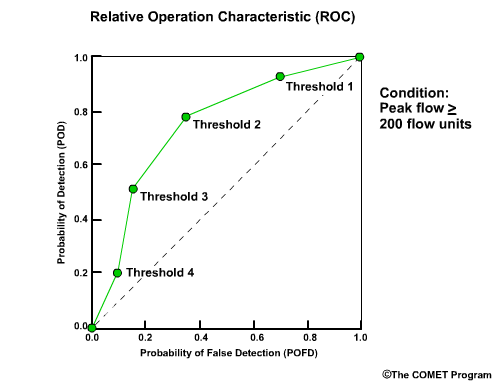
To understand how questions of forecast resolution are answered, let’s look more closely at the meaning of data in the ROC plot. The POFD is plotted on the x axis and the POD on the y axis. A set of increasing forecast probability threshold values from upper right to lower left is used to make yes/no decisions regarding the ≥ 200 condition. Each point represents a forecast probability threshold.
For now, ignore the POD and POFD values on the x and y axes so that we can focus on the “forecast’ probabilities that define the points.

Let’s assume threshold 1 in the upper right represents a forecast probability of 0.20 for greater than or equal to 200 flow units. Then we have increasing threshold probabilities so that we can further assume thresholds 2 through 4 represent forecast probabilities of, 0.40, 0.60, and 0.80.
Let's consider threshold 4 which represents a forecast probability of 0.80. This means that the forecast is considered a “Yes” forecast – meaning the event of ≥ 200 flow units will occur – if there is a 0.80 or greater probability.
Anything less than a 0.80 probability counts as a “No” forecast, meaning a non-event is expected. So, you may ask, "does this mean that a 0.75 probability of the event counts as a forecast for a non-event?" Yes, that's what it means for threshold 4.
Now we will come back to the values on the x and y axes. Using the 2 by 2 yes-no contingency table discussed in section 5 we can compute the POD and POFD for threshold 4. The “Yes” forecast is any forecast with a probability of 0.80 or more. The “No” forecast is any forecast with less than a 0.80 probability.

If we look at the plot, threshold 4 is associated with a POD of 0.20 and a POFD of 0.10.
Now let's compare that with threshold 1 which is associated with a forecast probability of only 0.20. This means that any forecast calling for a 0.20 or greater probability of reaching 200 flow units is considered a Yes forecast. Only forecast probabilities of less than 0.20 are considered predictions for a non-event. We should expect POD and POFD to be much greater than for threshold 4, because in this case there are many more forecasts that are considered predictions that the event will occur. The POD for threshold 1 is 0.95 and the POFD is 0.70
What about the corner points? As the threshold probability goes to 0.0, then every forecast is considered a “yes” forecast because everything with a 0.0 or greater probability is considered a forecast for an event. When an event is always forecast, the 2X2 contingency table shows us that POD and POFD both go to 1. This is the point in the upper right corner. When the threshold probability approaches 1.0, then all forecasts are lower than the threshold and they all count as “no” forecasts. In this case, the 2X2 contingency table shows us that POD = POFD = 0, and we have a point in the lower left.

The area under the ROC curve, toward the lower right, can be used as a numerical score. The bigger the area the better the score.
ROC Examples
ROC Interpretation Examples
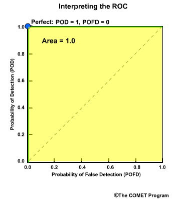
The upper left corner represents a perfect POD of 1 and a perfect POFD of 0. The perfect verification score would follow the y axis from the lower left to the upper left corner and then across to the upper right corner. The area under the ROC curve is 1.0 in this case.
We have positive event discrimination skill whenever the ROC curve is above the diagonal line. This shows there is skill at discriminating between events and non events. In other words, if an event was observed, the forecast was skillful at indicating an event would occur. The area under the ROC curve is between 0.5 and 1.0.
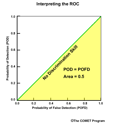
The forecast system has no event discrimination skill when the curve is along the diagonal line. Here the POD equals the POFD. This indicates that if an event was observed, the forecast was equally likely to indicate either an event or a non event. The area below the ROC curve in this case is 0.5.
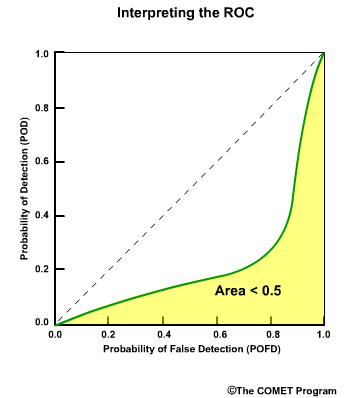
Negative event discrimination skill is indicated if the ROC curve is below the diagonal line. This suggests that if an event was observed, the forecast was most likely for a non-event. The area below the ROC curve in this case is between 0.0 and 0.5.
Review Questions
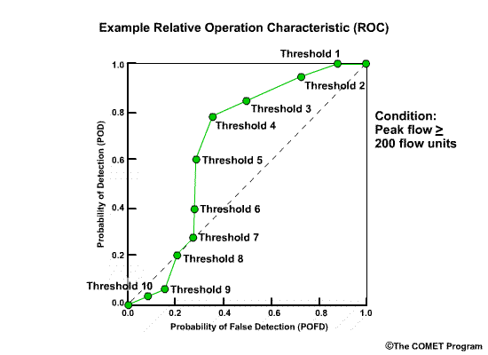
Here is a ROC curve for a high flow event. Please answer the following questions using this diagram:
Question 1 of 3
For forecast probability thresholds 9 and 10, what does the ROC curve tell
us?
Choose all that apply.
The correct answers are d) and e)
Question 2 of 3
For forecast probability thresholds 7 and 8, what does the ROC curve tell
us?
Choose all that apply.
The correct answers are c) and f)
Question 3 of 3
For forecast probability thresholds 1 through 6, what does the ROC curve
tell us?
Choose all that apply.
The correct answers are a) and b)
Summary
The verification scores and diagrams presented in this module do not make a complete list of all possible verification measures. The specific scores and subtopics were based on guidance from the NWS Hydrologic Verification System Requirements team. These measures are specifically useful for verifying hydrologic forecasts. However, these measures have wide applicability well beyond those in hydrology.
The top level reason for verifying hydrologic forecasts are to, one, evaluate the forecast system performance, two, improve the performance of the forecast system, and three, be able to compare forecast systems with each other.
Using Verification
Forecasters and users of the forecasts may have different reasons for verification.
A user for example, may be more interested in the accuracy of the current available forecast system, but not so concerned about how it can be improved or how it compares to a forecast system somewhere else.
The forecaster, on the other hand, may be very interested in improving forecasts which may include learning from other forecast systems that perform more favorably.
There are a wide range of needs among users. Some users may be very concerned about flooding even with just a small chance and perhaps they are willing to accept large uncertainties in the forecasts.
Other users may be more interested only when there is a high probability of flooding.
Still other users may not be concerned so much about categories like flooding, but are interested in the performance regarding the variations of the normal range of flows throughout the season.
For these reasons, verification cannot be summed up with one overall number or graphic. Useful verification will typically involve a set of measures catered to the specific need and data characteristics of the situation.
Summary Table
Verification Measures Summary Table:
VerifSummaryPage
The interactive table located at VerifSummaryPage summarizes the measures described in this module. For measures associated with numerical scores, the table lists the range of values as well as the optimal value for perfect forecasts. For measures that are presented as diagrams, the table provides a simple visual reminder of what the ideal verification would look like.
Timing Verification
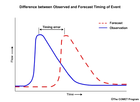
This module focused on the magnitude of the hydrologic variables. In other words we used examples of flow volume and stage height. However, we recognize the importance of verifying the timing of hydrologic events. For example, the magnitude of a forecast peak flow may be perfect, but the forecast time of that peak flow may be inaccurate.
In many cases the same scores can apply to timing issues. The differences between the forecast time and the observed time of peak flows can be used to compute the various error statistics.
Contributors
COMET Sponsors
The COMET® Program is sponsored by NOAA National Weather Service (NWS), with additional funding by:
- Air Force Weather (AFW)
- Australian Bureau of Meteorology (BoM)
- European Organisation for the Exploitation of Meteorological Satellites (EUMETSAT)
- Meteorological Service of Canada (MSC)
- National Environmental Education Foundation (NEEF)
- National Polar-orbiting Operational Environmental Satellite System (NPOESS)
- NOAA National Environmental Satellite, Data and Information Service (NESDIS)
- Naval Meteorology and Oceanography Command (NMOC)
Project Contributors
Principal Science Advisor
- Matthew Kelsch — UCAR/COMET
Additional Science Advisors
- Julie DeMargne — UCAR/NWS
- Kevin Werner — NWS
- Holly Hartmann — Univ of Arizona
Project Lead (Science)
- Lon Goldstein — UCAR/COMET
Project Lead (Instructional Design)
- Lon Goldstein — UCAR/COMET
Graphics/Interface Design
- Steve Deyo — UCAR/COMET
- Brannan McGill — UCAR/COMET
Multimedia Authoring
- Dan Riter — UCAR/COMET
- Lon Goldstein — UCAR/COMET
Audio Editing/Production
- Seth Lamos — UCAR/COMET
Audio Narration
- Matthew Kelsch — UCAR/COMET
COMET HTML Integration Team 2020
- Tim Alberta — Project Manager
- Dolores Kiessling — Project Lead
- Steve Deyo — Graphic Artist
- Gary Pacheco — Lead Web Developer
- David Russi — Translations
- Gretchen Throop Williams — Web Developer
- Tyler Winstead — Web Developer
COMET Staff, June 2008
Director
- Dr. Timothy Spangler
Deputy Director
- Dr. Joe Lamos
Business Manager/Supervisor of Administration
- Elizabeth Lessard
Administration
- Lorrie Alberta
- Michelle Harrison
- Hildy Kane
Graphics/Media Production
- Steve Deyo
- Seth Lamos
- Brannan McGill
Hardware/Software Support and Programming
- Tim Alberta (IT Manager)
- James Hamm
- Lance Jones
- Ken Kim
- Mark Mulholland
- Wade Pentz (Student)
- Dan Riter
- Carl Whitehurst
- Malte Winkler
Instructional Design
- Dr. Patrick Parrish (Production Manager)
- Dr. Alan Bol
- Lon Goldstein
- Bryan Guarente
- Dr. Vickie Johnson
- Bruce Muller
- Dwight Owens (Alphapure Design Studio)
- Marianne Weingroff
Meteorologists
- Dr. Greg Byrd (Project Cluster Manager)
- Wendy Schreiber-Abshire (Project Cluster Manager)
- Dr. William Bua
- Patrick Dills
- Dr. Stephen Jascourt
- Matthew Kelsch
- Dolores Kiessling
- Dr. Arlene Laing
- Dr. Elizabeth Mulvihill Page
- Amy Stevermer
- Dr. Doug Wesley
Science Writer
- Jennifer Frazer
Spanish Translations
- David Russi
NOAA/National Weather Service - Forecast Decision Training Branch
- Anthony Mostek (Branch Chief)
- Dr. Richard Koehler (Hydrology Training Lead)
- Brian Motta (IFPS Training)
- Dr. Robert Rozumalski (SOO Science and Training Resource [SOO/STRC] Coordinator)
- Ross Van Til (Meteorologist)
- Shannon White (AWIPS Training)
Meteorological Service of Canada Visiting Meteorologists
- Phil Chadwick