Subject Matter Expert

Hello, I am Richard Grumm, the Scientific Operations Officer at the National Weather Service Office in State College. I have been in State College since 1993 and in the NWS since 1987. I began using NCEP ensembles in 1999 and have been trained and have been training others on using ensembles since about 2000. I hope you enjoy this module, and find it useful in your work as an operational forecaster.
Introduction
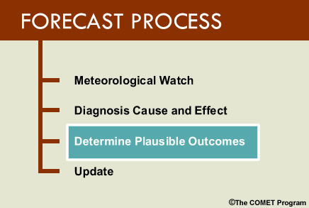
The content of this lesson will assist the forecaster with the third step of the forecast process, namely, determining plausible forecast outcomes forward in time. The lesson will highlight the role of ensemble forecast systems (EFSs) in helping the forecaster assess both the degree of certainty in a forecast, as well as the probabilities of high-impact weather events.
To accomplish these goals, this lesson will discuss the relationship between traditional and newer NWP forecast tools. It will compare the advantages and limitations of the deterministic models traditionally used in the forecast process with those of the coarser resolution EFSs that have more recently become available to the forecaster.
At the end of this lesson you will be able to:
- Compare and contrast deterministic versus probabilistic NWP products
- Describe strengths and limitations of probabilistic products in model forecast assessment
- Differentiate between high and low uncertainty situations using an ensemble forecast system in the forecast process
Three Elements Required to Forecast
Let us begin by introducing the three elements needed to make an intelligent decision about plausible forecasts:
- Knowledge gained from meteorological experience
- Knowledge of meteorological detail
- Knowledge about forecast uncertainty
The first element is forecaster meteorological knowledge. Knowledge is added to, reinforced or modified with forecasting experience. We gain a lot by forecasting and by purposefully learning from our forecast experiences.
Current observations of the atmosphere and higher-resolution deterministic models provide us information on the second needed element: meteorological detail. These details are realistically depicted by the models. Thus they look meteorologically correct and forecasters tend to gravitate toward these correct-looking forecasts.
There is a third and often overlooked element needed in the forecast process and that is knowledge about uncertainty. Our higher-resolution model forecast may look realistic, but cannot tell us with certainty that these realistic features will actually exist. The degree of forecast certainty is information critical to the forecast process, and not having it is a critical limitation of higher-resolution deterministic models.
Advantages of Higher-resolution Models
To help you recall the advantages of higher-resolution, deterministic models, consider the following question:
Question
Short-range forecasts of a 100 km wide rain band might be better resolved by our higher-resolution model than an EFS. (Choose the best answer.)
The correct response is a) True.
Typically, our higher-resolution models will show more meteorological detail than the coarser ensemble forecast system and will do so reasonably accurately at shorter time ranges.
Be aware that as EFSs get to finer resolution this advantage may diminish but will likely always be present. Additionally, by 24 to 72 hours, depending on the flow regime and the resulting degree of uncertainty, this advantage will disappear even when comparing the GFS to the GEFS, which includes the GFS as its members.
Advantages of Higher-resolution Models » Meteorological Detail in Higher-Resolution Models
This synthetic radar reflectivity image was obtained from the 4 km NCEP Weather Research and Forecasting Non-hydrostatic Mesoscale Model (WRF-NMM). Meteorologically, it is highly tempting to use this image because it looks so realistic.
We have highlighted several areas of precipitation that offer realistic depictions of convective and stratiform precipitation. We see linear convection in northern Alabama and western Louisiana, for example, and isolated cells from northeastern Arkansas to Indiana, while convective clusters are depicted over Kansas. Examples of banding within a stratiform precipitation area can be seen in Wisconsin, Minnesota, and western Ontario.
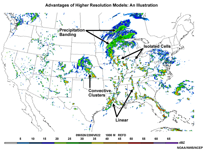
This is some of the detail which can be provided by high-resolution models when compared to coarser EFSs. Such detail is available for many weather phenomena, some of which are listed here:
- Mode of convection
- Onset time of convection
- Location and amount of heavy rainfall
- Banding in winter storms and heavy rain events
- Location and speed of strong winds
The list does not include regional or local phenomena where the higher-resolution model can provide additional insights.
Overall, these models are typically run at higher-resolution than our EFS. Thus, the higher-resolution model is, on average, more skillful than its ensemble counterpart in the short range (day 1 to day 3), due to its higher-resolution, and will show more meteorological detail than individual ensemble members. High- resolution deterministic forecasts can also be considered EFS members.
Limitations of Higher-resolution Models
Limitations of High-resolution Models » Question
Keeping in mind the detail (within the limitations of the model resolution) that can be forecast in higher-resolution deterministic models, consider the following question.
Question
Which of the following would be considered a limitation of deterministic models when compared to EFSs? (Choose the best answer.)
The correct response is choice c).
Deterministic models do not provide information about the level of uncertainty in their forecasts. The ability to show uncertainty information is an important strength of EFSs and can be helpful in creating a forecast.
Choice (a) is actually an advantage of our higher-resolution model over our EFS. In choice (b), the meteorological details are another advantage of our higher-resolution model, particularly at shorter lead times.
Limitations of High-resolution Models » No Direct Information on Predictability or Uncertainty
An important limitation of the higher-resolution deterministic models is that they provide no information about predictability or uncertainty. Thus, they cannot directly provide us with probabilistic information or the degree of confidence in the forecast.
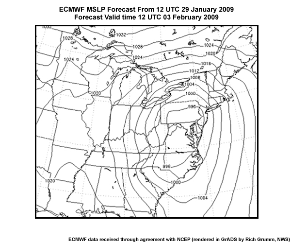
To illustrate the importance of knowing the degree of uncertainty in a forecast, let us begin by looking at a deterministic forecast from the European Center for Medium-Range Weather Forecasts model. (ECMWF)
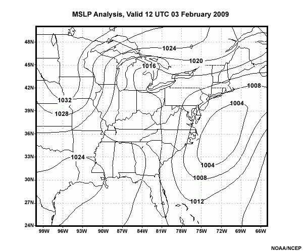
The ECMWF is often praised as the most accurate among the global models used by the world’s meteorological centers. This image shows the deterministic ECMWF Mean Sea Level Pressure (MSLP) (hPa) forecasts from 12 UTC 29 January 2009 valid at 12 UTC 3 February 2009 (a 120 hr forecast) over the eastern United States, with a pressure contour interval of 4 hPa.
In this particular forecast, there is a broad low pressure center at about 992 hPa centered over the Mid-Atlantic States. It looks like a big potential storm along the East Coast. As we shall soon show you however, this storm did not verify and though it looked meteorologically correct, it was an erroneous forecast.
The GFS, UKMet and Canadian GEM models all had significant cyclones, though with somewhat different locations, for this forecast cycle, valid at this time. The graphic below shows the GFS forecast for the same valid time as the ECMWF forecast shown previously.
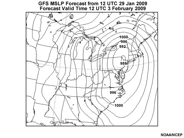
In spite of the general agreement among all the world meteorological centers’ medium-range global models at 120 hours, this storm subsequently showed considerable uncertainty from run to run and never did verify as a significant winter weather event, as we can see from the verifying analysis below. That analysis shows a much weaker cyclone well-offshore, with no real impact on the Mid-Atlantic States.
As tempting as their forecasts may look meteorologically, deterministic models invariably degrade as forecast lead time increases, especially at smaller spatial scales. Because of some of the limitations of high-resolution deterministic models, there is a need for EFSs to understand some of the uncertainty.
The following sections will demonstrate how EFSs help us deal with predictability issues. Good weather forecasts and decisions based on them require information about predictability of the forecast evolution of the atmosphere, and probabilities for different possible forecast outcomes.
Advantages of EFS
Predictability is dependent on many factors, including the scale of the feature we wish to forecast, the larger scale pattern, and the initial conditions provided to our NWP model.
Wherever there is uncertainty, we can also compute probabilities based on the ensemble forecast membership. For example, if there is large spread among forecasts of 850 hPa temperatures, we can compute the probability of the forecasts exceeding a critical threshold, such as say 0°C for a winter weather event.
Good EFS data visualizations help us get at uncertainty information. Some examples of these are plume diagrams, spaghetti plots, mean and spread plots, and probability charts.
The nice thing about plumes and spaghetti diagrams is that they let us visualize the forecast probability distribution for a plotted variable. These data lend themselves nicely to statistical computations such as means, medians, and percentile rankings.
Some of the advantages of EFSs are:
- identification of both high and low probability outcome events
- identification of both highly predictable and highly unpredictable situations
- identification of the degree of certainty in a forecast
Ultimately, probabilities will prove to be a key strength of our EFSs.
EFS Tools Used to Assess Uncertainty and Probability
There are a number of postprocessed EFS products that can be used to assess both the uncertainty in the forecast and the probability distribution for forecast variables. Some of the simpler ones are discussed below. For more on ensemble forecast tools, you can look at the COMET module "Ensemble Forecasting Explained" and click on Summarizing Data in the left-hand navigation menu.
EFS Tools Used to Assess Uncertainty and Probability » Spaghetti Plots
This image shows a spaghetti plot with the 5220, 5460, and 5760-m contours from each EFS member of the NCEP Short Range Ensemble Forecast (SREF) assigned a different color. The grey shading shows the spread about the ensemble mean and the thick black contour shows the ensemble mean position of each of the 3 contours. The darker shading depicts larger spread in the figure.
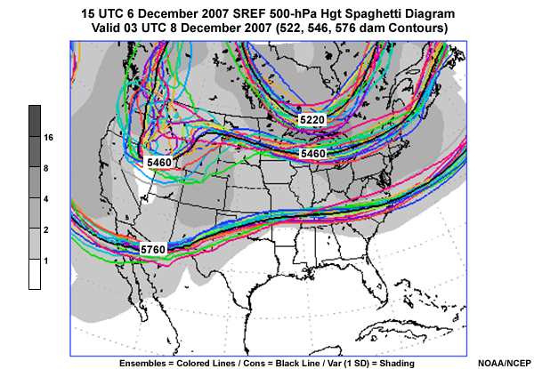
The 500 hPa data clearly show areas of both high and low uncertainty based on the spread of the contours. Adding the spread helps with this activity. Clearly, there is good agreement at 500 hPa over Florida where there is no shading and large disagreement over the Great Lakes where the contours diverge. Also, note the darker shading in the confluent flow along the East Coast.
EFS Tools Used to Assess Uncertainty and Probability » Spaghetti Plots » Question: Spaghetti Plots
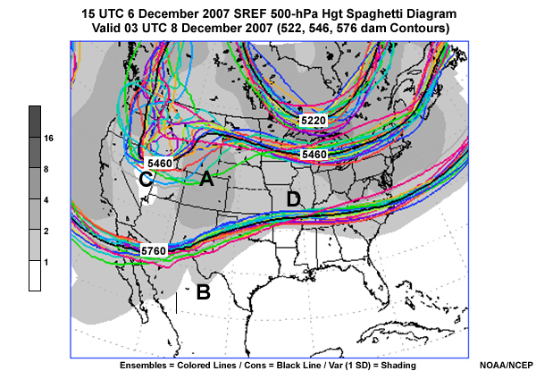
Other areas of high uncertainty are visible on the spaghetti plot which we reproduce below.
Question
We've added letters A, B, C, and D, to represent areas on the image. Select the area of highest uncertainty among the four choices, using the letters below. (Choose the best answer.)
The correct answer is a).
The area over the Rocky Mountains and western Plains is an area with high uncertainty. Area C is in the middle of the western U.S. trough, which seems to show relatively little uncertainty as to its strength, though area A shows that there is uncertainty as to its position over the West. Area B is part of a broad area of low uncertainty across the southern areas of North America, while area D has less uncertainty than there is downstream of that western U.S. trough.
EFS Tools Used to Assess Uncertainty and Probability » Spaghetti Plots » Question: Sea Level Pressure Spaghetti Plots
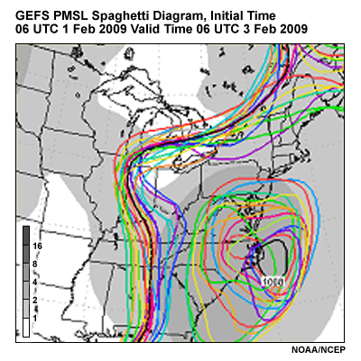
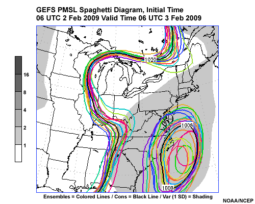
Going back to our potential East Coast snowstorm of 3-4 February 2009, the images here show spaghetti plots from the NCEP GEFS initialized at 0600 UTC 01 February 2009 and 06 UTC 02 February 2009. Both are valid 06 UTC 03 February 2009. They show the forecasts of 1008 and 1020 hPa contours of mean sea-level pressure for each GEFS member as indicated by different colors. The thicker black contour shows the ensemble mean, and the shading shows the standard deviation or spread about the mean, with the spread value indicated by the color bar to the left of the graphic.
Question
Which of the two spaghetti plots shows greater uncertainty in the forecast? (Choose the best answer.)
The correct response is a).
Image A shows greater uncertainty in the forecast, as indicated by the large distances between contours and the darker shades of gray beneath the contours. There is considerable uncertainty to the west of the cyclone off the NC coast, especially in the forecasts from 06 UTC 1 February valid at 0600 UTC 03 February.
EFS Tools Used to Assess Uncertainty and Probability » Plume Diagrams
Now, let’s look at a plume diagram, which is a spaghetti plot of a forecast variable (such as accumulated precipitation) at a point, over a period of time.
Below we see an example of a precipitation plume diagram. The point represented is Scottsbluff, NE, and the forecast starts with the 3-hour accumulated precipitation forecast initialized at 09 UTC 22 October, and runs to 21 UTC 25 October 2008. The EFS used for the plot is again the NCEP SREF. Cumulative forecast precipitation at three-hour intervals is shown, color coded by precipitation type – rain in green, snow in blue, freezing rain in red, and ice pellets in teal - as indicated by the legend to the left of the graphic. The light gray lines in the plume diagram are 3-hourly accumulated precipitation for each ensemble member.
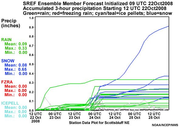
The plume diagram suggests the potential for a mixed snow and rain event late on 23 October into 24 October 2008. The uncertainty here is with regard to both the precipitation type and precipitation amount, with one member showing about 0.9" of total liquid equivalent precipitation, of which 0.65" is in the form of snow over a 36 hour period.
Generally speaking, in both spaghetti and plume diagrams, the distance between the lines tells us the degree of uncertainty.
EFS Tools Used to Assess Uncertainty and Probability » Plume Diagrams » Question: Precipitation Plume Diagrams
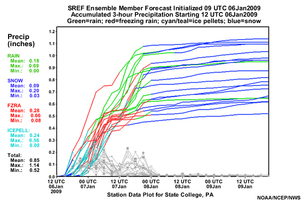
Here’s another precipitation plume diagram for State College, PA from 0900 UTC 6 January 2009 that shows the cumulative precipitation by type through 21 UTC 9 January. Again, the gray lines show the 3-hourly accumulated precipitation. In this image, green is rain, blue is snow, red is freezing rain, and teal is ice pellets.
Question
As a forecaster, what is going to be the most significant forecast issue based on this plume diagram? (Choose the best answer.)
The best response is c).
Clearly, based on the forecast, freezing rain and ice pellets dominate during most of the event, particularly early in the forecast. Rain and snow were the two issues later in the event. Thus, the plume clearly showed the precipitation type issues.
The storm ended up being mostly freezing rain, with about 0.66" falling!
A secondary issue was the timing of precipitation. For example, the ensemble member farthest to the left shows precipitation onset at around 15UTC. The precipitation begins as ice pellets and transitions to freezing rain by 18UTC until 00UTC on the 7th when the precipitation diminishes. At about 9UTC, another round of precipitation begins as freezing rain but quickly changes to rain three hours later (12UTC). Between 3 and 6UTC, the rain then changes to snow. Other ensemble members show different timing for these changes which shows the uncertainty in this part of the forecast.
EFS Tools Used to Assess Uncertainty and Probability » Plume Diagrams » Question: Temperature Plume Diagrams
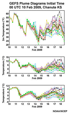
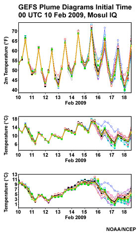
Here are two sets of plume diagrams from the NCEP GEFS initialized at 0000 UTC 10 February 2009 shown through 12 UTC 18 February 2009. The colored lines show each member's forecast, the thick black line is the ensemble mean and the thick yellow line the median. The panels from top to bottom for each are 2m, 925 hPa, and 850 hPa temperatures, respectively. On the left is data from Chanute, KS, while on the right is data from Mosul, Iraq.
Question
Comparing the two sites (Chanute, KS and Mosul, Iraq), which site exhibits more uncertainty in temperatures at all time ranges? (Choose the best answer.)
The correct response is a).
Based on the spread from each member's forecast, the plume from Chanute KS, on the left, suggests that the 2m, 925, and 850 hPa temperatures are not as predictable as those over Mosul, Iraq, on the right. Look at the large spread and high uncertainty at Chanute after about 1200 UTC on 14 February 2009.
The differences between two sites could be the result of differing predictability of weather regimes at the two locations or more predictability in general at one location than another. But in this case, the spread in the 2m temperatures at Chanute is larger than that over Mosul. This is especially true after 15 February when the uncertainty at Chanute grows and the temperature range is 25°F to 63°F! At Mosul, the 2m temperature curves seem to follow each other nicely.
EFS Tools Used to Assess Uncertainty and Probability » Plume Diagrams » Forecast Uncertainty: Spaghetti and Plume Plots
The previous examples suggest that plume diagrams and spaghetti plots have a lot in common. Divergent plume and spaghetti lines both show uncertainty. In the case of the spaghetti diagrams shown previously (and below), the shaded spread quantifies the amount of uncertainty in hPa.
Spread increases with increasing uncertainty, and thus will usually grow with forecast lead time. That can be seen here by noting that the spread in the top graphic for a 48 hour lead time is larger than that for the bottom graphic, with only a 24 hour lead time.
Thus, on average, overall confidence, no matter how low the spread should be inversely proportional to the forecast length. Remember, uncertainty grows with forecast length, and despite low spread at longer ranges forecast skill will be low. This concept is not covered in depth here but one should learn about confidence and relative measures of predictability which show that despite low spread at longer forecast ranges, predictability decreases.
When forecasting, it is unwise to agree with a solution at days 4-7 as it will likely change, even if the spread is relatively low.
EFS Tools Used to Assess Uncertainty and Probability » Probability of Exceedance
The real strength of EFSs is the ability to determine probability distributions. From such distributions, the probability of exceeding particular forecast thresholds can be determined. This information can be very helpful when deciding among several plausible outcomes. Threshold values are chosen because exceeding that value will have a potentially significant socioeconomic impact. Attention is quickly drawn to where important thresholds are exceeded in probability of exceedance maps. High probability of an event typically indicates low spread and thus low uncertainty, and vice versa for low probability of an event.
EFS Tools Used to Assess Uncertainty and Probability » Probability of Exceedance » Probability of Exceedance for High Impact Events
Question
Would you monitor a 10% chance of 5 inches of rainfall in a 24-hour period? (Choose the best answer.)
The correct response is a) Yes.
Extreme high-impact thresholds should always be given attention, even for low probability of exceedance. In most locations 5 inches of rainfall in 24 hours could be devastating and would likely need to be monitored and perhaps even mentioned in a forecast discussion.
EFS Tools Used to Assess Uncertainty and Probability » Probability of Exceedance » Use of Appropriate Thresholds for Forecast Problem of the Day
One should customize the probabilities and thresholds to the forecast problems of the day; some examples appear below:
- Temperatures < 0° C
- Temperatures > 40° C
- QPF > 50 mm
For key forecast problems, you can produce probabilities of exceedance that help with these issues. In winter weather, you might be concerned with 2m, 1000 hPa, 850 and 700 hPa temperatures under 0°C. In the summer 2m temperatures in excess of 40°C might be of concern.
EFS Tools Used to Assess Uncertainty and Probability » Probability of Exceedance » Temperature Probability of Exceedance
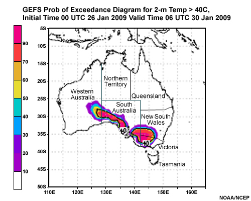
Here’s an example of a probability of exceedance diagram for temperature exceeding 40°C over Australia, during the Australian heat wave of late January 2009. The graphic uses data from the NCEP GEFS and shows probability of 2m temperatures exceeding 40°C over Australia. This forecast was initialized at 00 UTC 26 January valid at 06 UTC 31 January 2009. Probability of exceeding the threshold temperature is shaded with: red indicating the highest probability, purple the lowest non-zero probability; the ensemble mean 40°C contour is plotted in bold black. This case illustrates a well-predicted record heat wave which resulted in historic fires in Australia and how ensemble probabilities facilitate rapid identification of the event.
Question
If we define "very hot" as a temperature greater than 40°C, where in this area is the chance of very hot weather greater than 50%. (Choose all that apply.)
The correct answers are a), c), f), and g).
Where the yellow, orange, red, and magenta colors appear, represent areas with 50% or greater probability of temperatures exceeding the "very hot" threshold, 40°C. Clearly, hot weather was in store for southern Australia. This event was in fact well predicted and is now known as the record Australian heat and fire event of late January and early February 2009. Temperatures rose to as high as 50°C in a few locations during the heat wave.
EFS Tools Used to Assess Uncertainty and Probability » Probability of Exceedance » Precipitation Probability of Exceedance
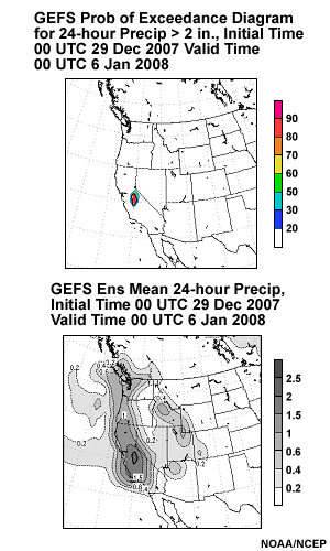
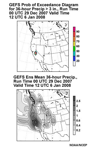
The two images below are GEFS forecasts of QPF initialized at 0000 UTC 29 December 2007 showing, in the upper panels, the probability (from left to right) of 2 inches of precipitation for 24 hours ending 00 UTC 6 January 2008 and 3 inches of precipitation in 36 hours ending 12 UTC 6 January 2008. The lower panels show the 24 and 36 hour ensemble mean QPF, respectively from left to right.
Question
Given these graphics, where would you be most confident that heavy precipitation, i.e. 2 or more inches of precipitation in 24 hours , will take place? (Choose the best answer.)
The correct response is d).
Note the high probability of 3 inches and 2 inches of precipitation in the mountains of eastern California for 24 hours and 36 hours respectively. This is a real attention-getter; it is pretty clear where the highest chances of the heaviest 24 and 36 hour precipitation are.
Current EFS limitations
EFSs are not a panacea, and have their limitations. Some critical limitations include the fact that they tend to be under dispersive, that is, the forecast members do not have enough spread. As a result, they will miss a few high-impact events from time-to-time. This is true of ALL EFSs not just the NCEP systems.
EFSs have lower resolution than the deterministic versions of the models used to create them due to computer resource constraints, so they cannot be used to forecast the same details as their companion high-resolution deterministic models.
Another issue is the uncertainty with respect to initial conditions. We will never get the initial conditions correct in any model and thus all model runs are subject to uncertainty due to the limits of the initial conditions. Our deterministic models use the best available initial conditions from its parent model. These initial conditions are then used, on a coarser grid, to initialize the control member of our EFS. This introduces more uncertainty. Then we take these conditions and perturb them to make the initial conditions for each member of the EFS. Thus, we further degrade the "best initial" conditions from where we started. Perturbation methods and getting a good diverse set of initial conditions for each EFS member is an area where there is still room for improvement.
Because of these limitations, EFSs are continually being improved. Improvements come from work done on:
- the underlying models used for the EFS including increasing the resolution of the members of the EFS
- improving the initial conditions and improving the methods to create perturbations in EFSs,
- post-processing EFS data via bias correction and calibration of the probabilities produced by EFSs.
Current EFS limitations » Use of Higher-resolution Models and EFS
Question
Let's consider this example. You are faced with a forecast situation involving locally strong gradients, such as temperatures over complex terrain or with a sharp cold front moving through the forecast area. The timing and placement of weather features look about the same in the EFS ensemble mean and higher-resolution deterministic forecasts. Which of the following is the best conclusion? (Choose the best answer.)
The correct response is c).
The EFS must be utilized to evaluate uncertainty. If the forecast has low uncertainty – small spread and a high probability outcome, then a high-resolution deterministic model forecast showing a similar solution can be used to help with local details.
Remember, you need to use an EFS to determine if the higher-resolution model forecast can be used approximately as is. You need to gauge the uncertainty before you can use a single model outcome with a high degree of confidence.
Summary
In this lesson, we considered how knowledge of uncertainty can assist us in creating better forecasts. One of the tools that we used in order to estimate the uncertainty in a forecast was an EFS. The spaghetti plots and plume diagrams from these EFSs offer us a visual representation of the spread between model runs and thus the relative degree of certainty in the forecast.
We also compared the EFSs to the capabilities offered by high-resolution deterministic models. Higher-resolution deterministic models tend to be more skillful and provide meteorological details and insights, but they provide no information on uncertainty or on probabilities. On the other hand, an EFS lacks the resolution but offers us the ability to gauge uncertainty in the forecasts. Also, EFSs tend to be under-dispersive.
When used together with the output of high-resolution deterministic models, EFS data should aid in your ability to differentiate between high and low uncertainty events and thus help you create a better forecast.
As EFSs continue to evolve and get better, they may gradually become the cornerstone of weather forecasting and decision support services.
Contributors
COMET Sponsors
The COMET® Program is sponsored by NOAA's National Weather Service (NWS), with additional funding by:
- Air Force Weather (AFW)
- Australian Bureau of Meteorology (BoM)
- European Organisation for the Exploitation of Meteorological Satellites (EUMETSAT)
- Meteorological Service of Canada (MSC)
- National Environmental Education Foundation (NEEF)
- National Polar-orbiting Operational Environmental Satellite System (NPOESS)
- NOAA's National Environmental Satellite, Data and Information Service (NESDIS)
- Naval Meteorology and Oceanography Command (NMOC)
Project Contributors
Project Lead
- Dr. William Bua — UCAR/COMET
Principal Science Advisor
- Richard Grumm — NOAA/NWS WFO State College, PA
Senior Project Manager
- Dr. Gregory Byrd — UCAR/COMET
Instructional Design
- Bryan Guarente — UCAR/COMET
- Tsvetomir Ross-Lazarov — UCAR/COMET
Graphics/Interface Design
- Steve Deyo — UCAR/COMET
- Brannan McGill — UCAR/COMET
- Heidi Godsil — UCAR/COMET
Multimedia Authoring
- Dan Riter — UCAR/COMET
- David Russi — UCAR/COMET
COMET Staff, Fall 2009
Director
- Dr. Timothy Spangler
Deputy Director
- Dr. Joe Lamos
Administration
- Elizabeth Lessard, Administration and Business Manager
- Lorrie Alberta
- Michelle Harrison
- Hildy Kane
Hardware/Software Support and Programming
- Tim Alberta, Group Manager
- Bob Bubon
- James Hamm
- Ken Kim
- Mark Mulholland
- Wade Pentz - Student Assistant
- Jay Shollenberger - Student Assistant
- Malte Winkler
Instructional Designers
- Dr. Patrick Parrish, Senior Project Manager
- Dr. Alan Bol
- Maria Frostic
- Lon Goldstein
- Bryan Guarente
- Dr. Vickie Johnson
- Tsvetomir Ross-Lazarov
- Marianne Weingroff
Media Production Group
- Bruce Muller, Group Manager
- Steve Deyo
- Seth Lamos
- Brannan McGill
- Dan Riter
- Carl Whitehurst
Meteorologists/Scientists
- Dr. Greg Byrd, Senior Project Manager
- Wendy Schreiber-Abshire, Senior Project Manager
- Dr. William Bua
- Patrick Dills
- Dr. Stephen Jascourt
- Matthew Kelsch
- Dolores Kiessling
- Dr. Arlene Laing
- Dave Linder
- Dr. Elizabeth Mulvihill Page
- Amy Stevermer
- Warren Rodie
- Dr. Doug Wesley
Science Writer
- Jennifer Frazer
Spanish Translations
- David Russi
NOAA/National Weather Service - Forecast Decision Training Branch
- Anthony Mostek, Branch Chief
- Dr. Richard Koehler, Hydrology Training Lead
- Brian Motta, IFPS Training
- Dr. Robert Rozumalski, SOO Science and Training Resource (SOO/STRC) Coordinator
- Ross Van Til, Meteorologist
- Shannon White, AWIPS Training
Meteorological Service of Canada Visiting Meteorologists
- Phil Chadwick
- Jim Murtha