EPS Products Reference Guide »
Climatological Percentiles
Description
Climatological percentile products are used to assess whether forecast variables have unusual values compared to a model climate or reanalysis climatology. Forecasters are not always familiar with what constitutes a typical range of conditions. Therefore, a comparison to model or observed climatological data is useful to help identify anomalous forecast conditions that could cause significant weather impacts.
Interpretation
The comparison climatology in the NAEFS maps used in this guide comes from a reanalysis dataset for the 30-year period of 1979-2009 from the Climate Forecast System Reanalysis (CFSR). The climatological period includes 10 days before and after the current forecast time. This 21-day window is used to capture highly impactful events, not only extreme or record-setting daily events that a much shorter window would examine. Note that the climatological period can vary by organisation.
Climatological percentile maps show a current ensemble mean field ranked as a percentile of a model climate or reanalysis climatology. Typically, the mean values are contoured and the percentile values are colour-shaded. Usually the shading only highlights the tails of the population (beyond 10% and 90%) to help you focus on potentially extreme events.
The climatological percentile value is calculated using the ensemble mean at a specific valid time compared to equivalent valid times for all days within the model climate or reanalysis climatology period. When the current ensemble mean values exceed those found within equivalent valid times in the climatology, the category and shading “max at XX hrs” is applied.
To eliminate diurnal variability concerns, the ensemble mean values are also compared to all valid times within the climatology. Ensemble values higher than this (if present) are shaded as “max at all hours.”
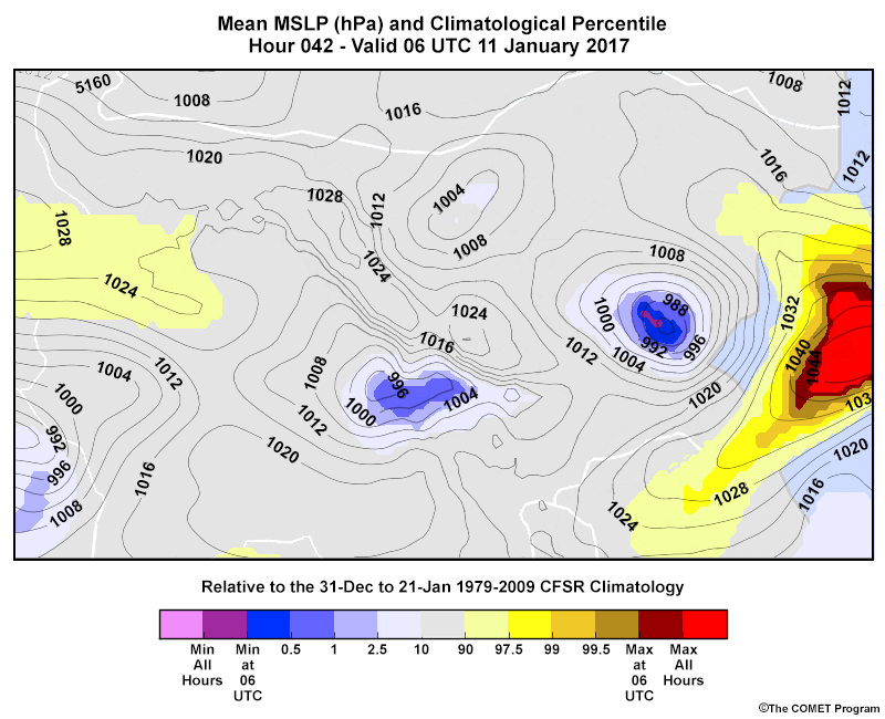
For example, the easternmost low pressure system above is shaded mostly in blues, with the darkest blue showing that the mean MSLP value there is <= 0.5% of the climatology values. The centre of the low pressure shows some purple shading, indicating that it has a mean MSLP percentile below any 06 UTC value in the climatology window.
As the ensemble spread gets smaller with closer lead times, the magnitude of the climatological percentile often becomes more extreme. In other words, as the event gets closer, the Probability Distribution Function (PDF) becomes narrower.
Strengths & Weaknesses
Strengths:
- This product lets you quickly anticipate anomalous forecast weather conditions, and is especially useful for assessing whether severe or extreme events are possible during the forecast period.
- The product uses a model climate or reanalysis climatology, which provides more comprehensive coverage than an observed climatology with gaps in records.
Weaknesses:
- Climatological percentile maps do not show the type of weather or details of weather systems—only whether specific forecast variables are anomalously high or low compared to the model or reanalysis climates.
- Climatological percentiles only compare the ensemble mean value to a model climate or reanalysis climatology; they do not provide information about the member distribution, such as its shape or the presence of multiple modes.
- Model climate and reanalysis climatologies are not equivalent to an observed climatology and may capture more or less than the full range of possible conditions at a given location.
Effective Use
Climatological percentile plots are useful for quickly assessing whether anomalous weather systems or conditions are possible in the forecast period. They are best combined with other plots in the following ways.
- Compare them to spaghetti maps or plume diagrams to see the shape of the member distribution. This can help you determine the usability of the ensemble mean and whether certain clusters favor a different outcome at a particular location.
- Use mean and spread maps to help determine overall uncertainty within the ensemble system and refine whether there are differences in weather system timing, magnitude or placement to consider.
- Use probability of exceedance/occurrence plan-view maps to understand whether specific values of interest (such as the freezing point) or other industry or warning criteria thresholds may be exceeded.
Keep the following points in mind when using climatological percentile maps.
- Climatological maxima or minima do not always correspond to the most extreme mean values. For example, this can occur near regions with topography where the ensemble mean value of precipitation is normal on the windward side of the range but anomalous on the leeward side.
- Depending on your users, you may need more detailed information about climatological percentiles other than the top and bottom 10%.
- The climatology window changes when you compare valid times in a single day of an ensemble run to those on a subsequent day. Consider this when determining if an increase or decrease in a climatological percentile value is from the evolution of forecast weather conditions or changes in the climatology values.
- A single variable with climatologically anomalous values does not imply that a related variable will also have anomalous values.
Example, Part 1
Answer the questions on this and the following page about this loop of NAEFS Mean Integrated Water Vapour Transport (IVT) and its climatological percentiles. The ensemble was initialized at 00 UTC 7 February 2017.
Question
At multiple times throughout the loop, the 750 kg m-1 s-1 ensemble mean value contour enters into California. At 12 UTC on 9 February, the 1000 kg m-1 s-1 contour comes very close but does not make it. Remember that these values are only the ensemble mean values; some members will show higher values.
Example, Part 2
Answer the following questions about the same animation.
Question 1 of 2
What is the significance of the integrated water vapour transport values in the MAX ALL HRS bin shown over northern California during the animation? Choose the best answer.
The correct answer is b.
When the percentiles of the ITV values enter into the MAX ALL HRS range, it means that the ensemble mean forecast value is higher than the 3-week window reanalysis climatology. It does not mean that all ensemble member values exceed the climatology, just that the mean does.
Question 2 of 2
Which other products would be most useful for estimating areas with high degrees of uncertainty in mean integrated water vapour transport? (For those unfamiliar with the products listed below, probability of exceedance maps show the probability of exceeding a value of interest; Extreme Forecast Index and Shift of Tails maps show whether a predicted variable is anomalously high or low compared to values from a model climate; mean and spread maps show the average value of a variable and its standard deviation; and plume diagrams show all ensemble members for a variable over time at a specific location.)
The correct answers are c, d.
Mean and spread maps allow you to see the standard deviation, or spread, in forecast integrated transport. Plume diagrams let you see the full distribution of ensemble members and the shape of the distribution as well as any evidence of multiple modes. Thus, you can get an idea of how much uncertainty there is across the region and whether the mean represents the shape of the distribution well enough to be used as a “most likely” outcome.
Probability of exceedance maps help you estimate whether certain water vapour transport amounts will be exceeded, but do not give a general estimate of uncertainty or show the shape of the ensemble distribution
Extreme Forecast Index and Shift of Tails maps provide a similar estimate of whether anomalously high or low variable values are expected in the forecast period. They do not show information about the general uncertainty or display the shape of the distribution.
Links
- Ensemble Situational Awareness Table - NAEFS Climatological Percentiles: http://ssd.wrh.noaa.gov/satable/?table_region=na&plot_region=na&type=pctl
- Ensemble Situational Awareness Table - NAEFS Climatological Probabilities: http://ssd.wrh.noaa.gov/satable/?type=prob