EPS Products Reference Guide »
Probability of Exceedance and Occurrence
Description
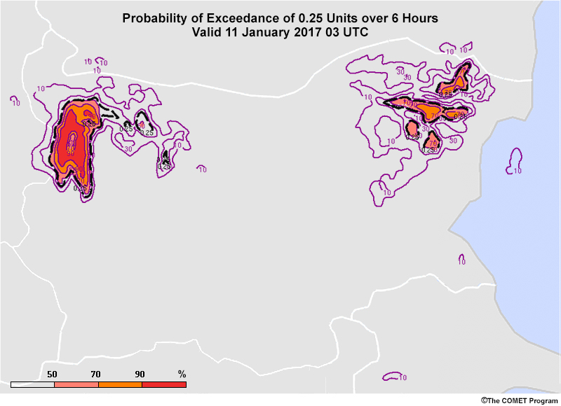
Probability of exceedance and occurrence maps are criteria-based, probabilistic maps. Each map uses specific variable and time thresholds. For instance, the map above is a probability of exceeding 0.25 units of precipitation over a 6-hour period.
These maps are useful for quickly summarizing the probability of specific conditions of concern, such as whether temperatures will reach dangerously high levels or become low enough to threaten vegetation, or whether precipitation amounts could cause flooding.
Interpretation
Colour-shaded values show the percentage of ensemble members that exceed the threshold value. According to the legend, some parts of the western precipitation area show 90-100% of members producing greater than 0.25 units over 6 hours. In the eastern precipitation area, the maximum probability is between 70% and 90%. Neither range should be interpreted as the average of its range since these maps cannot provide that information. For the eastern area, it would be misleading to communicate an 80% probability of >.25 units per 6 hours instead of using the range of 70-90%.
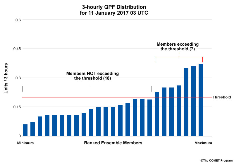
How are the probabilities calculated from the initial distribution of members? Below is the gridbox distribution for a threshold of .2 units/3 hours. Of the 25 possible members, 7 exceed the threshold, yielding a 28% percent probability of exceedance.
This type of map can be generated for any threshold. However, it is usually best to use thresholds that match user-driven or warning/advisory criteria when available. You may be tempted to use predefined thresholds from existing map sets. But it can be difficult to, for example, extrapolate the information from a 10 mm precipitation threshold to a 12 mm threshold given the variations in distribution shapes (for example, normal distributions vs. clusters).
Furthermore, outliers, clustering, and the full range of the distribution cannot be seen on these maps. You can only be certain of the distribution’s minimum and maximum when the probability is 0% or 100% respectively. Also be aware that the ensemble system may not be capturing all possibilities and that conditions may end up outside the envelope of any model solutions.
Although you cannot directly view the most likely outcome(s) within the EPS results, you can estimate a general range of likely outcomes by viewing a series of maps with increasing thresholds. For example, if all members show precipitation greater than 5 mm, 90% show over 10 mm of precipitation, and only 20% predict more than 20 mm, you can be fairly certain that precipitation will be between 10 mm and 20 mm. But since you cannot see the individual members or any percentiles for the distribution, you cannot tell if the precipitation will be closer to 10 mm or 20 mm.
This poses a problem when a customer wants to know whether a certain threshold, such as 15 mm, will be exceeded. Using a simple average or 15 mm can be misleading if many members are clustered near 10 mm or 20 mm rather than being evenly distributed throughout the threshold range. Thus, it is wise to consult other maps or charts that reveal the shape of the member distribution.
Strengths & Weaknesses
Strengths:
- Clear colour-shading and contours combined with a computed probability value make these maps easy and quick to interpret.
- The ability to determine the percentage of ensemble members that exceeds a given threshold makes them especially useful for forecasting watches, warnings, advisories, and user-driven criteria.
Weaknesses:
- Information about the shape of the distribution, including clustering and the maximum, minimum, and outlier values, is not available.
- You cannot view information that is typically used to gauge the most likely outcome, such as mean or median.
- The products are less meaningful if the threshold values do not match user-driven or warning/watch/advisory criteria, or are not part of a series with increasing threshold values.
Effective Use
Probability of exceedance or occurrence maps are useful at all time ranges. They are especially effective at helping forecasters gain situational awareness about any critical thresholds that might be met. They are best combined with other products in the following ways.
- Use spaghetti maps to gauge the shape of the distribution and the complete range of values; this will help you determine the most likely outcome(s) and the conditions for values between the available threshold intervals.
- Use point products for a specific location, such as box and whisker plots or plume diagrams, to see the forecast conditions and timing of exceedances.
- When possible, probability of exceedance/occurrence maps should be created in accordance with warning/watch criteria,such as the amount of snowfall that results in a heavy snow warning or winter storm watch; common industry and agricultural thresholds, such as the freezing temperature); or other user-driven criteria.
Keep the following points in mind when using probability of exceedance or occurrence plots.
- The time periods covered in each product may not match user or communication criteria.
- Direct-averaging or linear interpolation between two threshold values can yield poor results, especially when a skewed distribution or clustering is present. Consult the additional maps and plots listed above to help with estimating a threshold that lies between two available thresholds.
- These maps are often produced for a variety of precipitation-related quantities, such as QPF, rainfall, snow depth, snowfall, freezing rain, or ice pellets. When looking at each, you may need to add or subtract two fields or otherwise transform the information to a precipitation total or rate.
- Remember that snow-to-liquid ratios are often assumed to be 10:1 in many models and post-processing procedures. Use your knowledge of the flow regime and local factors to mentally adjust snowfall amounts and rates from the EPS as needed.
Examples, Part 1
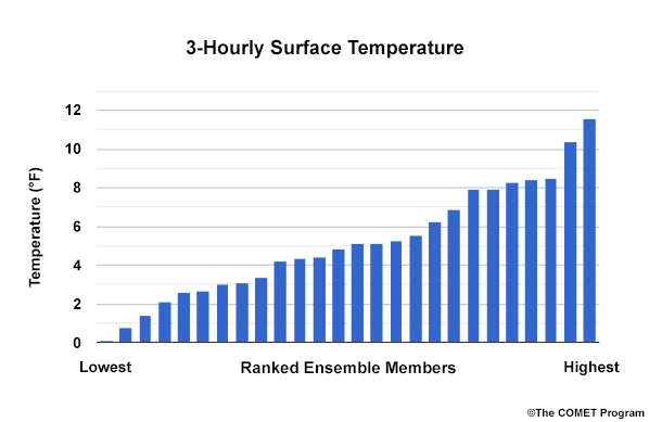
Select the best answer about this distribution of 3-hourly surface temperature data from the 26 member ensemble.
Question
What percentage of ensemble members forecast a surface temperature below 6˚F?
The correct answer is f.
17 members are forecasting a surface temperature below 6˚F. That’s approximately 65% of the distribution (17/26 = ~.65).
Examples, Part 2
Question
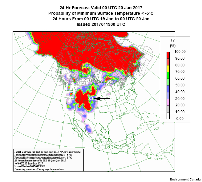
Decide if each of the following questions about the CIRCLED AREA in this probability of exceedance map is true or false.
At the circle, there is a 40-50% probability that the minimum surface temperature will be less than -5˚C. Saying that there is a 45% probability misrepresents the data since the mean of that range is not given.
There's a 60-50% probability that the temperature will be greater than -5˚C. This is just the inverse of the distribution.
As an aside, the white areas on the map represent probabilities of 0-10%, not just 0%, so outliers may be present but not evident.
Examples, Part 3
>2 mm
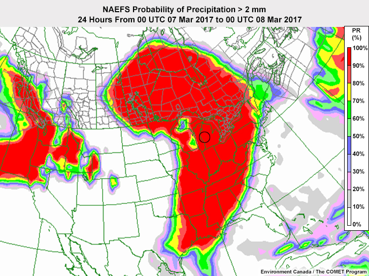
>5 mm
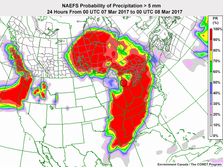
>10 mm
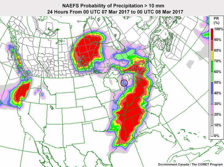
>25 mm
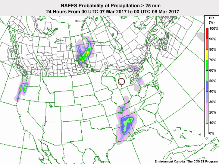
Question
If a customer asks about the probability of getting more than 6.35 mm of precipitation in the area circled on the maps, you should say that it is:
The correct answer is f.
The customer is asking about a threshold that isn't the exceedance criteria for this map so you cannot tell the true probability from it. You know that the probability is somewhere between 50% and 90%. But you would need to see the distribution of members to be more precise.
Links
- CMC NAEFS Probability of Exceedance Maps (days 1 - 15): https://weather.gc.ca/ensemble/naefs/produits_e.html
- WPC 70 member multi-model Precipitation Probability of Exceedance Maps (GIS; days 1 - 3): http://www.wpc.ncep.noaa.gov/pwpf/wwd_accum_probs.php
- WPC 70 member multi-model Precipitation Probability of Exceedance Maps (Gifs; days 4- 7): http://www.wpc.ncep.noaa.gov/wwd/winter_wx.shtml
- NCEP Global Ensemble PQPF (days 1 - 15): http://www.emc.ncep.noaa.gov/gmb/yluo/html_pqpf/pqpf_us1.html
- SPC SREF Probability of Exceedance Maps (hours 00 - 87): http://www.spc.noaa.gov/exper/sref/sref.php?run=latest&id=SREF_SNOWRATE_1INCH
- NCAR WRF Ensemble Precipitation Probability of Exceedance Maps (hours 00 - 48): http://ensemble.ucar.edu/images.php?d=2016011100&f=snow_neprob_1.0&r=CONUS
- NCAR WRF Ensemble Visibility Probability of Exceedance Maps (hours 00 - 48): http://ensemble.ucar.edu/images.php?d=2016011100&f=afwavis_problt_0.25&r=CONUS
- HRRR Time-Lagged Ensemble, Probability of Exceedance Maps: https://rapidrefresh.noaa.gov/hrrr/hrrrtle/