EPS Products Reference Guide »
Shaded Percentile EPSgrams
Description
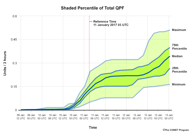
Shaded percentile meteograms, or EPSgrams, display probabilistic information about how specific weather variables change over time at a particular location. They can either represent Probability Distribution Functions (PDFs) or Cumulative Distribution Functions (CDFs, shown above). The values at each time step represent the full range of the PDF and distinguish important probabilistic quantities, such as nth percentile levels and the median.
Interpretation
The lines bordering the colour-shaded areas represent common percentile levels, such as the 25th, 50th, and 75th percentiles. Sometimes the ranges end at 10% and 90% instead of the maximum and minimum of the distribution as seen here.
The median value (most likely outcome if members are normally distributed) is typically indicated by a bold line in the “middle” (50th percentile) of the colour-shaded area.
The colour shadings indicate certain ranges of probabilities. In this case, the light green indicates the outer two 25 percent ranges while the darker green indicates the middle 50 percent range.
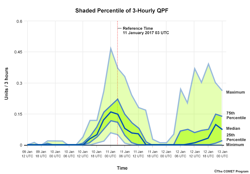
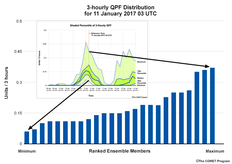
In the graphic below, the inset is a shaded percentile diagram, with the full distribution from the 14th time step is shown in the foreground. The highest and lowest precipitation values predicted within the distribution are represented by the maximum and minimum percentiles respectively.
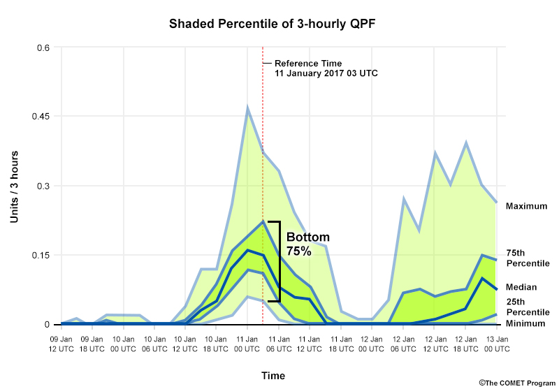
To understand the probability of a threshold being met or exceeded, use the percentile shadings. In the diagram below, there is a 75% chance of <= .22 units / 3 hrs of precipitation over the 3-hour time period since 75% of the ensemble members have values less than or equal to it.
The median value often represents the most likely outcome in a normal distribution. However, there may be member clustering or a multiple modes, so it is wise to consult other diagrams that display individual members, such as plume diagrams, to inform your use of the median.
Strengths & Weaknesses
Strengths:
You can quickly determine probabilities and percentiles at common intervals by visually inspecting the percentile lines. You can also estimate the general agreement between ensemble members by examining the size of each shaded area: the larger an area, the less agreement and more uncertainty there is in the EPS forecast. In our example, the areas (especially the lighter green ones) generally become larger at longer lead times, as we would expect.
Finally, shaded percentile diagrams show conditions at a specific point. This often gives you more precise information than estimating the value at a point from plan-view maps.
Weaknesses
Like point products in general, the model forecast is likely interpolated, bilinearly or using the nearest land or sea gridpoint, to the specific point location. Thus, the model is trying to represent horizontal and vertical scales that are not actually present, leading to some smoothing of forecast values.
While we can easily observe the median, maximum, minimum, and common percentiles from a shaded percentile plot, we do not know the shape of the distribution. The median will not represent the most likely solution when the distribution is multimodal or clustered. That’s the case with some of the time steps in our diagram below. Examine it, trying to figure out what the distribution of the 24 members looks like at each time step. Then move the slider to see the actual distribution in the plume diagram.
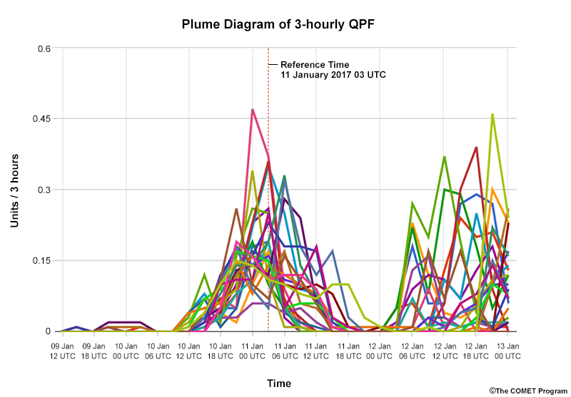
At 11 Jan 12 UTC (not the reference time indicated in red), the distribution is roughly clustered into two sets. One produces precipitation around the 0.10 unit level, while the other produces minimal or no precipitation.
Since shaded percentile EPSgrams do not show individual members spatially and temporally, you cannot identify the cause of member disagreement—if it’s due to differences in the timing, magnitude, position of the weather system, or a combination of the three.
It also makes it difficult to determine precipitation type and other qualities. Imagine that the majority of members forecast sub-zero temperatures while a large number also forecast substantial precipitation. Since you cannot identify which members forecast both quantities, you cannot determine precipitation phase.
Finally, tracking individual members instead would help in assessing whether members using certain model physics or parameterizations are causing clustering or outlier solutions.
Effective Use
Shaded percentile diagrams are useful for quickly finding bulk changes in variables throughout the entire forecast period. They are best combined with other plots in the following ways.
- Use plume diagrams to view clustering and/or the multimodal shape of the distribution, to help you assess the shape of the distribution and then determine most likely outcome(s). Plume diagrams also let you track individual members or clusters to better understand specific model impacts and assess categorical variable results.
- Use plan-view spaghetti maps, or trajectory maps to assess member disagreement in timing, magnitude, or position
- Use plan-view maps of probability to check on potential smoothing of surrounding values for your point forecast.
Keep the following points in mind when using shaded percentile plots.
- Carefully examine the legend to determine which percentiles are indicated by the different lines and shaded areas.
- Examine the start and end time of each period. See if the data is an instantaneous value, maximum or minimum for the period, or an accumulated value covering the beginning, middle, or end of the time step.
- If you are concerned about severe or rare events, access climate information (model, reanalysis, or observed). At long lead times, the EPS median has a tendency to gravitate asymptotically toward the model climate.
- Occasionally, a deterministic run may show values outside the range of the EPS solution set. Since deterministic runs often have smaller grid spacing than ensemble runs, this could signal that small-scale features and/or topography are better resolved, or that the EPS may not be adequately sampling the particular processes or regime. This does not mean that the EPS members or deterministic runs are better than the other. But it should alert you to closely scrutinize the model initialization and subsequent model runs.
- Be careful when interpreting cumulative distribution information, such as accumulated precipitation. The statistical values from smaller-time steps, such as the median precipitation over 6-hour periods, cannot be summed to deduce the median precipitation over 24 hours.
- If the data displayed is cumulative, the slope from time step to time step represents the PDF frequencies.
Examples
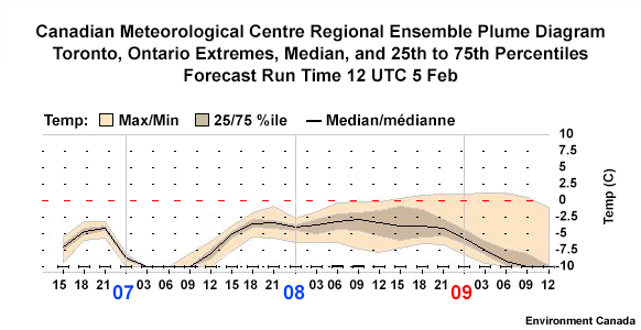
The following questions are based on this graphic from Toronto, Ontario, Canada.
Question 1 of 3
Assuming a normal distribution of ensemble members, what is the most likely 2 m temperature forecast by the ensemble for 00 UTC 9 February?
The correct answer is d.
On this graphic, each vertical dotted line represents the beginning of a 3-hour period. The brackets indicate plus/minus 1.5hrs around each time. Using the median value as the most likely outcome, the 2m temperature for the tick mark at 00 UTC is approximately -6.0˚C. If you used either end of the time period, you would get a different value given the slope of the line through the period.
Since ensemble members are not always normally distributed, do not always assume that the median is the most likely outcome. To be sure, check another product that shows individual members.
Question 2 of 3
At 00 UTC 9 February, what is the percent chance that the temperatures will be above 0˚C?
The correct answer is e.
It is hard to tell since you cannot see the full distribution to determine the actual location of the ensemble members between the two known surrounding percentiles (75% and 100%). If you assume that the ensemble members are distributed equally through the 75th to 100th percentile, ~5% would be correct. However, you cannot tell whether the distribution within that range is evenly spaced. The most we can say is that there is less than a 25% chance of the temperature exceeding 0˚C. Some shaded percentile diagrams show 5% and 95% lines, 10% and 90% lines, and so on to help with these types of situations.
Question 3 of 3
At which time below does the model show the least uncertainty in the temperature forecast for the following time steps?
The correct answer is a.
Of these times, model uncertainty is least at 00 UTC 8 February since it has the smallest difference between the maximum and minimum values and the lowest standard deviation overall (by visual estimate).
Remember that this is the model’s uncertainty in the forecast and that your personal confidence need not be the same. With deterministic solutions sometimes lying outside of the ensemble solution set, you may have a good reason not to trust the ensemble.
Links
- Shaded Percentile EPSgrams for clickable locations for Days 1 - 15: https://spotwx.com/