EPS Products Reference Guide »
Mean and Spread
Description
Mean and spread diagrams are plan-view products that display the average (mean) value of a variable as well as a representation of uncertainty (spread). The spread is often represented as the value of one standard deviation of the distribution at each grid box on the graphic. The mean and spread together give an indication of the overall shape of the distribution.
Interpretation
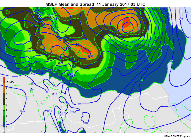
Mean and spread diagrams can show the mean values of a variable as well as the spatial, temporal, and magnitude uncertainty of the ensemble member distribution. Typically, the mean values are plotted as contours while the spread is colour-shaded, as shown on the map below.
Mean and spread diagrams do not display the full distribution of members at a given point. Rather, they are a generalized statistic that helps you interpret the distribution by displaying the value of the first standard deviation (1σ, or sigma).

If the ensemble has a normal distribution of values, 68% of members will occur within a range of +- σ from the mean, as shown above. Thus, at the location with the red dot, the contour has a mean value of 1000 hPa. The shading around it is brown, which correlates to +- 6-7. So 68% of the members have values between +- 6-7 or approximately 993-1007 hPa. The spread is larger at the white dot. The contour has a mean pressure value of 988 hPa, and the orange shading around it correlates to +- 9-10. Thus, 68% of the members have values of 978-998 hPa.
The placement of the spread in relation to the mean helps you interpret the timing and magnitude of the system or feature as well as spatial and/or track differences. Any or all of the following placements can occur in an ensemble.
Amplitude Discrepancies
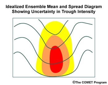
When the spread is centred within a feature in the mean field, it indicates that the magnitude of the feature differs between members.
Temporal Discrepancies
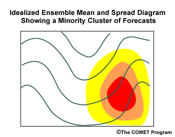
When the spread is on one side of a feature, it indicates that the timing of the feature varies among members. In our example, a large number of members with a similar trough (a cluster) are located to the east or temporally ahead (assuming roughly west to east flow) of the mean trough.
Spatial Discrepancies
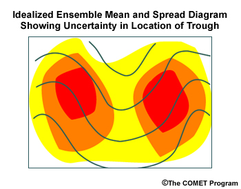
When the spread is on both sides of a feature, it indicates that the location of the feature varies among the members. Here, a large number of members with similar troughs are to the east and the west of the mean trough.
Outliers and the full range of member values are NOT shown in mean and spread plots.
The graphic below shows two cases, each with a normal distribution around the mean. The one with the narrow distribution (red shading) has a small standard deviation, while the one with the wide distribution (blue shading) has a large standard deviation.
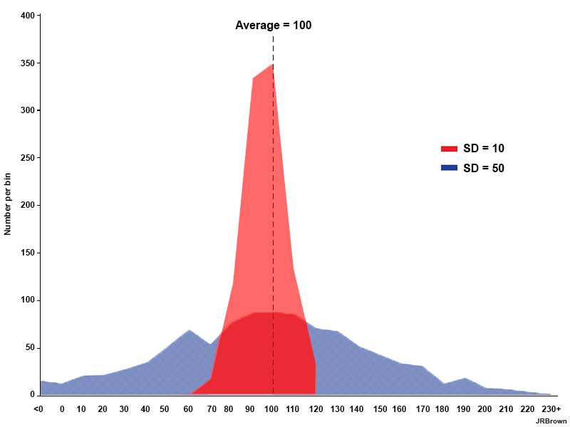
A large standard deviation tells us that the mean is not representative of the overall distribution and that there is more uncertainty in the feature’s location, timing, and/or magnitude. There is more certainty in the mean value when the standard deviation is small.
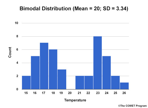
Clustering of members can also make the standard deviation large and unreliable, and the mean less meaningful. For example, the Bimodal Distribution graphic below has the same mean as the Normal Distribution graphic, but a much larger standard deviation.
Bimodal Distribution
Normal Distribution
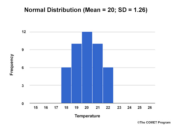
The most likely outcomes, then, are mean values with small standard deviations. In our examples, those are the mean from the single-mode normal distribution and the two local means within each peak of the bimodal distribution.
Strengths & Weaknesses
Strengths:
- Mean and spread charts are less cluttered than products such as spaghetti diagrams.
- The combination of contours and colour-shading is easy to read.
- The location of the larger standard deviation values with respect to the mean values lets you assess temporal, spatial, and amplitude differences together in one plot.
Weaknesses:
- Mean and spread charts do not show the entire range of member solutions.
- You cannot determine member clustering.
- Standard deviation calculations assume a normal distribution of ensemble members. This is not always the case and can cause misinterpretation.
Effective Use
Mean and spread diagrams give you a general understanding of where there is uncertainty in model solutions. They show where you should focus extra attention by checking the distribution of model members and/or deterministic solutions, assessing the quality of the model initialization, and harnessing local knowledge.
Mean and spread plots are best combined with other plots in the following ways.
- Use spaghetti diagrams and trajectories to see the distribution of solutions. They can help you determine if there’s clustering or a multimodal shape. To choose a contour or set of contours to view in a spaghetti plot, look for mean contours that intersect areas of large spread.
Keep the following points in mind when using mean and spread plots.
- They can be used at all time scales effectively. However, they often show little variation in the short-range.
- Be careful about relying on the mean around frontal passages, convective storms, and precipitation edges since the individual temperatures and precipitation amounts, etc., may be much higher or lower depending on the feature’s proximity to the mean contours.
- Occasionally, mean values are dramatically different from the individual members’ values and include values not present in the distribution. This sounds counterintuitive so let’s dig deeper with an example.
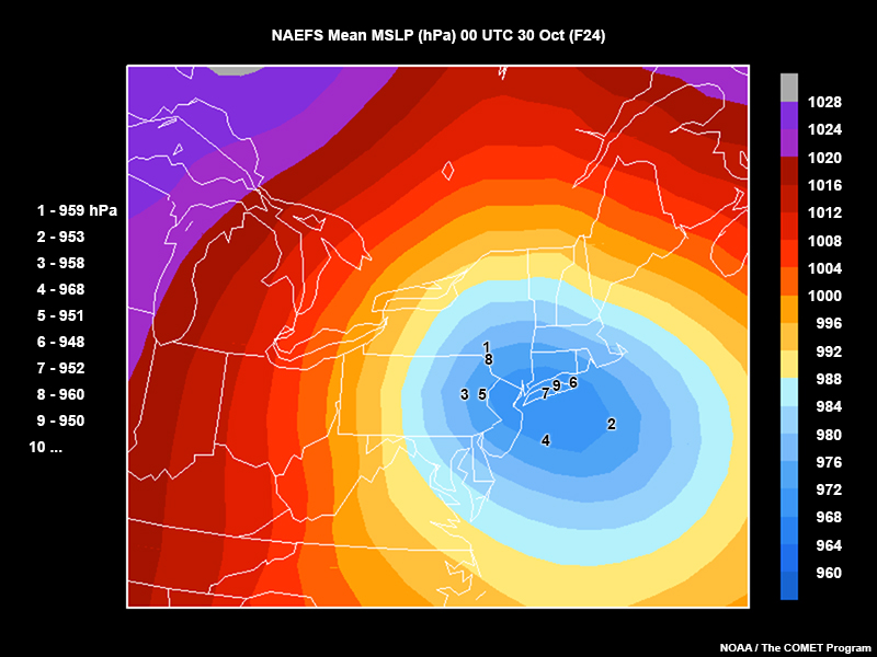
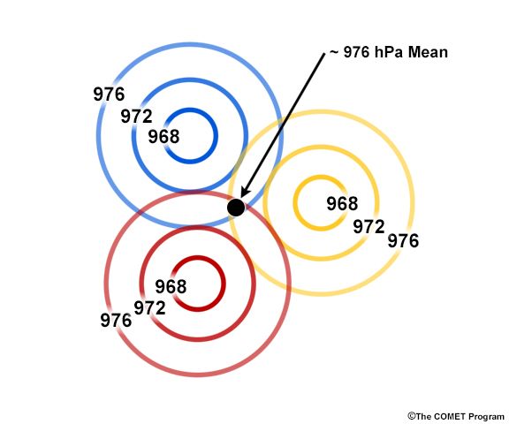
In this map from Hurricane Sandy, the individual lowest pressure centre values range from 948 to 968 hPa. However, the shading representing the lowest mean pressure value is 968 to 972 hPa, higher than all but one of the members shown.
The example below should help clarify this. Each set of coloured contours represents the low pressure system as predicted by a different ensemble member. The locations of the low pressure centres, not just the values of the centres, impacts the average pressure calculation for the weather system.
Examples
Questions
In the ECMWF mean and spread plot below, decide what the starred spread value (the darkest purple) indicates about the mean values of the MSLP and the distribution.
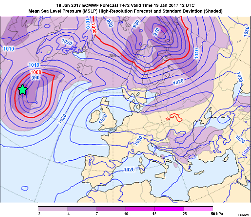
We cannot tell if the distribution indicates that the mean MSLP is too low or too high. There are too many confounding issues to account for, such as differences in individual member timing, location, and magnitude, to answer this with certainty. You would have to look at another product to answer that.
Because the spread bulls-eye is to the west of the mean central pressure feature, a significant portion of the distribution is placing a low to the west of the mean lowest pressure. This is a timing issue. Some members are lagging behind the main group temporally since only one side of the mean lowest pressure has a spread bulls-eye.
Assuming a normal distribution (which is unlikely at the star), the standard deviation value is between 7 and 10 hPa. So the expected range of 1 standard deviation from the mean would be 997 - 983 hPa (+- 7 hPa) or a greater range approaching but not exceeding 1000 - 980 hPa (+- 10 hPa).
Links
- CMC NAEFS Mean and Spread Diagrams days 1 - 15: https://weather.gc.ca/ensemble/naefs/cartes_e.html
- ESRL Mean and Spread Diagrams GEFS days 1 - 15: https://www.esrl.noaa.gov/psd/map/images/ens/ens.html
- NCEP GEFS Mean and Spread Diagrams days 1 - 4: http://mag.ncep.noaa.gov/model-guidance-model-parameter.php?group=Model%20Guidance&model=sref&area=namer&cycle=20131003%2009%20UTC¶m=precip_p12&fourpan=no&imageSize=&ps=
- ECMWF Mean and Spread Diagrams days 1 - 11: http://www.ecmwf.int/en/forecasts/charts/medium/ensemble-mean-and-spread-four-standard-parameters
- NCAR WRF Ensemble Mean and Spread Diagrams days 1 - 2: http://ensemble.ucar.edu/images.php?d=2016011100&f=hgt500_var&r=CONUS