1.0 Introduction

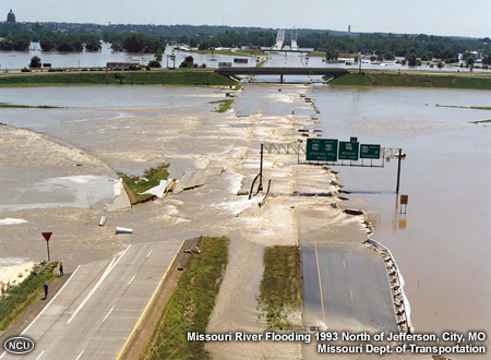
Hydrologic events, such as floods and droughts, are among the highest impact phenomena in the United States and around the world. Reducing their impact is an important goal of NOAA’s National Weather Service. A necessary step in supporting weather readiness and decision making is to provide forecasts that include explicit estimates of the forecast uncertainties. This information enables users to perform risk assessments and take actions appropriate for their vulnerability.
In this lesson, we will introduce the Hydrologic Ensemble Forecast Service (HEFS). Before we get to the specifics of the HEFS, we will examine some basics of hydrologic ensemble forecasting that underlie it.
After completing this lesson, you should be able to:
- Describe the need for ensemble forecast information in hydrology
- Compare and contrast the ensemble forecasts to single-valued forecasts
- Illustrate how an ensemble forecast is used to build probabilistic guidance
- Describe the major sources of uncertainty in HEFS (forcing vs hydro model)
- Identify the main functions for different components of the HEFS
- Describe the advantages of the HEFS over ESP
- Interpret HEFS products
2.0 Ensemble Forecasts in Hydrology
2.0 Ensemble Forecasts in Hydrology » 2.1 Single-valued vs. Ensemble Forecasts
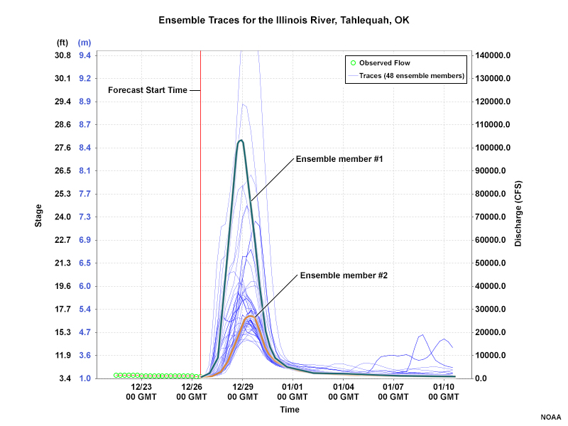
An ensemble forecast is, effectively, a collection of single-valued forecasts of the same variable at the same locations and times. For example, a single-valued forecast from a particular model may show the expected evolution of river stage at a specified point. If we run the model multiple times, each with slightly different inputs (such as precipitation or soil moisture states), we will have an ensemble forecast of river stage for that location and time period. An ensemble can also be created using the same inputs from multiple models. Each single-valued forecast is an ensemble member.
Question
In the ensemble forecast above, which member has a better chance of verifying against the observations, member 1 or member 2? (Choose the best response.)
The correct answer is c.
In a forecast system like the HEFS, each ensemble member has an equally likely chance of verifying as the correct forecast. A dense cluster of ensemble members suggests that values within the cluster have a higher probability of occurring, but not that an individual member is more likely than another. Therefore, ensemble member #2 is no more likely than ensemble member #1.
2.0 Ensemble Forecasts in Hydrology » 2.2 Flood Risk Example
Probabilistic guidance can be generated from an ensemble forecast to assist forecasters and end users with visualizing the range of possible outcomes and their associated probabilities.
Question
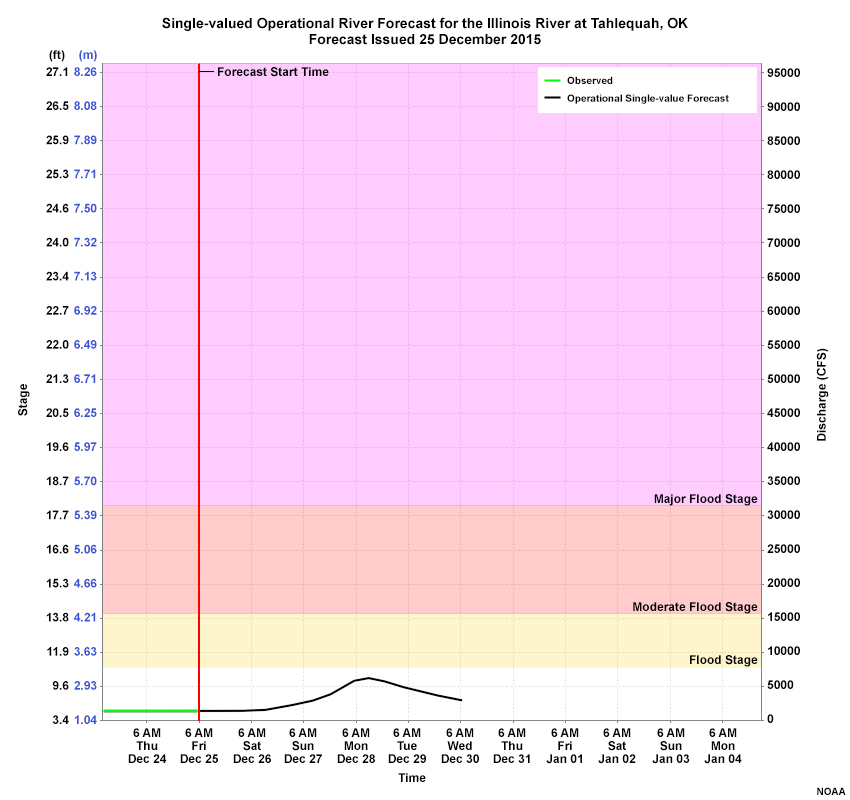
In this single-valued forecast, what is the probability of reaching flood stage? (Choose the best response.)
The correct answer is a.
There are no absolutely correct answers since your experience and familiarity with the situation play a role in developing the forecast. Given the situation, you may say there’s a small, non-zero chance because the forecast peaks close to flood stage and you know that that there’s uncertainty in the forecast. However, if you believe that the single-valued forecast is perfectly accurate, you would give a 0% chance.
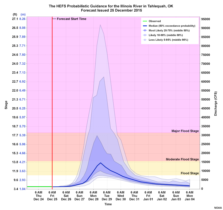
This HEFS graphic provides probability guidance for the same time period and initialization time as the single-valued forecast above.
Question
Based on this product, what should you forecast for reaching flood stage? (Choose all that apply.)
The correct answers are d, e.
The probabilistic forecast provides quantitative guidance about the forecast uncertainties. But like the single-valued forecast, it doesn’t provide an absolutely correct answer. It does, however, suggest a much greater chance of reaching flood stage (75%) and a small chance (10-25%) of reaching major flood stage.
2.0 Ensemble Forecasts in Hydrology » 2.3 Need for Uncertainty Information
Forecasters know that there is uncertainty in single-valued forecasts. But since a single-valued forecast cannot quantify the uncertainty, forecasters are not able to communicate it to decision makers in a way that lets them mitigate against risk.
In contrast, an ensemble forecast provides multiple, equally likely predictions that can be used to explicitly quantify the probability of a future event, such as flooding, for which some mitigating action is needed. Probability guidance derived from ensemble forecasts can provide more actionable information to users with decision-making responsibility.
Single-valued forecast
The HEFS Probabilistic Forecast
Note that the single-valued operational forecast uses only short-term quantitative precipitation forecasts (QPF), perhaps only 24 hours, while the HEFS does not curtail the forecast precipitation. Click the tabs to see the impact on the hydrologic forecasts.
Ensemble forecasts have become a valuable tool in weather and hydrologic forecasting due to the recognition that single-valued or “deterministic” forecasts do not provide essential decision-making guidance about forecast uncertainty. As stated in a 2006 report from the National Research Council, “uncertainty is thus a fundamental characteristic of weather, seasonal climate, and hydrological prediction, and no forecast is complete without a description of its uncertainty.”
As of this writing (early 2017), the HEFS only has a limited number of displays in operation.The number of HEFS guidance products is expected to increase as implementation continues and more user feedback is collected. This lesson provides a good foundation from which forecasters can make the best use of ensemble forecast information.
3.0 Developing Products from Hydrologic Ensembles
3.0 Developing Products from Hydrologic Ensembles » 3.1 Multiple Single-valued Forecasts
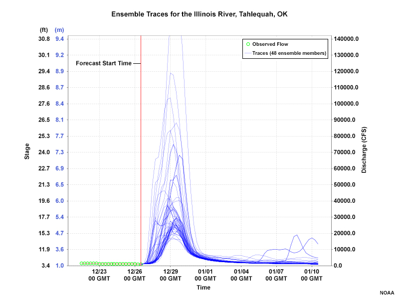
Consider this single-valued forecast hydrograph for a 10-day period. The peak stage reaches well above moderate flood stage during the first 48 hours of the forecast period. Making the most effective use of this forecast requires some ability to quantify that uncertainty.
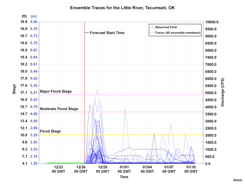
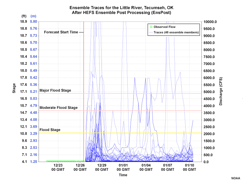
Here are the 48 single-valued forecasts that make up the ensemble for that location and 10-day period. They are displayed in an “ensemble traces” plot, sometimes called a “spaghetti plot.” Note the differences in timing and magnitude associated with the peak stage and rate of change. In addition, some members show high stage occurring after the first 48 hours.
Question
Examine this 48-member ensemble traces plot (the preceding graphic). Does it appear that the middle 50% (the 24 members in the middle of the ensemble) reaches flood stage during the forecast peak(s)? (Choose the best response.)
The correct answer is c.
Feedback provided after the next question.
Question
From the same graphic (above) does it appear that ensemble members in the top 5% reach moderate or major flood stage during the forecast peak(s)? (Choose the best response.)
The correct answer is b.

The graphic shows the middle 50% of ensemble members in the blue shading. The entire middle 50% of forecasts remains below flood stage. The top 5% of ensemble members for the 48-member ensemble is represented by the top 2 members at any given time. In the figure this is approximated with the 5% exceedance probability in dashed orange (the top two members lie above this line). The highest 5% of members are forecasting a moderate flood peak but not a major flood.
3.0 Developing Products from Hydrologic Ensembles » 3.2 Box Plots
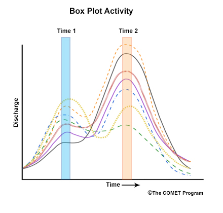
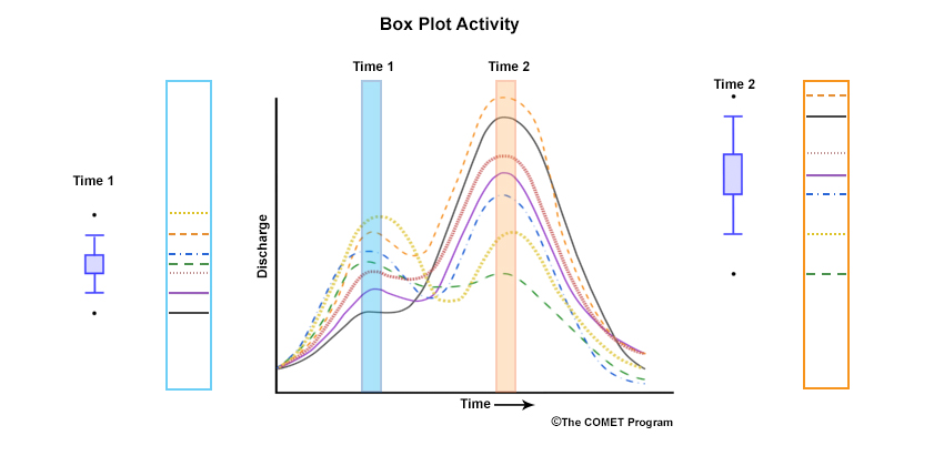
A box and whiskers plot, sometimes called simply “box plots,” helps us visualize how we get probability guidance from an ensemble of single-valued forecasts. Consider this simplified example of an ensemble with seven members, each shown with a different color and line style.
We will develop a box plot for a specific time that shows the following: 1) median member, 2) middle three members, 3) middle five members, and 4) two outliers.

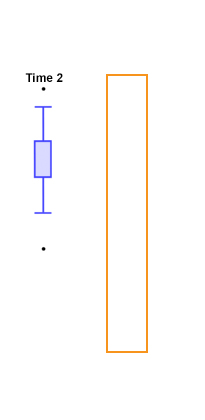
Box Plot Activity - Time 1


Box Plot Activity - Time 2

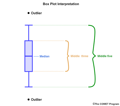
Click on the rectangle for Time 1. In the pop-up window, move the lines for the ensemble members on the left so their positions match their order in the line graph on the right. For example, the median ensemble member should be in the middle of the box. Note that the box part of the box plot represents the middle three ensemble members, including the median. The whiskers capture the middle five members, and the high and low outliers account for all seven members.
Now do the same thing for Time 2. Click the rectangle, then arrange the lines for the ensemble members (right) so they match their order in the line graph in the box plot (left). You'll be matching the median and middle three members, the second highest and lowest members, and the high and low outliers.
Question
Is the ensemble member that was the median in time 1 the same as the median ensemble member in time 2? (Choose the best response.)
The correct answer is b.
The median member changes from time 1 to time 2.
Question
Is the size of the box plot (the range of values it represents) different in time 2 than in time 1? (Choose the best response.)
The correct answer is a.
The size of the box plot, and thus the spread of the ensemble members is larger in time 2 than in time 1.
The box plots capture the distribution of ensemble members at a specific time. They help us visualize the value range represented by the ensemble members and the size of the “ensemble spread”. The placement or rank of an ensemble member at one time can be different at another time. Multiple box plots over a time period allow us to evaluate the change in the spread and thus the change in the uncertainty represented by the ensemble forecast. The larger the box and whiskers, the more spread there is in the ensemble forecast.
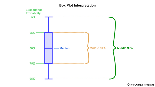
For the remainder of this lesson, we will use examples from the HEFS with a large number of ensemble members. As shown above, the box in the box plots represents the middle 50%, and the middle 90% falls within the whiskers.
The lowest whisker is at the 95% exceedance probability, meaning that fewer than 5% of the members are at or below this level. The highest whisker is at the 5% exceedance probability, which means that only 5% of members have values above this level. The bottom and top of the box are the 75% and 25% exceedance probabilities. The line near the middle, the median, is the 50% exceedance probability.
3.0 Developing Products from Hydrologic Ensembles » 3.3 Box Plot Example
Box Plots
Spaghetti Plot (Ensemble Traces)
Here is the box plot representation of the ensemble traces that we studied earlier. Click the tabs to see the actual ensemble traces. Recall that earlier, you outlined the middle 50% of the ensemble members—that’s what the box portion of the box plot represents. Beyond Day 4, when most ensemble members are near 0, only the highest members show up in the whiskers portion of the plot.
Activity
Use the drawing tool to trace the 50% and the 5% exceedance probability through the time series. Then click Done.
- Use the purple pen to draw the 50% exceedance probability
- Use the orange pen to draw the 5% exceedance probability
| Tool: | Tool Size: | Color: |
|---|---|---|
|
|
The graphic shows the median (50% exceedance probability) and the 5% exceedance probability, which connects the top whiskers in the box plot.
3.0 Developing Products from Hydrologic Ensembles » 3.4 Probabilistic Guidance
Middle 50% from the ensemble, and the median
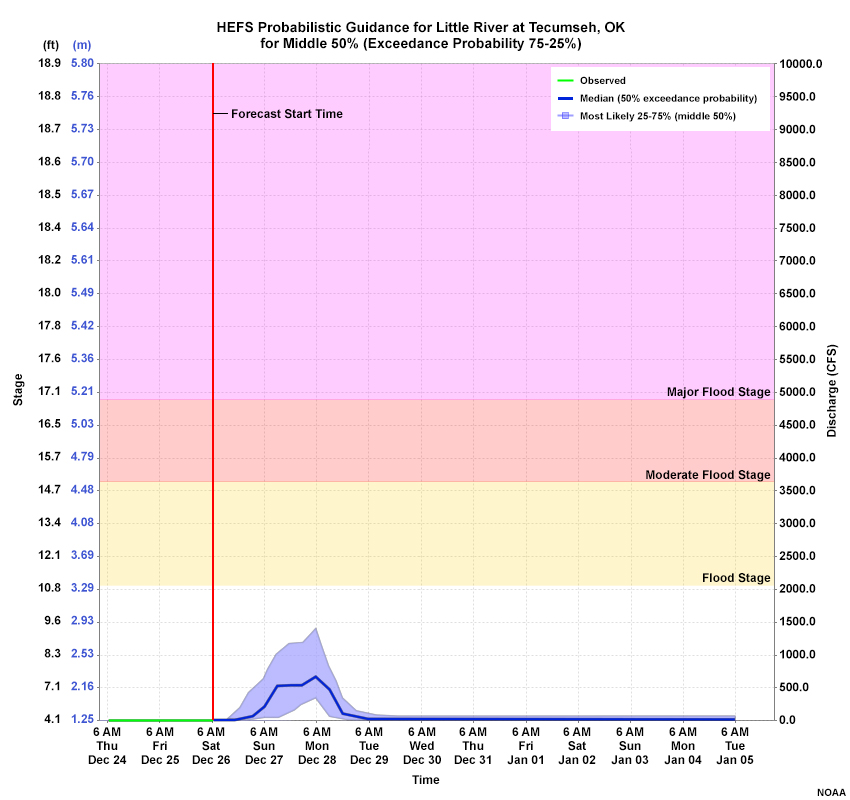
Box plot
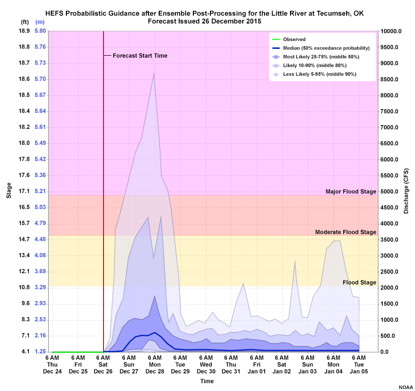
The information in the box and whiskers plot can be presented in a time series graphic of stage (or discharge), like the one shown in the first tab. We’ll look at how this kind of HEFS probabilistic guidance is constructed and how to interpret it.
The blue shading in the time series shows the middle 50% of possible outcomes according to the ensemble, which is depicted by the box portion of the box plot (tab 2). The dark blue horizontal line is the median. The probability that the outcome will be above the blue shading is <25%. Likewise, the chance of it being below the blue shading is ≤25%. Therefore, the blue shading depicts the probability of exceedance from 75% to 25%.
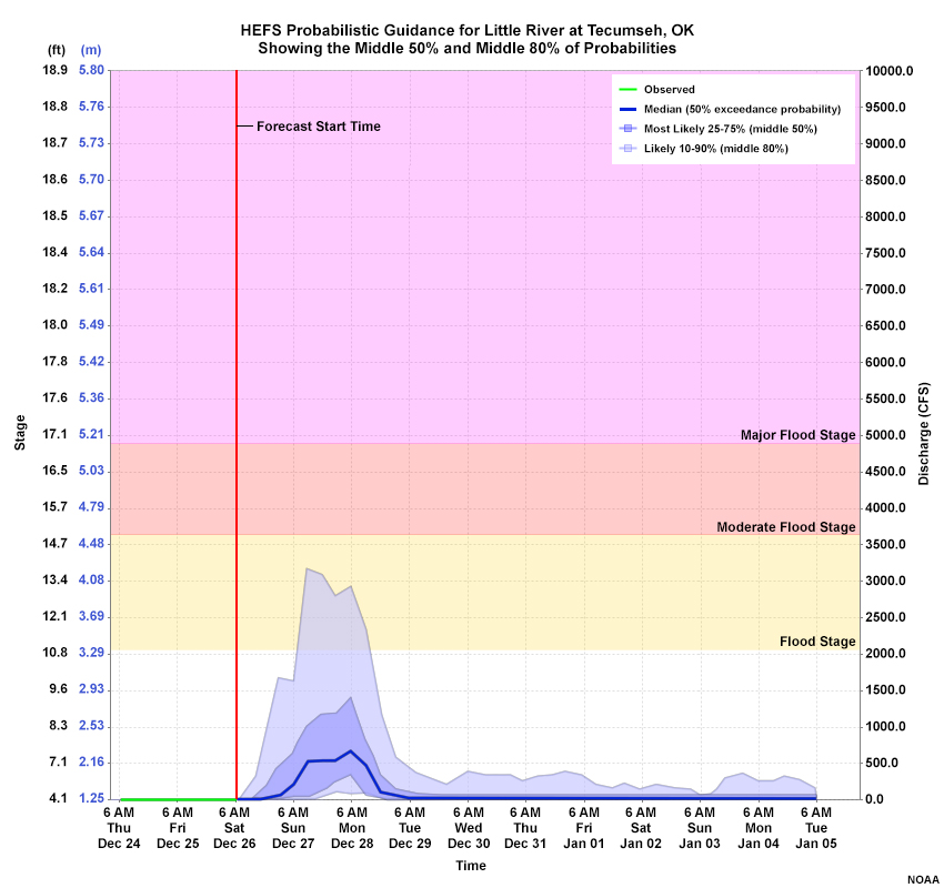
The medium shade of blue enveloping the darker blue shading represents the middle 80% of possible outcomes according to the ensemble. This interval represents exceedance probabilities ranging from 90% (bottom) to 10% (top).

Finally, the light shade enveloping the medium and dark blue shading represents the middle 90% of possible outcomes according to the ensemble. This interval represents exceedance probabilities ranging from 95% (bottom) to 5% (top), and is consistent with the whiskers on the box plot.
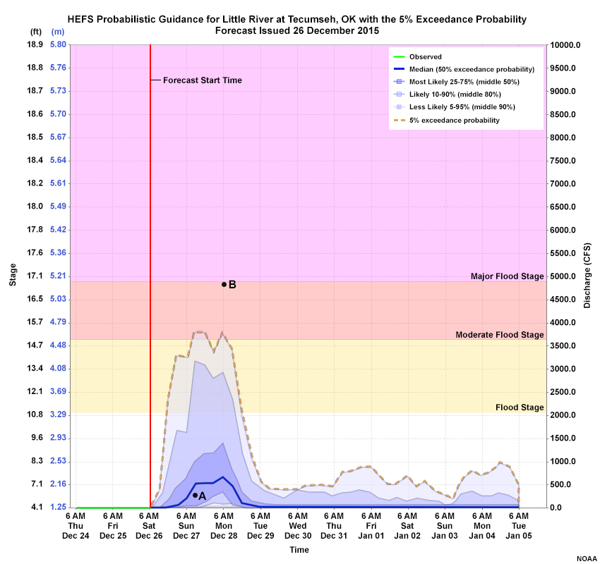
Question 1 of 3
The ensemble forecast system suggests that the discharge at point A has a _____ chance of occurring. (Choose the best response.)
The correct answer is d.
The ensemble forecast system suggest that the discharge at point A has a 50-75% chance of occurring.
Question 2 of 3
The forecast system suggest that the discharge at point B has a _____ chance of occurring. (Choose the best response.)
The correct answer is c.
The ensemble forecast system suggest that the discharge at point B has less than a 5% chance of occurring.
Question 3 of 3
The orange dashed line depicts the ensemble member with a 5% exceedance probability. (Choose the best response.)
The correct answer is b.
The orange dashed line does not necessarily depict a single ensemble member. It may be tempting to interpret the boundaries between shading in the probability plots as hydrographs (in which case, the line would represent the 5% exceedance hydrograph). But that’s not the correct way to interpret these plots. At any given time, the 5% exceedance probability is where 5% of ensemble members lie along and above that value. The actual member that meets this criterion will likely change from one lead time to the next.
4.0 The Hydrologic Ensemble Forecast Service (HEFS)
4.0 The Hydrologic Ensemble Forecast Service (HEFS) » 4.1 The HEFS Design
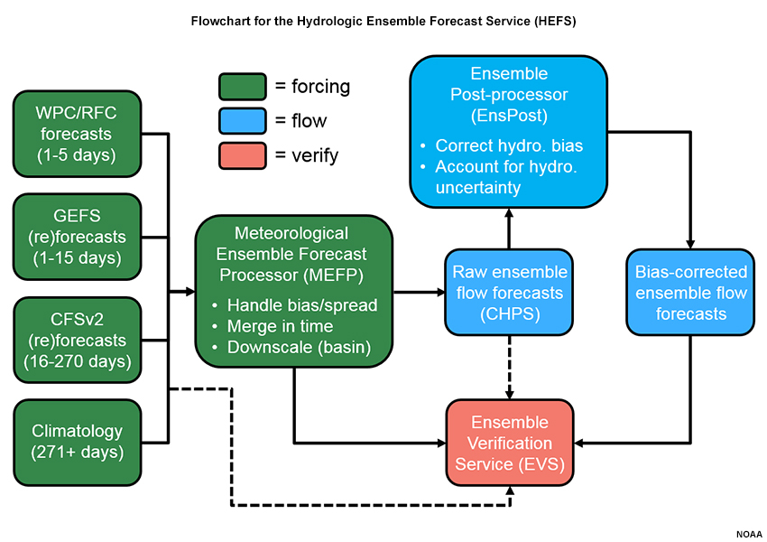
The flowchart shows the design of the HEFS. The HEFS utilizes the same hydrologic models that NOAA/NWS River Forecast Centers (RFCs) use to produce their operational single-valued forecasts. These hydrologic models are embedded within the Community Hydrologic Prediction System (CHPS). For a detailed discussion of this design, access the following sites.
The left side of the flowchart shows the time resolution of the input forcing data. The HEFS provides forecasts for a range of forecast time horizons from hours and days to weeks and months. The HEFS is designed to merge the forcings from different time horizons and produce seamless hydrologic forecast products.
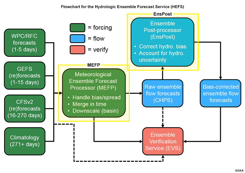
The MEFP (meteorological ensemble forecast processor) and EnsPost (Ensemble Post-processor) boxes represent the HEFS functions that quantify uncertainty. In broad terms, hydrologic forecasts deal with two kinds of uncertainty: the uncertainty associated with the meteorological forcing, and the uncertainty associated with the hydrologic response. Both can have biases. The HEFS quantifies the composite uncertainty associated with the meteorological forcing and hydrologic response, while reducing biases.
The Ensemble Verification Service (EVS) is used to verify predictions from the HEFS. The EVS will help with the long term improvement of the HEFS products.
4.0 The Hydrologic Ensemble Forecast Service (HEFS) » 4.2 Meteorological Forcing Uncertainty
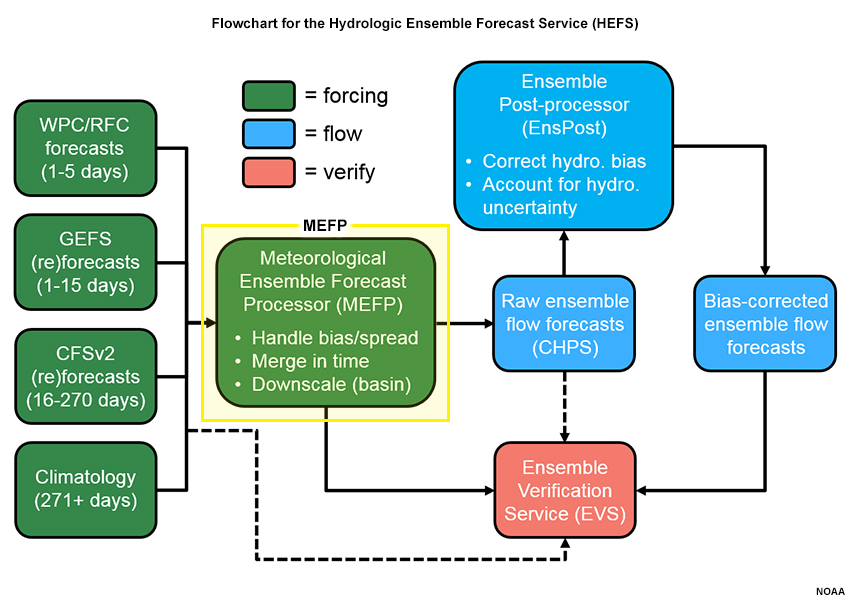
The Meteorological Ensemble Forcing Processor (MEFP) is designed to construct calibrated ensemble meteorological forecast forcings. This includes correcting for biases, merging time periods (i.e. forecasts that operate on different time horizons), and downscaling (i.e. to the hydrologic basin scale).
Meteorological inputs can be a major source of error in the hydrologic forecasts as we see in these QPF ensembles from the Global Ensemble Forecast System (GEFS).
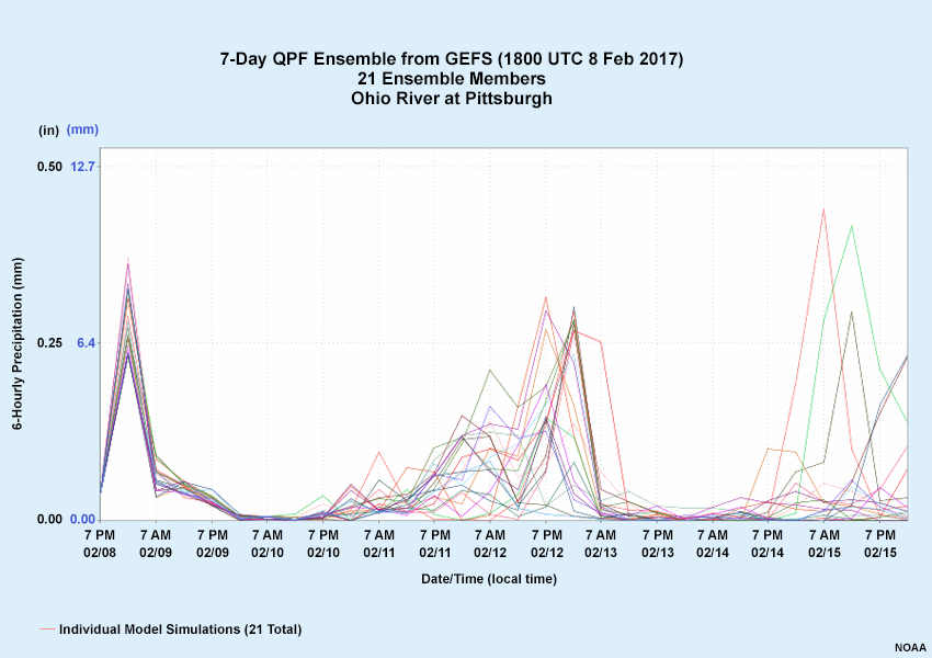
Here is the 7-day quantitative precipitation forecast from the Global Ensemble Forecast System (GEFS) for the 21 ensemble members.
Question
What can you say about the Day 1 QPF compared to the QPF in days 4-7? (Choose all that apply.)
The correct answers are a, d.
SInce QPF becomes more uncertain as lead time increases, the hydrologic forecasts that use these inputs become more uncertain at longer lead times. The Days 4-7 forecasts contain uncertainty in both the magnitude (vertical spread) and timing (horizontal spread).
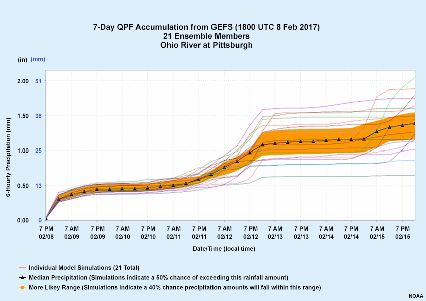
We can also view the GEFS QPF data as a cumulative value over the 7-day period. For the 21 ensemble members, the middle 40% are highlighted in orange, and the black line indicates the median for each time step. The spread in the cumulative outcomes, and thus the forecast uncertainty, clearly increases with lead time.
4.0 The Hydrologic Ensemble Forecast Service (HEFS) » 4.3 Hydrologic Modeling Uncertainty
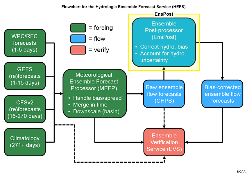
Just as the MEFP helps account for uncertainty with meteorological forcing inputs, the Ensemble Post-processes (EnsPost) quantifies the overall uncertainties in the hydrologic response and corrects for biases in streamflow forecasts.
Use the slider to compare the case without the EnsPost applied (first graphic) with the same data after EnsPost has been applied (second graphic).
Question
What are the main differences between the forecasts from before and after EnsPost is applied? (Choose the best response.)
The correct answer is a.
EnsPost increases the spread at all forecast lead times, and this spread reflects the contribution of hydrologic uncertainties to the streamflow forecasting. These include uncertainties originating from the initial conditions, parameters, and equations of the hydrologic models. When the EnsPost is not used and the hydrologic uncertainties are important, the HEFS forecasts may be overly optimistic about the range of possible outcomes and their probabilities (i.e. contain too little spread).
We can create plots of the HEFS Probabilistic Guidance from the ensemble traces, like the ones above. Note how the plots change when EnsPost functionality is used, particularly the higher discharge and stages associated with the 5% and 10% exceedance probabilities. By increasing the ensemble spread, the EnsPost is indicating that the hydrologic modeling introduces uncertainty. It is important to capture this uncertainty or a decision maker may incorrectly assume that a particular outcome, such as flooding, is highly unlikely.
EnsPost may not be included in early implementations of the HEFS. Users of the HEFS should check with their RFC about whether EnsPost is included if it’s not clear from the product label.
4.0 The Hydrologic Ensemble Forecast Service (HEFS) » 4.4 The HEFS Compared to Previous Guidance
|
Goal: Improve NWS Hydrologic Services |
||
|
Feature |
EPS (Old Service) |
HEFS (New Service) |
|
Forecast Time Horizon |
Weeks to seasons |
Hours to years, depending on the input forecasts |
|
Input Forecasting (“Forcing”) |
Historical climate data (i.e. weather observations) with some variations between RFCs |
Short-, medium-, and long-range weather forecasts |
|
Uncertainty Modeling |
Climate-based; no accounting for hydrologic uncertainty or bias; suitable for long-range forecasting only |
Captures uncertainty from multiple sources and corrects for biases in forcing and flow at all forecast lead times |
|
Products |
Limited number of graphical products (focused on long-range) and verification |
A wide array of data and user-tailored products are planned, including standard verification |
Until recently, NWS ensemble streamflow forecasts within NOAA’s Advanced Hydrologic PredictionService (AHPS) were produced exclusively with the Ensemble Streamflow Prediction (ESP) system. The HEFS offers advances in ensemble forecasting that were lacking in ESP, such as:
- Use of short, medium, and long-range NWP model forecasts, such as QPF
- More comprehensive accounting for uncertainty from both the meteorological forcing and the hydrologic modeling
- More products, including verification and user-tailored products
4.0 The Hydrologic Ensemble Forecast Service (HEFS) » 4.5 An Evolving Forecast Service
Currently (as of early 2017), not all HEFS functions have been fully evaluated and implemented in operations. For example, the Climate Forecasts (CFSv2) ingest and the EnsPost step for handling hydrologic model uncertainty will be evaluated at a later stage. The flowchart represents the full functionality that the HEFS will achieve after phased upgrades and enhancements.
For the HEFS Examples section, we will focus mainly on a 10-day HEFS time series forecast like this one. Examples do not have EnsPost processing unless otherwise indicated.
5.0 HEFS Examples
5.0 HEFS Examples » 5.1 HEFS vs. Single-value Operational
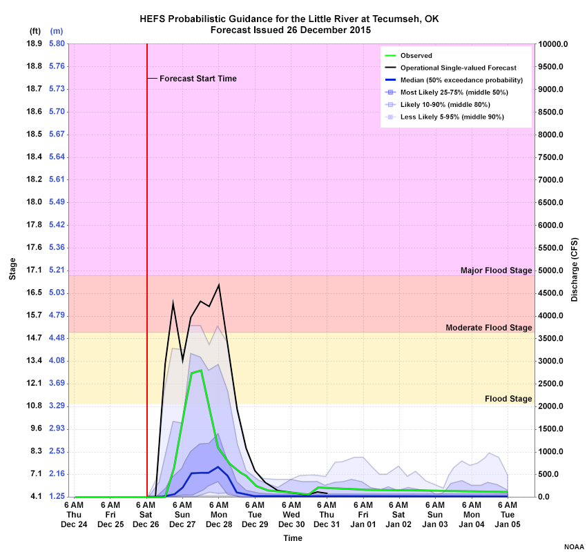
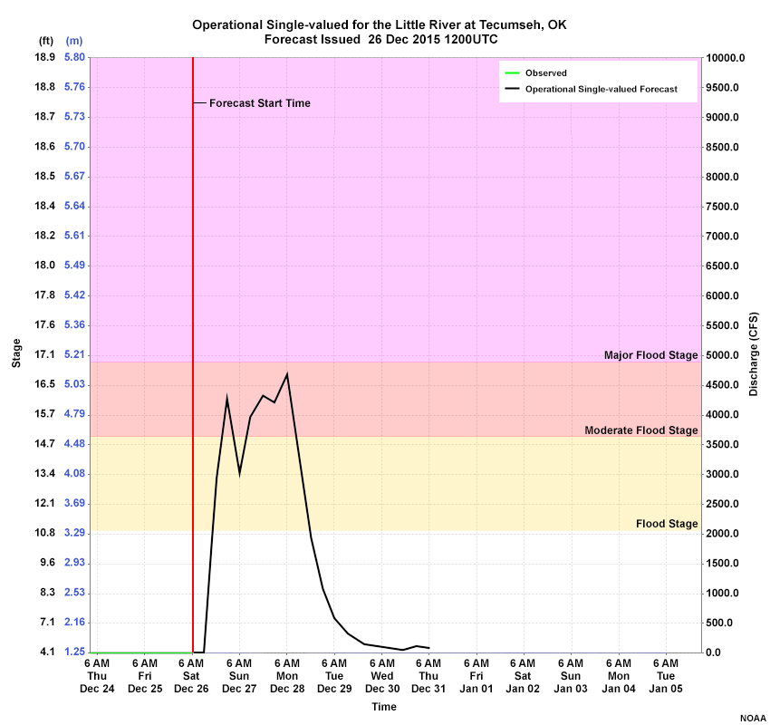
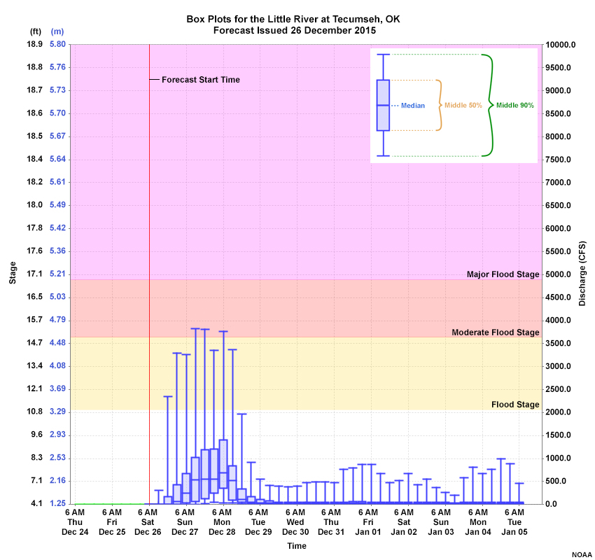
Let’s return to the standard 10-day forecast time series from the HEFS for the Little River case in Tecumseh, Oklahoma. The overlays show the single-value (deterministic) operational forecast in black, and the observations in green.
Question 1 of 3
What does the operational single-valued forecast show compared to the observations? (Choose all that apply.)
The correct answers are b, d.
The single-valued forecast had an earlier initial rise and more peaks than the observations.
Question 2 of 3
What does the HEFS probabilistic guidance show? (Choose all that apply.)
The correct answers are a, d.
The HEFS probabilistic guidance shows that the observed stage fell within the 10-25% exceedance probability at the time of observed peak. During the period of high flow, the observations were well above the ensemble median, and the probabilistic guidance showed at least a 5% chance of reaching moderate flood stage.
Question 3 of 3
The operational single-valued forecast has higher discharge values than all of the probabilistic guidance at the time of the peak observed discharge. (Choose the best response.)
The correct answer is b.
In this case, the operational single-valued forecast was higher than the observed value throughout the period of high flows through 28 December.
Ensemble Traces issued 26 December 2015
Probabilistic Guidance from the HEFS with Single-valued Forecast and Observations
In the HEFS plot through 28 December, the single-valued forecast was at a greater or equal discharge value than the blue shaded areas. However the single-valued forecast was not greater than all of the probabilistic guidance. Recall that a few ensemble members lie in the unshaded area above the 5% exceedance probability. In the ensemble traces plot, we can see that at least one member peaked at a discharge level that was greater than the single-value forecast.
5.0 HEFS Examples » 5.2 Focusing on Specific Thresholds
Probabilistic guidance is often used to asses the risk of certain high or low thresholds. In this graphic, the labels for different flood severity levels have been superimposed on the HEFS probabilistic time series. Although the HEFS does not currently have official tabular products, the HEFS information can be used to generate probabilities of reaching or exceeding important thresholds.
|
Stage |
Action (2.4m, 7.9ft) |
Flood (3.4m,11.1ft) |
Major Flood (5.1m, 17.0ft) |
|
Probability |
40% |
25% |
3% |
The table shows the probabilities of reaching Action, Flood, or Major Flood stage during the 10-day forecast period. Tabular information could also be generated with more time resolution rather than cumulative over the forecast period.
We showed this dataset earlier with the HEFS EnsPost functionality that identifies uncertainty associated with the hydrologic model and adds appropriate spread to the forecast. Here are the values for those cumulative probabilities.
|
Stage |
Action (2.4m, 7.9ft) |
Flood (3.4m,11.1ft) |
Major Flood (5.1m, 17.0ft) |
|
Probability |
55% |
38% |
16% |
Although major flooding was not observed, nearby basins did experience major flooding. Users who are sensitive to such high water can benefit from guidance when small chances of such an event is possible.
5.0 HEFS Examples » 5.3 Time Evolution of the HEFS Guidance
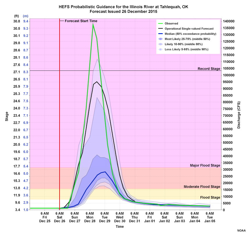
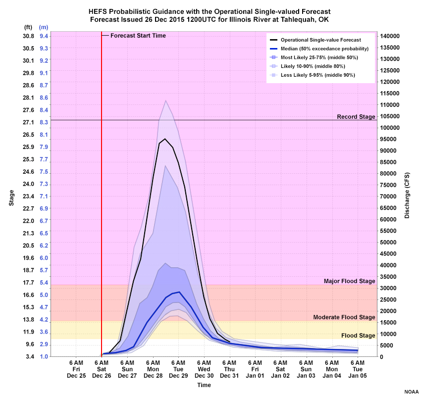
Here’s the HEFS probabilistic guidance compared with the operational single-valued forecast time series for a different basin (Illinois River at Tahlequah, Oklahoma) for the same 26 December 2015 storm event. The overlays show the single-value (deterministic) operational forecast in black, and the observations in green.
Question
Would the HEFS probabilistic guidance have given you more useful information than the single-value forecast? (Choose the best response.)
The correct answer is c.
This question does not have a correct answer, but you may have noted that the single-valued forecast called for a major flood level. It may be considered a better forecast because the HEFS only showed very small probabilities of a major flood.
Remember that this represents a rather short lead time, with the rapid rise in river levels beginning in 24 hours. If we look at the evolution in the days leading up to the forecast, we see that the HEFS gives more information than shown on this one plot.
21 Dec
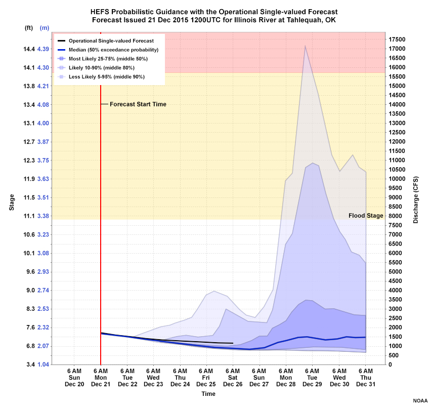
22 Dec
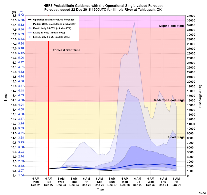
23 Dec
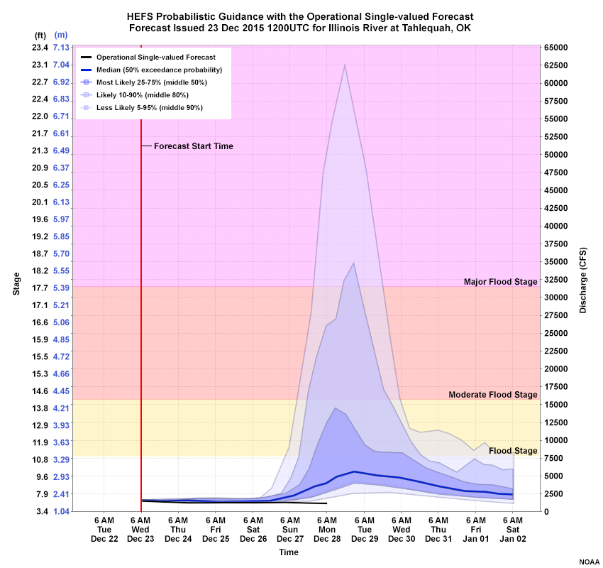
24 Dec
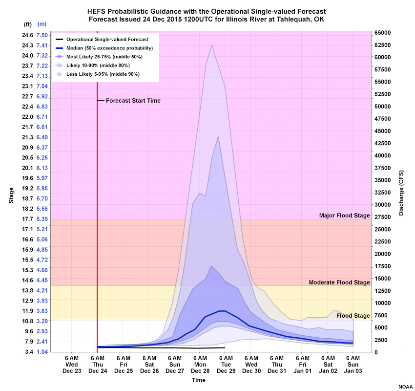
25 Dec
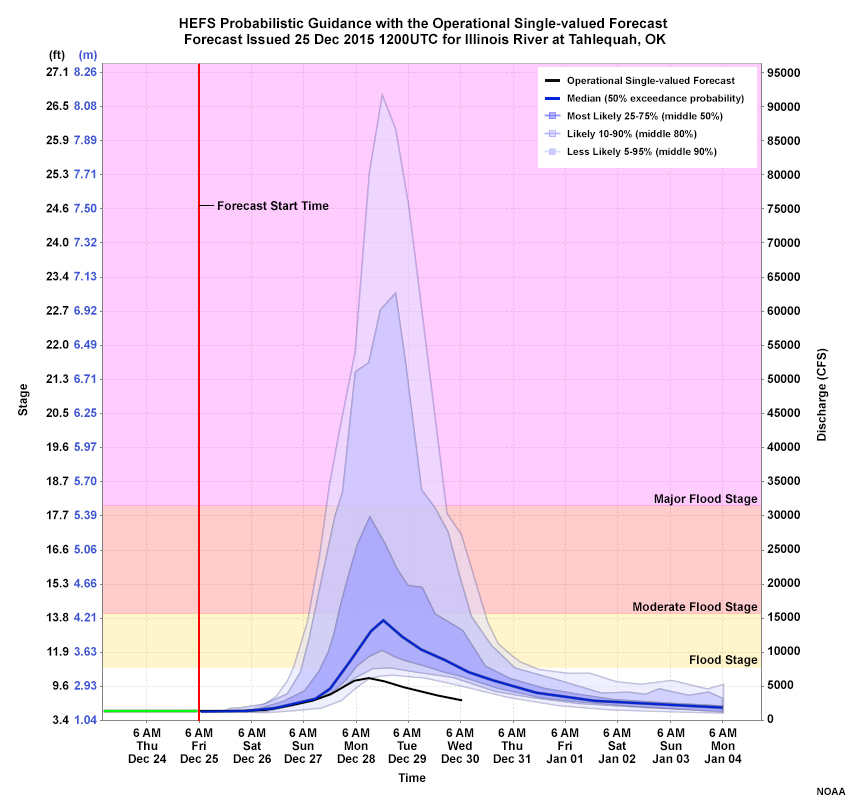
26 Dec
Question
Would the HEFS probabilistic guidance have provided you with more useful information than the single-value forecast? (Choose the best response.)
The correct answer is a.
This time the answer is yes. Because the HEFS uses QPF from short and medium-range model forecasts, its guidance can alert users to a potential significant or dangerous event several days out. Although this case has an example of a very useful single-valued forecast within 24 hours of the event, the HEFS guidance can provide very important longer lead times for major events.
6.0 Summary
Displays and guidance from the HEFS offer several advantages to operational forecasters and users of flow and stage forecasts due to the ability to express uncertainty, correct for biases, and provide probabilistic guidance across a range of conditions. In addition, the HEFS can give greater lead times for potential events than previous NWS hydrologic forecast systems because it uses QPF inputs across a range of time steps, while accounting for the uncertainties in those inputs.
Products and forecast displays from the HEFS will continue to evolve after the publication of this lesson. The full set of HEFS products will do the following:
- Provide seamless hydrologic forecast guidance from hours to years
- Use QPF input across multiple time scales
- Provide longer lead-time time evolution of major hydrologic events
- Quantify the combined uncertainty from both meteorological forcing and hydrologic modeling while correcting for biases
- Allow decision making about possible outcomes based on probabilistic guidance
- Evolve to include a wide array of user-tailored products, including standard verification
7.0 Contributors
COMET Sponsors
MetEd and the COMET® Program are a part of the University Corporation for Atmospheric Research's (UCAR's) Community Programs (UCP) and are sponsored by NOAA's National Weather Service (NWS), with additional funding by:
- Bureau of Meteorology of Australia (BoM)
- Bureau of Reclamation, United States Department of the Interior
- European Organisation for the Exploitation of Meteorological Satellites (EUMETSAT)
- Meteorological Service of Canada (MSC)
- NOAA's National Environmental Satellite, Data and Information Service (NESDIS)
- NOAA's National Geodetic Survey (NGS)
- National Science Foundation (NSF)
- Naval Meteorology and Oceanography Command (NMOC)
- U.S. Army Corps of Engineers (USACE)
To learn more about us, please visit the COMET website.
Project Contributors
Program Manager
- Matthew Kelsch — UCAR/COMET
Project Lead
- Matthew Kelsch — UCAR/COMET
Instructional Design
- Alan Bol — UCAR/COMET
Science Advisors
- James Brown — Hydrologic Solutions Limited
- Ernie Wells — NOAA’s National Weather Service
- Hank Herr — NOAA’s National Weather Service
- Mark Fresch — NOAA’s National Weather Service
- Laurie Hogan — NOAA’s National Weather Service
- Eric Jones — NOAA’s National Weather Service
- Nicole McGavock — NOAA’s National Weather Service
- Tony Anderson — NOAA’s National Weather Service
Graphics/Animations
- Steve Deyo — UCAR/COMET
Multimedia Authoring/Interface Design
- Gary Pacheco — UCAR/COMET
COMET Staff, May 2017
Director's Office
- Dr. Rich Jeffries, Director
- Dr. Greg Byrd, Deputy Director
Business Administration
- Dr. Elizabeth Mulvihill Page, Assistant Director of Operations and Administration
- Lorrie Alberta, Administrator
- Tara Torres, Program Coordinator
IT Services and Production Services
- Tim Alberta, Assistant Director of IT and Production
- Bob Bubon, Systems Administrator
- Steve Deyo, Graphic and 3D Designer
- Dolores Kiessling, Software Engineer
- Gary Pacheco, Web Designer and Developer
- Sylvia Quesada, Production Assistant
- Joey Rener, Software Engineer
- Malte Winkler, Software Engineer
International Program
- Paul Kucera, Project Manager
- Rosario Alfaro Ocampo, Translator/Meteorologist
- Bruce Muller, Project Manager
- David Russi, Spanish Translations
- Martin Steinson, Project Manager
Instructional Services
- Dr. Alan Bol, Scientist/Instructional Designer
- Lon Goldstein, Instructional Designer
- Bryan Guarente, Instructional Designer/Meteorologist
- Tsvetomir Ross-Lazarov, Instructional Designer
- Marianne Weingroff, Instructional Designer
Science Group
- Dr. William Bua, Meteorologist
- Patrick Dills, Meteorologist
- Lindsay Johnson, Student Assistant
- Matthew Kelsch, Hydrometeorologist
- Andrea Smith, Meteorologist
- Amy Stevermer, Meteorologist
- Vanessa Vincente, Meteorologist