Introduction
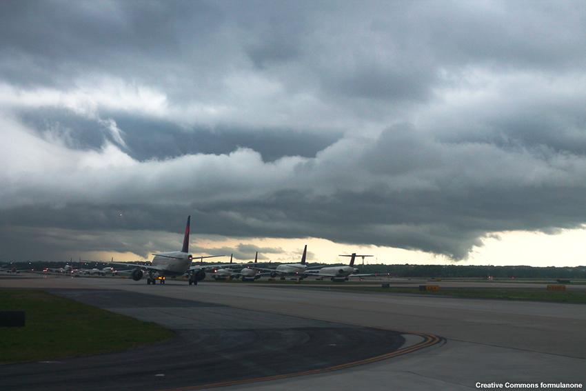
Thunderstorms are one of the most hazardous weather phenomena that forecasters monitor and assess. The National Weather Service (NWS) has developed the INSITE tool (INtegrated Support for Impacted air-Traffic Environments) to improve NWS convective impact forecasts by providing more precise convective impact areas in aviation forecast products. These improved forecast products can reduce delays in air-traffic and increase efficiency in the National Airspace System (NAS).
INSITE is currently (as of May 2017) located at https://esrl.noaa.gov/fiqas/tech/impact/insite. In the future it will likely move to another location.
Introduction » INSITE
The primary users of the INSITE tool are:
- NWS forecasters at the Aviation Weather Center (AWC) in Kansas City, MO
- National Aviation Meteorologists (NAMs) at the FAA’s Air Traffic Control System Command Center (ATCSCC) in Warrenton, VA
- Meteorologists at the 20 CONUS Center Weather Service Units (CWSUs)
NWS envisions routine use of INSITE by these forecasters to monitor the weather. For significant convective events, the tool will be used to identify potential constraints to air traffic out to 12 hours.
The INSITE tool is designed to complement other sources of weather information at operational forecast offices. The tool is unique in that it lets NWS forecasters identify potential constraints to the NAS by combining forecast weather and air traffic data.

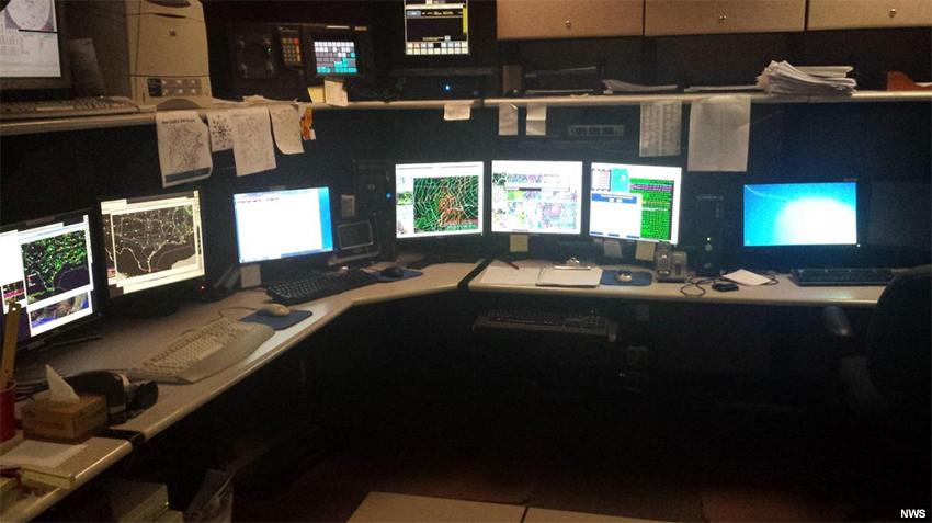
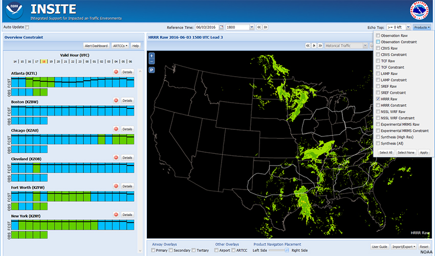
Forecasters access the INSITE through a web interface.
The right pane of the INSITE window displays a map view of a user-selected product. The INSITE domain is the CONUS, including the Great Lakes and coastal waters, with the capability of extending into selected sections of Canadian Airspace.
The left panel shows color-coded time series of Constraint and Confidence/Consistency, called a “CC bar.” Warmer colors indicate higher potential constraints to air traffic, except for purple, which is the highest severity. Each CC bar corresponds to a particular product, region, and altitude.
Across this webpage, we see various buttons, checkboxes, and drop-down menu selections. There are many options for where to start and how to proceed using INSITE. In this exercise, we will use an approach favored by several experienced users.
As we proceed through the lesson, we’ll explore and explain the different choices.
Introduction » Case: 3 Jun 2016

In this lesson, we will use the INSITE tool to evaluate potential aviation impacts due to forecast convective weather on 3 June 2016. We first approach the issue from the perspective of a forecaster located at the AWC. These forecasters are primarily interested in flight-level impacts at FL250 and higher (25,000 ft or more) with lead times of 4-8 hours. Then we shift our focus to the perspective of a CWSU forecaster, who’s more interested in routing traffic through “approach gates” for arrivals and departures at a specific airport.
Forecasters should have a good situational awareness of the current weather before starting up the INSITE tool. This will help guide their choice of products to view and evaluate.
Add Products
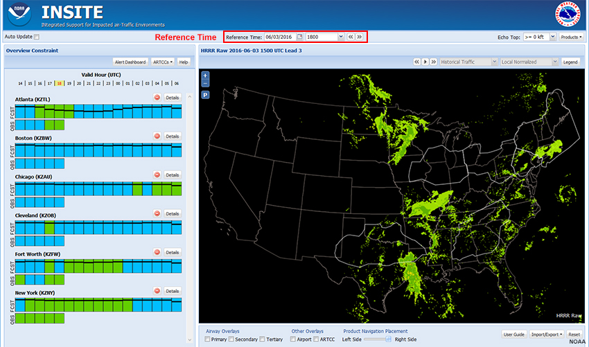
We begin with a “Reference Time” of 1800 UTC on 3 June. (In normal operations, the Reference Time is set to the current time.)
The right pane of the INSITE window shows a forecast of radar echo intensity (VIP levels) derived from the High Resolution Rapid Refresh (HRRR) weather model (“HRRR Raw”). The model run time and the lead time (forecast hour) are displayed over and left of the product pane.
The CC bars in the left panel correspond to potential constraints for air traffic passing through the Air Route Traffic Control Centers (ARTCCs) displayed on the map. High to severe constraints will likely result in delayed or diverted air traffic. The valid time (UTC) is shown at the top of the constraint pane. The current valid hour is highlighted with a yellow background. We can see that the product is available from 4 hours before to 12 hours after the Reference Time.
Add Products » Available Products
You can view several products in INSITE, which fall into three categories:
- “Raw” Numerical Weather Prediction (NWP) model data: This includes fields such as Vertically Integrated Liquid (VIL) and Echo Tops from several products, as well as probabilistic output from models that do not directly forecast these fields, such as the Short Range Ensemble Forecast (SREF). Several models are available, and the set is expected to change somewhat as INSITE transitions into the operational environment.
- “Constraints”: Numerical and statistical model guidance is converted to a constraint field of potential impacts to en-route traffic. This so-called Flow Constraint Index (FCI, described later) is displayed geographically as a heat map. A constraint map is available for each NWP model.
- “Synthesis”: A weighted blend of the individual constraint forecasts. Two synthesis products are available:
- Synthesis (All) uses all available numerical and statistical model guidance options.
- Synthesis (High Res) uses only the convection-resolving model guidance options. Currently (as of 2017), this includes the HRRR, National Severe Storms Laboratory (NSSL) Weather Research and Forecasting (WRF) model, and Corridor Integrated Weather System (CIWS).
Add Products » Select Product(s)
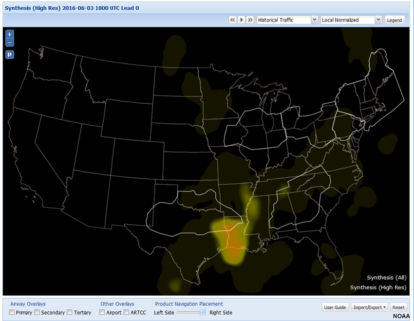
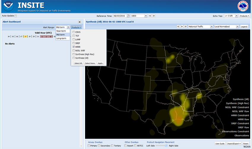
From the “Products” drop-down menu, select one or more products to load for display, then click Apply. The names of selected products will appear in the lower-right corner of the map display pane. Click on a name to display the product. In general, the high-resolution synthesis provides a reasonable overview of convection and is a good place to start, but that may not always be true.
Show Me How: Select Products
Below is a heat map of the Flow Constraint Index for the High-Res Synthesis.
Add Products » Select Product(s) » Flow Constraint Index
The primary output data from INSITE is the Flow Constraint Index (FCI), displayed geographically as a heat map for the CONUS region.
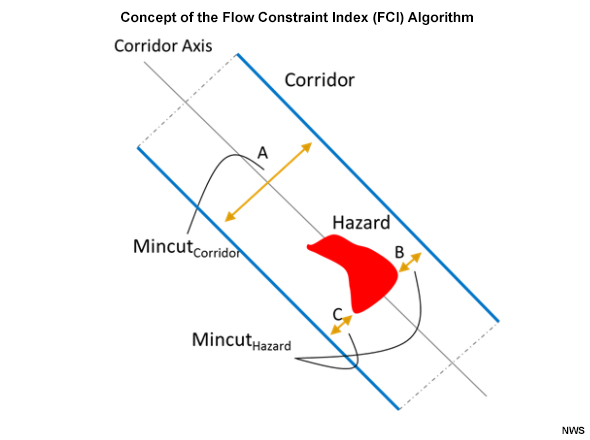
The concept for the FCI computation is based upon the physical constraints to airspace when hazardous weather such as deep convection is forecast to occur within the airspace of a defined air route. In this graphic, the blue lines represent the air route boundaries. The red area shows the convective weather hazard. Distance A represents the full width of the corridor. B and C are the distances available for traffic flow between the convective weather hazard and the corridor boundaries.
FCI = 1 – (B+C)/A
Thus, FCI is the effective minimum width of the corridor obstructed by the weather hazard relative to the full width of the corridor, such that FCI=0 for an unimpeded corridor, while FCI=1 for a completely blocked corridor.
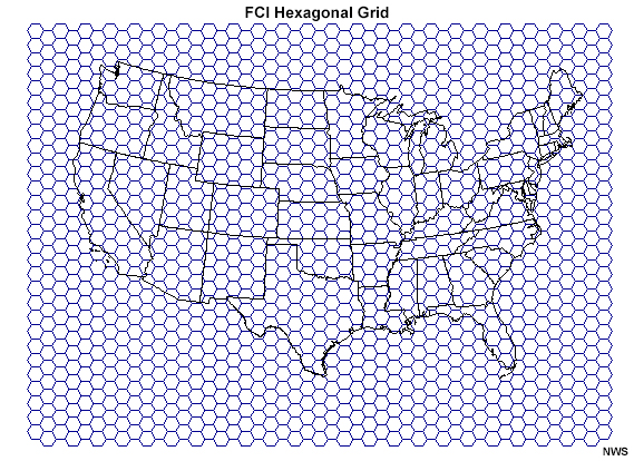
The FCI is computed on a hexagonal grid for echo tops at or above specified altitudes to better capture the vertical and horizontal aspects of the flight paths as they traverse North America. A weighting scheme is applied to adjust the index for air traffic density. As a result, given the same weather conditions, FCI will be higher in areas with more air traffic.
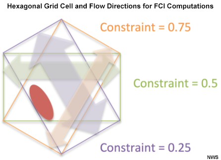
This example grid cell depicts the directions of flow for which the FCI is computed. The three different directions yield constraint values of 0.25, 0.5, and 0.75.
Add Products » Product Options
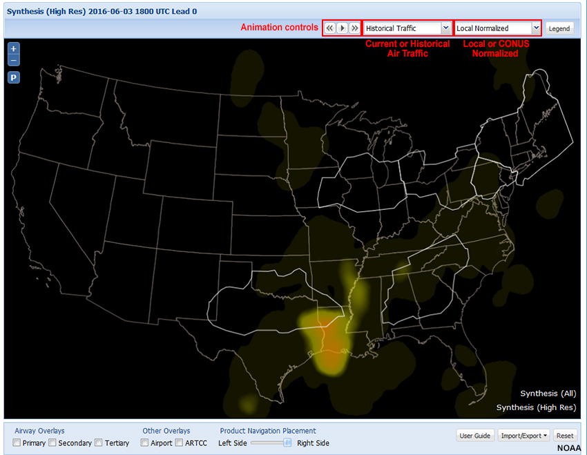
There are several options associated with the map view (right pane). They include animating a loop (using the controls over the right pane), historical or current air traffic, and local or CONUS normalized. We’ll look at the traffic and local/CONUS view options on the following pages.
Add Products » Product Options » Select Air Traffic
The Flow Constraint Index (FCI) depends, in part, on the air traffic density. You can choose to use either the historical air traffic or current traffic. The historical traffic is based on clear air conditions for the time of day and day of week, derived from FAA flight data from the previous convective season. The current traffic is based on Federal Aviation Administration (FAA) flight plan data updated hourly with the most recent information.
Which air traffic version should you use? Have a look at the following example.
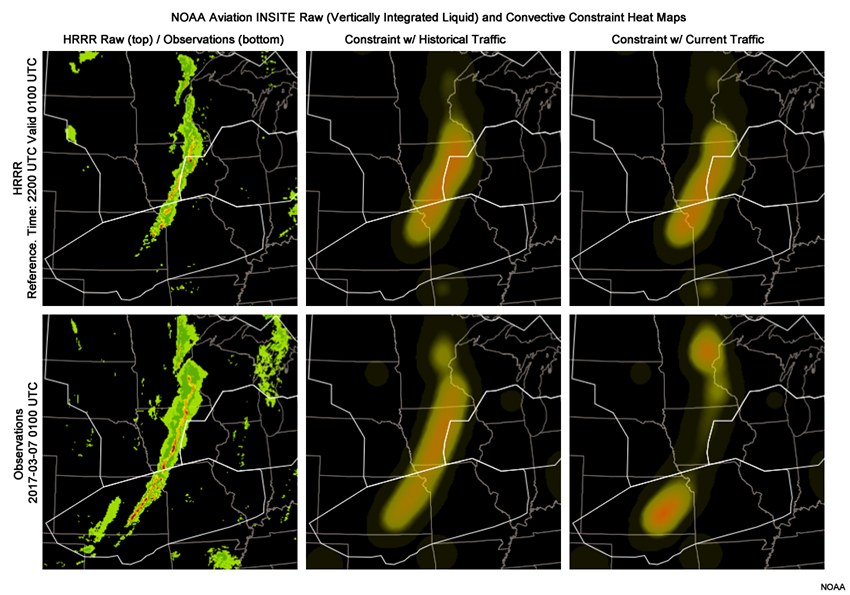
At 2200 UTC 6 March 2017 (images in top row), the HRRR predicted a squall line developing across Iowa and moving slowly east. At that time, there’s very little difference between historical traffic and current traffic for constraint heat maps valid 3 hours later at 0100 UTC 7 Mar.
Question (1 of 2)
Skip forward three hours to 0100 UTC 7 Mar (images in bottom row). The historical and current air traffic constraint heat maps are markedly different. Why?
The correct answer is b.
The HRRR did not overforecast the squall line; the forecast verified quite nicely. As flights diverted away from Iowa to avoid the squall line, the calculated FCI for current traffic decreased over Iowa to reflect the reduced air traffic. Increased traffic at the north and south ends of the squall line led to increased convective constraint in those areas. The heat map based on historical traffic, compiled from days with clear weather, did not account for the shifted traffic pattern.
Add Products » Product Options » Local or CONUS Normalized
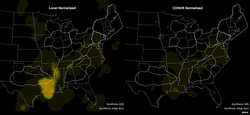
Looking again at the 3 June 2016 case, we see that the choice of a Local or CONUS Normalized view of FCI significantly alters the appearance of heat maps. Choosing a CONUS Normalized view displays FCI relative to the part of the country with the highest traffic congestion, typically the Northeast urban corridor. In contrast, a Local Normalized view displays FCI relative to a regional norm.
Question
Select the view option that’s best for each forecaster.
CONUS Normalized is useful for AWC forecasters who have national responsibilities and want an overview of the potential bottlenecks in the entire country.
In lower traffic areas, a Local Normalized view will show values relative to normal traffic for the region around a particular airport.
Identify Active Regions
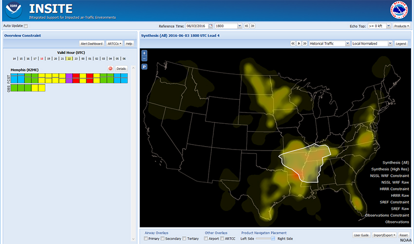
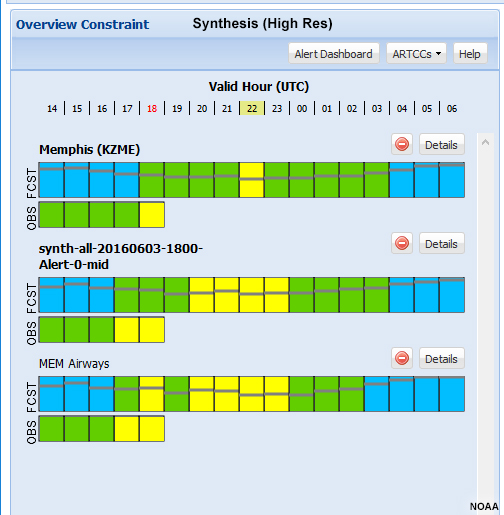
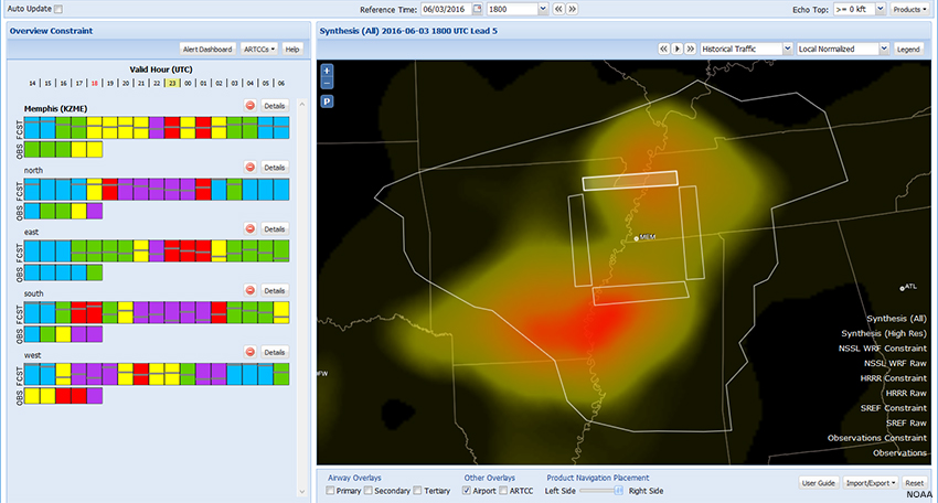
Synthesis (All)
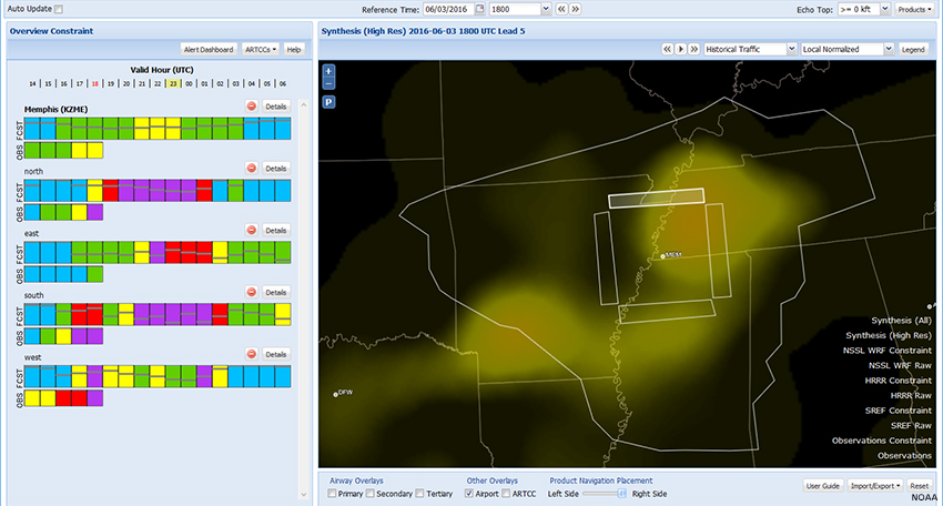
Synthesis (High Res)
Question
Looking at the maps for the 4-6-hour synthesis products, which location would be best to initially focus our attention on?
The correct answer is b.
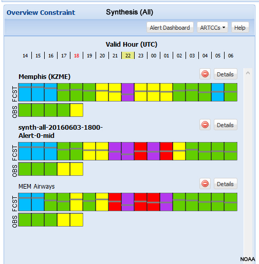
The greatest constraint is shown by the Synthesis-all product along the Mississippi River Valley, so we should focus our attention there.
Identify Active Regions » Select ARTCCs
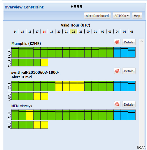
The left pane, Overview Constraint, shows color-coded constraint bars for several Air Route Traffic Control Centers (ARTCCs), which are outlined on the heat map. Mousing over the Constraint and Consistency (CC) bars highlights the associated region on the map. (We will discuss the left pane in more detail later.)
Question
Which ARTCC covers our area of concern in the lower Mississippi River Valley throughout the period shown?
The correct answer is g.
The lower Mississippi River Valley is primarily covered by the Memphis ARTCC (KZME). It is neither outlined on the map nor listed as one of the options in this view of the CC bar menu.
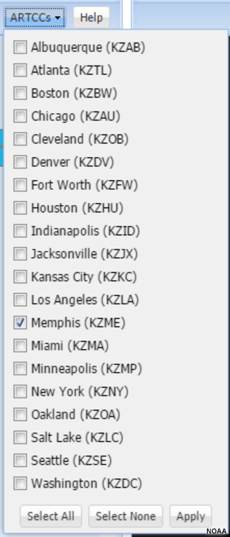
To change the ARTCCs shown on the map and CC bars, click the “ARTCCs” dropdown list, select those you want to see, and click “Apply.” You can add other areas of concern, like Houston, Miami, or Minneapolis, if you want.
Here is what we see with just KZME selected.
Show Me How: Select ARTCCs
Compare Models
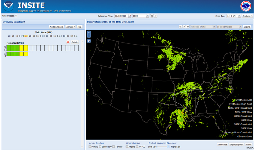
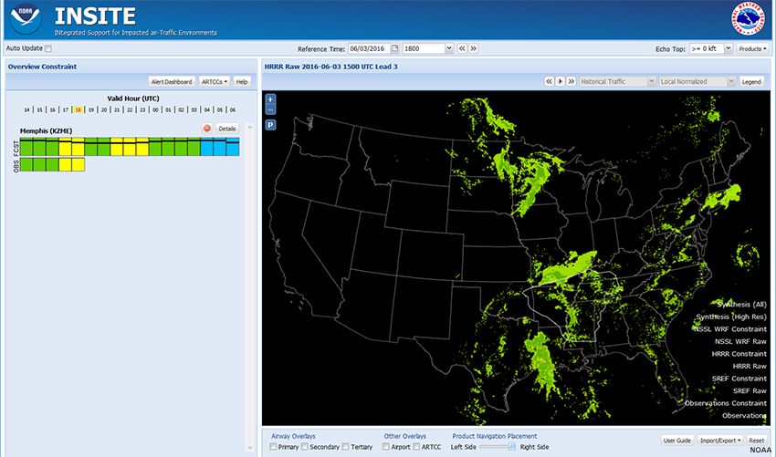
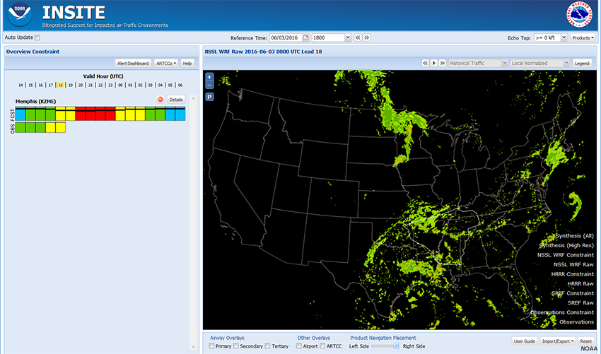
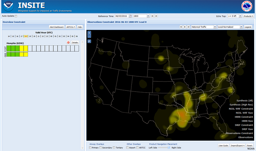
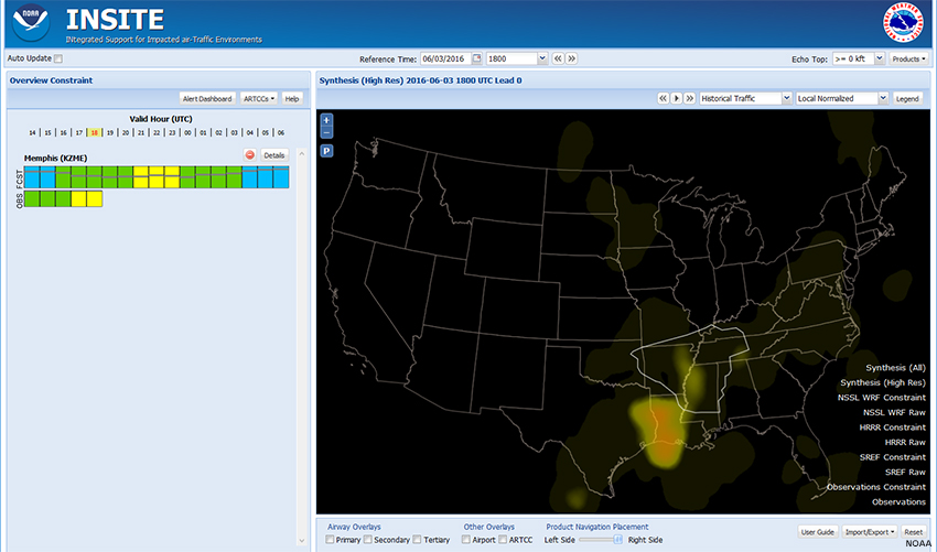
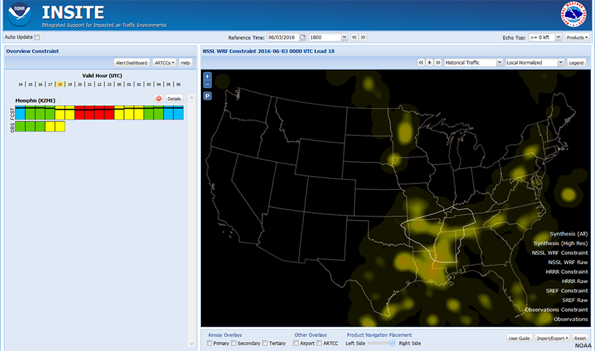
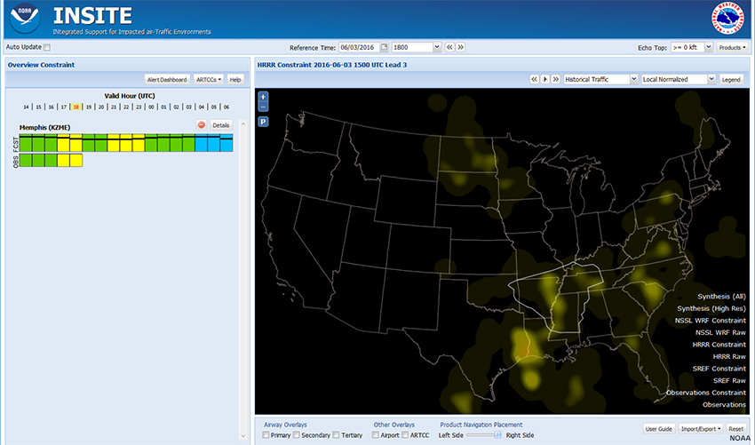
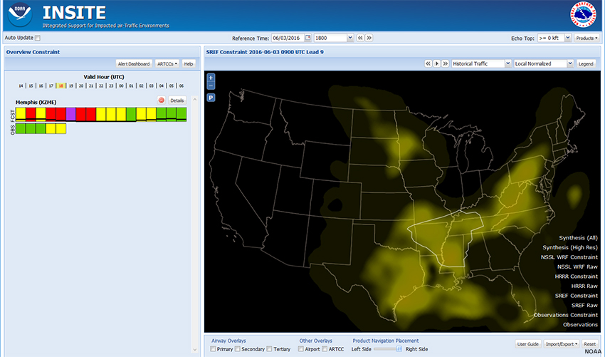
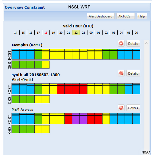
Now that we’ve identified our area of concern, let’s see what other forecast guidance products show. Using the products menu, we’ve added data for the NSSL WRF, HRRR, SREF, and Observations. We can look at both the model data and constraints, and compare them to observations from four hours prior up to our Reference Time.
Observations
SREF
HRRR
WRF
Question
Comparing the models with the observations, which model appears to have the best handle on convection at 1800 UTC?
The correct answer is a.
Based on this limited analysis, the observed pattern of convection at 1800 most closely resembles that produced by the HRRR model. In addition, the CC bars for the HRRR most closely match the observations for the four hours prior to the reference time.
Despite our limited analysis, we can see how the INSITE tool can assist in visualizing and analyzing forecast data.
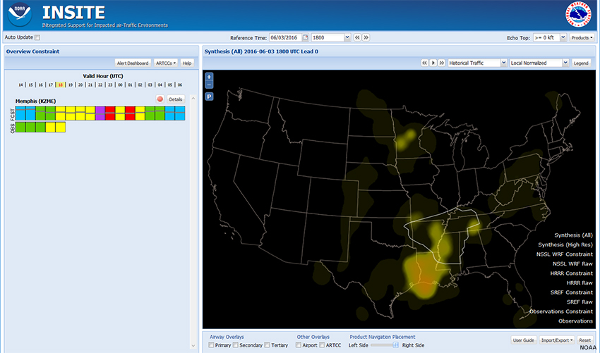
Compare Models » Compare Constraints
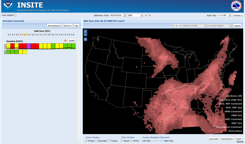
Observations
Synthesis (All)
Synthesis (High Res)
WRF
HRRR
SREF
Question
If we compare the constraint heat maps of model and synthesis products with the observed constraints, which model/synthesis product below best matches the observed constraints at 1800 UTC?
The correct answer is a.
Just by visual inspection, the Synthesis (All) Constraint heat map most closely matches the Observations Constraint heat map at 1800 UTC.
For the remainder of this lesson, we will use the Synthesis (All) product when examining constraints. Recall, though, that almost every action can be done using any of the different model fields and on any given day, the preferred product may vary depending on the circumstances.
Add Polygons
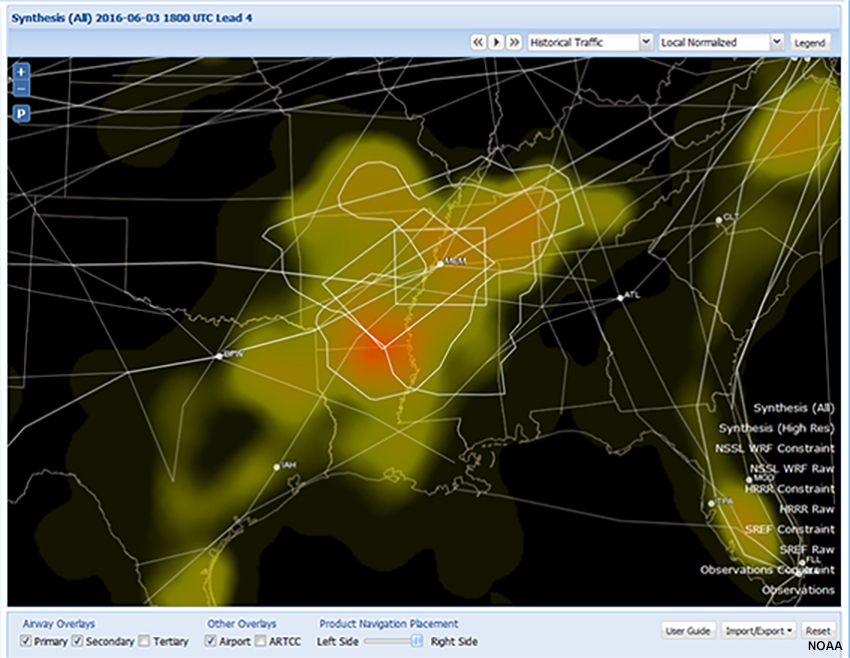
Add Polygons » Alert Polygons
INSITE has the ability to find and outline a polygon for regions of high forecast convective constraint. To do this, click the “Alert Dashboard” button above the CC bars. Then select a time range and the Constraint product(s) to examine. INSITE will then outline regions over which High/Severe constraints are forecast.
The time choices are Near-term (1-3 hours), Mid-term (4-6 hours), and Long-term (7-9 hours). Here, we selected Mid-term (4-6 hours) and the Synthesis (All) product. Note: If you select more than one product, INSITE will find and outline alert regions for each one.
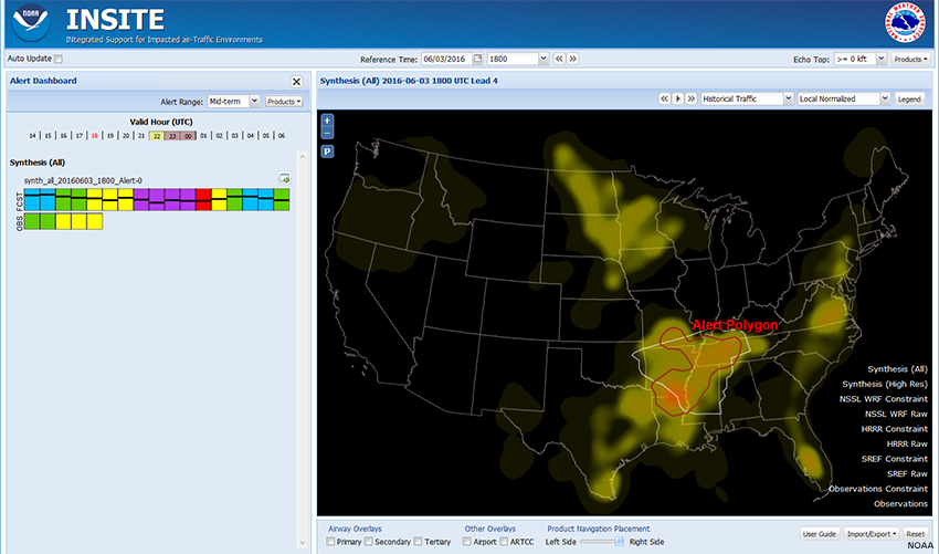
The Alert Polygon is outlined in red.
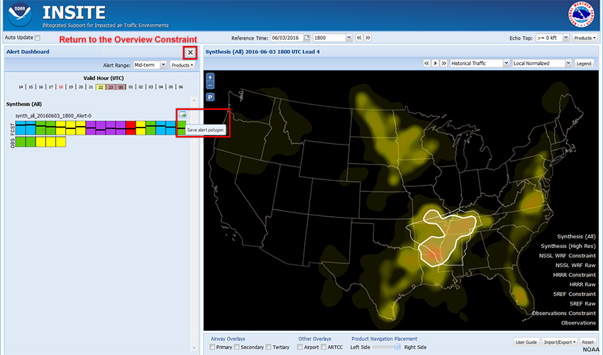
Rolling over the CC bar highlights the Alert Polygon on the map.
Clicking the icon at the top-right of the CC bar saves it to the Overview Constraint page, where you can rename it if you wish.
To return to the Overview Constraint page, click the "X" to the right of “Alert Dashboard”.
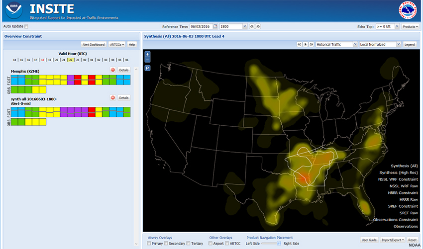
The polygon and CC bar will be added to the displays.
Show Me How: Alert Polygons
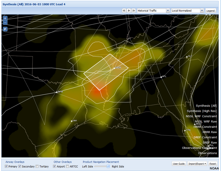
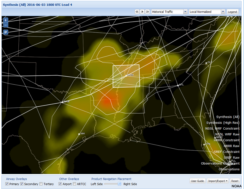
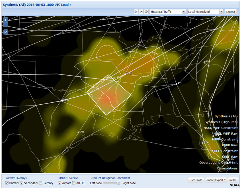
Add Polygons » User-Defined Polygons
Based on the forecast scenario and your area of responsibility, you may want to narrow down the area of focus. To assist in refining this area, you can overlay airways and airports in the right pane by checking the boxes along the bottom. Then you can define your own polygons and view the associated constraints.
Both the Alert Polygon and Memphis ARTCC sit astride airways extending from the Northeast and Texas, as well as routes heading south out of Chicago. In addition, the most constrained space includes the Memphis Airport (MEM).
You can draw a polygon to focus the forecast constraints for these airways. First, you may want to zoom in to your area of interest by clicking +/- in the upper left and then use the mouse to drag the map into position.
You can save polygons by using the Import/Export feature. Click the Import/Export button in the lower-right and select Import Export Profile. Exporting a profile saves all of your settings, including user-defined polygons, in a file. Later, you can import the profile to recreate your screen and upstate the Reference Time to the current time.
Show Me How: User-Defined Polygons
Polygon A
Polygon B
Polygon C
Question
Examine the three user-defined polygons above. Which polygon will probably assist you the most in refining constraints around Memphis?
The correct answer is either Polygon A or Polygon B.
The correct answer will likely depend on your role. If you’re an AWC forecaster interested in enroute constraints, you’re likely interested in option A, which focuses on airways. But if you’re a forecaster at the Memphis CWSU, you may be more interested in option B, which is centered over the airport. You can always see both, as depicted in the image below.
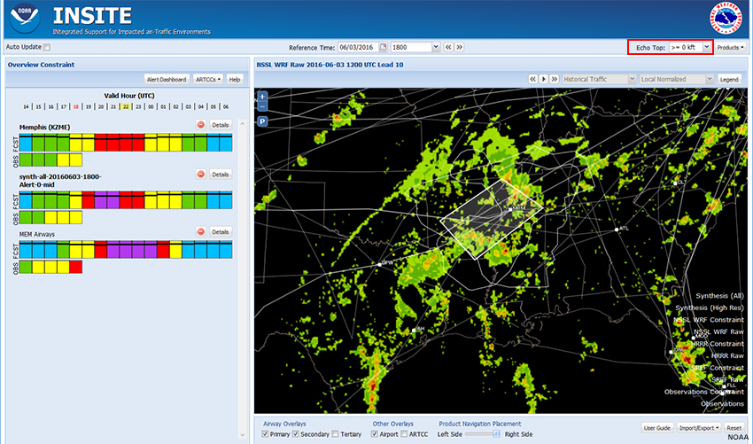
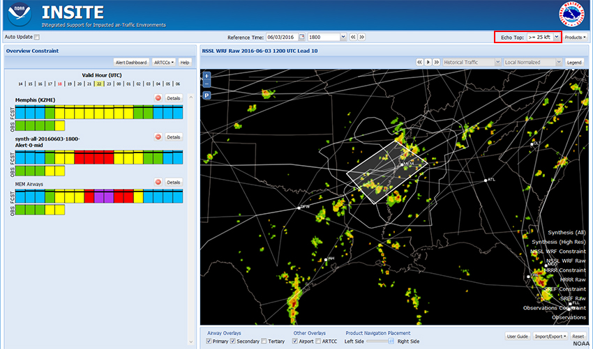
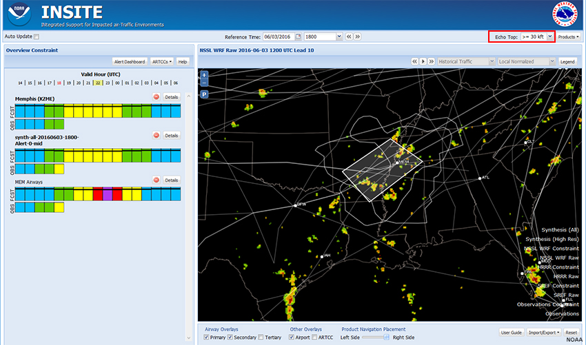
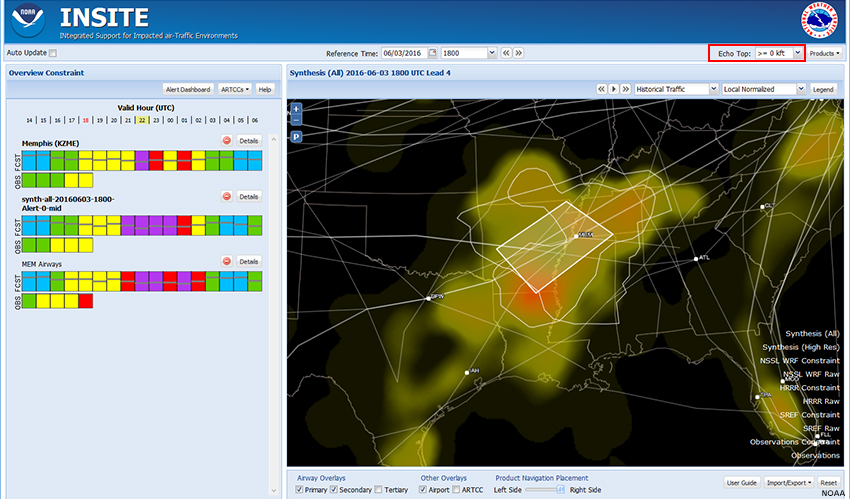
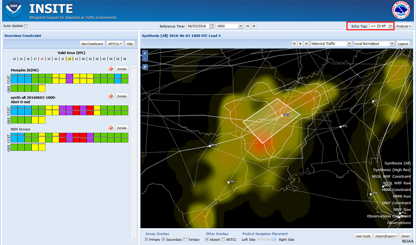
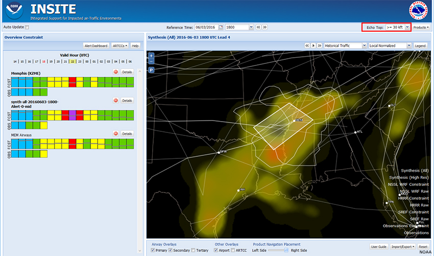
Choose Altitude
> 0 kft
>= 25 kft
>= 30 kft
>= 35 kft
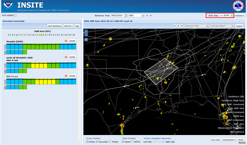
So far, we have focused on the geographic extent of convective constraints. All of the constraint heat maps and model products have been based on convection from the surface up. Now we will focus on altitude.
If you’re an AWC or CWSU forecaster concerned with enroute air traffic, convection that tops out at lower levels is less of a concern. However, convection is still a concern for the TRACON (Terminal Radar Approach Control Facilities) and towers.
In addition to the default of all echo tops (>=0 kft), INSITE allows for options above 25, 30, and 35 kft. Filtering out lower echo tops can profoundly affect constraint fields. The images in the tabs above show NSSL WRF echo tops at the four altitude fields at 2200 UTC.
> 0 kft
>= 25 kft
>= 30 kft
>= 35 kft
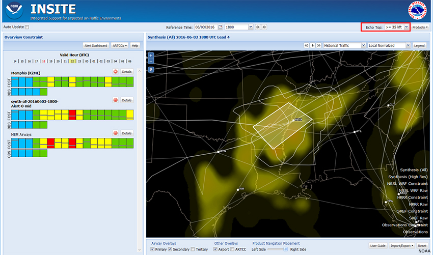
The Synthesis (All) product tells a somewhat different story, with generally higher forecast constraint. But in general, there are fewer echo tops with increasing altitude, which decreases the convective constraint.
Constraint and Confidence/Consistency (CC) Bars
Thus far, we have focused on the right pane of INSITE and defining the 3-dimensional extent of convective constraints. Now let’s look at the constraint bars in the left pane and the options available there.
The Constraint and Consistency/Confidence bars in the left pane present a time series of the severity of convective constraint through a given polygon, whether that’s an ARTCC, alert polygon, or user-defined polygon. The severity is classified as follows:
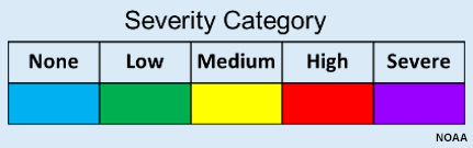
This key is available by clicking the Help button in the Constraint Overview window in the left pane.
Constraint and Confidence/Consistency (CC) Bars » Initiation/Cessation
Question
Looking at the CC bars for the mid-term (4-6 hour) forecast using the Synthesis (All) product at >= 25 kft, when will convective constraints impact air traffic passing through the region close to the Memphis airport?
Looking at the CC bar for the user-defined MEM Airways polygon, High and Severe constraints start at about 2100 UTC and end before 0200 UTC. This encompasses the entire mid-term (4-6 hour) period. However, the event would depend on the user's severity threshold. To some users the event might start at yellow (20Z) instead of red (21Z).
Constraint and Confidence/Consistency (CC) Bars » Synthesis Consistency Bars
Synthesis (All)
Synthesis (High Res)
Notice the gray horizontal lines within the colored CC squares. These lines indicate the consistency among the models that make up the synthesis. The higher the line, the greater the consistency. This consistency reflects the numerical and statistical model consistency for a 12-hour time period that is based upon the verification skill of the guidance for a similar time period from the previous convective weather season.
Question
Compare the consistency for Synthesis (All) to Synthesis (High Res) for the valid hour of 2200 UTC. Which product displays greater consistency?
The correct answer is b.
This indicates that the Synthesis (High Res) product may be more reliable and that the convective constraints will be less severe than those depicted in the Synthesis (All) product.
Constraint and Confidence/Consistency (CC) Bars » Model Confidence Bars
NSSL WRF
HRRR
For non-synthesis products, the black bars within the colored boxes depict model confidence. This confidence is initially based on climatology from the previous season and then updated on a monthly basis with the most recent data.
Question
Here we see CC bars for the NSSL WRF and HRRR models. Which of the following are reasonable interpretations at 2200 UTC? (Choose all that apply).
The correct answer is a.
The only correct answer is a.
HRRR shows low constraints within the MEM Airways polygon. While confidence levels for the two models are roughly equal, those for the HRRR are slightly greater.
Constraint and Confidence/Consistency (CC) Bars » Airway CC Bars
Individual airways are 40 nautical miles wide, which is much narrower than the polygons on our heat maps. We can look at CC bars for the individual airways that cross polygons by clicking the “Details” button for each CC bar.
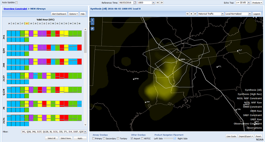
Here we see CC bars for the “MEM Airways” user-defined polygon, ranked in order of convective impact. Mousing over a CC bar will highlight the corresponding airway on the map. In doing this, we see that airway J41 is the most impacted. (For clarity, we have unchecked all airway overlays on the map.) You can edit the list of airway CC bars by using the “Filter” at the bottom of the page.
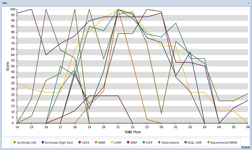
Clicking on a CC bar brings up a window with a time series of convective impacts from all available models for that airway.
Question
Answer the following questions for airway J41.
While there is no absolute scale and the answer is somewhat subjective, the position of the consistency line in the CC bar is near the bottom, indicating low consistency between models based up on their performance in the previous convective season. However, looking at the time series for this forecast period, the models show general agreement that convective impact will be high along this airway. Thus the time series reveals information that is otherwise unavailable in the standard CC bar.
Show Me How: Airway CC Bars
Approach Gates (CWSU forecasters)
So far this lesson has focused on the needs of AWC forecasters concerned with enroute flight-level convective impacts. Forecasters located at CWSUs are likely to be more concerned with arrivals and departures at airports within their area of responsibility. These flights typically arrive and depart through “gates” 50 miles or so north, south, east, and west of the airport.
Remember, you can save polygons by using the Import/Export feature. Click the Import/Export button in the lower-right and select Import Export Profile. Exporting a profile saves all of your settings, including user-defined polygons, in a file. Later, you can import the profile to recreate your screen and update the Reference Time to the current time.
Synthesis (All)
Synthesis (High Res)
INSITE can help you predict convective impacts for each gate by creating a series of polygons, one for each gate, and then assessing the convective constraints there.
Show Me How: Approach Gates
Question
Based on the CC bars for the Synthesis (All) and Synthesis (High Res) products:
The correct answers are East gate in the near-term and West gate in the mid-term. The North and South gates show consistently high-to-severe convective constraint.
Next Steps
Next Steps » Collaboration
Although INSITE is not intended to directly generate forecast products, forecasters and briefers use it as support when generating NWS products.
INSITE can be used to determine where forecast impacts to air traffic due to convective weather should be included in an aviation forecast product. It provides a common tool that forecasters at NWS offices can use to visualize the potential impacts to air traffic at various locations.
INSITE offers import/export options to facilitate collaboration. Clicking the Import/Export button in the lower-right gives you two choices:
- Import Shape File: This draws an image on your map.
- Import Export Profile. Exporting a profile saves all of your settings, including user-defined polygons, in a file. You can then send this file to a collaborator, who can import the profile to essentially recreate your screen on their computer. Export/Import is also a convenient way to save and retrieve case studies for training and other purposes.
Next Steps » Decision Support
INSITE provides capabilities that are linked to key IDSS concepts for communication and delivery of information. For example, INSITE capabilities are aligned with the IDSS concept to communicate on-demand reliable, quantified, and comprehensive forecast confidence information. Forecast confidence information is provided for each numerical and statistical model available in the INSITE tool.
INSITE is also aligned with the IDSS concept to deliver information that conveys potential impacts to support good decision-making and planning. The INSITE tool provides potential constraints to air traffic, which are conveyed as impacts to the NAS. Routine use of INSITE can potentially reduce air-traffic delays caused by convective weather.
Summary
The INSITE tool provides NWS forecasters capabilities to identify potential constraints to the NAS by combining forecast weather and air-traffic data.
These constraints are identified by calculating the Flow Constraint Index (FCI) on a grid over the CONUS, which is displayed as a heat map. Constraints are also displayed in a time series of potential impact severity, with confidence/consistency bars, for a designated polygon or airway. These time series are called CC: Constraint and Confidence for individual models or Constraint and Consistency for synthesis products.
The recommended sequence for using INSITE involves:
- Identify potential areas of air traffic constraints in the area of responsibility
- Compare potential areas of air traffic constraints with other model guidance
- Narrow the area of interest using alert polygons and user-drawn polygons
- Identify geographic areas and altitudes with constraints above moderate severity
- Identify the potential time of onset and cessation
- Adjust the forecast based upon confidence and consistency in CC bars
- Use these areas of constraints as first guess impact areas in forecast products and briefings
INSITE is a powerful tool for collaboration across offices and impact-based decision support.
Contributors
COMET Sponsors
MetEd and the COMET® Program are a part of the University Corporation for Atmospheric Research's (UCAR's) Community Programs (UCP) and are sponsored by NOAA's National Weather Service (NWS), with additional funding by:
- Bureau of Meteorology of Australia (BoM)
- Bureau of Reclamation, United States Department of the Interior
- European Organisation for the Exploitation of Meteorological Satellites (EUMETSAT)
- Meteorological Service of Canada (MSC)
- NOAA's National Environmental Satellite, Data and Information Service (NESDIS)
- NOAA's National Geodetic Survey (NGS)
- National Science Foundation (NSF)
- Naval Meteorology and Oceanography Command (NMOC)
- U.S. Army Corps of Engineers (USACE)
To learn more about us, please visit the COMET website.
Project Contributors
Program Manager
- Andrea Smith
Project Lead and Instructional Design
- Dr. Alan Bol
Science Advisors
- Jonathan Leffler
- Dr. Melissa Petty
- Dr. Jamie Vavra
Graphics/Animations
- Steve Deyo
- Lindsay Johnson
Multimedia Authoring/Interface Design
- Gary Pacheco
Audio/Video Editing/Production
- Steve Deyo
COMET Staff, [month] 2017
Director's Office
- Dr. Rich Jeffries, Director
- Dr. Greg Byrd, Deputy Director
Business Administration
- Dr. Elizabeth Mulvihill Page, Assistant Director of Operations and Administration
- Lorrie Alberta, Administrator
- Tara Torres, Program Coordinator
IT Services and Production Services
- Tim Alberta, Assistant Director of IT and Production
- Bob Bubon, Systems Administrator
- Steve Deyo, Graphic and 3D Designer
- Dolores Kiessling, Software Engineer
- Gary Pacheco, Web Designer and Developer
- Sylvia Quesada, Production Assistant
- Joey Rener, Software Engineer
- Malte Winkler, Software Engineer
International Program
- Paul Kucera, Project Manager
- Rosario Alfaro Ocampo, Translator/Meteorologist
- Bruce Muller, Project Manager
- David Russi, Spanish Translations
- Martin Steinson, Project Manager
Instructional Services
- Dr. Alan Bol, Scientist/Instructional Designer
- Lon Goldstein, Instructional Designer
- Bryan Guarente, Instructional Designer/Meteorologist
- Tsvetomir Ross-Lazarov, Instructional Designer
- Marianne Weingroff, Instructional Designer
Science Group
- Dr. William Bua, Meteorologist
- Patrick Dills, Meteorologist
- Matthew Kelsch, Hydrometeorologist
- Erin Regan, Student Assistant
- Andrea Smith, Meteorologist
- Amy Stevermer, Meteorologist
- Vanessa Vincente, Meteorologist