Produced by The COMET® Program
Introduction
Types of Drought
Drought occurs across large portions of Africa, often with devastating consequences for food security, water supply, crop production, and livestock. Drought often leads to famine, malnutrition, epidemics, and the displacement of large populations. Together with flooding, drought can significantly impede or erode a country’s economic growth and development. Drought is affected by a changing climate, and current projections indicate that it will become more frequent in the future.

Drought is defined as a persistent and abnormal moisture deficiency that impacts vegetation, animals, and people. There are four types of drought:
- Meteorological drought, which indicates lower precipitation than normal over a period of time.
- Hydrological drought, which defines deficiencies in surface and subsurface water supplies. It affects stream flow, groundwater tables, and reservoir levels. It reflects the effects and impacts of extended meteorological drought.
- Agricultural drought, which reflects root-zone soil moisture deficits and impacts on crop yields. It is usually expressed in terms of the soil moisture needed by a particular crop at a particular time.
- Socio-economic drought, which occurs when the demand for economic goods exceeds supply as a result of meteorological or hydrological drought.
Meteorological drought is the first phase of drought. It usually leads to agricultural drought due to lack of soil water. If precipitation deficiencies continue, hydrological drought develops. The groundwater is usually the last to be affected and the last to return to normal levels.
Drought Monitoring in the GHA
The Greater Horn of Africa (GHA) includes the countries of Burundi, Djibouti, Eritrea, Ethiopia, Kenya, Rwanda, South Sudan, Somalia, Tanzania, and Uganda.
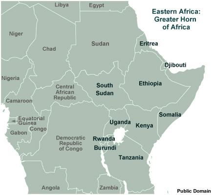
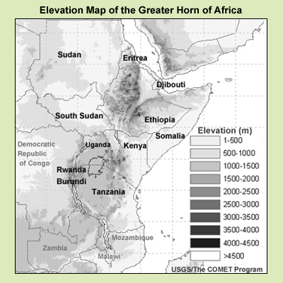
The GHA is a region of mostly high and complex terrain, which creates different local climates.
The GHA countries have a bimodal (twice yearly) rainfall pattern, with the long rains in March, April, May (MAM) and the short rains in October, November, December (OND). This pattern reflects the movement of the Inter-tropical Convergence Zone (ITCZ) following the overhead Sun. The long rains occur over several weeks with the relatively slow northward movement of the ITCZ. In contrast, the short rains occur during the more rapid southward migration and are highly variable from year to year.
The GHA experienced nine seasons of rainfall deficit between 2003 and 2008, which contributed to severe and devastating drought in 2009. This module explores that year's drought, using different types of data to understand its patterns, influencing factors, and impacts.
Data for Monitoring Drought
Drought monitoring and forecasting in Africa is limited by the scarcity of reliable ground-based observational data from, for example, rain gauge networks. There are large spatial gaps between operational weather stations and a lack of continuity in data from individual stations. As a result, rainfall measurements are commonly supplemented by data from satellite observations and atmospheric circulation models. This includes the following products, which we will examine in this module:
- Vegetation indices derived from satellite data; these are used to monitor the health and amount of vegetation, which are tied to rainfall performance
- Satellite-based multispectral products, such as the natural colour RGB, which provides information about the state of the land surface, and the day microphysics RGB, which is used to monitor convective activity
- Satellite-based sea surface temperature (SST) products, which are used to identify phases of climate oscillations that affect rainfall performance in the GHA
- Rainfall estimates made from satellites, gauges, and numerical weather prediction (NWP) models
About the Module
This module examines the 2009 drought situation in the GHA, focusing on conditions in Kenya. Kenya was selected because it has a long history of severe drought, has reliable long-term climate data, and is representative of the surrounding countries.
We will begin by looking at rainfall and drought conditions in the GHA in the years leading up to 2009, especially the short rains period of 2008 (October-November-December). Then we will examine the seasonal climate forecast for the long rains period (March-April-May) of 2009 and see what it portends. We will use satellite products to study rainfall performance for both rainfall seasons and see how they impacted the drought situation. Finally, we will look at the climate oscillations that can impact drought in the GHA and identifies patterns that were present in 2009 and contributed to its severity.
By the end of the module, weather forecasters and students should have a better understanding of drought and the tools available for its early detection and monitoring. Early detection is essential for planning for adaptation.
Drought Conditions Prior to 2009
Conditions in the GHA from 1982 to 2009
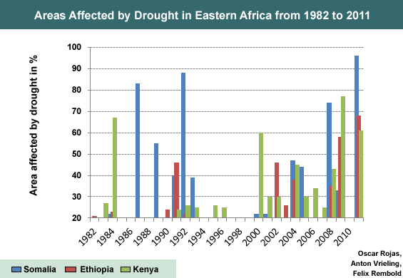
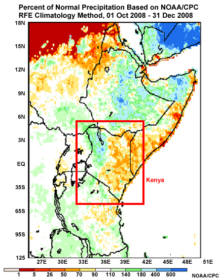
Kenya’s prolonged 2009 drought was impacted by previous seasons of depressed rainfall over most of the country. This graph shows the percentage of areas in Somalia, Ethiopia, and Kenya that were affected by drought between 1982 and 2011. Notice the increased trend from 2000.
Rainfall Distribution Map for OND 2008
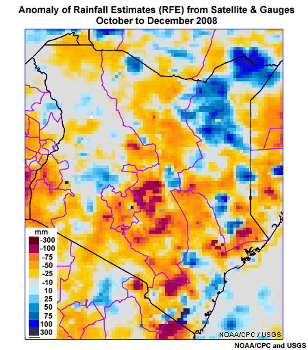
This rainfall distribution map for Kenya is made from gauge data and shows the rainfall received with respect to the long-term mean for the short rains period of October, November, and December 2008. Amounts below 100% are less than average rainfall.
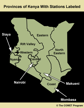
According to the data, much of Kenya received more than 75% of the long-term average seasonal rainfall in OND 2008, with some regions exceeding the average by up to 150%. However, the Coast Province and surrounding areas had below-normal rainfall. Click the Provinces tab if you are unfamiliar with Kenya's provinces.
Rainfall Distribution

Kenya's Provinces
Rainfall Estimate Anomalies in OND 2008
The plot shows rainfall estimate anomalies for the OND 2008 short rains period. Review the plot, then answer the question below.
Rainfall Anomaly
Percent of Normal Rainfall
Kenya's Provinces
Question
Which provinces have similar patterns in both the RFE anomaly and percent of normal rainfall distribution maps? Select the correct answer(s), then click Done.
The correct answers are a), b), d), e) and g).
As you can see, the findings are similar in some areas and different in others. The differences are due to the plots' data sources. The rainfall distribution map is made from gauges, which are irregularly and sparsely distributed, especially in eastern Kenya. In contrast, the RFE anomaly map is made from merged gauge and satellite data, and provides more detail about the magnitude, location, and spatial distribution of the rainfall deficit or surplus.
Forecast for MAM 2009
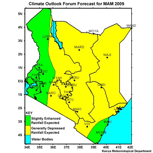
Climate Outlook Forum Forecast for MAM 2009
The World Meteorological Organization (WMO) Greater Horn of Africa Climate Outlook Forum (GHACOF) consists of national representatives and is coordinated by the IGAD (Inter-Governmental Authority on Development) Climate Prediction and Application Centre (ICPAC). The Forum provides routine outlooks of rainfall and drought severity (plus other measures) at 10-day (dekadal), monthly, and seasonal time scales. The predictions are based on recent past observations from stations and satellites, and output from dynamical and statistical models. National meteorological services also produce their own national outlooks at similar time scales.
In February 2009, the Climate Outlook Forum issued this rainfall forecast for the long rains period of 2009 (March-April-May). As you can see, most of the country is expected to receive less than normal precipitation, including areas that were already relatively dry. However, some of the driest areas in the southeast are predicted to get more rainfall than normal. As we go through the module, we'll see how accurate the expected trend is.
Vegetation Indices
About NDVI
Vegetation indices (VI) are derived from satellite observations and indicate vegetation health when combined with theories of the biophysical response of vegetation to its environment.
The Normalized Difference Vegetation Index (NDVI) is a widely used indicator for studying the status of vegetation and estimating crop production. NDVI is the normalized difference between the reflectance of the near IR and visible channels of the Advanced Very High Resolution Radiometer (AVHRR), which flies on the NOAA POES and EUMETSAT METOP polar-orbiting satellites.
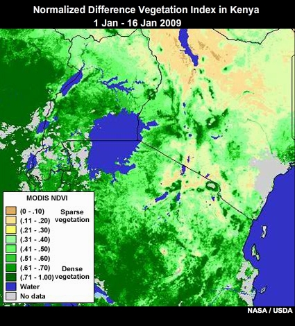
MODIS NDVI in Kenya from 06 to 21 March 2009
Since NDVI indicates the density and health of green vegetation, which are tied to rainfall performance, it is a good indicator of drought.
The index is available from a variety of sources, including:
- ICPAC (IGAD or Inter-Governmental Authority on Development Climate Prediction and Application Centre)
- Famine Early Warning System Network (FEWS-NET)
- U.S. Geological Survey (USGS)
- U.S. Department of Agriculture (USDA) Foreign Agricultural Services
- ENDELEO
- U.S. National Aeronautics and Space Administration (NASA) GLAM (Global Agricultural Monitoring)
- U.S. National Oceanic and Atmospheric Administration (NOAA) STAR (Center for Satellite Applications and Research)
NDVI for 2009
We will begin by examining NASA MODIS NDVI data for all of 2009, identifying periods and areas in the GHA with the lowest vegetation indices and greatest deficit anomalies.
The NDVI is unitless and is scaled so that values range from -0.1 to 1.00. Values greater than 0.1 generally have increasing degrees of vegetation greenness and intensity. Areas with values from 0 to 0.1 typically consist of rocks and bare soil. Values less than 0.1 generally indicate decreasing vegetation greenness and intensity (although they sometimes indicate clouds, rain, and snow). Note that low values of NDVI do not necessarily denote lack of vegetation. For example, deciduous forests may appear more tan than green during winter.
Review the animation, then answer the questions below.
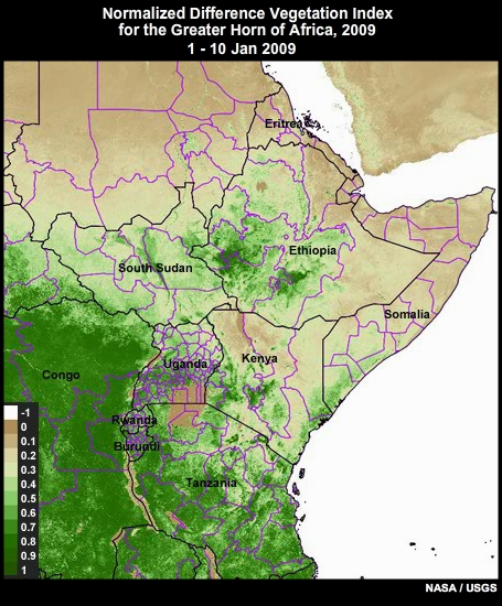
MODIS NDVI in the Greater Horn of Africa in 2009
Question 1
Let's start by interpreting the colours in the product. Select the terms that complete each sentence. When you are finished, click Done.
Cream to brown areas have low values of NDVI, reflecting inadequate rainfall. Green areas are vegetated, reflecting adequate or greater amounts of rainfall. Brown areas have little or no vegetation. White areas represent oceans or clouds, which obscure the land surface below.
Question 2
In which period(s) did vegetation have the lowest performance in the GHA region? Choose all that apply.
The correct answers are a) and c).
Large areas of low NDVI were observed during February-March for most of Sudan, South Sudan, Ethiopia, Eritrea, Djibouti, Somalia, and Kenya.
During August-September, NDVI was lowest in Tanzania, Rwanda, Burundi, Kenya, and Somalia.
These periods have the climatological minima in precipitation for this region.
Question 3
In which period did vegetation perform best in the GHA region?
The correct answer is d).
The vegetation was greenest in November and December.
NDVI Anomalies
NDVI anomalies are departures from long-term averages. Negative values represent a reduction from normal NDVI, while positive values represent an increase from normal. Review this NDVI anomaly animation for 2009, then answer the questions below.
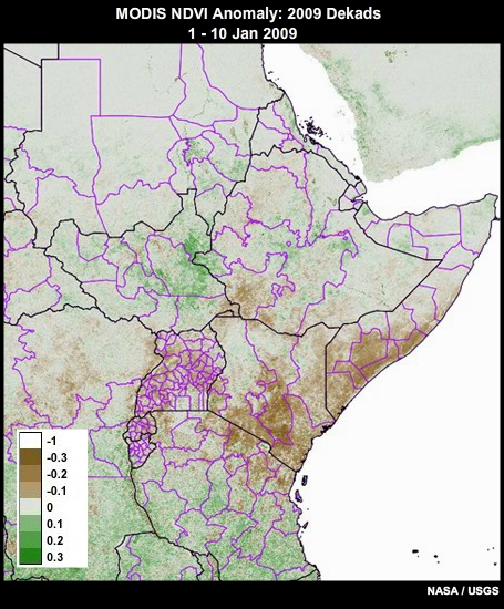
MODIS NDVI anomalies in the GHA, 01 Jan 2009 to 03 January 2010
Question 1
How would you characterize NDVI values in the GHA region in 2009?
The correct answer is c).
Most countries had much lower NDVI values than normal in 2009.
Question 2
Observe the spatial and temporal trend across the region. When did the drought peak in the GHA?
The correct answer is b).
During the third dekad of February, southeast Ethiopia, South Sudan, central and southern Kenya, Somalia, and central and northern Tanzania had below normal or depressed NDVI values.
The second dekad in April is usually the climax of rainfall in GHA region. Not coincidentally, it is the most important planting time in central and northern Tanzania. But the data show that the area experienced maximum depression in terms of vegetation cover then, signifying the presence of drought. The situation deteriorated in Kenya, Ethiopia, Somalia and east-central Uganda.
South Sudan was very green in May but turned to brownish red (very dry conditions) in the first dekad of June.
Southeastern Ethiopia continued to display depressed NDVI throughout this period. However, southwestern Ethiopia began the year in depressed conditions but returned to normal and above by May.
Question 3
When did signs of drought end for most of the GHA?
The correct answer is c).
Signs of drought ended by the second and third dekads of October in South Sudan, Ethiopia, and Somalia.
Kenya had well established vegetation by the first dekad of November.
In Tanzania, NDVI remained below normal until the second dekad of November when the wet season began.
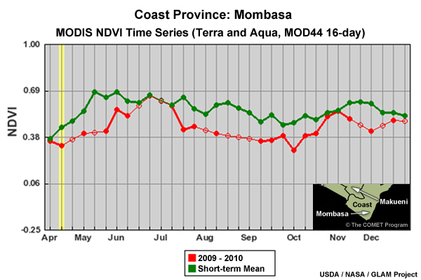
Time Series of NDVI
The time series graphs show current and mean NDVI values for stations in the Coast, Eastern, Central, and Western Provinces of Kenya from April to December 2009. The green is the mean while the red is the current value of NDVI. The difference between mean and current is the anomaly.
Time series are useful for seeing how drought evolves in different parts of the country. For example, in the Mombasa graph, the upward slope of the 2009 NDVI relative to the mean after October is one indicator of the switch from drought to normal conditions.
Review the plots, then you'll answer some questions about them on the next page.
Mombasa
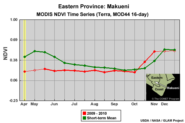
Makueni
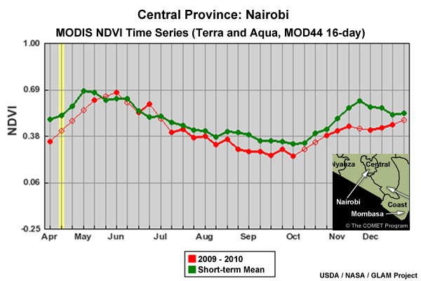
Nairobi
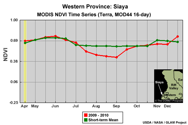
Siaya
Kenya's Provinces
Time Series Questions
Answer the questions below the graphs. Notice that the MODIS NDVI anomaly animation for 2009 has been added to the tabs.
Mombasa
Makueni
Nairobi
Siaya
Provinces
Anomaly Ani.
MODIS NDVI anomalies in the GHA, 01 Jan 2009 to 03 January 2010
Question 1
Of the four stations, which had the lowest NDVI values in 2009?
The correct answer is b).
The plots show that Makueni in Eastern Kenya had the lowest NDVI - in September.
Question 2
During which period(s) did Mombasa experience significantly depressed vegetation according to the time series? Choose all that apply.
The correct answers are a) and b).
May and August/September had the largest difference between the mean and the current NDVI. If you compare the time series with the anomaly animation, you'll see that the Mombasa area is brown during those periods, indicating reduced vegetation.
Question 3
Now look at Siaya in Western Kenya. According to the time series, during which period(s) did Siaya experience significantly depressed vegetation? Choose all that apply.
The correct answers are b).
From April to July, Siaya had normal vegetation, unlike many other areas of Kenya. The largest difference between the mean and current occurred during August and early September.
MetOp Global Vegetation Index
Now we will look at a vegetation index from another organisation and see what it shows for a particular day in the MAM long rains period. EUMETSAT produces the MetOp Global Vegetation Index (MGVI), which is derived from its polar-orbiting satellite. The product is a weekly composite that helps monitor the density and vigor of green vegetation. It is used to classify land cover, estimate crop acreage, and detect plant stress.
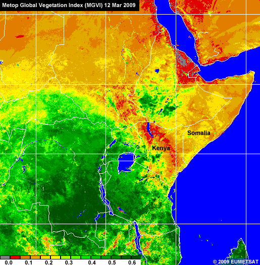
This sample product lets us compare conditions in the GHA with the rest of Africa on 12 March 2009, the beginning of the long rains season. As you can see, Kenya, Somalia, and other regions of the GHA were very dry in comparison. Notice how healthy vegetation in Kenya was limited to the Lake Victoria area, extending slightly to the central region. Most of the rest of the country showed little or no vegetation.
Question
Why were Tanzania and most of the neighboring countries to the south very green at this time?
The correct answer is b).
The rainfall season in Tanzania and most of the neighboring countries to the south had already started due to the approaching ITCZ.
Rainfall in Kenya
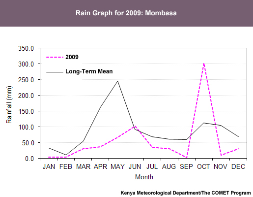
Rain Graphs for Two Stations
Now we'll see what rain graphs indicate about rainfall amounts in coastal and central Kenya throughout 2009. Note that the rain graphs are made from station data.
Mombasa
Nairobi
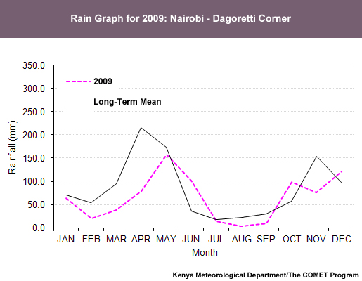
Question
How do the 2009 rainfall amounts compare to the long-term averages for the stations in Nairobi and Mombasa? Select the terms that complete each statement, then click Done.
Comparing Rainfall Amounts With Other Data
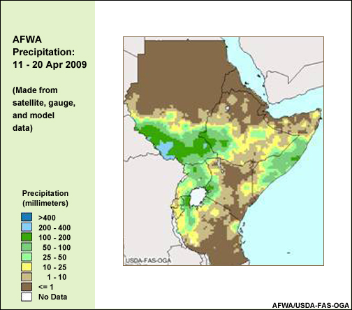
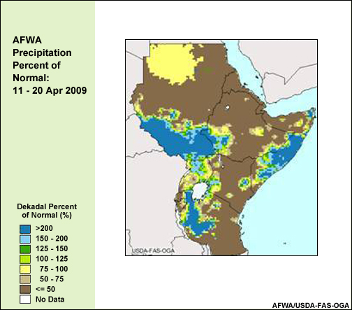
As you know, the surface network in the GHA is sparsely distributed, making satellite data vital for monitoring drought. Among the commonly used products are satellite rainfall estimates (RFE), which combine data from satellite IR and microwave channels and numerical models.
Examine these plots of precipitation (RFE), precipitation percent of normal, and NDVI anomalies for 11 to 20 April 2009, then answer the questions below.
RFE
RFE Percent of Normal
NDVI Anomaly
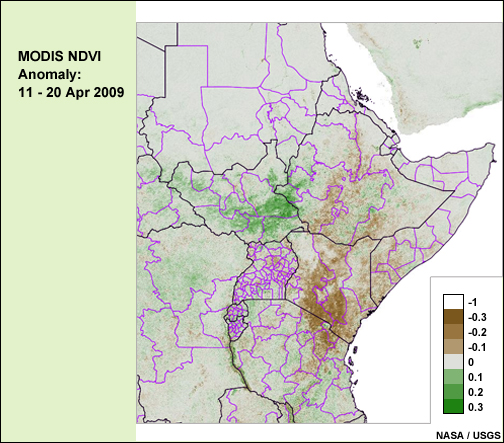
Question 1
Based on the two RFE plots, which parts of Kenya received rainfall--but at levels that were 50% or lower of normal rainfall? Select the option(s) that apply, then click Done.
The correct answers are b) and c).
According to the data, areas of central and southeastern Kenya received 50% or lower of normal rainfall amounts from 11 to 20 April 2009.
Question 2
Now compare the RFE percent of normal and NDVI anomaly maps. Which part of Kenya experienced the worst drought conditions from 11 to 20 April?
The correct answer is b).
Based on percent of normal rainfall estimates and anomalies of NDVI, central areas of Kenya had the worst drought conditions during this period. By comparing the animations of the RFE percent of normal and the NDVI, we can observe the response of the vegetation to rainfall during the rest of 2009.
For more information and data on RFE, access the following sites:
- NOAA Climate Prediction Center (CPC), https://www.cpc.ncep.noaa.gov/products/international/
- USDA Foreign Agriculture Service (FAS), https://www.fas.usda.gov/
- Food and Agriculture Organization of the United Nations ( FAO), http://www.fao.org/nr/climpag/data_2_en.asp
Using RGBs to Monitor Vegetation and Rainfall
EUMETSAT Natural Colour RGB
EUMETSAT's MSG natural colour RGB is made from three visible channels and does a good job of depicting many surface and near-surface features. It is useful for showing the effects of drought on vegetation, making it a good indicator of the performance of seasonal rains in rain-fed agricultural regions such as the GHA.
In the natural colour RGB, many features appear in their natural colours. Vegetation is green; deserts are reddish brown; and low clouds are white. Only snow cover and high ice clouds have a non-intuitive colour, cyan (that's to differentiate them from low clouds).

MSG natural colour images over the eastern part of the Greater Horn of Africa in 2009
As the animation shows, the western region of Kenya is usually rainy during most of the year compared with the rest of the country. This is reflected in the greenish colour around Lake Victoria and over a bit of the central region. It's due to the afternoon lake breeze from the lake as well as rainstorms induced by the high mountains.
The northwest and northeast regions are mainly semi-arid as indicated by the shades of brown. The central region can also be dry and experiences drought at times.
The coastal region experiences more frequent rains due to sea breezes from the Indian Ocean.
Analysing the Natural Colour RGB
Play the animation again, then answer the questions below.
MSG natural colour images over the eastern part of the Greater Horn of Africa in 2009
Question 1
Which region(s) in Kenya had good rainfall performance in January 2009? Select the option(s) that apply, then click Done.
The correct answers are a) and b).
Vegetation in Western and Central Kenya was strong in January due to the good rainfall performance of the previous season (OND 2008). However, the northeast and northwest regions had poor rainfall performance, making the areas quite dry.
Question 2
Which month had the least vegetation?
The correct answer is c).
September had the lowest amount of vegetation. That is not surprising as the previous month, August, is the climatological minimum in rainfall. Recall the rainfall graphs shown earlier.
MSG Day Microphysics RGB, 7 July 2009
The MSG day microphysics RGB lets forecasters monitor convective activity on a daily basis. The most active parts of convective systems indicate the location of heavy rain showers. Naturally, the absence of shower activity for long periods increases the risk or severity of drought.
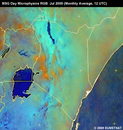
A simple way of estimating monthly cloud and rainfall amounts is to generate monthly average satellite images from infrared channels or RGB composites. This can be done with 15-minute images or daily images.
This image is the monthly average day microphysics RGB for July 2009. Blue areas are cloud-free/have no rain, while orange (yellow-brownish) areas have a high coverage of cold ice clouds and precipitation.
Question
Based on the image, which part(s) of Kenya had well-developed convection in July 2009? Select the correct choice(s).
The correct answer is a).
We only find orange (yellow-brown) areas in the western part of the country. That's due to the availability of humidity from Lake Victoria and orographic rain from the mountains. The rest of the country is dry.
MSG Day Microphysics RGB, 9 September 2009
This image shows the monthly average for September 2009. Notice how much drier most of the country is. Significant convection appears only around the Lake Victoria region.
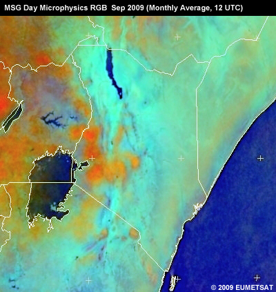
This is consistent with the relatively high NDVI values from Siaya just east of the lake.
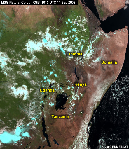
MSG Natural Colour RGB, 11 September 2009
Here's the MSG natural colour RGB for two days later, 11 September 2009. Notice how a large portion of eastern Africa looks similar to desert areas, such as the Sahara. This is particularly true of Somalia and eastern Kenya.
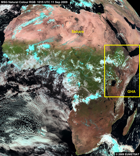
This close-up confirms how grave the situation was over Kenya and the neighboring countries in mid September.
Drought Conditions and Rainfall, September to December
Comparing NDVI and NDVI Anomalies for September
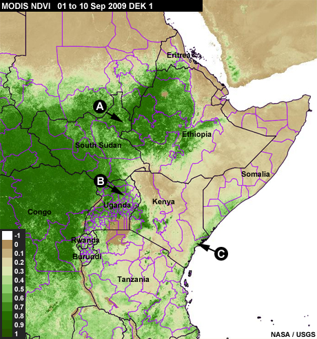
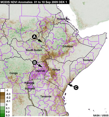
Now we'll take a closer look at the last quarter of the year, September to December, and see what different types of data reveal. We'll begin by comparing MODIS NDVI and NDVI anomalies for September.
The NDVI plot shows green vegetation in South Sudan (A), Uganda (B), and Kenya (C). In contrast, the NDVI anomaly plot shows depression in those same areas. Which is more useful for monitoring drought? In general, anomaly plots are more informative than NDVI plots. The magnitude of the departure from normal gives a clearer picture of the extreme nature of drought.
NDVI
NDVI Anomaly
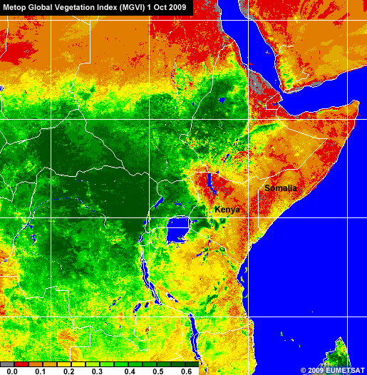
Vegetation Change and the Shifting ITCZ
These MGVI graphics are from March and October and show the impact of the northward progression of the ITCZ. Notice the northward shift in vegetation and the expanded area of red, especially over Kenya and Somalia, which indicates depressed vegetation.
MGVI March
MGVI October
Vegetation Response to Rainfall
Question
This graphic shows the status of vegetation in the first dekad of October for the GHA. Why were NDVI values so low over most parts in Somalia and Kenya and some of Tanzania when in fact the rains had begun? Select the correct choice(s), then click Done.
The correct answers are a) and d).
There are two reasons. It takes vegetation approximately 10 days to respond to rainfall. Plus there was too little rainfall to cause significant change in vegetation.
Forecast for the Short Rains
Before we examine the short rains period of OND in more detail, let's look at a summary of the forecast issued on 26 August 2009 for that period.
"The Climate Outlook for the Short Rains (October-November-December) 2009 season indicates that much of the country is likely to experience near-normal rainfall tending to above-normal (enhanced). The expected enhanced seasonal rains are driven by the presence of an evolving El Niño in the equatorial eastern Pacific Ocean coupled with a warming Indian Ocean in areas adjacent to the East African coastline. This El Niño is currently classified as moderate or mild compared with that of 1997/98. The distribution of the rainfall in time and space is expected to be generally good over most places".
Let's see what actually happened.
Examining the Short Rains
Each tab has a product for the OND short rains season. Review each one, then click the Final Question tab. You will decide if the trend in the data matched the seasonal forecast. (Microphysics = 1. Rainfall Performance = 2. Natural Colour = 3. NDVI = 4. NDVI Anomalies = 5. Time series for Eastern Province = 6, Western = 7, Coast = 8, Central = 9)
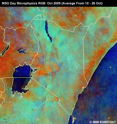
1
As the region entered the short rains season of OND, convection started over Somalia, Ethiopia, and the central and coastal parts of Kenya. This is evident in this MSG day microphysics RGB made from images from 10 to 26 October 2009. The orange (reddish-brown) areas indicate precipitating convective clouds.
2
This map of rainfall performance in the GHA shows near-normal rains (in light green) in central and northwest Kenya during the OND period of 2009; and above-normal rains (in dark green) in the western and eastern parts of the country. The RFE for the same period showed above normal rainfall for most of Kenya. However some areas, particularly in northern Eastern Province, had below normal rainfall.
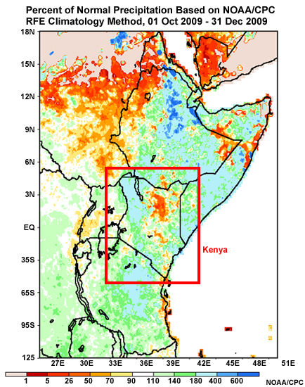
Overall, the rainfall over Kenya for OND 2009 was much improved from OND 2008.
3
The MSG natural colour RGB shows an increase in greenness (vegetation) over the eastern part of the GHA, especially Kenya, Tanzania, Somalia, and southern Ethiopia.
MSG natural colour images over the eastern part of the Greater Horn of Africa in 2009
4
This NDVI product shows good performance in the GHA from October through December. Values are enhanced in Kenya, Tanzania, Somalia, and Southern Ethiopia. Note that some parts of Somalia, especially in the north, remain dry.
MODIS NDVI in the Greater Horn of Africa in 2009
5
This NDVI anomaly product shows good performance in the GHA from October through December. Values are enhanced in Kenya, Tanzania, Somalia, and Southern Ethiopia. Note that some parts of Somalia, especially in the north, remain dry.
MODIS NDVI anomalies in the GHA, 01 Jan 2009 to 03 January 2010
6
7
8
9
Final Question
Question
Did the trend basically match the seasonal forecast? Recall that it indicated that "much of the country is likely to experience near-normal rainfall tending to above-normal (enhanced)."
The correct answer is a).
The forecast correctly predicted the good OND rainfall season over Kenya. Some areas experienced better than average rainfall, while other were just below normal.
Note
Recall the climate discussion in the forecast:
"The expected enhanced seasonal rains are driven by the presence of an evolving El Niño in the equatorial eastern Pacific Ocean coupled with a warming Indian Ocean in areas adjacent to the East African coastline. This El Niño is currently classified as moderate or mild compared with that of 1997/98. The distribution of the rainfall in time and space is expected to be generally good over most places."
In the next section, we'll discuss the climate cycles that impact the GHA and see what, if any, impact they had in 2009.
Impact of Climate Cycles
ENSO and the Indian Ocean Dipole
Rainfall in the GHA is highly variable. This is particularly true of the short rains. This variability is influenced by the coupling between atmospheric and oceanic dynamics. Anomalous gradients in tropical sea surface temperature (SST) lead to corresponding shifts in atmospheric circulations and rainfall patterns. The impacts on the GHA vary because of the complex local topography and climates.
The most dramatic of the coupled atmosphere-ocean phenomena is the El Niño-Southern Oscillation (ENSO) of the tropical Pacific Ocean, which affects the global climate. For more information on ENSO, access COMET's Tropical Textbook at http://www.meted.ucar.edu/tropical/textbook_2nd_edition/navmenu.php?tab=5&page=2.1.8.
However, the GHA is influenced more immediately by SST anomalies in the Indian Ocean and surface wind anomalies along the equatorial Indian Ocean. The Indian Ocean Dipole (IOD) or Indian Ocean Zonal Model (IOZM) is an east-west oscillation in SST anomalies that is accompanied by a shift in precipitation anomalies in East Africa, the Indian sub-continent, and Indonesia. Most of the variability of the East African short rains is linked to the IOD. For more information on the IOD, access Chapter 3 of COMET's Tropical Textbook at https://www.meted.ucar.edu/tropical/textbook_2nd_edition/navmenu.php?tab=4.
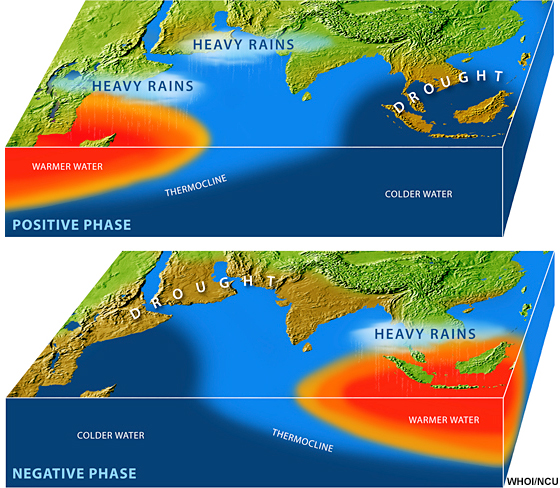
Generally, during the positive IOD phase:
- SSTs are anomalously warm in the western Indian Ocean. Greater than normal rainfall occurs over East Africa and India, and dry conditions prevail over western Indonesia and vicinity.
- Below-normal southwest monsoon flow is associated with less upwelling and a deeper thermocline, leading to above-normal SSTs over the North Indian Ocean and Arabian Sea. (A thermocline is a layer of water with a larger temperature gradient than the layers above and below it.)
During the negative IOD phase:
- SSTs are anomalously cool over the western Indian Ocean, and drought is prevalent over East Africa and India.
- Rainfall is reduced with anomalous westerly flow, which enhances the transport of moisture away from the African continent, out over the Indian Ocean.
Generally, the positive dipole becomes apparent in early to mid-summer, reaches its peak in late fall to early winter, and rapidly decays during the boreal spring. The negative phase has similar timing, magnitude, and decay.
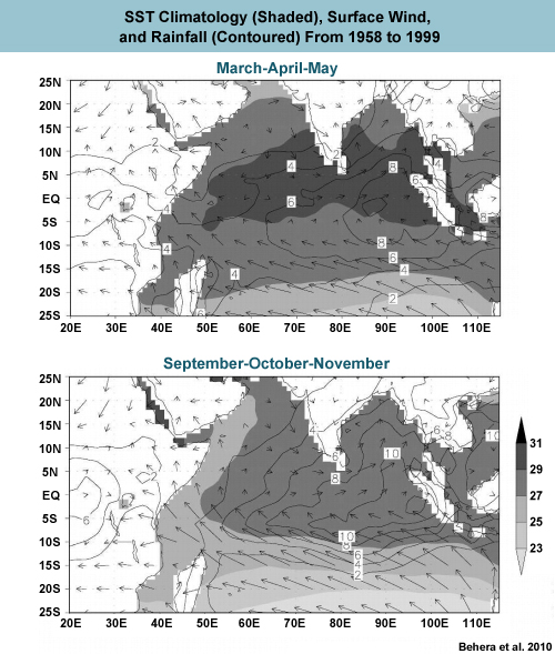
Extreme anomalies of seasonal rainfall over India and East Africa are correlated with the combined effect of IOD and ENSO events. These composites of SST anomalies for strong ENSO and IOD events show the typical pattern of SST anomalies for those periods. Note that the mechanisms for the IOD and its relationship with ENSO are still under active research.
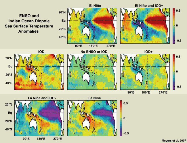
Individual ENSO events vary in magnitude and timing, and their impact depends on their coincidence with the phases of the IOD. For example, in 1997/98, anomalously warm SSTs over the western Indian Ocean during the positive IOD and an El Niño event produced strong convection over eastern Africa and a 20-160% increase in rainfall in the Lake Victoria region. In contrast, previous El Niño periods caused only a 15-25% increase in rainfall.
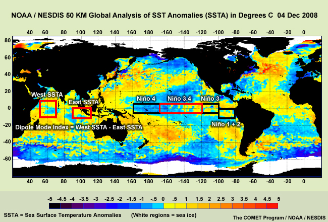
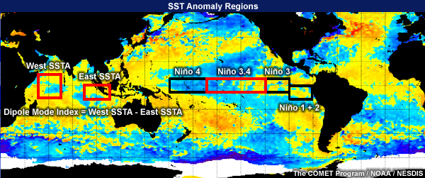
The map below shows the critical regions for monitoring the Indian Ocean Dipole and ENSO. The areas impacted by ENSO are divided into four Niño regions. The Dipole Mode Index is the difference between the western and eastern Indian Ocean SST anomalies (SSTA).
In late 2008, cool SST anomalies were present over the northern tropical Indian Ocean, while La Niña conditions were present in the tropical Pacific. This pattern of SST anomalies accounts for the rainfall deficit and reduction in the NDVI that we saw in Kenya in early 2009.
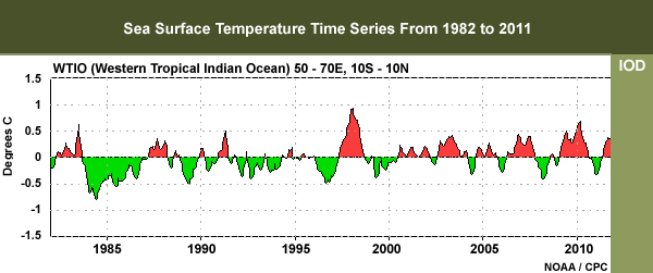
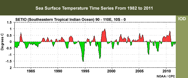
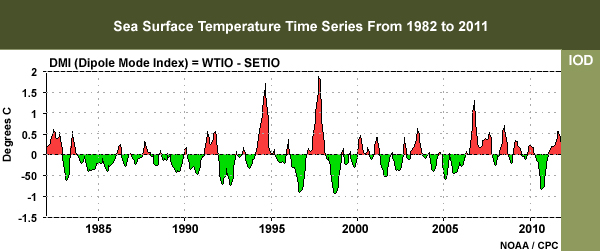
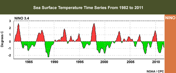
SST Anomalies for the Indian Ocean Dipole Mode and Niño Region, 1982 to 2011
These graphs are time series of SST anomalies for the Indian Ocean Dipole Mode and Niño regions from 1982 to 2011. Review them, then answer the questions below.
WTIO
SETIO
DMI
NINO
SST Anomaly Regions
Question 1
Based on the data, in what years would you expect that extremely dry periods might occur over the GHA? Select the correct option(s), then click Done.
The correct answers are b), d), e) and f).
The years of extremely dry conditions in the GHA are associated with strong negative IOD phases and strong La Niña events. These include 1983, 1999-2000, 2005, and 2008-2009.
Question 2
When were extremely wet periods likely to occur over the GHA that would make widespread drought very unlikely? Select the correct option(s), then click Done.
The correct answers are a), d), e) and f).
The years of extremely wet conditions in the GHA are associated with strong positive IOD phases and strong El Niño events. These include 1982, 1994, 1997, and 2006.
SST Anomaly Indices for 2008 to 2009
Let's examine late 2008 through 2009 in more detail and see what the SST anomaly indices tell us about the GHA rainfall during this period. Review the plots, then answer the question below.
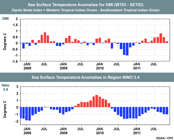
Question
Based on the linkages between the SST anomalies and the GHA rainfall, when might dry periods be expected over the GHA? Select the correct option(s), then click Done.
The correct answers are a).
During late 2008, both the DMI and the Niño 3.4 SST anomalies were negative, and dry conditions followed across many areas of Kenya. The SST influence on drought in early 2009 can be seen in the station data and satellite-derived vegetation indices.
MODIS NDVI anomalies in the GHA, 01 Jan 2009 to 03 January 2010
As the DMI increased, rainfall increased and vegetation health improved. However, the DMI was negative at the start of the short rains in 2009 while a mild El Niño was being established in the Pacific. So rainfall was expected to be near normal. By late 2009, El Niño was nearing its peak and the DMI was also positive. Rainfall increased and there was a corresponding increase in the NDVI.
GHA rainfall variability is occasionally influenced by Atlantic SST anomalies and corresponding shifts in the subtropical St. Helena Ridge that bring westerly winds far into the continent. Finally, mid-latitude circulations over the eastern Mediterranean and the Arabian Peninsula can influence seasonal rainfall in the GHA.
Conclusion
Summary of 2009 Drought
Rainfall patterns are well known in eastern Africa. Therefore, when seasonal performance is poor, concern is raised about the possibility of drought. 2009 had all the makings of a drought year. The GHA had experienced repeated seasons of poor rainfall performance beginning in 2003 (with the exception of 2006), and the short rains period of 2008 was very poor. This pattern continued through the long rains season of MAM 2009, resulting in devastating drought from July to October, especially in the northwestern part of the country. A good short rains season in OND improved conditions.
Impacts of the 2009 Drought
The KMD climate outlooks include descriptions of the impacts of weather events on the country. From these, we can see the impact of enhanced and diminished rainfall in the period covered by the module, the end of 2008 and all of 2009. Here are some examples.
Excerpts from the "12 November 2008 Review of the OND 2008 Short Rains Season"
- Most parts of the country have received heavy rainfall causing flooding, mudslides and loss of life and property, and destruction of infrastructure.
- The heavy rainfall being received over the North Rift Valley has interfered to a big extent with the harvesting.
Excerpts from the "29 May 2009 Review of the MAM Long Rains Season"
- Poor crop performance in the southeastern lowlands, eastern highlands, central Rift Valley and parts of western highlands;
- Poor pasture conditions continued in pastoral areas due to depressed rainfall;
- Outbreak of cholera was reported in some parts of the country in April;
- Signs of water stress and diminishing pastures for livestock were observed over northeastern districts and southern Rift Valley as a result of the poor rainfall performance; and
- Rainfall deficits in the catchment area of Tana River in the central highlands affected the water levels in the Seven-Forks hydroelectric power generation dams.
- On the other hand, heavy rainfall that was experienced in some areas resulted in some flash floods. The flash floods led to displacement of families reported over parts of Turkana... At least ten people were reported dead in Turkana and Hyanza Provinces and nearly 1,000 people were rendered homeless due to the floods.
Excerpts from the "29 May 2009 Potential Impacts Expected for June-July-August"
- Save for the western highlands, Lake Basin and parts of central Rift Valley, chances of crop rejuvenation are very low in most other areas considering the fact that the crop performance was already poor during the March-May rainfall season
- Poor pasture conditions and limited water resources for livestock are expected to persist over the Arid and Semi-Arid Lands (ASALs). Contingency measure ought to be put in place to sustain livestock keeping and also minimize conflicts. A slight improvement in crop performance, availability of pasture and water for livestock is likely to occur in southern Rift Valley areas...
- Problems related to limited pasture and water scarcity are likely to get worse for the pastoral communities. There is also potential for human-wildlife and community-to-community conflicts over the limited resources in these areas.
- Famine is expected to persist in areas where there was rainfall failure... Relief food and rehabilitation plans should therefore be sustained
- There is always a tendency for people to close all windows and light jikos to keep themselves warm during very chilly conditions in June-July-August. This should be avoided since the burning charcoal produces a poisonous gas called Carbon Monoxide that suffocates and even kills.
- The "Long Rains" were not sufficient to fill the dams for power generation and for domestic use. The situation may deteriorate during the coming months considering that June-September is generally a dry period over most of the central highlands, including Nairobi. Rationing of power and water may, therefore, be inevitable.
- The dry conditions especially in the Arid and Semi Arid Lands (ASALs) combined with relatively strong winds will enhance potential for forest fires...
This final assessment comes from the United States Agency for International Development (USAID) on 1 October 2009:
- The collective impact of recurrent seasons of failed or poor rainfall, sustained high food prices, continuing environmental degradation, disease outbreaks, localized violence, and flooding have led to deteriorating food security conditions. According to the Kenya Food Security Steering Group (KFSSG), a joint U.N., government, and non-governmental organization consortium, approximately 3.8 million people throughout Kenya require emergency food assistance through the end of 2009. Although the majority of individuals displaced by post-election violence in 2008 have subsequently returned to areas of origin, vulnerabilities among remaining internally displaced persons (IDPs) and disruptions to agricultural production in affected areas have contributed to increased food insecurity.
- According to KFSSG, the 2009 long rains performed poorly in most areas of the country, with four of the eight provinces experiencing less than 40 percent of the average rainfall for the season. As a result, KFSSG anticipates the 2009 long rain season maize harvest to yield 28 percent less than the five-year average. In pastoral areas, drought conditions have resulted in deteriorating livestock body conditions, increased livestock disease incidence, and early and extended livestock migration patterns. In addition, resource-related conflict due to drought exacerbated inter-ethnic tensions in northwestern Kenya has hampered relief activities.
- On October 1, 2009, U.S. Ambassador Michael E. Ranneberger redeclared a disaster due to food insecurity in Kenya. In Fiscal Year 2009, USAID/OFDA provided more than $24 million for humanitarian programming in response to food insecurity, including programs designed to strengthen livelihood opportunities, protect and diversify household assets, and increase agricultural productivity.
Final Words
Climate change may increase the risk of drought in many parts of Africa. Declining and more erratic rainfall may result in lower agricultural production and more unpredictable harvests. It is critical to develop better ways of detecting the early onset of drought and plan for its adaptation. Satellites are vital to this effort given, for example, their global coverage and frequent updates. The data are critical for developing weather forecasts and improving weather and climate models.
We have presented a number of satellite-based products that forecasters can use to assess impending adverse weather-related events. We hope that you will use them in your forecasts throughout the year.
References
Anderson, Martha C., Christopher Hain, Brian Wardlow, Agustin Pimstein, John R. Mecikalski, William P. Kustas, 2011: Evaluation of Drought Indices Based on Thermal Remote Sensing of Evapotranspiration over the Continental United States. J. Climate, 24, 2025–2044.
Behera, Swadhin K., Jing-Jia Luo, Sebastien Masson, Pascale Delecluse, Silvio Gualdi, Antonio Navarra, Toshio Yamagata, 2005: Paramount Impact of the Indian Ocean Dipole on the East African Short Rains: A CGCM Study. J. Climate, 18, 4514–4530.
Deering, D. W. (1978): Rangeland reflectance characteristics measured by aircraft and spacecraft sensors. Thesis, Texas A & M University, 1978.
Gadgil, Sulochana, Vinaychandran, P. N., Francis, P. A. and Gadgil, Siddhartha, Extremes of
Indian
summer monsoon rainfall, ENSO, equatorial Indian Ocean Oscillation. Geophys. Res.
Lett.,
2004.
Hastenrath, Stefan, Dierk Polzin, Charles Mutai, 2010: Diagnosing the Droughts and Floods in
Equatorial East Africa during Boreal Autumn 2005–08. J. Climate,
23,
813–817.
MacDonald, R. B., & Hall, F. G. (1980): Global crop forecasting. Science 16, Vol. 208, Issue 4445, 670-679.
Meyers, Gary, Peter McIntosh, Lidia Pigot, Mike Pook, 2007: The Years of El Niño, La Niña, and Interactions with the Tropical Indian Ocean. J. Climate, 20, 2872–2880.
Rojas, O., A. Vrieling, F. Rembold (2011) Assessing drought probability for agricultural
areas
in Africa with coarse resolution remote sensing imagery. Remote Sensing of Environment,
115, 343–352.
Saji, N. N., B. N. Goswami, P. N. Vinayachandran, and T. Yamagata, 1999: A dipole mode in the tropical Indian Ocean. Nature, 401, 360–363.
Sellers, P. J. (1985): Canopy reflectance, photosynthesis and transpiration. International Journal of Remote Sensing. International Journal of Remote Sensing.Vol. 6, Issue 8.
Tucker, C. J. (1979): Red and photographic infrared linear combinations for monitoring vegetation. Remote Sensing of Environment, May 1979,Vol. 8, Issue 2, 127-150.
Wilhite & Glantz (1985) – ENSO Relationship with Rainfall from Food Security in Southern Africa: Assessing the Use and Value of ENSO Information, A Publication of the University Corporation for Atmospheric Research pursuant to National Oceanic and Atmospheric Administration Proposal No. GC95-014.
Contributors
COMET Sponsors
The COMET® Program is sponsored by NOAA National Weather Service (NWS), with additional funding by:
- European Organisation for the Exploitation of Meteorological Satellites (EUMETSAT)
- Meteorological Service of Canada (MSC)
- NOAA National Environmental Satellite, Data and Information Service (NESDIS)
- Naval Meteorology and Oceanography Command (NMOC)
Project Contributors
The ASMET project is funded by EUMETSAT. For more information on ASMET, see https://www.meted.ucar.edu/communities/asmet/about.htm.
PRINCIPAl Scientist
- Ignatius Gitonga — Kenya Meteorological Department
Additional Scientists
- Peter Ambenje — KMD
- Joseph Kageni — KMD
- Jochen Kerkmann — EUMETSAT
- Gideon Kinyodah — FEWSnet
- Arlene Laing — University Corporation for Atmospheric Research (UCAR) / COMET
- James Muhindi — KMD
- Charles Mutai — KMD
- HansPeter Roesli —EUMETSAT
- Henk Verschuur —EUMETSAT
Instructional Design / Graphics Design / Programming
- Marianne Weingroff — UCAR/COMET
Project Managers
- Henk Verschuur —EUMETSAT
- Marianne Weingroff —UCAR/COMET
- Dr. Patrick Parrish —UCAR/COMET
COMET HTML Integration Team 2020
- Tim Alberta — Project Manager
- Dolores Kiessling — Project Lead
- Steve Deyo — Graphic Artist
- Gary Pacheco — Lead Web Developer
- David Russi — Translations
- Gretchen Throop Williams — Web Developer
- Tyler Winstead — Web Developer
COMET Staff, Summer 2011
Director
- Dr. Timothy Spangler
Administration
- Elizabeth Lessard, Administration and Business Manager
- Lorrie Alberta
- Michelle Harrison
- Hildy Kane
Hardware/Software Support and Programming
- Tim Alberta, Group Manager
- Bob Bubon
- Ken Kim
- Mark Mulholland
- Victor Taberski - Student Assistant
- Chris Webber - Student Assistant
- Malte Winkler
Instructional Designers
- Dr. Patrick Parrish, Senior Project Manager
- Dr. Alan Bol
- Maria Frostic
- Lon Goldstein
- Bryan Guarente
- Dr. Vickie Johnson
- Tsvetomir Ross-Lazarov
- Marianne Weingroff
Media Production Group
- Bruce Muller, Group Manager
- Steve Deyo
- Dan Riter
- Carl Whitehurst
Meteorologists/Scientists
- Dr. Greg Byrd, Senior Project Manager
- Wendy Schreiber-Abshire, Senior Project Manager
- Dr. William Bua
- Patrick Dills
- Matthew Kelsch
- Dolores Kiessling
- Dr. Cody Kirkpatrick
- Dr. Arlene Laing
- Dave Linder
- Dr. Elizabeth Mulvihill Page
- Amy Stevermer
Spanish Translations
- David Russi
NOAA/National Weather Service - Forecast Decision Training Branch
- Anthony Mostek, Branch Chief
- Dr. Richard Koehler, Hydrology Training Lead
- Brian Motta, IFPS Training
- Dr. Robert Rozumalski, SOO Science and Training Resource (SOO/STRC) Coordinator
- Ross Van Til, Meteorologist
- Shannon White, AWIPS Training
Meteorological Service of Canada Visiting Meteorologists
- Brad Snyder